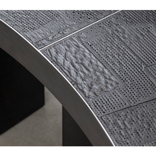
There is a design studio that raises a question over familiar and obvious things. It is Studio EJ, run by EJ Pak. Pak addresses the following questions: Why are bookshelves always designed in a fixed form, when the categories and number of books in their collections are subject to change? Why can’t nesting tables, which overlap and spread several large and small tables like a matryoshka, reveal their properties visually? Can furniture itself always maintain the warm feeling of light, even when it is not placed under the sun? In response to these questions, Pak has created the 2013 Tab Bookcase, 2015 Layered Table, and Printed Light series.
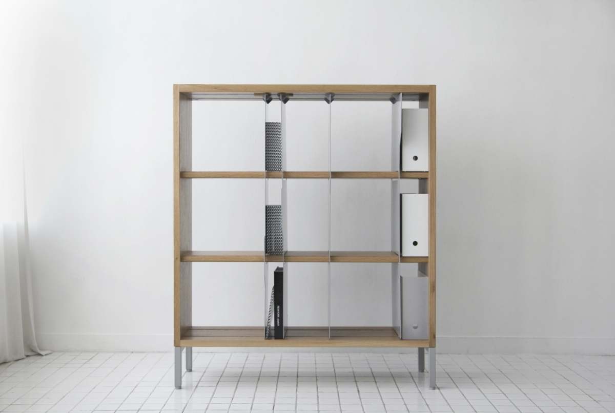
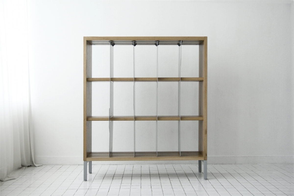
EJ Pak, 2013 Tab Bookcase, White oak, steel powder coated,
1,000×300×1,100mm, 2013 (©EJ Pak)
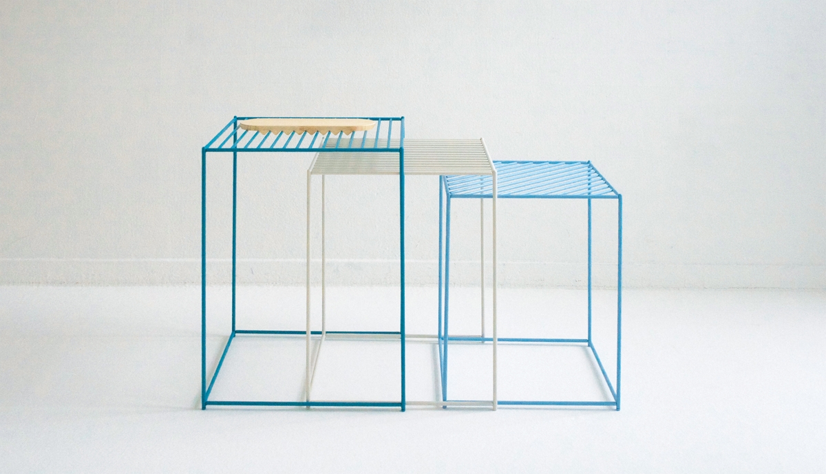
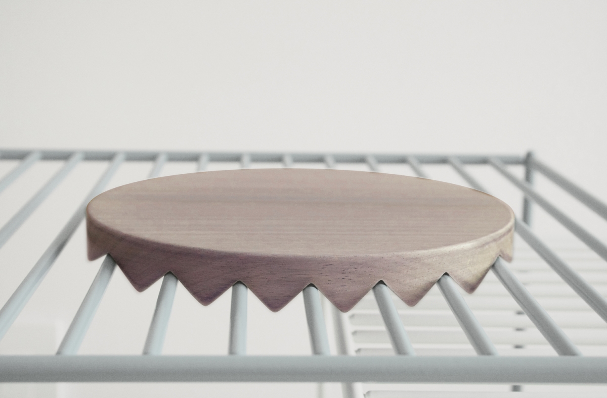
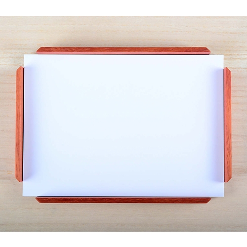
EJ Pak, 2015 Layered Table, Steel rod powder coated, white oak for
plate, 500×500×550mm, 2015 (©EJ Pak)
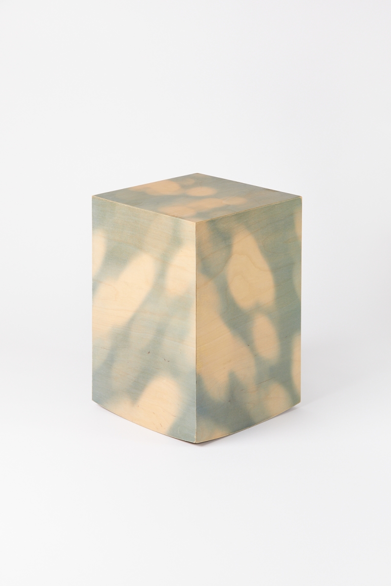
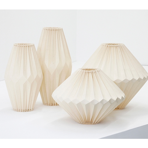
EJ Pak, 2015 Printed Light, Printed on birch plywood white stain finish, 300×300×430mm, 2015 (©Roh Kyung)
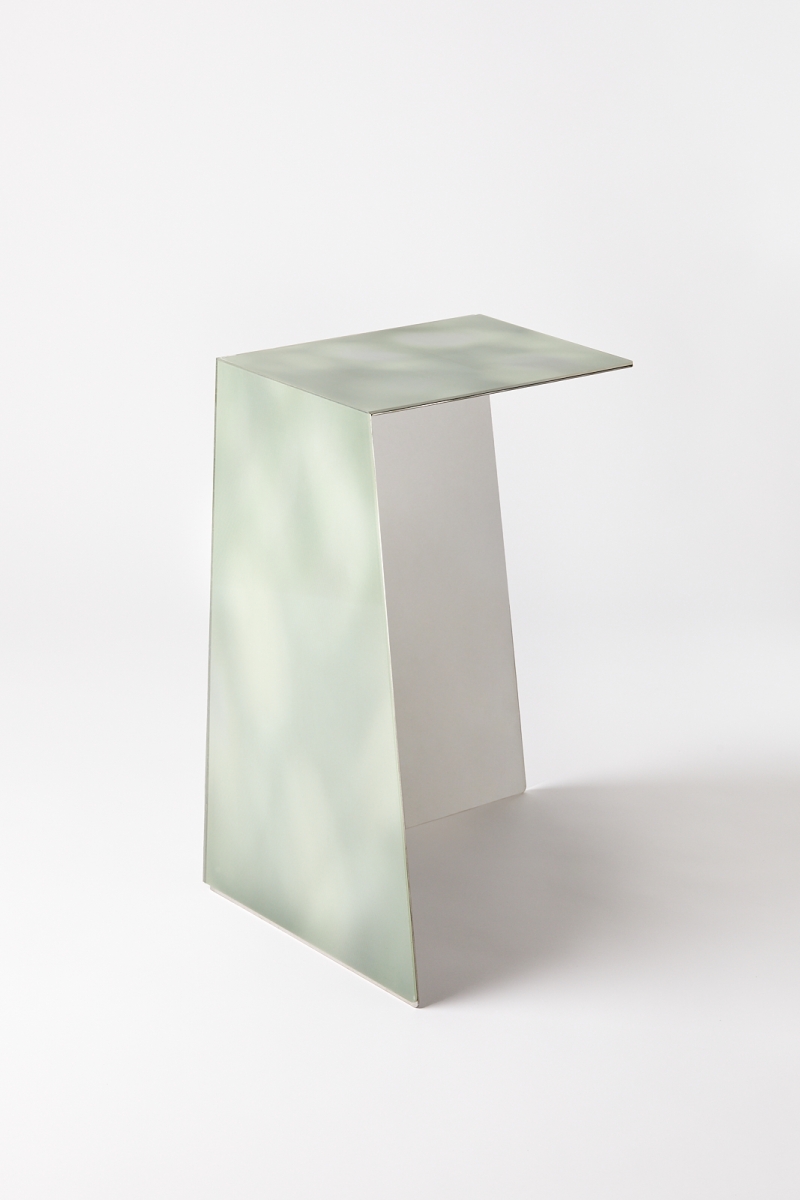
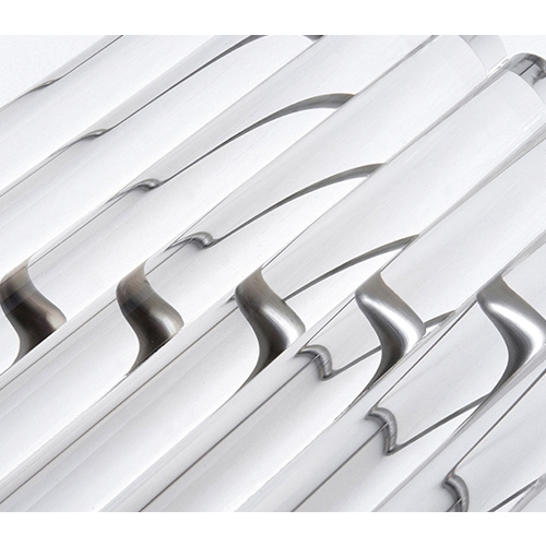
EJ Pak, 2017 Printed Light, Lenticular lens, mirror finished stainless
steel, 350×250×550mm, 2017 (©Roh Kyung)
Interview EJ Pak × Choi Eunhwa
Choi Eunwha (Choi): After studying Woodworking and Furniture Design at Hongik University, you majored in Interior Architecture at the graduate school of Rhode Island School of Design (RISD).
EJ Pak (Pak): When I was an undergraduate, I worked on projects that were close to ‘art furniture’. At some point, a moment of skepticism arrived. The relationship between furniture and space is like that of contents and container. I realised that, no matter how much I focus on the content, in the absence of understanding a container, a limitation always exists.
Choi: By majoring in Interior Architecture, did you get to quench your thirst to better understand space?
Pak: RISD focuses on renovation. It is geared towards looking at the structure of existing buildings, researching the surrounding environment, discovering social and cultural values, and then proposing new narratives informed by a series of logical decisions. It was pleasant to engage with that extensive process of storytelling. Whenever I start a new project, I always think about the reason behind it. When it starts to lose its validity, the project just turns into pretty trash. During my undergraduate studies, I was always anxious and was constantly asking myself whether ‘the furniture piece that I am working on right now could be considered worthwhile for many years to come’. I was able to resolve some part of that anxiety at graduate school.
Choi: You’ve officially committed to working on furniture design. Could you tell us about how you came to design the 2013 Tab Bookcase?
Pak: After graduation, I worked at design firms as a junior architect in the U.S. and Korea. As I got to work on several projects, I suggested alternative ideas, imagining different scenarios that could’ve worked for that issue or whether it would be fun to make particular changes. Yet, not many of them were reflected in the actual design. I felt bad about letting those ideas slip away. One of them was about a way of organising books. Books are generally put in horizontal rows on the shelves. This makes it difficult to organise by section. Moreover, based on the volume of the books that are stored, the size of each section changes every time. If you can’t fit the books in one row, you must place them on the next row. While looking for a way to resolve such discomfort, I came up with the concept of sliding: let the books in different sections be partitioned but make that divider unfixed and flexible so that it could be adjusted according to the total number of books. If a horizontal member moves up and down, there may be a safety issue, so the 2013 Tab Bookcase was designed with vertical members moving from left to right.
Choi: You seem to look at everyday life with a keen perspective. How did you approach to nesting tables?
Pak: Nesting tables overlap and spread. Usually, they are made of opaque and rigid materials, and are not able to clearly reveal their distinct properties. Striped tops are made with thick frames so the overlapping can be effectively revealed. However, when there is an opening in the table, it is unsuitable to put things on top of it. This had to be solved, and I wished the solution could be much simpler than adding a separate lock or using magnets. After making 2015 Layered Table, I personally used it and performed various trials. Then one day, I folded a paper into a zigzag, placed it on top of the frames, and noticed that it stayed and remained stable. In order to withstand the load, I made the members out of wood with thickened depths, and I also made them out of sheet aluminum with folded edges. Rather than remaining fixed with a certain idea in a single direction, my working process involves adding something and then trying another even after the furniture piece is finished. However, during this process, what I tried to avoid was clear: I tried to avoid something complicated and excessive.
Choi: The structure of the 2015 Layered Table is also simple.
Pak: I mostly outsource production, but it is important to achieve the same quality every time. Framing typically involves welding, but the 2015 Layered Table was made with a mortise and tenon joint technique that bores holes and inserts members to minimise welding. No matter who fabricates it, it had to be designed to be able to reach a certain level of proficiency. However, the production cost is high, so I continue to research alternative ways of manufacturing it more easily.
Choi: Your Printed Light series addresses the themes of light and shadow. They are important subjects in painting or architecture, and it is interesting to see them applied to furniture as design elements.
Pak: I take photos and write notes to document what I like in my surroundings. When I looked at this journal later, I realised that I had captured a lot of dappled light, without really noticing. Whenever I was inside and accidentally found the light on one side of the wall, I felt pleasure and it made me happy. It gives a totally different effect to that of putting many flowerpots inside. As such, along with my furniture, I try to reproduce the more poetic moments in experiencing nature. Rather than using the bulbs to produce artificial light, the warm feeling delivered by natural light was important. The shadow pattern was applied to the furniture piece, creating the effect as if the light has been cast across.
Choi: There has been a change to your technique of expressing shadows. In 2015, you transfer-printed on plywood, then in 2017 you attached the lenticular lens on stainless steel. The effect of dappled light seemed to have been maximised due to the lenticular lens, which makes the form change as the viewing angle shifts.
Pak: At first, I imagined the light was coming from one corner and represented the back as just black. Then I attached lenticular lens on stainless steel, which seemed like a method that was not making the best use of the material. So, I just got rid of two sides. Of the cube, two vertical members disappeared, and the two remaining vertical members were adjusted to have longer lengths towards the bottom, in order to strengthen the structure. The problem that came up after resolving the structural issues was deciding on the finishing material of the inner sides that were exposed to the outside. The solution was finishing them with mirror so that only light exists while the rest blends into the surroundings.
Choi: The Printed Light series seems to be in a process of constant change. Is there something that you would like to maintain as its core concept?
Pak: I would like to continue using the warm feeling that light gives. So far, I’ve used images in a rather direct way, so in the future I will most likely pursue my work in a more abstract way.
www.studio-ej.com


