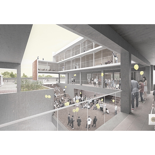
Who knows most about buildings? Without needing to refer to reception theory, buildings become received and evaluated by people from various backgrounds – architects, occupants, pedestrians, tourists, and others – under the huge overarching umbrella of architecture. All buildings are bound to change in time. While people who visit a certain city or region for the first time may find it easier to intuit its significance than those who experience it as their backdrop to the everyday, those perspectives are only kind among many.
Minimising Form and Optimising Reception: Paju FINELINK
Recently broached as a potential bridgehead in the ongoing talks between the two Koreas, Paju Heyri has secured itself as an important place within the Korean architectural scene due to the existence of Paju Book City. Paju Book City resulted from an unusual accord: the designer and the specific regulations of the project were to be determined in an agreement made by an organisation consisting of members from the publishing industry, architecture, and the head architect. The masterplan of the second block was designed by Kim Youngjoon. Its programme was configured to provide infrastructural support to the first block. As the expansion project, which surpassed early expectation, was carried out, the following questions were raised. First, whether this kind of urbanisation project – which is about creating a building complex for a single industry – is valid or not. A city goes through numerous unexpected changes, due to the individual desires of its population, and this is reflected in the current plans for a large-scale shopping facility and a film industry complex, related office buildings, on the second block. Furthermore, with the construction of a residential block in the vicinity, plans for a third block has been put on the table. It is anticipated that more diverse and positive change will continue to happen from now on. The second question is regarding the potential conflict between an ethical approach that abides by commonly-agreed principles and a practical use of space within privately-owned land. How much have the general principles – which were originally established along with a limited architectural line attributing sense of connection and urban continuity between individual buildings, and so ensuring a minimum level of homogeneity – been put into practice? Unfortunately, because the regulations related to the construction principles were not followed in the second phase of the city’s development, it took on a snake-like shape with disconnected pedestrian roads and visual pathways. The ‘green road’ between the sites and the roadside pedestrian paths are now filled with temporary buildings that support each building’s functions. Similar to the changes mentioned earlier, the inside of the complex – which did not follow the original plans for it to be a public area – will also likely have its current functions replaced by businesses in the service and cultural industries after about 10 years, such that it will take on a completely new look from its current aspect.
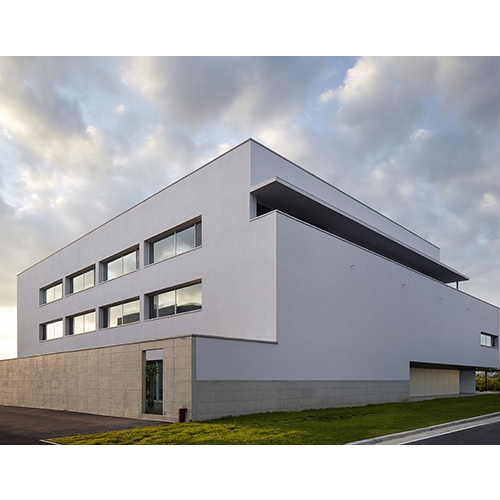
FINELINK is the office building of a design company that also produces packaging work. According to Kim Soo-young, this project took up 4 months from the day of signing the contract to its construction approval, and was carried out by following an effective line of communication with the building’s owner in terms of deciding and developing the main ideas. The most significant demands made by the owner was the flexibility to accommodate various kinds of programmes in the future and a large bathroom. The owner also wanted the building to be representative of the ethos of the design company, which was fulfilled by securing sufficient space both inside and outside. The office resembles a playground, where tables and partition walls can be installed as required, and has been designed to accommodate up to about 30 personnel.
The difficulty faced by the architect during the FINELINK project was the lack of an urban context. While the site is now almost entirely overlaid with buildings, at the time of the construction of FINELINK there were only about five buildings on this large terrain. In this situation, where it was impossible to predict what kind of buildings would be built in the following years, there were no contributing factors that would help the architect design the building with regards to the positioning of openings for sunlight, ventilation, and views.
The FINELINK project was carried out within a fixed size limit. Excluding the northern office space, in response to the surroundings, it was decided that the windows should be small and adopt an introverted character in the remaining areas. As a solution to the bulkiness of the plane, determined by the limited architectural line, the architect decided to have the module – arguably the most significant decision – designed in the framework of a flat order and cross-sectional virtuality. An atrium was installed on the lower floors, a courtyard was built on the middle floors, and multiple layers were installed on the facade. This method of securing a courtyard that embraces its exterior while also remaining introspective has been previously employed in Sharing Moonlight (2014) and the Jaws Food office building (2016). This emphasis between a virtual courtyard and a facade boundary was also enacted in the Myeonmok fire house (2016). The exterior outline was decided in this way. On the other hand, instead of dividing the space by its rooms, the interior space, secured as a one-directional beam structure, was composed as a continuous form in line with the traffic flow. As the most of the spaces were used either as work or exhibition spaces, this decision strategically used the limited space in a flexible manner. Moreover, a traffic line that freely moves outside the building – a feature also notable in Gotjawal (2013) – was internalised with the designed spaces and the modules as basis. In addition a heterogeneous entrance, which protrudes diagonally, creates a perceptual contrast to all these principles.
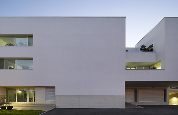
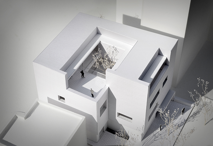
In FINELINK, one can see how much thought has been put into its dualistic strategy, with the original buildings achieving both physicality and abstraction in the use of exposed concrete. In many similar cases the buildings appear to stay silent, overwhelmed by the dissonant chord produced by the urban city centre. Also, despite being under the premise of the abstract – i.e., that it signifies the end and the fulfillment of time – the physical wall progressively and inevitably exposes the passing of time through its outer layer.
There was a deliberative agreement on the colour and lighting for FINELINK’s interior and exterior between the architect and the building owner. The addition of red pigment to the outer wall, finished with white stucco, was decided upon, so that it would fade to a different colour according to the changing amount of sunlight. On the other hand, the interior is consistently white to take on the appearance of being indirectly lighted.
In this building, there are multiple architectural vocabularies that go beyond the dichotomy of empty rhetoric and silence. Minimalism in architecture usually adopts strategies such as minimalisation, optimisation, abstraction and immateriality, which creates a dramatic effect and results in the reduction of structure and use of materials. In the FINELINK, by inserting unexpected elements that escape the hierarchical relation between whole and part, such as a rotated pillar and a circular external ceiling, introduces a contrast with the presumed architectural norm. To minimise is part of the strategy of optimisation and dramatisation.
While it is referred to as ‘sustainability’, the aspect that is as important as physical realisation in architecture is the ‘review’, meaning how the building is run, managed, and used. Here, by embodying the variability of time as an element that completes a building, one arrives at the question of how one should mediate between the two time dimensions, i.e., the now and the transitional. The empty space, the limited opening margins, and the division of interior spaces created by indirect lighting reveals the transitions of time and the seasons in their respective ways, and thereby the building becomes both stage and background. The wall surfaces have turned into a canvas for light and shadows, along with other elements such as the entrances, openings, and ceilings, and function as instruments that respond to the time of day and the seasons.
Location-Formation of an Anonymous Point: Yangju SOVICO Professional
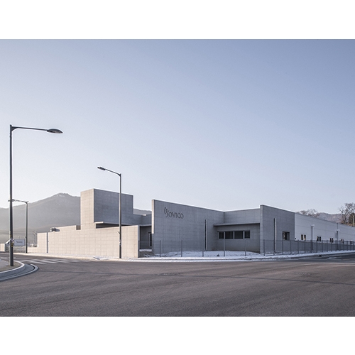
Through common investment from Yangju city, Gyeonggi Urban Innovation Corporation, and the Korea Industrial Complex Corporation, the Yangju Hongjuk Industrial Complex was constructed in 2010. In this place, which specializes in the production of fabric, metal processing, electronics, telecommunication, medical equipment, and optic instruments, the SOVICO Professional, which is known for producing and importing audio equipment, was planned in 2016 on a scale of 700 pyeong. The factory comprises an office block, production block, and an item distribution block, and the assembly line and the warehouse constitute the key parts of the plant. This industrial complex, which has now secured a level of density after four years of real estate business, was built in such a way so that it remains indifferent to the beauty of the surrounding landscape. The complex has taken on the character of a simple function-oriented district with homogeneous programmes that fill up the site, attributing to it a sense of disconnectedness from the outside as one cannot know what will last in these surroundings. Furthermore, because one cannot know what future buildings will be established within and outside the complex, the notion of conceiving a relationship itself was impossible.
SOVICO Professional began with precisely such a dualistic blank state. For a factory where a functional programme takes priority, a three-part strategy for visual and cognitional reception was adopted. First, the vertical expression of the staircase, which is visible from the roadside and the entrance area, acts as a sign announcing the existence of the building sector. Crafted in consideration of the speed of an anonymous urban environment as its premise, the entrance position is implied at a close distance. The low wall and the staircase tower form a contrast, and the appearance of other perpendicular, multilayered surfaces assigns a strong sense of identity to an otherwise monotonous manufacturing plant. Perception of these two elevations is more effective when looking upwards at a diagonal angle. Second, one may take time to consider the small atrium located at the front of the office space. In this multi-purpose space, created by an arc-shaped concrete block wall, products manufactured in this factory can be displayed. Of course, the matter of how this space is to be best used is totally dependent on the desires of its user. Lastly, the attempt to create a contrast between the entrance canopy opening and the tiles of the lower wall is made possible.The canopy opening, which was created as a homage to Alvaro Siza, not only filters and reflects light but also functions, like the tiles, as an instrument that senses the flow of time.
The large work block and distribution block were constructed according to a textbook steel structure with a transitional space in the copula between the two blocks. The lower wall of this transition, which is a masonry wall of concrete blocks, begins at the entrance wall and displays a logic of construction that extends throughout the entire building blocks. In the upper half a logical performance of the structure plays out to show how the volumes can be integrated. Lastly, the end section of the distribution block, where the emergency exit is placed, has been cut in a diagonal line. This demonstrates again how the entrance theme was approached according to a distinct strategy. The design may have been completed in consideration of future expansion, but when looking at the warehouse, added by the building’s owner after construction, as well as accounting for the management of domestic matters in relation to office space, it is difficult to be optimistic about future changes. This again reveals how the reception and the management of a building relies on the outlook of its user.
Architecture as a Product of a Process Under Completion: Yeongju Swimming Pool
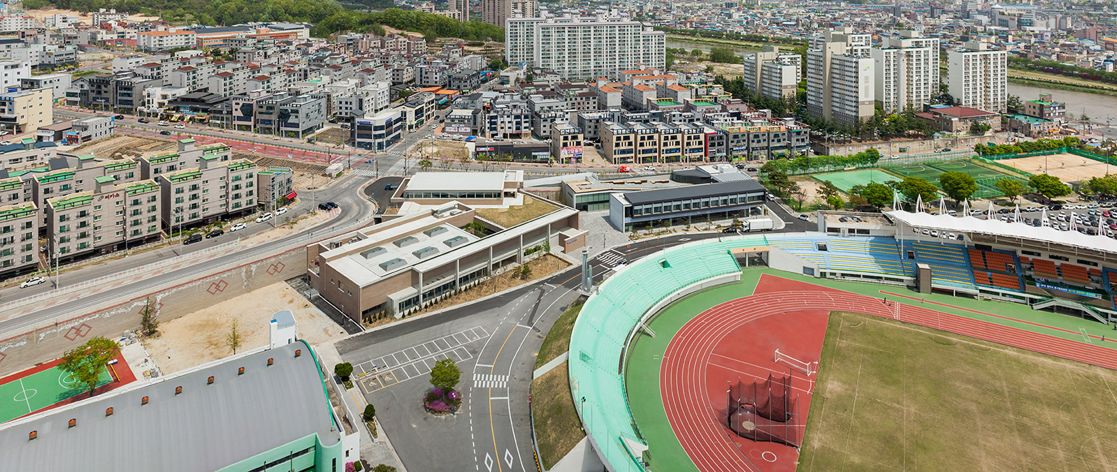
There are some pertinent examples of urban specialisation projects in contemporary architecture. As in Muju County, Jeollabuk-do in Korea or the Kumamoto Prefecture in Japan, Yeongju is a place characterised by a significant concentration of diverse architectural projects. It adopted the Public Architect system for the first time in the nationwide, and with an integrated masterplan that was passed in 2007 as its basis, it witnessed the construction of a health care centre, town office, senior citizens’ centre, among others. More recently an indoor swimming pool and a boxing training centre have been added to this list. Through post-construction design management, su:mvie architects, as ‘design manager’ at Yeongju, is working hard to make sure that the buildings are used as originally intended.
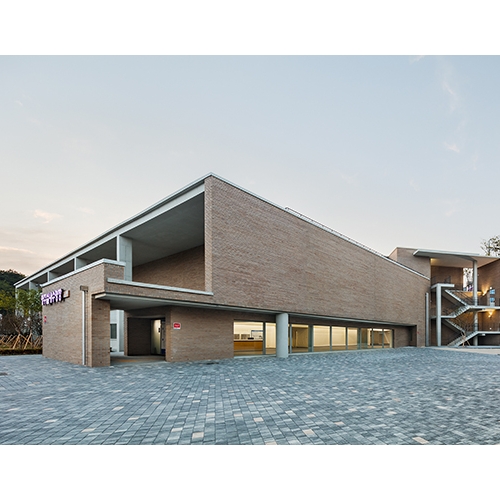
The most notable point in the plan for Yeongju Swimming pool was the physical conditions of the site. Yeongju city carried out a design competition for a building that would combine both an indoor swimming pool and a boxing training centre, and the given site had unfavourable conditions in terms of its urban context, due to its level difference of more than 10m with its surrounding roads. Kim Junsung, who was responsible for the boxing fitness centre, and Kim Soo-young, who was in charge of the indoor swimming pool, focused mainly on overcoming through architectural terms the unfavourable physical conditions created by the level difference and the road gap. However, these two almost similarly-sized buildings have different kinds of approaches. In the case of the boxing training centre, a continuity has been achieved in the monumental slope that widens at its narrow entrance to the central plaza and the fitness centre facility, while a professional boxing fitness space is secured at the building’s basement level. This allows for a line of sight to allow members to observe the athletes from the ground floor. In the case of the indoor swimming pool, there are two entrances at two different points, a proposal that counters probable disconnection from the urban context. The indoor fitness facility leads the pedestrians descending from above the beam along to the rooftop garden above the swimming centre. On the other hand, the exterior staircase placed in the narrow gap where the path turns connects the traffic line vertically and makes the pedestrians active in their choice of entrance. This traffic line continues into a post-monumental external staircase and culminates in the theatrical central plaza.
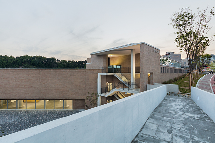
Let us observe the approach taken towards the original fitness area, designed on a relatively large-scale when compared to the overarching urban scale. In Yeongju Swimming pool, a series of pillars that compose five sections render the urban scale visible in an abstract traditional way. At the same time, it insinuates a spatial hierarchy that structures the interior space. A wall, in contrast to this openness, constitutes the front facade and divides the interior and the exterior of the swimming centre, promoting visual communication through the horizontal window at ground level. The intersection between openness and closure has also been realised in the inner court and along the original beam space that faces the health centre through the window.
The interior of the swimming pool has been created constructively, with structural elements based on a restrictive hierarchy. The indirect lighting creates a visible effect, by which the walls that regulate physical space appear to float and they help one to orient oneself naturally according to the location of the light source. Kim Soo-young prefers to specify and visualise the divisions of surfaces by revealing the outlines of space. This is also effective when creating an autonomous space that appears divided from the exterior.
As Guy de Maupassant expressed in his criticism of the Tour Eiffel, one of the most significant faculties of architecture lies in its unavoidable presence. Exemplary works of Land Art refused to be limited to gallery spaces; this in architecture becomes a group of experiencing bodies that was once limited to the building owner, architect, and the user, and has now expanded to an absolute multiplicity of identities and experiences in the city and architecture, such as the ‘street pedestrian’. In reality, architecture is completed in the actions of such diverse participants. Therefore, under the premise that ‘everyone is a critic’, the discussion of a certain building is functional in that it leads people to experience a location on their own terms.
Sustainability presumes not only the physical existential continuance of a building but also its flexibility of response to the changing demands of the future. Its success and failure depends on the creation of a place of communication that goes beyond mere functional interests, as well as on the reception of reconfigured meaning and the manner of its use. In this sense, Yeongju Swimming pool still has some tasks to fulfill. Although the boxing training centre has been completed, it is difficult to manage the entire public space organically as the space is not presently used. In this public building, surplus spaces were planned to cater to possible changes to the interior and exterior spaces. The situation calls for better spatial layouts in a relatively wider lobby, passageways, and the cafe, and an adoption of relevant specific programmes. This also applies to the entranceway mentioned earlier. In opposition with the architect’s intentions, the area connected to the pedestrian pathway at the roadside is now used as a carpark. The surplus space and the matter of an organic connection with the exterior space are issues that must be resolved in the future.
If there is a point of intersection between conceptual art and architecture, it would be in terms of receptivity. If the audience participates in an artwork by assuming the position of a creator of meaning, then in architecture, ultimately, users of various attitudes participate to complete the space. It is not a coincidence that the flaneur and the dandy, figures popular before the Second World War, led to the ‘street pedestrian’ and anonymous architecture, which gained influence after the war. It is not an overstatement to say that the actual result depends on such individuals, and this is testament to the strong and the weak aspects of architecture. Just as a published book comes to live its own life separate from the author, the same applies to architecture. Accounts of a government official who empathises with love for a region or the potential of architecture, and how he or she cooperated with the architect, never enter record, but such things have always played a key role in the planning, realisation, and management of public architecture. Effort not only came from the architects but also from anonymous individuals in the public sector who have shown their support and fidelity. In order for the public buildings in Yeongju City, including the Yeongju Swimming pool, fulfill the functions they are intended to serve, the city’s policy and management and the autonomous participation of regional residents is in demand. I hope that a de facto public character encourages public buildings to become platforms that not only embody the everyday and the specific, but also the way they can be ultimately produced by the masses.


