REVERSAL OF THE OLD AND NEW
When I visited the site within the originally-abandoned Seoul Dongmyeong Elementary School for the first time, its windows were broken, the chairs and tables were haphazardly strewn over in the classrooms and the corridors, and its front and back yards were overrun by wild plants. Ever since its establishment in 1944, with 18 classrooms, many facilities had been either newly built or renovated in the Dongmyeong Elementary School. The abandoned school building is a building that was last constructed in 1967. Perhaps it’s more correct to say that this building was growing old, derelict, and was in disrepair for about 50 years, but it was left untouched in contrast to the colour-striped facilities and the green field. The field, which was newly planted with artificial green grass, was right next to the abandoned building, and the scene of children playing soccer on it with the school as the background was surreal.
Neverthelss, I liked the fact that the façade retained the school’s original image. I also liked the way the frame of the concrete rahmen structure and the horizontally long windows remain untouched in the original school building. Of course, this also meant that the floor plane wasn’t as free inside. Furthermore, I appreciated the way the façade of the western residence stood out with its red brick finish.
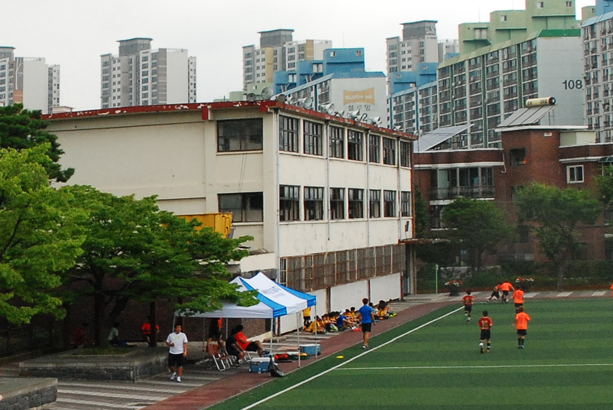
Image courtesy of studio_K_works
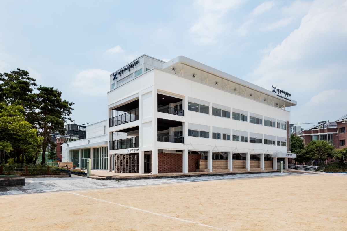
Seoul Creative Art Education Center_ The architect decided to revive the horizontally long windows, making an extension by continuing the concrete rahmen structure.
In any case, the urethane running track and the walking path of the sports field was almost touching the school building, and the children often sat there in front of the school to rest after their vigorous sports activities. I also saw their mothers either standing in front of the school building with water bottles or sitting on their coolers. They chose to be positioned by the school building for the shade that it provided.
Bearing these reasons in mind, the first thought that came to mind from my visit was to build a stand in which people might actually be able to rest. I also decided to revive the original façade of the school building, making an extension by continuing the concrete rahmen structure, and somehow retaining the crude red bricks of the western façade throughout the process.
Moreover, by going for a slightly inclined board concept, I planned to have a buffer zone installed between the stand and the walking path and to combine the extended area with the original school as a combined area. This board also provides a cozy outdoor student activity area between the eastern eco-garden and the extended area while providing a sense of outdoor freedom and the green of the landscape scenery for the multipurpose theatre.
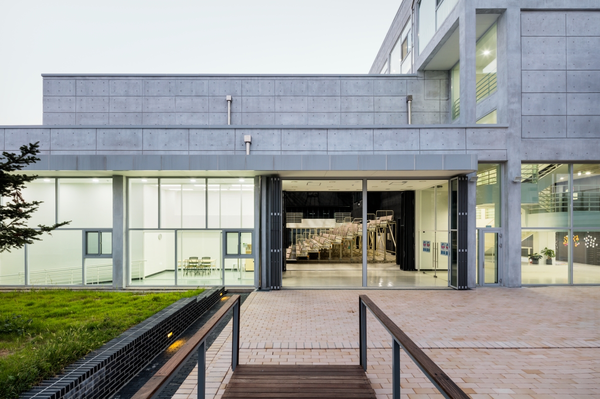
The architect planned to have a buffer zone installed between the stand and the walking path and to combine the extended area with the original school as a combined area.
The building interior is divided largely into these three areas. The first area is that original school building that various rooms for educational programmes are installed (the main finish is HR steel). The second area is a multipurpose theatre. This place with folding chairs can be adjusted in terms of scale according to the activity type as it is divided into two areas. It can also be used for exhibitions, an education space, or a recreational space (black bricks). The last one is a vertical hall. As an intermediary space between the original building and the extension, it provides active visibility and a sense of coexistence (the main themes of this design), and also functions as a place for rest and exchange by providing an open shared space in every floor with its alcove benches (plaster boards with white paint).
Above all, it was hoped that the vertical hall would be a space that is not merely represented as an intermediary space between the first two structures, but one that embodies a completely different character from them. Expectations arose around the necessity to contain ambiguous spaces like an attic as it rises vertically. As a completely isolated area in opposition to the theme of coexistence, a training room with a view of the surroundings and a music practice room were also installed.
For the part facing the street in the west, the building size was scaled down. I then came up with an artless idea to create an unwalled and landscaped boundary by making the building function as an entrance and exit control while allowing the theatre to be visible from the outside. However, due to the strong opinion of the school principal when nearing the end of construction, it ended up with the installation of a green metal fence around the site boundary, thus creating an enclosed atmosphere.
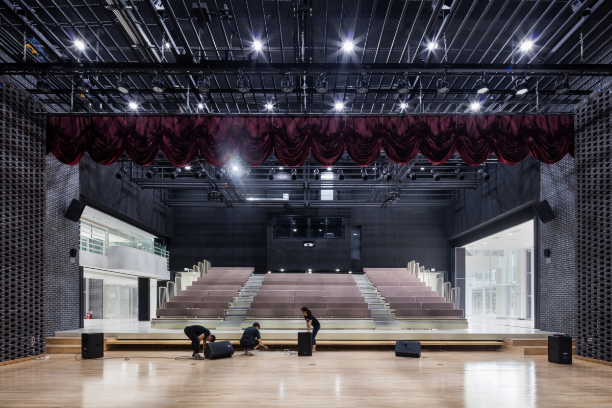
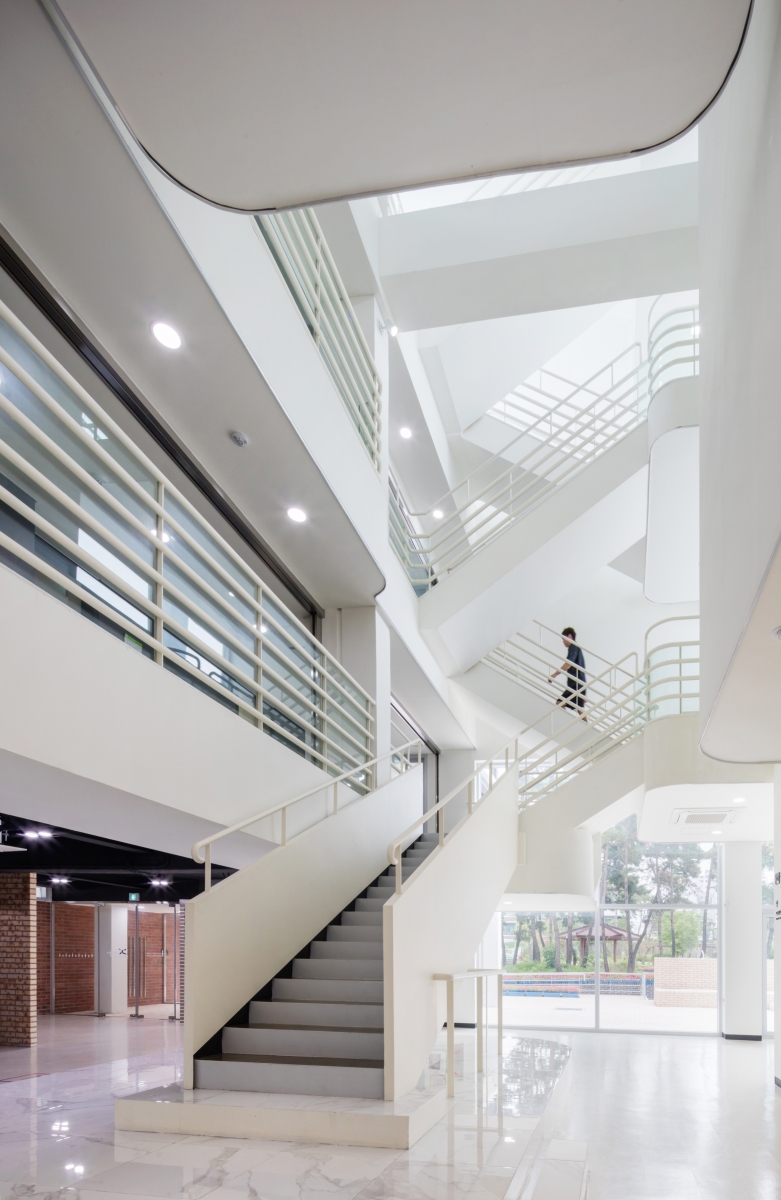
As an intermediary space between the original building and the extension, vertical hall provides active visibility and a sense of coexistence.
Kim Kwangsoo
Kim Kwangsoo, the principal of studio_K_works and co-director of the platform Curtainhall, graduated from the school of architecture, Yonsei University (B.Arch) and from Yale University (M.Arch.). He prefers collaborative processes in architectural practices focusing on social changes introduced by new media cultures. His works have been exhibited in Venice Architectural Biennale (2004), Finland Museum of Cultures (2007, Helsinki), Art Sonje Center (Seoul, 2012), Austria Museum of Cultures (2013, Vienna), Aedes Gallery (Berlin, 2014), etc.
109


