SPACE February 2024 (No. 675)
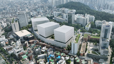
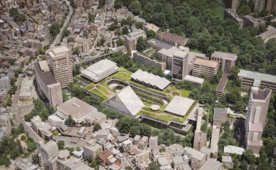
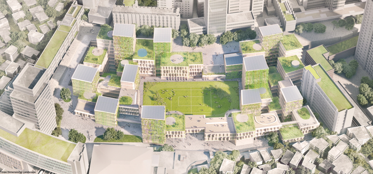
Jury Comment 2 This proposal is startling in its simultaneous quietude and radicalism: it recasts the university as a landscape of small-scale buildings, recognising that today’s university attends with greater sensitivity to the individual than to the large, more anonymous pedagogical models of the past. It is also notable for its commitment to conservation in the central green space as a sports field. What is less successful, perhaps, is the limits imposed and decisions made about scale and which programmes have access to the best locations: the little towers offer a fantastic view across the campus and the neighbourhood below, but they are limited in size.
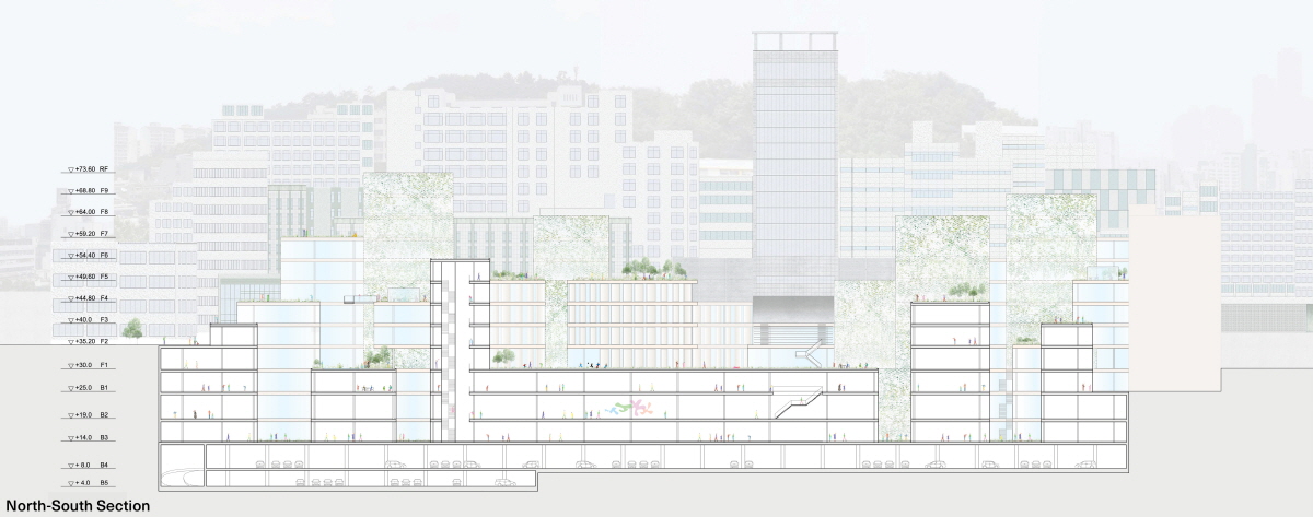
Jury Comment 3 What appears as a collection of many small delicate pavilions reveals itself as a huge underground building with some vertical extrusion. Although doubts have been raised about the quality of daylight and wayfinding in the lower levels, there is the hope that the small towers will provide a completely new type of spatial engagement on the university campus. However, a question remains about the flexibility of those chosen floor plates.
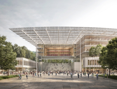
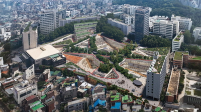
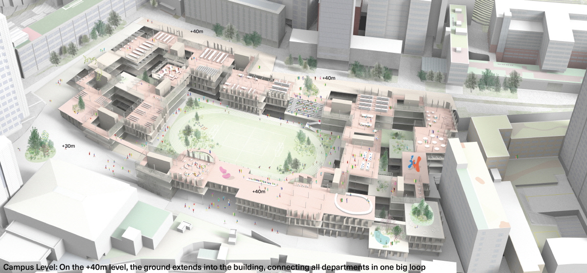
Jury Comment 4 It is a beautiful and peaceful vision of the university as an aggregate of smaller parts—an academic village. Meanwhile, maintaining the large playing field in the middle was a much appreciated and bold gesture. Despite its fine-grain aggregation, the key levels of +35m and +40m where the project connects with the campus ground levels were relatively closed. Even thought the building mass shifts in and out, there are no real alleyways or outdoor open channels that lead to the central field. Therefore, the project appears as the ‘image’ of something that is of fine grain, but does not yet act like actual fine grain because its ground floor perimeter is too enclosed in spite of the ample use of glass.
Jury Comment 5 The design is exceptional in finding the right scale between the scale of the surrounding city and the scale of the existing school facilities. The preservation of the sports field in the middle is also exceptional. However, the excessive fragmentation of the massing, which reduces the flexibility of the school space, could prove fatal.
You can see more information on the SPACE No. February (2024).
36


