SPACE February 2024 (No. 675)
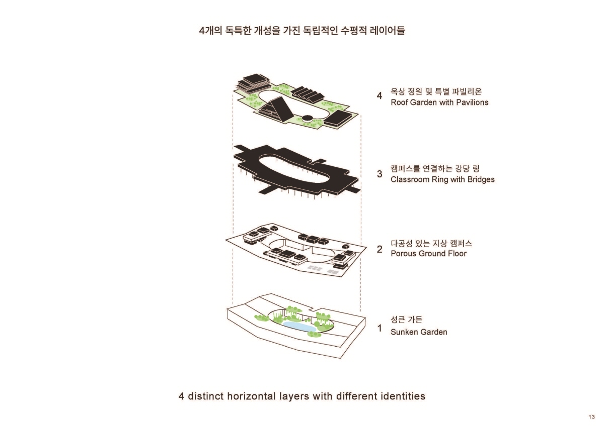
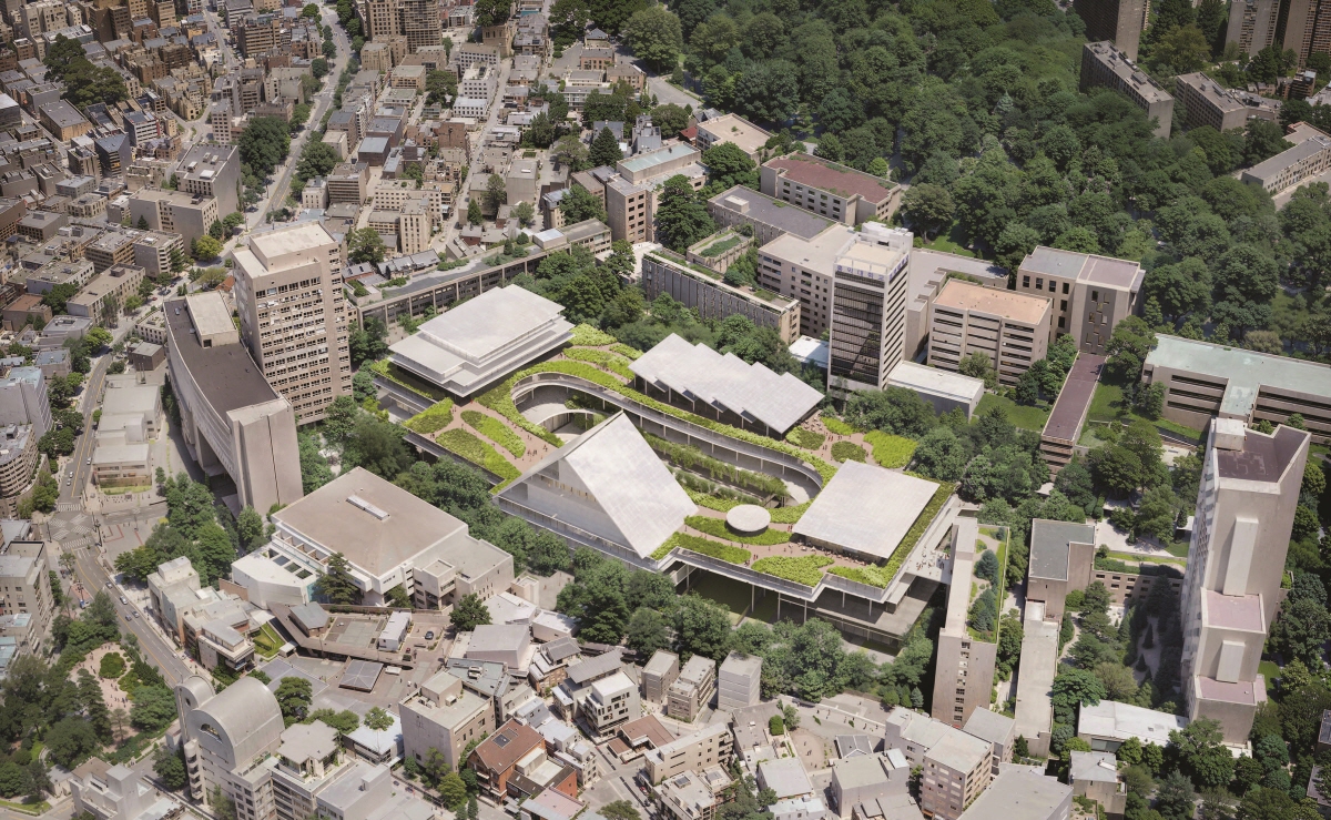
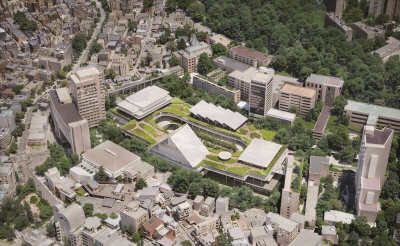
Jury Comment 1 It is a great concept in which horizontal and vertical circulation on four levels clearly intersect. However, in relation to the circulation around the courtyard, the west faҫade forms a symmetrical plan with the centre of the museum as its axis, giving the impression that the symbolism of the museum has become overbearing and overemphasised.
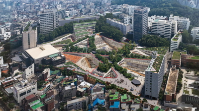
Jury Comment 2 The ring offers terrific flexibility and a strong sense of identity. The pavilions provide a fun and helpful way of defining vertical zones, but the museum form ‒ with its pitched roof ‒ is very cartoonish and problematic (it’s agreed that that could be revised). What is harder to revise is the fixed symmetry of the proposal, which demarcates four zones in a surprisingly rigid manner.
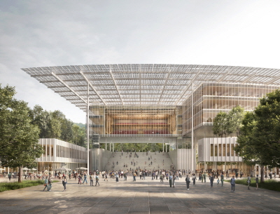
Jury Comment 3 Very simple and convincing technical features. Low tech helps to achieve goals of sustainable building.
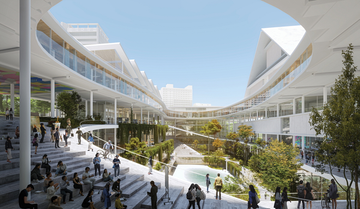
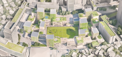
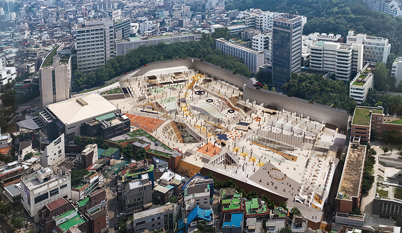
Jury Comment 4 The generosity of the project is much appreciated: from the dynamic central court, which seems like it will be well-used, to the four corner plazas that connect to the rest of the campus, the planometric expression is simple and yet well suited to the site. The four ‘tower’ programmes, which are in contrast to the horizontal mixed-use areas, will allow students to cognitively map how best to use the building, allowing them to occupy it on their own terms. Issues do arise with the elevation. For instance, at the main gate, one confronts the side of the learning lab building— the side of the classrooms seem to not be able to create a sense of frontage toward this important plaza. Similarly debated was the museum elevation with its centralized pitched roof. Even though these angles can be said to have derived from the art school, it in fact bears too much of a resemblance to the entrance gate to a certain university. Other connotations of this elevation were also discussed for their more negative repurcussions.
Jury Comment 5 The way the use of space is proposed (vertically) creates very interesting potential synergy between the main programmes. The innovation in design lies with creating a building that stands between horizontality and verticality. I believe this approach created atmosphere of interpersonal and creative exchange that is foremost in mind in a creative educational institution. Questions arise in connection with the upper pavilions, casting doubt whether the building should or should not stand as an icon.
