SPACE February 2024 (No. 675)
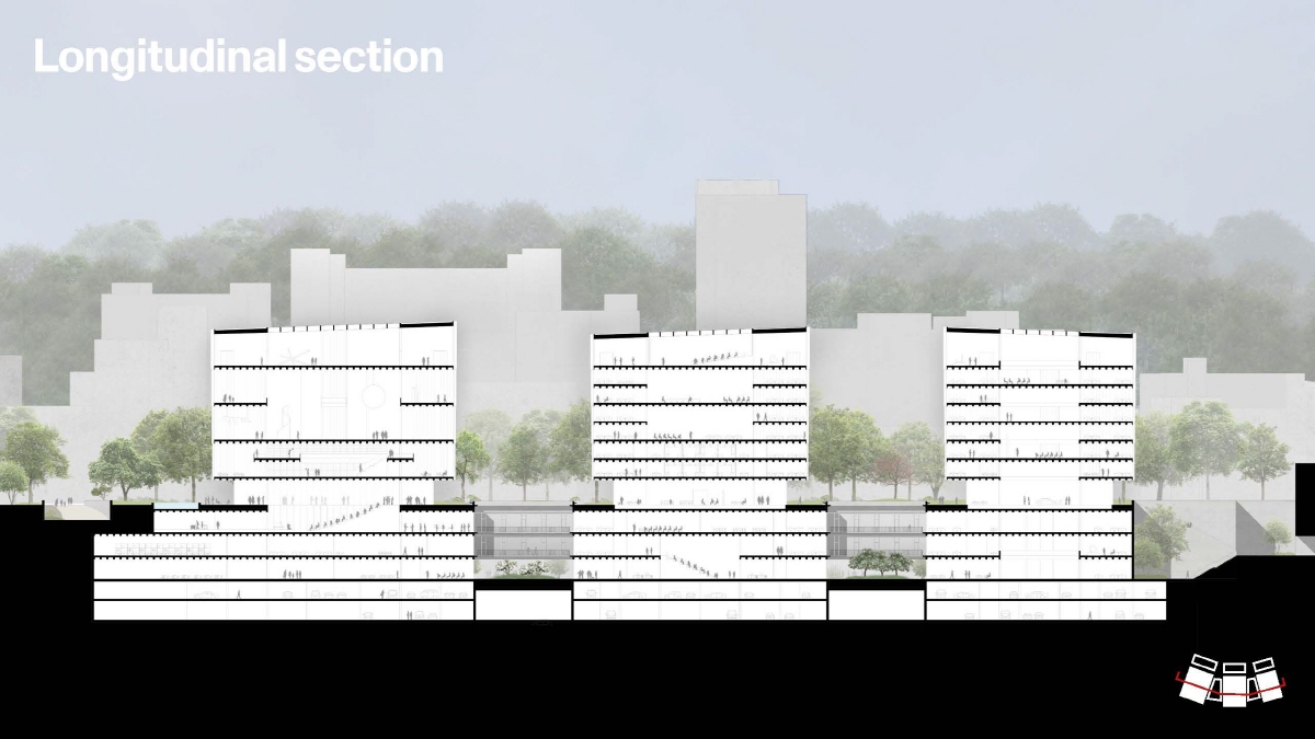
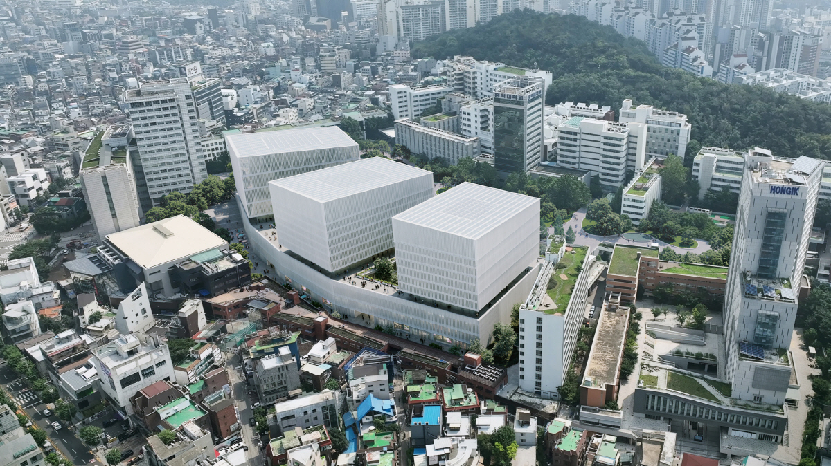
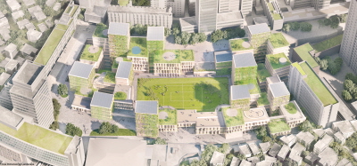
Jury Comment 1 With the +40m level as a baseline, the division of the design into three equally formed volumes (cubes) is clear. The problems are that the height of the proposed overall architectural form makes it difficult to see the existing campus buildings to the rear, and that all the faҫades look the same, creating a homogeneous and monotonous impression.
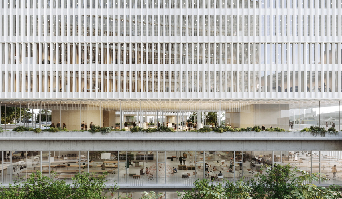
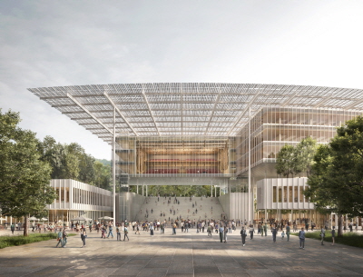
Jury Comment 2 This proposal offers an extremely elegant construction (structure and material proposal), but in terms of a vision for a university of today (and for tomorrow), it reads more as a corporate headquarters than a university complex. The outdoor spaces are compromised for the sake of the three large volumes. It must be noted that the volumes offer flexible interiors, however, which could be very exciting. It’s a pity that that same excitement and flexibility was not applied to the whole (especially to the exterior spaces).
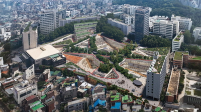
Jury Comment 3 A bold and robust scheme that can be re-programmed easily because of its column-free structural innovation. The elegant recycled glass skin would be iconic. The massing however is ‘general.’ Hongik University is very unique in Seoul—there is a quality to its slopes for instance and the way they meet with a density of artistic activity. The project could benefit more from responding to this—not necessarily mimicking it, but leveraging Hongik University’s unique qualities more.
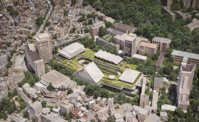
Jury Comment 4 The project proposes a clear organisation of the programmes putting the effort to introduce natural light and sceneries into the inner spaces through a sequence of courtyards. The extension of the slab at +40m level allows for the creation of a great public green space, with the Wausan Mountain on one side and the new light volumes on the other. This space is powerful and inspiring while useful at the same time. The proposal to expose three pure volumes to the city reflects a clear and clean organisation of the three main programmes but it creates, perhaps, a solution that does not reflect nor connect with the vibrant, dynamic and playful surroundings. Perhaps the language of the project, incredible elegant and efficient lacks the spirit of a place where young people are being educated.
Jury Comment 5 The understanding of the campus and the surrounding context is too swingeing, and three large masses are in a form that block the context of the existing campus. It lacks the flexibility that is characteristic of school facilities.
