More than 50 participating countries (65 exhibitions in total), with pavilions on a significant scale dispersed throughout the Arsenale – the former nineteenth-century shipyards – and Giardini (garden) are surrounded by greenery. If the Giardini is composed of independent pavilions that are mostly prepared by first world countries, the Arsenale is a course leading to the main exhibition, passing through other densely separated pavilions and eventually arriving at the Italian and Chinese Pavilions placed in the most secluded area.
I first stopped by at the Japanese Pavilion on my way to the Korean Pavilion. The overall supervision was by Momoyo Kaijima, the co-founder of Atelier Bow-Wow and a Professor at the Swiss Federal Institute of Technology in Zürich (ETHZ). Prior to the opening of the exhibition, I had already heard that ETHZ professors had been selected as participating artists. So I was expecting to see collaboration with Swiss architects, who are well regarded within the field of tectonics in contemporary architecture. However, the exhibition completely upended my expectations. There are already 40 participating artists, and the materials permitted for show were limited to drawings produced in the past. It is surprising in a sense, because the exhibition consists only of these drawings, without any three-dimensional objects (although there was a Lego model displayed). Carefully selected drawings under the theme of Architectural Ethnography are not at all like the visual materials intended for accurate construction. Instead, their subjects are descriptive records of both architecture and the human life surrounding it, like the artist Do Ho Suh’s axonometric work titled My Home and the mapping project of Hong Kong’s maze-like interior space, Cities without Ground. There is an unspoken influence shared by Japanese architects in recent years: the decision to juxtapose a specific ‘life’ next to the dimension, material, and details that are described inside architectural books. For example, in the technical drawing book Graphic Anatomy by Atelier Bow-Wow, specific and diverse flora are recorded along with the person planting. All of a sudden, a mundane and neutral CAD drawing becomes a cute illustration. In the exhibition hall, magnifying glasses are displayed for the visitors to take a closer look at the selected drawings, yet the number of glasses provided is far from sufficient. The observation platform and binoculars, which are probably presented for the visitors to look at something, only make those who have tried them feel embarrassed, because of the gadgets are unclear about their intended use. However, if you look at all these moments from a distance, this is one ‘Kawai’ scene. A Japanese-style food stall called Yatai is located on the lower space of the piloti. There are sales counters for catalogues or drawing tools placed inside. This exhibition might let some people down – particularly those who are eager to figure out about the Japanese Pavilion’s ambitious agenda for the Biennale, or people who have been very determined to learn something from it. Yet, aside from these more pedantic approaches, the exhibition also takes into account the people in family units who might not be involved in the field of architecture. Communicated in a such friendly manner, it is also astonishing to realise that its elaboration, in secretly placing the word describing Japan’s traditional space within the exhibition, takes advantage of the merit of Japanese being easy to pronounce. (How difficult it would be if we ask foreigners to pronounce pojangmacha – the Korean-style food stall!) Considering Atelier Bow-Wow’s publication of Made in Tokyo and the Pet Architecture Guidebook, the strategy is clearly understood.
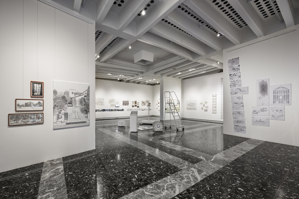
Japanese Pavilion_ Carefully selected drawings under the theme of ‘Architectural Ethnography’ are not at all like the visual materials intended for accurate construction. Instead, their subjects are descriptive records of both architecture and the human life surrounding it. ©Andrea Sarti/CAST1466, Image courtesy of the Japan Foundation
The British Pavilion
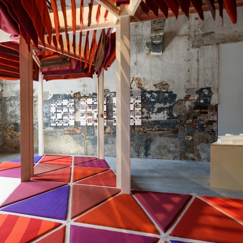
The United Kingdom, Switzerland, and three Nordic countries (Sweden, Norway, and Finland. But Finland presented another national pavilion designed by Alvar Aalto) are the teams who have interpreted the central theme of this Biennale most cleverly. In particular, Britain is the country that has responded to the theme Freespace most casually. The pavilion reveals a constructive attitude by building a rooftop deck supported by the scaffolding, yet there is nothing inside. Instead of being metaphorical, it literally emptied the space. It is a paradox in line with the thought of Laotzu, that an empty space is an opportunity for the occupation of something else. A creaking sound at every step, the still air, and the traces on the walls left behind by the last exhibition. The following evokes imagery taken from a passage in William Shakespeare’s play The Tempest. Caruso St. John, the director of the British Pavilion, drew on this poetry, replaced by this silent atmosphere as an Island. The puzzled audience goes up to the new rooftop deck and is again astonished by what they find. Again, there is nothing displayed. Instead, the afternoon sunshine and the beautiful Mediterranean Sea welcome the visitor. It has been volunteered as a refuge from the crowded exhibitions. An island within an island. Considering this concept, a gable roof for lighting sticks out in the middle of the deck, introducing itself as Venice as a duck under water every time it floods. The pattern of the deck floor derives from that of the plazas. Expressing the design intention as a space for social gatherings and events, tea is also provided to the visitors at 4p.m. There is no doubt that the directors have snatched the once-in-history opportunity. Emptying the exhibition hall twice will not be tolerated twice. They have interpreted free space as an empty space, yet the audience paid an entrance fee, hoping to see the space filled with something. Then, wouldn’t it be fair to return the 2 euros, announcing it as free of charge?
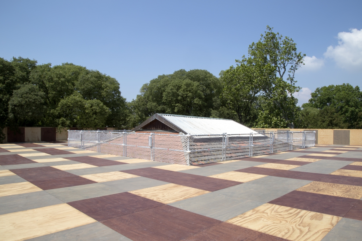
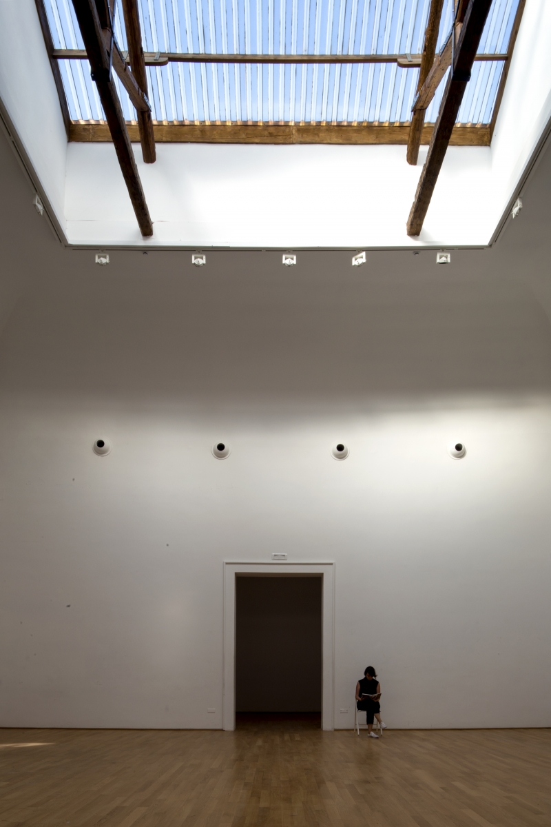
British Pavilion_ The pavilion reveals a constructive attitude by building a rooftop deck supported by the scaffolding, yet there is nothing inside. Instead of being metaphorical, it literally emptied the space. ©British Council, photographed by Hélène Binet
The Swiss Pavilion
The Swiss Pavilion questions what an architectural exhibition is, answering in an unconventional way. It won the Golden Lion Award, proving that its provocations were not off-putting. As one may gather from the title, ‘Svizzera 240: House Tour, it brought in the model-house-like interior of the apartment, focusing on how visitors actually experience it. The apartment housing unit is extremely ordinary and a common form of living. Yet, ever since its design by Otto Haesler, who led German Neue Sachlichkeit in the early 20th century, it has been the type that survived from numerous design experiments. While the visitor wonders if touring this conventionally built house is what the exhibition is all about, a whole new space appears beyond the threshold. The change is not about a shape or property, but a scale. The apartment, which is based on a 240cm ceiling height, is scaled down to 1:5 and 1:2, or scaled up at a ratio of 1.3:1 and 1.5:1. Rooms that disable one’s sense of scale continue to appear, enlightening the true meaning of the ‘tour’, which are based on one’s physical experience. The sink is positioned at an unreachable height and the doorknob is overly large. The exhibition design paid close attention to the details, even including the electrical outlets when changing the three-dimensional volumes inside the pavilion. Tall Europeans had to bend their heads to avoid hitting their heads. Many of the visitors burst into laughter, realising how ludicrous this is. If you felt like moving out from your own home into the British Pavilion, the Swiss Pavilion would be like moving into a new place. It offers a spatial condition where only the elements that are drawn with solid lines on technical drawings exist, a circumstance that makes it hard to recognise the constituent parts aside from the scale of the space. But the director’s intentions are to bring out a sense of affluence in this neutral interior that is assembled with ready-made items. By referencing a Rorschach test and Le Corbusier’s use of Ripolin’s white paint, he even expects the pavilion to be referred to as a phenomenological space.
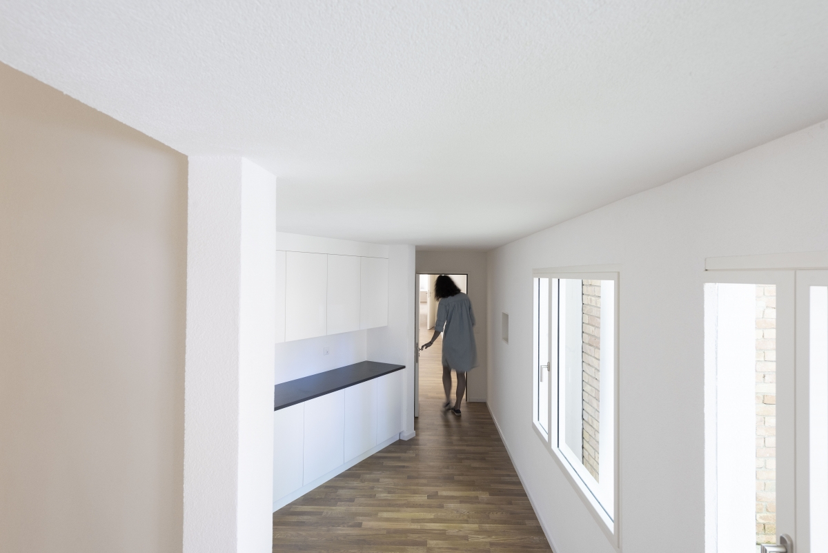
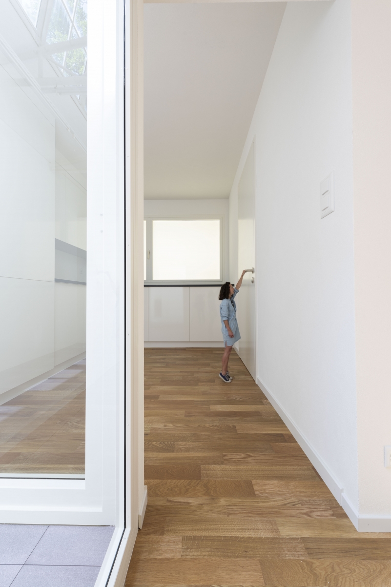
Swiss Pavilion_ Rooms that disable one’s sense of scale continue to appear, enlightening the true meaning of the ‘tour’, which are based on one’s physical experience. Photographed by Christian Beutler / KEYSTONE
The Nordic Pavilion
The Nordic Pavilion always pleases the audience with the uniqueness of its exhibition hall. So this year, it displayed four large masses made of plastic units. They are connected to several hoses suspended from the ceiling, and air and water occasionally flow into the masses with a loud sound. This reactant is controlled by the carbon dioxide measuring sensor inside, but this does not sound appealing. The two indispensable elements to support life and the direct adaptation of the uterus and umbilical cord represent an overly optimistic attitude to the coexistence of mankind and nature.
The Dutch Pavilion
The Dutch pavilion is presented under the themes of ‘Work, Body, Leisure’. It mostly portrays the ways everyday life have changed due to computer technology development. Ultimately it sheds light on the physical body, which mediate between the two, from various perspectives. The square-shaped interior, surrounded by the orange cabinets and the long chair placed in the middle. It is a general configuration of the locker room, and also a space that you make yourself alter for the purpose of work or leisure. Its first impression is somewhat unfriendly: each cabinet has to be opened individually, and the contents that appear when you open the cabinet lack in clues to understanding the specific instructions. Later on, some cabinets open like a door, leading to the hidden space behind, and the previous, orderly arranged space transforms into a more charming and lively atmosphere. The CG hung on the frame and the Renderlands (a compound word of rendering and the Netherlands) where small architectural models displayed are about the subcontracted structure of the architectural rendering business. Most images of the buildings that are designed by the domestic architects, or even the images provided prior to the construction are, in fact, produced by Indian workers who have never been on the construction site. The artist asked the anonymous workers, who mostly work for others’ dreams, about their own dream house and displayed their responses. At the Simulation corner, there are many air-filled dolls scattered around. Throughout this display, the artist questions whose physical body should be the assumed standard when we design for the majority, like the human model for the car crash test. Consider Le Corbusier, who used his own proportional system known as Modular, or Albrecht Dürer who always placed the model in the front and measured the stature to draw accurately, or Erhard Schön’s illustration in sixteenth-century depicting the segmented body. When a physical space is experienced through a body, someone’s body is selected, another is not. At the Bed-In section, Beatriz Colomina recreated Room 902 in the Amsterdam Hilton Hotel. It was where John Lennon and Yoko Ono staged Bed-In for Peace, the 1969 anti-war and peaceful protest. They constantly stayed in bed, but they were fighting for peace. The distinction between the work and rest area is blurred due to smartphones that are capable of performing multiple tasks. Beatriz Colomina referred to a bed as the horizontal workspace, deliberately proceeding with the conversation while lying on the bed. Mark Wigley, who reinterpreted Constant’s New Babylon, exhibited a painting only, but there is an unexpected message hidden here. Constant’s New Babylon project is a city planning project for humans that are liberated from their labours, oriented for joy and play. The Netherlands, which considers temperance and diligence as virtues following the Calvinist tradition, is rather a Babylonian against Christianity. Mark Wigley responded to this idea by presenting a reality where labour is completely replaced by machinery. The picture of Constant hanging on the wall of the exhibition hall is in fact a reproduction. The oil painting was printed by scanning the original and then machine laminating the pigment. The reproduction was done very finely as the thickness of the brush strokes are even reflected in the piece. Most of the visitors left the exhibition hall thinking that the drawing was in fact real.
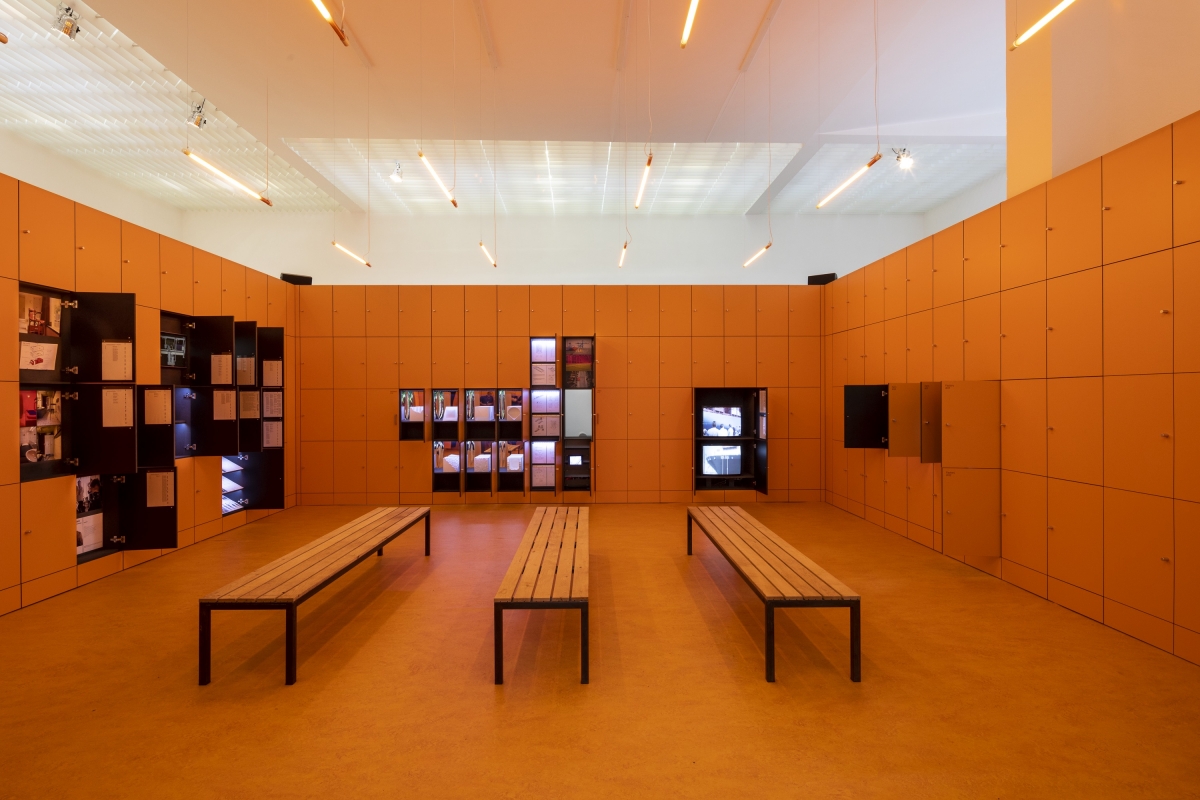
Dutch Pavilion_ The square-shaped interior, surrounded by the orange cabinets and the long chair placed in the middle. It is a general configuration of the locker room, and also a space that you make yourself alter for the purpose of work or leisure. Photographed by Daria Scagliola
The Korean Pavilion
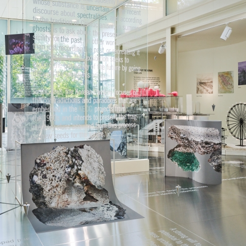
The Korean pavilion shed new light on the Korea Engineering Consultants Corporation (KECC) which used to lead the national projects in the 1960s. Focusing on the contradictory condition where the young avant-garde was being responsible for the utopia during the military regime, it releases the blueprint that became the starting point of today’s Yeouido, Euljiro, Guro-gu. Moreover, it reveals the identity of the spectres that are still surviving in a coercive way of development. The natural light that passed the halftone dot of the pavilion’s window and the pleasant atmosphere of the terrace are helping the ceremony of the regulations. The exhibition also invites various visionaires that are leading the overall culture and art including architecture, history, literature, picture, and media art – deriving a horizontal and democratic relationship. The independent archive that can only be seen at the Korean Pavilion is interesting itself, reminding of a mine shaft that has been dug up to excavate ruins.
The Vatican Chapels
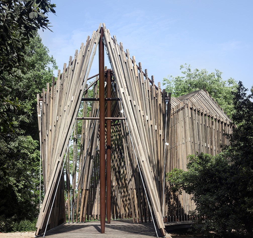
One of the biggest news announcements this year was that of the Vatican’s participation. Behind the Basilica di San Giorgio Maggiore, designed by Andrea Palladio, there is a wonderful work of nature lying hidden. It is a perfect place for the construction of a chapel because of the course of crossing by a boat, walking on a cobbled street, and arriving at the park resembles a religious ritual before arriving at the sacred space. 11 chapels designed by 11 architects represent various interpretations of how God can be incarnated in space. Terunobu Fujimori borrowed the form of the vernacular hut, depicting a more primitive attribution to religion. A simple coloured window instead of a stained glass, an embroidered wall finish with natural instinct, and a cross-shaped colour paper attached to a wooden structure offer a glimpse of human’s pure spirit, prior to the original sin. Norman Foster properly positioned members in charge of tensile and compressive forces, materializing structural efficiency and the resulting aesthetic. It is interesting that the exposed structure itself, supporting mass-producible prefabricated members, also functions as a cross, unifying the function and the symbolism. The pavilion designed by Francesco Magnani and Traudy Pelzel serves the exhibiting function. It introduces the chapel designed by Swedish architect Gunnar Asplund, located in the Skogskyrkogården cemetery, and delivers the charm of a small and faithful religious space. Smiljan Radic inserts an untreated wooden pole between the reinforced beam and the rough concrete foundation, creating a miracle-like situation. It is a worthwhile proposal that reenergises visitors who have been exhausted by indirect experience with small-scale models and drawings.

Vatican Chapels_ Norman Foster properly positioned members in charge of tensile and compressive forces, materializing structural efficiency and the resulting aesthetic.
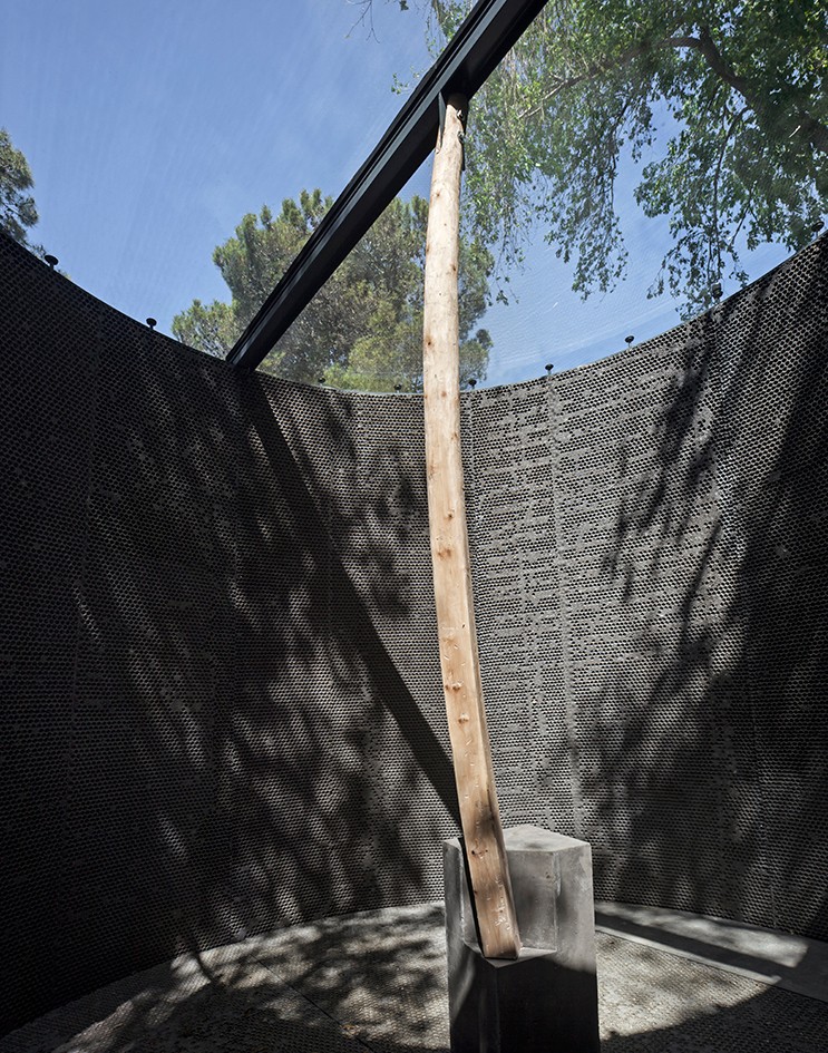
Vatican Chapels_ Smiljan Radic inserts an untreated wooden pole between the reinforced beam and the rough concrete foundation, creating a miracle-like situation.
Photographed by Alessandra Chemollo
The exhibition in the National pavilion may be a response to the central theme of the Biennale, or it may be an independent act differing from the main exhibition. Its ambiguous nature may be the definition of the National pavilion, and its purpose. Certain subjects regularly appear at the Biennale: China’s Cloud Village that combines algorithm-based design and 3D printing technology, while Denmark’s experiment with plotters to overcome the limitation of a handcrafted membrane structure. The stone floor that filled part of the U.S. Pavilion was brought directly from Memphis, with the transported cotton from the Mississippi river to the ground. This ordinary paved stone is historic evidence of black slavery. At the same time, it asks a question about what values the civitas and the monument should embrace, and how they can speak on behalf of diverse co-existing races and cultures. Even if there is no concrete answer, and even if it is hard to make a direct connection with architecture in a narrow sense, it is important to shift the audience’s viewpoint into various points of view. An honest exhibition, such as the ones from Germany and France that display completed projects in horizontal order, are still ongoing. Or as in those from Venezuela or Austria, this might be a visit to enjoy the exhibition itself designed by the great architects. In the meantime, visitors continue to capture and record every detail with their cellphones, and the mediated virtual space prevails. It remains to be seen if the traditional exhibition method of using models, drawings, texts, and art catalogues will continue to be valid.


