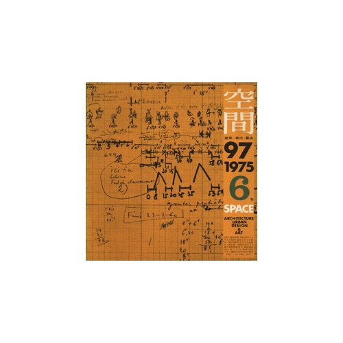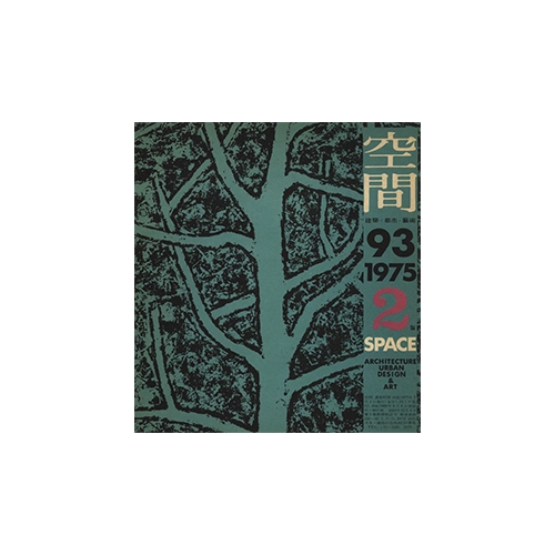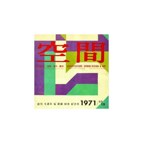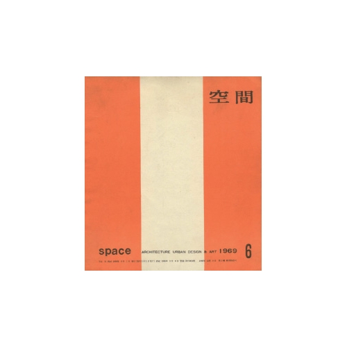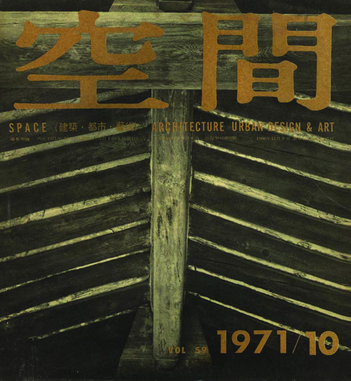
It is a truth widely acknowledged that Kim Chung-up's masterpiece is the French Embassy in Korea (1959 ‒ 1962). Along with Kim Swoo Geun’s SPACE Group of Korea Building,▼1 this embassy design is often cited as the best work of modern architecture in Korea. Aside from this, however, there are also various significant designs in the long list of Kim Chung-up’s works. Among them, the ‘Samilro Building’ (1969 ‒ 1971) is remarkable for a number of reasons. Macroscopically, the skyscraper, the tallest in Seoul when it was built, served for some time as a symbol of Korea’s economic growth and technological development. This symbolism was heightened by the image of the Cheonggye Overpass (1967 ‒ 1971) that ran in front of the building. The fact that the Cheonggye Overpass was designed by Kim Swoo Geun’s Korea Engineering Consultants Corporation (KECC) is meaningful because it is revealing of another interesting encounter between the two masters.▼2 On Kim Chung-up’s personal level, the building has significance as it demonstrates a turning point in his career. Considering that he had to finish the project in a hurry, exiled to France in November 1971 due to a disagreement with the Korean government,▼3 the Samilro Building can be regarded as marking the end of the first half of his career. At the same time, this building is also a prelude to the second phase of his career. With this building, he began to adopt the glass curtain wall as a defining feature.
However, there is another reason that the Samilro Building catches the eye of those who are attuned to modern architecture in the West and in Korea. That is the fact that it is a typical Miesian building, and, more precisely, it is modelled after Mies Van der Rohe’s Seagram Building (1954 ‒ 1958) in New York. It is quite a surprise to find that the recognised disciple of Le Corbusier followed the totally different style architecture in this building, although the Miesian steel-and-glass skyscraper had already become an archetype for the high-rise office building; and the client was the Sammi Group who were in the process of expanding their business into the steel industry. In addition, placed in a completely heterogenous context, the Samilro Building produced marked differences to the ‘ideal model’ ‒ Miesian architecture with a self-sufficient style ‒ in terms of space, proportion, and details. The heterogeneity is conspicuous at the exterior of the core, which was finished opaque and blunt.▼4 Nevertheless, the achievements made by the Samilro Building in Korea’s stark reality shouldn’t be underestimated. For example, the new construction methods and details, employed to realise this unprecedented steel-framed skyscraper with a glass curtain wall, provided the opportunity for a technological leap forward.▼5 It was designed initially as a reinforced concrete structure of 26 stories. Moreover, it is remarkable as it demonstrated new aesthetic possibilities by making a proportion of the windows narrower than those found in the Seagram Building. This proportion is partly the result of the effort to stuff thirty-one floors into a structure of a limited height—just a little more than 110m. In other words, the floorto-floor height was lowered (3.3m on a typical floor), and accordingly, the width of the windows was reduced to solve the issue of proportion across the façade. It is well known that a series of holes were made on its steel beams for duct installation due to the lowered height.▼6 The Samilro Building was the outcome of such strenuous efforts.
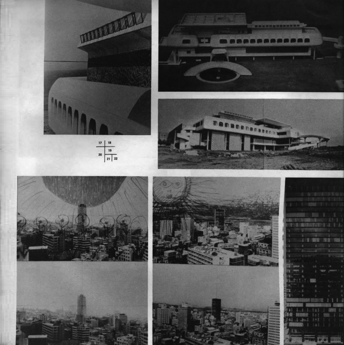
‘Two Architecture Exhibitions’, SPACE No. 59, p. 23.
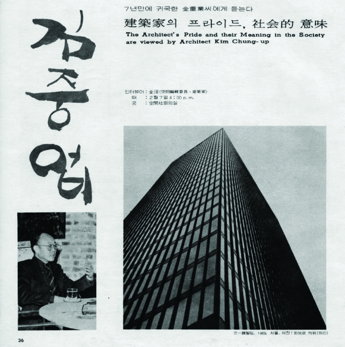
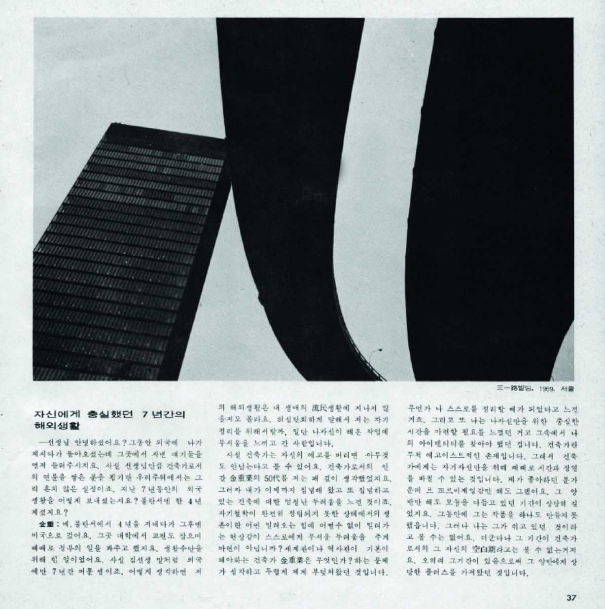
‘Special Feature: Architect Kim Chung-up’, SPACE No. 141 (Mar. 1979), pp. 36 ‒ 37.
So, how was the Samilro Building described in SPACE at the time? The bottom line is, SPACE failed to take the building seriously, even though the work of Kim Chung-up was covered in special features in three issues, each in the 1960s, 1970s, and 1980s. Any mention in SPACE No. 5 (Mar. 1967) is out of the question as it was published before the Samilro Building project, and SPACE No. 141 (Mar. 1979) primarily introduced projects on which he had worked while abroad (1971 – 1978). However, even SPACE No. 224 (Mar. 1986) opted not to cover the Samilro Building in the building introduction pages (the selected works were five: the French Embassy in Korea, Administration Building of Jeju National University, Dr. Seo’s Clinic (now Arium Office Building), New Building of Korean Educational Development Institute, and Lee’s Residence in Hannam-dong). At best, interviews in SPACE No. 141 and 224 featured only one or two photographs of the building. Nevertheless, SPACE provides a glimpse of the Samilro Building right after its completion, by publishing a report of ‘Kim Chung-up Architecture Exhibition’ (Oct. 19 ‒ 24, 1971) in No. 59 (Oct. 1971). Running to four pages, this report belongs to the section ‘Two Architecture Exhibitions’ along with the report of ‘Kim Swoo Geun Pan-pacific Architecture Award Commemoration Exhibition’ (Aug. 17 ‒ 22, 1971).Ahead of his deportation to France, Kim Chung-up held an exhibition in a hurry, at Shinsegae Gallery. The banner reads ‘Kim Chung-up Architectural Work Exhibition’. The daily newspapers introduced it under the name ‘Architecture Photo Exhibition’.▼7 It was so titled possibly because architecture exhibitions ‒ which cannot display real buildings in general ‒ were not familiar to the public at that time, but more importantly, the title seemed to reveal the emphasis placed on photography as opposed to real buildings. The main exhibits were 120 stills of Kim Chungup’s twelve buildings featured in Paul Buron’s documentary film, KIM CHUNG UP architecte 1971), photographs were taken by Pierre Camus. On the last day of the exhibition, the film’s premiere was held. SPACE reported on this exhibition with twenty-two photographs without explanatory texts except for short captions; four cuts showing the exhibition and eighteen showing his works displayed at the exhibition. The last two cuts belong to the Samilro Building. One may ignore the meaning of the two photos published in this way, but they contain important information. One of them shows a distant view of this building amid downtown Seoul. The other is a portrait view highlighting the façade from bottom to top, excluding the surrounding context and partially cropping the right-hand side.▼8

Paul Buron’s documentary film, Kim CHUNG UP architecte (1971)
The latter greatly emphasises the verticality of the building, that is, the aspect of the skyscraper, though the original intention is not clear.What is more interesting is the distant view. The same photo, repeated up and down, forms one plate with a freehand sketch overlaid on the upper photo. This overlaid picture looks both humorous and mysterious. The sun is drawn on the upper left side, and the lower part of the sky behind the building is filled with dense pen strokes. The sun has eyes, nose, and mouth, like that from a fairy tale book, emitting light (or heat) in a radial manner, and the eyes seem to stare out at the Samilro Building. Does it mean that the sun is illuminating the building? It is not easy to grasp its meaning simply from the small picture published in black and white. However, we can infer some of the meaning because the original colour picture appears briefly in the documentary film, though it is in a slightly different version from that published in SPACE.▼9 In this picture, the sun is depicted by red lines, the sky is painted in a strong blue, and the surroundings of the building in green. The intention might have been to revitalise our desolate city, or to console the Samilro Building which is described as an example of an ‘arrogant and lonely’ architecture in the film. Otherwise, it might have been a caricature of ‘forced modernisation’ (which Kim Chung-up claimed to strongly reject at the end of the film) or a conflict with the clients of the Samilro Building. He used the same composition of an overlapped sketch in an original photograph▼10 for ‘Empire Building’ published on the same page of SPACE.▼11 The two buildings reveal Kim Chung-up’s contrasting approach to high-rises, of which we need to give greater consideration later. What is important here is this: after the Samilro Building, he began to experiment in his architecture with the typology of the glass mass which is much more modern and refined compared to that of the concrete mass.
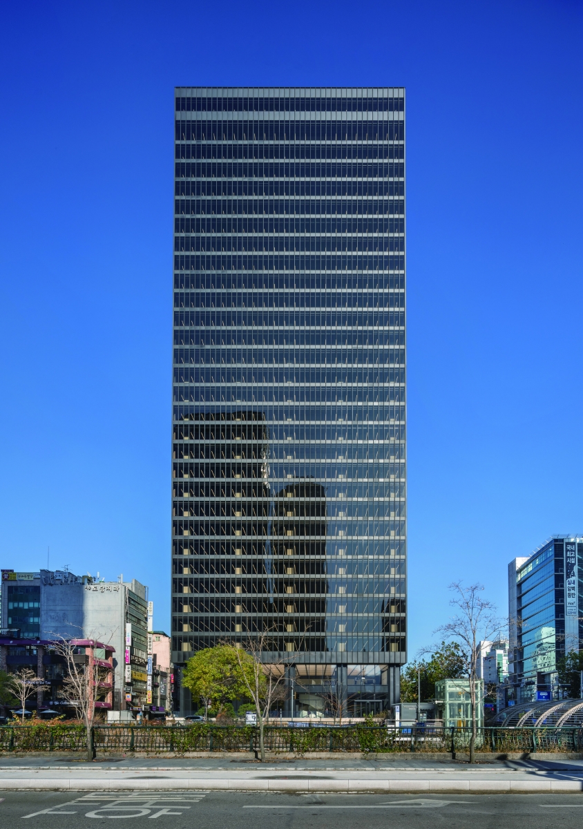
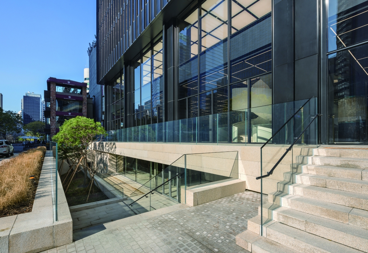
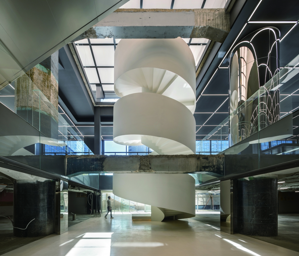
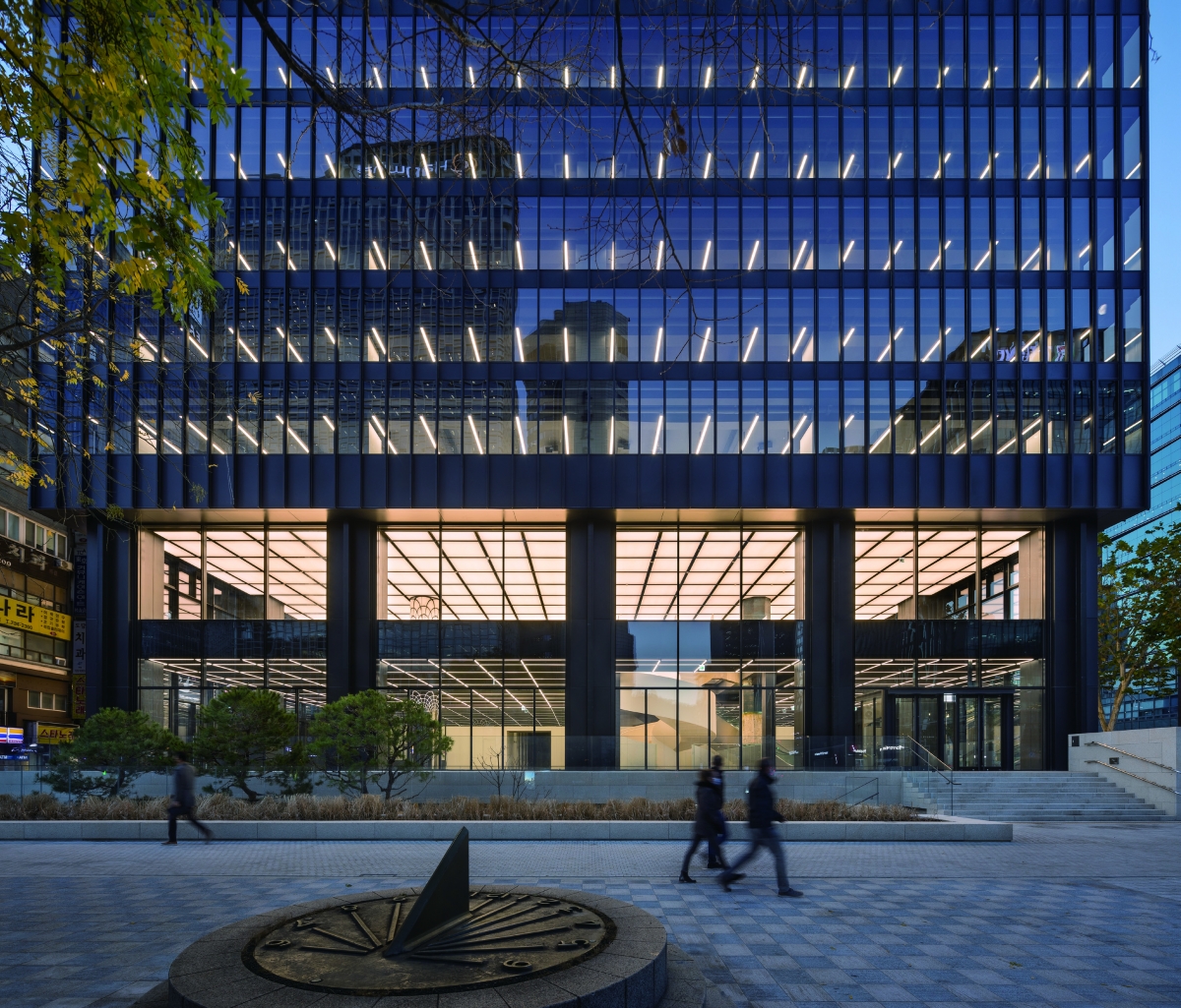
View of Samil Building (Samilro Building) renovated by the ONE O ONE architets and JUNGLIM Architecture
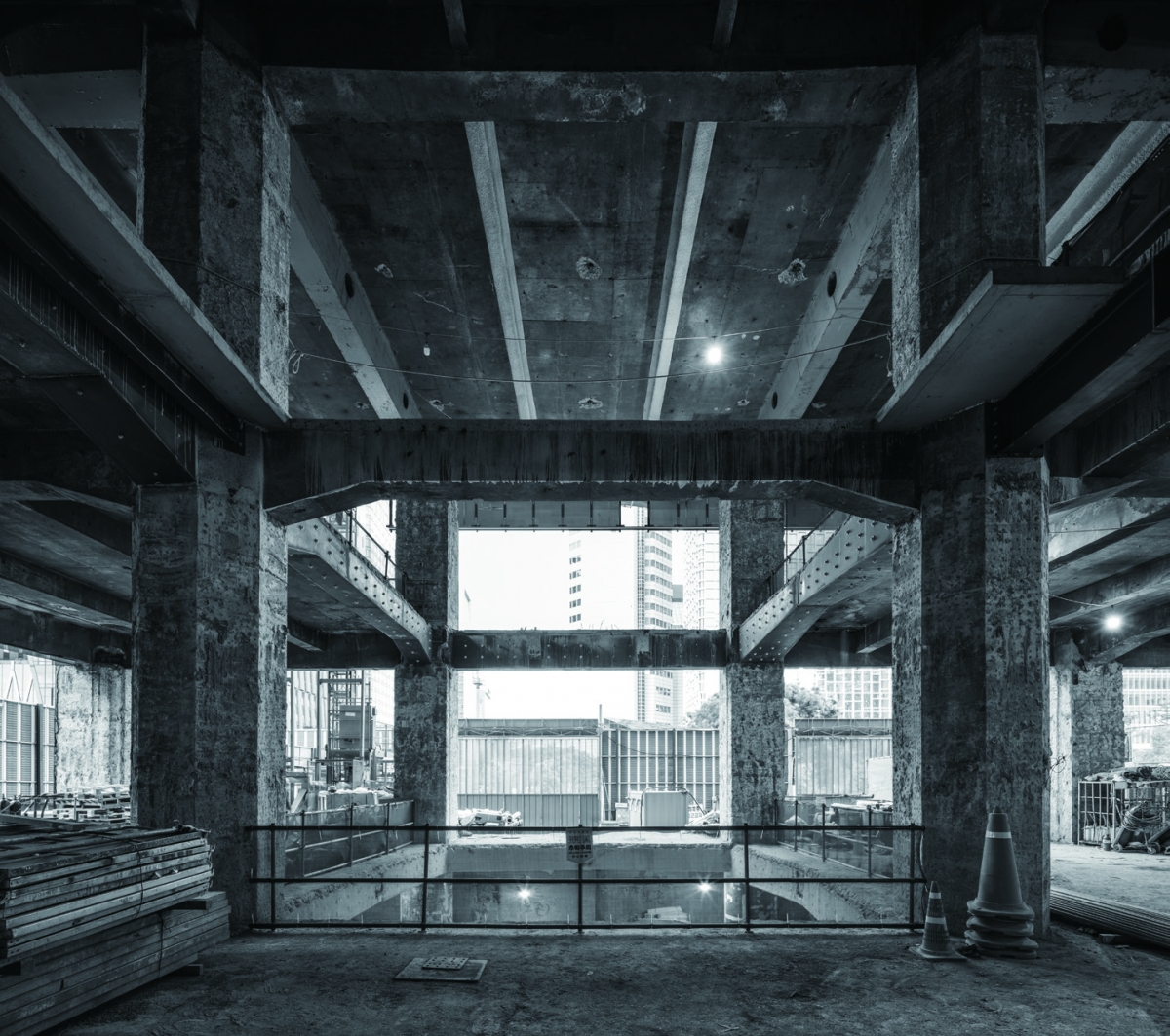
The slabs on the first and second floors of the lobby were removed during construction.
As time passes, the stories of Samilro Building are recorded in its half-century-old history. The building has changed hands several times, and during this time the building’s name has been simplified—‘Samil Building’. As the building itself was also beginning to fade, renovation work was recently carried out by ONE O ONE architects (hereinafter ONE O ONE) and JUNGLIM Architecture.▼12 The reinstallation of I-beam mullions on the curtain wall, and new lighting design, were both attempts to reinvigorate the façade. In particular, the horizontality of the building was emphasised – no less than its verticality – because the transparency of the glass surface was increased, and the emphasised horizontality represents the change of the building’s overall impression. Of course, the wrapping-up the exterior of the core with metal panels is also a marked improvement in the renovation because the plastered finish to the core was considered heterogeneous in the original building. Entering the building, a spiral stairway that connects the first basement to the second floor dominates the atmosphere of the interior like a piece of large sculpture, and one octagonal concrete column of the original building is left to evoke memories of time past. On the typical office floor, it was important to secure a minimum height of the space by exposing its ceiling. However, the most outstanding feature of the renovated building is the relationship it cultivates with its surrounding context. With the demolition of the overpass in front of it and the restoration of Cheonggyecheon, the Samil Building is now completely open to its surrounding urban space and pedestrians. In response to this, a sunken space has been created under the front platform, which made the basement floor open to the outside, and a continuous glass surface from the first floor to the second floor increases the openness to the lower part of the building. This is one aspect of the ‘groundscape’ that ONE O ONE emphasises.▼13 The new sunken space has altered the location of the main entrance, which also instigates a change to the interior circulation leading to the elevator hall at the core. Likewise, the renovated Samil Building is responding to the requirements of the time through various changes, whether big and small. Nevertheless, the legacy of Kim Chung-up’s architecture and the symbolism of Korean modernisation, both of which the original building represents, were highly respected by the architects. Now that the occupants are beginning to move in, let’s look forward to encountering the new legacy added to this building by its users and our society in the future. Of course, the image of the ‘Samilro Building’ in SPACE No. 59 will be remembered as one of the meaningful memories in the history of the building. (written by Hyon-Sob Kim / edited by Bang Yukyung)
In our next issue, Park Junghyun will cover ‘Special Feature: Architectural Criticism’, which featured in SPACE No. 205 (July 1984).
▼
1. Refer to ‘Re-visit SPACE 1’ in SPACE No. 638.
2. Sohn Jeong Mok stated that the first thing Mayor Kim Hyon-ok did when planning the Cheonggye Overpass was to meet Kim Swoo Geun. Sohn Jeong Mok, Seoul Urban Planning Story 5, Hanul, 2003, p. 192. However, it is said that the mayor, who was nicknamed bulldozer, cared little for Kim Swoo Geun’s plan nor for the existing urban plan of Seoul.
3. The Samilro Building is often said to have reached completion in 1970, and indeed, the head office of the Korea Exchange Bank moved into the building in June of that year. Nevertheless, there were some problems with certain floors because the tenants moved in before the completion inspection. ‘Firefighters giving way to the fire in a high-rise’, The Kyunghyang Shinmun, 3 Sep. 1970. However, Kwon Taemoon who led the Samilro Building design team at that time says that it was completed in October 1971. Kwon Taemoon, ‘Review of the Samilro Building’, Review of Architecture and Building Science 55. 1 (Jan. 2011), pp. 60 ‒ 61. Kwon Taemoon’s information accords with Kim Chung-up’s statement that he opened an architectural exhibition at Shinsegae Gallery immediately after the building was completed, just before leaving for France. Kim Chung-up, The Light and Shadow of the Architect, Youlhwadang Publishers: 1984, pp. 112; 286.
4. Refer to my article for a critical discussion of this building. Hyon-Sob Kim, ‘Beyond the Myth: Revisiting Kim Chung-up’s Architecture’, Kim Chung-up Dialogue, ed. MMCA and Kimchungup Architecture Museum, Youlhwadang Publishers, 2018, pp. 304 ‒ 319.
5. Son Jongyoon, ‘Problems on Construction Works of Lofty Building’, Review of Architecture and Building Science 15.40 (May 1971), pp. 26 ‒ 35; Kwon Taemoon, ibid.
6. Kim Chung-up, ibid., p. 112.
7. ‘Kim Chung-up, Architecture Photo Exhibition’, JoongAng Daily, 19 Oct. 1971; ‘Mr Kim Chung-up’s Architecture Photo Exhibition’, Dong-A Ilbo, 21 Oct. 1971.
8. To be precise, one bay from the four-bay façade has been removed. Possibly, it is this proportion that Kim Chung-up originally wanted to achieve.
9. The running time of this film is 22 minutes and 20 seconds, and this picture appears twice very briefly at the end. The film is available at the Kimchungup Architecture Museum.
10. Was this a significant instrument of the ‘Cine Architecto Graphie’ that Kim mentioned in the film? The overlaid sketch also seems to demonstrate a desire for an unrealised design, which is proved in another sketch on the photograph of Dr. Seo’s Clinic.
11. This building seems to be the same as the Tokyu Hotel (now Danam Tower).
12. The building completion ceremony took place on the 23 Nov. 2020. This project is documented in Domus Korea (Winter 2020), Review of Architecture and Building Science (Feb. 2021), and Architect (Mar. 2021).
13. Refer to my article for the concept of ONE O ONE’s ‘groundscape’. Hyon-Sob Kim, ‘Architecture of Choi Wook: A Commentary on “Form of the Sense”’, Architectural Critics Association No. 9 (Spring 2017), pp. 269 ‒ 279.


