Small ‘Massiveness’
Size
The concept of size is relative. The standards for what is defined as big or small depends on the object in question. The interpretative mechanism is more complex when it comes to building sizes in cities. Many standalone standards, such as the neighboring building’s size, the adjacent street’s width, the building’s function, and even personally familiar units of area measurement, are all considered in the equation. In the end, size is a matter of visual or empirical proportion, and the object of comparison is equally important.
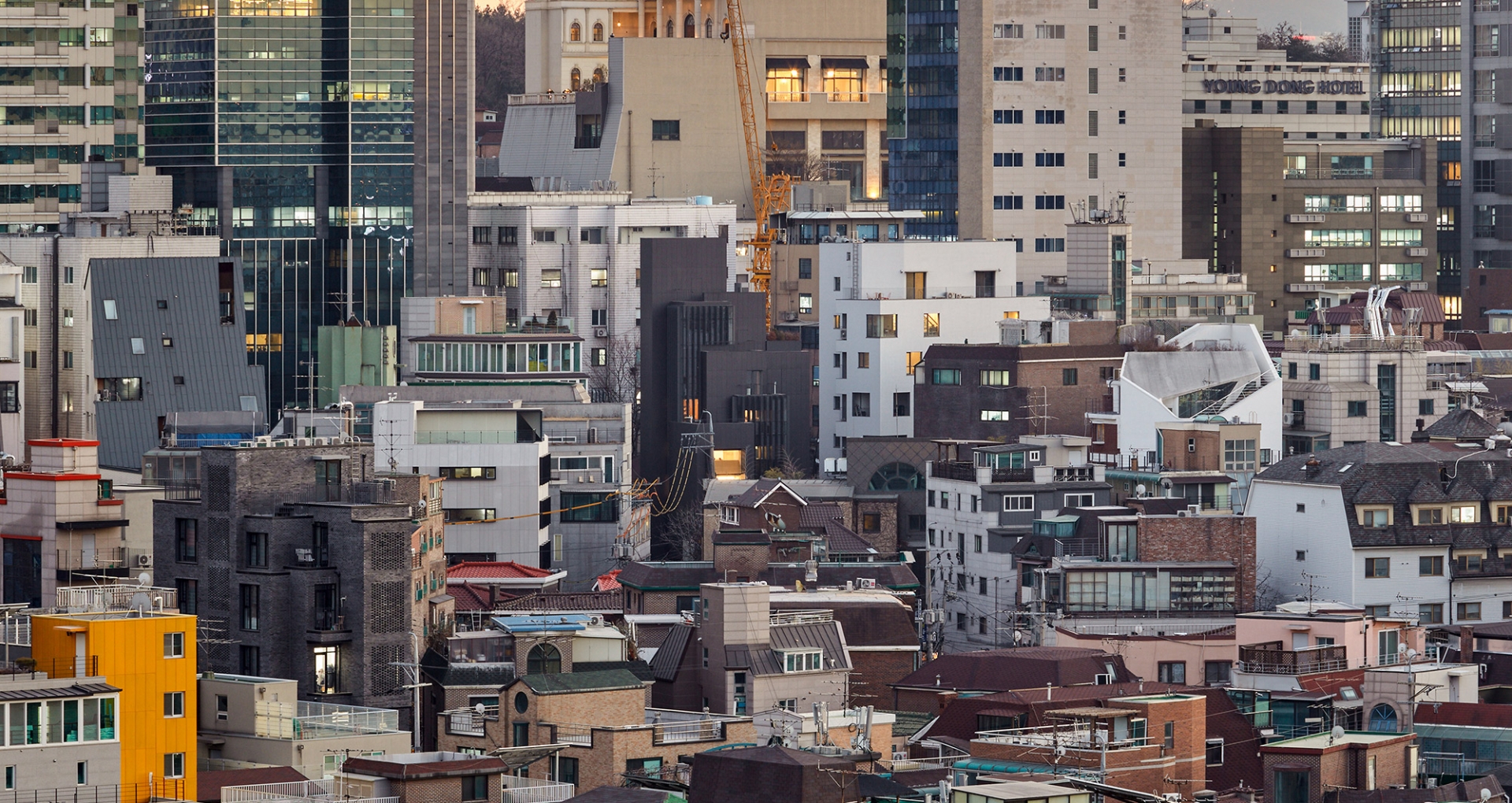
The small site less than 50 pyeong on the side street of Garosugil, Sinsadong, is close to the low-rise residential area separated only by a four metre wide alleyway but institutionally is situated on the highest height designation area of Dosandaero that now defines the skyline of Gangnam. This site, which has varying potential, as either colossal or miniscule depending on one’s perspective, required special strategy ahead of its spatial planning.
The Methodology of ‘Massiveness’
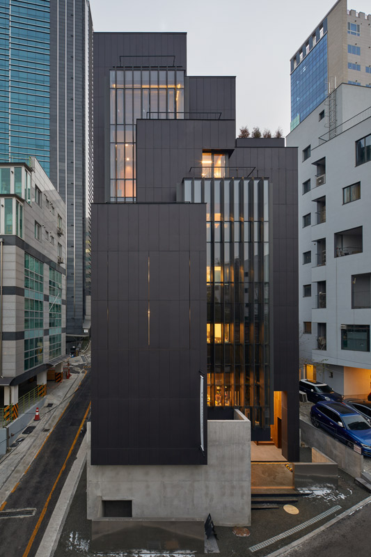
Typically, you would not consider a seven storey building in the city as big, but you would consider a 20 metre-high rock as colossal. The moment that the object of comparison is switched from another building or another object, the standard for judging size also changes. The plan’s direction set out to erase traces of familiar architecture and to emphasise the physical attributes of stone after deciding to build a 1,500㎥ boulder instead of a 120 pyeong-small neighbourhood living facility.
First, the building was simplified into seven masses complying with the maximum legally permitted volume. Of those, two masses were planned to be transparent and to be responsible for natural light and ventilation, which freed the other masses from the necessity of openings. The transparent masses made of curtain walls were given deep louvres to hide construction details. The other five rocky masses formed by artificial stone all had functional traces hidden by panel modules. The main entrance and windows are unexposed due to the finishing materials and the outer door.
The 400ⅹ2,000mm panel modules that dictate the appearance of the entire building were planned to be the least common multiples of the exterior elements and to give the building proportionality. The roughly 1,500 panel modules exist to create the surface texture of the building instead of presenting an image of fragmentation based on each module’s size.
To secure a carpark, these seven masses had to be stacked. We decided to use a concrete mass instead of columns to bolster these masses. The concrete mass that appears to levitate above the ground implies a massive rock hidden underground and makes observers consider size.
Maximum Indoor Space
Aside from the proportional size of the building, situated in an urban context, the indoor space’s size was determined by a numerical measurement. In particular, the vertical movement path covered a large portion of this tall building on a small plot of land and the rugged, thick external wall overwhelmed the indoor space. Due to various regulations, the top floor inevitably came to have very little space. Before planning out the indoor space, we needed to establish a building system that would contain maximum space without waste.
We first thought about the smallest possible size that a vertical movement path could secure in this building. When building small stairways, we planned a ceiling height no taller than 3m and separated the 2nd floor stairway to make the living room area within 200㎡ which is linked to the direct stairway. While following regulations stipulating a low ceiling height, the separately secured living room space liberated us from the minimum width rule on the direct stairway. Additionally, a small 5.5ⅹ2.1m core was planned for the four-person elevator and minimum vertical facility space. Simultaneously, the thin exterior material, the exposed finishing of the indoor areas, and the external insulation were applied to physically and institutionally secure maximum floor area.
After securing the maximum volume for such efforts, we removed its density and made an open indoor space. The first floor, which integrates two floors, serves as the building’s lobby and invites the city inside. The two empty spaces beginning on the 2nd floor and extending to the 4th and 5th floors allows people to perceive the size of the building indoors, and adds openness to the cramped space with the large window. In response to the height limit on the upper levels, we chose pixelization. Instead of creating a closed space with sloping walls, we placed small outdoor spaces on each floor so that they could be used as expansions of the indoor space.
Garosugil and Office Building
Not every building needs to overstate its presence. Sometimes an out-of-the-blue presence disturbs the familiarity of urban space and only introduces chaos. Yet, for the client who chose this shady site, removed from the Garosugil centre, as the home for their office building, this small piece of land is the result of years of hard work and a stepping-stone towards the future. Like all houses in Garosugil, the willingness to become a figure is desperate. From ‘small massiveness’, we hope this building will retain a special presence in its visually over-stimulating landscape.
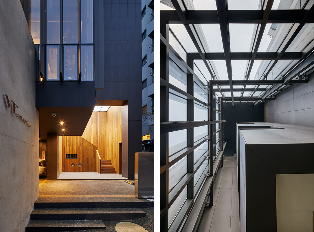
A separate stairway to the second floor / Deep width rubbers
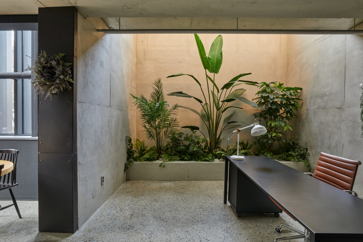
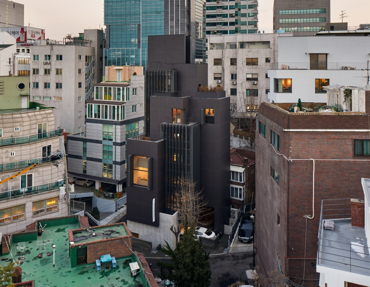
fig.architects (Kim Daeil, Kim Hanjoong, Lee Juhan
Kim Hanjoong (fig.architects), Chung Heejin, Seo M
561-13, Sinsa-dong, Gangnam-gu, Seoul, Korea
office, showroom, shop
148.03m2
73.48m2
446.18m2
B1, 7F
3
19.94m
49.64%
241.23%
RC
Equitone, exposed concrete
exposed concrete, stainless steel, sliced veneer
Teo Structure
Jusung MEC
Jisung Consultant
Taein Construction
Feb. - Sep. 2016
Oct. 2016 - Feb. 2018
VT cosmetic


