What a great pleasure to finally see the Seoul Hall of Urbanism & Architecture, which has opened after a long wait. Although we already have the Seoul Center for Architecture & Urbanism in the not-so-far-away Donuimun Open Creative Village, this Hall was built in Seoul to address the nature of the city and architecture in earnest. Moreover, considering the Hall’s location in wider area of Sejong-daero, that stretches out from Ganghwamun, its significance cannot be emphasised enough. The title of the 2015 competition ‘Sejong-daero Historic Cultural Space Design Competition’ along with the competition guidelines clearly elucidates how this area was the starting point for the Korean Empire, with 500 years of Joseon dynasty as a background. It has been the heart of Korean modern and contemporary history for the past 100 years. The site was obtained by demolishing the National Tax Service Annex (formerly the Joseon Postal Service Center, 1937), and its three sides are surrounded by Deoksugung, Seoul Cathedral Anglican Church of Korea (1926 & 1996), and the Seoul Metropolitan Council (formerly Gyeongseong Public Hall, 1935). Moreover, the Seoul Metropolitan Library (formerly Gyeongseong Municipal Government Building) and the New Seoul City Hall (2012), facing across eastern view of Sejong-daero and a view of Sogong-dong just beyond Seoul Plaza, are enlivening this land. In other words, the layers of history and culture that are stacked one atop the other – which have built up over the past century – overlap in the middle of this contemporary metropolis.
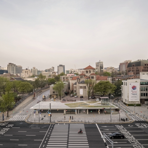
Let’s discuss the conclusion first. The most significant aspect of the Seoul Hall of Urbanism & Architecture is that it has humbled itself and lowered its profile, in order to highlight the historical buildings and spaces nearby. As the body of the building is exposed to the ground, there is nothing more than a rectangular plate that covers the entire site. It is even elevated just to the height of the adjacent Deoksugung fence. Oh, less is more! In the end, the gently sloping rooftop alone stands out. This space of emptiness, now called ‘Seoul Maru’, will serve best as a platform to reveal various defining elements in the historical and cultural landscape. On the other hand, when it is seen from City Hall, the long horizon of the building roof becomes a kind of visual foundation for the Anglican Church. This understated simplicity is what the ‘Seoul Chronicle’ by Terminal 7 Architects (Cho Gyeong-chan), the project that won the competition, has differentiated it from other prize-winning projects. In the next-ranked projects ‘Time Connector’ by UnSangDong or ‘Seoul Living Room’ by design group oz, the charming landscapes sing their own praises, capturing a pedestrian’s attention as much as the surrounding historical buildings.
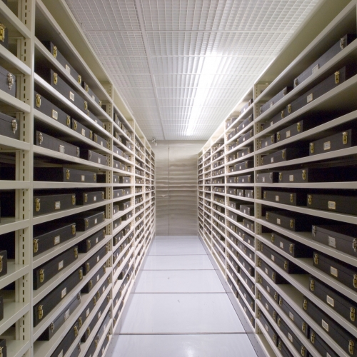
Architecture crouches down to offer a simplified background. From this perspective, we became doubtful about the name of the building, ‘Seoul Museum for Architecture & Urbanism’, which was popularly used well before the opening. Although the initial design for ‘Seoul Chronicle’ proposed several exhibitions and a certain expanse of storage in the interior space, from the third basement level to the first floor above the ground, its size was too small to be referred to in any grandiose way as a ‘museum’, along with other reasons. (As you can tell from the absent mention of the new building’s role as a museum at the time of the competition, the idea of ‘Seoul Museum for Architecture & Urbanism’ was suggested long after the winning prize was decided. Since it was not planned carefully from the beginning, it could not be realised, but let’s not speak of the confusion between the decision makers here. Also, what about the Seoul Center for Architecture & Urbanism in Donuimun?) No matter how eager we were for a museum, the underground space of this building had a physical limit to cover and in which to exhibit a vast amount of urban architecture content that would live up to its name. Hence, it is better that it serves as a lighter version of itself; an ‘exhibition hall’. Of course, this is based on the assumption that the prime concern is the outside of the building. In other words, the distinct identity of the Seoul Hall of Urbanism & Architecture is a platform from which to enjoy and browse the borrowed scenery of the surrounding historic buildings and spaces with an expanded knowledge, rather than the building itself becoming a museum in which to store items from the collections.
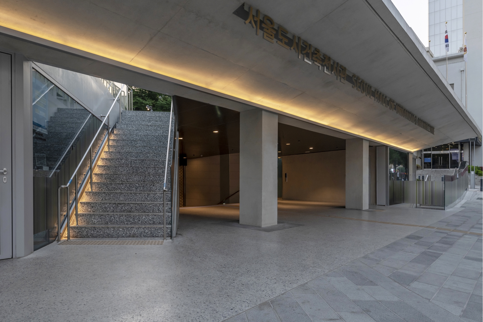
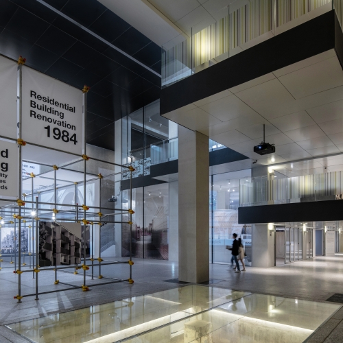
Nonetheless, we cannot help but turn our eyes to look towards this interior space as an exhibition hall. The most impressive place inside is the ‘Empty Hall’, a multi-cultural space penetrating the four stories from the third basement level to the ceiling of the roof ceiling, facing Deoksugung at the south. This space can be found by going down the main stairs on each floor from the main entrance on the ground floor, and it can hold a relatively large exhibition or event by token of its large interior space. Each level underground encounters this space in many ways, as well as containing its own exhibition room, archive, or education space. The architect enhanced the visual penetration and transparency between spaces by placing walls that would compartmentalize the interior space and making the railings into glass surfaces. This is also the case for the surface of the wall facing the open air on the ground floor, which also serves as a clerestory to bring natural light into the Empty Hall. Meanwhile, there are various ways to enter the building from the outside. Visitors can access the interior of the building from not only the main entrance at the sidewalk of the Sejong-daero, but also through the two stairways on the left and right sides of it, as well as the first basement level of the exhibition hall from the underground walkway connected to the Seoul City Hall and the subway. Elevators from the rooftop square to all floors inside also offer additional circulation paths.
The Seoul Hall of Urbanism & Architecture can be considered successful as a platform for browsing the surrounding historical scenery and as an underground exhibition hall, but it also leaves a lot to be desired. The details are somewhat less complete and perfect. For instance, the 1:20 sloping roof square and the stairs towards the Seoul Metropolitan Council do not meet naturally, and there are some noticeable flaws with the interior finishing material. It would be better to look to the construction company for the reasons behind these problems, rather than the architect, and more fundamentally, from the bureaucratic system that delayed the project and brought confusion in the decision-making process. Another thing that I feel regret about is that many of the ideas that were included in the competition entry design were lost during the actual design process, for a number of practical reasons. For example, there were ideas to put the skylight on the rooftop to encourage light into the Empty Hall, and to place a ‘green wall’ and ‘archive wall’ of the Empty Hall. Of the ideas developed after the competition, it is quite unfortunate that the rooftop square did not get to combine with the parking space of the Anglican Church but was rather disconnected by a height difference of 1m. If the two could be physically integrated, it would gain the additional symbolic definition of being an open space for the citizens.
However, there are issues that need to be seriously considered apart from those things unrealised due to realistic constraints. How efficiently is this building embracing or representing the traces of multi-layered history, as emphasised by the project? Although some excavated traces were preserved and exhibited on the one side of the Empty Hall’s floor, its position is different from the original and the description is also not true to the actual traces, so it is impossible to achieve an organic integration between the historical layer and the architectural space. Nevertheless, let’s consider this as a problem outside of the architect’s competence. Then, for example, what about the usage of the 23 columns that remained after the National Tax Service Annex was being demolished? Even though the columns included in the competition entry design disappeared due to practical reasons - and it was fortunate that at least one body of a column and some traces of few columns were preserved in the rooftop square - it feels quite unheeding that these columns could not be linked to the actual interior space. If that idea could not be realised in the Empty Hall due to the difference in depth of the column foundation, wasn’t it feasible to use the columns and the existing frame in any other way in the opposite exhibition space? It could have welcomed the waves of history into the interior space and raised a certain tremble when faced with the intensity of these traces of the ruins. Even the project was successful as a space of sophistication with a contemporary touch at first, but it could have increased the intensity of the spatial experience if it added the depth of time here. Architecture as background would rather be the protagonist.
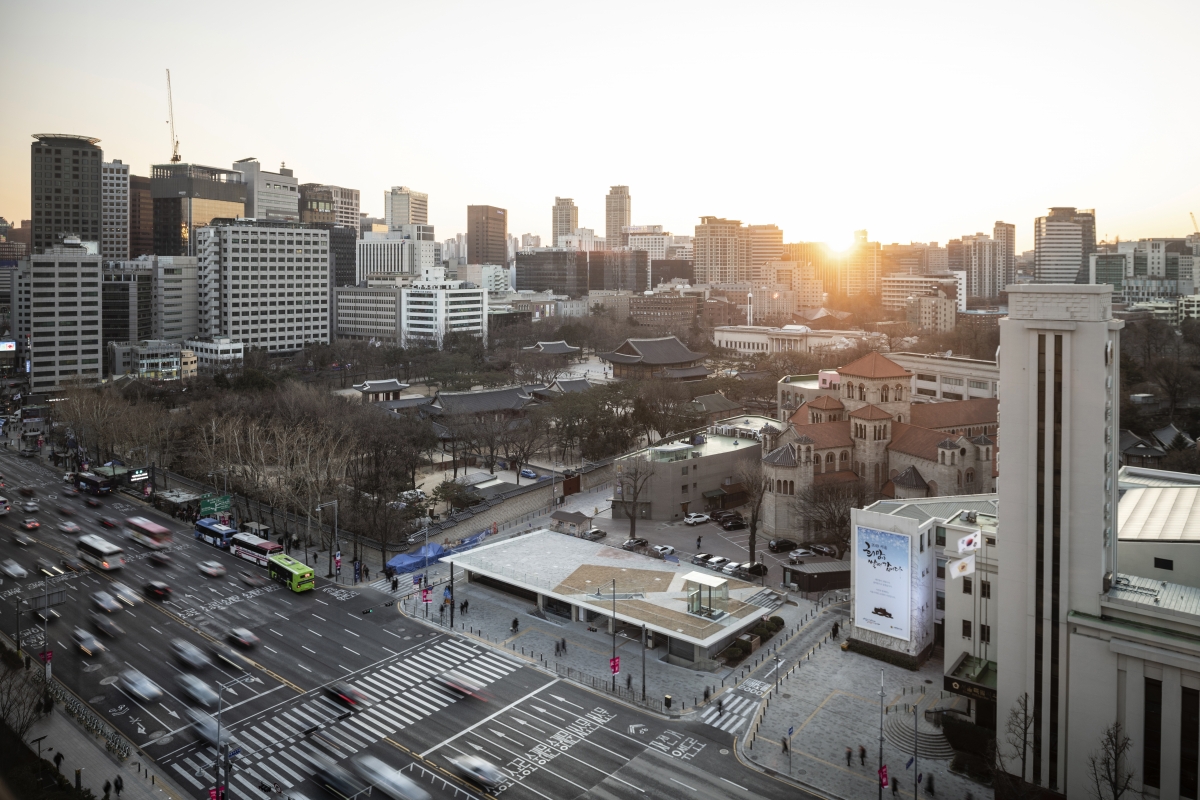
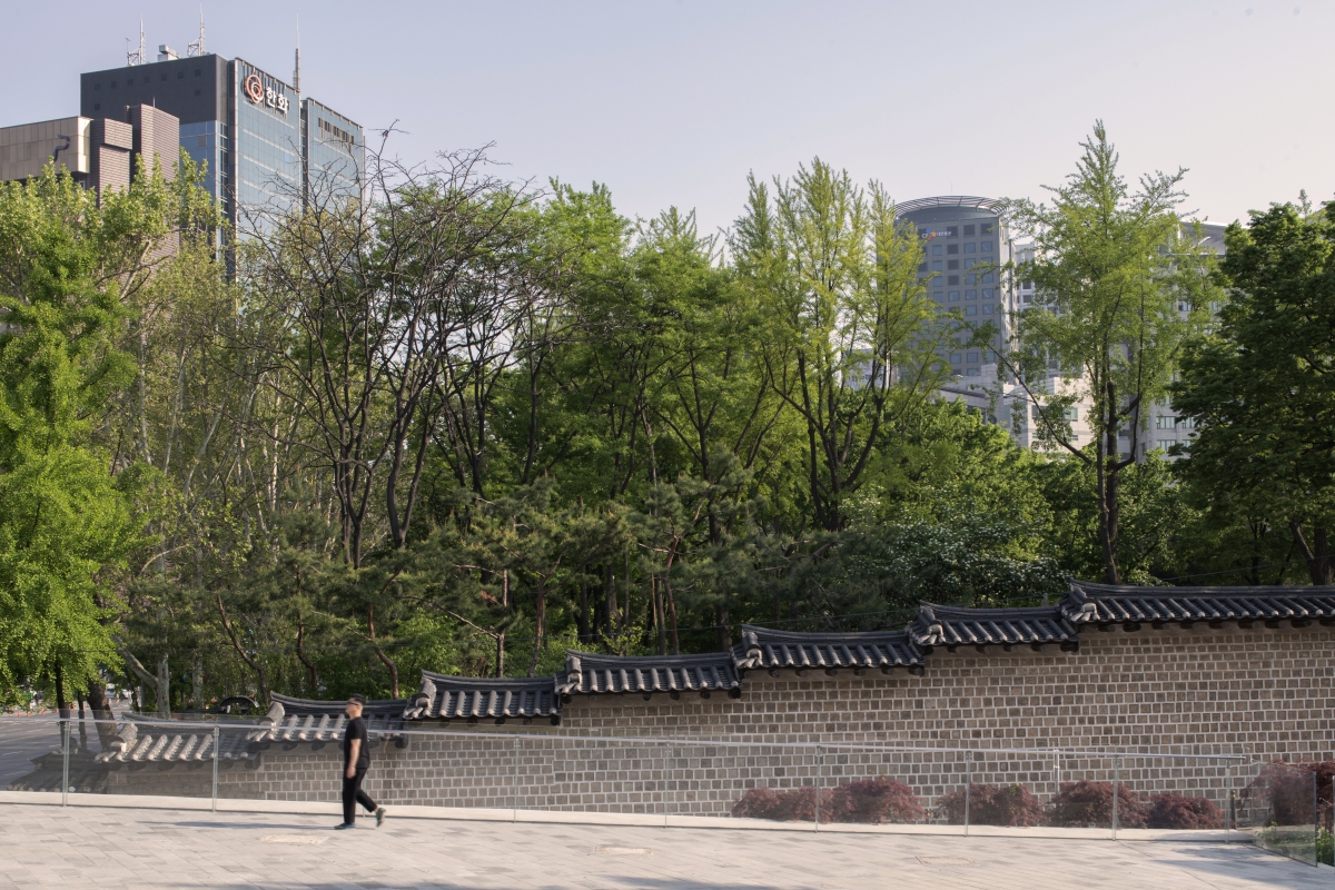
Seoul Hall of Urbanism & Architecture is even elevated just to the height of the adjacent Deoksugung fence.
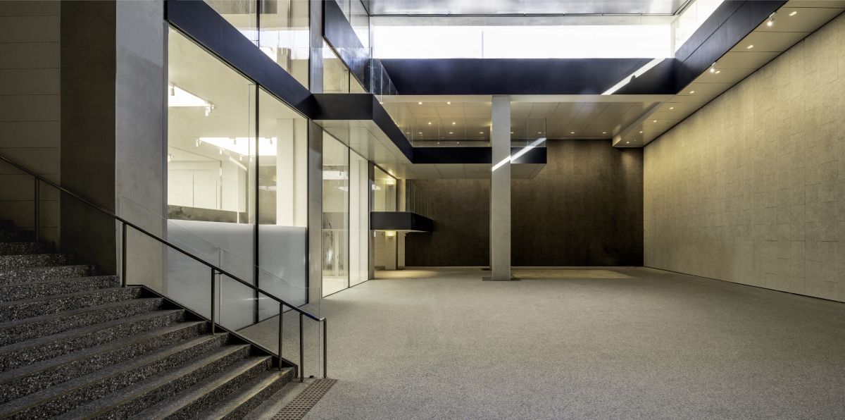
VIUM Hall from the third basement to the first floor


