SPACE April 2023 (No. 665)
A Museum Embracing the City: Sydney Modern Museum
Asano Yagi project architect, SANAAⅹ Kim Jia
Kim Jia (Kim): The Sydney Modern Project began following an initiative to transform the 151-year-old Art Gallery of New South Wales into an art museum campus. The project aims to build a contemporary culture and arts infrastructure that will connect the past and the present. As an art museum project that endeavours to go beyond mere building expansion to matters of urban significance, what were your main points of concern in terms of design?
Asano Yagi(Yagi): We wanted to design a place that somehow relates to Sydney. When I first visited Sydney, I noticed that the city and nature are intertwined. People are engaged in outdoor activities and enjoy socialising outside. So we always had the image of how people engage with nature as we designed the project.
Kim: In contrast to the original building, which was of a nineteenth-century, neo-classical style, the new building form employs layers in its low-rise and lightweight pavilions. How did you approach this new design?
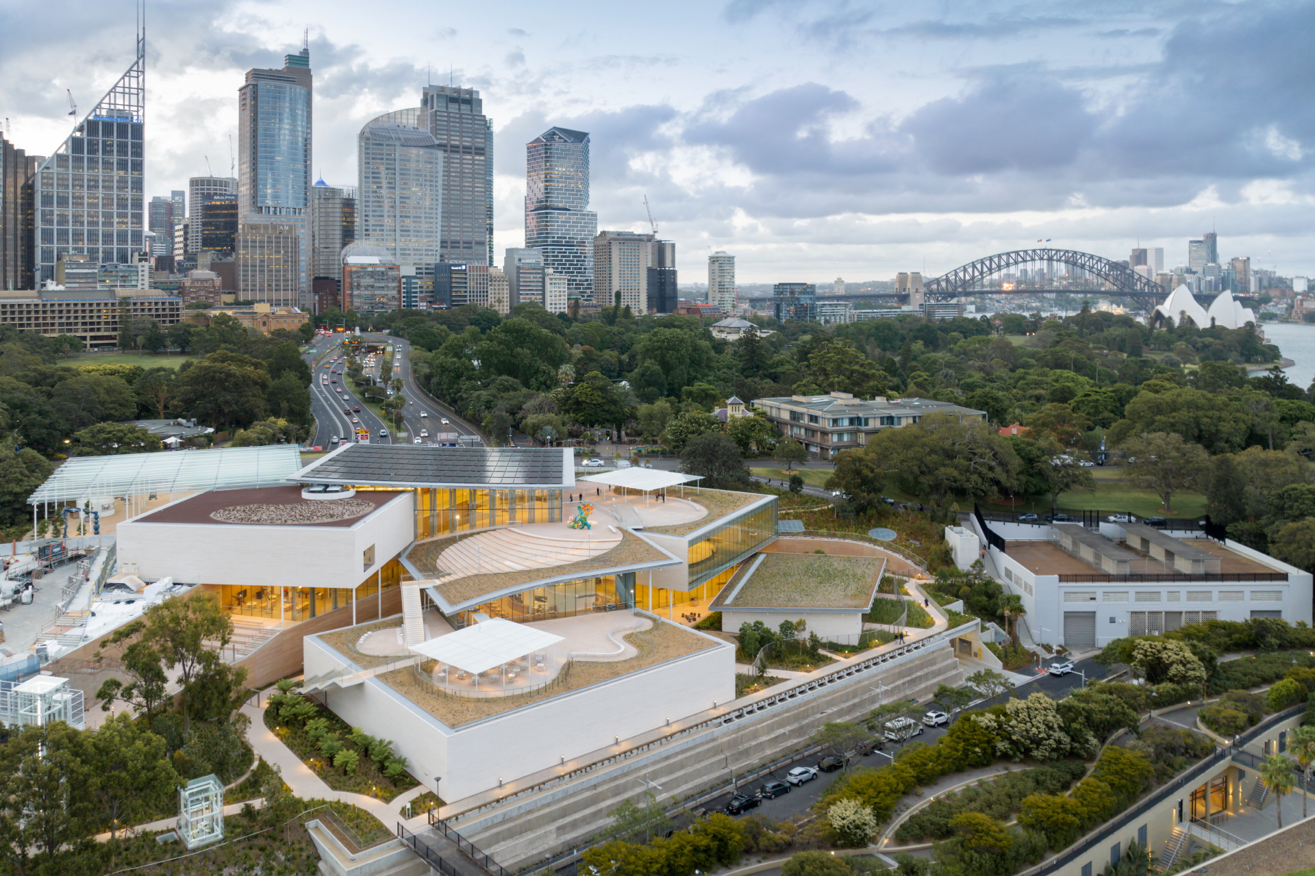
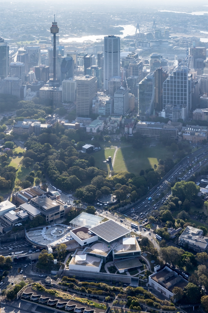
Yagi: We designed an expansion that would relate to the existing building in terms of scale. The new facility is quite large, so instead of building a singular solid volume adjacent to the existing building, we broke it down into several smaller volumes, which is more like the composition of the existing building.
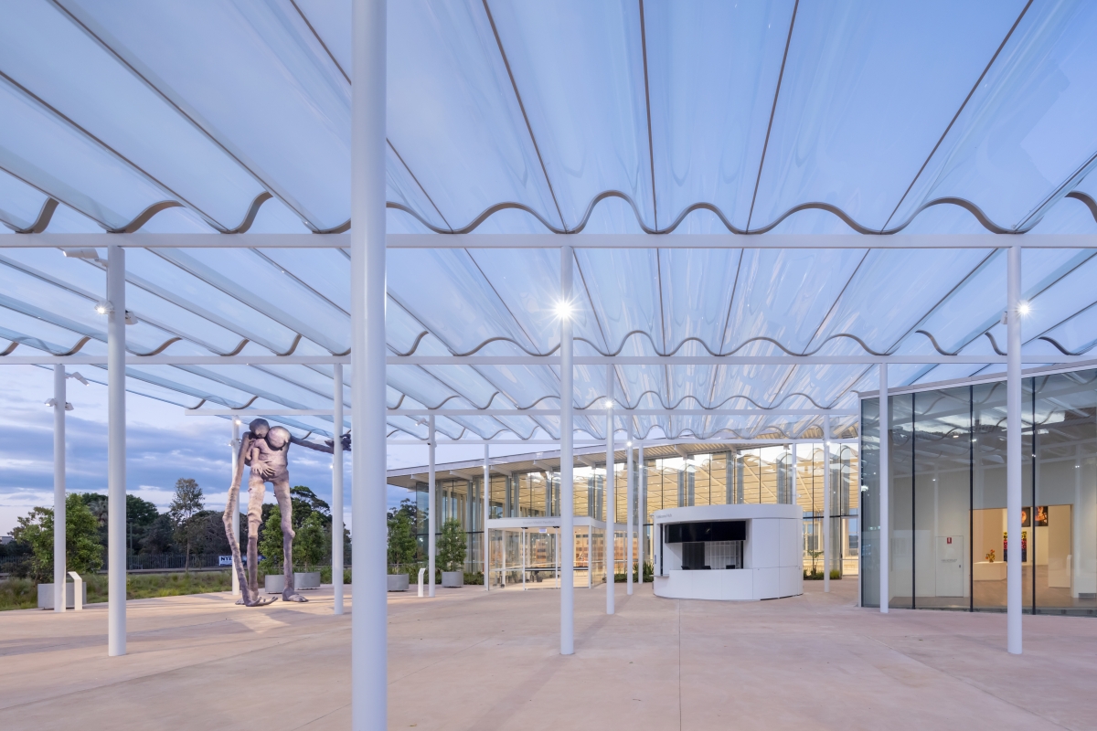
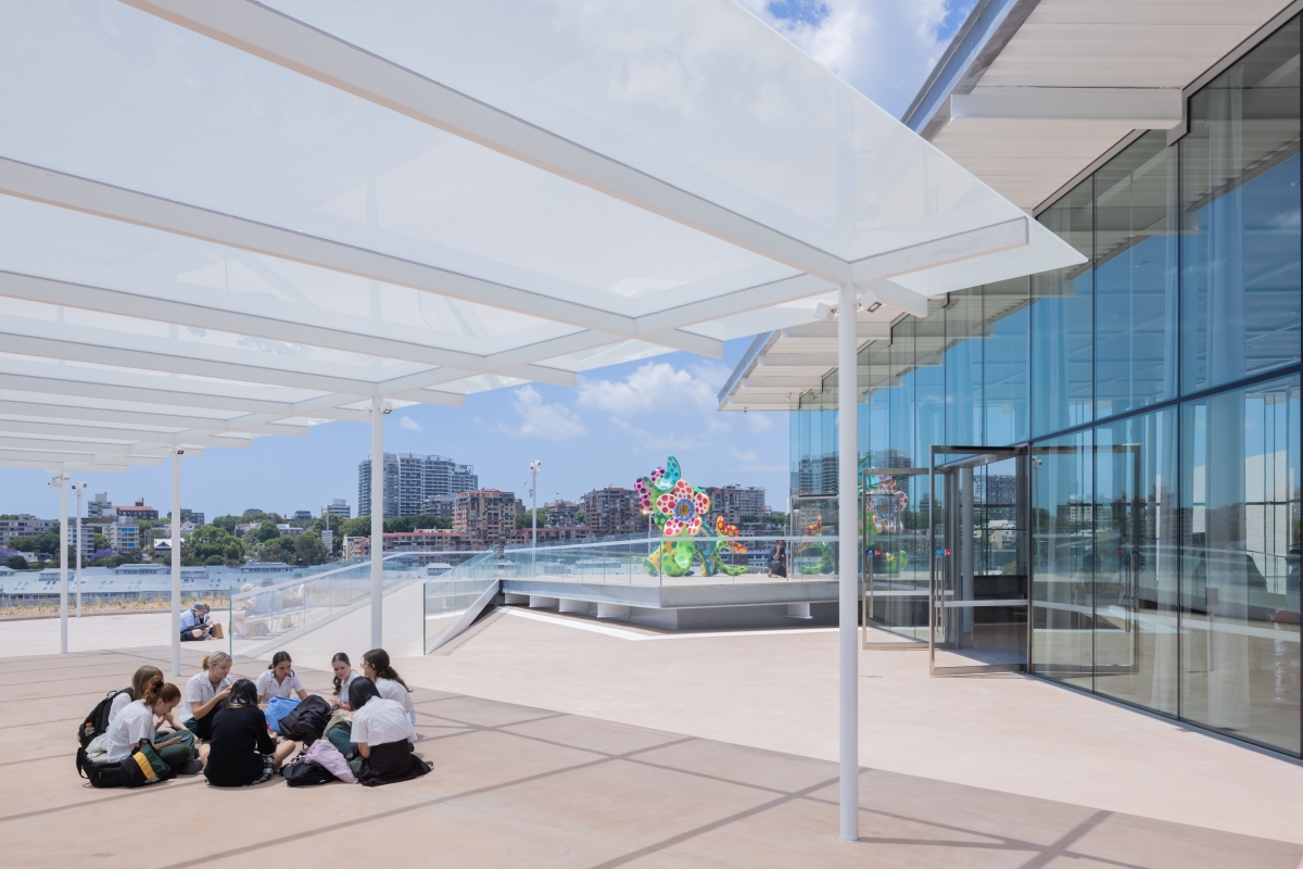
Kim: The Welcome Plaza that faces the original building at a distance is composed of a glass canopy of wave-like patterns. What aesthetic and functional effects does the irregularly-curved glass roof possess?
Yagi: The fritted glazed canopy provides a varying amount of light into the plaza. On a warmer day, visitors can find a more shaded location in the plaza, while on a winter day, visitors can find a sunnier, warmer spot. The curvature in the glass provides structure to the glass, so it can span from beam to beam.
Kim: The atrium cuts through the entire building vertically. What role does it play in terms of the relationships between each room as well as between the interior and the exterior?
Yagi: The atrium is created by the roofs hovering between the volumes and the gallery volumes themselves. It is a space where visitors can understand the site's shape and building composition. The atrium is a large space that branches into smaller, more intimate areas towards the perimeter of the building. Furthermore, the mound shape reflects the form of the existing site.
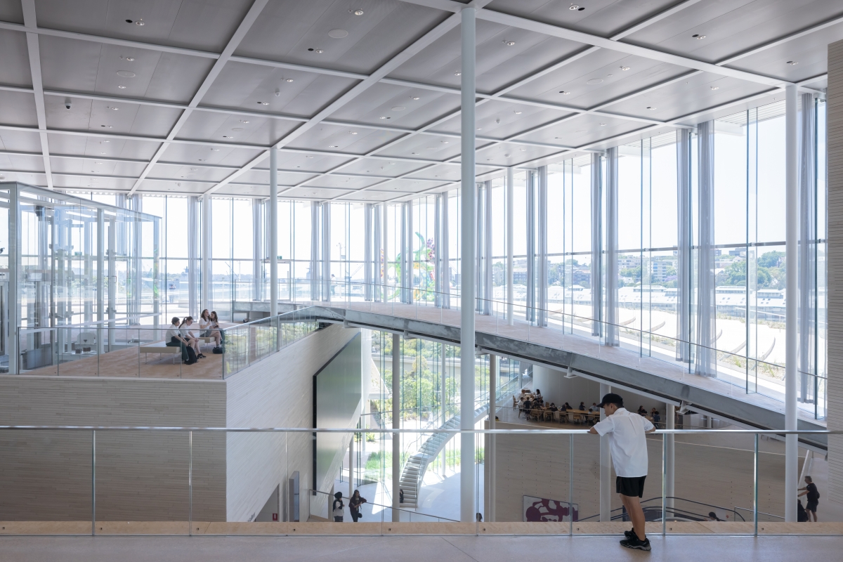
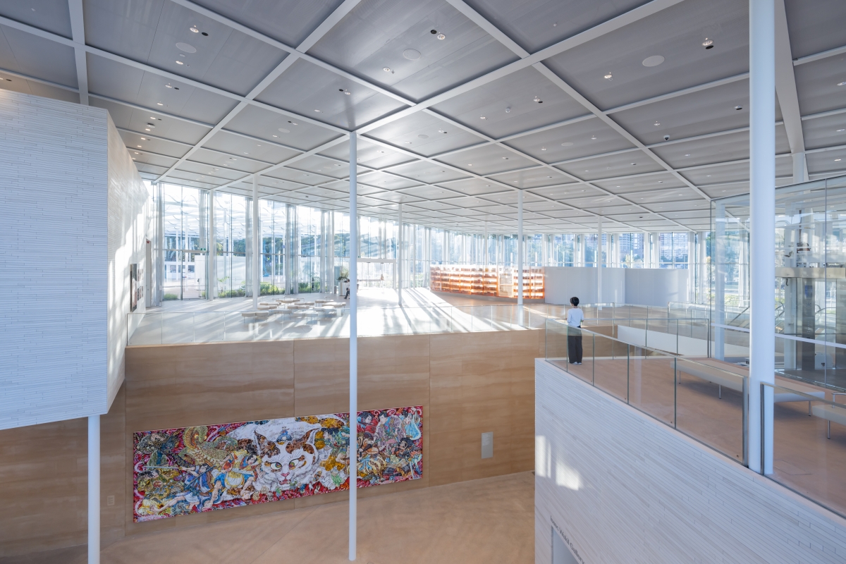
Kim: Could you explain the flow plan connecting each building? There are stairs, escalators, and elevators placed in various places.
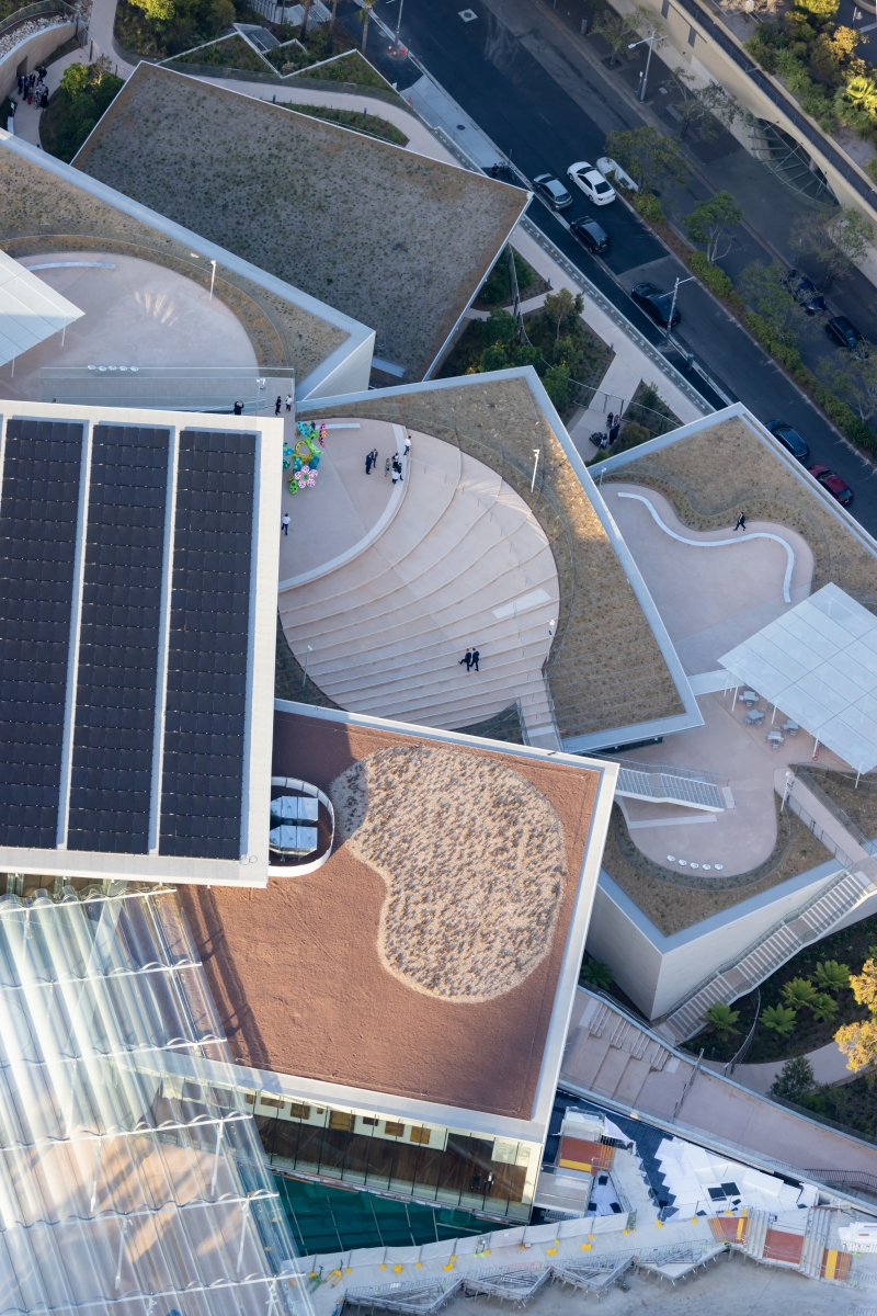
Yagi: There were many discussions and studies done about circulation. There is no singular path that visitors can take. Instead, there are escalators placed more centrally in the atrium and stairs placed behind walls or in the open - these provide different experiences through the internal spaces as visitors traverse the different levels. An external path through the roof terraces also takes visitors from one level to another. We hope the visitors experience the gallery differently as they discover the other paths.
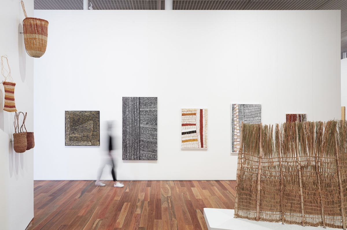 Image courtesy of Art Gallery of New South Wales
Kim: There are a total of eight exhibition spaces within the building. These spaces were designed according to themes, genres, and exhibition types including the Yiribana Gallery that exhibits artworks by the indigenous people of the Torres Strait Islands, and Making World, which showcases contemporary art collections from all over the world, multi-purpose spaces for new media, public programmes, and lectures, and exhibition space for special exhibitions, sculptures, and more. What are the distinguishing features in each space?
Yagi: We proposed a glazed wall in some of the gallery spaces in order for the Yiribana Gallery to create a relationship with the existing building and to provide a view of the harbor from the contemporary gallery. We discussed the finishes for the gallery spaces with the client. For example, the Gallery requested that the finish of the floor of Yiribana should be timber so as to resonate with the exhibited media. On the first basement floor, a large gallery with a size of 1,300㎡ and a gallery with a size of 1,100㎡ without columns are located side by side. Both spaces have a floor height of 5.5m. In particular, in the case of the latter, the boundaries of space were loosely organized to embrace various media such as painting, installation, sculpture, and video.
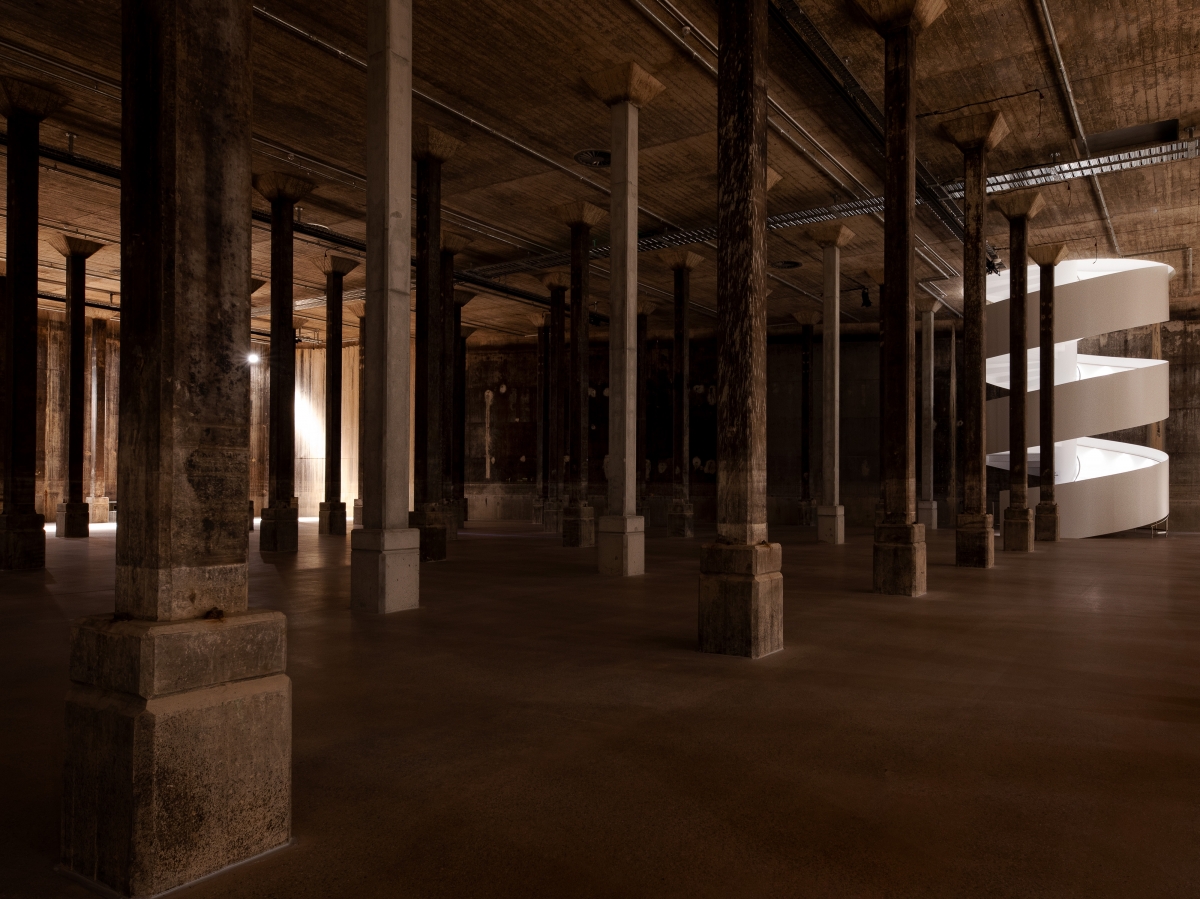 Image courtesy of Art Gallery of New South Wales
Kim: The lowest floor, which was a fuel facility during the Second World War, was restructured into a gallery named ‘Tank’. As a space of minimal intervention, it offers a raw impression. What potential did you see here for an exhibition space?
Yagi: When we first entered the Tank, SANAA and the Gallery agreed to preserve this space and its elements as much as possible. It was thought that this place, characterised by a unique sense of space and amplifying sound effects, could provide visitors with new opportunities to experience art. A white spiral staircase was placed on the path leading to the Tank so that the space could be fully experienced with minimal equipment.
Kim: By keeping the seven pavilions unaligned in their relative positions, various external viewpoints and spaces (terrace, stairs, pavilion) were created. What were the most important factors in terms of the relationship between the exterior and the interior?
Yagi: We determined the orientations of the volumes and roof while considering connections and views. The other important factor was the creation of interstitial spaces in between each pavilion. The landscape can extend closer to the centre of the building by separating building elements.
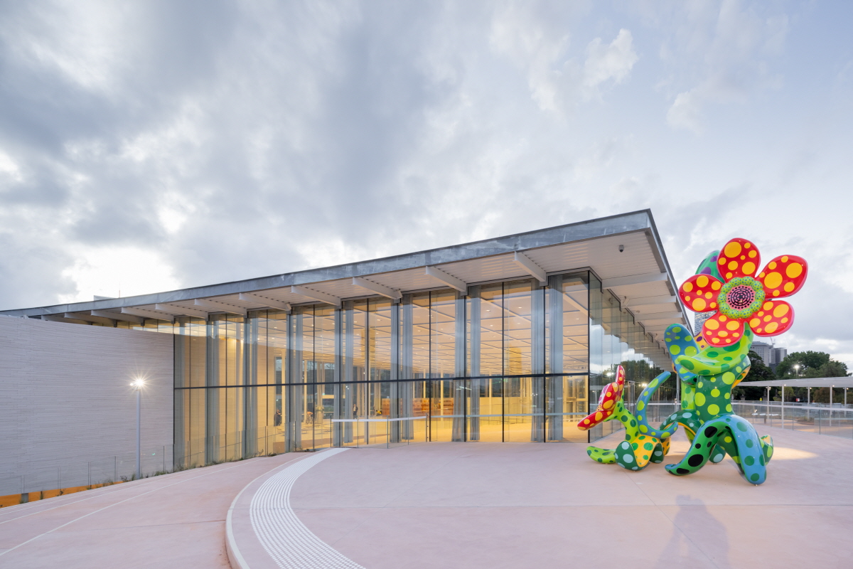
Kim: A part of the exterior space was designed as an exhibition space. What kind of experience did you want the visitors to have in here?
Yagi: Luckily, the weather in Sydney allows visitors to flow more fluidly between inside and outside. So I hope the visitors will experience art in a way that is natural to Sydney. Meanwhile, the Sydney Modern project also includes an extension of the site belonging to the old building. As part of this, the green area within the site was cultivated and a new civic plaza was created with seating, rest areas and convenience facilities. Throughout this process, harmony with the topography was considered and prioritised, such as planning the landscaping with local species in mind.
Kim: You have designed art museums in multiple locations now. I would like to know what kind of challenges this project presented?
Yagi: In terms of this project, the client always had a strong sense and will to engage with the public and the wider community. I appreciated the notion that this Gallery would be a place for everyone.
SANAA (Kazuyo Sejima, Ryue Nishizawa)
Yumiko Yamada, Asano Yagi, Soo Kim, Hiroaki Katagi
Sydney, NSW, Australia
art museum
23,000㎡
11,686㎡
17,595㎡
B4, 1F
28.7m
50.71%
RC, steel
warm color topping concrete and landscape, limesto
concrete, rammed earth, perforated aluminum metal,
ARUP
Richard Crookes Construction
May 2015 - Oct. 2019
Nov. 2019 - Dec. 2022
Art Gallery of New South Wales


