SPACE March 2023 (No. 664) 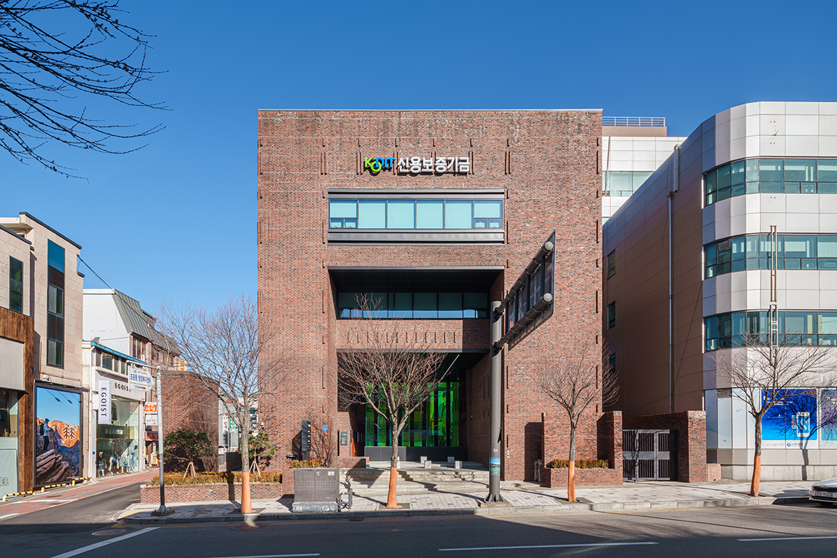
The Chuncheon Branch Office of Korea Credit Guarantee Fund (KODIT) was designed by SPACE Group of Korea led by Kim Swoo Geun and has served as the KODIT’s office building since its completion in December 1981. Along with the Children’s Center of Kangwon Province (1979) and the Handi Crafts Center of Kangwon Province (1983), which are now known as KT&G Sangsangmadang Chuncheon, it shares architectural features with many of Kim Swoo Geun’s buildings, such as the red brick exterior and access through various levels indoors and outdoors. Joyang-dong, where the building is located, is in the heart of Chuncheon, home to the city hall and government offices, and was once the tallest structure in the area when the four-storey building was built. However, over the course of 40 years, the building has experienced a number of challenges due to its age, such as leaks, insulation problems, the absence of elevators, and insufficient parking. In 2020, the client (KODIT) considered selling the building and purchasing a new one, but during the project review process, this direction changed when Chuncheon City proposed remodeling the building to preserve its appearance in recognition of its architectural value.
At the time of the design competition, the top priority for remodeling was to increase the usability of the building. The existing building had been vacant for several years, with only two or three of the four floors used as office spaces and the first floor rented out. The fourth floor, which suffered from leaks and insulation issues, was not as accessible due to the absence of an elevator, and the interior was more than 40 years old. We had to address these issues while preserving the exterior materials as much as possible, as well as applying a new colour scheme without compromising the original architectural intentions of Kim Swoo Geun. We aimed not only at preserving the building, but transforming the space in such a way that would further reinforces the architectural aims of the designer. In order to reinterpret the old building in a dynamic way and to add a layer of time to the present, we wanted to introduce both a youthful and new image to the old red brick building, revitalising the street.
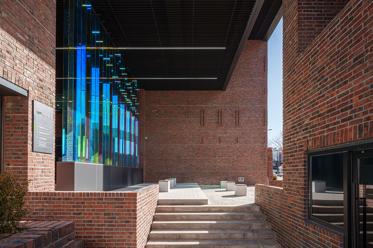
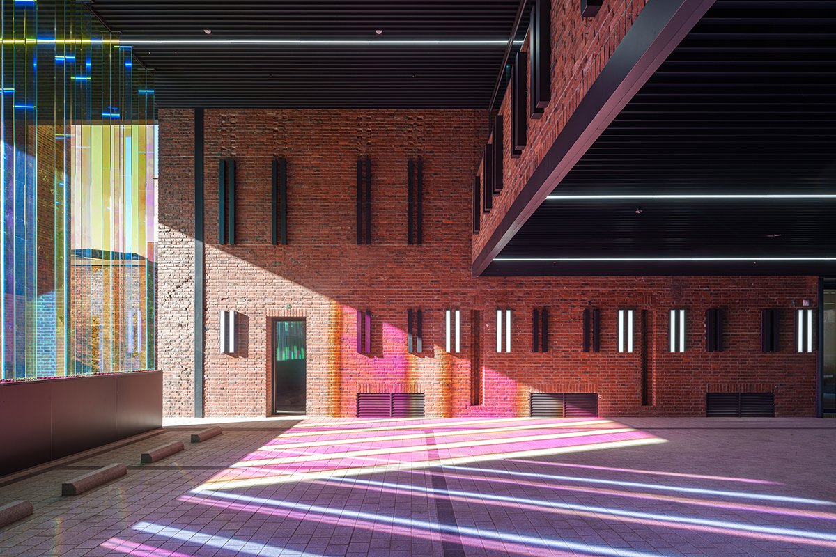
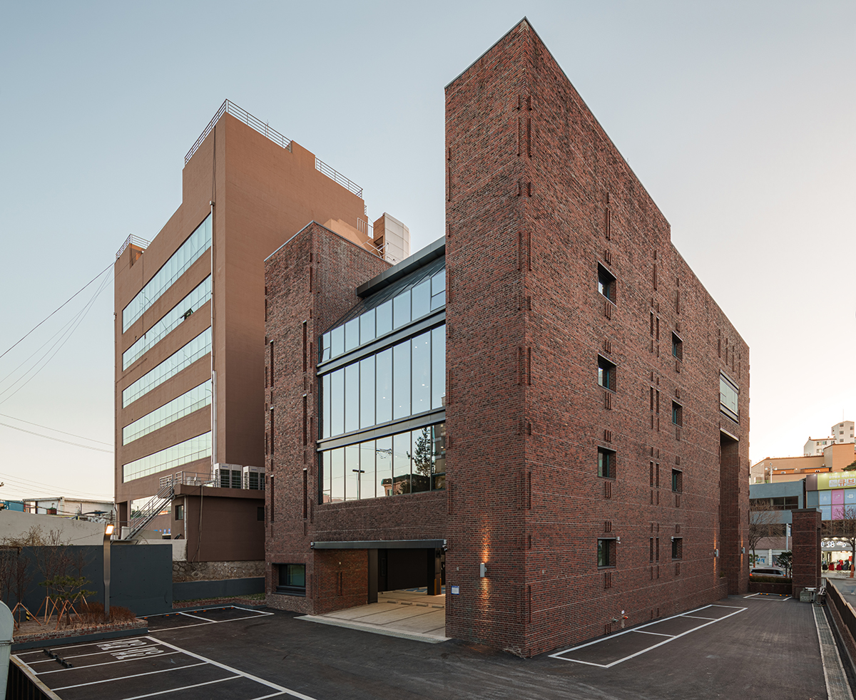
The existing building is sculptural with two large columns supporting a large central mass and shapely throughout its structural system. The building’s function and the spatial layout are based on this sculptural system. This structural impression brings to mind the Museu de Arte de São Paulo (1968) in Brazil, designed by Lina Bo Bardi. Four legs support a large box suspended in the air. In the Chuncheon Branch Office of KODIT, as with this method, we decided to clear the first floor and to make it open to the public, with the hope of attracting as many visitors as possible to the space. With such a generous programme area, we had the bold idea to empty out the first floor and make it open to the public. The open first floor also improved the appearance of the red brick exterior, which was previously perceived as stuffy and closed, giving it a more open and inviting image. To enhance this effect, a glass curtain wall was installed on the exterior balconies spanning three floors, creating an atrium and visually emphasising the fact that the second through to the fourth floors are suspended from two large columns. This solution also solved the issue of water leakage.
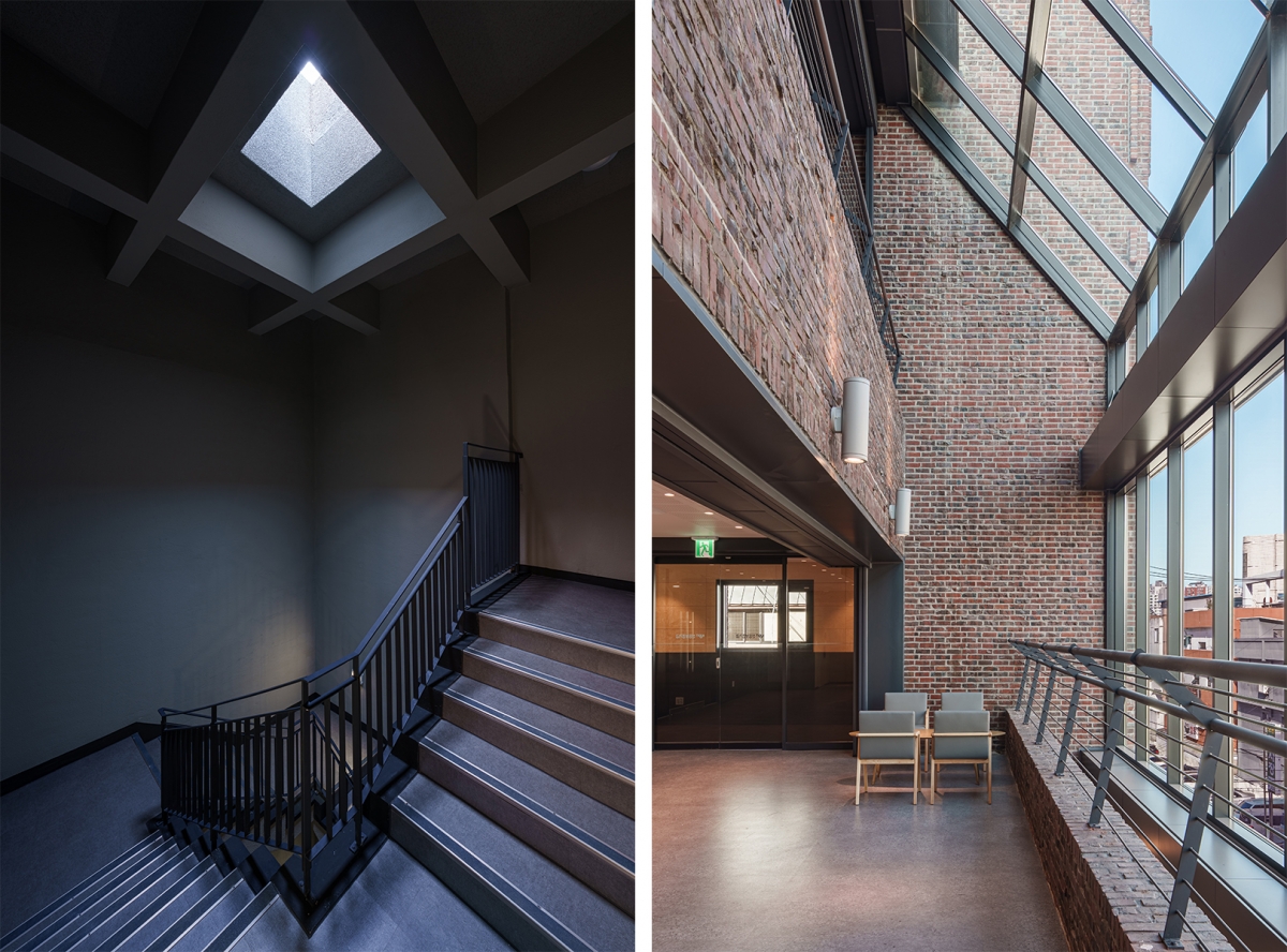
The initial plans for the winning proposal called for the third and fourth floors to be used as offices and for the first floor to remain fully open, with a cultural space connecting the second floor to the basement. However, during the design process, the first floor was repurposed as a parking and the second floor as a startup incubator facility according to the request of the client. As a result, suitable separation between the parking on the first floor and the front street was required, and the same rib glass screen was installed in the place of the existing glass curtain wall. This is an homage to the old building and serves to organise the area more efficiently while providing a degree of screening. The elevator, which was an important requirement for users, could be installed without any structural modifications by employing the air duct space. In the floor plan, service spaces were placed in the two trunk sections, which play a structural role, in line with the design intentions of the old building, and the common area was widened towards the newly created rear atrium to enhance the comfort of building users. In addition, corten steel and black-coloured stainless steel was used as exterior materials other than brick, such as the fence built around the site, to create an image that blends in seamlessly with the existing brick.
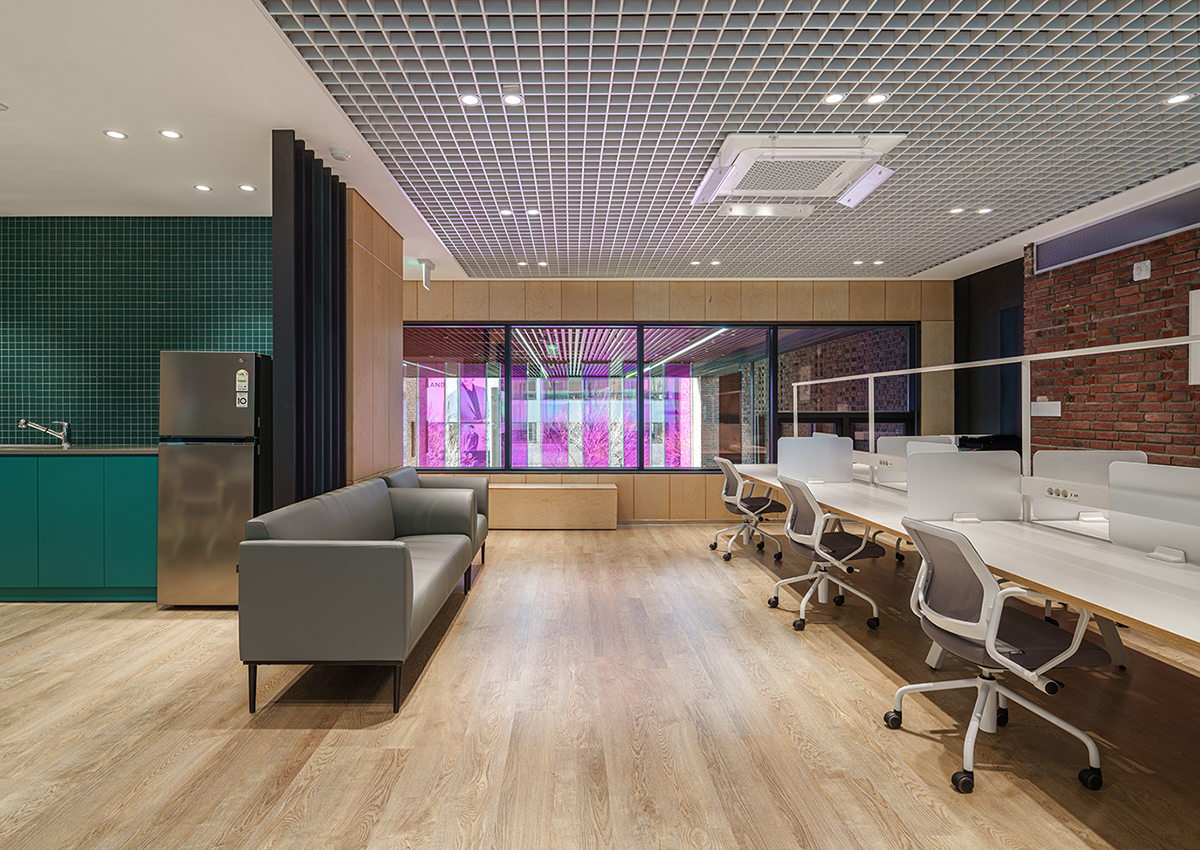
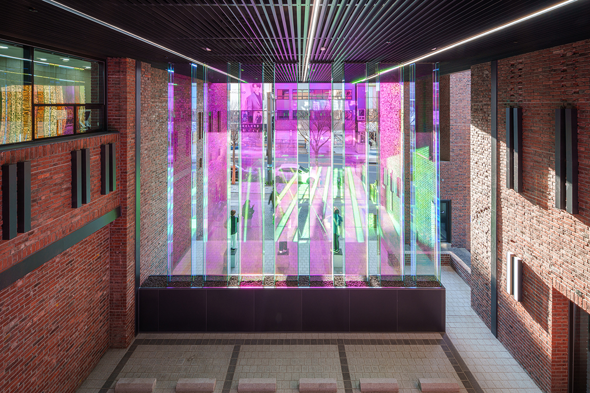
In order to properly realise the design intention of a public building remodeling project, it became necessary to carefully strategise not only the drawings but the construction documents. For example, the original drawings for the walls were marked as ‘red brick finish’, but the layered interior made it impossible to see throughout the space, so we had to propose an appropriate solution based on the construction details to match the actual conditions after demolition. With a limited budget, we couldn’t spend too much on structural reinforcement to enhance the effectiveness of the remodel, but, fortunately, the building’s structural design was well thought out, and the framing was in pristine condition with few cracks or sagging. We reinforced the structure with carbon fiber only where it was necessary, and we also decided that structural reinforcement for non-structural elements such as settling of the face brick on the outside was necessary, so we were able to complete the face brick seismic reinforcement within a reasonable line. As we removed every single layer of finish, we were able to reveal the original red brick on the interior of the first and second floors. Some of it had deteriorated, but for the most part it was in the best condition we could have anticipated for our design. Red bricks from the fence and building demolition were reused to repair the building and rebuild where necessary. The contractor was also willing to take on the cumbersome task of removing and reusing the mortar from the existing bricks by hand. Due to the nature of remodeling projects, which frequently come up against unpredictable situations during construction, the pressure on construction costs is high. In the case of this project, it is regrettable that some of our finishes and details detailed in the original plan had to be abandoned, such as the red brick pavement on the first floor, which was exposed to the outside due to the pandemic and Russian Invasion of Ukraine. We didn’t think about it at all during the competition process, but at the construction documents stage we suddenly felt the weight of the design originator’s name. Our conclusion was, ‘Let’s not hold ourselves back, but respect and reflect upon the original architectural intentions as much as possible in order to fully unfold the new enthusiasms and design potential of the current generation.’ In Korean society, where it is common to tear down old buildings and build new ones, it is certainly not easy to remodel a 40-year-old building to meet the needs of today’s users. As the old building has survived because of its cultural value, we hope that it will remain firmly rooted in the community for another 40 years, just like the old willow tree at the entrance to the town.
OMAK Architects (Ahn Kwangil)
Choi Sungul
77, Geumgang-ro, Chuncheon-si, Gangwon-do, Korea
office
1,321.39㎡
482.25㎡
1,926.22㎡
B1, 4F
19
19.77m
36.5%
105.44%
RC
brick, black stainless steel, low-e glass
paint, birch-plywood, steel plate
Bon ST
MAC&MEC
Inkok Engineering
Dooil construction. Ltd
June – Sep. 2021
Dec. 2021 – Nov. 2022
3.1 billion KRW
Korea Credit Guarantee Fund


