In-between Space Created by Substantial Rainfall
Due to seasonal winds, the eastern area of the Eurasian continent experiences frequent heavy rainfall and a significant level of precipitation throughout the year. In contrast, the west receives less than 1,000mm of rain per year. This disparity in rainfall prompted different architectural methods and approaches between the two areas. Since the first Mesopotamian civilisation, western civilisations chose to build buildings by constructing walls, whereas eastern civilisations faced difficulties when employing heavy walls in construction as the terrain would become soft and unstable during the rainy season. This eventually led to those in the east to select lightweight materials such as wood in construction. In the west, large windows were typically not used because large windows tended to make the buildings susceptible to collapse. In contrast, as wood was primarily used in structures in the east, architecture generally adopted pillars at their centre. As there was no need for walls to support the roof between these pillars, large windows could be used. In this way, eastern architecture naturally places greater emphasis upon views of the surrounding landscape than western architecture, and to command an outside view from the inside became a defining feature of eastern architecture. In order to keep wooden pillars dry during the wetter seasons, the eaves were elongated, and toenmaru (wooden porches) were built below. As a result, toenmaru spaces were created beneath the eaves.
The toenmaru spaces below the eaves possess an intermediary character due to their semi-exterior and semi-interior property. Due to the frequent rains in far-east Asia, the removal of one’s wet shoes before entering the home became a convention. After taking off one’s shoes to enter the room through the daecheongmaru (main hall), one can then relax by the toenmaru outside the window. As the toenmaru also functions as a space in which one can (after taking off one’s shoes) shelter from the rain, it can be considered as an interior space. However, as it also allows one to enjoy the outside air, it is also an exterior space. With both exterior and interior qualities, this space is an ambiguous space. A comparable space in contemporary architecture would be the balcony or veranda. As Korea became rapidly urbanised in the 1970s, the country had to develop urban residential quarters. The new residential form created out of reinforced concrete and elevators to face this challenge was the apartment block. At that time, the floor plan for each household in an apartment block replicated the ㄷ-shaped form of a hanok. The yard covered by the roof became the living room, and the toenmaru outside the windows became the balcony. This became the norm for approximately 20 years. A change, however, was set in motion as beds were introduced into these apartments.

©Park Youngchae
Beds and the Balcony Expansion: The Disappearance of In-between Spaces
In earlier periods, Korea used the ondol (floor heating system) to manage room temperature, by heating up the stone floors with the fireplace. The warmest spot in the room is inevitably the floor. As a result, laying out a wool blanket and sleeping on the floor was the most comfortable way of sleeping in Korea. In European bedrooms, however, heaters were generally used to heat up rooms as warm air tends to rise, and it was therefore normal to sleep on an elevated bed to stay warm during the winter. In countries such as Korea where people sleep atop of blankets, one can easily clear the room to take breakfast in one’s bedroom by simply folding up the blankets and storing them in wardrobes. In this way, a single space can be used in more than one way. However, as the fight for womens’ rights – who were mostly housewives at that time – became more vocal from the 1980s, beds were introduced to reduce the need to spread and fold blankets before and after sleep. Sofas where families of four could all sit together to watch television also became more common. Beds and sofas take up a significant amount of space, and hence bigger homes were required. To resolve this problem, the expansion of the balcony was introduced. By extending external balconies and incorporating them into interior space, room sizes were enlarged and furniture could be more comfortably and efficiently placed. With the disappearance of balconies, however, the urban environment became desolate. Balconies had long been the transitional space between buildings and streets in densely populated urban settings. As people used their balconies to relax, garden, and to dry one’s laundry, the balcony meant that the everyday activities of the building’s inhabitants became a dynamic part of the building’s façade. With the disappearance of balconies, glass walls increasingly took their place. This buffer that had once provided a seamless connection between public and private spaces was no more. The contemporary city is replete with architectural façades that resemble facial masks. In the past, however, there was greater transparency and permeability in the buildings and throughout the city in general. The aim to revive this transparent and permeable ‘in-between space’, such as the absent toenmaru, is the main driving concept behind these three projects.

©Kyungsub Shin
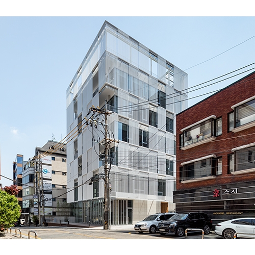
Customisable Façade
In JJJ, balconies were used across the façade facing the street. A window that appears semi-transparent, due to the narrow vertical round bars, was added to the furthest end of the balconies. This screening device, which functions as a semi-transparent screen, filters out light and allows for variations in transparency according to the viewer’s angle. This screen also opens and closes through a motor. The occupants of the building or on the balconies can choose to open and close this screen, and these individual choices mean that they can customise the façade. The inhabitants can also chat to neighbours from their balconies or decorate them with plants. In this way, the lives of the inhabitants complete the building’s façade. Scenes from their lives play across the façade and are therefore employed as the finishing material. Due to the balcony spaces and the screens in the façade, it is possible for both those inside the building and those on the streets to communicate with one another. This building is one of changing expressions.
The most difficult point in realising this design was the negotiation phase with the district architecture office, which was the authorising party. The reason was the possibility of exploiting these balcony spaces, including them in measurements of interior spaces by making the external screen non-transparent after receiving approval. In general, our government is prejudiced against architects, imagining that they all harbor the potential to transgress the law. As a result, many new designs never see the light of day. For example, designs such as the House N by Sou Fujimoto can be easily manipulated to create extra interior space by covering the roof. It would probably be impossible to have such designs approved in our country. Similarly, it became necessary to repeatedly reassure the authorising party that JJJ’s balconies would not be used for interior expansion became necessary. The problem lay with the screen’s level of transparency. The district office wanted the screens to be fully transparent, and I opposed this as I felt it would make the bars across the screens appear like those of prison cells. Ultimately, I received their approval under the condition that I was able to prove its transparency in a mock-up.
During the design phase, the most difficult decision concerned the level of transparency in the screen. I had to decide whether to use rectangular bars, round bars, or T-shaped sections for the bars. As rectangular bars and T-shaped sections excessively denied transparency when viewed at a 45-degree angle, I decided to opt for round bars. The intervals and thickness of the bars was also key, but the decision regarding their thickness was achieved relatively quickly as the bars had to be structurally stable against the wind. The only element left to decide was the thickness of the steel for the bars. While the overall costs could be reduced by making the steel thinner, thicker bars would have to be employed, and so an appropriate compromise between these two aspects reached. The thickness of the bars also influences the intervals between bars. I was able to come to a decision after numerous iterations, trials and sample productions.

©Park Youngchae
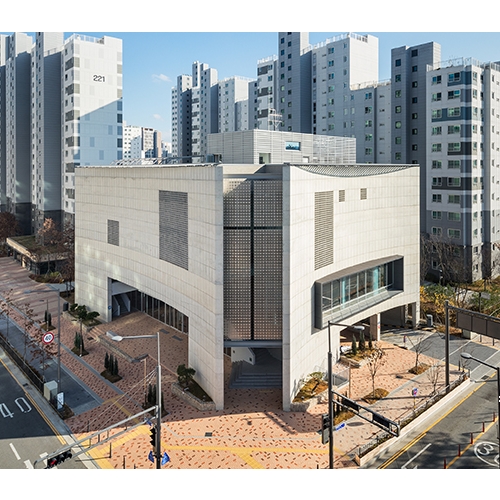
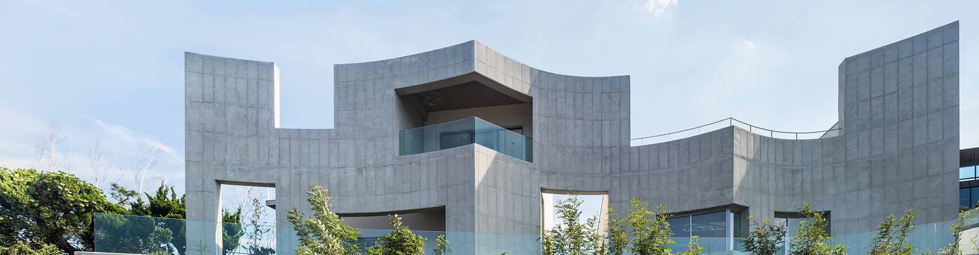
A Church with an Open Daecheongmaru
The Hug was designed with the intention of building a church where churchgoers and non-churchgoers alike are able to enter freely. Ironically, the buildings of the evangelical religion tend to be closed off and feature an exclusive spatial structure. In order to create an inviting church space, the first thing to be designed was the curvature of the façade. Buildings in cities generally have flat façades. However, a flat surface is different from a curved surface. When a building has a curved façade, and when I’m facing the part where the curve becomes a flat line, I get the impression that I’m being rejected by the building. In contrast, when I’m standing in the centre of the arc, I feel as though I’m being welcomed. A similar feeling can be experienced under an umbrella. Umbrellas create a light and affordable dome space within a contemporary urban setting. The reason why one feels a sense of psychological stability under a domed space is because one feels as though one is being embraced by the curvature of the ceiling. In light of this, churches on the most sacred sites feature domes. However, as churches became more pulpit-centred, and as they were forced to allocate a greater number of people as they moved deeper into the city, dome architecture gradually became replaced by rectangular buildings and chapels. Church spaces such as these are not welcoming spaces. In my view, churches should welcome those who are marginalised, and embrace the ‘wearied and burdened’. I designed the curved façade to welcome those outside the church. Furthermore, I opened up the lobby to create an inviting space for people to freely come and go. Non-churchgoers may find it somewhat intimidating to open the doors to the street-adjacent café. To mitigate this sense of exclusivity, an in-between space – that is, a small plaza that resembles an eaves space under the church curved façade – was introduced. This semi-exterior and semi-interior space is open not only to the church members but also to the general public. Immediately after entering this space, one encounters a café made of transparent glass windows. As a leisure space for all, it functions as the daecheongmaru of The Hug. A place for borderless communication between church members and non-church members can be found at the lobby of The Hug.
What is important to note in such designs is the preservation of homogeneity in terms of the materials used in the pedestrian path as a public space and the plaza under the eaves by the church façade. This is because using different materials generates a sense of division even if the spaces remain connected. There was no room for choice when it came to materials as we had to use the sidewalk blocks designated by Sejong city, even though we didn’t approve of the colour. And yet, we concluded it was better than turning to other materials, so we went along with it.

©Kyungsub Shin
Building Woven with the Wind, People, and Alleyways
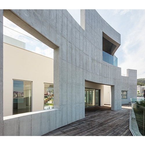
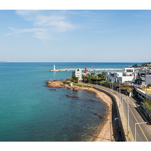
The site of Wind Fence lies on the boundary between the land and sea. This is also the boundary where nature and the city meet. One side of the site faces the sea, and the opposite side faces the town and the alleyway. As a consequence, this building is composed of two façades: one facing nature and another facing the urban context. By drawing on the façade that faces the nature, I wanted to make the invisible shifting of the wind visible. In terms of form, I was inspired by Christo and Jeanne-Claude’s work. Their long canvas installed on the site is distorted and reshaped by the wind, creating a sense of visual tension, reminiscent of the sail of a yacht on a bobbing tide. The heavy exposed concrete wall facing the sea was designed to appear as though it was taut and bent into shape by the wind coming from the sea. By making holes in the wall, communication between the exterior and interior tense wall was enhanced. The sea-facing façade formed of three curved surfaces makes it look as though the sea and the building are engaged in a ‘push and pull’ movement.
The opposite city-facing side has been divided into multiple blocks with alleys coursing between them. The alleyways between the buildings were designed with the commercial aim of creating a space that holds the maximum number of visitors with the minimum amount of interior area space. Two external staircases were installed per block to emphasise a sense of attachment between the upper floor area of relatively affordable rent and the above ground levels. The external staircases also function as alleyways, but in a vertical manner. As a building between the urban and natural, characterised by several penetrating spaces, the desire to fill its empty spaces with people is all the greater. The reason why we chose external instead of internal staircases was to allow access to the deck, even for passersby. By weaving together the wind, the people, and the buildings along longitudinal and latitudinal lines, this spatial construction is made of a complex matrix.
As there is a beautiful rocky coast next to the site, the initial design proposed to cut off the site’s embankment in order to create a direct connection to the sea via a staircase. To do this, however, would mean resolving other challenges. First, the 1m-wide embankment adjacent to the site was under the control of the Ministry of Oceans and Fisheries, and so it would difficult to purchase the embankment outright even though it was possible to pay a yearly fee to alter and use it. In the process of cutting costs, we decided to cancel the plans for the staircase to reduce the amount of required civil engineering work. However, if we were to install stairs between the main site and the second site in development towards the east, it would be possible to connect the alley leading out from the back of the main site to the seashore. James Stirling’s Stuttgart Museum was designed to be a dynamic connection between the higher-level side streets and the lower-level main road. This building design is a good example of how architecture can be organically connected to the surrounding urban context. We hope that Wind Fence will also play a similar role as the stairs that connect the alleyway to the sea reach completion.