Heavy Race to the Sky
Living in the digital, hyper-networked world, publishers nevertheless continue to make paper books. This project presented me an opportunity to observe the ways in which publishers try to communicate with their public in terms of broader culture concerns.
I was allowed enough time to develop the design, and my design concept was reviewed, reflected upon, and revisited throughout the construction process. Nevertheless, the positive desire of the architects seemed to be to encourage all participants to work hard without any conflict and to produce the result. Victor Hugo said that 'the book destroyed the edifice', but the client seemed determined to revive the sense of 'books' by means of architecture.
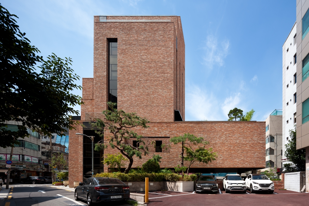
The building will accommodate an exhibition hall, caf?s and a roof garden, spread across the basement to the third floor, and the headquarters of the publishing company and the client's residence on the fourth to the seventh floors. In terms of area, more than half of the building has been assigned to public spaces. The basement has a large entrance; the first floor has a spacious parking lot; the first and second floor are connected through a slab opening; outdoor spaces are placed here and there on the second and third floors.
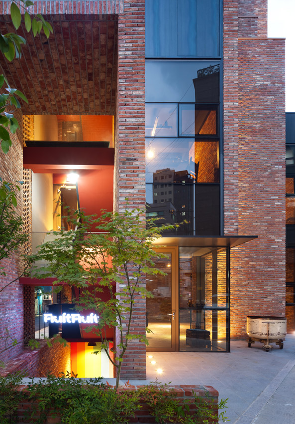
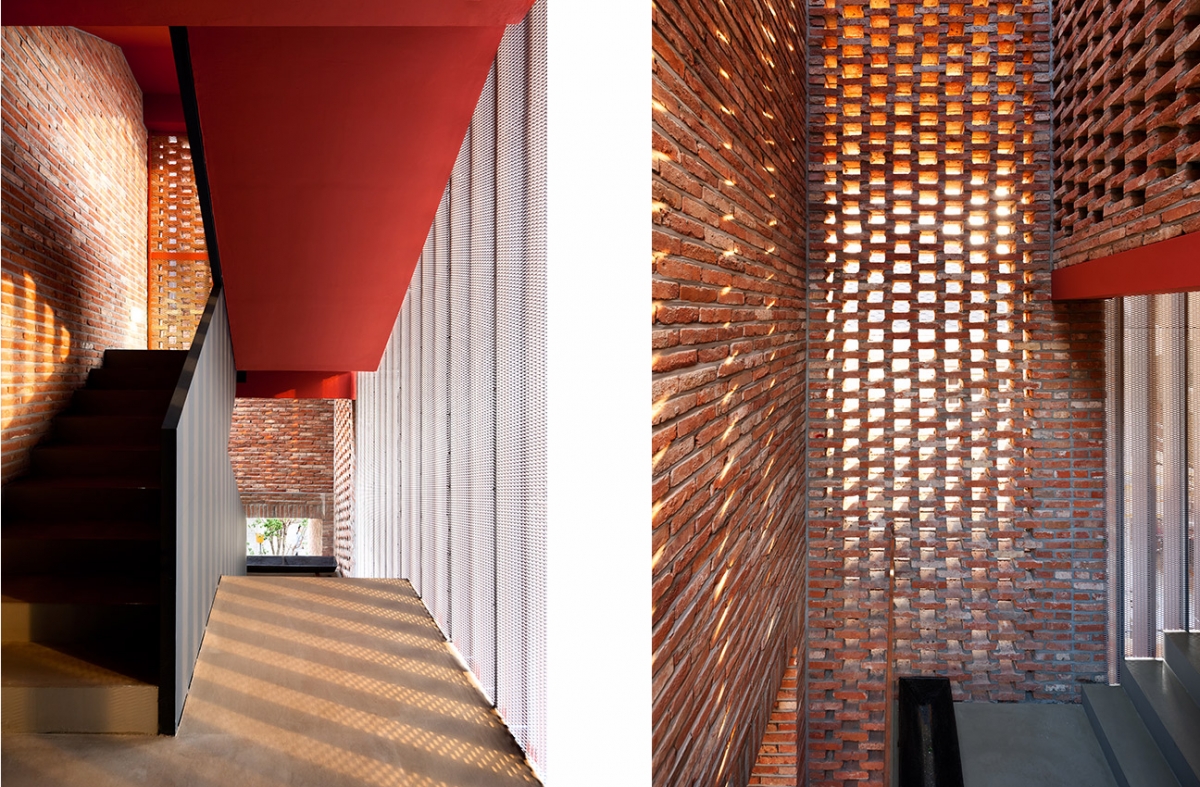
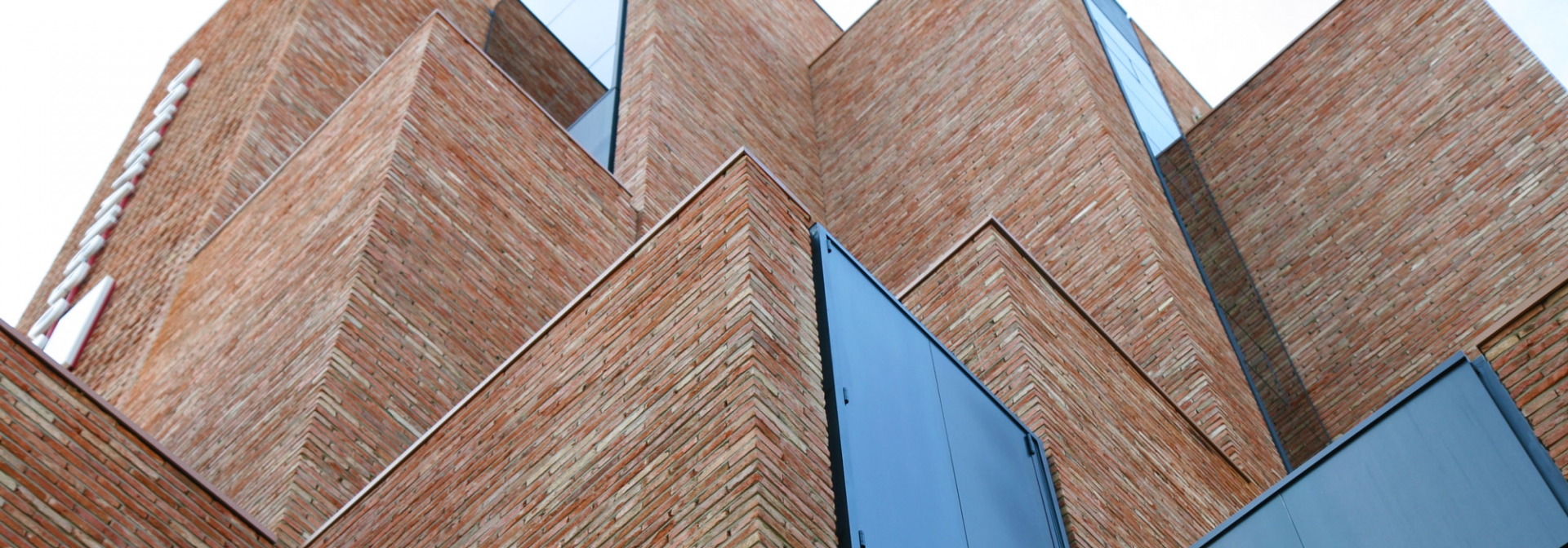
The use of old bricks had already been determined before the design process began. Warm, familiar and stable, bricks are a heavy and enthusiastic material in that they can be stacked up rather than attached on the surface. Brick faces laid one by one form another mass, clustering and appearing piled toward the sky and the city. The mass has internal functions, such as stairways, entrances, lightwell, terrace, caf? and even toilet. With different uses, these volumes are all tall boxes made of old bricks. Viewed from the front, twelve masses of different heights rise one after the other from the ground. The client inscribed 'The 3rd Space; A New Cultural Space Platform soaring into the sky' onto the memorial tablet detailing completion.
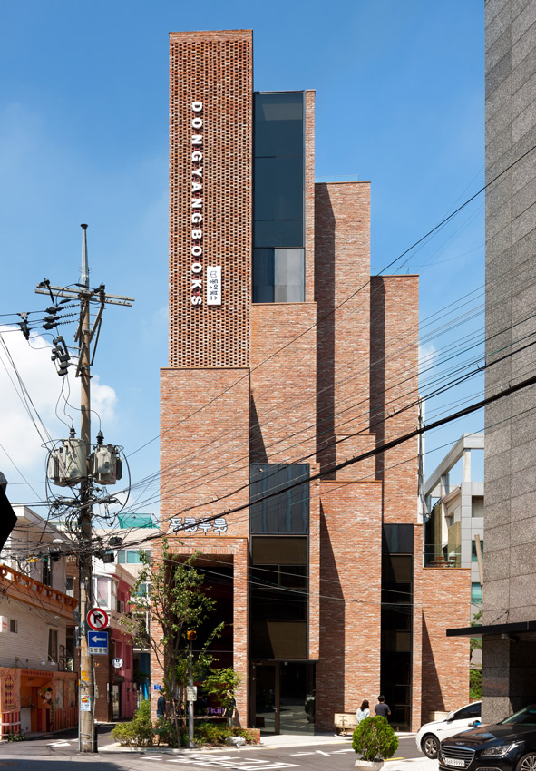
Belonging to a large block, the site is located at the end of a northbound street connected to Yanghwa-ro, which can be recognised from the main street. The street stops running to the north but intersects with three other alleys that are not perpendicular to each other. The site is shaped like an acute triangle from the front side and a long rectangle from the back. I wanted to push the ground a little to the left to gain better view from the Yanghwa-ro, and to widen the acute corners. Of course, this was impossible. A building must make a claim on the basis of its given shape and location. It was not easy to adapt the site to the purpose of the building. It reminded me of those strange-looking flatfish who have eyes, nose and mouth on one side of their faces.
I have studied various masses of differing orientations. To think about providing a proper pose and expression in a building is an important consideration for the client and architect and particularly those familiar with the site. I think that the parcel of about 3m wide tall square towers was a good solution towards shaping a building for the given location.
The first volume is a high gate at the front; the second has a deep recess pointed towards the sky; the third is the tallest centre which scatters light through a perforated brick wall; the fourth is the entrance to the caf? on the first and second floors; the fifth is a solid mass; the sixth is a passageway to the attic; the seventh looks like a face in profile; the eighth is a small lightwell open to both up and down; the ninth has a hidden mouth at its bottom; the tenth faces the seventh; the eleventh has a house garden at the top; the twelfth stands at the east end. Made of red brickwork, all are united with each other. Despite their different roles, they all aim for the same goal.
