A Problem of Necessity Dissolved by Arbitrariness
Quad is an extremely rational product. As a multi-household residence and a neighbourhood living facility, the maximum floor area ratio and building coverage ratio were prerequisite conditions of the design. It was imperative to make use of every last volume, as permitted by the road width, the sunlight setback regulations and as stipulated by the law. For the client, this building had to achieve a necessary result. As such, what critique is possible of such a building? What value does such building have to a young architect who expresses his style and ultimately wants to solidify his brand?
A young architect’s style, unlike that of famous architects, has not attained recognition for its brand value in the architecture market, which by consequence means it has not been generally accepted. It is difficult to claim that an architect’s style has value for a client, or that it will fundamentally influence a client’s decision regarding a commission. Instead, a young architect’s style is often observed as one of juvenalia and can be easily neglected by the client’s preference or economic rationale. This is why for architects Kim Jinhyu and Nam Hojin necessity is the only window through which to express their colour. The crux of the problem lies with how to relate what is considered most arbitrary, such as the relationship of one’s style to necessity, or, in other words, how to dissolve the arbitrary into the necessary demands of the design.
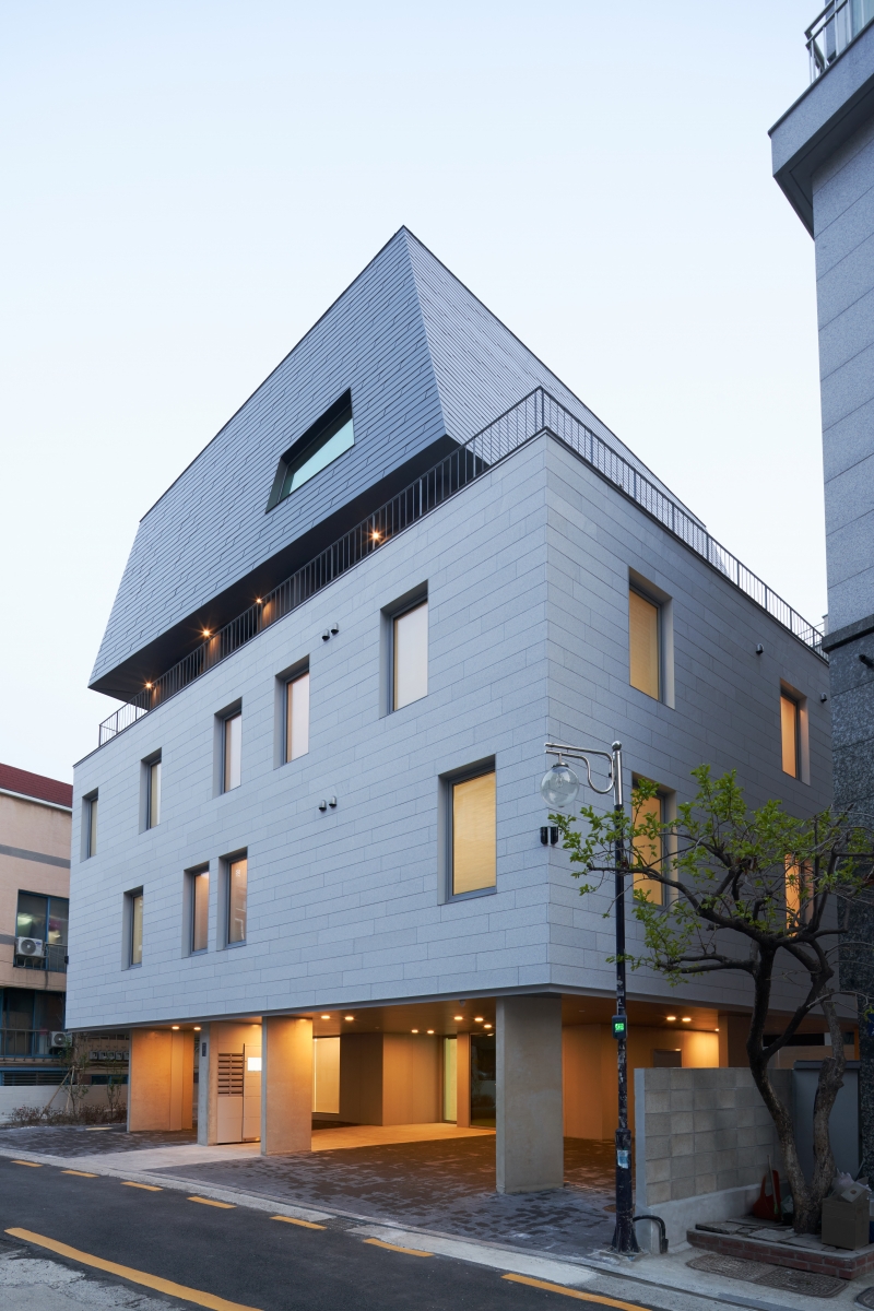
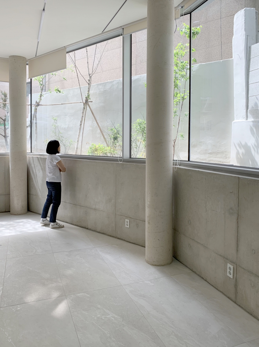
The description of Quad is full of necessities. First, the different finishes for each floor – the exposed concrete on the first floor, the Pochon granite on the 2nd and 3rd floors, the stucco on the 4th, and the coloured steel plates on the 5th and attic floors – have all been adopted from materials commonly used in the neighbourhood.
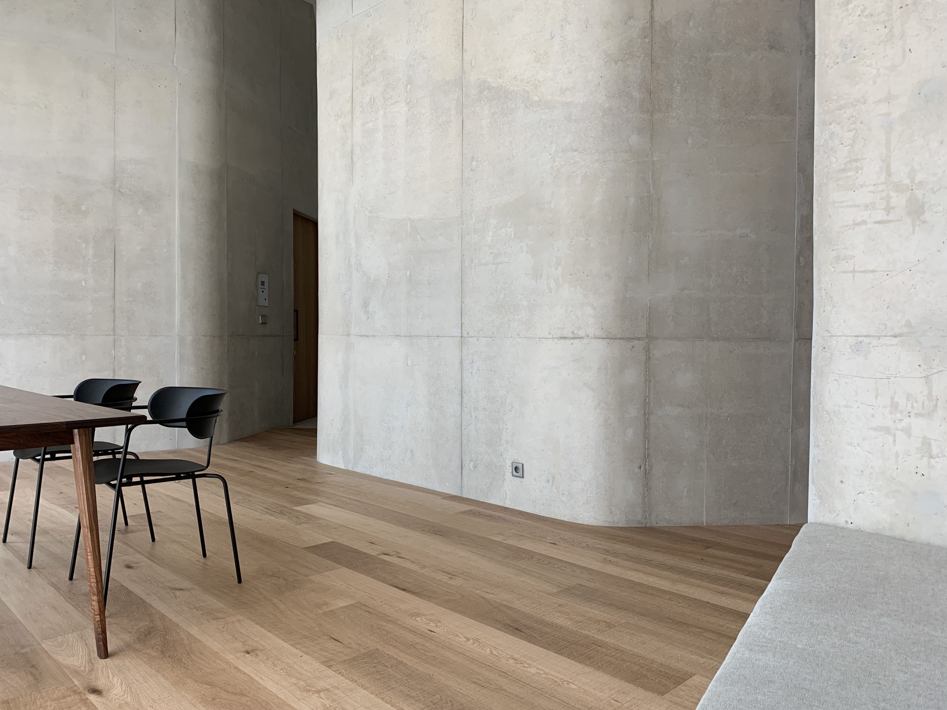
The eerie polygon on the top floor was created by drawing on the surrounding limiting oblique lines and the window facing the street at a peculiar angle, which is offset1 by the outer line of the polygon. Moreover, contrary to the expectation that such an exquisitely curved interior space would have introduced other grandiose ideas or design elements, this is the product of offset, tangent lines and fillets2. The surrounding context determined the exterior finish, and the width of the road and sunlight setback regulations determined the form of the building; even the shaping of the top floor and its window were directed by AutoCAD.
Let's consider the indoor spaces. The first floor rental space accepted the vague semi-basement depth created during construction, and the interesting split-level space on the top floor accommodated the upper level space created by setback lines. The irregularly placed windows on the facade of the 2nd and 3rd floors were intended to secure visual channels or the observation of green areas to provide maximum spaciousness in each house. The surreal triangular terrace on the top floor can be explained by necessity, with its intention to secure privacy from other buildings, and to allow natural light while facing southward.
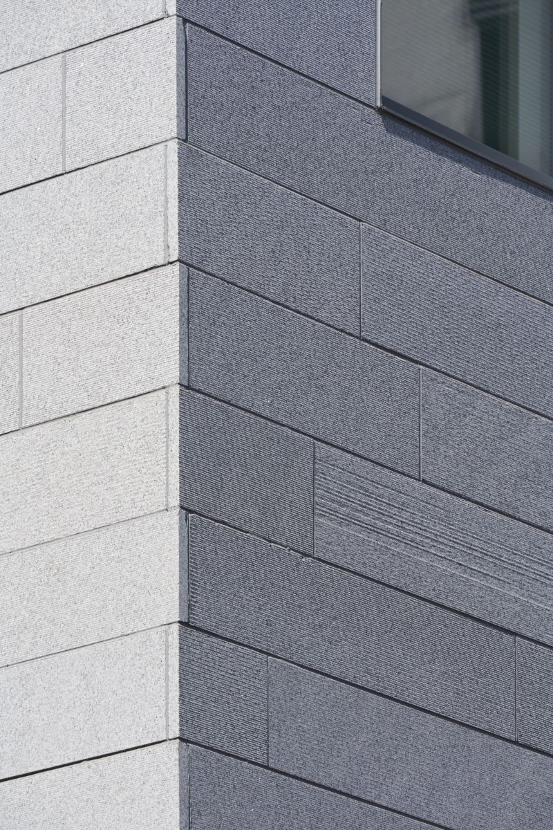
However, the architects' explanation of the Pochon stone finish, which lumps the 2nd and 3rd floors into one mass, appears different from the aforementioned products of necessity. They decided to maximise the length of the module to distinguish it from other surrounding Pochon stone finishes and to expose their working marks. They have also preserved the strangely obtuse angled corners of the pentagonal site. It seems as if the architects refused the conventional results of necessity and instead chose a stance of 'arbitrariness'.
In Sobre el concepto de arbitrariedad en arquitectura, José Rafael Moneo Vallés3) claims that the quintessentially decorative elements of Anthony Gaudi's architecture are actually the product of a process of necessity, concluding that Gaudi is different from other architects that have considered arbitrariness as actually derived from architectural form. He added that the masters of modern architecture Le Corbusier and Mies van der Rohe, who based their work on the appreciation of formal consistency, assumed to be in conflict with arbitrariness, also share this same path. While Le Corbusier tried to avoid any definition or association with form that was not the result of an architectural system, Mies van der Rohe strove to lay the foundations for a general and decisive language from steel structures through five principles of modern architecture derived from steel concrete structures. In particular, Moneo can be understood to stand among the ranks of architects throughout history who have bravely fought to forget their sin of compressing a sense of arbitrariness, and simultaneously interrogate an arbitrariness claimed, paradoxically, to be a prerequisite of architecture's necessity. Architectural creativity is infeasible without arbitrariness, and the products of a certain arbitrariness have become the long-held essentials now perceived as necessities. However, Moneo argued that when the epoch of John Hejduk, James Stirling, and Frank Gehry concluded at the end of the 20th century, form gradually attained a freedom and the sense that architects must discuss a formal arbitrariness based on subjective impulse gained in influence.
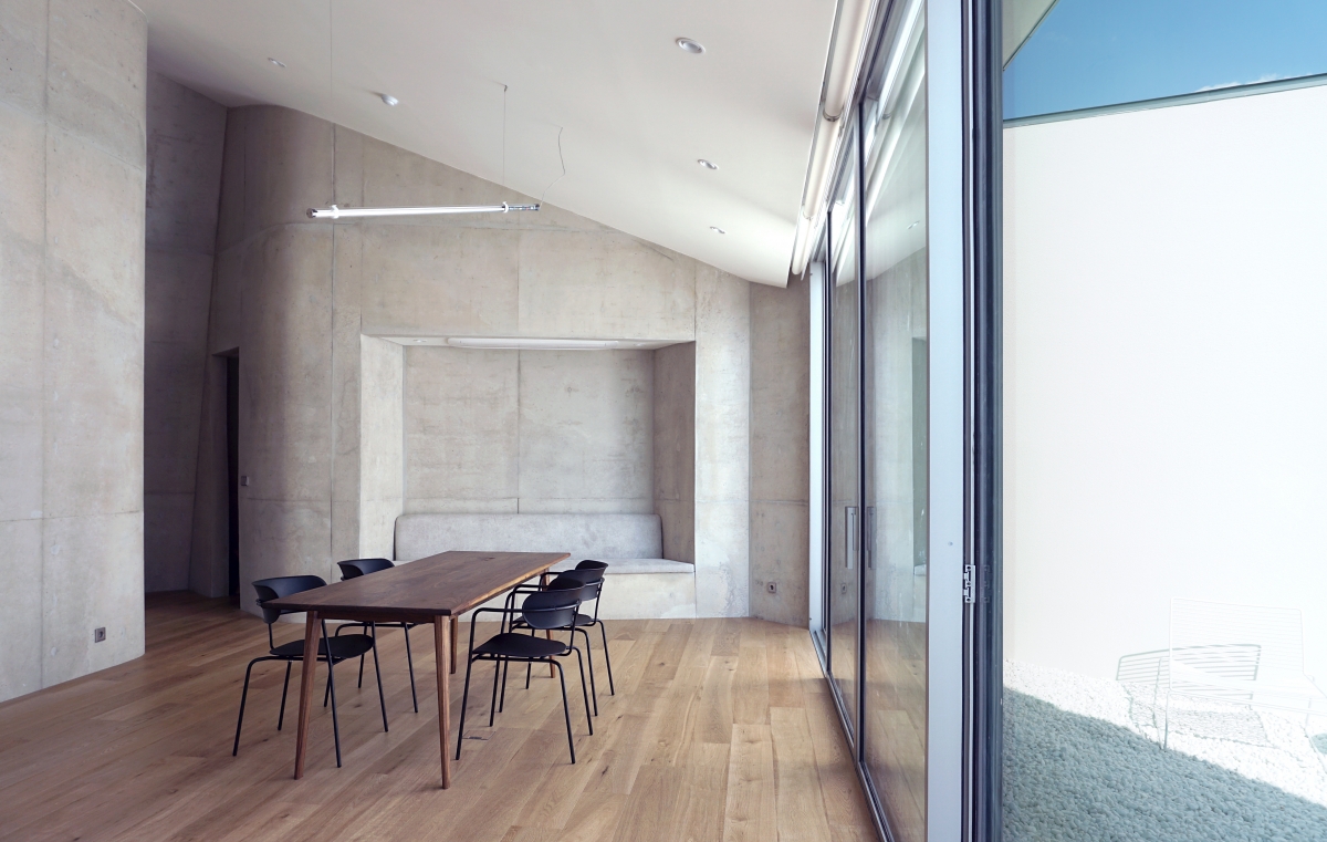

The 5th floor living room is surrounded by three curved walls. The spaces in between the walls offer pathways to other spaces.
Let's return to Quad. Truth be told, this incredibly rational and inevitable product was triggered by the architect's sense of arbitrariness. In other words, it has become the product of the architect's desire to express one's colour and contemplation when trying to create difference. The processed marks on stone, the peculiar angles of the corners on the pentagonal site, the virtual volume governed by local laws, and the geometric system provided by AutoCAD are all elements that dissolve necessity into the architect's creative desire or notional arbitrariness. A problem remains, however; even though we live in an era in which necessity can be shown to be arbitrary, we still try to diffuse this arbitrariness into an apparent necessity. While Moneo says that western architecture clings to necessity because of the prevailing desire of architects to conceive of architecture as a positive science, it is questionable whether we have such an overriding desire. Additionally, it is questionable whether we here observe form in the context of what Moneo describes as a formative freedom.3 In lieu, our necessity, unlike western architecture's obsession with positive science, is the product of paranoia concerning what is natural. In much the same way that we seek beauty in our temples and for hanok to be in harmony with nature, we also pursue natural forms that seemingly evade the invisible hand of laws and profit, considering them beautiful in a time when the force of nature has been replaced by architecture laws and market principles.
3. 달항아리를 형상화한 김석철의 밀라노 엑스포 한국관이나, 황소 뿔을 단 문훈의 ‘락있수다’ 펜션 등의 사례가 있지만, 과연 이들을 한국적 맥락에서 ‘형태의 자율성’의 결과물로 볼 수 있는지는 의문이다.
-
1. 'offset': The function on AutoCAD of drawing a lateral line of a certain length.
2. 'fillet': The function on AutoCAD to round out corners.
3. Although cases exist, such as Kim Seok Cheol's Milan Expo Korea Pavilion (which resembles a moon jar) and Moon Hoon's 'Rock It Suda' (which features bull horns), it is doubtful whether they can be recognised as products of formative freedom in the Korean context.


