The Anonymous Image of a Ruin
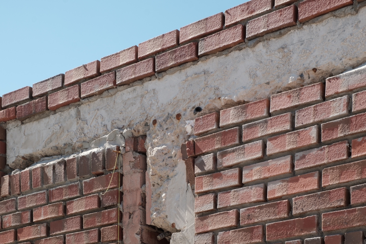
A chemical plant built in the 1970s has undergone renovation and is now reborn as a cultural complex, the Seongsu Yeonbang. However, the factory renovation is now all too familiar. We have seen many examples of old buildings transformed into multi-cultural art spaces with the traces of time held in the hands of architects and artists - such as B39 of Bucheon Art Bunker, which was originally a garbage incinerator, and Cosmo 40, which was a chemical factory. - even if this phenomenon does not return to the trend of putting the ruins on stage as observed on the art scene of the 2000s. This landscape of ruins, beyond the realm of art, can be seen to have much in common with commercial spaces, and even in new buildings and interiors, which have been deliberately processed and consumed. This is an age in which the anonymous image of ruins that the paint barely obscures, permeated with the damp smell of old concrete and rough, rugged interior materials.
The Seongsu Yeonbang also may have had a good chance of a more obvious solution, given the task of renovating the 50-year-old building used as a factory into a profitable rental building. There are already many dramatic examples in Seongsu-dong, which have turned into ‘Instagram hot spots’, as factories and warehouses undergo expensive renovation projects. Therefore, what kind of attitude did FHHH Freinds (hereinafter FHHH), who designed the Seongsu Yeonbang with Daelim warehouse, in the first generation of these renovations, hope to achieve in the neighbouring block?
‘Renovation is making buildings, which we don’t know how long it will last, stronger and let them hold out for a longer time. I didn't want to renovate this building, dating from 1974, in an anonymous manner, so that it wouldn’t matter whether anyone changed it in the future, or that it would risk dying right after our modifications’, explained, Han Seungjae (co-principal, FHHH). While the purpose and value of regeneration pursued in the renovation of existing buildings may vary, if renovated into a public-run cultural facility, it is likely that the identity will not be easily compromised because it intends to preserve and display parts of architecture with historical value from the outset and return them to citizens. However, in rental-profitable commercial buildings, the preservation of the spatial elements and temporal value of existing buildings cannot be guaranteed a future according to the circumstances of the owner. Thus, FHHH focuses on architectural elements that will not change over time, regardless of their owner and use. This is attention to the proportion of structural safety, frame design and the proportion of the building.
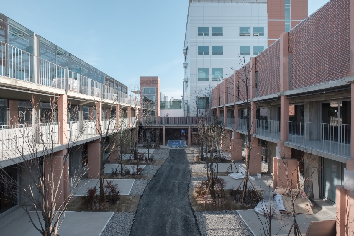
FHHH said it has a good sense of height and horizontal stability in the existing building. It is because if the height is too high, the feeling of being surrounded can be turned into coercion in the space. Thus, while maintaining the large proportion of the two buildings and the middle between them as much as possible, they emphasized the horizontality of the buildings with handrails and bridges. The balcony, which initially protruded about 60cm, expanded to 1.4m, adding a bridge between the two blocks to create the traffic line. They intended to ‘extend horizontal elements and columns outside the building so that the design of each store does not destroy the building's overall proportion’. In particular, they adjusted the thickness of the slab to 220mm, which is usually more than 350mm, which is easy to design and construct, because ‘when the shape of the column looked already heavy and heavy to the slab, the neutral would look too uncomfortable’. They then considered the building's proportions, embedding the railings on slabs and minimising the sealing thickness, while thinking about what ‘such small dimensions did to the overall impression of the building’.
Meanwhile, FHHH, who was not wholly convinced of the structural performance of buildings built in the 1970s, assumed the structural performance of existing buildings to a minimum and improved their earthquake resistance. They reinforced the structure following the structural design that was carried out after the structural review. They added shear walls and beams and secured the building's bearing power of the soil by inserting micro files to a depth of 19m below ground.
A Silent Roar
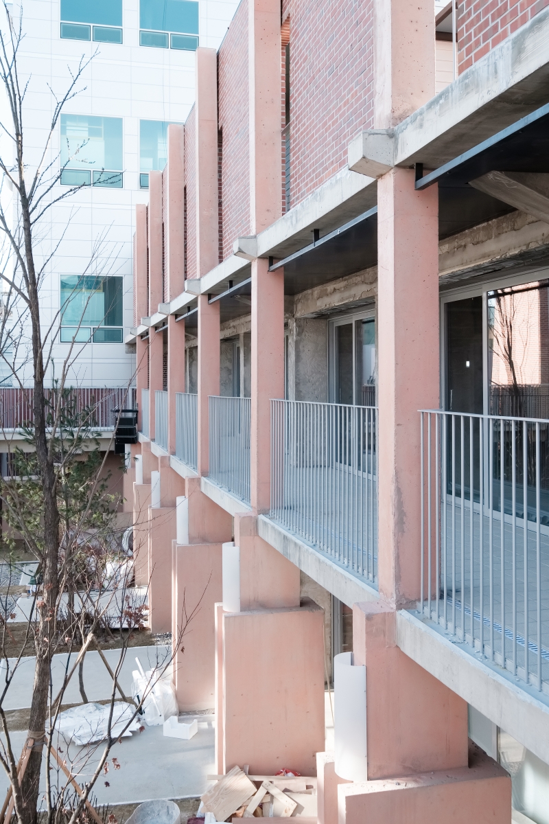
A remarkable aspect is that the framework was designed alongside programme of structural reinforcement, which is a good way to regenerate the proportions of existing buildings. When one enters Sungsu Yeonbang, the most noticeable thing is not the red bricks that make up the façade, but the pink vertical columns. Anyone with an insight into architecture will soon notice that these pillars are not just structural but also formative elements. The columns support the balcony and serve to reinforce the existing structure, while at the same time playing a formative role with the architect's intentions. In response, Han Seungjae said, ‘I designed it by imagining sculptures, such as the Soviet-era Monument, where optimism for the future and economic prosperity were swept away. Without using European Form, I made it as if I were to make a sculpture using ordinary plywood and moulds’. He also speaks of an episode related to the columns: ‘The pillars of Yeonhui Central Church are carved. Passing through this building many times, I imagined what the architect of that time might have thought when designing this building. It’s a bold expression of an ambition to change the world. Now the church has changed, but the pillar remains. I've also often heard people around the church tell stories about the building, which is probably because of the carved pillars. It's kind of like a memory device’. The building was designed by Kim Incheol (Principal, Archium) and was built in 1984.
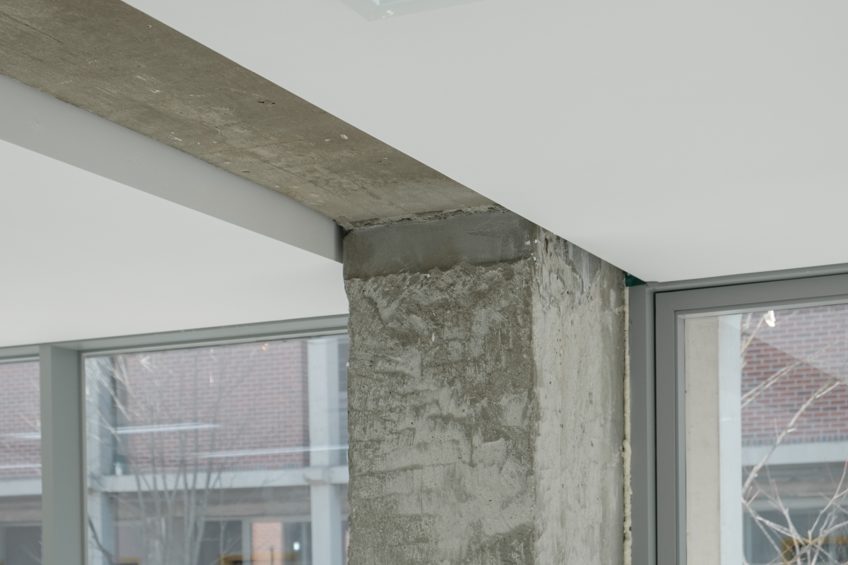
FHHH believes that the ‘formativeness’ of the frame is also a device that protects the identity of a building in a commercial space, one that changes its appearance easily and quickly. They designed the pillar to reflects the atmosphere of the era in which the building was built. Rather than producing a modern design, the new pillar was designed to get thinner from the base to the top, just like the Empire State Building in New York, so that it contrasted with the existing pillar at the back. Also, stain, not high-quality colour concrete, is applied to reveal the flow of time. In answer to a question, ‘Do you have any reference or borrowed images in designing the building?’, Han showed us a picture of a building built in Unni-dong, Jongno-gu, in 1971 and noted, ‘Look at the façade of the building. People can remember the building and fully imagine what it was, even if many signs are running on the top, owners changing and uses change’.
A little more attention is given to the formative columns in the Seongsu Yeonbang, and one can see that the columns of operation and the columns of Building Ga and Na have different shapes. The height, width, protruding or inserted parts of the base are all slightly different. Han explained that he wanted to give the feeling of ‘a silent roar’ in the column design. Amid the growing voices of signs and interiors in today's commercial buildings, FHHH sought to reveal the heavy, portentous and unique voices of architecture that stand behind them in these the columns.
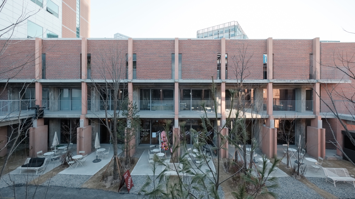
Elevation view of the building Ga.
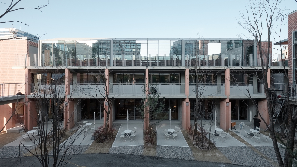
Elevation view of the building Na.
Architecture Dealing with Uncertainty
FHHH, who participated in the planning phase, are said to have come in and named it the ‘Seongsu Yeonbang’, imagining a place where factories and shops are dynamic, just like a Federation(yeonbang), where various countries coexist and are united as one. While they were designing Seongsu Yeonbang, they imagined a medieval painting in which dancers, blacksmiths, butchers and drinkers all gathered in one place, not an outlet in modern civilized society that shares beauty and ugliness, reveals only good things, and tries to hide the bad things. However, due to the practical constraints of commercial architecture, the initial plan of filling the Seongsu Yeonbang with small factories could not be realised, and they focused on the unchangeable physical properties of the architecture: structural safety, frame design and the proportions of the buildings. Indeed, if one looks around the Seongsu Yeonbang, into every nook and cranny, it is surprising that one cannot find the architect's touch except for the three. The rest of the interior except the first and second floors of Building Ga are different from each other, and there is a mix of consistently untidy features such as hallway flooring and management rooms. As they stated, an essential architectural vocabulary that prevents a changing identity is taken in its strictest terms but there is still ample room for numerous changes in commercial architecture for rental. In the interior guidelines provided to clients by FHHH, one of the design concepts is ‘the separate design of buildings and interiors’, which, together with the designation of ‘parts not allowed modification’. It noted that ‘parts of the structure and slab will not be changed to encourage the unified design of the entire building’ and ‘materials that meet the non-changeable parts and interior construction parts are divided’. ‘In the case of Seongsu Yeonbang, we wanted to give a specific image to the act of architecture itself, which leaves room. We wanted to reveal an anachronistic character that is oriented toward authority but has no authority, just like a sculpture that used to symbolise power laid to waste or signs hanging over a carefully constructed old building. We focused on the properties of those buildings that do not change over time. Unlike buildings whose identity changes after being swept away by commercial facilities, this approach intends to prevent commercial facilities and buildings from being mixed like water and oil. I didn't think architecture that left room for us should not be the one that gives its body away to commercial facilities’, Han asserted.
As such, the Seongsu Yeonbang has refused to become an anonymous building that could change its identity anytime, and that doesn’t know what it is, as with some renovated factory projects, depending on the image of its old and shabby ruins. Even if time went by and the owner and usage changed, the building used its inherent power to prevent the building's unique atmosphere and memory from being damaged. By reinforcing the structure, reviving the proportion of buildingw and courtyardw through elevation design, and transplanting new columns with elements of sculpture, the memory and atmosphere of the past have been reproduced again. By leaving room for other elements to run by the autonomy of clients and users, architecture is set as a backdrop for people with vastly different lives, the past and present, good and bad.
The completion of Seongsu Yeonbang will probably not be January 2019 but January 2029. This is because the architect designed it by imagining what would be ten years from now. We don't know what kind of wishes they threw at the future, so here we consider Seongsu Yeonbang in a decade, as drawn by FHHH: ;I hope the middle world is full of big trees like Chernobyl,.. I hope people in the middle wear bikinis and sunbathing… ‘I hope users will be free to use the building and shine more on it.’
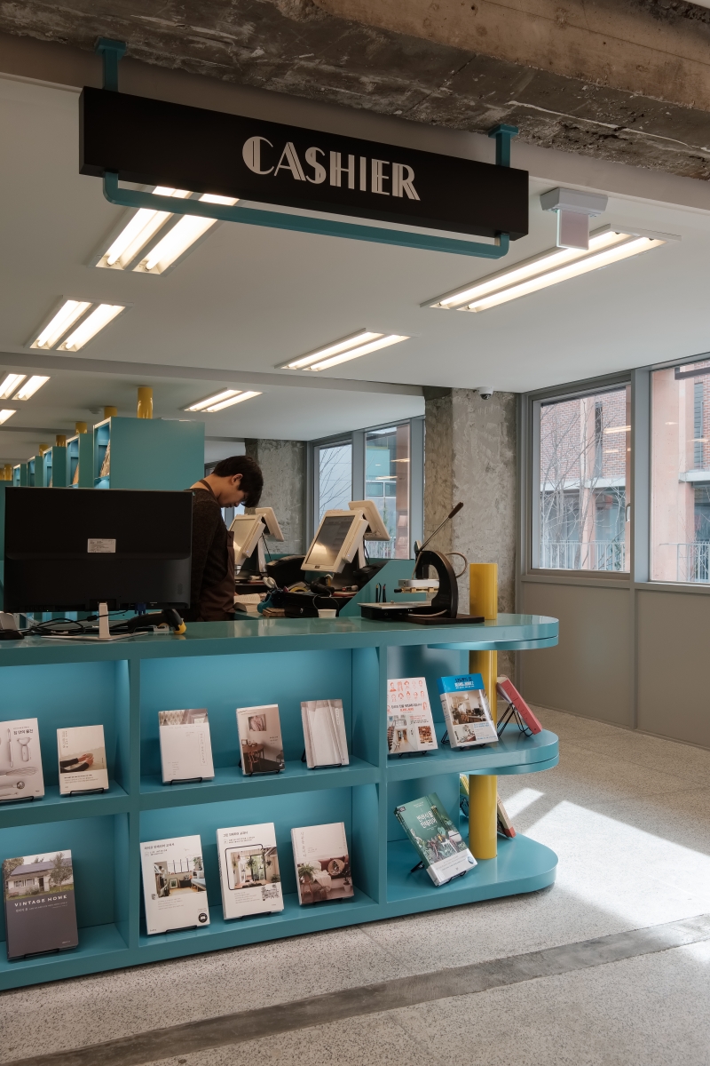
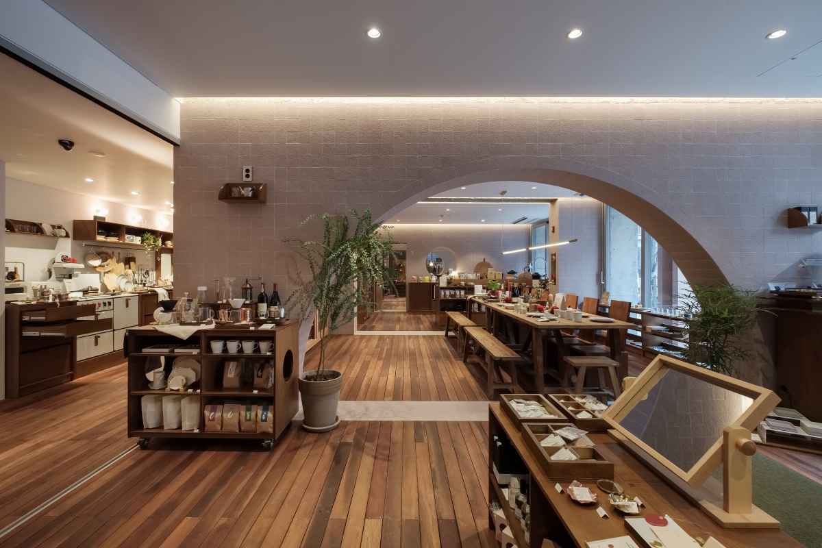
The interior of the building Ga's first and second floors was worked by FHHH.
FHHH Freinds
598


