[Essay] Fragments that are Present and also Realistic
written by
Seo Seungmo (principal, Samuso Hyojadong)
photographed by
Chin Hyosook (unless otherwise indicated)
materials provided by
Samuso Hyojadong
Out of the Blue, Being Without Context
The efforts undertaken by countries to retain their particular interests or design features, while also conforming to a global architecture that has adopted an increasingly standardised aesthetic, do not seem to have the same influence in Korea. A similar effort to preserve what is ‘ours’ is not found in Korea. Furthermore, as it has become more and more difficult to read the trends or standards that define ‘Korean architecture’, due to the confusion created by an overabundance of different design directions, it has also become too complex to evaluate each architectural design. In the countries known to be architecture powerhouses – such as England, USA, Germany, France, Switzerland, Japan, pr certain countries in the Southeast Asia – there are unique standards for evaluating architecture. These standards lead to their own unique indigenous urban landscapes that are distinct from that of other countries.
It is said that architecture is a western product, that it is contemporary, or that ‘there is no architecture in Korea’. Some claim that architecture should be differentiated from the construction of a building, and that an idea, concept, and thought process should be embodied in the field of architecture. While there are many ongoing discussions regarding architecture in a country that invests a great deal in construction, such as Korea, it is also common to see how baffling it is to the public when asked, what is ‘Korean architecture?’ They often avoid the conversation altogether. Of course, I think that there exists a certain distinguishable Korean architectural tenor, but as Korea went through its short but intense period of economic growth, the clue to modernising the traditional language of Korean architecture became either so distorted or blurred that it was difficult for it to be conceptualised. The Korea of the past was Choson, and the many structures of the high-growth era were mere reprints and copies of western architecture. Practical contemplation on how to best utilise the buildings, or efforts to create a uniquely Korean urban image, were also lackluster. The language to explain architecture was also superficial at best, and they were often disconnected from historical and social contexts. As such, there were many buildings – which may have looked shiny from the outside but lacked inner national identities – that were built successfully but were soon abandoned. The reference works detailed in the books that were used in architecture classes were also not local examples but foreign ones.
The reason why I chose to stay in Seochon is because it is a town in which the architecture of the Choson era, the era of colonial rule and the high-growth era following liberation coexists. Also, I wanted to use this as a reference to discover the hidden potentiality or the architectural property that is uniquely Korean. When observing the changes in the land, the streets, and the alleys, one can not only learn more of the era-specific situation and the rationale behind the changes that they had undergone, but also come to freely imagine how ‘it would be better if they were done in this way in the future’. Therefore, this area creates a different atmosphere than that of the new cities such as Gangnam, Bundang, and Ilsan. This is because the new cities not only have a different development history but also because they all look the same.
Kyungyangsik, which literally means ‘light western dish’, is a word that was coined as Japan was first introduced to western cuisine. Dishes such as omurice, hi-rice (hayashi rice), tonkatsu, napolitan spaghetti, ka-re (curry), Japanese sandwiches, and many others are now commonly recognised as from Japanese cuisine. Although they were western in origin, this food culture permeated the daily lives of the Japanese people so profoundly over a long period of time that have become what is essentially Japanese and now represent a central part of Japanese cuisine.
There is an abundant sense of ‘Koreanness’ in Seochon. It is where a mix of spatiotemporal contexts can be found – from the palace, alleys, markets, and the relics of the colonial and dictatorial eras. If there are elements here that are related to this sense of what is Korean, I’d like to develop them. This is because I believe that such small details are what can be brought together to represent what defines ‘Korean architecture’. Hence, I think that even things that seem ‘out of the blue’ or lacking in context can become ‘Koreanized’, in the same way kyungyangsik became Japanese. Perhaps this could be described metaphorically as an architecture that is created by brewing the western ingredients in a Korean soup?
The subtitles that I chose for the following text – ‘land, floor’, ‘stacked layers, plane’, ‘alley, corner’, ‘nameless things’, and ‘façade’ – are words that I specified and refined from existing architectural projects in relation to the things that I felt and came across while exploring the town. It is an attempt to discover and define the ‘Korean element’.
1. Land/Floor
The planning of an exhibition has to include the properties of a game of go and a game of janggi (Korean chess). This is because its theme must not be overly conspicuous or obvious but also be something that permeates the entire exhibition. Just as the game of go builds its cluster by laying down each individual piece, a theme must be recognisable through the activity of the rational faculty of the audience. On the other hand, the works in the exhibition must be able to reveal their positions at particular coordinates, just as the pieces in the game of janggi hold their places. In the same way as the roles of a sang, mal, and cha (various chess pieces in janggi) are all different, the works must also be able to assert themselves in their specifically assigned places.
In the 2017 Wooran exhibition ‘Sense of Rhythm’, we placed various works of traditional to contemporary art and craftwork from across the decades, on a single 16x4.5m size floor. We also added 90cm-tall lamps to the floor. According to the different heights of the lamps, the floor also had an altitude difference of up to 20cm. The audience was invited to view the artworks at different altitudes. Just as subtle differences can be created in a cross-section of a traditional Korean house due to its stylobate, main hall, threshold, windows, and dining table, a sense of rhythm could also be introduced according to the difference between the viewpoints as one admires the artworks across various eras.
The floor-finish looks like white paint at first glance, but it is actually hanji (Korean traditional paper). The hanji was cut into a fixed size and stacked at 2mm to cover the floor. The sense of volume created by the angular points formed from the four layers of hanji created semi-invisible grids on the floor across which the artworks were placed. If the lighting was used locally, the hanji floor could become a horizontal background for the objet. Like the soban (dining table in Korean traditional house), the ends of the floor corners were rolled up a little to create shadows.
The exhibition hall where the show ‘Personally’ was held established a connection between two fair-sized rectangular spaces. Perhaps because of the reception desk, the several steps, and the disorderly walls, it felt as if the exhibition was being planned in a spare space of a newly-constructed building. The exhibition works were contemporary works, hwamunseok, and related archived materials. Hwamunseok is a sedge dotjari (mat) that is decorated with patterns. Here, what we should focus on is the idea of a jari (place). Jari is on the one hand an abstract word that defines space, but it is also drawn from a specific architectural language. According to how a jari is outlined on a ground or a floor, it can be turned into a stage for dancing, or a location for parties, or an altar for religious prayers. In this way, a jari functions by defining and assigning meaning to spaces temporarily.
The exhibition title momso (personally) means to do something ‘personally’. It was hoped that the audience would be able to experience the space ‘personally’ through all senses other than sight. First, we connected the two simply separate spaces via a floor that arranged in a zigzag manner. On the floor, on which there was a regular pattern of height transitions of 10cm, the audience was invited to admire the artworks after removing their shoes. By maximising the act of ‘standing’ on an inclined floor, the perception of one’s own location and space was enhanced. It cannot but be enhanced. Because of this, the perception of one’s own location and space was stimulated. Elements, such as the floor, ground, place, are all architectural languages that describe a plane. However, it is assumed that a floor is an abstraction from the ground, and space is an abstraction from a floor. The inclined floor and space regulated in a fixed pattern is abstract, but at the same time it is also architectural as a specific floor.
The expressions ‘a house with a deep yard’ or ‘a vertical hanok (Korean traditional house)’ are quite familiar. In a previous work that involved restoring a hanok, we removed the second stylobates in the lower main hall and raised the yard to create and emphasise the horizontal relationship between the rooms. As this resulted in the removal of the element that supports the heavy roof of the hanok, the building ended up looking rather ungraceful. Admittedly, from a conceptual viewpoint, this design could be positively evaluated for its horizontal expandability and the opening up of design opportunities. However, it was regrettable that the importance of this decisive element, that defines a hanok, was overlooked. The expression ‘a house with a deep yard’ concerns the architecture of a planal axis, but I think that it is also related to what is vertical and cross-sectional. For example, in this same expression, I choose to focus more on the word ‘deep’. This is because the word ‘deep’ has the sense that makes something as flat as a yard vertical and cross-sectional. Also, I believe that this is one of the clues that will lead us to the modernisation of a traditional architectural language. Likewise, if the floor integrates with the expression ‘inclined’, it can become something flat and also cross-sectional.
In the movie Finding Forrester (2000), the protagonist Forrester starts to type on his typewriter with a young black young man opposite. While Forrester is effortlessly typing, the young man stares at the typewriter, still caught in his own thoughts. Noticing that he hasn’t typed for a number of hours, Forrester shouts at that man, asking him to ‘write’. Then he adds, ‘write your first draft with your heart, and you rewrite with your head’.
The words ‘plane’ and ‘stacked layers’ were not something that I was thinking of when working in this project. Rather, they were words that became manifest in the unconscious process of focusing on the plane and trying to draw out the Korean element. To translate Forrester’s words into architecture, I drew the blueprint with my heart, and during the re-drawing process in my head I learned that I was ‘layering up planes to stacks’. Throughout my education and teaching experience in Japan, the plane was always at the centre. After finishing the diagram and the plane map, the cross-section and the façade, the scale of space, and other details naturally came forth in sequence after the plane.
M House is a three-storey residential building located in the residential development area of Misa district, Hanam city. In its surroundings, flashy and rhetorical sculptures are prevalent. For that reason, it was thought that a house that would showcase a concise structural logic would be most appropriate for the area. As such, along the lines of the Domino theory, we thought: ‘how about stacking up three floors, and stoically exhibiting the fact that the building is three-storey high by allowing the side of the floor protrude along the façade?’ Furthermore, by deliberately composing the plane form of each floor differently, we sought to emphasise the stacked impression of the building like that of a Jenga game. Therefore, we extracted the plane form of the threshold and the vestibular from the urban hanok plane and applied them to the first floor, while orientating the three rooms of the second floor to look as if they are surrounding the inner court and facing each other with the main hall at their centre. We then mitigated the weakest point of the third floor, as the floor furthest from the ground, by orientating it towards the mountain in the distance and securing a part for the soil depth by slightly cutting off the volume of the single house.
Thus we laid three respectively different plane forms onto each mushroom slab structure on each floor. By planning the wall and the pillars via mutually-independent compositions per floor, we reduced the sense of cross-sectional intertwinement while also emphasising the planar aspect of a stacked layer.
The first project in which my thoughts on planes and stacked layers began to take shape was the J Studio House at Yeonhee-dong. The building was designed for an artist couple as a two-storey residential house with a loft. The total floor area was only approximately 20 pyeong, and it was difficult to ask for much spatial flexibility such as a transitional space after the addition of a room, two bathrooms, a main hall, a dining hall, a kitchen, and a staircase. Hence, what we came up with was to compose a space of another quality by stacking reinforced concrete construction with wooden construction. It was not a strategy widely used in interior architecture, where the tone and manner of a space is adjusted by using the transitions between finishing materials on the first and second floors; but rather, it was a structural approach. The first floor was designed with an exposed reinforced concrete construction, and the second floor was designed with mainly a lightweight timber construction with heavy timber structures applied in selected areas. The first floor was finished in white to create a space of inorganic character, while the second floor became a space of familiarity due to the warmth of the wooden materials and the detailed structural modules. The first floor section was divided by the exposed beam, the second floor section was composed of the supporting structural material for the heavy timber structure’s pillar, along with the building loft all overlapped and met each other cross-sectionally, thus bringing about a refreshing sense of spatiality despite the lack of transitional space.
The exterior material on the first floor was finished simply with chiseled concrete frames to draw out a sense of weight in the structure on the surface. On the other hand, the exterior of the second floor was finished with outside insulation stucco to express the lightness of the wooden construction atop the concrete construction. In that sense, the plane and stacked layers of the J Studio House is not a stack of plane forms, but a stack of respectively different post-lintel constructions. This is an example of where the space is divided not through different finishing materials but through a contrast created in the post-lintel construction brought about by concrete and wood.
The D House located in the residential development area of Daejeon city shares many similarities with the J Studio House, but it is special in that it involved deep contemplation of ‘how to form a relationship between the ground and the external environment’. The first floor was designed with a ㅁ-shaped court-form that opens towards the centre, while the second floor was stacked with a ㄴ-shaped plane form that is open towards the distance. Four 16-17m long beams (beam depth 800mm) created a hash shape and supported the second floor as one might hold a palanquin. Through this, the inner space and the space within the inner court became seamlessly connected to the outside without the necessity of structural pillars. This however required the eaves to be located somewhat higher than the windows so that the eaves could express themselves as an independent element that does not conform to the architectural structure. Because of this, the eaves create a subtle boundary between the interior and the exterior.
I think that pyungmyeon (plane) and jeokcheung (stacked layers) are in contrast to those commonly used western architectural terms such as façade, volume, and mass. Korea has a tradition of wooden construction, and the west has a tradition of masonry construction. Because it is common in masonry construction to lay bricks or stones to create a façade and the volume inside, aspects such as mass segmentation and façade expression are inevitably important. However, because Korean wooden composition creates inner space by connecting pillars and beams above the foundation and segments the inner and outer parts via windows, it becomes horizontal and planal by nature. This is why the inner and outer relationship is emphasised and thus the recurring issue of land allocation becomes inevitable. In this way, the plane and stacked layers become the basis for the Korean architectural vocabulary.
J Studio House. The first floor was designed with an exposed reinforced concrete construction, and the second floor was designed with mainly a lightweight timber construction.
D House. Four 16-17m long beams created a hash shape and supported the second floor as one might hold a palanquin.
3. Alley, Corner
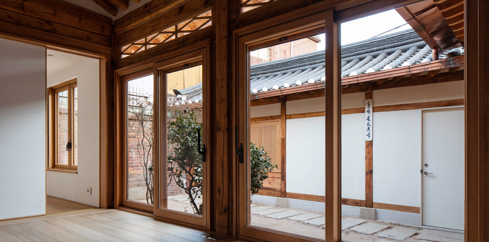
There are many alleys in Seochon. Within these labyrinthine alleys, hanok, yangok (houses of western designs), multi-household residential complexes, and neighborhood infrastructures can be found. Alleys, which have existed at least since the Choson era, were either cut off or widened throughout history from the colonial era, the high-growth era, and now. The margins were partitioned in the way a cell divides itself or combines. In this way, the contemporary moment in Seochon is a sedimentation of spatio-temporalities across different eras, revealing geographical traces quite candidly.
A tree-diagram features the image of a tree branching out. It also represents a graph that goes on continuously without repeating itself. Like a tree-dram that creates an infinite number of patterns, alleys also create an endlessly changing vanishing point. Just as one walks along these alleys, that are all similar to one another, one experiences countlessly changing perspectives, sequences, and points of decision-making. In an alley cross-section surrounded by walls on either side, or two floors – or any number equal to or below five – the pedestrian develops a sense of familiarity from the Korean-specific spatial scale. Also, the corners enhanced by the alleys are where life that was restricted within the house interior could flourish. These corners where things such as vases, bicycles, chairs, and other daily commodities are placed are the urban margins that have not been assigned to any specific function, and they offer themselves as pocket spaces for the community.
The O House is located in the corner where four alleys cross one another in a loose way. The mass that is cut at a 45 degree angle to the right and the two-storey wooden jeoksangaok (Japanese-styled house) that is cut into half form a panorama between the two alleys. They also create – via the removal of street corner – a wide corner in front of them. The two sides created by the meeting of the 45 degrees angle bring about a mild tension. Also, with consideration for the colour information of the surrounding buildings, the finish was done with a concave mosaic tiles with dimensions of 18x140mm that transitions from black to shades of dark red.
The first floor was composed of an external space in the corner, an entrance, a bathroom a bathtub, and a laundry room; the second floor was composed of three rooms; the third floor was fitted with a main hall with a high ceiling and a dining room, kitchen, and a bathroom, and the fourth room was designed to hold a study room. As in the previous work ‘S House’, each floor is connected via the same staircase that resembles an alley street. An improvement made from that the previous work was, like the alley street that is composed out of a unity of irregular edges and corners, the staircase was designed to make twists and turns at every two or three steps to segment the corners.
If one goes past the entrance and goes down three steps from the first floor, one will discover a secret space with a bathtub. With the stairs leading to the second floor at the centre, the stairs that lead to the third floor are located at the corner across the living room door to the right. By going up two steps to the left, there are two rooms. There is a corner space behind the wall that is cut at a gentle slope of 45 degrees in the last room, and here the paper-panel door of the room walked past, the living room windows, and the windows at the entrance where the sunlight shines through come to meet. This ambiguous space functions as an intermediary between the outside air, the three rooms, and the entrance. Upon climbing the winding stairs that are connected towards the upper body, one encounters a small bathroom, a kitchen, and eventually the main hall by going up two more steps. By traversing the loosely wide empty space and by going up the staircase of unique details, one can find the study room supported by a wooden structure. The width of the hanok corridor that I’m living in is 600mm, and the staircase width of S House is 750mm. However, upon using this 750mm-wide staircase, I couldn’t help but feel that it was rather narrow. Hence, I designed the staircase width for the O House to be 800mm. The 450mm height and 1350x1350mm square measurements of the windows were based on previous projects and experiences. Architectural words such as unspecific, ambiguous, ambivalent, and abstract are all concrete measurements based on previous projects. It is presumed that it would be possible to plan an actual space that can be unspecific, ambiguous, and ambivalent as one becomes increasingly familiar with measurements. Like the gentle gradient of the edges of the alley streets, the number and positioning of the staircase that is made up of multiple small steps function cross-sectionally or sequentially as corners between space, and they provide a sense of leisure on this rigorously detailed plane. A sense of leisure that is found in planal alley streets could thereby also be located in small cross-sectional changes: that is, sometimes from the stairs, and sometimes from a simple place where one could sit down and rest.
O House. Like the gentle gradient of the edges of the alley streets, the number and positioning of the staircase that is made up of multiple small steps function crosssectionally or sequentially as corners between space.
4. Nameless Things
When walking the alleyways of Seochon, I am greeted by elements that evoke a sense of comfort. Some of these things are the roof of a hanok, the window guard of various shapes, bricks, mixed materials, or overly decorated gates. These are things that are not categorised under architectural templates, but nonetheless are things that have form and create a peculiar sense of familiarity. I call things such as these, that can’t be defined and yet exist as familiar and common to all of us, the ‘nameless things’. One hopes that they function as a specific architectural nomenclature that interacts with existing things (and their calculated materials and measurements) and abstract frames.
The first thought that came to mind while performing the renovation work on J hanok at Chebu-dong was the idea ‘to emphasise the proportion of the wooden structure that are supporting the elegant hanok roof’. At the same time, I wanted to minimise leaving my architectural fingerprints as much as possible so that it would turn out to be a pristine and natural space.
As the pillar and the beam of a hanok are organised together systematically, the beams with their different heights cannot but become connected to the pillar at the centre in the wooden composition of a hanok. By touching up the edge of the pillar manually, to make it rounded, it brings out a peculiar kind of style. The scene of how a slightly blunt material creates a contrast, while supporting the eaves of the hanok, evokes a certain Korean ‘flavour’.
Between the wooden structure, we added a white wall finished with Korean system windows and terracotta. Through the unique ‘flavour’ that arises from these materials, we were able to bring about Korean proportions in the changing heights in the horizontal and vertical placements. While doing this, we also combined the door and the windows of the house entrance, and added it as part of the structure. For the insect screen, that becomes an issue when incorporating system windows, we developed a beige-colour insect screen using the fabric for blind curtains for its easy maintenance. The door was placed a little towards the streets to create more leisure space as one enters the house from the alley. This, however, is different from the kind of doors that have been internalized in the urban hanok of today. While it is often the case that the interior of the gate becomes a storage area to put various things, this way of sharing half of its space with the alley allows it to function as a leisure space both inside and outside the house.
We decided to retain the original vegetation in the yard landscape. We chose to lay rectangular stones at the front yard to overcome the possibility (and a possible weakness of the front yard) of the lowered house appearing as flattened. We lowered the height of the boiler room to keep it between the side of the main house and the wall, so as not to disrupt the overall ambience of the hanok. Also, we turned a part of the extended lower stylobate of the toenmaru (wooden veranda porch) into a area with a tap.
We decided to hide the outdoor air conditioner unit and the electricity metre gauge – things that often become an issue in alleys where multiple hanok are gathered – within the wall. We designed them as part of the wall in order to preserve the tranquil atmosphere of the alley. Thus, J hanok became one of the nameless hanok that form the backdrop to the alleyway.
When walking along old cities such as New York or London, one can see how a collection of buildings come to reveal the features and templates of various eras. Seochon, as a town that had existed since the Choson era, is also a mixture of various era-specific features. The building of M Guesthouse was an uncanny combination of two buildings that went beyond the building-to-land ratio of current regulations. Hence, there was a need to heavily renovate the building to meet the legal requirements. We chose to keep the two-storey masonry exterior – one which can be found often in buildings built in the 1970s – and took out a part of the interior’s non-bearing wall. We planned the building owner’s residence on the first floor, four guestrooms for foreigners on the second floor, and a workroom, laundry room, and linen room for maintenance of the guestrooms on the basement floor.
Originally a tofu manufacturing factory, the basement and the first floors had been repurposed as small guestrooms while the second floor had been redesigned as a residence for a shaman. The space was dark, humid, and unpleasant. However, the spatial framework that was enmeshed between the entrance, the basement and first floor was interesting. As one enters through the entrance gate, one would find the semi-basement floor if one was to go down half a floor, and one would arrive at the first floor if one was to make a right and go up half a floor. The planal and cross-sectional lines might not have been arranged in the best manner, but the sense of space was splendid. The combination of the design aspects that were added atop of what was needed by the user was enough to stimulate a professional with inspiration. Perhaps, this kind of spatiality might have been difficult to bring about if this was a new construction. With the cross-section of this space as the background, we started out by contemplating the framework of the space. First, to let light into the dark first floor, we cut open the floor of the second floor. This led to the expansion of the visual cross-section across the basement, first floor, and the second floor, which allowed the first floor to function as a well of light. There were two awkward-looking doors at the front. One was for the users of the basement and first floor, and the other was for the user of the second floor. We kept the staircase leading to the second floor, and installed a sliding door at the entrance to connect the two doors.
In terms of the building’s exterior, we did not fix the opening area. We preserved the two doors that were skewed to one side, but made slight changes such as replacing them with wooden doors finished with paint and adjusting one of them to be in an angle. Also, we produced new window guards with a pattern similar to Louis Vuitton and added them onto the windows. Probably the people living in the vicinity would still feel a sense of familiarity with the newly-renovated building due to its preserved exterior. However, in terms of its interior, the original spatial framework has been amplified and the entire space has been expanded to create a completely new space. Perhaps, when looking at the M Guesthouse, the attitude of Samuso Hyojadong may seem rather ambivalent (paradoxical), as we added significant changes in the interior while barely touching the façade. However, because the interior spatial framework would not be renovated to this extent if it weren’t for the potential of the original space, it may also be said that it was an attempt at a kind of an anonymous design – i.e., to carry on the original design that was based on need.
The subtitle of this chapter is ‘nameless things’. The design elements that inspired me as I was walking through Seochon unconsciously permeated this project. This is also why I preserve elements that give me visual inspiration via snapshots. I look forward to a newly developed Korean architectural language by examining these ambiguous, pedestrian, familiar, and ambivalent things.
J Hanok Renovation. The architect was able to bring about Korean proportions in the changing heights in the horizontal and vertical placements.
M Guest House. In terms of the building’s exterior, the architect was not fix the opening area. The people living in the vicinity would still feel a sense of familiarity with the newly-renovated building due to its preserved exterior.
5. Façades of the Streets and Alleyways
A street is a pathway that is deliberately created to feed through an urban framework under an ideological background. In contrast, an alley is a pathway created simply out of need. In Europe, we can see how the façade responds differently according to the types of streets in each city. Because the architectural structures by the streets were built in connection to the key buildings under a certain country-specific template or code, they come together to create a distinct image of the city. However, the façade in an alley is different. Rather than following a fixed template or code, the façade is composed freely to fit whatever is required, and therefore brings about a relatively more liberal façade composition.
In fact, because most of the projects at Samuso Hyojadong were located along the complex urban context of the alley roads, there was no need to contemplate the façade to any exceptional degree. However, as we conducted the renovation works for Theory, Hyundai Card Music Library, and Boan Inn, we came to question our own sense of what a façade is.
Frankly, we think that a façade does not hold much significance in Korean architecture, which developed from wooden construction by tradition. Because there is the tradition of masonry construction in western architecture, units of materials are stacked to create an edifice. Because the opening is created with such a masonry space as its background, an intimate relationship with the façade in terms of composition and material is thereby formed. However, in the space of a post-lintel construction, that is formed by connecting a pillar with a beam, there is a high possibility that a façade could be recognised simply as part of a decorative design. As such, the façade does not have much of a relationship to an essential traditional architecture – that is, things related to structure, material, and function. For this reason, most projects of Samuso Hyojadong were focused mainly on the plane and created architectural volumes via the stacking of such planes.
Theory is located by Itaewon-ro, which is a four-lane, two-directional road. Although Itaewon-ro does not have deep historical significance, however, one can easily perceive the buildings’ façades from the opposite pedestrian path because of their width. The plot site used to be the music cultural space of iRiver, and so had a façade that represented the company’s image. With Theory moving in, however, it became our task to design a façade that would correspond to Theory. Therefore, we contemplated ‘how to reflect the commercial image of Theory in a highly commercialised street while remaining close to the essence of architecture’.
The Theory store was placed on the first basement floor and the lobby, the iRiver recording studio and listening space occupy the second and third floors, and a café was installed on the fourth floor. The shared space and external space of the lobby and the façade were the tasks assigned for Samuso Hyojadong, while the inner interior was to be done by the main headquarters of Theory.
It is common in façade renovation work to create a commercial image by removing the original finishing materials and replacing them with a new finishing materials over the original structure. Instead of following this common practice, we decided to approach this structurally. The original building was reigned back by 3m from the limiting line of the structure, which gave the impression that it took a step back when compared to adjacent buildings. It was a decisive flaw in terms of creating publicity. There was a need to address this and make an earthquake-resistant design based on current legal regulations.
We conceived of a ㄷ-shaped wall that wraps the front and the two sides. As a ㄷ-shaped structural wall with its independent foundation, it wraps the original structure from the outside and acts as an earthquake-resistant factor. Using the original wall as the inside mold and creating a new mold-frame for the outside, we placed walls of 200mm in thickness on each floor. Also, by designing the walls to protrude out in increments of 50mm per floor in a stepwise manner, we removed the joint that arises on each floor. Thus, the wall on the first floor became 200mm thick, and by increments of 50mm per level, it went up to 400mm of thickness for the wall on the fifth floor. The shadows created by these steps are thought of as new lines.
While the façade looks quite simple on the surface, there were many complicated ways of realising this during construction. Most importantly, there was a need to connect the reinforcing steel of the original rahmen structure and that of the new structure via anchoring in order to unify the structure as one. Also, because of the possibility of damaging the inner interior due to the water produced from depositing concrete, there was a need to do waterproofing work on the original wall surfaces. For structural resolution, the pillars and the beams were not waterproofed. Also, to absorb the lateral force created from the depositing of concrete, we used a mesh in part to prevent the aggregate from striking the wall surfaces directly when vibrating.
On the other hand, we added a 9m-long vertical wall in order to support the increasing weight of the wall as it progressed upwards. The black wall not only divides the main entrance and the show windows, but because of its protrusion to the limit line of structure, it offsets the impression that the building has retreated a step backwards. Also, by supporting the exposed concrete wall in a perpendicular manner, it further emphasises the structural aspect of this building. We also removed the right corner pillar next to the show window to make the building look monolithic and yet light-weight.
The clothing from Theory is known for its simplistic structural aesthetics and elegant lines. The structural aesthetics created by the black wall and the exposed concrete wall surface, along with the elegant lines created by the 50mm height differences between the steps, relate somehow to the philosophy of Theory. While the difficulty of the construction does not become manifest on the façade, we think that it asserts itself, in the same way the lining of high-quality clothing makes a statement.
Theory Façade Design. The structural aesthetics created by the black wall and the exposed concrete wall surface, along with the elegant lines created by the 50mm height differences between the steps, relate somehow to the philosophy of Theory.
Many say that making Korean food requires a good sense of ‘flavour’. While it may be right to some extent, it is also true that taste cannot be reproduced in an orderly way without a recipe. I think this also applies in architecture. A book on architecture planning is a recipe to create an order of taste. As mentioned above, while the attitudes and the beginnings of each project might have been different, they are mostly explainable with quantifiable measurements in terms of structure, planal form, and material. They are things that can be reproduced in order. When a reproduced taste or vocabulary develops its own unique property, it becomes the distinct personality of the artist. It is still yet too early to say that the projects introduced above are the uniquely distinct properties of Samuso Hyojadong. However, we believe that these words such as floor, stacked layers, alley, corner, and others that were deduced during the process of uncovering what is ‘Korean’ can become a specific medium to express the ‘Korean’ element. In that sense, they are different from how one simply refers to the madang (yard) as the classic example of what that is ‘Korean’.
I prefer books that showcase the implementation of specific measurements rather than sketches, and I place greater weight on the feel of the actual site than on concepts. This is because such books help me to imagine the details of the architecture in a very specific way, while sites allow me to read subtle four-dimensional information, such as light and shadows, temperature, wind, and anticipated user patterns.
Therefore, the architecture of Samuso Hyojadong is present and realistic. It is also hoped that such present and realistic things can be expressed as kind of an extreme abstraction, and that this abstraction would connect us to what that is ‘Korean’. This is different from the western architectural process, which is about the manifestation of an abstract concept. This is why the architecture of Samuso Hyojadong is more functional than conceptual, and why it is more inclined towards craft than design. To put it in other words, our architecture is better explained as a ‘room’ than a ‘space’. This is because we base ourselves on the pre-architectural elements of Korean life and land at our fundamental premise.
Seo Seungmo was born in Kyoto in 1971, obstained his Master's degree of Fine Art from Tokyo University of the Arts School of Architecture after his studies at Kyungwon University. He worked as a part-time lecturer at the college for two years, and then started working as an independent architectur in Seoul in 2004. He renamed his practice Samuso Hyojadong in 2010 and has carried out a wide variety of projects including houses, hotels and offices.