Lee Sungje (Lee): Please tell us the physical conditions of the Lasipalatsi and the nearby square, and their original uses before the project.
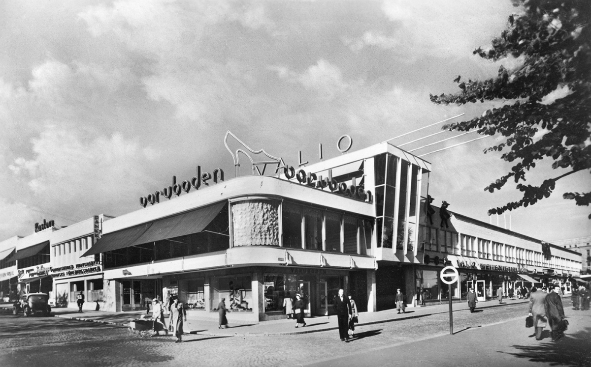
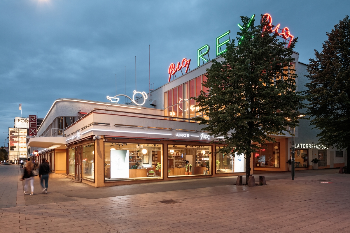
JKMM Architects (JKMM): Lasipalatsi is a Functionalist building dating from 1936 and designed by three young Finnish architects, Viljo Revell, Heino Riihimäki and Niilo Kokko. Interestingly, Lasipalatsi was intended as a temporary building. It was originally conceived as a mixed-use, multipurpose pavilion-type facility with a restaurant, shops and a cinema for the 1940 Olympic Games in Helsinki (postponed to 1952). Lasipalatsi was nonetheless built in an efficient and lasting way and, both technically and architecturally, it is very much a building ahead of its time. Its readily visible neon lights and large windows, with their impressive sun blinds, also attest to this.
Moreover, the Lasipalatsi Square played a significant role in the modern plan. Since the capital of Finland still lacked a proper bus-station in the mid-1930s, Kokko, Rewell, Riihimäki added platforms to their design. In the middle of the square stands the chimney: a clock tower and landmark, as well as a heating centre and electricity substation. After the removal of the busstation, Lasipalatsi Square became an open space for various events and beer gardens of a temporary nature. The previous renovation was completed in 1999 by Talli architects, and its objective was to reinstate the original spirit of Lasipalatsi. As a new function, the media centre was at this point introduced to the building. At the start of the JKMM restoration project Lasipalatsi had weathered many changes, and the overall architectural clarity had suffered. Due to its continued active use, the building was somewhat tired and had started to lose its functionalist shine.
Lee: Carrying out a project that links the past and the present building; how did you approach the restoration and what was the most challenging task in the project?
JKMM: The main task faced by the restoration project was trying reinforce and revisit the glory of Lasipalatsi – so we were striving for the plain beauty of 1930ЁЏs architecture while also enabling it to be part of the new ventures offered by the 21st century museum. The methods for bringing back the original qualities of the building were, for example, relying upon professional conservators and reconstruction techniques. The existing building and even the existing replicas of the previous refurbishment have been preserved wherever possible. In the new interventions, we have sought to reach the same standards of craftsmanship as was achieved in the 1930s. In terms of the process, there have also been lots of practical considerations concerning building technology and building regulations. We had to strike a balance between how current requirements can be adapted sensitively to a 1930s context. This was, in fact, one the most challenging aspects of the project which demanded a lot of negotiation.
Lee: Lasipalatsi has also been registered as the significant exemples of Modernism in Finland by DOCOMOMO. Did the City of Helsinki or DOCOMOMO provide you with any guidelines or regulations to follow when you carried out the restoration of this building?
JKMM: DOCOMOMOЁЏs register has been of particular importance, since in the City Plan Lasipalatsi was only listed in 2015. The listing applies to both the exterior and the interior of the building and includes a chimney piece in Lasipalatsi Square. The Helsinki City Planning gave us clear guidelines for the overall design and The Helsinki City Museum became a key collaborator during this process. The plans were regularly presented and commented upon by the authorities, from the start to the finish of the project. Moreover, many details were carefully examined on site. We also drew a lot of information from the buildingЁЏs historical archive. Photographs from different periods proved immensely useful, as did the maintenance logs outlining repairs which we have up-dated by documenting our own work, for the benefit of the next round of alterations.

©Aarne Pietinen

Lee: The new museum seems unique, in that it can be approached via the entrance of the existing building (Bio Rex Cinema). Tell me why you chose this approach even though it could undermine the characteristics of the existing building? I also wonder whether it caused any difficulties during the construction process?
JKMM: The nature of the Lasipalatsi Square as an open area surrounded on all sides by historically valuable buildings, such as the Lasipalatsi and a neo-classical barracks dating from the nineteenth-century, influenced the entrance solution for the new museum. We wanted to preserve the openness of the square. As a result, the new main entrance, as well as all fire exits and ventilation channels, were directed through the Lasipalatsi and the old chimney in the centre of the square. At the same time, by entering the museum through the existing building we highlighted and integrated the modernist building with the new museum compound.
Through these interventions, the protected Bio Rex Cinema entrance, the façades, windows, doors and interior surfaces are now restored with respect to their original 1930s features, while the new entrance lobby on the ground floor has been created by combining three former commercial spaces. To connect the new underground museum to the existing building required thorough planning, careful excavation work, as well as the support of existing bearing structures and foundations during the construction process.
Lee: The new museum below the square draws daylight down into the exhibition space and offers a view of the surroundings through skylights. What aspects did you consider when you decided upon the number, location, and orientation of the skylights?
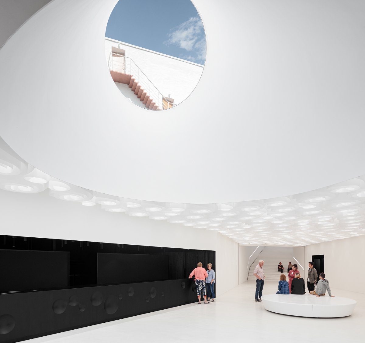
JKMM: The skylights and the connections these entail, between the urban life on the square and museum galleries below, are a central part of our architectural concept. We wanted to create a dialogue between the art scene and city life. The skylights and the way they are orientated frame carefully selected views of the Lasipalatsi. These views are glimpses of landmarks that help the visitor orientate themselves inside the building; through the views you can recognise where you are underground. At the same time the skylights draw natural light into the exhibition spaces. The exhibition galleries form a continuous spatial sequence covered by three domes of different heights and sizes. There is one skylight in each of the domed spaces, each facing different directions. The skylight of the first domed space frames the old chimney in the centre of the square – an important and well-known landmark. Two of the skylights are located in the underground main lobby. The main lobby is the antithesis of an underground space; it is a light, totally white space, receiving natural light from the skylights. From one of the main lobby skylights we can see the functionalist exterior staircase, which is still in use today, leading to the Bio Rex Cinema machinery room. The staircase exemplifies the functionalist character of the Lasipalatsi.
Lee: The project created an artificial terrain within the square. While it provided an enjoyable urban park for citizens, the square, on the other hand, cannot be used in the same way as before due to the structure. In other words, the artificial terrain replaced the square. What was your intended aim for this space when you
designed it?
JKMM: The new Amos Rex urban landscape provides a platform for a wide range of new activities, happenings and leisurely time, while simultaneously preserving the old uses of the square. Prior to the Amos Rex, the square held terraces for the restaurants and cafés of the Lasipalatsi, and it was not really used for any other activities. Today, the restaurants and cafés still have their terraces, but, in addition, people can freely spend their day in this area and use the new hillscape in numerous ways. The landscape hills can be used as a meeting point, for picnics, for open-air concerts or even art exhibitions. Children can climb or play on this landscape, while teenagers can skate or cycle.
Lee: The domed exhibition room of the museum is different from the conventional ЁЎwhite cubeЁЏ of the modern gallery. The space itself makes a strong impression. What kind of exhibition space did you intend to create?
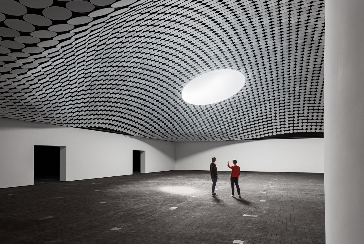
JKMM: Contemporary art needs big and flexible spaces, without any bearing structures that might block the exhibiting of an art work. There seems to be no limit to the size, shape, colour and technical sophistication of contemporary art forms. We wanted to create flexible spaces that respond to these unforeseen future trends and complex needs of the art world. The domed structure is a natural and even ancient way of covering large spaces. The main exhibition galleries are composed of three domed spaces. This continuous flowing space can be used flexibly and according to the needs of the exhibitions, be divided into smaller spaces as required through a system of partition walls and connection points integrated into the floor structure. The colours and the division of the spaces can be manifold, as the opening exhibition by the Japanese art collective Teamlab has proven.
Lee: The finishing methods for interior and exterior of the domed structure are impressive. The exterior is finished with round and clover-shaped tiles, while the interior ceiling is filled with round panels. Which elements were taken into consideration during the process of determining the finishing method, such as the patterning?
JKMM: The shape and pattern of the exterior tiles was carefully designed with respect to the concave and convex shapes of the landscaped hills. We studied the shapes and the patterns both in 3D-computer models and in real scale models. The detailing of the tiles, their assembly, and their mortar joints were tested using 1:1 maquettes. The interior roof panels of the exhibition spaces were dimensioned and designed in order to create a continuous flowing surface. The perforated panels function as acoustic panels and at the same time they hide a network of technical installations, such as lighting tracks and sprinklers. The panels are covered with a tactile white textile hood, which can be removed if the exhibition required a different coloured roof surface. Textiles were also used in the interior ceiling of the main lobby. There, the entire ceiling is covered by over 300 vertically suspended textile shades in the shape of spirals. Each textile spiral conceals a lighting fixture, the light quality and intensity of which is computer programmable and adjustable.


