SPACE March 2024 (No. 676)
A practice that takes into account the action that will take place in a space and adjusting every unseen corner accordingly: this is the path that LimTaeHee Design Studio (principal, Lim Taehee) has taken for the past 15 years. The spaces they design are oriented towards the user, before catching the eye with distinctive visual elements. SPACE spoke to Lim Taehee from LimTaeHee Design Studio, who has long focused on designing for the user from the perspective that the essence of a space is in the desire to stay, about the values she tries to realise through her designs, ranging from spaces to furniture.
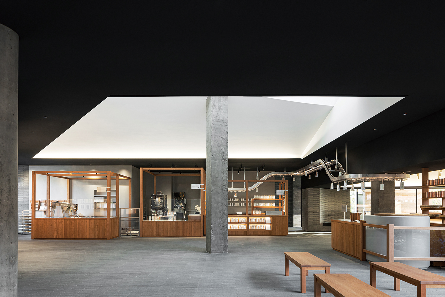
Osulloc Tea Museum Roastery Zone (2023)
Interview Lim Taehee principal, LimTaeHee Design Studio × Kim Jia
Kim Jia (Kim): You majored in interior design and architecture, and since 2007 you have been working on diverse spatial design projects. I heard that you did your undergraduate studies in Korea and moved to Japan to study.
Lim Taehee (Lim): My undergraduate degree was in interior design. After graduating, my first job was at an architectural design office, which was an unusual step at the time. There were cases of architecture graduates working in interior design companies, but the architecture industry requires different skills and qualifications. During the two years I worked there, my interest in space expanded into architecture, and I went abroad to study. I had always thought that I wanted to work on projects that can link architecture and interior space together, so I developed this interest and wrote my doctoral thesis in 2006 on the preservation and reuse of modern architecture. I felt that the task of regenerating existing space was in a middle ground between architecture and interior design.
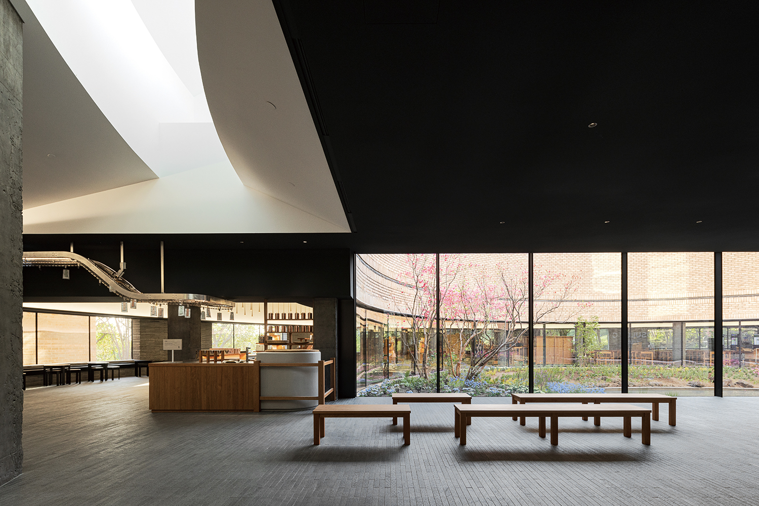
Osulloc Tea Museum Roastery Zone (2023)
Kim: In the early to mid—2000s, the discussion of regeneration architecture in Korea was not as active as it is now. In Japan, you studied in the historic city of Kyoto, which I’m sure had an influence.
Lim: Kyoto is a city where historic buildings continue to shape the landscape to this day, and while I was studying there, I became interested in the modern period above all other epochs. The modern period in the East was not one of natural progression like in the West, but rather a clash and mixture of different cultures. So, what to leave behind and how to change what remains became significant topics for us. In Japan, the discussion about the preservation and reuse of architecture began earlier than in Korea, so I was able to develop a perspective of my own on it during my studies.
Kim: Since your return to Korea, you have opened an office for your own practice, working mainly on interior design projects. Interior design is often considered to have a shorter lifespan than architecture. In an interview, you said that you ‘want to create interior design that will endure’–what efforts are you making to achieve this?
Lim: It is still a prevailing attitude to think of interior design as decoration. Since it is also an attribute of design, it cannot be denied. However, from the early project, we have tended to avoid designing something pretentious. Instead, we have worked on projects that delicately refine the space, taking into account the activities that will take place within the architecture. This perspective may not be as evident in the work we’re doing now, as there are more commercial projects including F&B, but when we’re working on residential spaces, which are essentially meant to be inhabited, or office spaces, we’ve particularly focused on designing for time and action.
Kim: Such a perspective is expressed in Sangha Farm (2016). You designed the interiors of ten spaces with different purposes, including a café, a restaurant, a greenhouse, and staff offices. Which aspect did you focus on?
Lim: Sangha Farm is a project in which the installation artist Kim Beom was in charge of the overall concept and planning, and we collaborated on the design of interior spaces. The concept of Sangha Farm is ‘design that is not designed’. We wanted it to be a sustainable space that didn’t put itself on display but fully fulfilled its function. It was a very different direction from the guiding trend in interior design at the time, but as different spaces that were concentrated in Seoul began to appear in other cities one by one, the designs were mainly focused on creating Seoul-like spaces. We thought that Gochang should have something that could only be experienced in Gochang. Sangha Farm is a rural-type theme park where people can experience the processes behind how various foods get from the farm to the table. It was therefore essential to show visitors the act of production and manufacturing in the workshop, ranch, and kitchen. As the visitors were actually visiting the places where the staff were at work at the farm, it was important that there was no mixing of the circulations between the visitors and staff. Other than that, some other key considerations included where staff should take off their shoes and put on hygiene boots when entering the workshops, where the bread should be kneaded, where the aroma should be experienced when the bread is baked, and what finishes should be used to make users and visitors feel comfortable. We designed it as if we were directing a play, imagining how individual characters would behave.
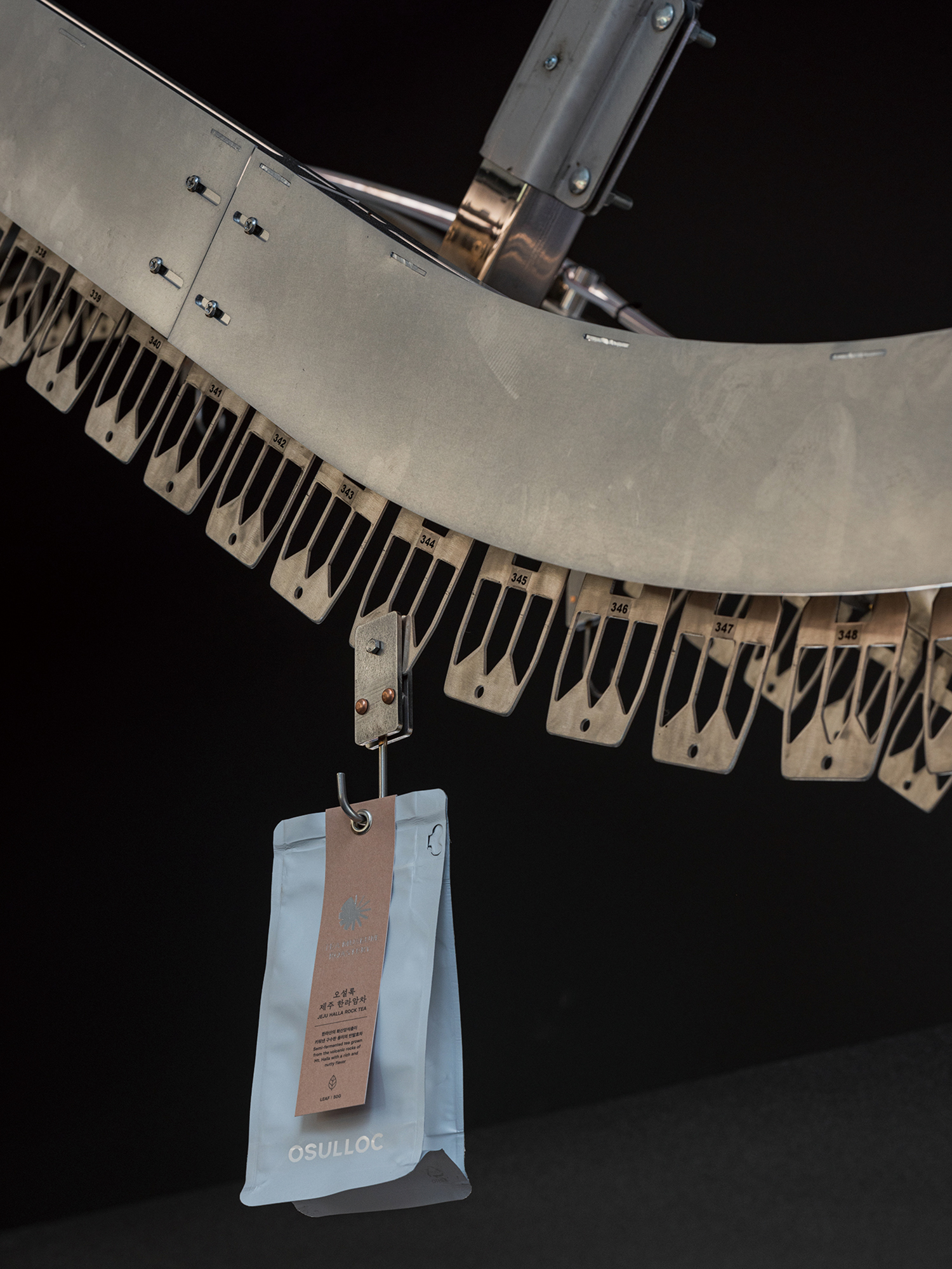
In the Osulloc Tea Museum Roastery Zone, a conveyor belt transports automatically the hand-roasted tea to the sales counters.
Kim: Recently, you were put in charge of the interior design for Osulloc Tea Museum Roastery Zone (2023, hereinafter Roastery Zone). The Roastery Zone is a space within the Tea Museum complex where tea is roasted, packaged, tasted, and sold.
Lim: In the renovation project for Osulloc Tea Museum (refer to pp. 76 – 79), we were responsible for designing an area that is part of the institution. Most of all, Osulloc wanted to be able to explain the brand through this space. Of course, the entire Osulloc Tea Museum reflects this intention, but it was requested that the story of the brand be told in a different way from the way it was explained in the museum exhibitions, which was located next to the café before the renovation. In other words, the Roastery Zone was planned as a space that would visually reveal the brand’s identity. Osulloc, which has long been a significant part of Korea’s tea culture, is a company that grows tea in a tea field on Jeju Island, roasts it, and manufactures it to creates its range of products. So, we wanted to emphasise the brand’s aspect as a ‘maker’ by placing it next to Seogwang Tea Garden.
Kim: I heard that, before the renovation, the Roastery Zone was hidden away in a corner.
Lim: The Roastery Zone located within the Tea Museum has been expanded. There are several stages of roasting, cooling, sorting, transporting, packaging, tasting, and selling tea. In this project, we wanted to break down this complex series of processes. We divided the area into roasting, sorting, packaging, selling and tasting, as if we were building four houses in a city called Tea Museum. However, the process needs to be continuous, so we introduced conveyor belts to connect them visually and physically. Similar to Sangha Farm, it is a space that shows how production and manufacturing is done, and this can be seen as a project that deals with it more delicately by zooming in. In today’s consumer activities, the process of how products are made is often left out and most people think that machines do the work. However, humans are still involved in the process. We wanted to express the meaning of human labour through space rather than words.
Kim: You designed not only the space but also the furniture and tools yourself.
Lim: The Roastery Zone is not just a space to be shown, it is literally a production site, in other words, a small factory. As such, it was important to design tools that would support the actions that take place there. The conveyor belt is part of that. We designed the belt so that the hand-roasted tea can automatically transported to the sales counters. We also built trays to reduce unnecessary labour in the process of picking up, moving, cleaning, and putting away the cups that customers have used for tasting. When customers place their cups in the tray’s compartments after tasting, the tray can be moved to clean them in batches. On top of this, we built a modular trolley that operates semi-automatically. Products can be loaded onto customised trays in the packaging area, transported on the trolley to the sales area and then displayed immediately. In this way, the design was carefully considered from the point of view of the staff who spend most of their time in the space. Meanwhile, we wanted to create a consistency in appearance by matching the wood found in the furniture to the other furniture in the Tea Museum.
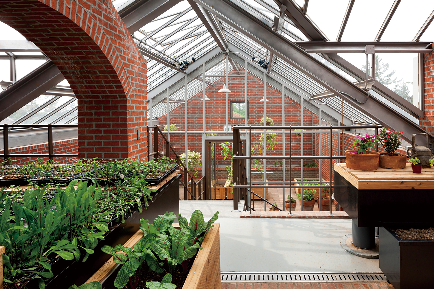
Greenhouse at Sangha Farm (2016) ©Park Youngchae
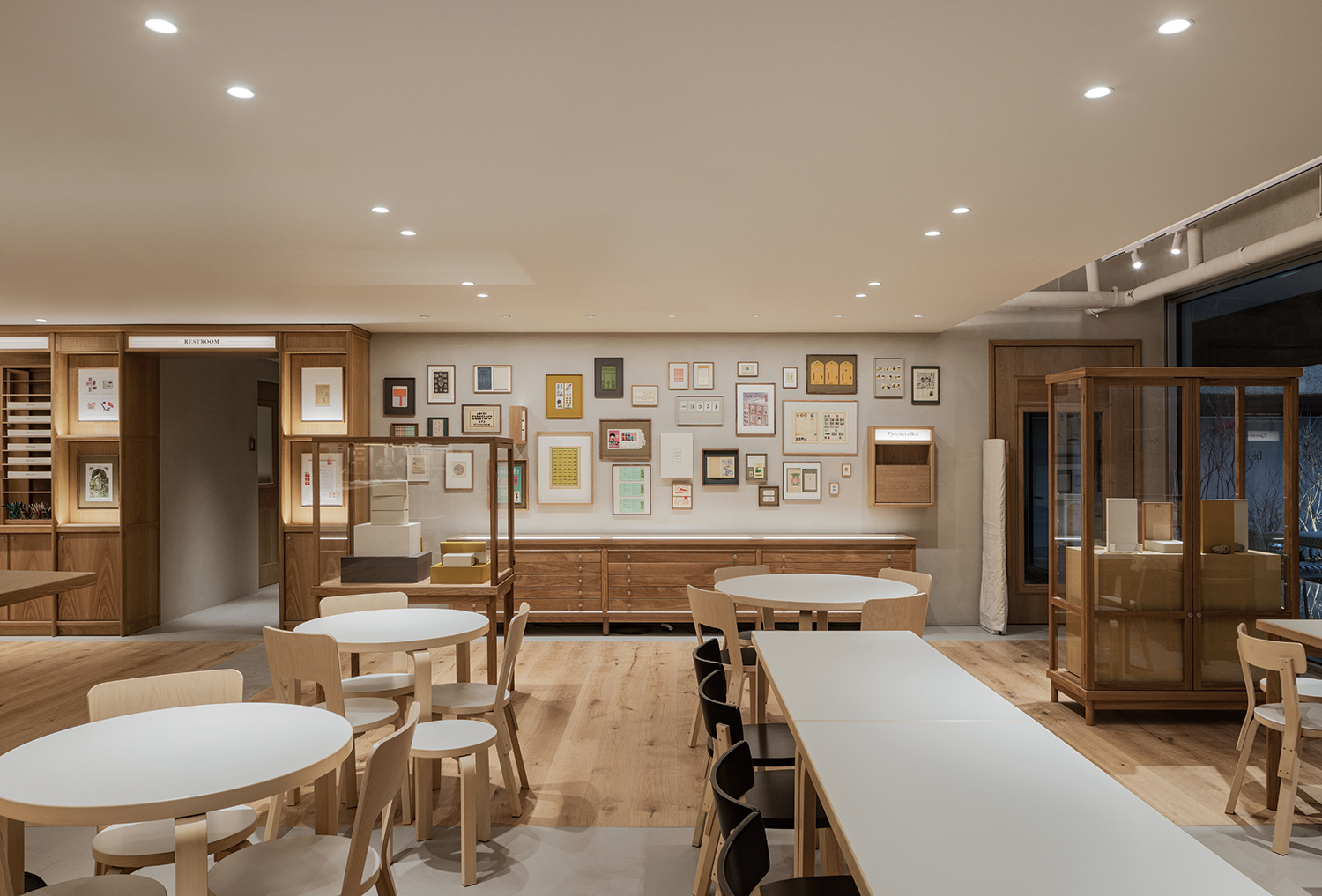
Cafe Ephemera (2022)
Kim: Other than Roastery Zone, you have worked on many other projects in collaboration with architects, including LCDC Seoul’s Cafe Ephemera (2022), Onyang Folk Museum’s Cafe Onyang (2022), and Hotel Namu (2018, covered in SPACE No. 651). At what point do you usually begin your engagement and how would you describe your collaborative process?
Lim: It depends on the context and the purpose of the project, so it’s hard to say at what stage it’s best to begin collaborating. As long as you know the architect’s working style and you trust each other, it’s beneficial to collaborate as early as possible. The reason for collaborating in the early stages is not to dictate ‘this is what the architecture should look like because this is what the interior looks like,’ but rather to have time to understand the architecture in depth. Hotel Namu designed by Jeong Jaeheon (professor, Kyung Hee University) and MONO architects was a project we joined after the architectural structure had been completed, and we were responsible for designing the furniture for the interior space. Instead of making major changes to the space, we completed small elements by adding them to the furniture. For example, in order to block the view of the front door when lying in bed, we made storage furniture such as a closet and a snack bar by the front door. Another small detail is that there was no space to store toiletries and a hairdryer in the bathroom, so we made a leather pocket under the sink so that it can be used as a storage unit. I think it’s our job to increase the level of completion of the space by adding things that cannot be considered separately in the architecture.
Kim: You design the furniture yourself across many of your projects. What role do you expect furniture to play in a space?
Lim: There is a different spectrum to furniture design. There are teams that only design furniture, and then there are teams that design spaces and design furniture together. I know there are also a lot of architects who design furniture. We approach furniture from a spatial perspective. It’s a bit different from designing furniture for furniture’s sake, where we consider the context within the overall space and create a piece of furniture that fulfils a specific role. The furniture at Hotel Namu is the same. It was an attempt to create a space with furniture. The furniture for THE ILMA at Hyundai Department Store Pangyo (2022) is also unique because it is difficult to make spatial changes in a department store within a given structure, so we actively used furniture to create a flexible space. Twelve intact pieces of furniture were created that can be combined and disassembled as needed. In the centre of the store, these pieces of furniture are stacked in the form of a staircase and used as a stage. As a clothing brand, the challenge is to create a new display every season, and you can’t turn the space upside down every season. We tried to design furniture that may be simple from a design perspective but is useful for the space and the users.
Kim: It seems like you’re experimenting with and practicing sustainable space in your projects.
Lim: I think it’s important for us as designers to think about what we can do—even in small ways. For the Seoul Design Festival 2022, we designed an exhibition space for three of KOLON FnC’s brands, and we managed to design all the materials used in the structure are 100% recyclable. We used metal, a material that can be melted down and reused, and chose air caps that can be recycled. The structure is made of metal pipes connected by joints, and the air caps that form the elevation are attached with magnets so that when dismantled, they can be deflated and rolled up so that they can be recycled. The furniture in the exhibition space was also requested from the brands’ collections of their own. In addition, the temporary pavilion created for YOUNHYUN Trading’s booth at the Seoul Living Design Fair 2021 was recently moved to the Onyang Folk Museum after being reused three times.
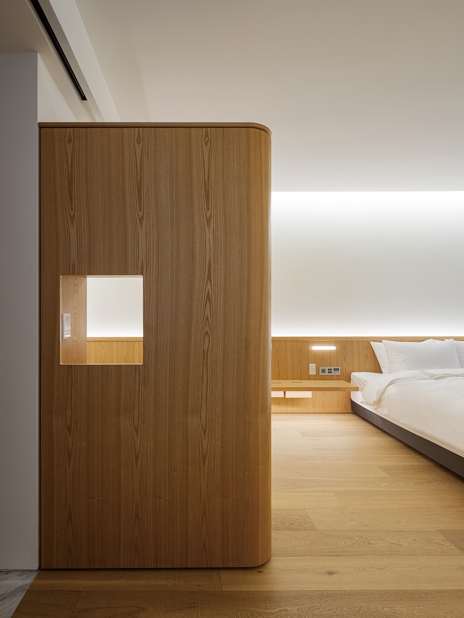
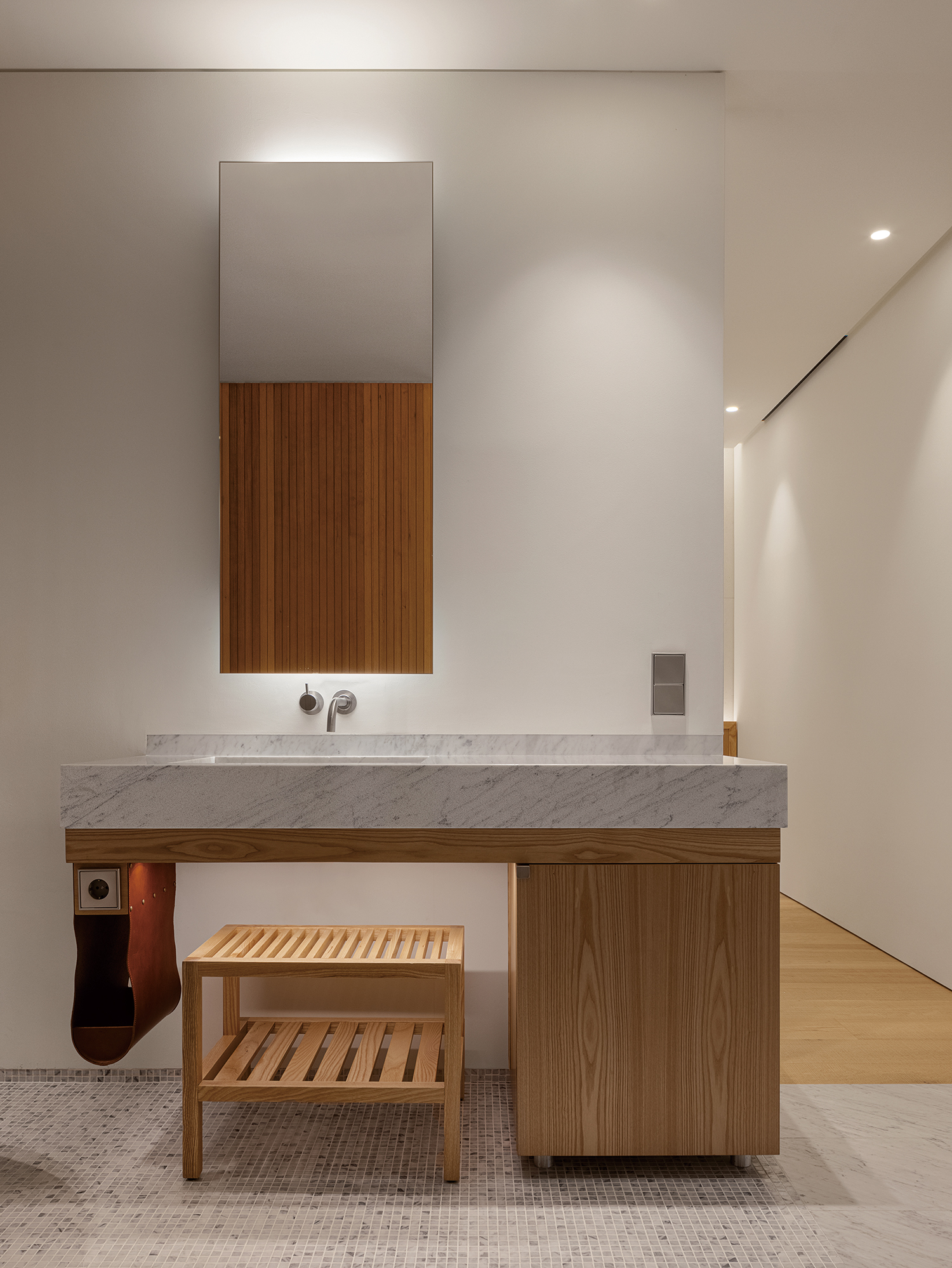
In Hotel Namu (2018), they attempted to create a space with furniture. In order to block the view of the front door when lying in bed, they made storage furniture by the front door. In the bathroom, a leather pocket under the sink can be used as a storage unit.
Kim: You have also had a steady interest in crafts. You designed the exhibition space for the Craft Trend Fair (2018, 2019), and the year before last, you directed the YÉOL × CHANEL Project ‘The aesthetics of the glitter’ (2022).
Lim: I am very interested in things made by hand. In this era where most products, from small objects to furniture, are mass-produced, I’m focusing on the value of craftsmanship. At the Craft Trend Fair 2018, we designed a showcase pavilion with the theme of everyday crafts, and the following year, we designed a pavilion for hanji. By focusing on the characteristics of each craft, we wanted to show what kind of scenery crafts create in everyday life. In a project jointly conducted by YÉOL and CHANEL, I served as the art director and participated in the overall planning and design of the exhibition space, and collaborated with craftsman Park Sooyoung to present mobile works themed on the flow and movement of nature. Crafts not only help develop discernment in a consumer society, but also are an opportunity for designers to train in the properties of materials.
Kim: You’ve been working in Korea for almost 20 years now. Have there been any marked changes to architectural culture and the space industry that you’ve noticed?
Lim: I’ve been practising ever since I came back in 2007, and I feel that architecture and space industry in Korea has generally levelled up. As the movement to enjoy space has increased, space has developed rapidly to keep up. There are more and more people who are good at what they do in terms of completeness. The more I think about it, the more I think about what I can do as myself rather than what I should do better. Even though I’ve done a lot of work in terms of quantity, I still feel like I’m in the process of development.
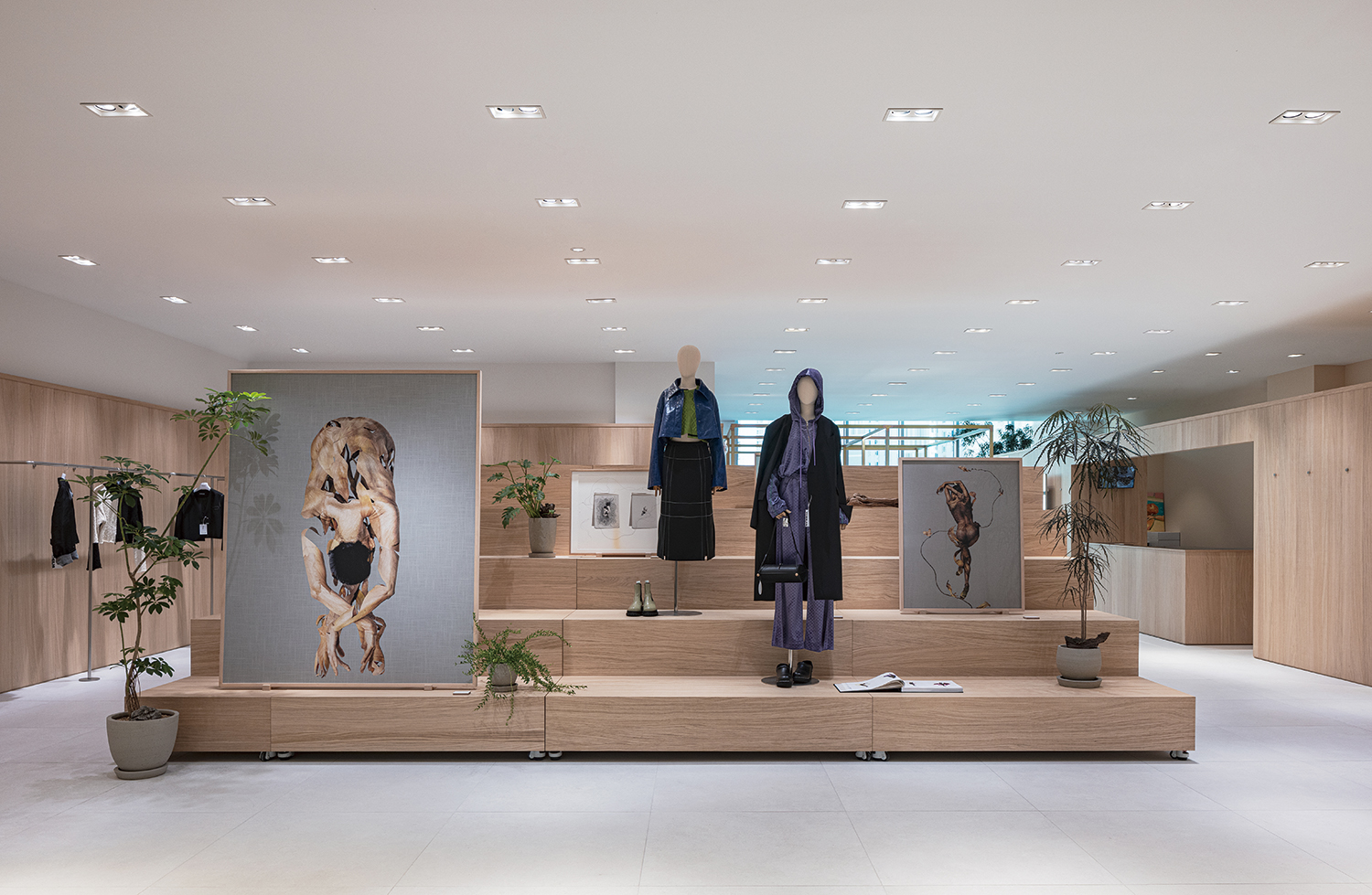
THE ILMA at Hyundai Department Store Pangyo (2022)
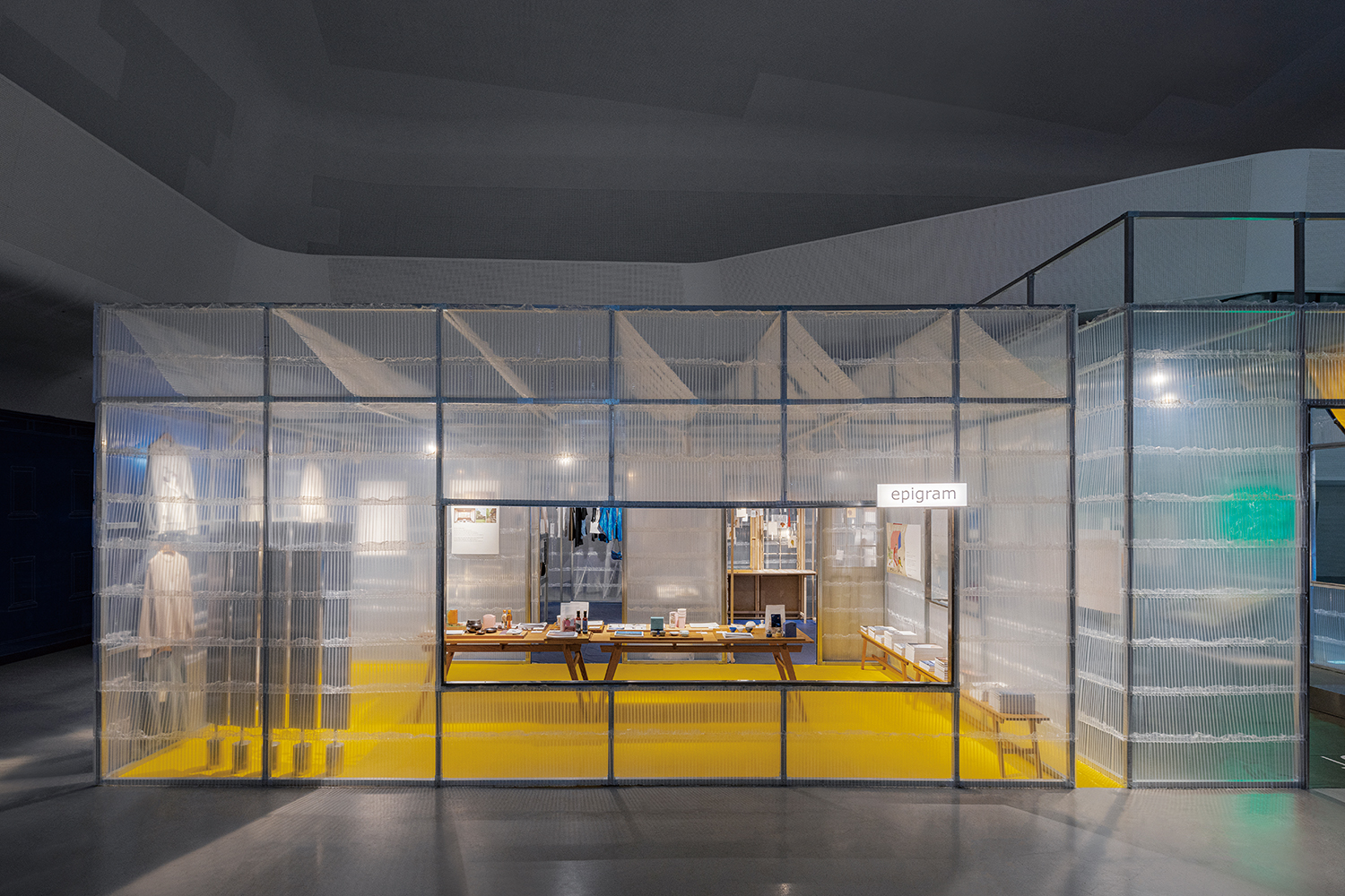
For the Seoul Design Festival 2022, they designed an exhibition space for three of KOLON FnC’s brands, and managed to design all the materials used in the structure are 100% recyclable.
Kim: Could you tell us what you would like to achieve in the future?
Lim: Freedom. For instance, when one says ‘LimTaeHee Design Studio uses wood very often’, then we are still lacking vision sand have long way to go. Instead, we want to surprise people and let them say that ‘LimTaeHee Design Studio is also capable of doing this type of project.’ These days, we are often commissioned to work on not only spatial design projects but also architectural projects. For those types of projects, we work on them as we learn. Whether it’s architecture, space, or small handles that make up the space, we try not to get stuck in a fixed frame, and as designers, we try to do things that can make users more comfortable and bring them pleasure.
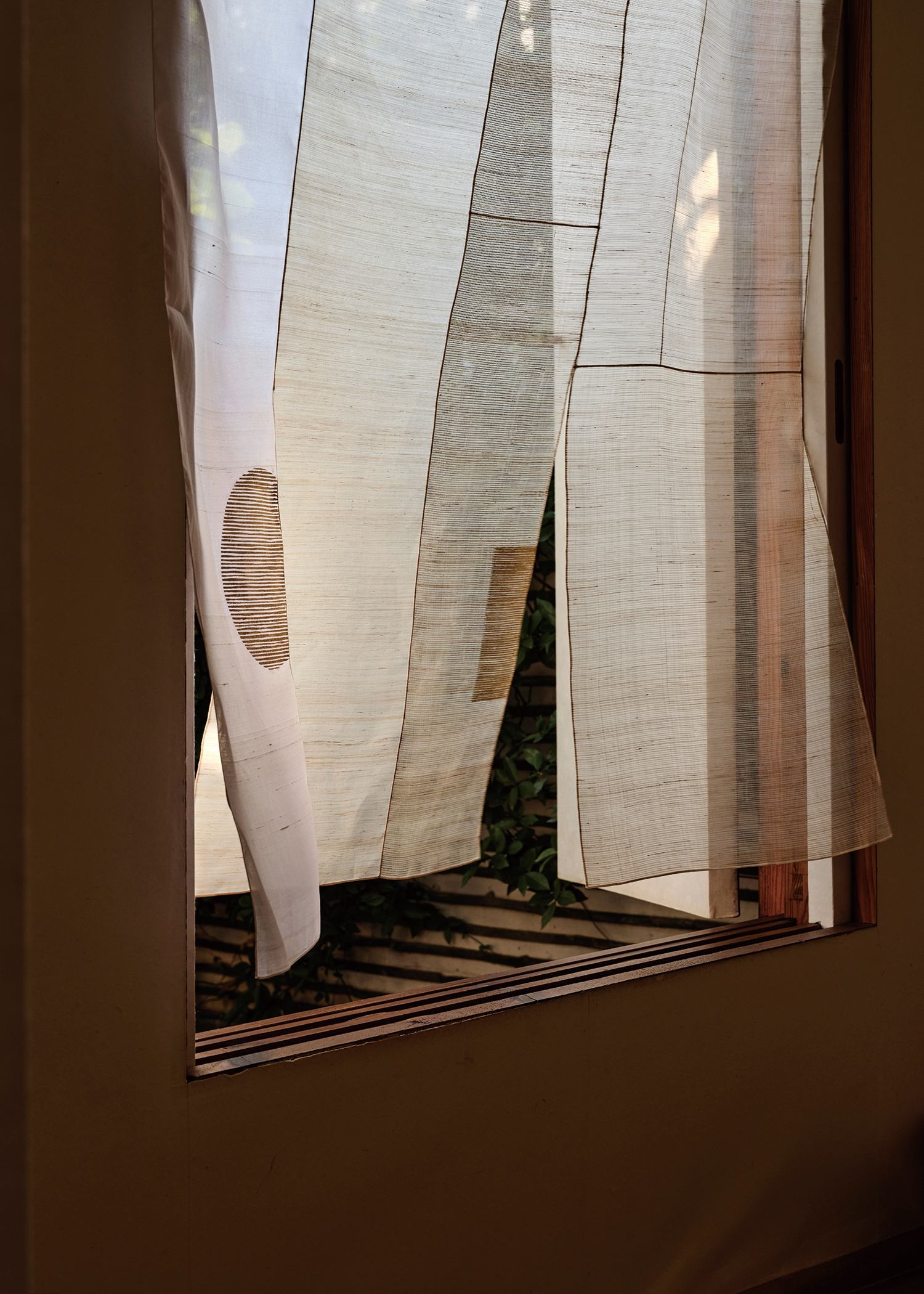
Exhibition view of ‘The aesthetics of the glitter’ (2022) ©Kim Jandee
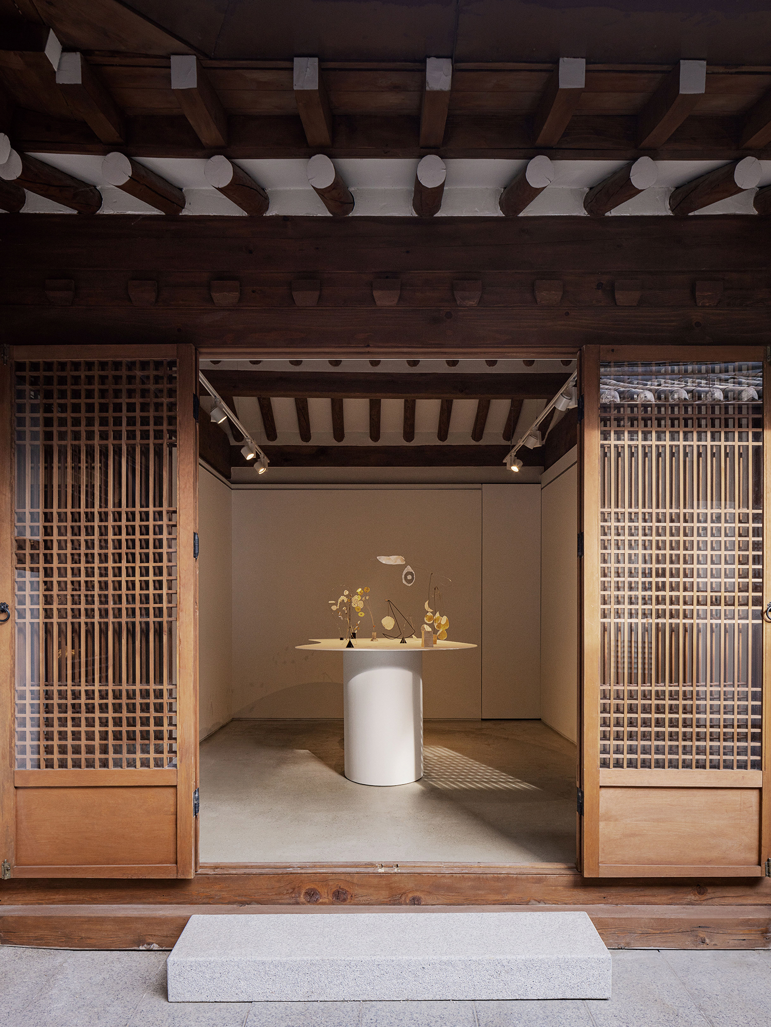
In the 2022 YÉOL × CHANEL Project, they collaborated with craftsman Park Sooyoung to present mobile works themed on the flow and movement of nature.
