SPACE October 2023 (No. 671)
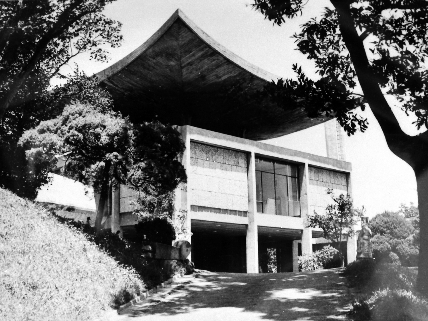
Image courtesy of Kimchungup Architecture Museum
DIALOGUE Kang Junkoo partner, Mass Studies × Yoon Taehoon principal, SATHY × Cho Minsuk principal, Mass Studies × Choi Wonjoon professor, Soongsil University
Design Competitions and Collaborative Projects
Choi Wonjoon (Choi): Kim Chung-up’s French Embassy in Korea (hereinafter French Embassy) is considered a true masterpiece in Korean modern and contemporary architecture. However, it has long been inaccessible to the public and its appearance has changed a lot over time, remaining almost non-existent and intangible. However, this new construction and renovation project provided the opportunity to partially restore the original structure and to use the spaces in a more contemporary way. I would like to hear from the two architects who led the project about their overall design process. First, I think it will be good to begin our conversation with the invited design competition held in 2015. I understand that this was not the first collaboration between MASS STUDIES and SATHY.
Cho Minsuk (Cho), Yoon Taehoon (Yoon): We had already collaborated on a design competition proposal for the Cité Universitaire, Pavillon Coréen in 2014, and then in July 2015, for the design competition for the new construction and renovation of the French Embassy was announced. We were selected as one of the five finalists after the public announcements, and participated in the next round.
Choi: How was the collaboration between the two companies?
Yoon: From the first collaboration with MASS STUDIES, we took on the mindset that it was okay if we didn’t win the competition, and so the preparation process was fun. We were a French and Korean team, but I’m Korean-French, and we were the youngest participants in the competition. A big company like Wilmotte & Associés was also invited, but we could design freely without worrying about the result.
Cho: We worked well together because we had lost (a competition) once before. A good rapport between design staff members aided easy communication.
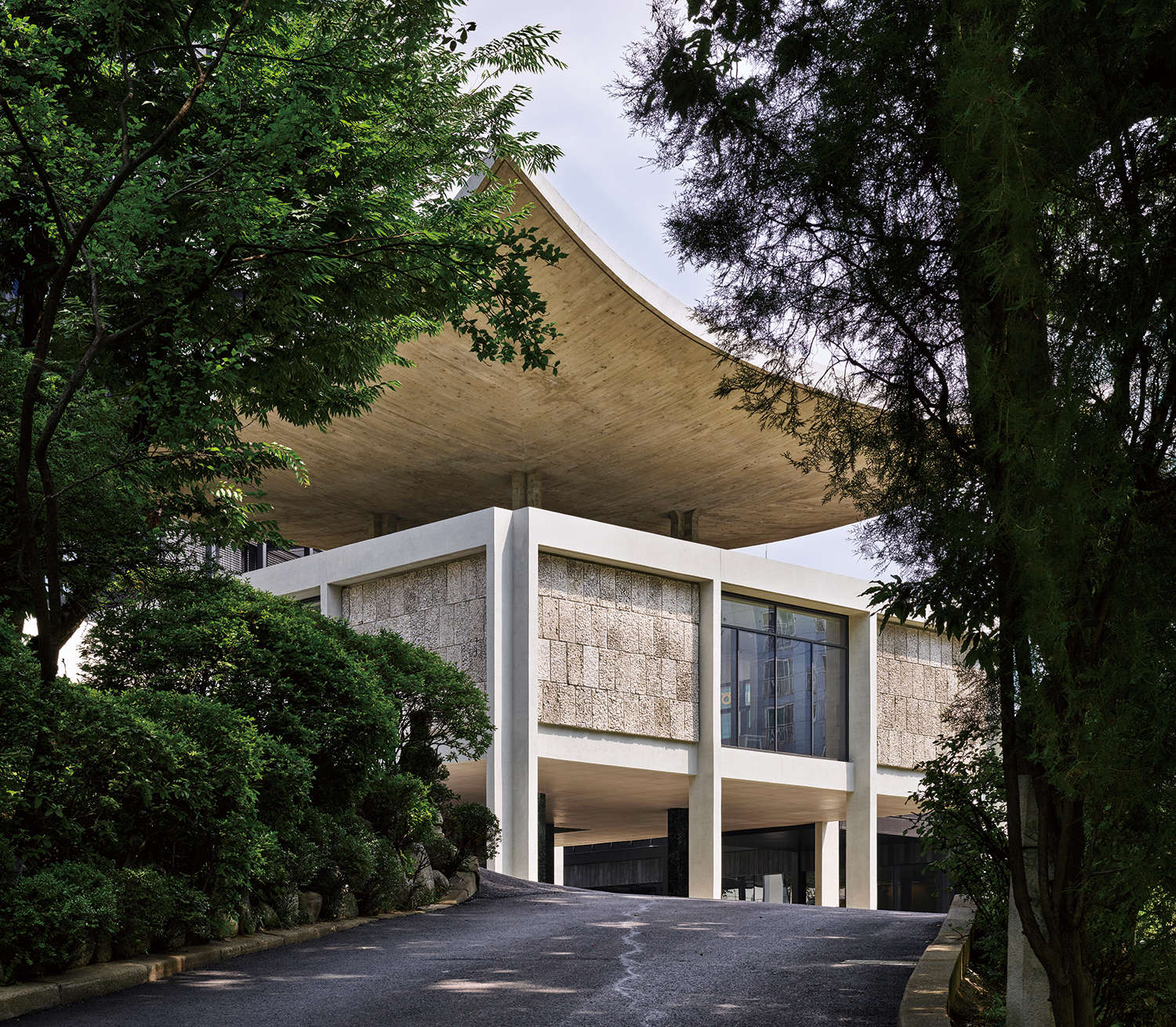
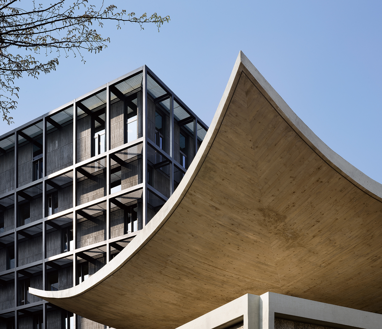
Kim Chung-up Pavilion (former Ambassadorʼs Office), French Embassy in Korea, 2023
The Competition Brief and Design Guidelines
Choi: I heard that the initial competition brief was to preserve the Ambassador’s Residence but demolish the Ambassador’s Office (now Kim Chung-up Pavilion) and it excluded the central garden from the project site.
Yoon: The original design brief announced at the second phase of the competition (November 2015) requested the demolition of all the existing buildings except the Ambassador’s Residence, including the consular building and other annexes as well as the former Ambassador’s Office, which was being used as the embassy office at the time, and to replace them with a new embassy campus building. As opinions about the value and importance of the Ambassador’s Office were formed and the Korean government sent an official letter to the embassy, the competition was suspended for further discussion for four months. After the competition resumed, the new design guidelines recommended preserving the Ambassador’s Office (March 2016), and we submitted our work reflecting the guidelines in the summer of 2016. The winner was announced in October of that year.
Cho: Initially, the garden was out of the project site boundary, as the embassy had a separate plan for its use. If included, we would have seen more diverse proposals that stretched into this space. However, after we won the competition, we thought it was good that an open space in the city centre was allowed to remain as the garden and was left as it was.
Choi: I would like to know whether the competition brief asked you to provide a more public programme than before, or whether they expected to see a space as enclosed as before.
Kang Junkoo (Kang): Compared to 1962, when the French Embassy was built, the number of embassy staff has expanded greatly. As the project was initiated to consolidate the scattered departments and functions of the embassy, and to celebrate the 130th anniversary of Korea and France diplomatic relations, the facilities that were previously outside the embassy, such as CAMPUS FRANCE for international students of the French Cultural Center and ATOUT FRANCE, which supports travel to France, were also drawn into the remit of the project. The project makes the French Embassy more public-facing than before, particularly considering that it accommodates programmes of a more public nature.
Cho: It’s probably fair to say that the embassy ought to be closed to the public as it mainly has to perform and provide consular services. This had a great impact on the design process, especially when it came to space zoning due to security concerns.
Choi: What was your plan for organising the programme? What were some of the key issues to consider?
Cho: These days, influenced by Silicon Valley culture, most workspaces prefer to be large open-spaces in buildings with fewer floors. On the other hand, La Tour, the office building, is a 10-storey mini-tower with a small footprint. This typology can be adopted as it is an embassy function. There are five or six offices on each floor, compartmentalised by the nature of the department. I heard that the small footprint tower form was well received because it was considered advantageous in terms of daylighting and ventilation, and also has a functional layout suitable for a small organisation.
Yoon: I think our strategy worked well, while many proposals adapted architecture to the topography. In the design of a tower that serves as La Tour, we wanted to create a cosy, loft-like atmosphere in the workspace, for employees that are appointed to various posts around the world every three to four years. Due to the character of the embassy’s work, most employees do not work in one large space. Depending on the nature of each area, office types are divided into a room for one manager, or rooms for one, two, four, and up to six office workers. After we won the competition, we spent time at the embassy for a couple of days and discussed any considerations with employees from all departments to optimise the use of space. I think this helped us develop floor plans that better met the users’ expectations. When we arranged offices on each floor, we considered accessibility based on departmental relationships, and we assigned two adjacent floors to a large department.
Choi: I would like to hear about the competition evaluation process.
Cho: The jury was held in France, and only Yoon participated in the presentation.
Yoon: In France, the jury must include outside architects and engineers. The rest were embassy officials. Later, I met an engineer from the jury in private, and he told me that when our team presented, Ambassador Fabien Penone said, ‘This team understands the environment and the city of Seoul very well.’ We were told that the Ambassador was very supportive of our proposal, saying that the mini tower (La Tour) in our proposal blended well with the surrounding high rise neighbourhood.
Cho: There’s an interesting point about the tower compared to the other teams’ proposals. In architectural renderings, architects often neglect or choose to ignore the context of the surrounding area. They even delete the buildings and apartments that sit behind in their renderings. When I visited the site, the streetscape of apartment buildings around the embassy was very intense. We softened it a little bit in our renderings, but we also showed them as it is. We felt it was important to address the context.
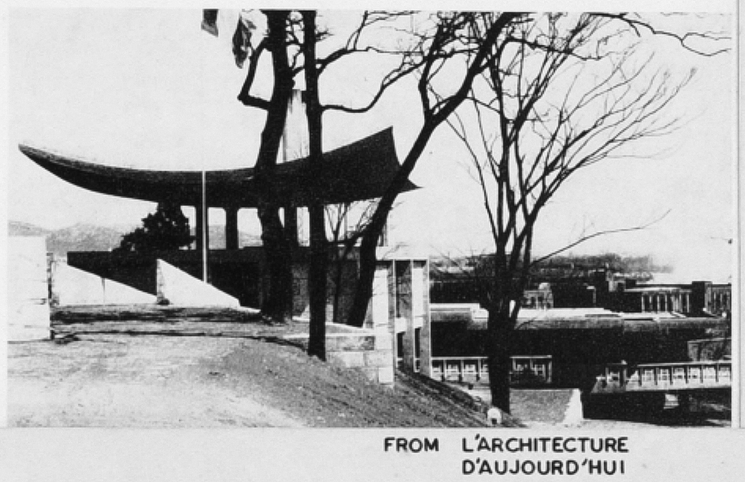
A Part of the French Embassy in Korea’s publication in a French magazine. Ambassador’s Office (left) and Staff Office (right) / Image courtesy of Kimchungup Architecture Museum
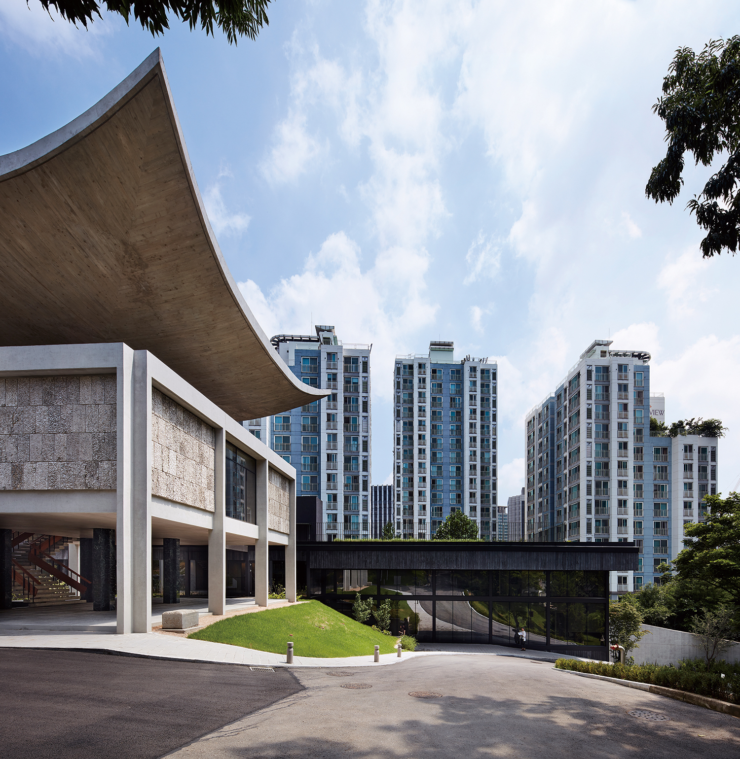
Kim Chung-up Pavilion (left) and La Jetée (right), 2023
Contemporary Interventions, Principles and Strategies
Choi: Some proposals in the competition attempted to alter the Ambassador’s Office, changing its façade and leaving only the structure. SATHY and MASS STUDIES, on the other hand, focused on ‘restoration to original form’ from the beginning.
Cho: Based on the client’s change of attitude towards the existing Ambassador’s Office in the revised competition guidelines announced after the suspension, and on the extent of the Ambassador’s Office’s transformation found during the site visit, we decided that it would be most appropriate and convincing to seriously restore Kim Chung-up’s original design rather than devise a new proposal. However, once the competition resumed, we found ourselves in a situation where the building had to be restored without a requisite increase in budget. In other words, more work and less site! (laugh)
Choi: I would like to hear about how you interpreted the characteristics of and values that inform Kim Chung-up’s work. How did you decide what to focus on within the overall layout and what to save?
Yoon: I didn’t know much about his work. Since we started with buildings that had been significantly altered from the original, it was important to study this evolution and understand the existing work. From the very beginning of the project, we spent months researching Kim Chung-up and his work, and the transformation of the embassy, and we tried to establish our own methodology by thinking about what point in time should be considered important if we were to rebuild it. Our initial plan for the Ambassador’s Office was to rebuild only the roof and keep the rest of the structural frames. But when we examined all of the existing conditions, we realised that the stairs were different from the original design, the piloti space was blocked off with solid walls, and the pond under the stairs was gone. We put a lot of thought into deciding what to keep.
Cho: It is an interpretation of the historical context in our own way, like a script which assigns two historic buildings (Ambassador’s Residence, Ambassador’s Office) as the main characters and our new buildings (La Jetée, La Tour) as supporting actors. However, in terms of the total floor area, the new buildings are about four times larger than the old ones, so we set up the spatial relationship in a vertical and horizontal way. The tower (La Tour) is surrounded by neighbouring buildings and becomes part of the surrounding towers, but we were convinced that it should also be clearly distinguished from its surroundings. Most other proposals adopted an approach to making a cluster of buildings on a similar scale with similar materials, whereas we wanted to buffer the surrounding context using a low, linear building (La Jetée) and a tall, narrow building (La Tour). At the time of its completion in 1962, the embassy stood alone on a hill high enough to see the Han River, offering tranquility. It’s a contrast between that serenity and the overcrowded verticality of the city today.
Choi: In other proposals, we observed new sculptural gestures in the compositions that somewhat stood against Kim Chung-up’s architecture. Some proposals completely reorganised the order or changed the elevation of the Ambassador’s Office by inserting new elements.
Cho: I think the tone and degree of the architect’s desire made the difference. Especially in terms of the layout—some proposals confronted the existing spatial order completely opposite to ours. Our basic position was not to change the building principal, but that if we were to offer too close an imitation, as a homage, it could end up overshadowning the original. Similarly, Ann Demeulemeeter commissioned Belgian architect Georges Bains (1925 – 2013) to design her studio in 1993. The new building was adjacent to her home, Le Corbusier’s Citroën House (La Maison Guiette, 1926) in Antwerp. Much like Kim, Baines was influenced by Le Corbusier. Placing two white buildings side by side would blur their uniqueness, especially Corbusier’s design. Ann painted her new studio dark gray, contrasting the original Citroën House. Ivy plants later emphasised Corbusier’s work. For us, too, distinguishing and contrasting the new building with the existing ones was the right decision.
Choi: In many ways, MASS STUDIES and SATHY’s proposal stood out for its attitude to an understanding and deep respect for Kim Chung-up’s plan.
Cho: We approached our choice of materials with the same attitude. We exposed the joints and welding marks in the steel frames to realise the rawness of the exposed concrete (béton brut). We also aligned the axis (orientation) of the Ambassador’s Residence – La Tour and that of the Kim Chung-up Pavilion – La Jetée. Especially in the latter case, we extended the concept of chae division in the Kim Chung-up Pavilion (hereinafter Pavilion) and unified grid modules. A particularly interesting point that was noticed in terms of ‘extending the past’ was ‘eave architecture’. The eaves are a theme that are found in almost every discussion about early works of Kim Swoo Geun or Kim Chung-up, and the ‘Koreanness’ of architecture in Korea. We also tried to revise the context by applying two different types of eaves to the south part of La Tour and La Jetée respectively. The eaves of La Jetée serves as a large welcoming canopy in the most public spaces used by many people and it is the only occupiable eave in the entire ensemble. In a way, it is an extension of Kim’s attitude toward revising the eaves in the three buildings of the triptych.
Choi: The rooftop garden at La Jetée is also an element from the former Staff Office.
Cho: The original competition brief presented a vague premise that allowed the central garden to be used for other purposes, and we tried to create an alternative space. One thing that stirred our imagination while preparing for the competition was the film La Jetée (1962) by French filmmaker Chris Marker (1921 – 2012), which was shown in the Korean Pavilion at the 2014 Venice Biennale. When he was shooting the movie, Kim was building the French Embassy. The rooftop of the airport is an important setting in the film, and we imagined that the present and the future were intermingling, like time travelling by time machine.
Yoon: ‘La Jetée’, borrowed from a nautical term meaning breakwater, is represented by the straight roof of Paris-Orly Airport in the film. This space was created to provide access to each plane with a horizontal view of the runway. This space inspired us to create a rooftop space on La Jetée within this project. The place is a supplementary programme for the absence of a central garden required by the initial design guidelines, but also had the potential to accommodate all other types of programmes.

The first floor plan (left) and the second floor plan (right) of the French Embassy in Korea by Kim Chung-up / Images courtesy of Kimchungup Architecture Museum
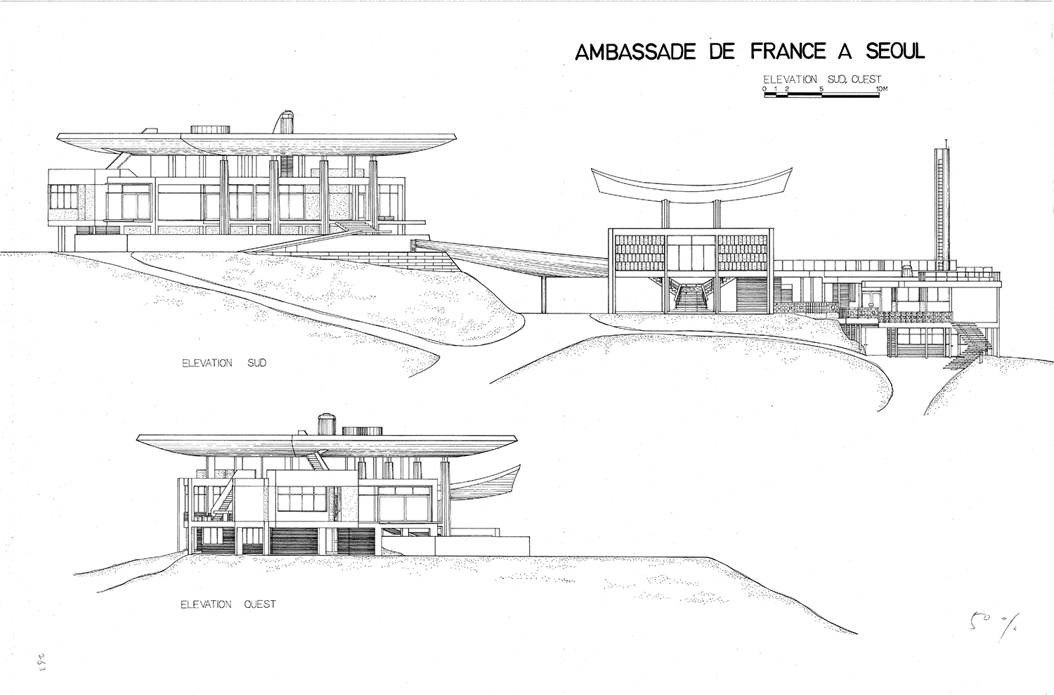
The southern elevation of the French Embassy in Korea by Kim Chung-up / Image courtesy of Kimchungup Architecture Museum
Original Plan and the Final One
Choi: You used a variety of strategies to express both continuity and distinction from the past. In terms of materials, you wanted to use steel and wood to differentiate from exposed concrete, but wood was replaced with UHPC panels in the end.
Cho: During the construction process, the regulations were revised, which doesn’t allow the use of carbonised cedar wood from the initial proposal. Looking for an alternative, we used dark coloured UHPC panels with a pattern reminiscent of wood texture. It can be an evolved version of the Pavilion’s old PC panel cladding. As a result, changes in the building code allowed the material to resonate with Kim’s work through advanced technology that was not available in the 1960s.
Choi: Kim’s works have a lot of expressive elements, but La Jetée and La Tour show a clear intention to avoid creating a recognisable form. Encouraging continuity with existing buildings, such as grid modules and axes, there is also an attitude that naturally extends the existing order rather than creating a new form. It’s a formless gesture that is the most restrained.
Cho: Your understanding is correct. At the early stages of the design competition, Yoon and I tried out several proposals, adding various elements, but gradually, we removed parts with a willingness to create form and made it simpler and simpler.
Yoon: During our first site visit in November 2015, we found that the French Embassy had a strong sense of accumulation of heterogeneous objects, and we focused on showing a ‘unified and clear legibility’ in our design. At the same time, we proposed a design that would respect the context of the site in a neutral and thoughtful way.
Choi: Bright colours of the surrounding apartment complexes and skyscrapers are very intense, so I think applying black to La Tour was appropriate. Viewed from the front, it becomes the background of the Pavilion, but from the back, La Tour stands out more because it is black. In fact, the embassy could be recognised from the back in the past, but it became completely invisible later.
Kang: That point had been addressed during the design competition, so we suggested that the embassy be visible from behind. Though smaller in scale compared to neighbouring buildings and apartments, La Tour can be easily recognised thanks to its darker finish.
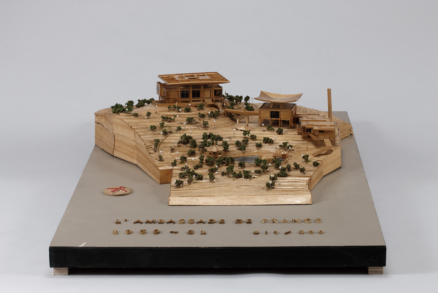
The model of the French Embassy in Korea by Kim Chung-up / Image courtesy of Kimchungup Architecture Museum
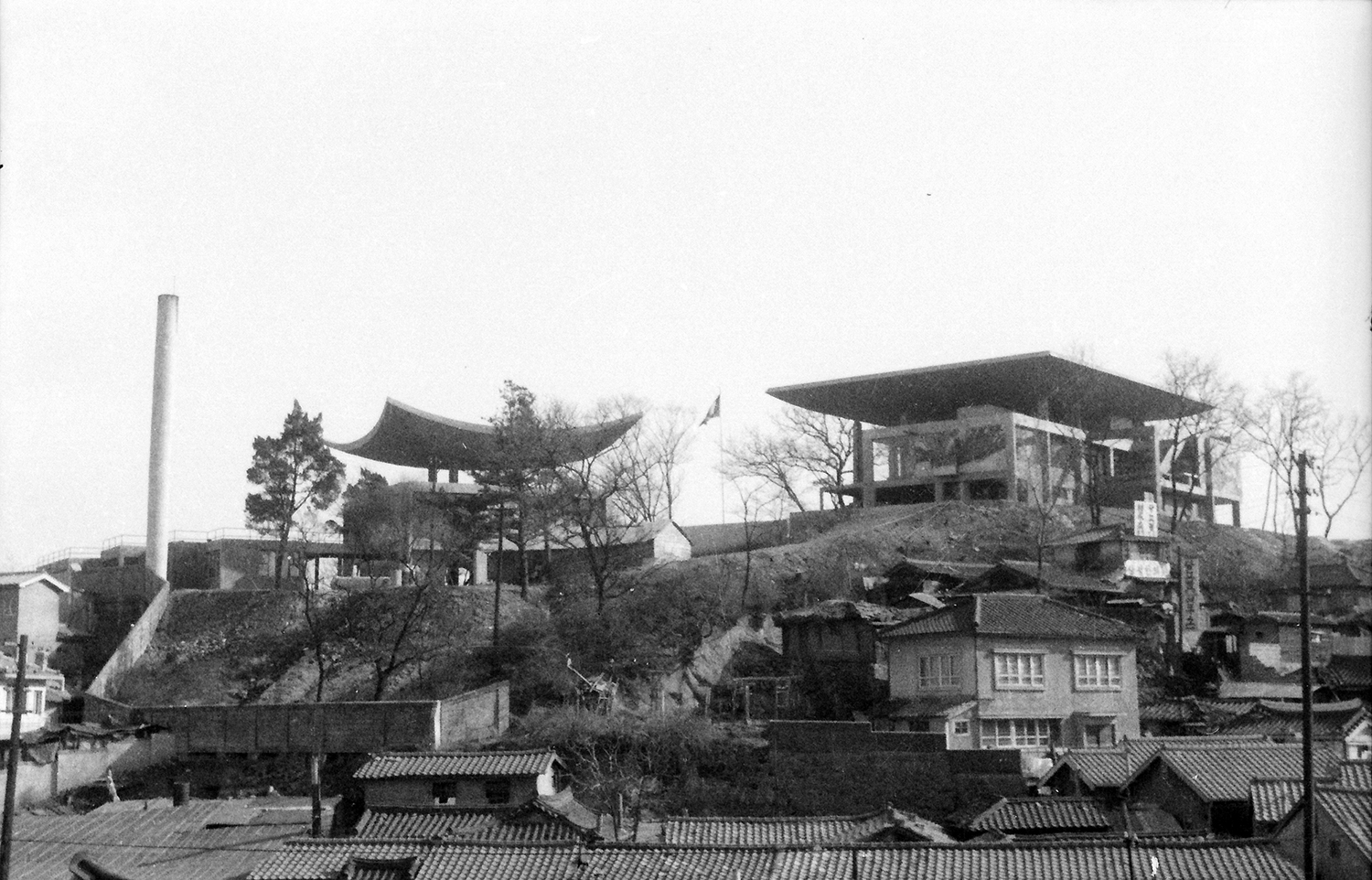
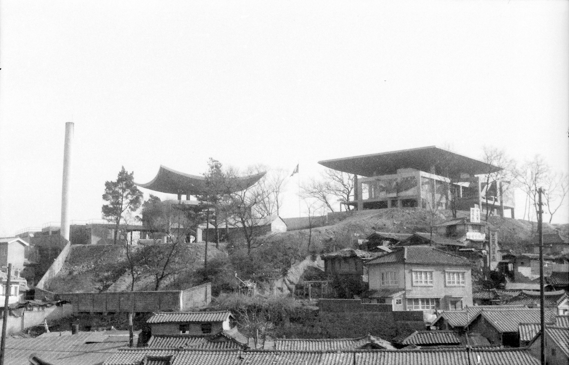
Rear view of the French Embassy in Korea from Chungjeong-ro, 1960s / Image courtesy of Kimchungup Architecture Museum
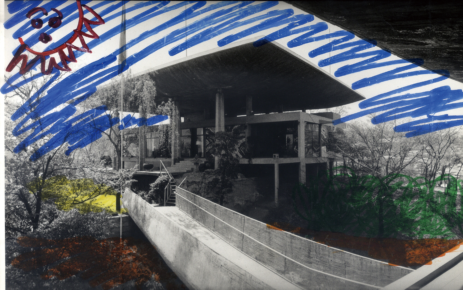
Sketch by Kim Chung-up over the photograph / Image courtesy of Kimchungup Architecture Museum
Between Preservation, Restoration, and Reconstruction
Choi: How did you collect the materials for restoration, such as drawings and photographs, and did you have any difficulty during the construction process?
Cho: We received basic materials, old drawings and sketches, from the Kimchungup Architecture Museum. During construction, we referred to photography and cinema because it was rare to find materials to confirm original details. In the comic film Under the Sky of Seoul (1961), which starred well known actors of the time like Kim Seungho, Kim Jinkyu, Do Kumbong, Kim Heekap, the site of the French Embassy, which was under construction at the time, makes a brief appearance. At that time, plywood was not produced in Korea, and a scene shows construction with lumber formwork. It was unintentional, but when I compared it later, I realised that even the construction was similar. However, what I want to emphasise here is that, although they look alike, beyond visible dimensions, elements, and images, we approached our design through a completely different structural approach and technology. In particular, the post-tension system is applied to the upper roof structure, and the four indoor columns are also asteel reinforced concrete structures. The image was realised by keeping to the outline dimensions based on the existing drawings, but a steel frame was added to meet the current seismic structure standards. The existing external PC panels were also removed, marked with serial numbers, and reinstalled in their original locations.
Yoon: Our team conducted internal research to document and organise the history of Kim Chung-up’s works, Le Corbusier’s influence on him, and history of various transformations of the French Embassy over time. Bringing together and analysing various scattered records helped us to better understand the French Embassy and is still very useful today.
Choi: For the Ambassador’s Office, I understand that initially you were going to rebuild only its upper roof structure which had been modified from the original design, but during construction, you had to demolish and rebuild the whole building?
Cho: That was just last year. According to records, in the mid-1970s, in order to secure additional office space, the first floor piloti space was enclosed, and the bifurcated staircase removed. A U-shaped staircase was built, and the front space used as a lobby. During the design stage, the embassy wanted to revitalise the piloti space but keep the internal staircase as is, which we didn’t think was appropriate. However, we couldn’t just propose the removal of the staircase wall on the first floor because the existing structure couldn’t be inspected for structural integrity until we began demolition.
Kang: In the initial design competition, we planned to restore the Ambassador’s Office based on Kim Chung-up’s design. The competition renderings didn’t show shear walls in the Pavilion’s ground floor. During the design phase, detailed calculations showed the need for shear walls to prevent earthquake damage. We kept some original features, like the stairs. Later assessments revealed severe structural issues with the existing frame, leading to significant reinforcement and repair procedures. When we started construction, we found more structural defects, prompting a structural engineer’s evaluation. Most of the structure failed to meet expectations, so after consulting heritage advisors, we decided to preserve only four central columns. If the painstakingly preserved cross-shaped columns were re-clad in marble as originally designed, it would be difficult to distinguish whether they were original or new. This made us question the effectiveness of our preservation efforts. Moreover, preserving these columns still meant the existing staircase would remain irrelevant to the original design. Cho then proposed a complete re-build to the original, marking a new phase in our approach.
Cho: At that time, when re-watching an old documentary film about Kim Chung-up, I found an interview scene in which people were in tears, claiming ‘He was a poet,’ and the shadows of the pond were reflected on the Ambassador’s Office. I realised that we were neglecting the heart of the project. And, Without the scene of the original stairs and pond, Kim Chung-up’s ‘poem’ would not be fully restored. (laugh) So, I suggested to the construction company to, that we tear down the Ambassador’s Office and reconstruct it. They responded, ‘I was troubled by the situation that even if I reinforced the structure, it would be covered with marble.’ and replied that rebuilding would not make much of a difference in cost. Finally, we explained the situation to Ahn Changmo (professor, Kyonggi University), an architectural historian who had been advising us on the project since its inception, and decided to focus on the ‘authentic reproduction’ rather than ‘physical preservation’.
Choi: A restoration is if any structure of the building is kept, but based on the decision to demolish and rebuild as a whole, this case turned into a complete reconstruction. Were you worried about the potential controversies about ‘reconstructing’ a modern architectural heritage site?
Kang: We consulted the Modern Cultural Heritage Advisory Group, including professor Ahn Changmo, gathering expertise from various fields. The consensus was that while historical restoration matters, building safety is utmost important. Ahn supported an authentic reproduction to convey Kim Chung-up’s architectural legacy. Our client accepted the design changes, leading to a meticulous approach on which parts to preserve or reproduce. Some columns were donated to the Kimchungup Architecture Museum, with one showcased at La Jetée. Demolished columns were repurposed as benches. We also preserved and reinstalled old PC panels and original marble finishes, blending the past with the new. Even though reconstructed, it feels like a restoration project in many respects.
Choi: The site is now surrounded by high rise buildings, which forms a completely different context compared to that of 60 years ago. How did you read this context?
Cho: Form as a kind of ensemble responds to nature, but architecture should also take a different attitude depending on whether the background is of the mountains or the sky. In the past, the French Embassy had a prevailing notion of its architecture which invited the observer to recognize the changes through an upward architectural promenade, like Le Corbusier’s Acropolis sitting at the top. The point that I found interesting was that Kim Chung-up painted the sky over the photograph of the completed buildings. If one were to make a comparison, it's like ‘Matisse’s cut-outs’, where the curved and the straight rooflines are like two blades cutting the sky. I imagined the shapes of the sky that he would have enjoyed cutting out while walking around with scissors. With this sky mostly blocked by the emergence of current high rises, the only place to recreate this play (landscape) is at the entrance of the campus, under the eaves of La Jetée. As the eaves of La Jetée obscure the large towers and buildings behind, the sky is revealed between these curved and straight eaves.
Yoon: Kim Chung-up’s dream was to create the ideal modern building on a hill at the hyper-center of Seoul, a metropolis surrounded by huge skyscrapers. La Tour and La Jetée organically combine the two. We borrowed the form of the vertical tower and horizontal bar, but adapted it to the scale of Kim Chung-up’s original work. This control of scale allows for a smooth transition between the landscape created by the surrounding towers, Pavilion and the Ambassador’s Residence.
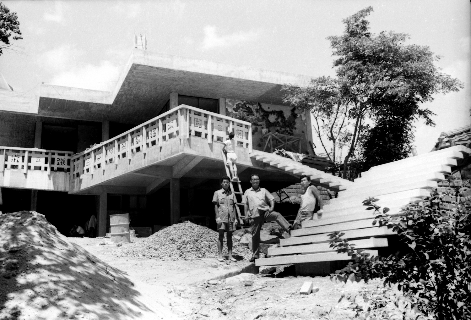
Archival film taken on-site of the French Embassy in Korea (Kim Chung-up, centre) / Images courtesy of Kimchungup Architecture Museum
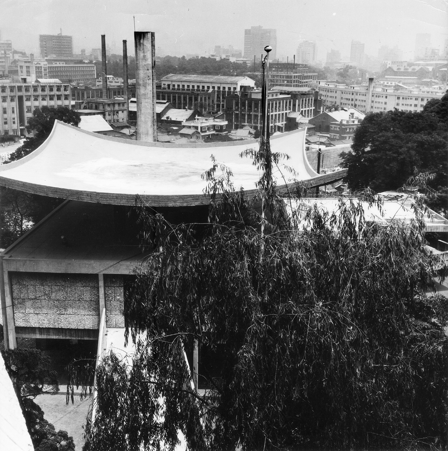
Archival photo of the French Embassy in Korea / Images courtesy of Kimchungup Architecture Museum
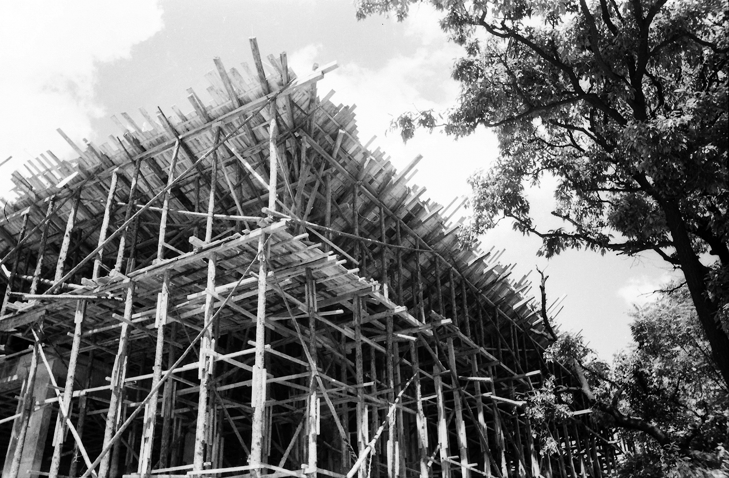
Formwork of Ambassadoriʼs Office / Image courtesy of French Embassy in Korea
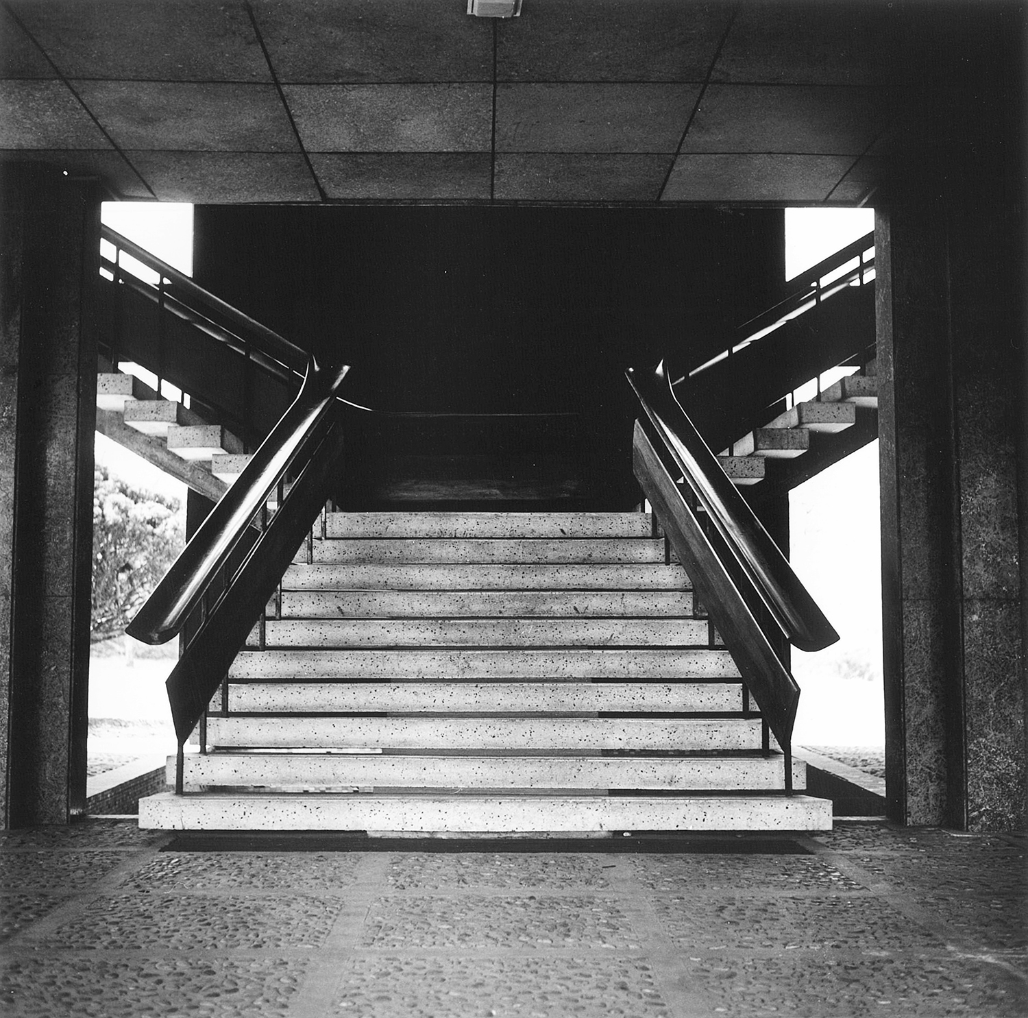
Original stairs in Ambassadorʼs Office / Image courtesy of French Embassy in Korea

Formwork of Kim Chung-up Pavilion, 2022
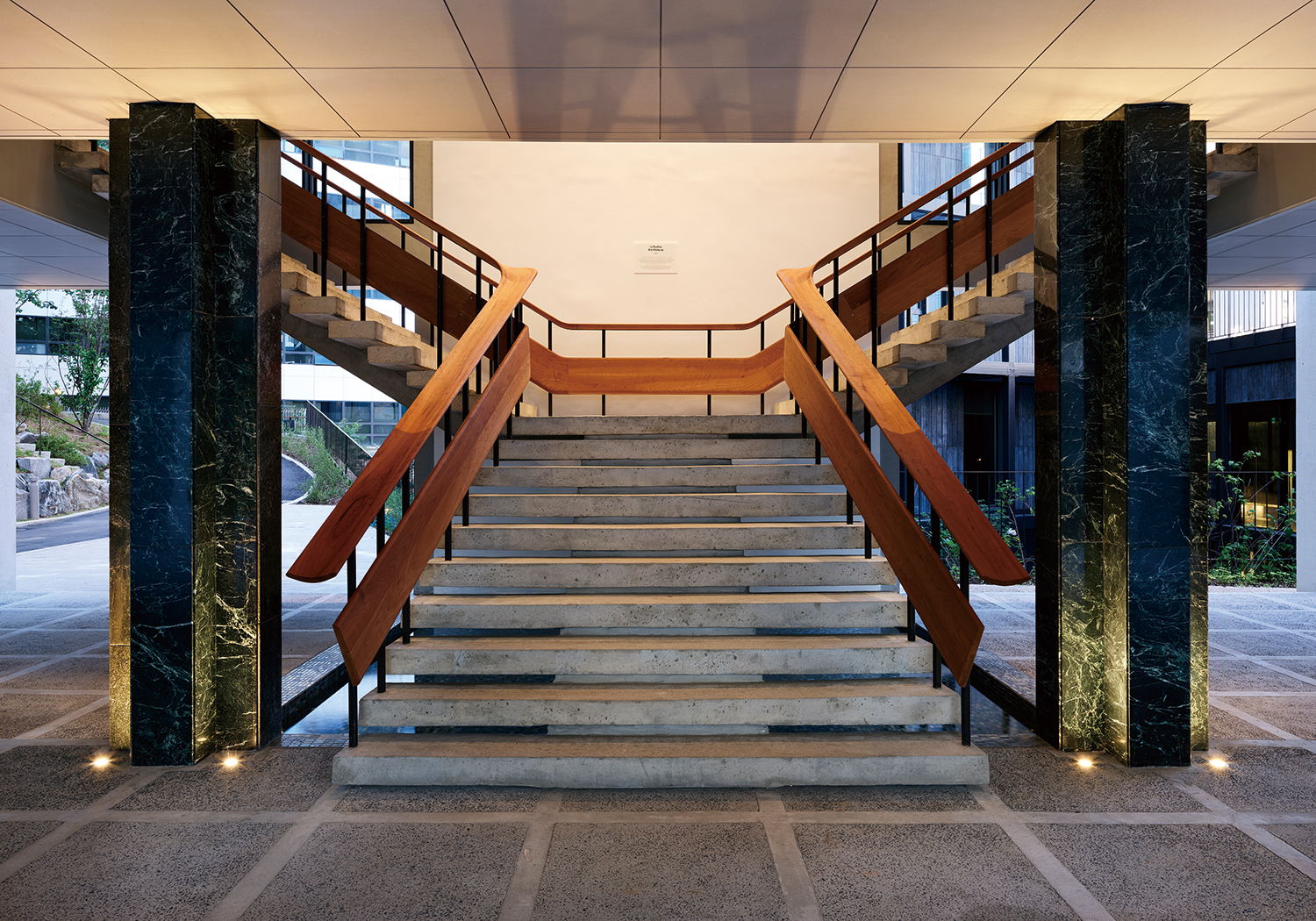
Reconstructed stairs in Kim Chung-up Pavilion, 2023
Kim Chung-up’s Legacy
Cho: It is attractive when the steel is exposed like Maison de Iran (1967) in Cité Universitaire. Now the trend is to enclose materials with a specific finish, so in that sense, I wanted to talk about historical context. When we decided to use a dark colour for the frame of the tower (La Tour), I couldn't help think of the Samil Building (1970). It’s another iconic work by Kim Chung-up.
Choi: Personally, I don’t agree with the Samil Building being listed as one of his masterpieces. Technically, it was a remarkable endeavour for its time, but he just borrowed from Mies van der Rohe’s unique language. I think it is only appropriate to find Kim Chung-up’s originality among the tower-type buildings in Tokyu Hotel (now Danam Tower, 1970) built in front of Seoul Station around the same time. I think the use of protruding structures is a consummate achievement of his style.
Cho: I think that such an assessment means that we, practicing architects, have a reductive conversation with Kim Chung-up. Throughout his work, it is true that the work in his first four years were heavily influenced by Le Corbusier’s atelier. However, along the rest of a much longer architectural journey, he made various attempts to break away from this influence, so my attitude may be different from that of an architectural critic or architectural historian. At that time, a small elite group monopolised discourse and knowledge, unlike now, and they were affected by various influences and responded to the many given opportunities. On the other hand, as a creator, I also wanted to have a conversation with Kim Chung-up’s legacy in a broader way, covering the whole context instead of just one or two works. We chose dark materials with that intention, although it’s not the same as the Samil Building exactly. Kim Chung-up’s Samil Building was the tallest skyscraper in Korea when it was completed. In the context of its current surroundings, which have become a forest of towers, the image of a 10-storey mini tower, designed as a buffer between the site’s internal ensemble and its surrounding city, overlaps with the Samil Building, conveying both familiarity and unfamiliarity. Here, the Samil Overpass (now Cheonggyecheon Stream), which was always paired with the Samil Building horizontally and vertically and considered a symbol of 20th century modernity in Korea at the time, resonates with La Jetée. While La Jetée falls under the category of infrastructure like an overpass, there is another contrast between artificial ground or infrastructure that is meant to be occupied by people instead of cars in this densely populated area.
Choi: La Tour is demonstrative of Kim Chung-up’s style, one that exposed structures out of the building body. It’s an element that appears in many of his works, including not only Tokyu Hotel, but also Ambassador’s Residence, Naval Officers’ Residence in Jinhae, Changwon (1968), and YuYu Pharma, Inc. Factory (now Kimchungup Architecture Museum, 1959).
Yoon: I think it can be seen in terms of a constructive structure. First of all, the structure of Kim Chung-up’s buildings are exposed. Not only are there elements that play actual structural features, but also additional ‘expressions’ that emphasise these features. When we designed it, we matched the modules (column spacing), and matched the footprint of La Tour with the Pavilion as well. They are related to each other. So compared to the Pavilion, there are differences in elements such as colour and material, but, at the same time, there are unified elements like modules and rhythm.
Choi: The French Embassy is a very important work, but it hasn’t been exposed due to limited access, which has left the citizens of Seoul without knowing much about its status and significance in the architectural world. With its dramatic reappearance, now clearly visible from the main road, we’re sure many people will be surprised to know that it was built in the early 1960s. (laugh) I hope it will become widely known that it is the product of a brilliant artist who overcame a harsh creative environment and system. You mentioned a film, and I think The Housemaid (1960) directed by Kim Kiyoung also gave us something to be proud of from that era.
Cho: That’s right. It can be a scene from the present viewed by a new ensemble. Japan has a lot of buildings by landmark modernist architects, which are all well preserved and still in good use. Without architects like Kim Chung-up and Kimm Jong-soung, Western modern architecture would have formed its own league and we would have known it via hearsay in Korea. At the time, in the center of the world’s modern architecture, the fact that they had direct encoutners with the last years of the modern masters makes their position special in Korea.
Yoon: Restoring the Ambassador’s Office to its original form is a great homage to modern architectural heritage. We restored a modern architectural heritage just like rebuilding an ancient historical site. This is reminiscent of Kinkaku-ji Temple, Kyoto and Namdaemun Gate, Seoul reconstructed exactly like the original after a fire. Only when concrete was poured to the roof of the Pavilion, which has been restored to Kim Chung-up’s original design, did the Pavilion become an iconic monument to Korean modernity.
Choi: The whole process must’ve been memorable since it involved people who respect culture above the logic of capital. It is quite unfortunate that it still remains off-limits to the citizens.
Cho: If I had one future hope for the French Embassy, it would be to create a public cultural facility on the front open space to visually connect the currently cordoned-off garden with the French Embassy. In fact, Ambassador Penone designated the street in front of the French Embassy, which could play an important role in bridging the separation between the Embassy and the city. I think the state of our city today is like a ‘moving target’ and the rapidly changing context around remaining modern architecture like Dr. Seo’s Clinic (now Arium Office Building, 1967) threatens them with violating force. ‘Context’ in the West is a term that comes from seeing and idealising the surrounding urban environment as ‘static’ in a less dense situation than ours. The French Embassy, on the other hand, is a good example of how to deal with an object that almost disappeared in the context of a unique situation in Seoul over the past 60 years, rapidly changing without more detailed discussion on the city. To understand and respond properly in an architectural way to a world where capitalism is rampant and difficult to control is an important task for architects.
Yoon: As an overseas Korean, I have experienced the very specific and unique relationship between two cultures in both France and Korea. With a strong French-Korean bicultural background, including memories at the Centre Cultural Coréen in France in the early 1990s, I am proud to contribute as an architect to the French Embassy project, which means so much to me. Beyond the completed project, I am convinced that the site of Hap-dong 30 in Jung-gu, Seoul still has great potential to bring the relationship between France and Korea a step closer. When the new space for the French Cultural Center opens the French Embassy to the city, located along the front, main road, it will serve as a place to welcome French and Korean communities and to spread French culture.
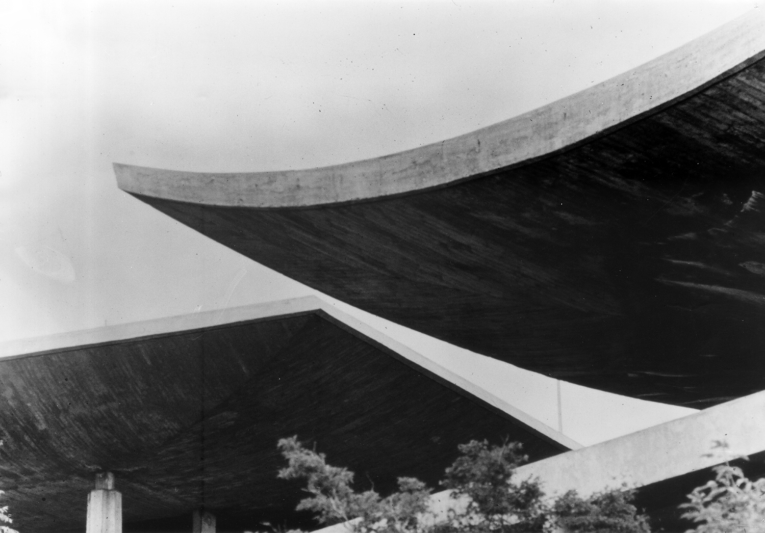
Archival photo of the French Embassy in Korea / Image courtesy of Kimchungup Architecture Museum
