SPACE August 2023 (No. 669)
The Swiss Pavilion
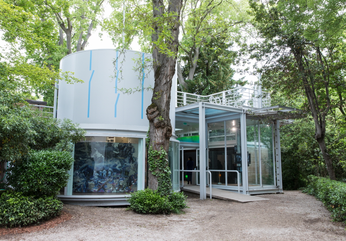
The Swiss Pavilion was dedicated to the theme of borders between their pavilion and its immediate neighbour, the Venezuelan Pavilion. In the name of national representation and territoriality, a wall was built between the two pavilions, and under the title ‘Neighbours’, the artists devised a way of breaking down the boundaries and bringing them together. At the same time, architecturally, the co-directors, artist Karin Sander and art historian Philip Ursprung, challenged the convention that each national pavilion should have a distinct architectural style and decided to actually tear down part of the fence between the Venezuelan and Swiss Pavilions, allowing for a natural flow of traffic between the two. They also removed the steel fence around an old tree in the Swiss Pavilion and displayed it on one of the walls. Meanwhile, inside the Swiss Pavilion, the floor plans of the two national pavilions, including the Venezuelan Pavilion, were organised into a giant carpet and laid on the floor, sending a simple but clear message.
When I visited the Venezuelan Pavilion, I had to go to the Swiss Pavilion for some reason, and the internal and external spatial experience created by the dismantled fence between the two pavilions made me wonder if there were two pavilions at all. The Venezuelan Pavilion, designed by Carlo Scarpa, and the Swiss Pavilion, designed by Bruno Giacometti, were seamlessly connected and yet retained their individual character. Perhaps the Swiss Pavilion had the most effective display with the most straightforward message in the Biennale. The Swiss Pavilion seemed to insist that it was the execution that mattered not the exhibition.
 ©Martin Lauffer
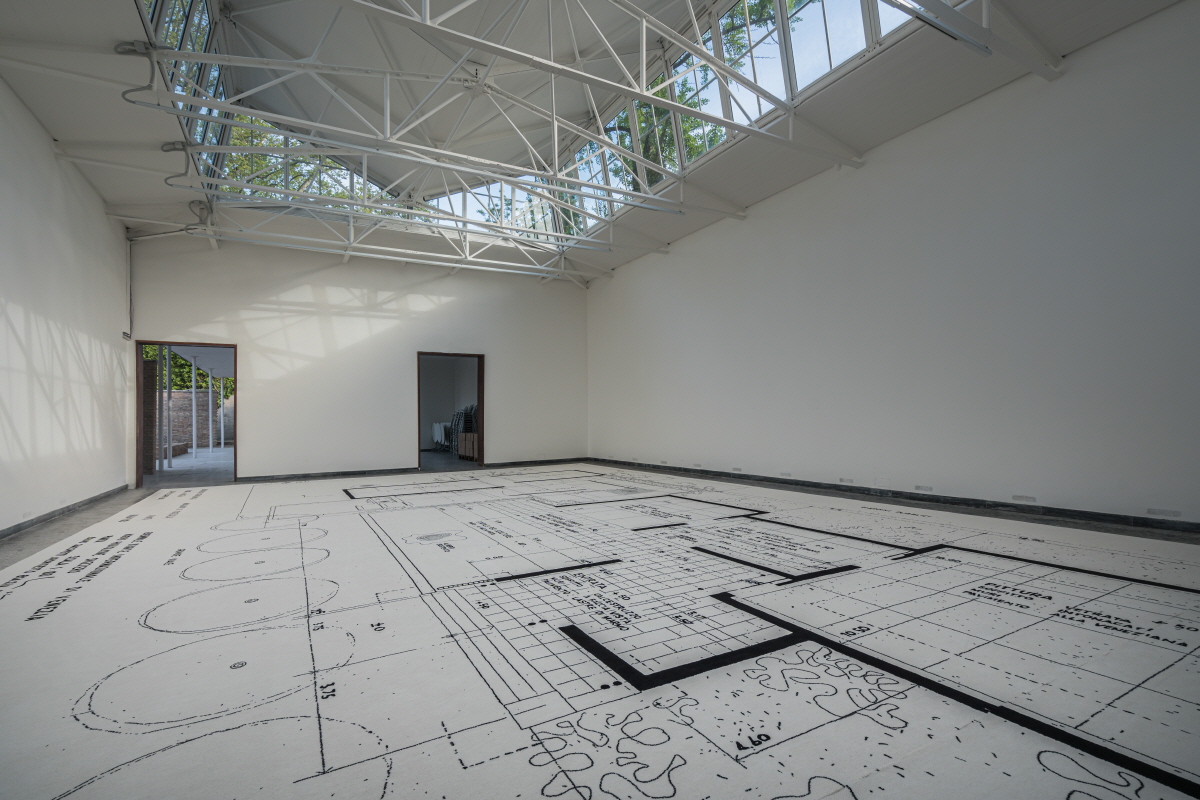 ‘Neighbours’ of Swiss Pavilion ©Samuele Cherubini
The Japanese Pavilion
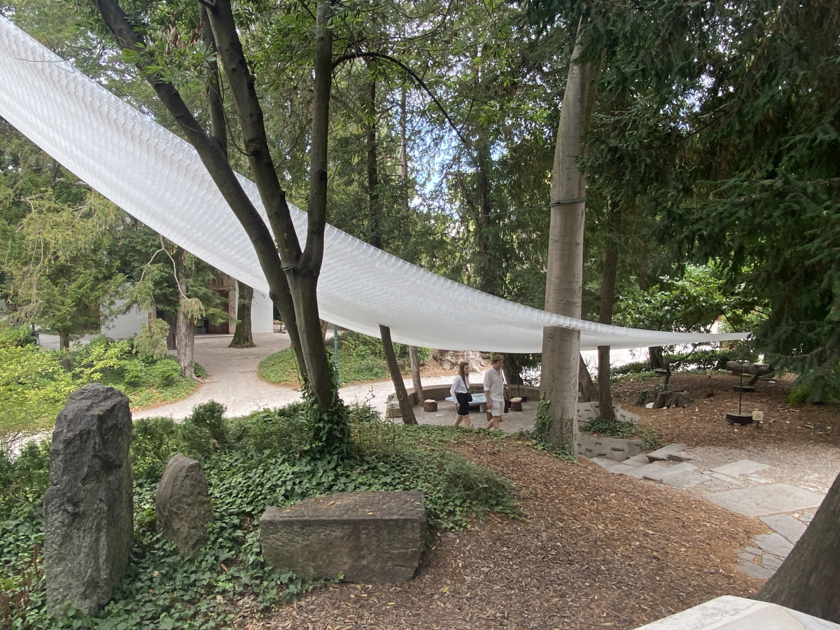
The Japanese Pavilion featured their national pavilion designed over 60 years ago by Yoshizaka Takamasa. It was titled ‘Architecture, A Place To be Loved and featured’ the word ‘nurture’ as its keyword. From the perspective of the importance of understanding, nurturing, and caring for a building beyond its construction, the exhibition tells the story of the Japanese Pavilion, its history, what happened there, and how the original architect’s intentions were not realised or acted upon in the way they should have been, through the careful archiving of substantial records and historical drawings. Based on this loving understanding, they then created partial additions and auxiliaries, such as sunshades and wayfinding installations, to provide the intended spatial movement and experience of evoking the past or memory. Inside, models and stories of these attempts were on display, and in the lower level pilotti, many staff members welcomed people as they came and went, offering tea and scented candles.
The Japanese Pavilion seemed to have made a complete turnaround in its attitude towards architecture, moving away from ‘growth’ towards ‘nurture’. I had felt this when I met Japanese architects after the Fukushima disaster a few years ago, but a profound shift in world perception was taking place, and I felt the same sensation in Venice. Having suffered three nuclear disasters, not to mention various earthquakes, Japan was perhaps most desperate in its contemplation of what hopes and attitudes we should have in the face of the coming apocalypse, cautiously and tentatively experiencing this utopia of disaster. The message of the exhibition was clear, and its format and approach were focused on the subject matter, but it felt profitable without being simplistic. The many architectural drawings by Yoshizaka Takamasa, hand-drawn 60 years ago, were also quite impressive.
 ⓒKim Jeoungeun
 ‘Architecture, a place to be loved’ of Japanese Pavilion Image courtesy of La Biennale di Venezia / ©Matteo de Mayda
The Dutch Pavilion
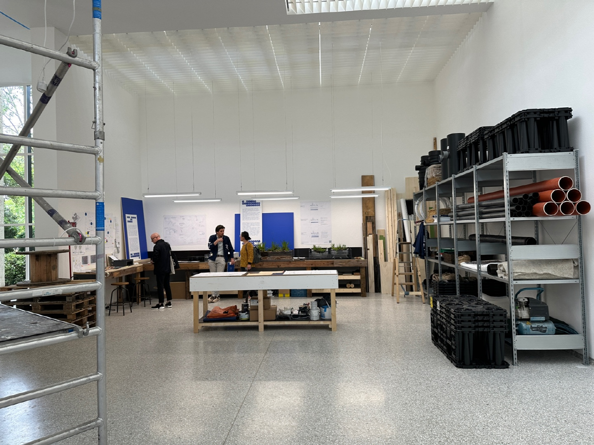
The Dutch Pavilion also targeted the architecture of their country’s national pavilion. They wanted to ‘experiment’ with the buildings of their national pavilion, not as a large-scale architectural or developmental act, but as a way of showing that many problematic situations can be improved by taking small steps in existing buildings. Given that the overall theme of the biennale, the Dutch Pavilion took the attitude that the environmental crisis is an urgent one and that rather than lingering or waiting to engage in critical discourse, they should embark immediately by experimenting with the site of the biennale. The experiment was to make some adjustments to the stormwater piping system of their national pavilion to retain and recycle rainwater, intending to implement it beginning in 2023, checking the situation, taking further measurements, and gradually turning the interior and exterior spaces of the building into eco-friendly spaces that do not rely on municipal pipes. The plumbing and building materials required for this project were on display on one side of the exhibition hall, demonstrating that anyone could do this with minimal DIY skills. On the other side, sketches of the experiments and measures were on display. What was most impressive was the fact that the experiment was made very real and tangible by cutting a square hole in the ceiling at the main connection points of the new measures to the stormwater pipes under the roof and by taping the route of the pipes with coloured solid lines on the ceiling and walls. But this also made me wonder whether this is already being done elsewhere worldwide.
In another area of the exhibition space, a large drawing installation by participating artist Carlijn Kingma, Waterworks of Money, emphasised that the gap between the water-rich and water-poor regions is also a gap between capital-rich and capital- poor, driven by the monetary system. It seemed to emphasise the exhibition’s key point: small steps could be taken to minimise from the gap between the rich and poor and limit the monetary system without needing a national civil engineering pipeline system that would require huge capital investment. Visitors who climbed the ladders of the drawing installation were taking selfies with interesting reactions.
 ©Kim Kwangsoo
 ‘Plumbing the System’ of Dutch Pavilion ©Cristiano Corte
The German Pavilion
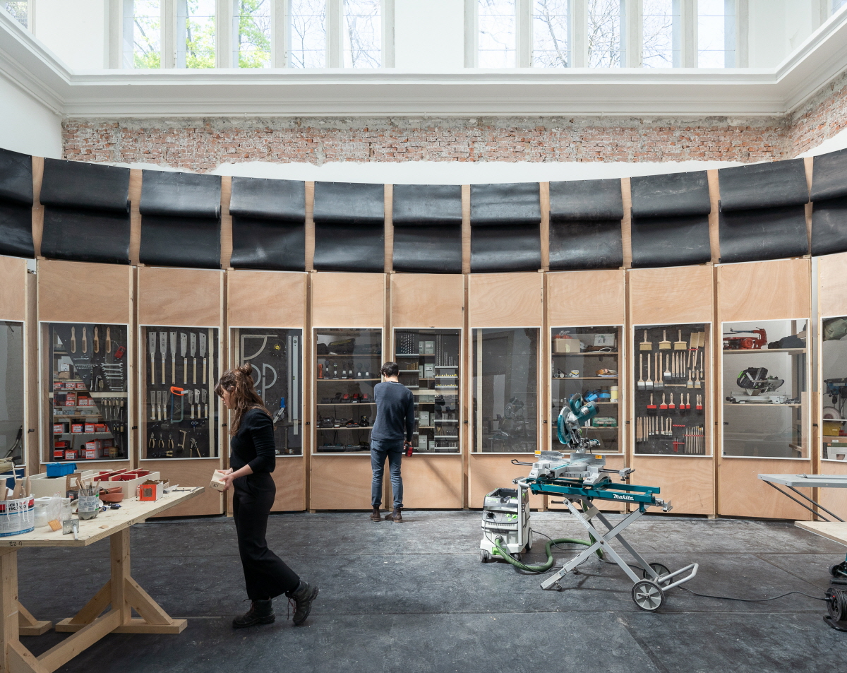
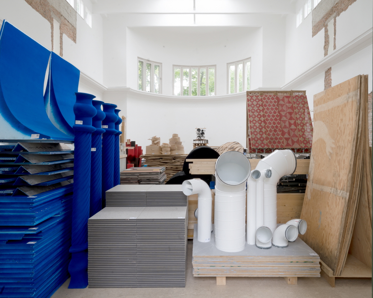
The German Pavilion was a collection of exhibition installations and discarded materials from each country’s pavilion that had been demolished once the previous year’s art biennale ended. Each piece of demolished material was sorted and QR-coded for its background and explanation, and the overall impression was of a giant recycling warehouse. The German Pavilion seems to have performed minimal demolition since the biennale, so they also seemed to demonstrate a solid commitment to not creating environmental waste. They left the walls and torn-up floor displays from the previous year’s biennale in place. The message was strong, showing a commitment to recycling the waste generated by the biennale. In general, the German Pavilion seems to have taken the attitude of creating a scene by pursuing a single idea in a number of ways.
 ‘Open for Maintenance’ of German Pavilion ⓒARCH+ UMMACUMFEMMER BUERO JULIANE GREB
The French Pavilion
The French Pavilion was called the ‘Ball Theater’ and included a bleacher theatre at the centre of the exhibition, half of a giant globe representing the planets or the earth, with several circular reflectors standing opposite it on large and small scale. Various wires connecting to stage lighting and speakers dangled from the ceiling, making a theatrical gesture, which was described as ‘reawakening the desire for utopia’. There was something there, but I couldn’t quite put my finger on it, and I wondered if it was allegorical or nostalgic, given that modern imperialism and globalism have their origins in such visual representations of the globe.
 ‘Ball Theater’ of French Pavilion Image courtesy of La Biennale di Venezia / ©Matteo de Mayda
The Australian Pavilion
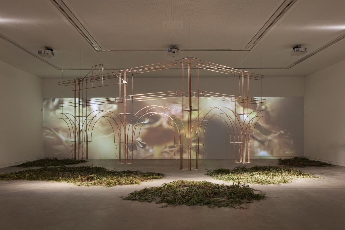
The Australian Pavilion, a former British colony, was postcolonial in preoccupation, proposing the restoration of the Australian suburbs damaged during colonisation. A threedimensional installation located in an ample space at the centre of the exhibition hall recreated the silhouettes of colonial buildings in somewhat abstract, three-dimensional lines with a nostalgic and pastoral feel, while a lengthy video was shown behind the installation. It also displayed the research, proposals, and implemented projects for a suburban town during the colonial period. The deconstruction of colonial legacies and reconstruction in a postcolonial era seemed to imply a necessary grounding in the critical discourse. The proposed action is conducted under the theme of decoloniality, but the exhibition format was pretty and well presented so the idea and materials would appear less approachable or graspable. In addition, it took a lot of work to read what the actual problems or points of action for decolonisation were, so my appreciation was lessened.
 ‘Unsettling Queenstown’ of Australian Pavilion ©Tom Roe
The Hungarian Pavilion
The Hungarian Pavilion presented plans for their large building project, the Museum of Ethnography Budapest. Large models and drawings were shown, as well as buildings designed by SANNA and their own architects, which gave the impression of an old-fashioned national publicity stunt that should be avoided.
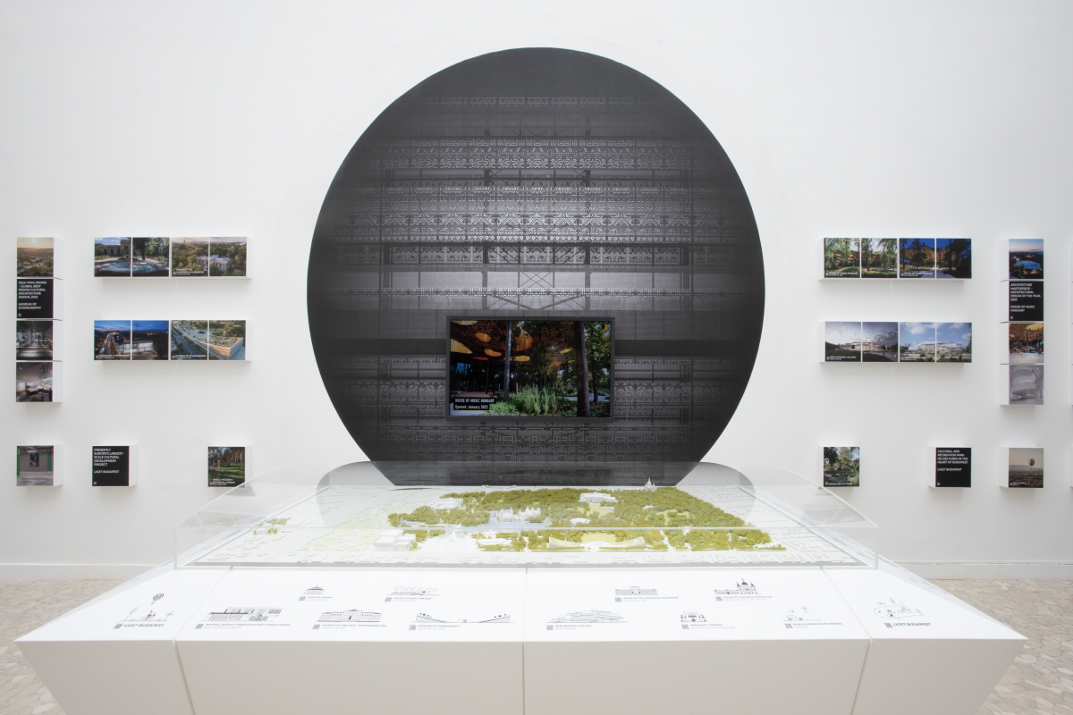 ‘Reziduum – The Frequency of Architecture’ of Hungarian Pavilion ⓒJózsef Rosta
The American Pavilion
This exhibition was about rethinking and recycling materials invented in the United States, including plastics, styrofoam, and sponge. There were architectural approaches to interpreting and using styrofoam insulation and sponge sound absorption, artistic 3D printed crafts and creations of plastic recycling, and junk art sculptures of discarded plastic goods. It was a neatly organised and elaborately displayed exhibition, but it felt like a flagship store display for a company promoting recycled products.

‘Everlasting Plastics’ of American Pavilion ©Andrea Ferro Photograph
The Spanish Pavilion
The Spanish Pavilion was dedicated to the food processing industry and logistics, including agriculture and livestock. The images and videos on display were very large-scale. They reminded me of research documentation of the metropolises and the spectacular artificial environments for mass production and mass consumption that flourished between the 1990s and early 2000s. The large-scale photographs and videos that dominate the exhibition are eye-catching, but perhaps I’m just jaded by these spectacular images and didn’t really take away any fresh impression.
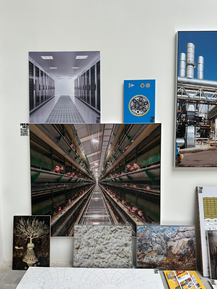
‘FOODSCAPE’ of Spanish Pavilion ©Kim Kwangsoo
The Finnish Pavilion
Much like the diminutive, cute, unassuming Finnish Pavilion building, the exhibition’s contents were simple and practical. The exhibition focused solely on a waterless Finnish huussi (composting toilet) that doesn’t require a civil sewage system. A wooden toilet with a huussi occupies the centre of the exhibition, and that was focal point. The introduction emphasised that dry toilets are not only useful in vast landscapes like those found in Finland, where population and housing density make it difficult to build pipelines, but also in dense cities. But huussis are also being built and tested all over the world, and I couldn’t quite figure out what made the dry toilets on display different. I walked out of the Finnish Pavilion with a smile, as I felt like I had just walked into a booth at a building materials fair, left with the impression that they this was a simple and cute solution.
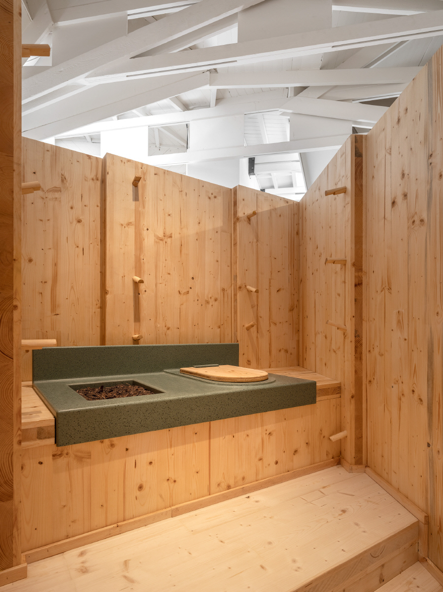
‘Huussi – Imagining the Future History of Sanitation’ of Finnish Pavilion ©Ugo Carmen
This article continues on to the next page.
