SPACE September 2023 (No. 670)
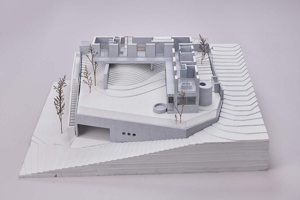
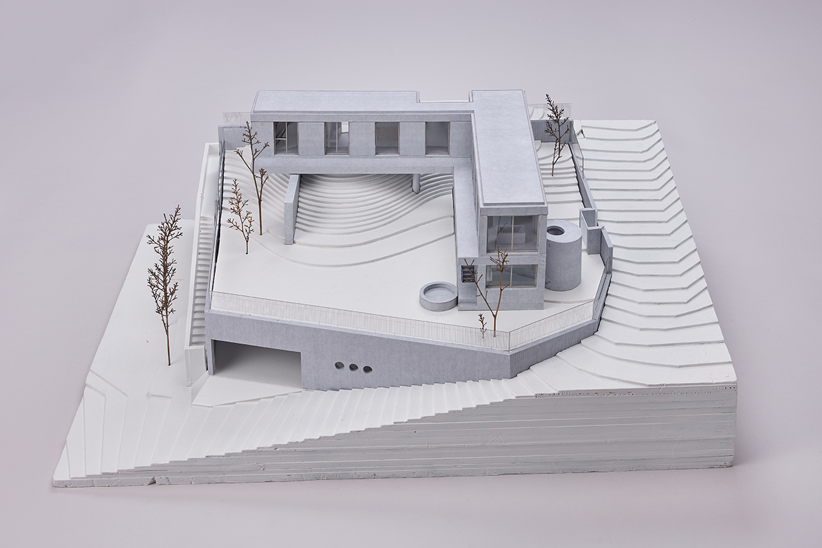
Models of House on the Hill
House on the Hill (2023) is nestled in the highest point of a detached housing complex erected on the hillock. Due to regulations that made it impossible to maintain the slope while transforming the site into a flat parcel, a small hill has been left on a level along with a broad yard that creates a space at once natural and artificial. Two rectangular masses of clear and concise plans meet each other vertically, and one of them spans a small hill in the yard. The concrete structure, clearly distinguished from the ground, stands on the site in an extremely simple geometrical layout. Although there is a staircase leading to the underground parking lot, the building does not actively make use of the steep slope. As in the previous project, AeLe House with 9 rooms (2018, covered in SPACE No. 605), the ground is the ground, and the building is the building. The surface still bears the traces of the formwork, removing the impression that this mass is a single block. These traces, which were made by adjusting the height and spacing of the openings according to the formwork module, the location of the beams, as well as the location and depth of the slabs, resemble traces of stacking by assembling the concrete boards together. In terms of structure, even if all the floors and walls were a single block, the models by NAMELESS Architecture more convincingly demonstrate that the building was actually constructed by joining members that fulfil various functions. That does not mean that this house has imitated the dry process. It just more firmly emphasises concrete as the material. The rest of the walls and stairs are identical to the exterior walls, with the exception of the floor where the property of matter on the exterior continues intact without distinct finishes and the walls that face the open air for interior insulation. The lifestyle of the client (who does not use kitchen furniture, the handrail made of metal or fabrics like carpet and curtains) has been addressed, allowing the materiality of the raw architectural materials to explode. The gap between noticing it from the outside and then feeling the it with one’s own body and the bottom of one’s feet in the interior is extremely narrow. If Ando Tadao intended to transmute concrete into the marble of the 20th century industrial society, here, concrete is concrete. The support walls for the concrete structure, which are used to emphasise a mass that has climbed aboard a small hill in the yard, reveal the other face of the concrete, which is the integration of aggregate with rough-trimmed surfaces, something that is usually hidden. Meanwhile, they have divided the yard into different areas.
NAMELESS Architecture’s approach of emphasising the nature of the materials and matter as well as contrasting the properties of the structure with the members is more clearly expressed in CONCRETEWALL (2023). CONCRETEWALL appertains to and slightly deviated from the fashion for cafés that have appeared all over Seoul as if they were in competition. It is a place in which images are sold more fervently than drinks and dessert, a place where people use Instagram to check out the location, food on offer, and views before choosing it as their final destination. These are often places that one has no chance of incidentally encountering on any ordinary day. The most obvious way to gain more Instagram followers and ‘likes’ is to find a place that has a view of a river, the sea, and a rugged precipice with rocks of fantastic shape. The duty of architects appears at this time to design plans that place as many people as possible facing a ‘view’ and adding large windows to an elevation. A magnificent vista can easily overwhelm architectural devices. Architecture serves a dual media function—as an observatory for the ‘view’ and as a backdrop for Instagram. Fortunately (or perhaps unfortunately), CONCRETEWALL faces Cheongpungho Lake, but the view of the lake is interrupted by a small knoll on the site. As such, the architects of NAMELESS Architecture were not able to position the café to face the lake. In other words, they were given another choice, which is to allow the visitors encounter intriguing building elements such as the wall, staircase, and window first.
The architects placed the parking lot at the highest point of the site, and required visitors to enter from one floor below. When you go downstairs to order drinks, the first thing you see is an unfamiliar concrete wall. The poured-down wall that descends diagonally from one end of the structure, along with the inserted windows, create a strong contrast and draw attention. To maximise this effect, the smooth concrete surface is stripped away with a high-pressure washer to emphasise the rough texture. They appear to be making an attempt to demonstrate the fact that concrete is an artificial ‘stone’ created by hardening the liquid formed by the mixture of small aggregates, fine cement, and water. Including this diagonal wall, all of the walls of the CONCRETEWALL are made of chipped concrete. On the contrary, the floor and ceiling are made of smooth concrete. Within the reinforced concrete structure where everything solidifies into a single block, walls and slabs are – at this point – visually separated.
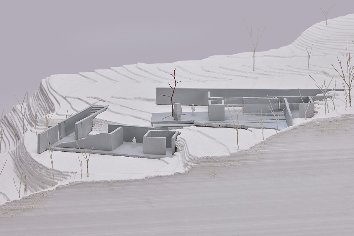
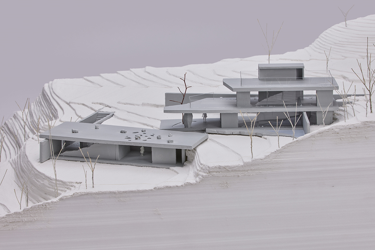
Models of CONCRETEWALL
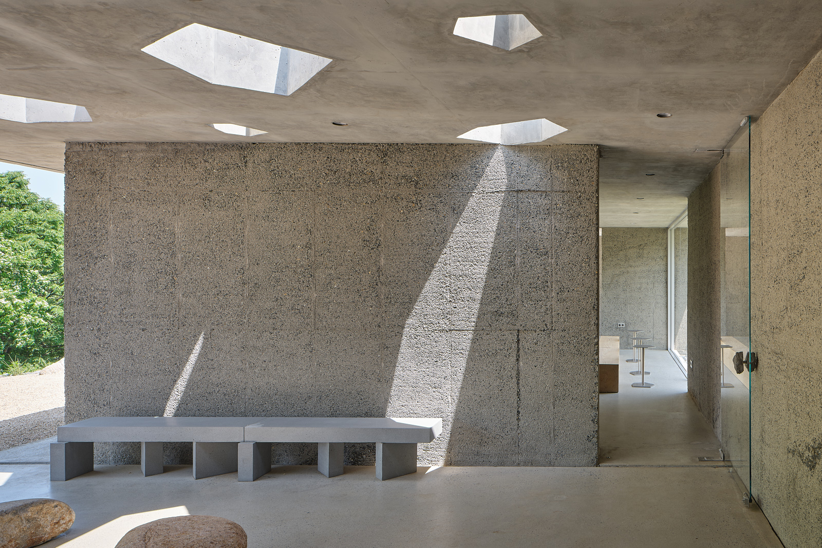
Going to a level above where the chairs are placed, you must pass through a small exterior space with a width about 5m. The polygonal hole punctured in the roof of this place is similar to the Pearling Path Visitor and Experience Center (2019) in Bahrain by Valerio Olgiati. However, the remainder of the various elements that make up this space consistently adhere to the logic of the CONCRETEWALL. The lightemitted from the polygonal-shaped hole drops down the wall and round-shaped natural stones. The contrast between the artificial and nature, between concrete and natural stones, and between shade and light, is repeated in every design intervention that is placed around this space. The contrast is accentuated by a bench designed personally designed by the architects. Made of a rectilinear vertical member of the same-width and long horizontal member casually placed on top of it, the bench occupies the space by contrasting itself to the round and natural stones. This brings to mind the mid-1960s minimalist art, more specifically the works of Robert Morris or Donald Judd. However, by positioning the vertical member contrarily, it clearly shows that there is no repetition of simple forms and that the functions of the vertical and horizontal members are different. After passing through this polyphonic space, where each property of matter and form has its own voice, one finds another variation in tone by ascending another level to where the chairs are. The rough-finished wall traverses the interior and exterior and stretches out by widening the building’s boundaries. The floor and ceiling slabs that are placed in identical sizes on top and bottom of this wall, as well as the glass that is inserted in between, form a near-perfect top and bottom symmetry and create reflection and projection simultaneously. It recallsthe Brick Country House in the 1920s or the Barcelona Pavilion by Mies van der Rohe. The water drops and small nails penetrating the rough wall add the light to be more scattered, breaking the rigorousness of the Miesian silence. The preference of architects for Minimal Art is evident in stools built of steel quadrilaterals.
When you look at the building, CONCRETEWALL is made up of a simple combination, which is a wall inserted between two slabs. In a building that is divided per slope and separated into two parts, the wall – as the building name implies – divides, adjusts, and defines its own spaces. When you find the seat while holding your drinks, there is another natural stone placed on top of the slab with polygonal holes, revealing that this is lakeside. It is similar to tuning in with the concrete walls and asking you to look at concrete plates placed within nature. Their method does not differ much from a school facility that is resistant to the influence of one’s tastes or preferences – unlike a house or café – and more specifically in D School Complex (2022), which used a metal material that was unfavourable for showing off the property of matter when compared to rough concrete. They focus on a single material rather than a variety of materials, visually expressing the roles of each member, and designing the plan more abstinently and rigorously than the affluent properties of matters. This is an extremely consistent track. The steel frame structure determines the outline of the entire building with the grid and provides a sense of regular rhythm. On the contrary, the lightweight reinforced steel plate conveys the atmosphere that this is an event place, such as a gym, canteen, and auditorium, where one does not stay long. The auditorium, which is entirely finished with wood, is in accordance with the outside rhythm with its own sense of rhythm while also clearly distinguishing itself from other spaces. The foundations built in the 1970s serve as the project’s foundations as if it were second nature. The interior design takes a similar approach. The massive concrete column that supports the entire building is positioned with its end protruding slightly, like the bench at the CONCRETEWALL. It’s as if the column and the structure on top are not a single entity.
How should one read these buildings? First, recent works of NAMELESS Architecture are unrelated to tectonics. Although the definition of tectonics has been stretched like a rubber band and become a term that embraces the action of marking a side dot at the construction and material, tectonics is an articulation created by stacking materials. This assumes the articulation of many disparate materials and elements, as well as the recognising activity, which begins as a material but enhances into aesthetical (formal) dimensions.▼1 CONCRETEWALL, which emphasises that ‘concrete is concrete, a wall is a wall, and a floor is a floor,’ or, to put it another way, which distinguishes between the floor and wall by employing an identical material and claims that the stones from nature and concrete are actually the same, is rather quite non-tectonics. If tectonics is, as Kenneth Frampton put it, ‘the poetics of construction’, the recent works of NAMELESS Architecture are ‘the technique of expression’, close to a literalism that expresses the thing or object without idealising.▼2 Such attempts by NAMELESS Architecture continue to evoke the strategies of Minimal Art. In a broader context, these buildings are curiously postmodern. Not necessarily postmodernism architecture, which refers to specific works that mimic historical styles, but postmodern in the way that it covers many different searching experiments and practices post-1980s that appropriated and subverted the legacy of modern architecture in its own ways.▼3
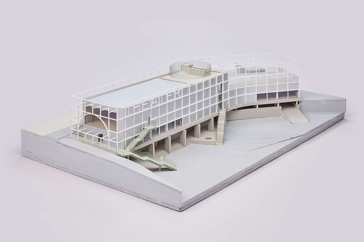
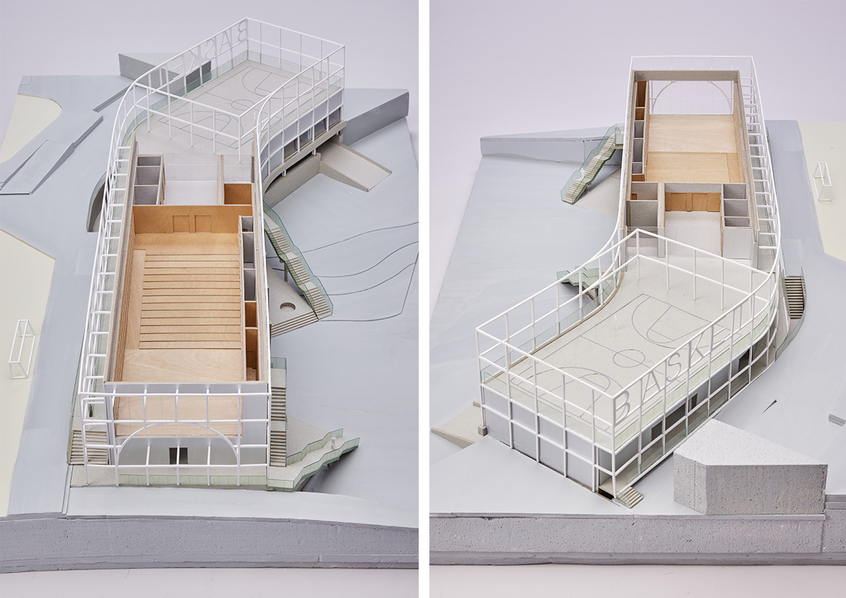
Models of D School Complex
László Moholy-Nagy, a master of Bauhaus, redeclared in 1929 in From Material to Architecture (von material zu architektur) that space is the major interest and accomplishment of modern architecture. He emphasised that ‘building material (baumaterial)’ is secondary, and the ‘primary design method (hauptgestaltungsmittel)’ is only space.▼4 Material should be absorbed into architecture (space). When space is prioritised, the material does not become too prominent—similar to the way we don’t ask whether the walls of Villa Garche are brick or concrete. It goes without saying that the recent flow is exactly the opposite. Is architecture going back to materials? It has for a long time been that a focus on space, which has become a synonym for area or floor area ratio, is not the primary design method. In atonement for this, many architects look for God in the detail, but what resides there is no God but capital. NAMELESS Architecture is also concerned with materials but does not scrutinise details. Rather than elaborate and refined detailing, it highlights rough and coarse surfaces.▼5
Ways of treating the wall and the column as if they were rough stones and fragments of concrete, rather than crafting them like an order, can be easily found in contemporary practices including works by Anne Holtrop. ‘Switching to the material and matter’ is perhaps a phenomenon that arises in the awareness of the time that many architects of the day can relate to. In addition to the climate crisis, which no one can ignore these days, recent humanistic discourses (new materialism, nonhuman actor of Bruno Latour, etc.) are paying more attention to the subject and matter themselves than ever before.▼6 The phenomenon that occurs in architecture must be in response to such a social change. The stones of architecture, on the other hand, cannot be the same as the stones of an art museum or a field.▼7
Stones of architecture, no matter how rough and raw they are, are carefully selected artefacts, manufactured ruins, and chosen fragments. They are the stones that rejected the order’s wholeness or part of the white walls, the stones that are not present but reappearance. It is impossible to reduce the manner and strategies of NAMELESS Architecture as expressed in recent works to a single discourse. Rather, they are closer to expertly and freely mobilising and utilising various stances, theories, and flows. It is a polyphonic body of work composed of rigorous plans, raw materials, and many different citations. Perhaps we should inquire into the conditions (of the Korean architectural industry) that allow for such design sensibilities rather than focus on outcomes. Because the works are quite different, visually, even when derived from similar stances and positions. Let’s see what noises and music these varied sounds can be intertwined with, and what changes or does not change inside them. There is more future than the past, and the change has only just begun.
1. It is sufficient to recall that the partner of tectonics in 19th-century Germany, where the discussion of Tectonics began to hit its stride, was (idealism) aesthetics. For related discussion, refer to Mitchell Schwarzer, German Architectural Theory and the Search for Modern Identity, Cambridge: Cambridge University Press, 1995.
2. For more information on the mid and late-1960s Minimal Art movement, which revolved around the boundary and division between objects and art, ordinary and art, fine art and architecture, as its relevance to architecture, refer to Mark Linder, Nothing less than Literal: Architecture After Minimalism, Cambridge MA: MIT Press, 2004, and for the basic definition of literalism, p. 11.
3. One should never forget that contemporary architecture is always a reference point in various subjects, from Deconstruction to Digital, Diagram, and the recent OOO (Object-Oriented Ontology) in which philosopher Graham Harman was a key figure. Deconstruction does not dispute with Post-modern, and Diagram does not dispute with Deconstruction. The opponent is not the preceding one, but Avantgardeand Modernism in the early and mid-20th century. The 20th century has not yet disappeared, and practices of the time still remain in the scope of encountering and battling with this spectre.
4. moholy-nagy, von material zu architektur, münchen: albert langen verlag, 1929, p. 211. This book, published as a part of a Bauhaus series of 14 books, does not capitalise the first letters of the nouns in German. Therefore, it was not capitalised either when referencing or citing it.
5. Regarding such a manner, refer to NAMELESS Architecture, Compete Incomplete Dictionary, SPACE BOOKS, 2019.
6. Kwak Yung Bin’s writing about stone, ‘Does a Stone Have a World?: Lithic Turn of Contemporary (Korean) art’, which emerged in the fine arts scene, is a good point of reference. Busan Biennale 2022, the website of the ‘WE, ON THE RISING WAVE’, accessed 7 Aug. 2023.
7. When stones in an art museum or a field invoke a new interest and spark a discourse and reason, it might be considered that the primary purpose has been fulfilled.
You can see more information on the SPACE No. 670 (September 2023).
