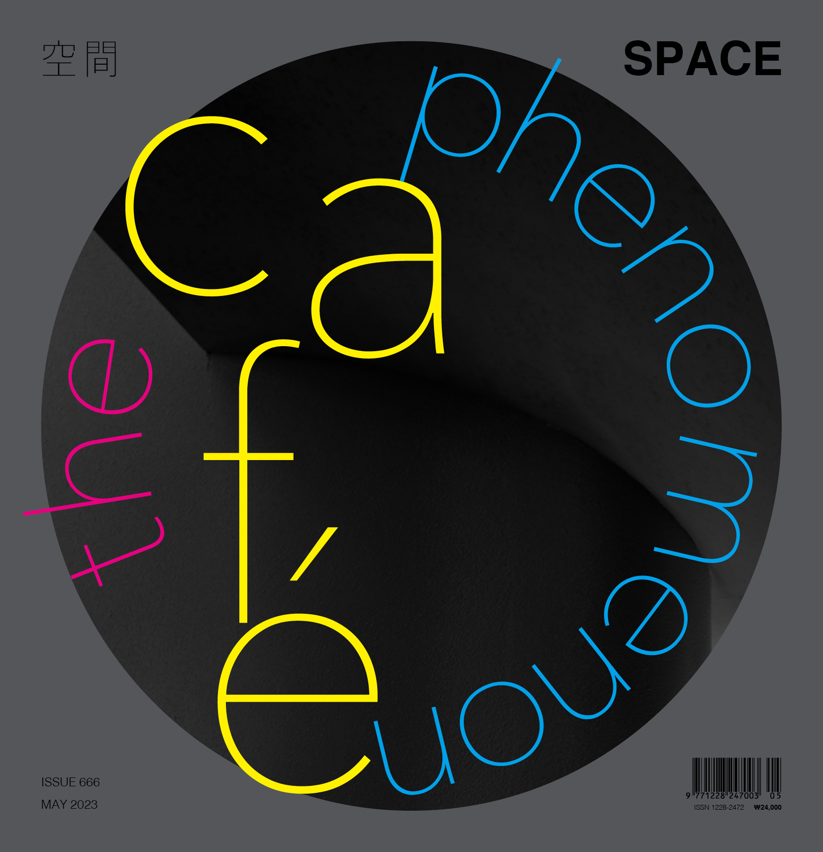
SPACE May 2023 (No. 666)
[THE CAFÉ PHENOMENON] Cafés from Across the History of Architecture
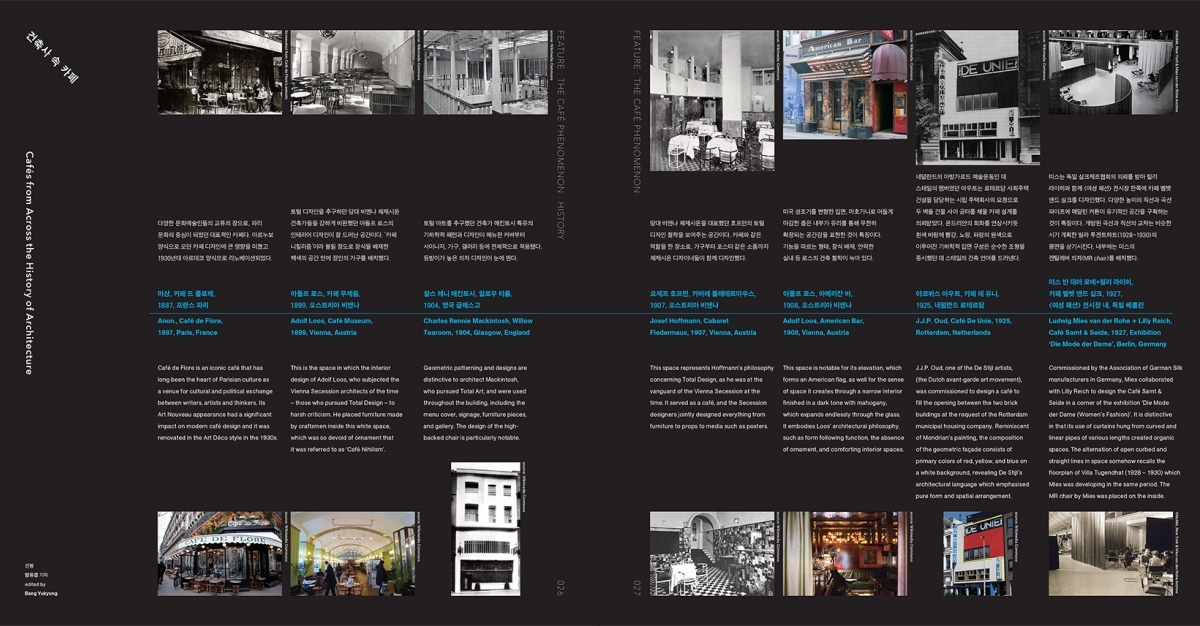
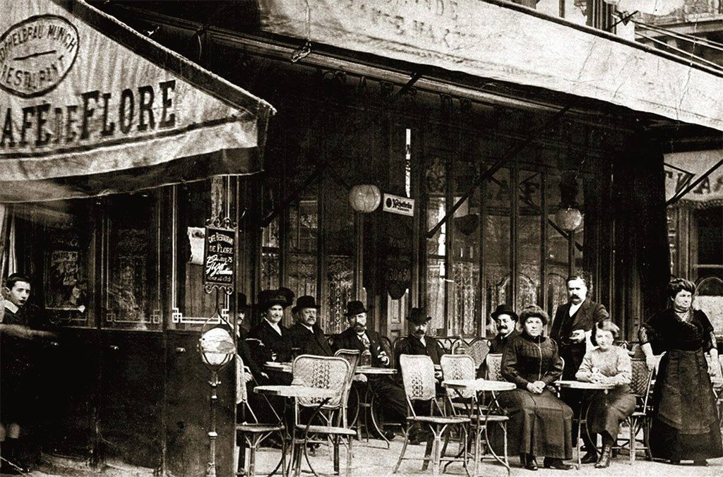
Anon., Café de Flore, 1887, Paris, France
Café de Flore is an iconic café that has long been the heart of Parisian culture as a venue for cultural and political exchange between writers, artists and thinkers. Its Art Nouveau appearance had a significant impact on modern café design and it was renovated in the Art Déco style in the 1930s.
Screenshot from Café de Flore’s website
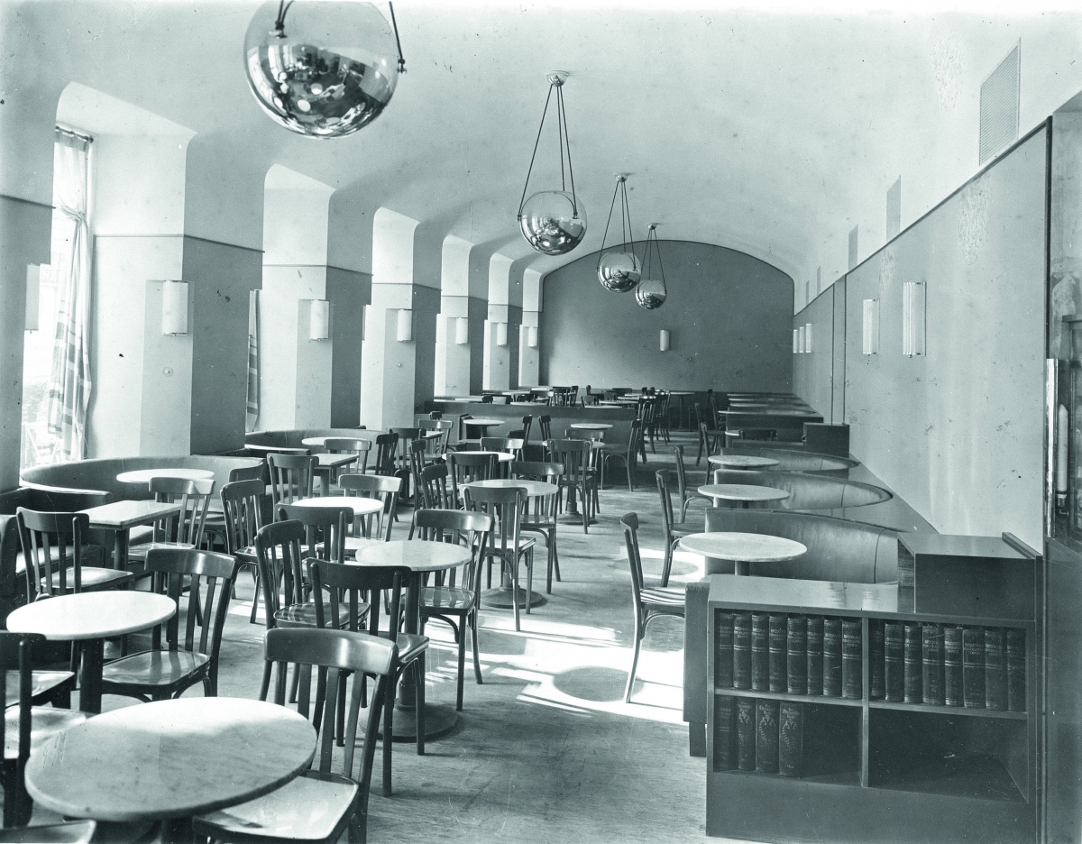
Adolf Loos, Café Museum, 1899, Vienna, Austria
This is the space in which the interior design of Adolf Loos, who subjected the Vienna Secession architects of the time – those who pursued Total Design – to harsh criticism. He placed furniture made by craftsmen inside this white space, which was so devoid of ornament that it was referred to as ‘Café Nihilism’.
source: Wikimedia Commons
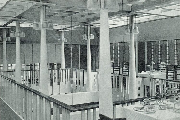
Charles Rennie Mackintosh, Willow Tearoom, 1904, Glasgow, England
Geometric patterning and designs are distinctive to architect Mackintosh, who pursued Total Art, and were used throughout the building, including the menu cover, signage, furniture pieces, and gallery. The design of the high-backed chair is particularly notable.
source: Wikimedia Commons
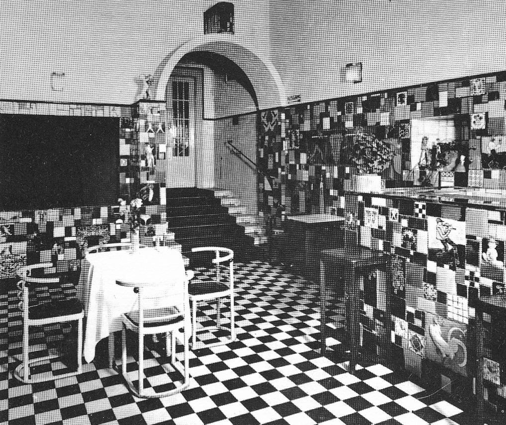
Josef Hoffmann, Cabaret Fledermaus, 1907, Vienna, Austria
This space represents Hoffmann’s philosophy concerning Total Design, as he was at the vanguard of the Vienna Secession at the time. It served as a café, and the Secession designers jointly designed everything from furniture to props to media such as posters.
source: Wikimedia Commons
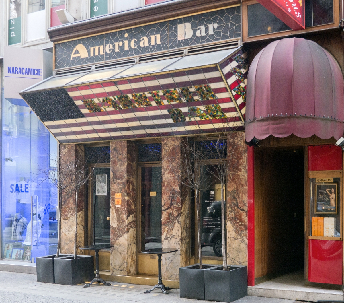
Adolf Loos, American Bar, 1908, Vienna, Austria
This space is notable for its elevation, which forms an American flag, as well for the sense of space it creates through a narrow interior finished in a dark tone with mahogany, which expands endlessly through the glass. It embodies Loos’ architectural philosophy, such as form following function, the absence of ornament, and comforting interior spaces.
source: Wikimedia Commons
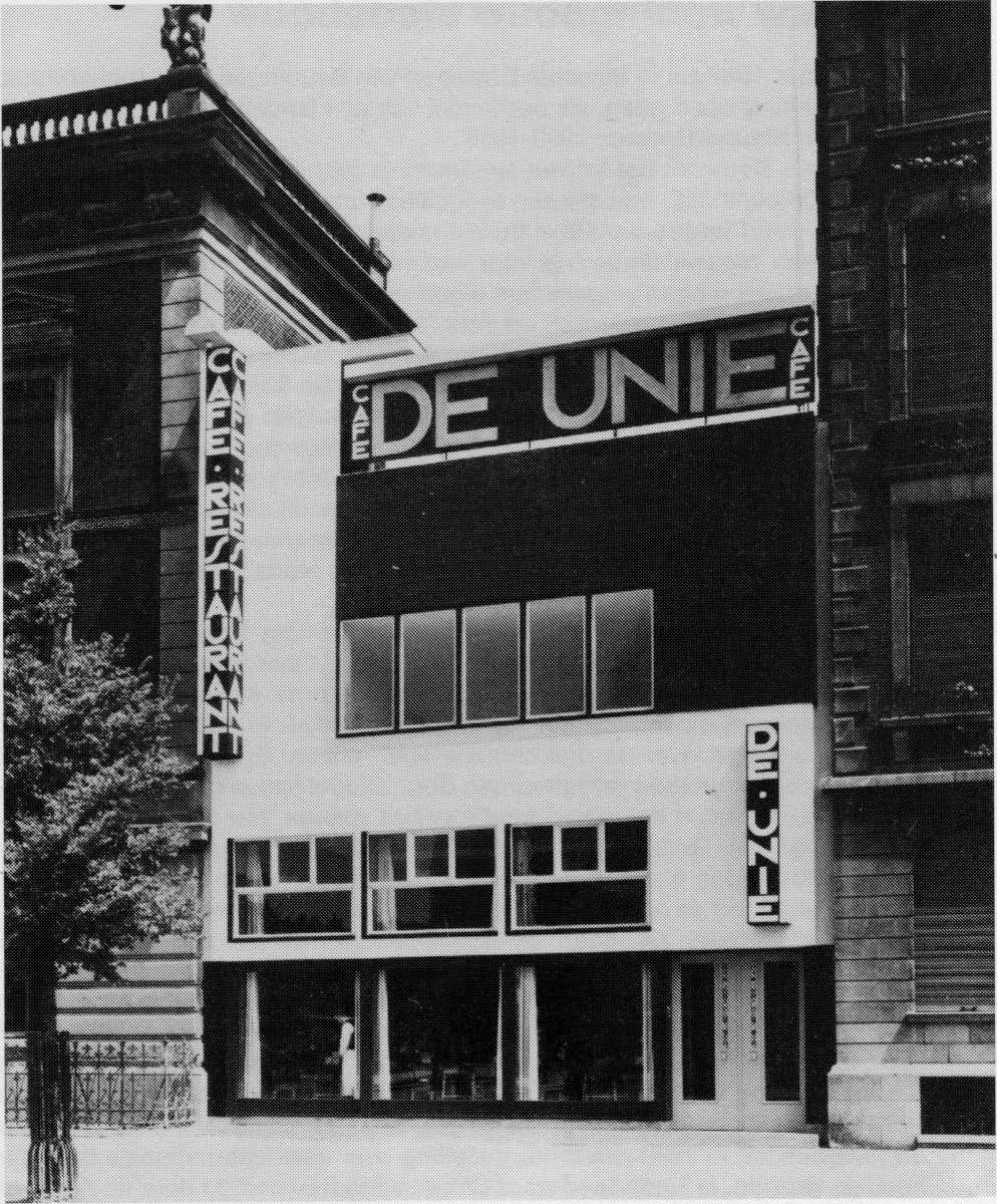
J.J.P. Oud, Café De Unie, 1925, Rotterdam, Netherlands
J.J.P. Oud, one of the De Stijl artists, (the Dutch avant-garde art movement), was commissioned to design a café to fill the opening between the two brick buildings at the request of the Rotterdam municipal housing company. Reminiscent of Mondrian’s painting, the composition of the geometric façade consists of primary colors of red, yellow, and blue on a white background, revealing De Stijl’s architectural language which emphasised pure form and spatial arrangement.
source: Wikimedia Commons
Ludwig Mies van der Rohe + Lilly Reich, Café Samt & Seide, 1927, Exhibition ‘Die Mode der Dame’, Berlin, Germany
Commissioned by the Association of German Silk manufacturers in Germany, Mies collaborated with Lilly Reich to design the Café Samt & Seide in a corner of the exhibition ‘Die Mode der Dame (Women’s Fashion)’. It is distinctive in that its use of curtains hung from curved and linear pipes of various lengths created organic spaces. The alternation of open curbed and straight lines in space somehow recalls the floorplan of Villa Tugendhat (1928 – 1930) which Mies was developing in the same period. The MR chair by Mies was placed on the inside.
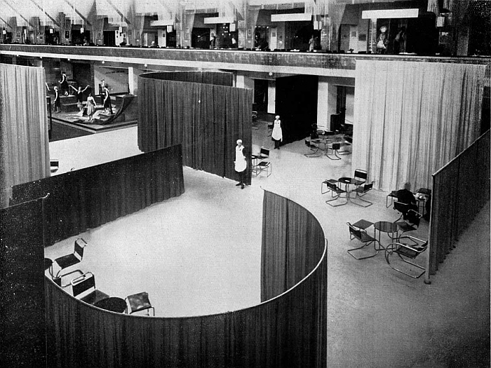
ⓒMoMA, New York & Mies van der Rohe Archive
Jože Plečnik + Vinko Glanz, Cafe Belvedere (Tito’s Teahouse), 1930s – 1945, Bled, Slovenia
Jože Plečnik, known as the Gaudi in Slovenia, designed a summer residence at the King’s request near the Bled lakeside, which features magnificent scenery. When the three 30m high columns were erected, the King was assassinated, thereby terminating the project. Following that, his disciple Vinko Glanz completed the project by building a teahouse on top of the columns. It is a space where the atmospheres of classicism and modernism coexist, much like a folly in nature.
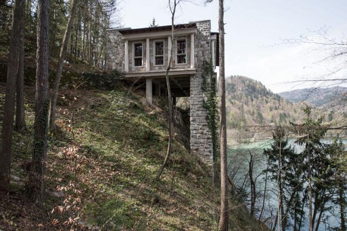
source: Architectuul (CC BY-SA)
Oscar Niemeyer, Tea House in Praça dos tres poderes Square, 1960s, Brasília, Brazil
Designed by Niemeyer, this is a tea house with a visitors’ centre in Praça dos tres poderes Square. Located in the heart of the symbolic space where the National Congress, Presidential Palace, and Highest Court are positioned in a triangular composition, this project displays a sense of publicness. The long, horizontal, and half-storey-sunken mass as well as the transparent and open interior space exemplify the modernist formativeness of Niemeyer’s architecture.
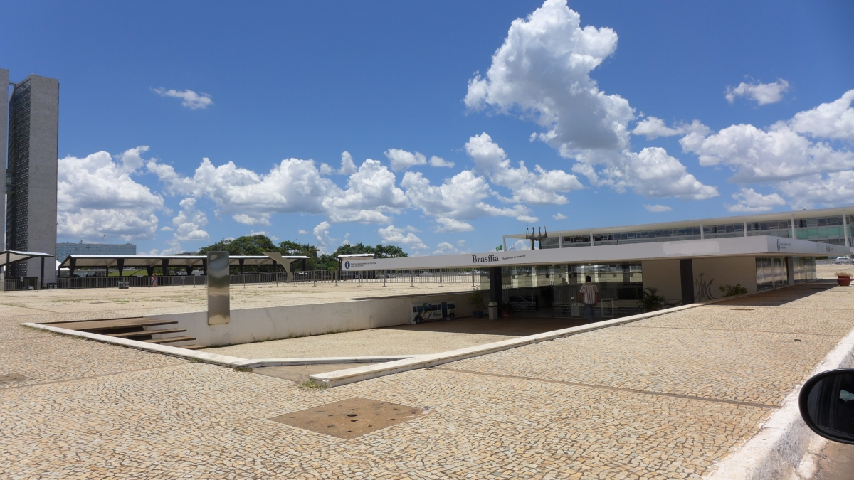
ⓒChang Yongsoon
Robert Venturi + Scott Brown, Grand’s Restaurant, 1962, Philadelphia, USA
This is a project in which two adjoining terraced houses were converted into a cheap cafeteria and café. This was an early project completed prior to the publication of Complexity and Contradiction in Architecture (1966) and the construction of Vanna Venturi House (1959 – 1964). The three-dimensional signboard in the form of an eye-catching cup is an element that reveals the significance of an explicit and easy-to-understand architecture central to their design outlook.
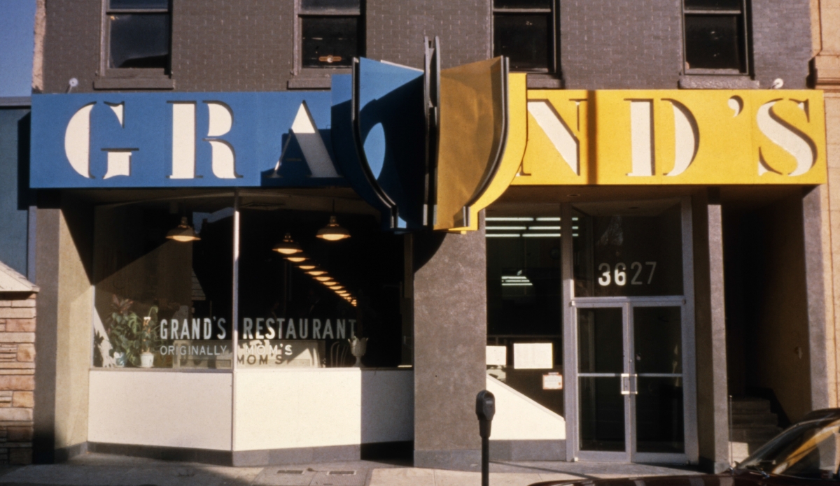
Image courtesy of Venturi, Scott Brown and Associates, Inc.
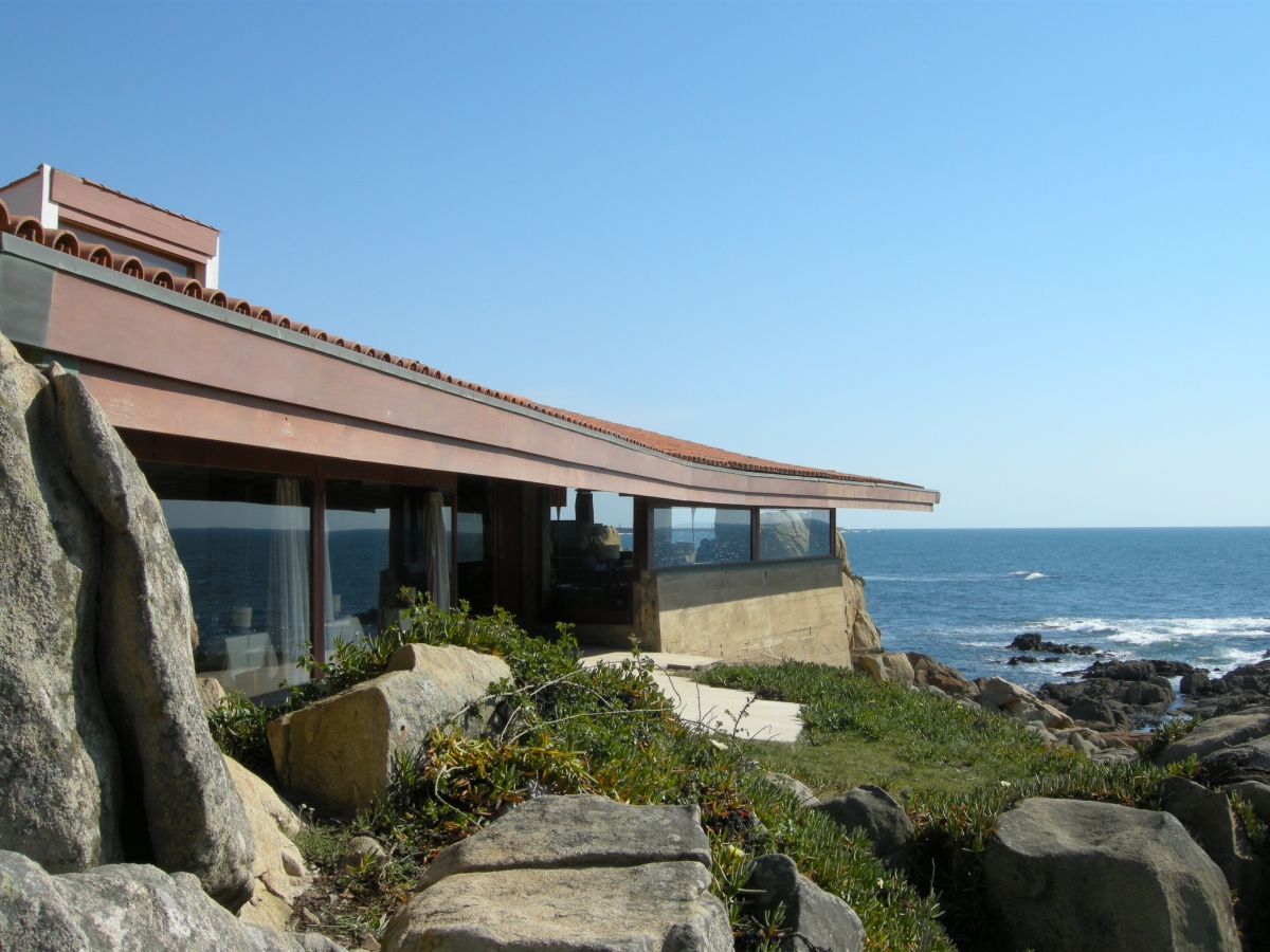
Álvaro Siza Vieira, Boa Nova Tea House, 1963, Matosinhos, Portugal
This tea house, which is next to the pioneering project Leça Swimming Pools (1966), is an early project in Siza’s architectural style, which values harmony with and respect for nature. The building, which is sunken low while retaining the coastline’s natural rocks, blurs the boundary between inside and outside, assimilating itself into the scenery.
ⓒNam Sungtaeg
Ando Tadao, Tea House in Oyodo, 1985 – 1988, Osaka, Japan
This is a small-scale project that was undertaken after receiving significant attention for Row House in Sumiyoshi (1975) in Osaka. Ando designed three different tea rooms made of veneer, blocks, and tents, respectively, while renovating an old wooden building. This work received attention because it used lightweight materials and structure to explore a new architectural interpretation of the traditional Japanese tea house space.
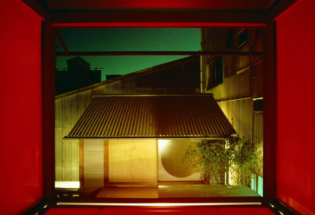
Image courtesy of Tadao Ando Architect & Associates
Isozaki Arata, Ujian Tea House, 1992, Shinagawa, Japan
This is a challenging project in which Isozaki designed a tea house that inherited elements of traditional tea ceremony architecture but reinterpreting it using contemporary materials. Isozaki named this process an ‘aesthetics of combination’, and designed a space for contemplation that would suit the atmosphere of a tea ceremony by adhering to traditional manner while adding titanium walls, steel screens and eaves, and cedar roofing panels.
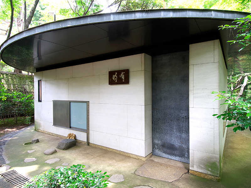
Image courtesy of GOTENYAMA TRUST CITY
Frank Gehry, Condé Nast Cafeteria, 1996 – 1997, New York, USA
This was Gehry’s first project in New York, and he challenged himself to bend glass instead of steel plates. Beneath the titanium ceiling, more than 70 glass walls of various sizes and curvatures were installed in a form of a booth. The interior space, with its sinuous giant glass wall, expresses a sense of openness and dynamism, perfectly embodying Gehry’s peculiar sense of floating space. (The photo is of it remodelled, taken in 2018.)
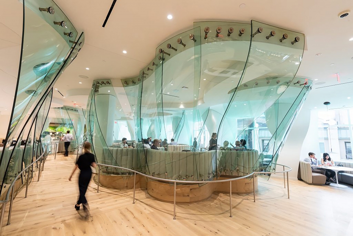
Image courtesy of the Durst Organization
Sejima Kazuyo + Nishizawa Ryue, Koga Park Café, 1998, Ibaraki, Japan
Sejima often referenced the park as an endlessly extending space for free and arbitrary ‘occupation’. This café, which was completed in 1997 during an early point in her architectural practice, is located in Koga Park in Ibaraki, her hometown. On the inside, slender columns are freely positioned like forest trees, with chairs and tables randomly placed in the (semi)transparent space in between. This can be considered to be one of the prototypes for SANAA’s unified, horizontal, non-hierarchical spaces.
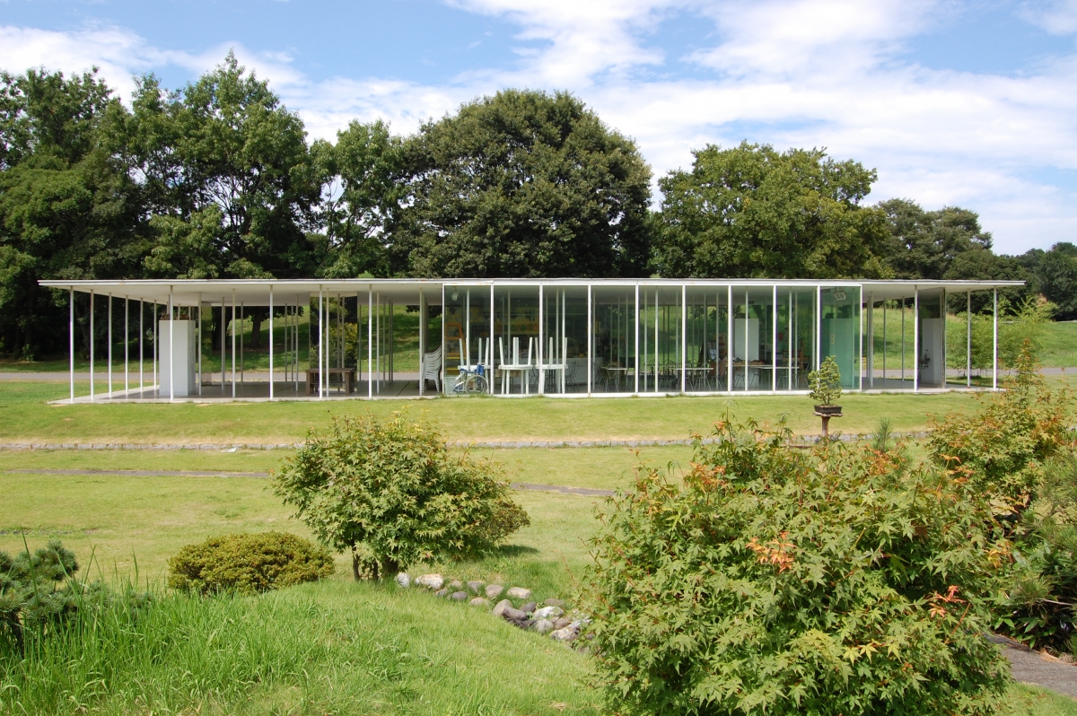
source: Wikimedia Commons
You can see more information on the SPACE No. 666 (May 2023).
