SPACE November 2022 (No. 660)

SPACE No. 66 (July 1972) ▶ e-magazine
Designed in 1971, at a crucial moment in Korean modern history that can be traced through a series of incidents triggered by student’s campaign against military conscription and followed by the Flight from Silmido Island, as well as the declaration of a state of national emergency that unexpectedly paved the way to the Yushin (Revitalising Reform), and further compounded by the Daeyeonggak Hotel fire, Residence for Mr. K stands at the entrance of the present Geumhwa Tunnel with a dignified indifference far removed from the chaotic and turbulent social atmosphere of those days.▼1 Bone tile, a newly devised material that covers the house in its distinctive white, makes it appear like the plaster mass of a cubist sculpture, while most detached houses of that period are heavy as they are often finished with brick, as found in Frank Lloyd Wright’s architecture. The three different cubes, like toy blocks as if piled up by a child, are vaguely reminiscent of Ricardo Bofill’s bold faÇades due to the deep shadows cast by the blunt narrow awning drawn with a thick pencil, and the tiled roof cut into two pieces to the northeast is somehow cute and friendly. The client, the father of three students at Ewha Womans University, commissioned this unassuming house which is very Mediterranean in its style. The client is said to have requested only one thing: arrange the rooms so that he can avoid his daughters when he’d rather have some privacy. Except for this, the architect was given free rein in its design.▼2 In the house, one of his debut works commissioned before entering his thirties, the architect played a kind of game with the architectural design as if he wanted to present a ‘zeitgeist’ work drawn from a manifesto rather than the presence of ‘genius loci’.▼3
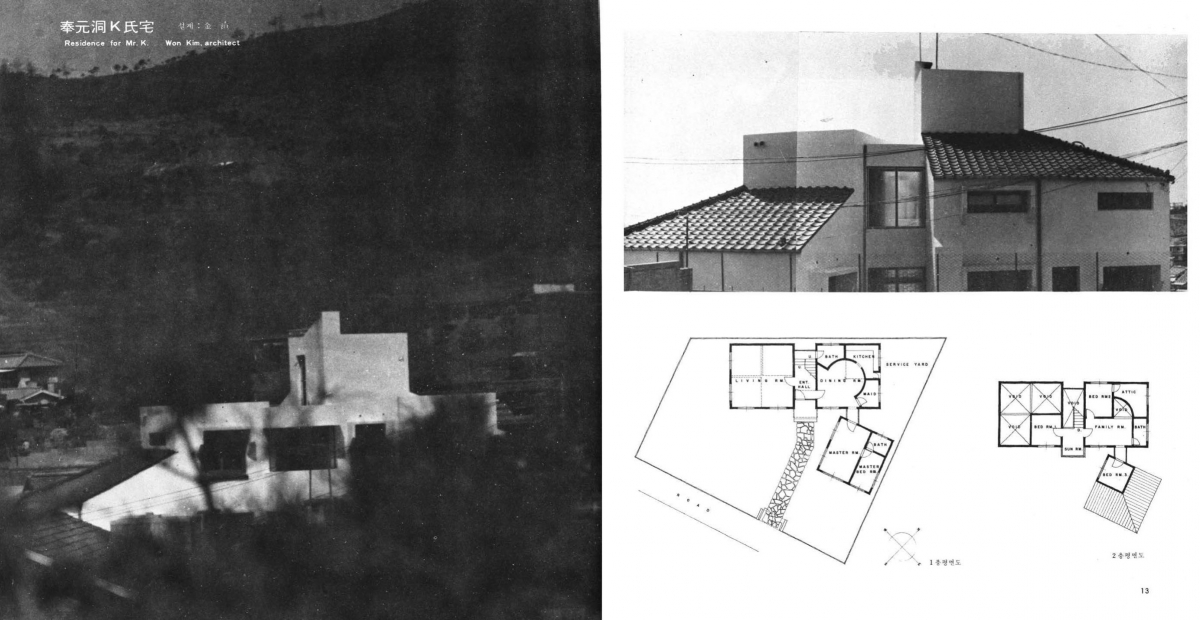
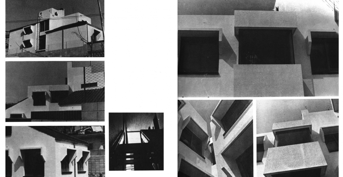
SPACE No. 66, pp. 12 – 15.
This house, which is easy to understand from the drawings, is composed of three elongated quadrangular pyramids simply combined on square plans with rectangular function boxes inserted between them. As it is based on modern formative principles and proportions, it is no wonder one often encounters them on an overseas webzine or when browsing Instagram. The volumes have a clearly diagrammatic relationship with each other because the house eventually reads as one entity, like a cake of three-quarters. It features a kind of flat facade towards the south entrance created due to the reduced volumes of the square on the second floor, while containing independent ‘completeness’ due to the properties of square in volumes of living room, dining kitchen, and master bedroom area respectively. In the sense that all volumes are ‘Forms Derived from a Cube’, they recall Sol LeWitt’s drawings, and their simple geometric partition of plane is also reminiscent of hip Chilean architect, Pezo von Ellrichshausen’s ‘Spatial Structure’ drawing. Geometric compositions through transformation such as segmentation, movement, and rotation within rectangular grid system remind me of Peter Eisenman’s series of houses, which explored the autonomy of architectural forms through strict inner principles, but the house is much more conservative than these examples. Considering that he divided a volume into quarters and separated them, and granted an independent character to each element, it is similar to John Hejduk’s 1/4 House and 3/4 House, but Residence for Mr. K is less playful in that each piece is not different from each other. It is unlikely that he would have come across the work of overseas architects at his time, particularly as it was difficult to find them in translation, not to mention the absence of Internet presence, but it is very interesting and curious in that his house is loosely connected to the manifesto works of the New York Fives.
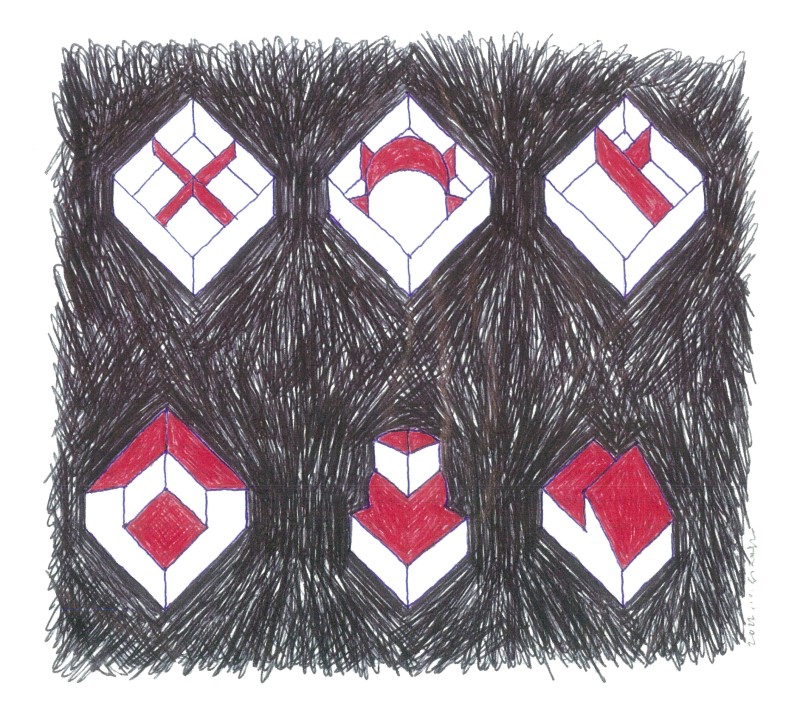
‘Spatial Structure’ and ‘Forms Derived from a Cube’. ballpoint pen sketch
Following the principle of a form creation by division, interior space is also considered a ‘game of division’. The rule is how to solve the necessary functions with the least number of lines without ruining the system inherent in each square space. Perhaps that’s why the lines of the partition wall are very simple, mechanical, and without any technique. Interior wall lines that define a wealthy house of 58-pyeong (about 192㎡) are used seven times on the first floor and eight on the second floor, and in total, twelve lines satisfied the whole functions when duplicate lines are left out of count. This means that architectural design is a strict game for oneself, which tries to avoid drawing excess lines here and there as needed. As a result, there are no surpluses such as small function rooms, terraces, and closet alcoves as commonly seen in house plans. Without displaying room names, the plan even doesn’t really look like that of a house. This house may have been revealed by simply drawing lines from the revelation by the geometry that the site assigned. As the architect later stated, ‘If an architect believes that something is thrown into nothing, he is exceeding his authority, and if he thinks that something can be created, he is conceited ... So, a designated path exists there’.▼4 This asks an ontological question which makes us reconsider the act of architectural design, and addresses architects who have perhaps forgotten this essential task.
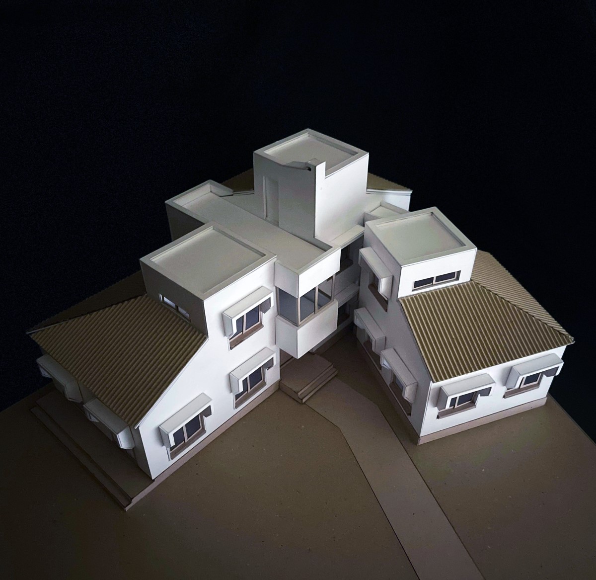
A bird’s-eye view. 1:50 model (production: Choi Jangmin)
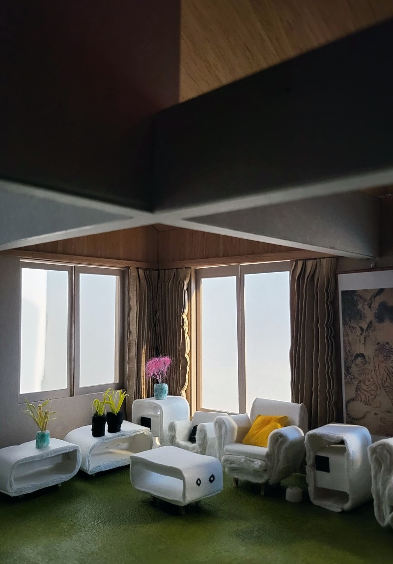
Interior of the living room. 1:20 model (production: Bak Sunmin)
In the house, the same volumes are placed on both sides of entrance and stairs at the centre, and another volume is placed away from them like a separate building. The location of stairs makes it look like multi-family house rather than a single-family house, which enables the client’s daughters to freely enter and exit their rooms on the second floor without going through a common living room or dining room. This satisfied the client’s original requirements: complete separation from his daughters but the possibility of monitoring them as they arrive home and ability to check their outfits when they go out from the window of parent’s room on the first floor of the separate building faces the entrance. The house is a small dormitory. The living room is an empty square space with a slanted and exposed ceiling surface, and its geometrical purity is not altered by separating ancillary spaces such as the bathroom and dining at the outside. However, the exposed cross beam that supports the room for one daughter on the second floor without a column and a ceiling volume left incomplete at 3/4 both play the role of strengthening the overall visual dynamics and tensions. This is a natural result of securing privacy for the three rooms for the daughters around a family room on the second floor. The entrance to the living room, like a single pavilion, begins at the centre of the wall, and the resulting series of spatial configurations fits the space perfectly without any frills. A series of planned sequences appears quite naturally, like putting together a puzzle: the low level stair landing, due to starting point of the stairs near the living room door; the accessibility and independence of common toilets created using the stair landing; a solution to the floor plumbing issue; a wide open void thanks to the extended stairs on the second floor; the doors of a daughter’s room and family room which face each other designed following geometric principles; living and dining doors that don’t face each other at the same location on the first floor. Above all, the circular wall of dining kitchen space not only serves as a pivotal icon connecting the two spaces on the left and right in the first floor plan, but also clearly intends to differentiate it from other spaces. Moreover, imagining the scene of the family sitting around a round table for a meal reveals it as a welcoming space, and a cute fan-shaped void invites one to enter the space. More careful observation reveals that the centre of the circle has deviated by about 30cm from the centre of the square, which slightly violates the rules of a game to secure a workspace in the kitchen. However, this not only allocates more space to the kitchen, bathroom, maid’s room, and dining room, but also means that the rooms on the second floor are also of a more reasonable proportion, which is an admirable achievement overall. The most dubious element is the two short walls protruding from the ends of the circle, which operate on an angle that appears to be without origin. In order to obey the principle, it would have been more appropriate to move the hallway so that it could lead to the master bedroom towards front door and to align the protruding wall on the right angle, but this will not only block the view from the dining room, but also require turning the annex itself along the grid to make the connection smoother. However, it would have made the overall layout too rigid and undesirable in relation to the irregular site boundary. The volume which features the master bedroom is freer than others from such rules as it is separate. It was roughly divided according to its function and also incorporates a square room for one daughter on the second floor. A closer look at this part shows that walls on the first floor and the second floor do not match, and this is because he wanted the three volumes to be united into one icon on the roof. As such, the three volumes develop their own variations while following basic principles, which is testament to the fact that the game rules are established by themselves rather than given, but the house eventually goes beyond a dimension of a simple game while it clearly also reveals the architect’s attitude who wrestles with the encounter between form and function, reason and emotion, moderation, and relaxation.An informed guess would be that Residence for Mr. K was not a design devised according to the terms of the so-called ‘good house’ for the client or ‘impressive house’, which was then mainstream among architects. Rather, the architect seems to have tried to present to contemporary architects what the ‘right architectural design’ might be through this house. He is Kim Won, a revered architect of our time who first translated Architecture without architects, the foremost ‘genius loci’ book into Korean in 1979, and Skyscraper (currently known as Fountainhead), the most zeitgeist book in 1988.▼5
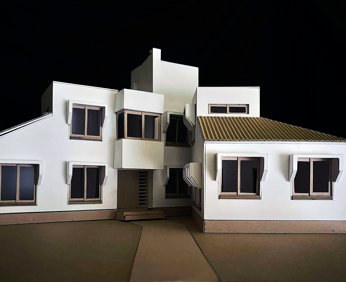
View of the entrance from approach. 1:50 model (production: Choi Jangmin)
In our next issue Shin Chunghoon will cover Park Yongsook’s ‘Why It Is Ideological’, which originally featured in SPACE No. 84 (Apr. 1974).
------
1 The current administrative district address of the Residence for Mr. K is 37, Seongsan-ro 24-gil, Seodaemun-gu, Seoul, Korea, and the building appears to have been demolished in 1993 according to visible changes in the aerial photographs of the National Geographic Information Institute.
2 Refer to the description of Residence for Mr. K posted on the architect’s Naver blog.
3 Refer to Peter Eisenman’s ‘Lateness and the Crisis of Modernity’ lecture at the AA School in the UK in February 2010 for more on the debate over ‘genius loci’ and ‘zeitgeist’ in contemporary architecture.
4 Kim Won, ‘My Architectural Vocabulary on Residential Design’, SPACE No. 93 (Feb. 1975), p. 18.
5 Born in Seoul in 1943, Kim Won graduated from Kyunggi High School and College of Engineering at Seoul National University, and after working for Kim Swoo Geun Architects and Korea Engineering Consultants Corporation for 5 years from 1965, he established his architectural firm, KwangJang (Architects’ Group Forum). He is famous for prolificacy in writing as many as his architectural works, and he has published many essays and collections of works.


