Towards the end of last year, another historic factory in Seongsu-dong was given new life as a new spatial platform. While this is no longer something new, LCDC SEOUL exudes a certain different atmosphere in comparison to the commercial complex spaces that came before. The difference may come from its linguistically-weaved meticulous planning, the architecture that acts as its dependable background, and its particular view toward the neighborhood. I had the opportunity to interview the project management team composed of Kim Jaewon (principal, Atelier Écriture), Chung Kangwha (professor, Konkuk University), and the architect Seo Seungmo (principal, Samuso Hyojadong).
interview Kim Jaewon principal, Atelier Écriture, Seo Seungmo principal, Samuso Hyojadong, Chung Kangwha pofessor, Konkuk University × Park Semi photographed by Chin Hyosook (unless otherwise indicated)
Park Semi (Park): I’d like to know how the LCDC SEOUL (hereinafter LCDC) project came about. What brief did you receive from the client and what was your approach?
Kim Jaewon (Kim): At first, SJ Group requested the branding design for an approximately 60-pyeong sized fashion boutique store with travel as its guiding concept. So we were doing the branding project without being tied to a specific location, but after visiting the current site of LCDC, the approach had to be readjusted. The 60-pyeong turned into 500-pyeong in scale, and my thought was that it would be impossible to expand a single brand to match such an increase. I began thinking about how to reconfigure these three building blocks that used to be an auto repair shop per floor, and various professionals were brought in to experiment with collaborative work.
Park: Considering that there was a great deal of autonomy in the project, despite emerging from a client request, I assume that there was a need to develop a dependable and concrete plan?
Chung Kangwha (Chung): Considering our previous projects with Atelier Écriture, it was a challenge to stick to a single direction from the start to finish as we often had numerous parties and participating artists involved. The projects tended to proceed in phases: after the building stage, it was followed by the interior design stage, which was then followed by the software stage, and so on. While this approach led to interesting results as each stage had its own unique direction, however, it was hard to locate the overarching theme. In that context, our goal behind LCDC was to ‘stick to the original idea until the end’. To do this, we needed to clearly explain to the client from the early stages why this project must be done this way, and why these elements are needed. Because of this, the project got suspended quite a number of times. (laugh) We kept reminding ourselves that we had to inspect details, in every nook and cranny, to maintain a sense of consistency throughout and not give up midway on what we had decided. We wanted there to be a harmonious relationship between architecture as the larger context and the little details such as music and audio. The architecture designed by Seo Seungmo was an excellent basis upon which to build, and overall was a pleasant working experience.
Park: The greater the number of participant parties, the more crucial it must have been to develop a meticulous planning and appropriate communication method. I heard that Atelier Écriture conducts its projects using a conceptual language as its medium rather than relying on referential images.
Kim: We collaborated with various creators on the LCDC project. People from architecture, interior design, lighting, landscape, graphic design, and small-scale artwork artists participated. The early stage was smooth because the branding design was all finished beforehand. We continued to communicate and archived our progress by putting together a brand manual book. This manual book became a useful guide and media of communication to the F&B team that joined later at the management stage. In fact, nine tenants composed of six brands and boutique stores signed up to set up stores on the third floor doors while the building was still undergoing demolition. What I mean to underscore is that these future tenants had signed up even without having the chance to visit the space firsthand. This was all possible because everything from brand concept to specific strategies were all well-presented in the manual book.
Park: Under the overarching theme ‘journey’, LCDC follows the linguistic structure as a ‘a tale within a tale’ (Le Conte des Contes). How is this reflected in the arrangement and sequence of its interior design?
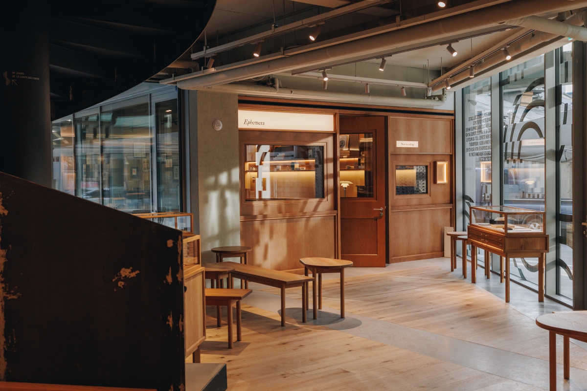
Kim: The boutique store on the second floor was what that sparked this whole project, and so the client assumed that this boutique store would be placed at the lobby. We strongly asserted that the café should be in the lobby instead, and the more interesting content must be placed on the upper floors. It was not a question of what is more important, but that it is only right that the café as a generally welcoming and comfortable space should be placed in the lobby. It was important that the journey progresses from the mundane to the extramundane. So much thought was put into the third floor and its content. We wanted to realise the concept of a collective essay that encompasses the stories of individual brands. This is why there are many reviews saying that the ‘third floor is an inescapable trap’. (laugh) We wanted LCDC to be more of a space where people can stay and have fun than a space for short visits. We built it while imagining people sitting in the lobby, spending time walking around on the second and third floors, and making their way to the bar on the fourth floor when the sun sets. Rather than having each floor struggle for its own survival, we wanted the floors to be mutually supportive and connected with one another as an organic whole. Coincidentally, Seo Seungmo removed the original stairs on both extremes and added a central staircase. This was, in our view, a concern as this structure was not favorable in terms of profit-making. Thinking now, however, it was an excellent choice. Thanks to the central staircase, people are moving about freely between floors enjoying the space.
©Jang Sooin
©Jang Sooin
Park: The architecture of LCDC does not follow the language of extreme dramatisation and industrialisation commonly found in Seongsu-dong. Instead, it presents itself as a new realm that forms a contrast against the neighbourhood atmosphere. What sort of physical frame is architecturally implemented in LCDC?
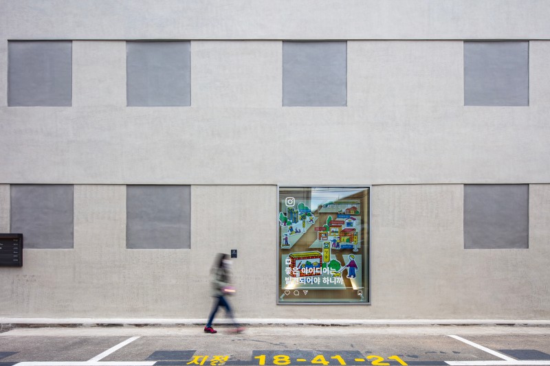
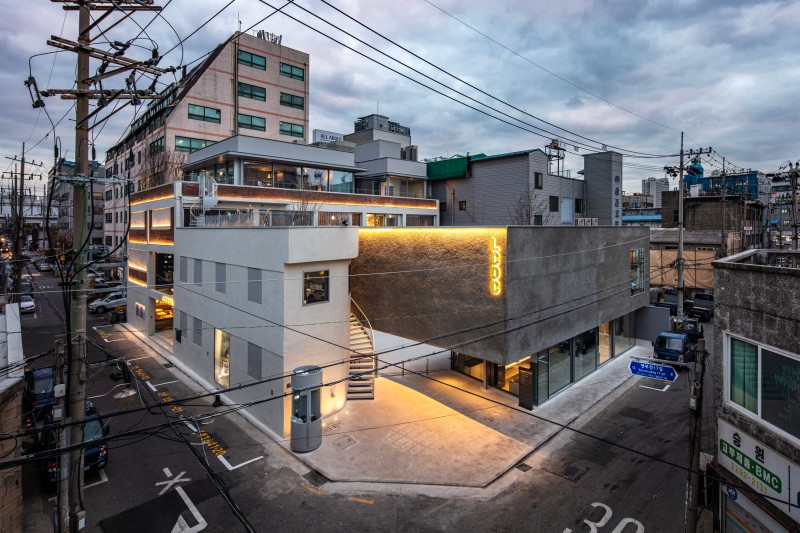
Seo Seungmo (Seo): Architecturally speaking, there were three main points: taxidermy, gaps, and the yard. By taxidermy I mean ‘how best to preserve the original structural order’. The original windows that were no longer needed, filled up with concrete in the interior while maintaining the shape. For areas where windows were needed, a method that goes against the original order was implemented.
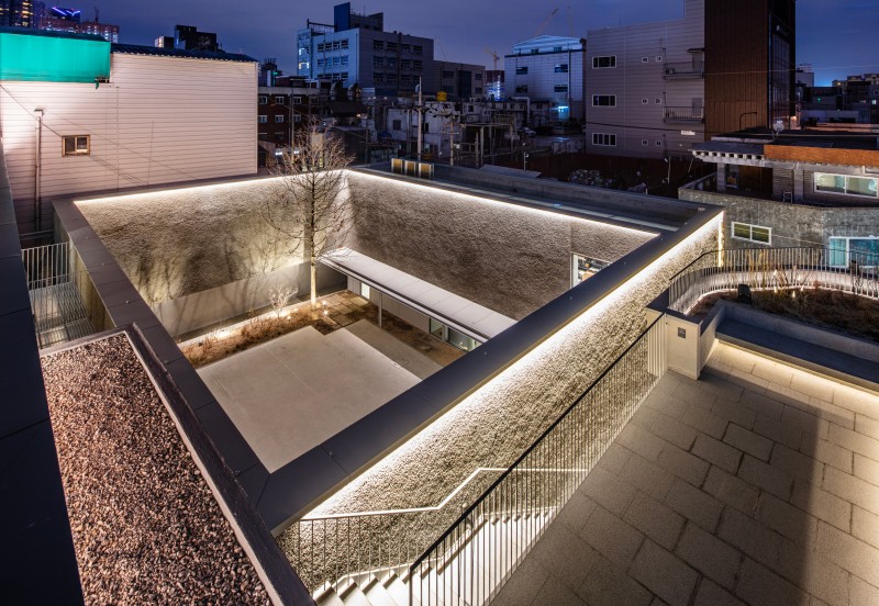
Also, gaps with multiple functions were introduced. For example, the lobby entrance was cut out into a triangular shape until the second floor glass installation was able to create a perspective that could comprises the interior space of both sides to the second floor tenant. The other entrances also act as gaps in between the original and new buildings. Gaps were also created via the wall surrounding the inner court. The rectangular-shaped wall of the inner court supported by the new building without the use of columns was structurally stabilised by ensuring it was adjacent to the original building. This created gaps between the original building and the wall, and these gaps were turned either into a staircase hall, a device for allowing natural light into the second floor, the third-floor terrace, and the fourth-floor landscape space. The yard is a key space that not only connects the original and new buildings, as well as the little spaces together, but also acts as a hub in wihch people can gather and also freely disperse. As the wall that forms the inner court is suspended on the second and third floors, the lobby is freed up for three or four-panel sliding doors which were installed to soften the boundary of the yard while also being equipped with facilities able to accommodate various activities.
Another element that involved contemplation was the elevator known as the ‘megavator’. Megavator is a concept first introduced by Herzog & de Meuron in their renovation work of Park Ave. Armory at the US. Personally, I was very much impressed by an elevator in a painting department building that I encountered during my studies in Japan. That elevator was appropriately scaled to hold large paintings. Although it’s not exactly the same, I wanted to make the elevator as large as possible to provide a unique experience while traversing across floors.
Park: The night landscape of LCDC is also impressive. How did you design the light and audio for such a high-sensitive space?
Chung: LCDC is located in an undeveloped region in Seongsu-dong. Therefore, there was a need to brighten up the street. The external lighting design was kept simple without losing a close connection to the whole sequence. The original idea was to use light beams or searchlights for active manipulation indoors, but this plan was cancelled due to financial constraints. There were many lighting options, but we wanted something that would support the general architectural expression and diversify the architectural language by creating different impressions between day and night. While doing this project, we thought it would be great if there were more opportunities for collaboration between architects and lighting designers. The better the quality of each part, the better the overall finish—and so to promote such possibilities, long-term investments should be encouraged. There is a need to persuade the clients why collaboration is necessary and worthy of investment, while the clients need to experience the true value of such an investment.
Seo: To add one more thing about lighting, what helped in architectural terms was that the lighting diversified the expressions of each architectural element. At night, for example, the lighting highlighted the heavily-textured walls via wall washing, provided information as it entered along the staircase rails, and revived the textures of the original building’s filled-up surfaces.
Park: I’d like to know what LCDC represents in light of the works and directions that you have done and followed thus far. Also, I’d like to know what your views are on the public nature of a culturally complex space located in an urban setting.
Chung: When I designed café zagmachi in 2014 with Kim Jaewon, Seongsu-dong was a rundown place with much untapped potential. We wanted to build a space in which people involved in creative work could come to exchange ideas and embark on interesting collaborations together. Our contribution is this public element delivered through spatial means. This applies for lighting as well. In Lyon, France which is termed as the city of lights has a public system that finances the building owners up to 70% of costs used for lighting. The rationale is that beautiful buildings always somehow contribute to the ambience of the city. This decision is based on the assumption that lighting installed in buildings can help to reduce crime, change the neighbourhood atmosphere, create more nighttime businesses, and aid the tourism industry. We believe that this captures the idea of a ‘public’. Lighting is not just about being flashy, but about beautifying the building while showing consideration to the people on the streets. Ultimately, making something nice for oneself leads to a public value. There must be a structure of mutual growth between the invisible practice of hospitability and propriety. In that sense, we hope that LCDC will be a space that breathes in sync with the locals.
Kim: I agree. I have a relatable story to share. On Yeonmujang-gil at Seongsu-dong, a line of streetlamps that resembled red shoes were installed. Apparently, they were installed because Yeonmujang-gil is a street known for handmade shoes. I was shocked at this and made a post on social media, and to my greater surprise, the lamps were gone a week later. Quite a significant sum of money must have been spent to develop and install them, but from what I’ve heard, there had been a complaint and so they got relocated to another neighbourhood. But what wrong did that neighborhood do to deserve that? Aside from this example, there are quite a number of violent acts committed in the name of public installation. Anyway, the neighbourhood is not lit up by such streetlamps, but by spaces like LCDC that can act as a landmark in a neighbourhood and bring about a change in the atmosphere. I’m not saying ‘we should contribute towards public interests regardless of profit’, as public good and profitability can go together. There was a time when people came all the way to Seongsu-dong to visit the 10-pyeong sized café zagmachi. Then when I heard that Daelim Changgo was opening right next door, I thought that it was the end for the café. But it actually turned out for the better thanks to the new neighbour. A business that vitalises the town and economy is bound to have a public character.
Seo: If I were to list the most representative public spaces from the urban architectural context, they would be buildings like the library, art museum, and gym. If these are the classic types of public architecture, then I wonder if commercial complexes can be the public architecture of today. Not simply a place for consumeristic activities but a space that provides a non-everyday experience, a space where people can gather and communicate—I think that is what we call ‘public’. For example, in a café in Paris, is France merely a place for commercial activity? I don’t think so. It is a place for the locals to gather and communicate over a cup of coffee. The café in Korea is somewhat skewed in that aspect, but still it is a kind of public architecture with a unique Korean twist. Most of the works we did at Samuso Hyojadong recently were residential spaces. If a residence is a background for the everyday, then a commercial complex space is a background to the non-everyday. In terms of devising a strengthening background, the direction we sought here is not too far from what we’ve followed previously. But because it’s about the non-everyday, the usual rice-based diet is now replaced with pasta, bread, and consumable goods. The LCDC project was about making a background for such things.
Chung Kangwha, after winning his position at Graduate School of Art & Design at Konkuk University, has been the adviser to the design company Atelier Écriture. Aside from designing objects, space, and events, Chung established the Design major and Space Display Design major at Konkuk University’s graduate college where he currently works as researcher and lecturer. Chung is also actively conducting experiments on various spatial details, physical properties, and modeling in his workroom located within Atelier Écriture.
Seo Seungmo, born in Kyoto in 1971, graduated from Kyungwon University and soon received his Master’s in art studies from the Department of Architecture in Tokyo University of the Arts. Seo then worked as part-time lecturer at the same university for two years before opening his office at Seoul in 2004. In 2010, Seo renamed his office as Samuso Hyojadong, and has widened the spectrum of design to various works including residence, hotel, and business facility. As his major works, there are SJ Hanok renovation, Hyundae Card Vinyl and Plastic façade renovation, Theory façade renovation, LCDC SEOUL, and the Ankuk Building renovation.


