ⓒKevin Mak
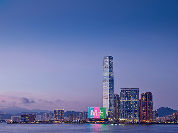
On the 11th of November, 2021, the international contemporary visual art museum M+ opened in Hong Kong. It took fifteen years for this project to be realised since the establishment of museum was confirmed in 2006. What does this contemporary museum look like, a project in which numerous parties have engaged over many years? And what topography of display will be drawn in the future? Let’s consider the processes behind establishing an art museum as an institution and building a distinctive physical space through two interviews with Doryun Chong (deputy director, M+) and Wim Walschap (partner, Herzog & de Meuron).
ⓒKevin Mak
② Space and Architecture of M+: Robust and Flexible
interview Wim Walschap partner, Herzog & de Meuron × Choi Eunhwa
Choi: The process of building M+ began by holding a competition. During the first phase, between 2009 to 2010, M+ invited about 50 architects from all over the world, asking them to submit expressions of interest. Then, during the second phase in 2012, it shortlisted six teams and asked them to take part in the competition. Please explain in detail your proposal at each phase. Were there any specific aims or requirements that M+ requested? If so, how did you interpret and reflect these desires in your design?
Wim Walschap (Walschap): The competition process was very inspiring, and much more dynamic and engaging than a typical competition because we had two hands-on workshops in Hong Kong where we basically tested out a client dialogue with the M+ Curatorial department and other stakeholders. We simultaneously worked with them on the refinement of the display spaces while they were building up the collection. The design process also ran parallel with the formation of the institution of M+; it was the first opportunity for us to design a museum which was also founding an institution at the same time. These workshops made our competition proposal much stronger, developing a well-rounded sense of the common goals. The process was, overall, very smooth, and our design proposal at the competition stage actually did not change drastically in the period afterwards.
Choi: The site is on reclaimed land and there was an underground metro tunnel running very close by. How did you deal with this complicated situation? Throughout projects, Herzog & de Meuron continues to hold a manner of ‘finding’ the given site conditions, and I’d like to know how they were expressed in this project.
Walschap: The West Kowloon Cultural District did not yet exist, but it was in the making. Unlike other projects where we had to work with existing conditions, here we had to deal with absence. What can lend authenticity to reclaimed land? The Airport Express Tunnel was first discovered as dotted lines on the site drawings. Instead of seeing it as an obstacle, we immediately decided to incorporate it into our design proposal, turning it into the museum’s ‘Found Space’: a rough, largescale exhibition universe that quite literally anchors the entire building in the ground. The Found Space is a good example of something we’re always seeking in our work: does the site have something pre-existing to offer? Is there something there already that can influence or inspire our conceptual process? This method is not dissimilar to our approach for the Turbine Hall in the Tate Modern, where we took an almost archaeological approach to work with the existing and not against it.
ⓒVirgile Simon Bertrand
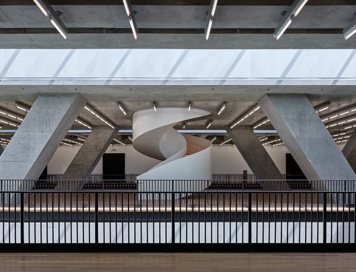
Choi: Please tell us about the structure. The main structure is a mega truss: that helps to solve the structural issue of supporting the vertical load and also creates a unique atmosphere by being partially exposed in the interior and exterior spaces.
Walschap: The tunnel was initially seen as a problem, something that should be avoided, because it also remained in use during the entire construction period. Instead, we saw it as the project’s starting point. Running diagonally through the site and with the vibration of moving trains, we took the tunnel as a given form that, in order to distribute the loads, we had to span it with mega-trusses. By exposing fragments of this structure and integrating them into the architecture, people can understand that these forces are brought down away from that tunnel, also expressing the building as a piece of infrastructure itself. It’s a platform, a public constituent of the topography.
Choi: Most of the galleries are in a form of a white cube with white ceilings and walls, but there are some areas with a more unique aesthetic. For instance, there is a gallery where the entire ceiling, wall, and floor are covered with bamboo and a courtyard gallery. Please detail these spaces.
Walschap: M+ is not only a museum for art; as the name implies, it’s a museum for visual culture, including design, architecture, and moving image. The building is a platform with a wide range of display spaces: largescale galleries with exposed structural concrete like the Found Space, all the way down to spaces of a domestic scale completely finished in bamboo. The galleries needed to be robust and flexible, making them diverse in their proportions, materiality and light conditions. They have the possibility to change over time, because the means of showing and perceiving art will evolve, and the museum needs to account for that.
ⓒKevin Mak
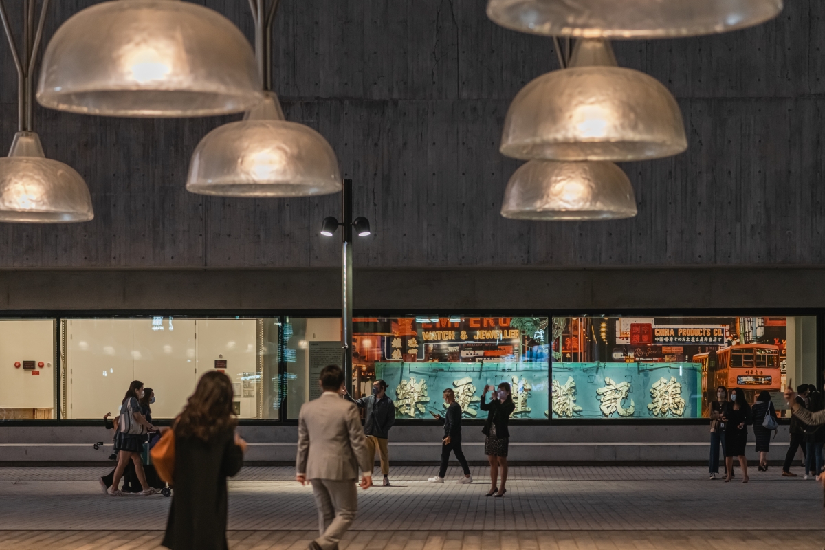
Choi: The museum gives the impression that it is open to the external environment. The building is in contact with the park located on the site below, you can also see the view of Hong Kong from the roof garden, and some of the Conservation and Storage Facility (CSF) spaces are located on the ground floor so that people can see inside as if they were windowshopping. You can also glance at the museum staff working away. In order to take such an open and inviting stance towards the external and surrounding environment, what other methods and strategies did you employ?
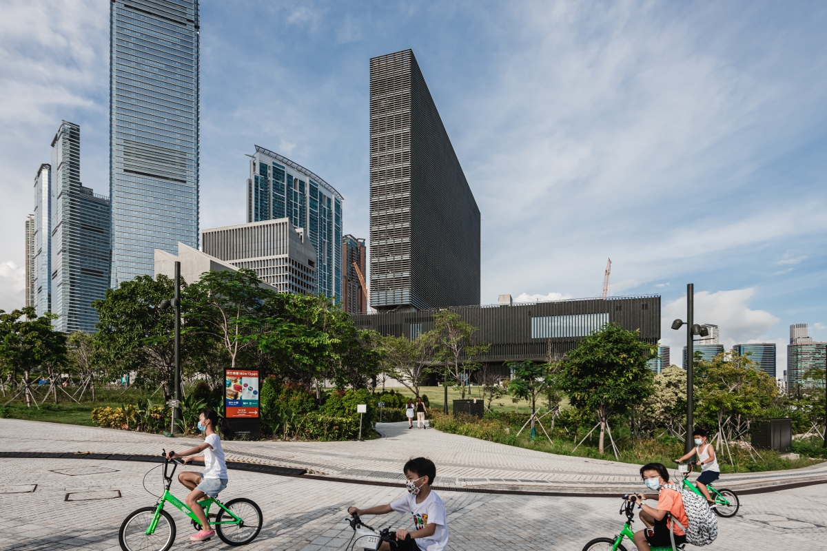
Walschap: There are multiple ways to enter the building. It’s open from all sides, and there are also many ways to travel through the building, so the visitor’s sequence is not the only one. You have choice, not only in terms of content, but also how to circulate through those spaces. The ground floor is very open, permeable and accessible for the public. We wanted to make that space an extension of the outside, so the park continues into the building. This is also clear in the expression of materials: the outside ceramic façade is repeated in the interior, and the ground treatment is continuous. That’s done very consciously, to accentuate there is almost no threshold between inside and outside. This urban interior space provides a platform for the exchange between people and art, permitting access to the museum and offering views into various activities of the building, but also providing a sheltered area for people to meet and spend time together. In combination with the CSF and office tower, M+ is a composition of buildings. It’s not only one, but a cluster of buildings, providing a strong starting point for an area that will grow over the coming years.
Choi: I would also like to hear about the ceramic cladding. You chose to use ceramic cladding rather than the glass, steel, and aluminum commonly used in high-rise buildings in Hong Kong. I wonder if there was any specific reason behind it. Also, since Hong Kong has a humid and highly windy climate, it was specially produced close to Florence, Italy to achieve the desired form of the curved surface. Could you elaborate on the design, production, transportation, and construction processes?
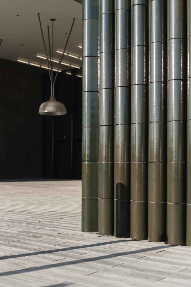
Walschap: Ceramics has a very long-standing tradition as a significant construction material in the Asian context. The finish is very durable, protecting the building from the extreme weather conditions in Hong Kong, including heat, humidity, and wind. The shingled, vaulted modules of the M+ facade create narrow channels that direct runoff. Though they are machine-made, they still maintain a handmade quality that reveal slight differences, particularly in their individual surface textures due to the glazing process. The dark green colour changes depending on the exterior conditions, going from yellow green to nearly black depending on the time of day or season. The background of M+ is a commercial area with offices and residential buildings, which are typically clad in glass and metal—we wanted to stand out from this palette. M+ is a museum, a landmark building, and we wanted to distinguish it in this way.
ⓒKevin Mak
Choi: There is a huge façade of 66 × 110m facing the waterfront, and this façade is used as a screen to transmit images and videos. The manner of treating an elevation as something beyond a simple cladding can be found in other projects done by Herzog & de Meuron. This time, the elevation stands as a piece of work and a gallery itself. What did you consider significant when designing the façade? And, when creating this façade, did you plan to make a new attempt in any aspect?
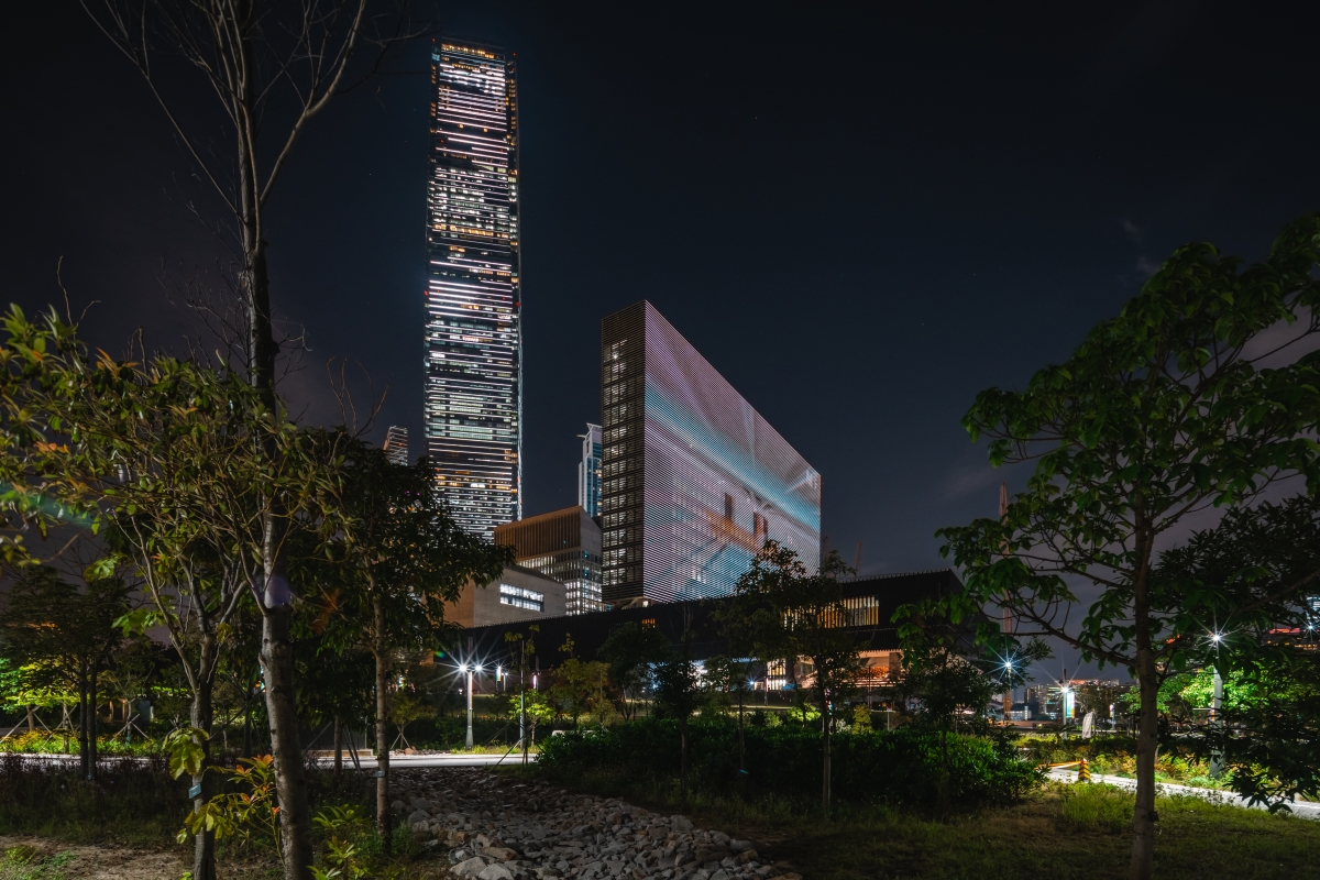
Walschap: The LED screen is another display space, but visible from Hong Kong Island. This façade anchors the building in the skyline, displaying content from curators or artists, and inviting people to visit the museum. As soon as it’s activated with information it changes its shape, making M+ a site in constant renewal. It’s very different than the typical LED features you find throughout Hong Kong because it has a much finer resolution due to the placement of the horizontal louvers. With these elements already implemented as sun shaders, it was a natural next step that we should fit the LED tubes. We developed the technical solution with our partner in Basel, i-art, who came up with a brilliant idea for making the screen legible from 2km away as well as directly from the roof garden; there are two LED dots that are always alternating, where one points down and one faces outwards, each with different light intensities to accommodate the distances.
Choi: Since it was a long-term project, I assume there must have been a lot of twists and turns. If there is an episode you found memorable, please share it with us.
Walschap: At one point we were traveling on a very regular basis to visit the construction site and stay close to the building’s realisation. Once that was no longer possible, we relied solely on our local partners TFP Farrells, ARUP and the Herzog & de Meuron Hong Kong team to cover the construction phases. This went very smoothly because we already had strong working relationships in place for many years prior. Overseas travel was quickly compensated in the exchange of photos, videos and conferences, and in the end their contribution in this collaboration produced a great building.
ⓒKevin Mak


