THE FIRST PENGUIN is a design studio that integrates a wide variety of design works including graphic design, branding, furniture, space, and so on. They are known for creating diverse spatial experiences stemming from operational characteristics. We were joined by Choi Jaeyoung, who leads the studio, and discussed their working methods and projects.
interview Choi Jaeyoung (principal, THE FIRST PENGUIN) × Kim Yeram
Kim Yeram (Kim): THE FIRST PENGUIN embraces design across a broad spectrum of fields. How do you run the studio?
Choi Jaeyoung (Choi): We now have 13 members in our team. Although the range of responsibilities differs depending on the size and scale of each project, it usually takes three personnel on one project each, with one director and two designers. I am in charge of directing the project. If the work requires more sophisticated user experience design or if it is a longer term project, we usually add up to one or two more members.
Kim: What made you want to found a spatial design studio?
Choi: I ran a café named THE FIRST PENGUIN in 2009. It was a place for those from the younger generation to develop their skills by taking on various programmes hosted by the café. I decorated the café with my own hands, and subsequently received some interior design requests. As the requests piled up, I decided to close the café and began working on spatial design in earnest. I opened my own studio in 2012.
Kim: What does THE FIRST PENGUIN prioritise when designing a space?
Choi: I feel that I may have a different design perspective to some of my peers as my background differs from many people in this business. THE FIRST PENGUIN tries to extract a sense of ‘ownership’ from the client and to incorporate it into a brand identity or space.
Kim: Can you describe in greater detail the process behind expressing the clientʼs ‘ownership’?
Choi: The designer might be more knowledgeable than the client, as it is a profession, and this have has led designer to gain greater momentum when working with clients. The designer receives from third parties, but that doesn’t mean it pleases the clients in the same way when they are with our work. One must not take the client’s personality too seriously into consideration; we made that mistake before. We pushed forward, and the client seemed okay with it, but this turned out to be a failure as the client cannot see it as his own. He had to close down the business, even though it made quite a decent profit at the time. After making the same mistakes over time, I came to realise it is vital that we reflect upon the client’s personality, their sense of self, in order to guarantee permanence and sustainability. We now investigate with rigour what clients like and what they don’t, and ask a great many questions in detail with regard to his/her background. We then fuse these into our designs for spaces, furniture, playlists, aromas, and signage.
café ‘.txt’ (2017) / ⓒShim Seokyong
Flagship store ‘Life Positive Studio’ (2020) for athleisure brand ANDAR
Fastfood restaurant ‘Mooger Burger’ (2019)
Kim: Are there any other projects that incorporate good spatial design?
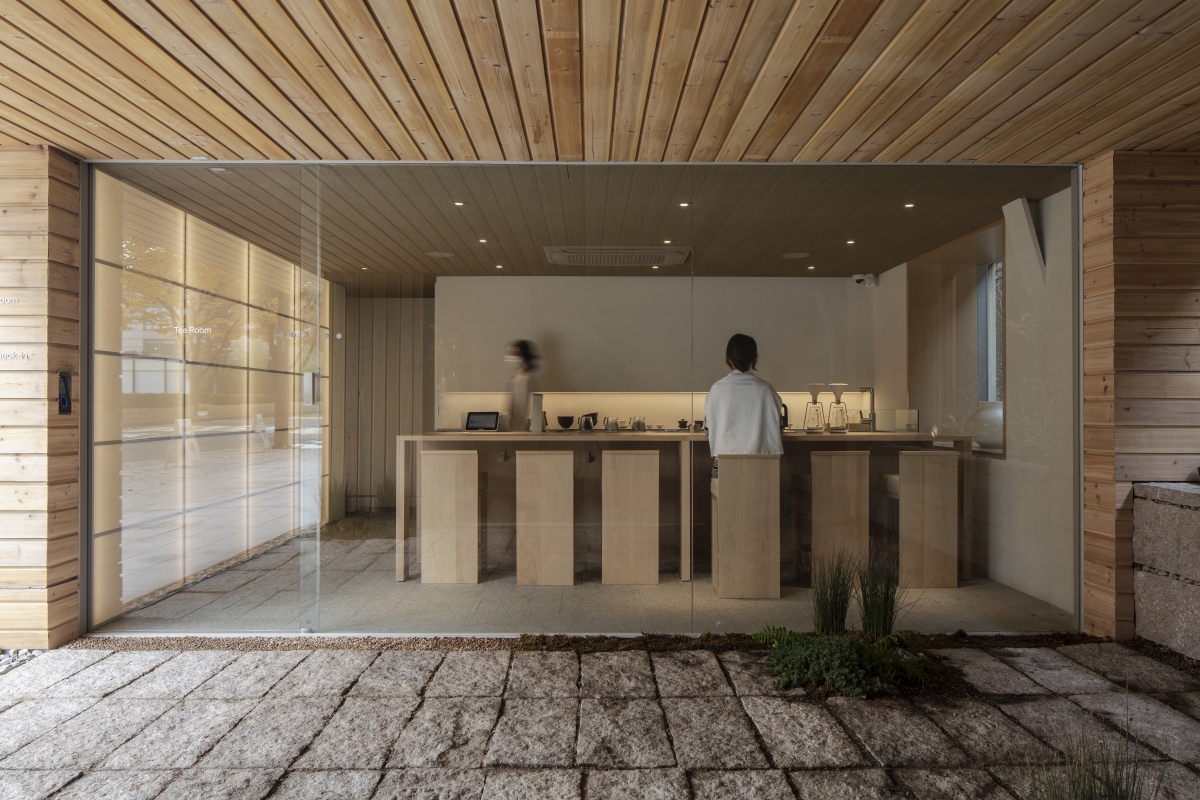
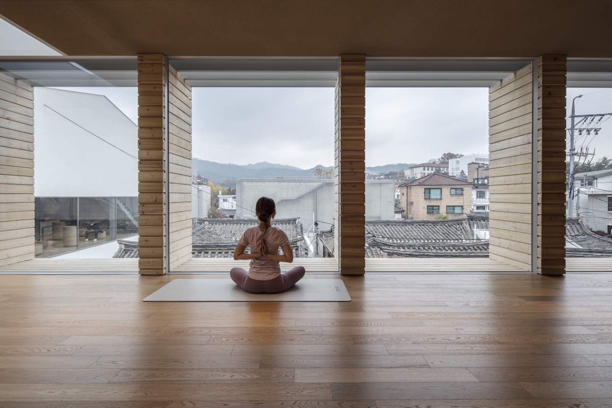
Choi: ‘Life Positive Studio’ (2020) is a flagship store of athleisure brand ANDAR next to the National Museum of Modern and Contemporary Art in Seoul. As you might deduce from its name, the design is based on ‘Body Positive’ movement which is quite popular these days. Our studio envisioned a ‘Body Positive’ lifestyle that would be supportive of affection towards one’s own body ‒ which is also the brand’s philosophy ‒ and designed a space that embraces people’s mind emotionally. We proposed a tearoom for a serene mind, a self-photo booth that makes records of oneself, a yoga zone in which people can enjoy the view of the old Hanok.
Kim: As you list the users’ activities when talking about commercial space, it sounds a lot like a ‘sequence’, a popular term in architecture.
Choi: It is important to adopt a sequential order, not only in large buildings but also in small and medium-sized spaces such as cafés and flagship stores. Therein, people can immerse themselves in a space without losing a sense of spatial tension. Whenever we design, we consider the order of experience and install spatial elements, but we don’t always think that our aims work perfectly. However, I still believe we should retain a method that values the flow.
Kim: Your intentions for intergrated design are well demonstrated by ‘Mooger Burger’ (2019) in Jeju. I wonder how you arranged the experience in this fast food store?
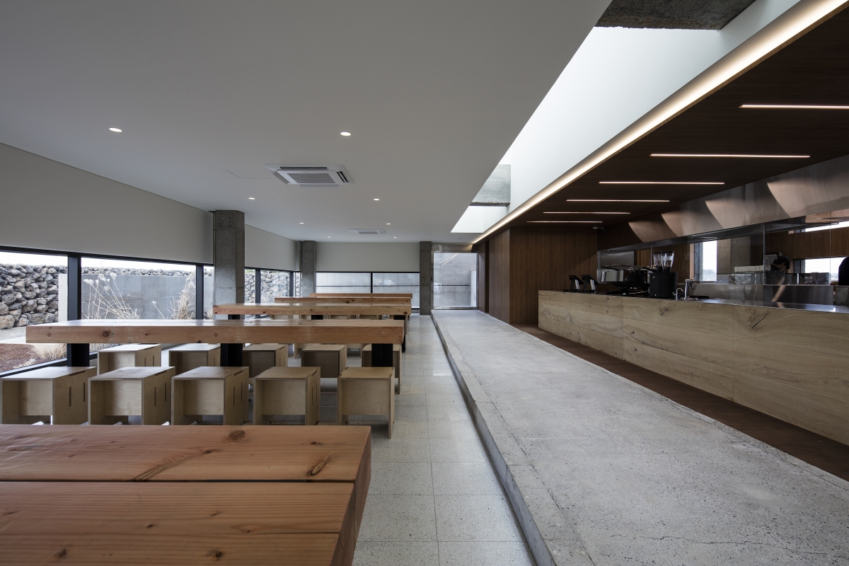
Choi: The client had been running a hamburger shop before commissioning this project. He thought that the taste of natural ingredients matched well with the culture of Jeju as opposed to the cheesy and juicy New York-style hamburger. We hoped that his integrity would not fade with the food but extend throughout the building. From Mooger Burger, you can see beaches, wetlands, and tangerine fields stretching from north to south. The experience of looking out over the natural environment while eating hamburgers seemed to fit the direction of the brand. So, a horizontal ribbon window is surrounded by slopes to see the surroundings with a wide view. As you can see, there are many days of harsh winds in Jeju Island, and the elements that take advantage of this climate are on the second floor. In the courtyard on the second floor, there is a sky window with a water tank containing shallow water, and when the wind blows, light glimmers across the waves. The light is transmitted to the first floor and presents another atmosphere.
Kim: THE FIRST PENGUIN reveals a distinctive use of materials, as revealed in its spatial divisions through the woodchips on the floor and the fluorescence of the PVC sheet. What are your considerations when selecting materials?
Choi: As a creator, there is always a desire to use materials in an unconventional manner. We are committed to introducing materials that have not been used in similar types of projects, even those that have been neglected. More recently, I realised why we are so concerned with materials. While we have run a spatial design studio for quite some time, and here are many interior projects in decent condition, there are still few requests for architectural projects. This is probably because of a relatively low proportion of architectural work in our portfolio. In order to design a building with a small budget, it seems that materials are used elaborately instead of committing a plainer form. Life Positive Studio, the project mentioned earlier, features a silicification finish on the cedar to create the exterior, and WITHJIS showroom in Jeju, which will be completed soon, has chipped concrete to create a texture on which black dots stand out like volcanic stone.
Kim: This might relate to your previous lesson, as when observing your projects I have a strong sense that the project fits with the client. But isn’t it just as important to think of customers when considering the sustainability of commercial spaces?
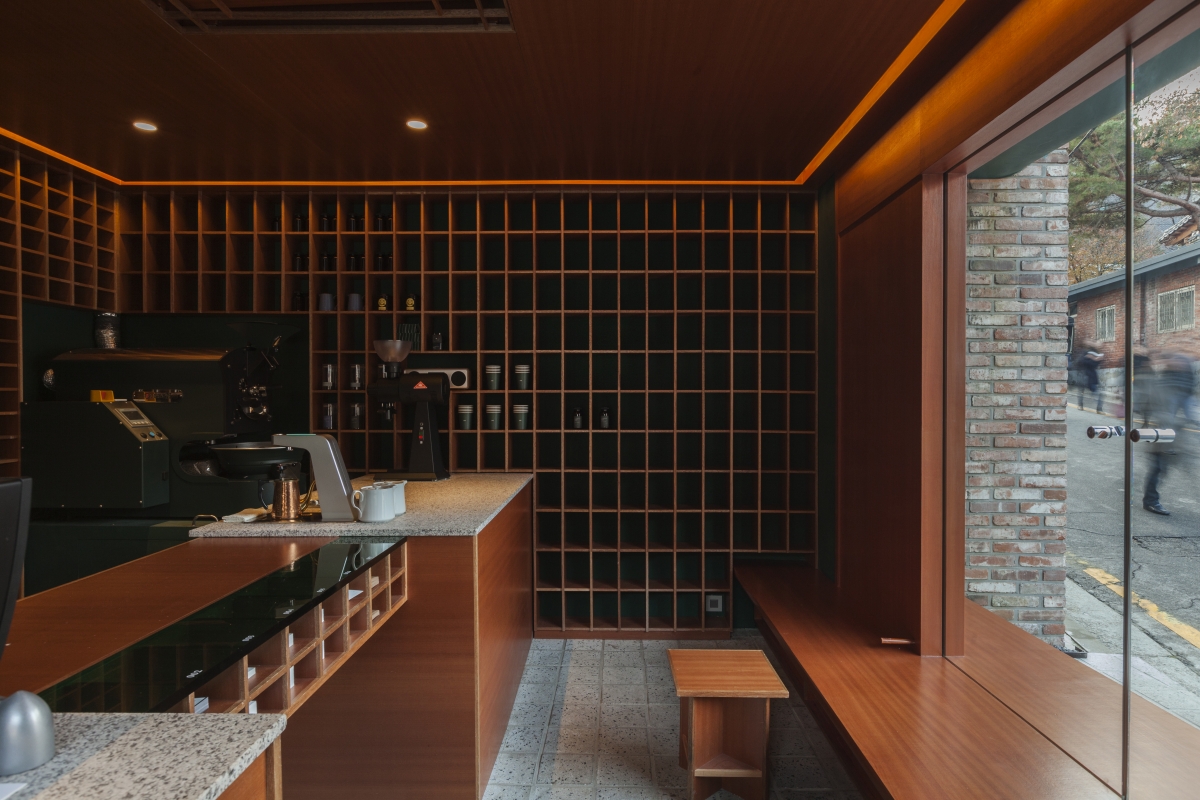
Choi: We take a deeper dive into the user experience than usual. The meaning of users spans from the operator to the visitors. And we believe this mindset might be better when expressing the operator’s character. Let me give you an example of ‘.txt’ (2017) located in Gye-dong, Jongno-gu in Seoul. The barista here is good with making coffee, but the store is 15 minutes away from the subway station so there might be the chance of serving only a few customers each day. We decided to increase the unit price to sustain business, however, we also had to come up with a good reason to convince customers with the price. This made us focus on designing the process of ‘ordering-receiving-drinking’ as nicely designed as the taste of coffee. It is indeed about selling quality. Before coming up with the ideas, we measured how much coffee beans we need for a cup of coffee. Then we decided the size of cup for dispensing coffee beans and produced the shelf to display them.
Kim: It seems that the process of making coffee is reflected in the design of the products and furniture.
Choi: Baristas give an ardent explanation on every step of making their beverages. We don’t usually embark on our ideas with the drier matters of space and furniture, instead choosing to start with lighter considerations such as our ingredients and light-weight products. The same thing goes with ordering beverages. We devised a whole new process of writing down the order onto a piece of paper and submitting, instead of soullessly retreating to the counter and saying ‘one cup of americano, please’. We assumed a more literal conversation fits in customising coffee, so we designed accordingly. We installed a document box-like counter reminiscent of the one in the public office building, and people are asked to take one slip of paper when ordering beverages.
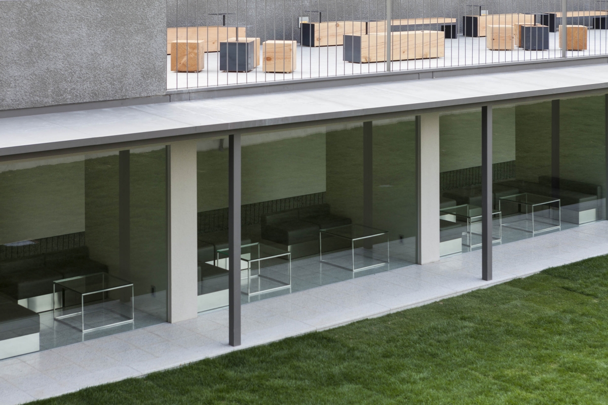
‘Café Jinjungsung Bonjeom’ (2017) / ⓒKim Younghyun
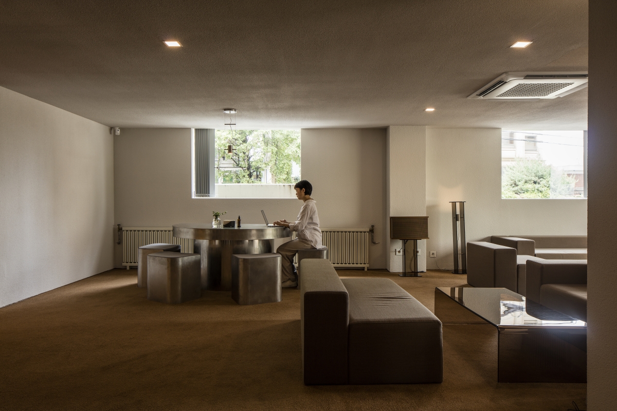
Showroom for bedding store 60SECONDS ‘60s Lounge’ (2019)
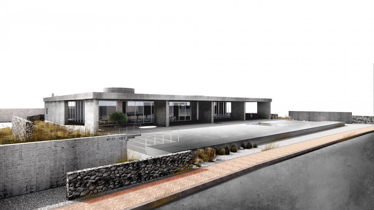
WITHJIS showroom in Jeju(2021)/ ⓒTHE FIRST PENGUIN
Kim: It seems there’s an increasing number of small brands’ spaces. This phenomenon could become a background for stores having various concepts, but also make a tragedy of producing spaces having a similar mood. How do you feel about this situation?
Choi: It’s very upsetting when you find a design that looks too similar, but it’s hard to clearly prove the damage to the client or studio from the design theft. Iʼm so depressed, but sometimes I feel like I should be grateful for even that. If you think otherwise, wouldn’t it be another form of appraisal? Rather than responding to these situations individually, it is better for us to reveal stories that only we can tell in a faster and more penetrating way.
Kim: The increasing use of mobile applications has led many changes in spatial design. Recently, the word ‘Instagrammable’ has become a keyword for people in the industry of architecture and spatial design. I want to hear how THE FIRST PENGUIN defines this word and to what extent it reflects this concepts for space?
Choi: Quite a few clients order an instagrammable space. Rather than translating it literally, we need to take a look at whatʼs behind it: Instagram is an social media that shares fleeting moments. On the surface, it could be thought to symbolises a contemporary superficiality that simply devours space, but it also reveals a public’s affection for architecture and space. The clientʼs needs aren’t very different from Instagram users. A lot of people are telling me to make them like ‘my space’. If you express thids in a little refined way, it might just mean that we must raise a level of excitement about the space. (laugh) There seems to be no reason to exclude it if a scene suitable for the SNS format does not harm the integrity of the space.
Kim: The proportion of architectural projects in your portfolio is gradually increasing. Could you share with us any difficulties you have experienced while working at a larger scale and the direction taken by THE FIRST PENGUIN to progress?
Choi: We are grateful that we are able to diversify our portfolio as we take on such big projects. However, we sometimes feel we are losing our more punctilious touches that we invested in our previous works. So we try not to ditch small projects at the expense of larger projects. It can be produce a deficit in terms of business, but I believe small projects will present us with a faithful platform on which we can deliver our best work. THE FIRST PENGUIN now dreams of becoming an unprecedented type of creative studio. Our vision is to include architecture, interior, installation, etc. I wish we could tackle some of the upcoming foreign projects. It may be cautious to say this, but it is also to drive our practice forward.


