Kolon Sports Hannam opened its flagship store in Itaewon. By running both a clothing store and exhibition space, Kolon Sports Hannam seeks to attract younger consumers. Seo Donghan interpreted his client’s desired outcome through the concept ‘Urban Trekking’ and applied it to the spatial and circulation design. SPACE asked him to talk about his thought process behind his design for the flagship store of an outdoor fashion brand, one that invites us to walk, rest, and look around.
Seo Donghan principal, Studio Fragment × Kim Yeram
Kim Yeram (Kim): Kolon FnC has opened a flagship store for its outdoor fashion brand in Itaewon. What kind of space did the client want to create in this location, one crowded with various showrooms of other fashion brands?
Seo Donghan (Seo): The client wanted to mirror the characteristics of visitors to Itaewon onto its spaces. The client observed that the pedestrians passing by the store tended to avoid its heavily embellished outlook, and therefore requested all unnecessary ornaments were removed in his design.
Kim: I heard that the concept behind this flagship store is ‘Urban Trekking’. How did you realise this concept?
Seo: The theme guiding Kolon Sports as a fashion brand is not going deep into the isolations of nature but about enjoying the outdoors in everyday life. When I embarked on this project, I had no clue how to connect this deeply urban space – detached from anything natural – to the outdoors. After designing elements such as the louver and grating with achromatic materials, we got the idea of reinterpreting the natural phenomenon in the forest with the materials can be seen in urban.
Kim: I noticed that the grid patterning that you have used in your previous works is again evident here in the louver and grating. What role do these patterns play?
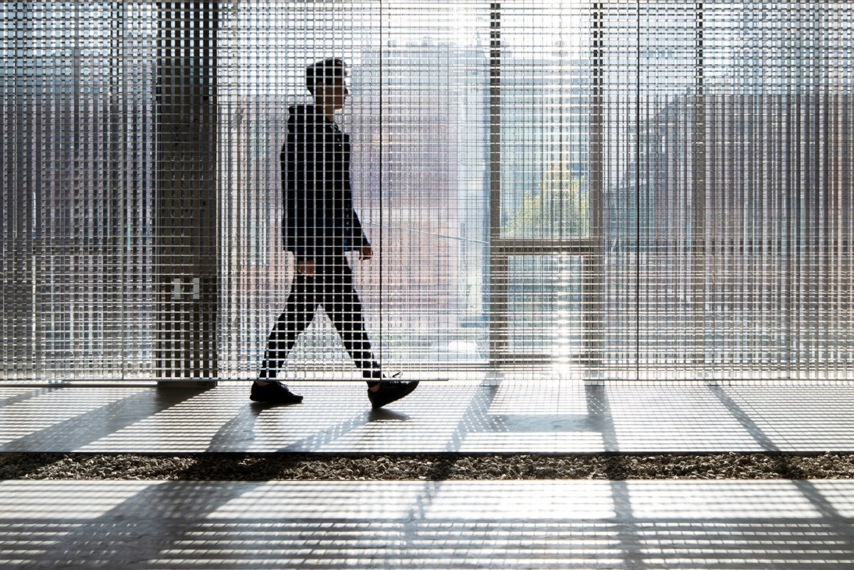
Seo: Regardless of my intentions, I often find our work ends up with gridded patterns. (laugh) Grids are interesting because they are densely constructed but remain open. In this project, we wanted to use this patterning to recreate scenes of people fading in and out while walking through trees. The louver installed at the building’s exterior has its core component lined up vertically on the upper part and horizontally on the lower part. From the street, pedestrians can make out occupants at the lobby, but they cannot see exactly what they are doing because of this obstruction. They can only find this out by coming indoors.
Kim: Which part of the first floor did you renovate to become the exhibition space?
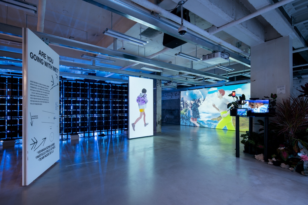
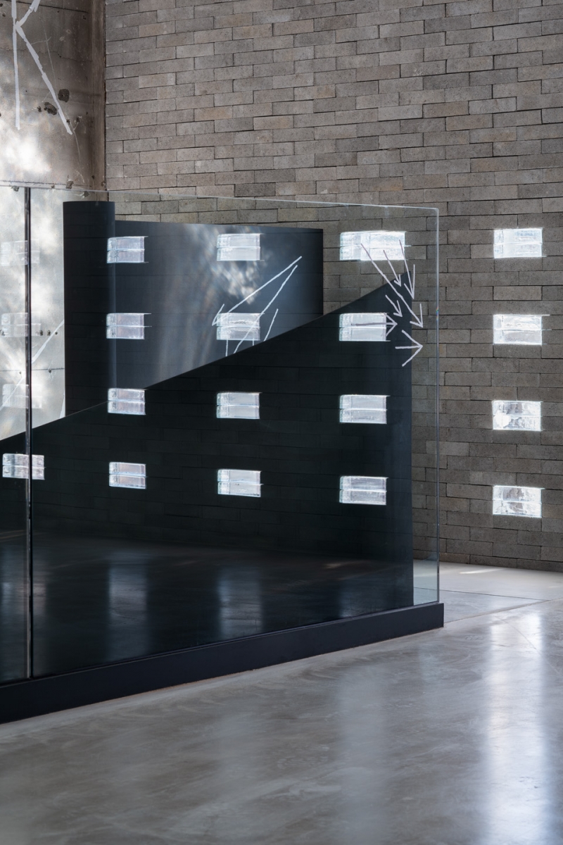
Seo: When I visited the site for the first time, the space had already been cleared out and the structural reinforcement was complete. I had to dim the light in the space for the purpose of turning it into an exhibition space, and so we needed not only an automatic blind to adjust the openings to the exterior but also a device that would draw light into the interior space. As such, I stacked a mixture of bricks and glass bricks by the windows. As this helped with the overall lighting conditions, we also considered installing this material everywhere in sporadic intervals, but I did not want to appear as though we were trying to force it to be something beautiful, and so I decided to maintain alignment with the brick grids.
Kim: There are two staircases that lead to the basement floor. I am curious why you decided to split the vertical circulation route in this relatively small interior space.
Seo: Two staircases are related to the overall concept directing this flagship store. I thought that the connection between the street and the store would be established by installing a clearly presented line of traffic to the exhibition space, and so I wanted to build a trail that could be distinguished from its surroundings. What I mean is that I wanted visitors to carve their own route through this space over the gravel-covered floor. In a forest, people leave behind trails, and those trails turn into permanent paths. However, because that would restrict the range of possible exhibition layouts, we could not realise the idea of covering the lobby floor with gravel. Fortunately, the idea of separate staircases was accepted, and the use of the space now closely resembles our original design intention. Well, visitors are not moving against the traffic at least. (laugh) Moreover, the two staircases minimise clashes between the exhibition audience and consumers.
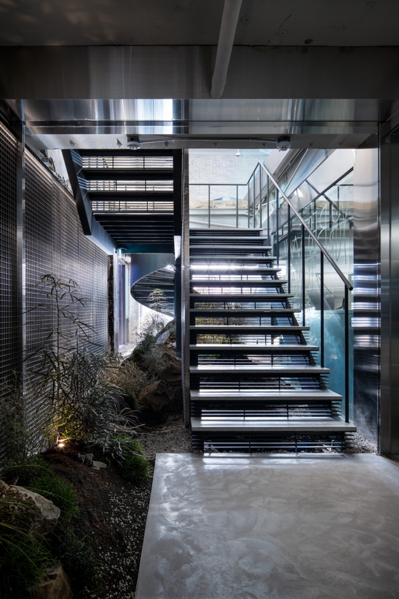
Kim: When descending the stairs, I noticed a landscape space within the dimmed atmosphere. Could you tell me more about the thought process behind the hill and the vegetation planted in this void where the two staircases meet?
Seo: Using plants with dark leaves and gravel that appears slightly burnt, Elle Travaille — who was put in charge for landscaping — designed the landscape design to match the overall spatial atmosphere. In order to fully experience the concept of space, visitors should see the exhibition and go down to the store. I hoped this vegetation would play a role in changing the atmosphere of the space and trying to experience something new below.
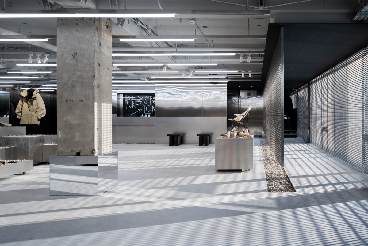
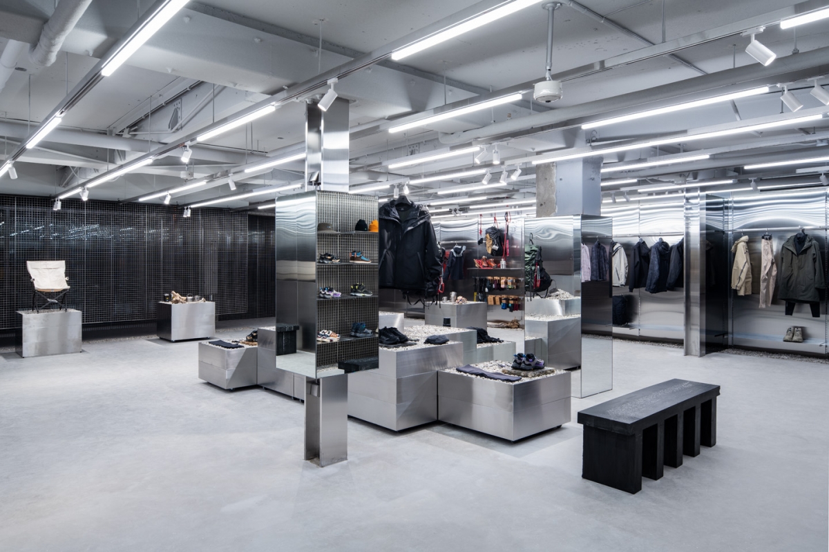
Kim: Like a terrazzo patterned with small fragments, there are black benches placed at intervals throughout the store. Did you design them?
Seo: The client told us that it would be fine to design an objet-like work of furniture as long as they were comfortable. I created these benches with jesmonite—a material I had never worked with before. The surface of jesmonite is similar to that of masonry, but this material retains a high-level of hardness even after being mixed with other materials.
Kim: Recently, the number of commercial facilities installing opened spaces in their lower floors to attract customers is on the increase in Itaewon. What do you think is the most important thing when attempting strategies like this that minimise perceived obstacles to entry of commercial facilities?
Seo: In the past, there were many places in Itaewon where one could not help but ask oneself, ‘is it okay to enter?’. I think that sense of anxiety towards spaces has diminished due to the increase in number of open spaces and exhibition rooms. It seems like an attempt to attract people to come into their spaces but I believe creating a sense of curiosity about an indoor programme is much more important than opening spaces.


