The Two Sides of Architecture: Perspectives of Observers and Users
A White Frame in a Varied Urban Landscape: An ObserverЁЏs Perspective
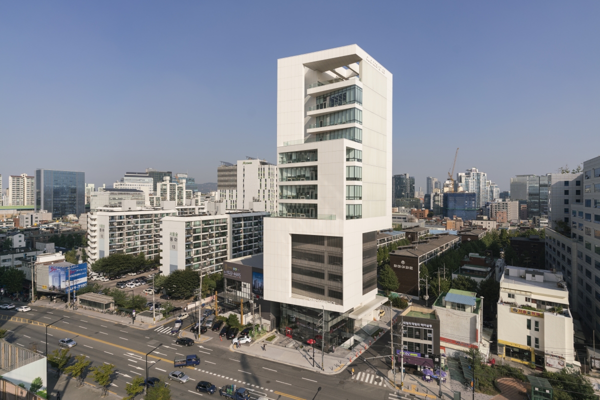
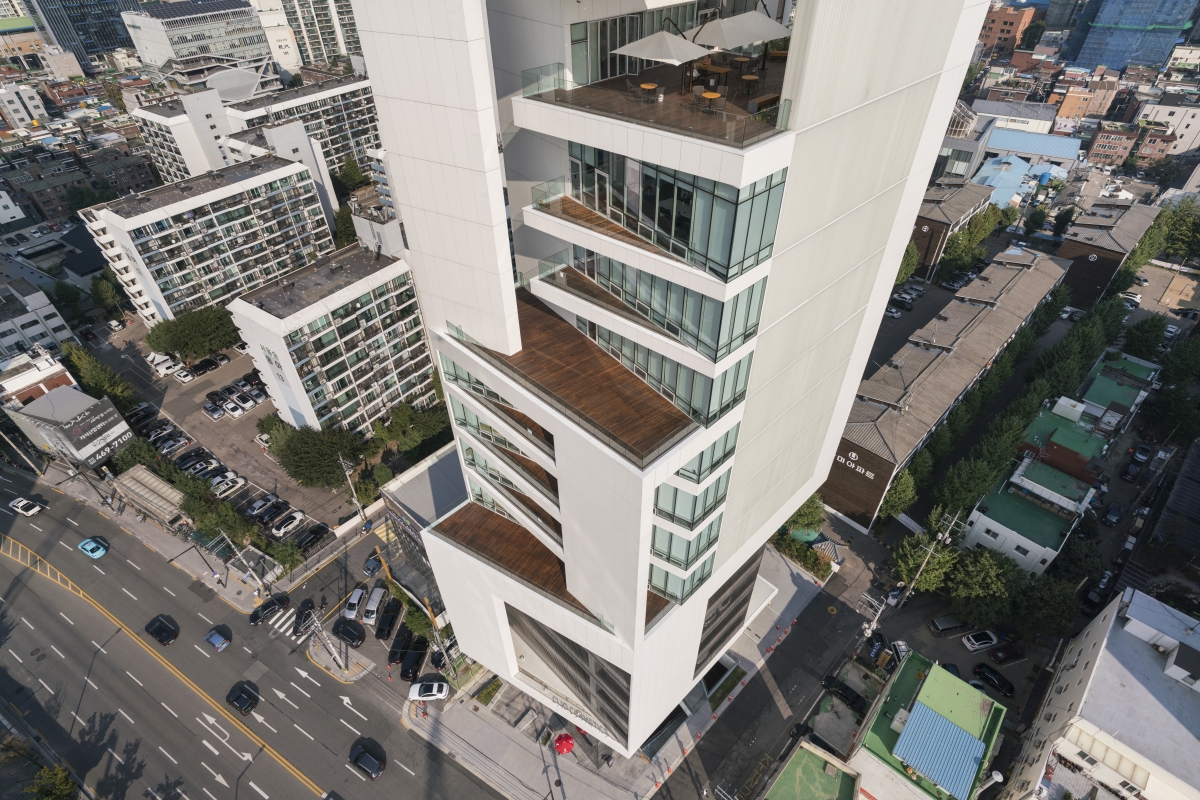
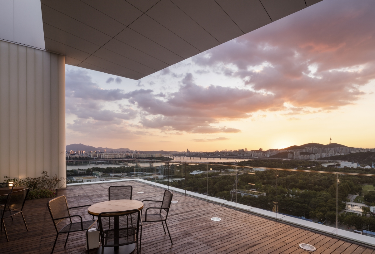
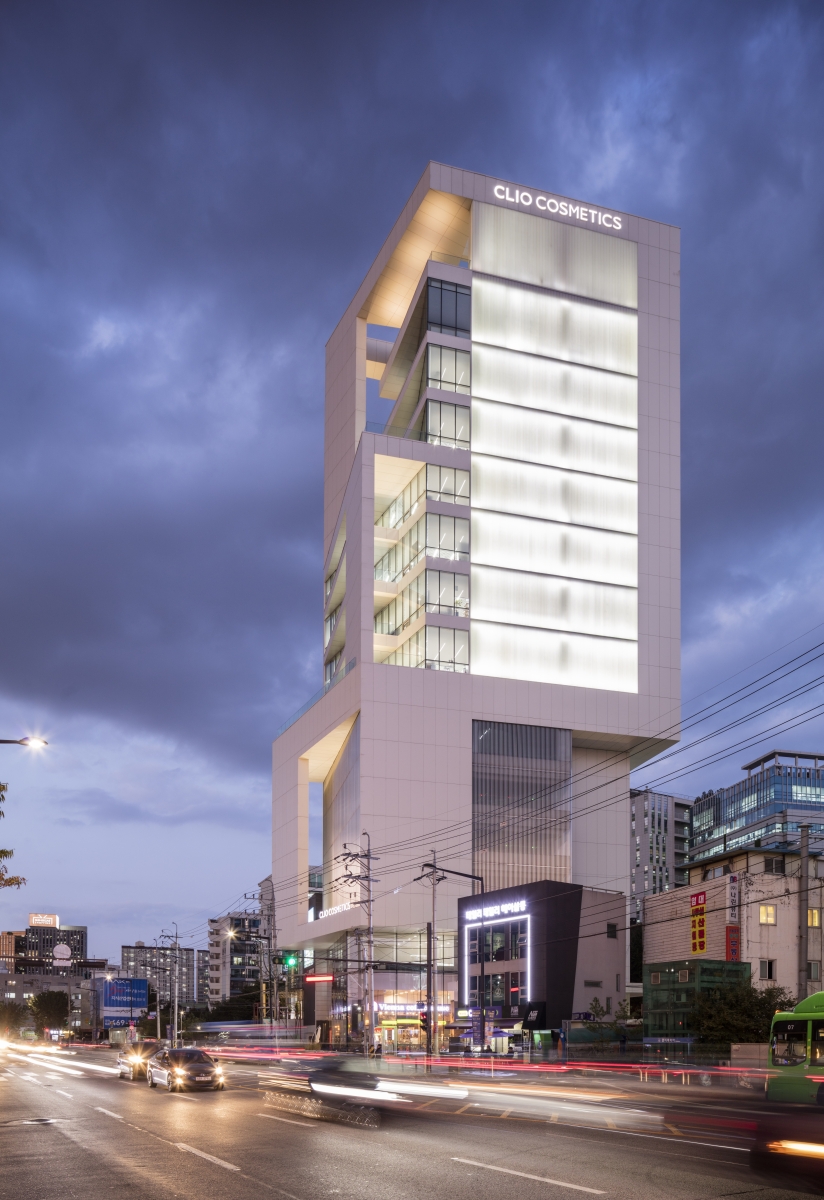
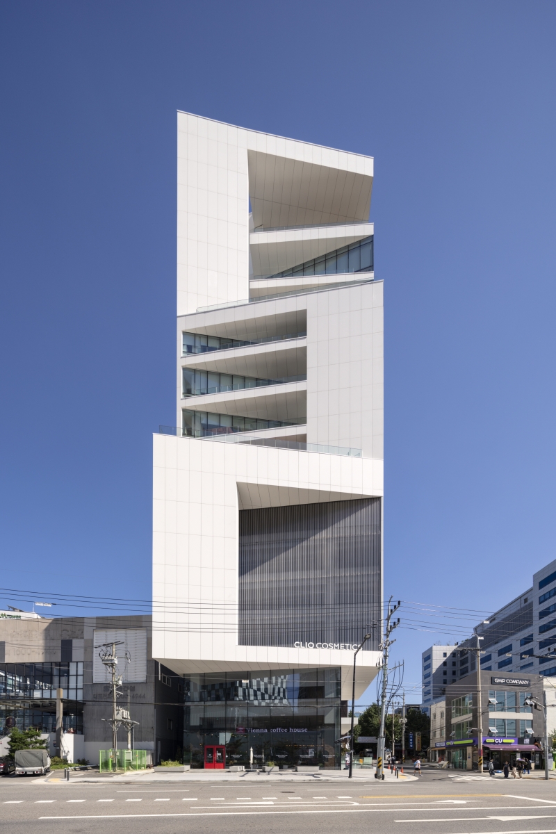
The Clio office terrace consists of an array of large-scale terraces supported by wall structures in the units of the four floors and smaller-scale terraces suspended from one floor to the other. These terraces are the medium in which people and nature mingle, as well as important elements that create varied urban landscapes. The simpler the frame is, the better it can capture the changes. The exterior made of white thin plate Ceramic, low iron U-glass, and low iron glass captures the surrounding landscape in a benign manner. The colour white also matches the image of the cosmetic company, Clio.
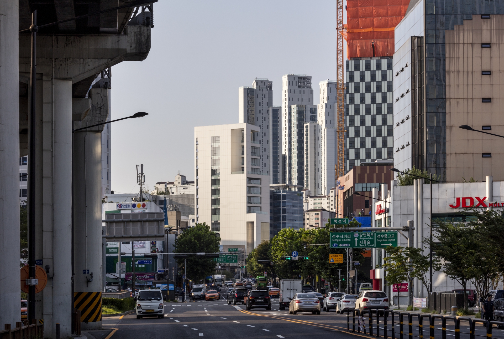
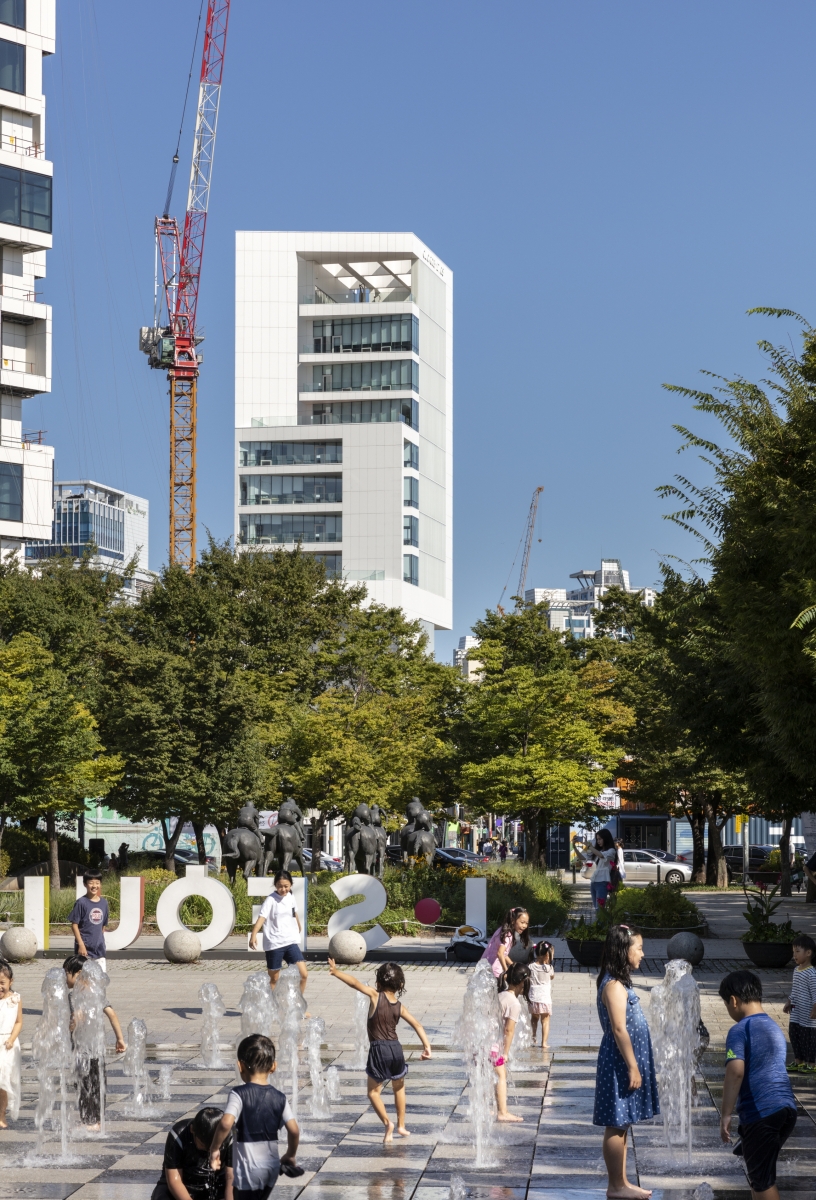
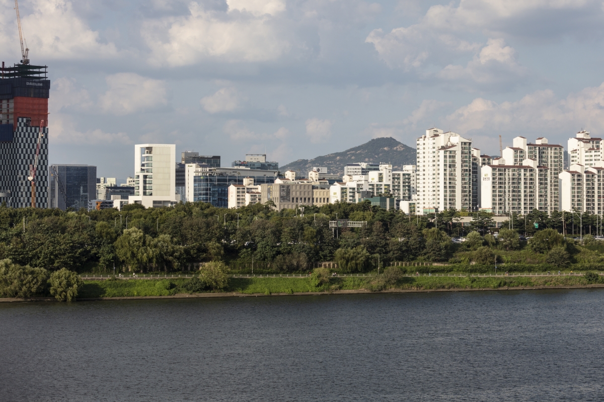
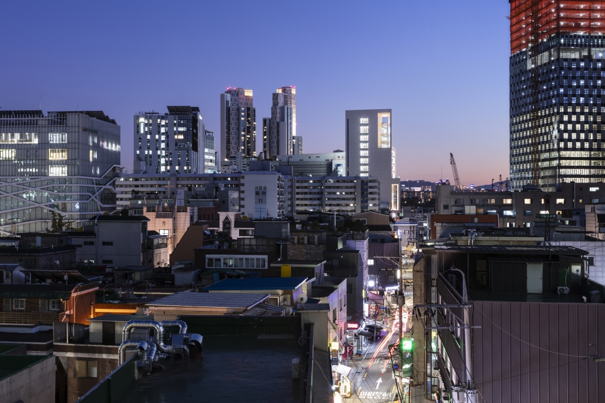
The Clio office building is of a clustered form with multiple frames, and can be observed from various points in the city. If you move North along the Seong-su Bridge through the Seoul Forest, you can glimpse a variety of scenes along the road toward the south along the Wangsim-ri Road. It is also observed from SeoulЁЏs Forest Mirror Pond, Understand Avenue, and Ttukseom Station. Some scenes were intentional but some were not anticipated.
A View-Finder for Various Urban Landscapes: A UserЁЏs Perspective
The building is accessible in all directions, overlooking the city. The terrace serves as a view-finder through which to enjoy various urban scenes. The view from the terrace is incomparable to what one hopes to see through the window. It is, of course, different in that it gives you the open scenery, but the difference between whether it allows you a direct exposure or not is huge. Just as we chase after shots through a cameraЁЏs view-finder, we can set the location and direction of the terraces. You can see the Han River to the south, Namsan to the west and Lotte Tower to the further back east, on almost every floor.
New Parking Strategy: Lessons from Chicago
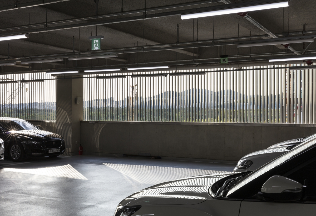
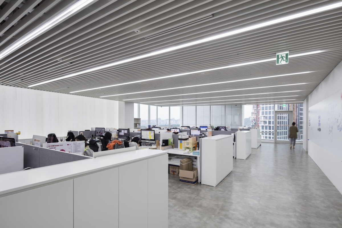
There were two concerns during the design process. The first concern was to overcome the contrast in height with the 43-story apartment building and hotel under construction across the street. This is because the maximum number of floors we can stack was ten stories according to the limited Floor Area Ratio. The second concern was that of the ground floor area remaining in compliance with the law, which was far smaller than the area required. While working on the design with these concerns, we were off for a business trip to Chicago and there we found that the parking space was in the lower floors of many high-rise buildings in Chicago. After returning from the business trip to Chicago, neither the stereotypical underground parking nor a mechanical parking tower system was adopted, and so we boldly introduced a ground floor self-driving parking system. The self-driving parking lots were placed from the third to the sixth floor, and two car lifts were installed for efficient transit within the building. Since the parking lot areas are not included in calculation of Floor Area Ratio according to the Korean Building Act, we could maintain the ground floors while converting the underground area into feasible spaces, which also solves the insufficiency of the total space. In addition, as a 10-story building turns into 14-story building above ground, this improves the building's aesthetic proportions and helps to overcome the dwarf complex. These were indispensable lessons well learned in Chicago.
O.C.A (Jae Y. Lim)
Kim Heedong, Chung Inchul, Park Kyeongeun
66, Wangsimni-ro, Seongdong-gu, Seoul, Korea
office
989ЇГ
586.65 ЇГ
7,089.26 ЇГ
B2, 14F
52
72.5m
59.32 %
415.42 %
SRC
ceramic tile, U-channel glass, LOW-E insulating gl
ceramic tile, paint finish above gypsum board, alu
Joongang Structural Engineering
FOREST MEC
Seongjin TEC
SUNG HYUN E&C
Apr. 2016 - Apr. 2017
June 2017 - Aug. 2019
CLIO COSMETICS
Song hyeona, Sin jisu, Lee Seulgi


