Inclusive Proportions: The Egalitarian Section and the Variable Plan
Architecture's exclusion of different and even variable scales is still rife in recently constructed buildings. Prior to renovation, the Seoul Foreign School Elementary School Library functioned only as a general repository for books and provision of desk space without the proper regard for the scale of its younger members. The design goal for renovation was to blend flexibility with specificity, addressing the changing scales of growing elementary school-age students through the careful integration of architectural elements, furniture, and books. Where previous proportional systems exacted a standardised human body, the ES library incorporates a range of postures that include play and study, along with the recognition of our relationships to other bodies in shared space. If the 'Modulor Man' is fixed and idealised, the ES library's system is dynamic and instable: Its framework is both socially utopic and spatially practical, in appreciation of the fact that children between 6 and 12 years of age grow at an average of 6cm a year.
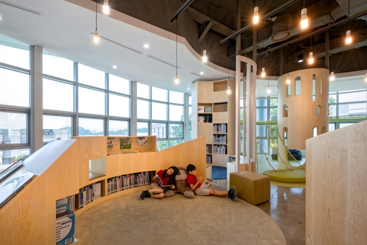
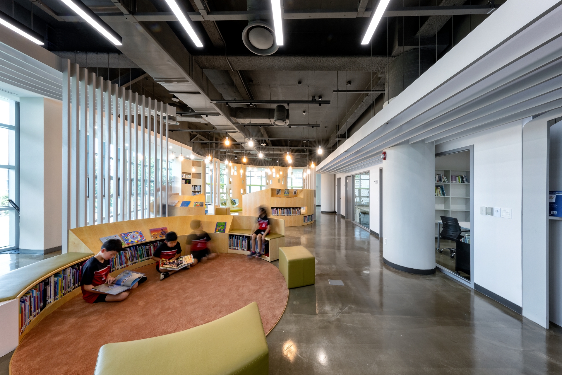
프The overall organisation is a response to the existing building's volume: originally designed from the outside-in and bifurcated down the middle by the main entrance, the given interior floor plate appears as two oddly shaped lobes; one circular the other cubic. While the previous library design ignored this specific geometry, with its standardised layout, a more idiosyncratic approach became a starting-point for renovation. The northern circular envelope now houses a more free-form area, connoting an urban park. Modular and moveable semi-circular shelving nested within a larger circular volume resituates the individual in the existing curve of the building. Segmented into smaller arcs, the furniture can be reconfigured to support various sized gatherings and diverse circulation paths. On the southern side, the rectangular envelope lends itself to a denser 'city block' feel. Book stacks intersect with moveable desks and act as reconfigurable building blocks for individual and collective study. A large conference room defined by folding glass partitions can either extend this space's activities or close it off into a private realm for teacher meetings.
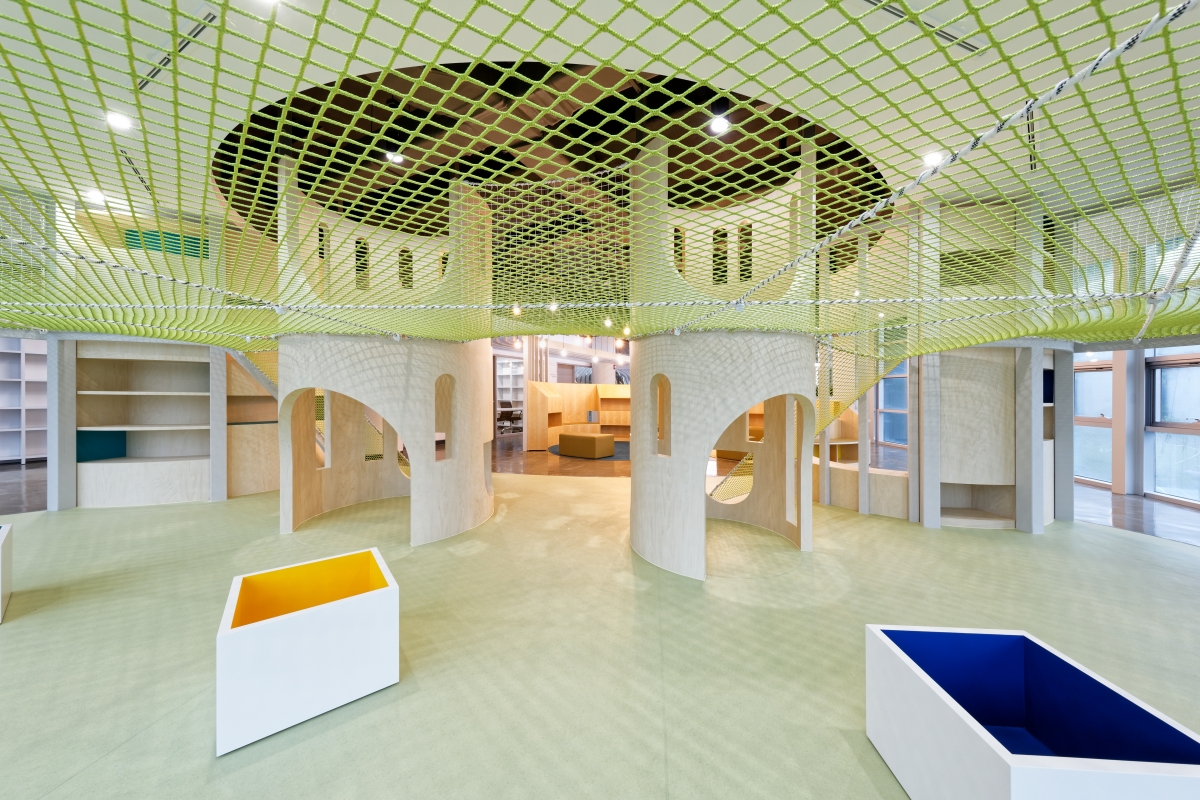
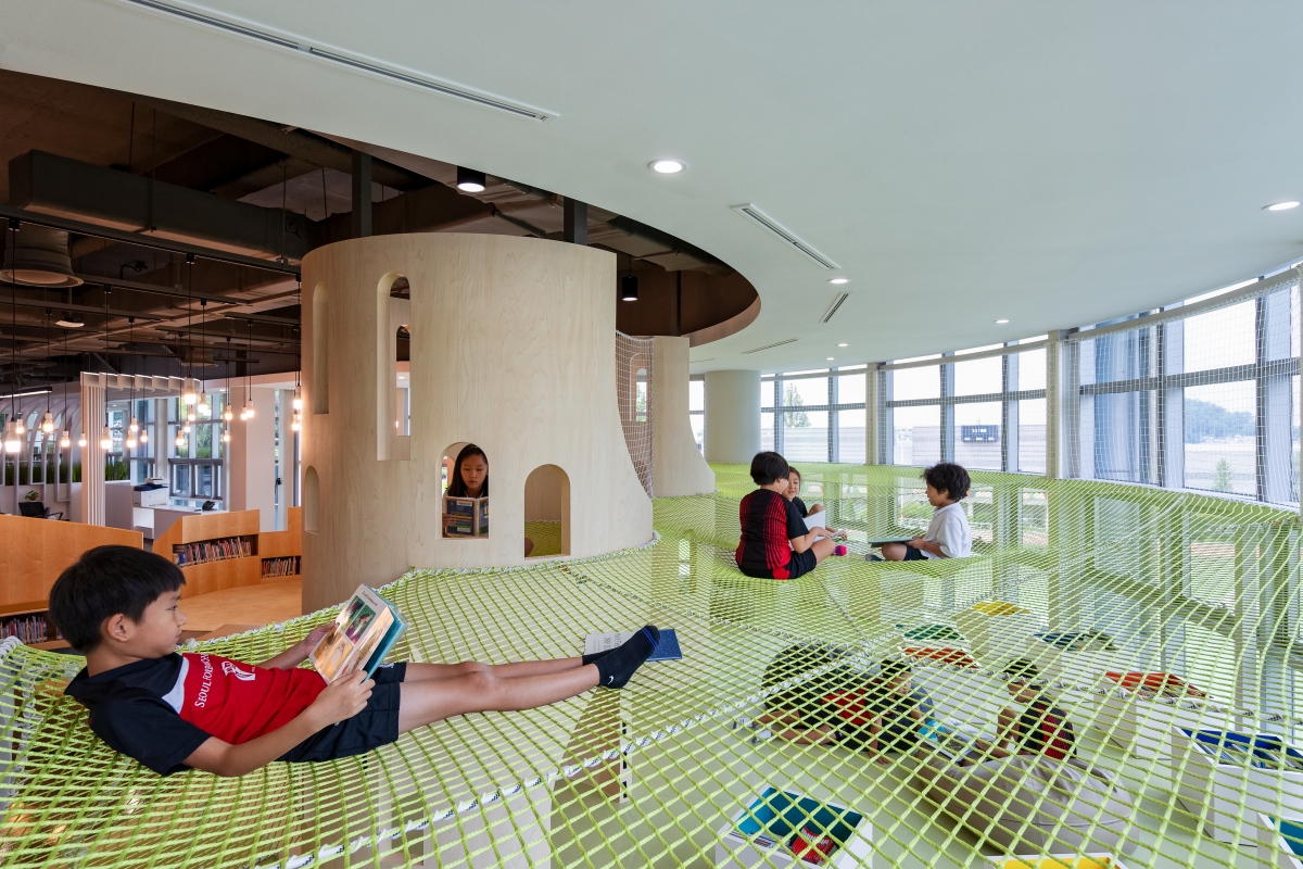
Even though the raw existing space offered a high floor-to-ceiling dimension, the lower portions of the curtain wall were covered and the highest windows obscured by a dropped ceiling. Our design removes these previous layers of construction, revealing a line of floor-level glazing at the eye level of small children. Moreover, by updating the inefficient HVAC system, a 45cm of ceiling height is achieved, allowing for a series of reading towers that emerge at the furthest reaches of the space. The northern towers support a hammock mezzanine that blends the spontaneity of a playground with the function of a library. The space underneath the net is canopy-like, while above, children can imagine floating above the clouds as the hammock presses against the curved exterior glazing. On the southern end, four reading towers support a series of semi-hidden mezzanines reminiscent of 19th century public libraries. They appear as micro-buildings, again nesting within the overall proportional systems. With massing and windows that abstractly reference historical structures, the intention of these towers is to create memories in reverse - in essence, 'future memories' that will register when the children travel in their later years.
Where Le Corbusier's 'Modulor' places the human figure on the ground, the ES Library's proportional system extends the notion of the horizon to multiple raised datums that create reciprocal relationships between architecture and the body. In this way, the project's section contains an ecosystem of shelving, seating, desks, and mezzanines along a series of horizontal lines in the same way notes are arranged along a musical staff. This strategy assures that school children of all ages can physically interact with library activities at some level.
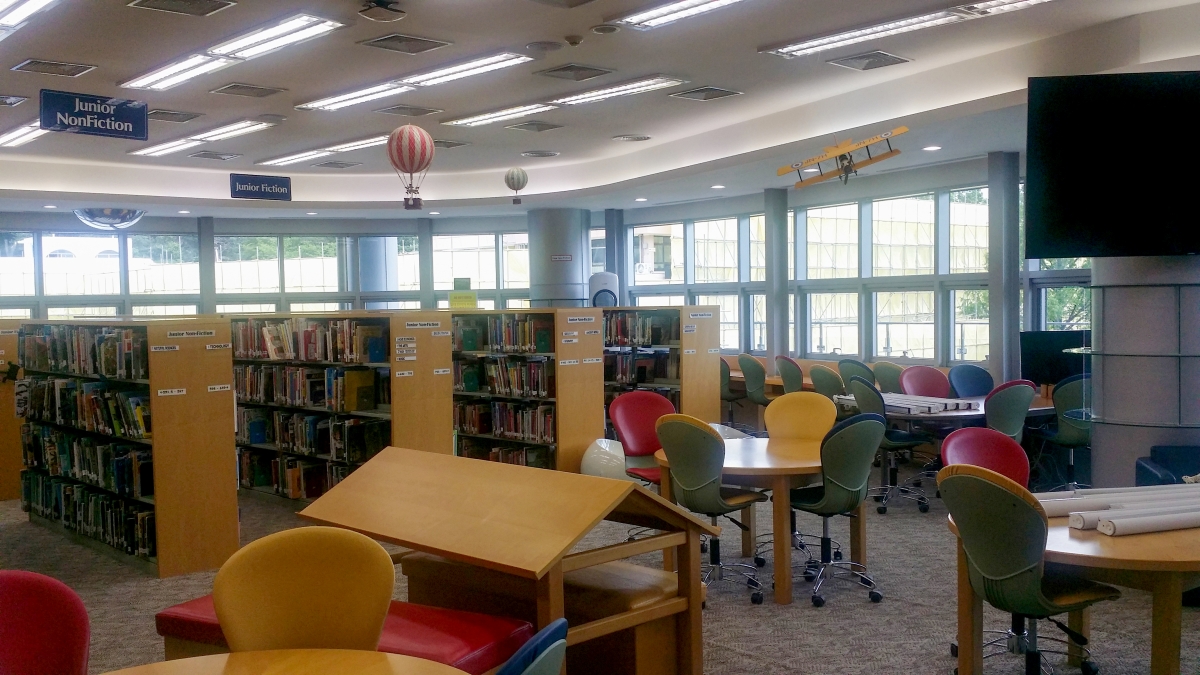
Previous library
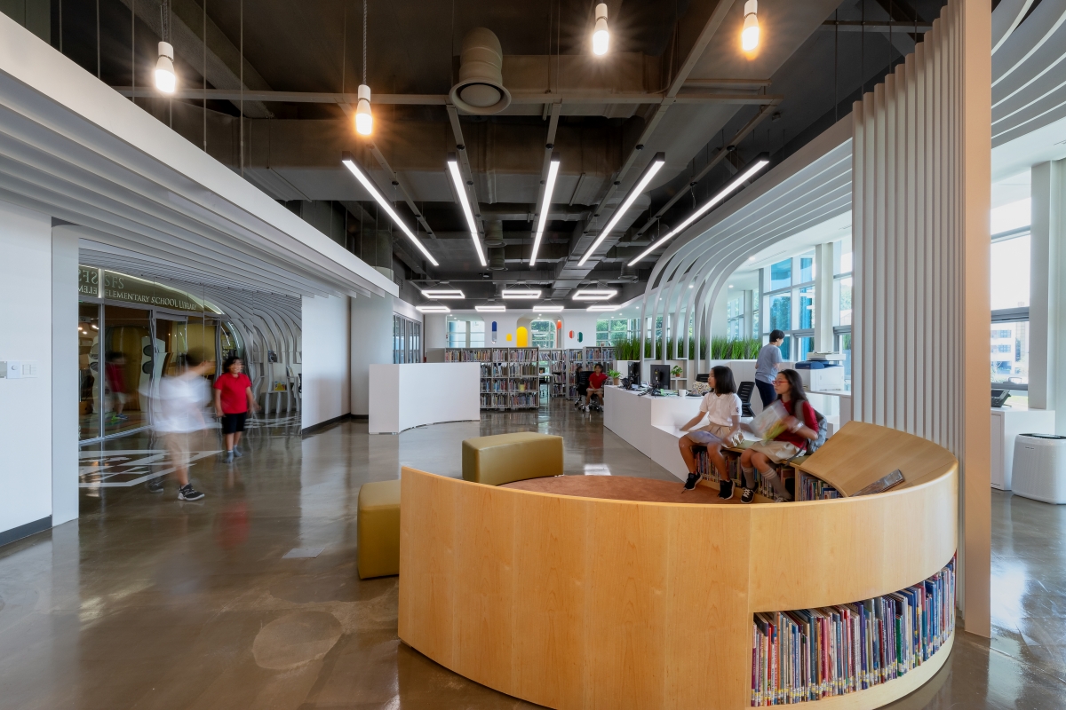
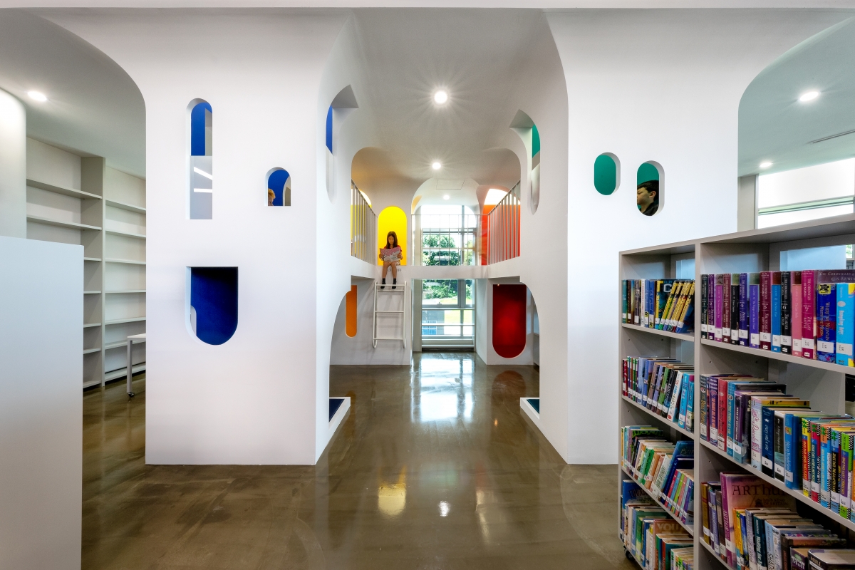
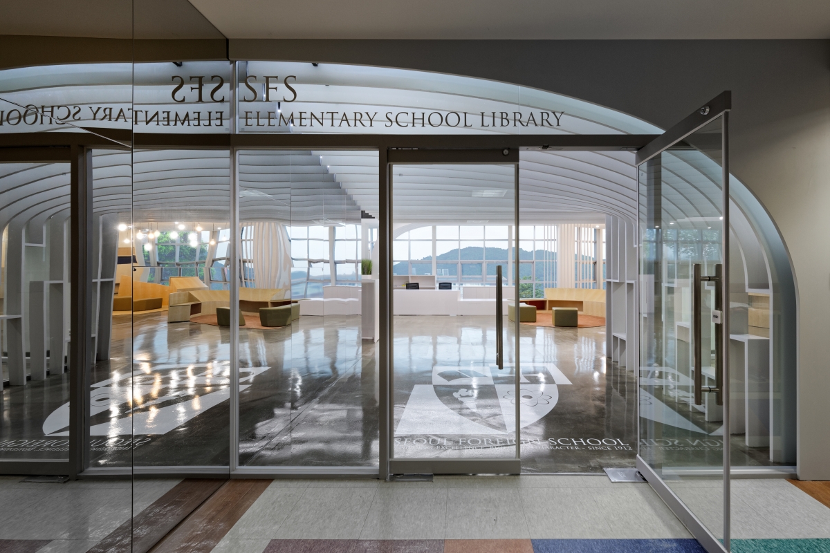
As children grow so rapidly, however, the spatial extension of their bodies beyond what they can literally touch is also of crucial importance. For instance, gaps in the bookshelves form low 'windows' unique to the scale of younger children and equivalent to the long views available to older students and adults. The use of mirrored stainless surfaces then extends their views in various ways. At the architectural scale, reflective panels at the entrance expand views to the campus beyond while creating a sense of wonder by mirroring the half-arch of the ceiling. At the scale of furniture, the reflective underside of the angled display bookshelves extends the visual reach of smaller children, who otherwise would not be able to reach the books. In this way, the design of the ES Library augments the spatial involvement of school children: rather than offering a fixed proportional system that responds to a singular notion of human scale, the interior architecture acts in the same way customised prosthetics might in extending the body's usual range of motions and experiences.
Project : Architecture (John Hong)
Kang Seungjae, Jang Jinwook
39-1 Yeonhui-ro 22-gil, Seodaemun-Gu, Seoul, Korea
library
445㎡
4.7m
paint, sheet, wood veneer, epoxy on exposed concre
CPLUS DESIGN CO., LTD.
Myungbo Air Conditioning
CPLUS DESIGN CO., LTD.
CPLUS DESIGN CO., LTD.
Mar. 2019 - June 2019
June 2019 – July 2019
Seoul Foreign School


