©Kim Sooyeon
Architecture That Can Control Light
Deep in Dongpyeon village, where Gwacheon and Anyang meet, the project site can be found, surrounded by parkland and green spaces at the foot of Mt. Gwanak. How might one try to harness the best aspects of the surrounding environment and draw them into a building? This was the starting point of the project. At the end of an approach to Dongpyeong-ro, the site forms the target in a line of sight.
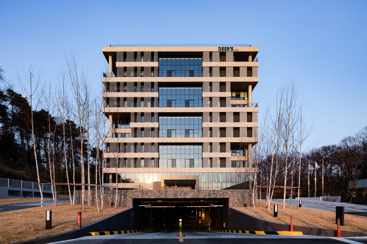
Although the regulations allow for a floor area ratio of up to 300%, the client requested 200% with a maximum height of ten floors. This provided room for manoeuvre between various spatial devices planned throughout the mass of the building. Shifted 45° in the southwesterly direction, the site encourages a building’s orientation to face the southeast and southwest, securing the longest exposure to sunlight. Spatial devices such as eaves and balconies, louvers and terraces have been applied to address an issue that has arisen as a consequence; the control of sunlight emanating from the south-west. The control of sunlight exposure in summer at latitude of 37.24N is an issue of great importance. Traditional Korean houses are equipped with spatial devices, such as eaves, which still work well in contemporary architecture. Continuous eaves between each floor have the form of economical balconies, which function very efficiently in summer when the sun’s is high in the sky. To solve the solar heat gain from the south-west and the west, louvers of the smallest possible size have been installed on the outside of the balcony in accordance with calculations of the window locations and the altitude of the sun in each season. Louvers of streamlined sections have been installed at different angles depending on the orientation, which alters the amount of reflection or cast shadows depending on the position of the sun. This affects not only the interior space but also the external appearance of the building, producing a variety of light effects through different reflection angles, shadows, and the depths between the louver and the skin of the building.
The eaves and toenmaru of a traditional Korean-style house, the Hanok, functions as the intermediate space to connect inside and outside. This building’s balcony, of similar character, connects the internal space of the office, which is usually closed to the outside space, so that it interacts with the surrounding forest. The terrace, of a two-storey height, forms the culmination of the intermediate space with intense sense of space, serving as a space to stay outside, drawing the external landscape inside, and creating a sense of diversity and change across the external faces of the building.
The spatial characteristics and diversity of the plan tends towards a floor plan of a familiar kind, and yet varies the positions and orientations of the same terraces. The atrium, which is installed on two floors, was planned as an energy saving device to reduce the cooling and heating burdens in summer and winter, by making use of the eaves effect and the greenhouse effect. It supports internal temperature control, and naturally maintains a cooler than external temperature in the summer, through awnings and ventilation, and warmer by inviting the sunlight in winter. In addition, decorated as an interior garden, the space is a kind of borrowed scenery that draws the outside landscape into the interior, and also features an open rest area and community space between two office floors in much the same way as an independent courtyard. The building is designed to adopt a balanced architectural personality through the harmony and economy of chosen materials, creating a certain simplicity and sense of structural space.
Commanding a view of the surrounding mountains, such as Gwanak, Cheonggye, Baekwoon and Suri, the rooftop has been transformed into a rooftop garden, which can also be used as a vegetable garden. The tenants are employed by ink and paint companies related to colour, and wanted to reflect this through something symbolic concerned with colour on the building’s design. Twelve colours for the twelve floors have been extracted using the motif of the birthstones of 12 months of the year, and applied to the elevator hall of each floor gives each level a unique identity. The main stairway was planned to be wide enough to attract tenants into its regular use, and a skylight was partially installed for natural lighting. Its handrail is designed to represent spatially the acoustic reflections of the colours extracted from Paul Klee’s painting, ‘Ancient Sound’ (1925). This pattern with the motif of the building elevation is used on the main signboard and signs, and frees it to realise its own identity.
©Kim Yongsoon
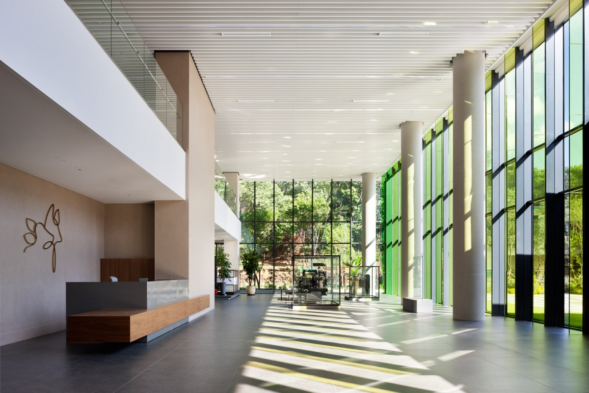
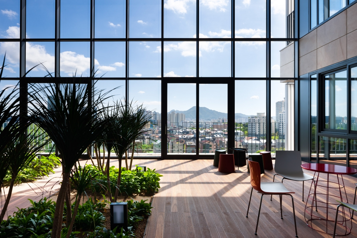
The atrium, which is installed each on two floors, was planned as an energy saving device to reduce the cooling and heating burdens in summer and winter, by making use of the eaves effect and the greenhouse effect.
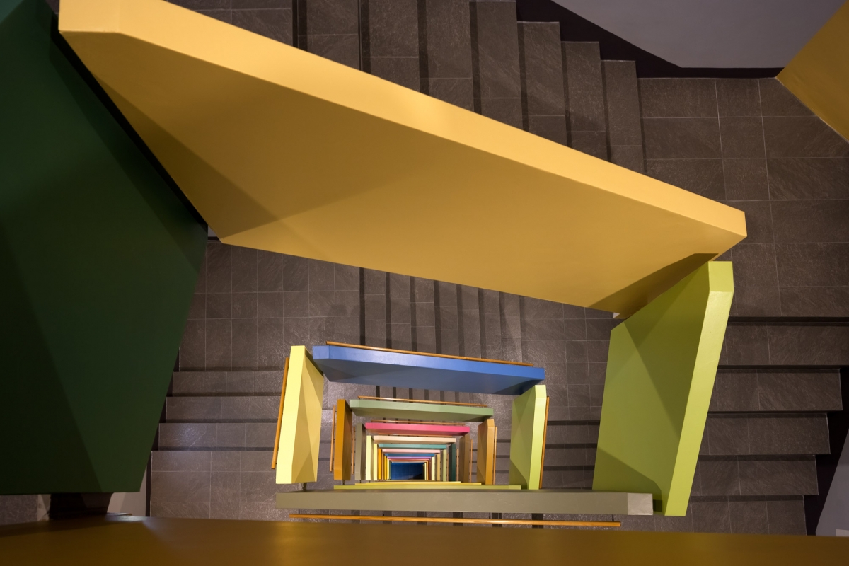
The main stairway’s handrail is designed to represent spatially the acoustic reflections of the colours extracted from Paul Klee’s painting, ‘Ancient Sound’.
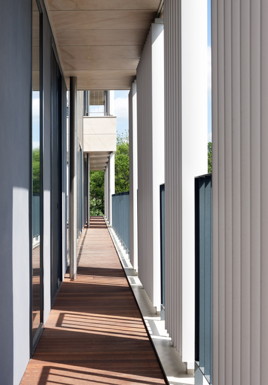
Louvers of streamlined sections have been installed at different angles depending on the orientation, which alters the amount of reflection or cast shadows depending on the position of the sun.
HnSa architects & designers (Han Manwon, Choi Kyun
Chung Jinsuk, Jeong Yohan, Lee Yeongnam, Lee Wonch
54-11, Dongpyeon-ro, Dongan-gu, Anyang-si, Gyeongg
office building
4,166m2
1,224.78m2
13,643.49m2
B2, 10F
110
40.9m
29.4%
206.01%
RC
ceramic tile, aluminium louver
waterpaint
EUN Structural Eng. Inc.
HANIL M.E.C
sgc Engineering & Construction
Oct. 2015 - Oct. 2017
Feb. 2017 – Oct. 2018
20 billion KRW
SEDA CO.,LTD
landscape design studio knl
DAWON DESIGN(1F, 10F)
Chung Daun
NOROO PANTONE Color Institute


