Concurring with this viewpoint of the floor and paying attention to the unique property found in the interior space of his architectural work, this article intends to think about the elevation that is, in the words of the architect, ‘effortlessly given’ as a consequence of its plan composition. The reason for obstinately looking into the part against the architect’s emphasis, is because I believe this is worthy of discussion along with the issue of the floor. What kind of possibilities and limitations does an interest in the floor bring about to the elevation? What problem or significance does the elevation that achieved autonomy indicate? We stand on the floor, but it is the wall towards which our gaze is directed. The floor is what a few people who enjoy the interiors can experience, yet the exterior elevation is what is expressed towards the unspecified individuals, that is, the society at large. The architectural community usually supposes a hierarchy between spatial and visual experiences, but in fact, we communicate visually through most of the buildings and their elevations. Above all, the elevation is the area where the architect relates architecture to the outside world.
Interestingly, his four recent residential projects that show similar properties in the interior space, exhibit, at a glance, different aspects of elevations.

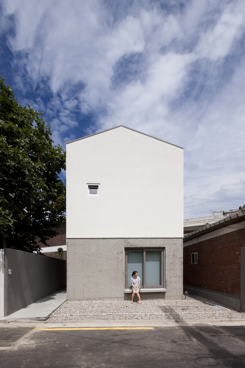
J Studio House
Case 1. A Given Elevation: The Seochon M Guesthouse
Located deep in the alley of Seochon, this is the project that converted a two-storey brick house into a residence-cum-guesthouse. Access into the building from the alleyway is quite abrupt, but once you enter the front door, a distinctive middle area appears. It is a space that contains a small ritual suggested by the architect amid the repetitive routine of returning home. It is something that commonly appears in the architect’s recent works, and it is distinguished from the other spaces through a change in floor level. Going a half-storey up, a living room and a kitchen on the first floor stretch out as a single space. However, despite its role as the main space, all sides are blocked except the two small windows in corners. This is because the architect chose to maintain the somewhat closed brick elevation from the existing building. Nevertheless, this space does not feel confined, since the upper floor was partially left open to introduce light and the view from the second floor’s window (also the opening from the existing building). It is easy to secure a sense of openness by creating a wide opening to the outside. Yet it is much more difficult to create a space that is adequately closed to give a cosy and unstuffy atmosphere, and this is a crucial ability that is required for architects who practice architecture in the dense urban area. In this renovation project, Seo Seungmo embraced the existing elevation in order to preserve the alleyway ambiance, burdening himself with much greater constraints on compositing the interior space. On the other hand, he freed himself from the load of composing a new façade, and brilliantly solved the programme required for the residence and the guestroom by proposing a multi-storey plan design. Inside the given shell, the architect created tranquil rooms by carefully adjusting the levels between floors and emptying out certain parts of the floors.
Case 2. An Almost Given Elevation: Seochon J Hanok Renovation
Seo Seungmo also links his interest in the floor to the structural method of our traditional post-and-lintel wood construction. In the hanok, an architect designs the floor, then the wall is inserted into the resulting structural frame, in consequence generating the elevation. Moreover, since this was a renovation project, the scope of work for Seo Seungmo on the elevation was limited to dismantling and rebuilding the structurally unstable portion, changing the position of the entrance, windows and doors, and adjusting the location of some horizontal members.
Furthermore, the elevation of the urban Hanok is more restrictive. Unless it is located in a special position, such as an edge, its lateral and rear sides become close to the neighbouring walls, so the only elevation that is revealed to the outside is at the front. The rest of the unseen sides are like ancient Rome’s catacombs or the first floor’s back side of Maison Bordeaux by Rem Koolhaas, which were buried in the ground and were formed corresponding to the internal needs only. Taking advantage of these conditions, the architect freely pushed the closet backward to the finishing side of the living room inside, and placed the walls in front or behind of the columns based on the internal needs of each room. As if the tiled roof was considered as another elevation towards the sky, the architect inserted an additional level to avoid the client’s low bedroom from being seen. Orchestrating the interior without being conscious of the exterior is an opportunity that is not often given to an architect. In this respect, the architect was able to concentrate on structuring the interior space by carefully adjusting the floor, putting the task of designing the elevation aside.
 M House
Case 3. A Designed Elevation to Reveal: Hanam M House
However, there is no way to avoid the task of designing the elevation in a new project which is not a Hanok. It may be possible if the entire surface is covered with front glass to express the cross-section as it is, but such is not a viable choice when considering the privacy or environmental attitudes of the residence. It is especially true for Seo Seungmo, who is experimenting with appropriate dark spaces.
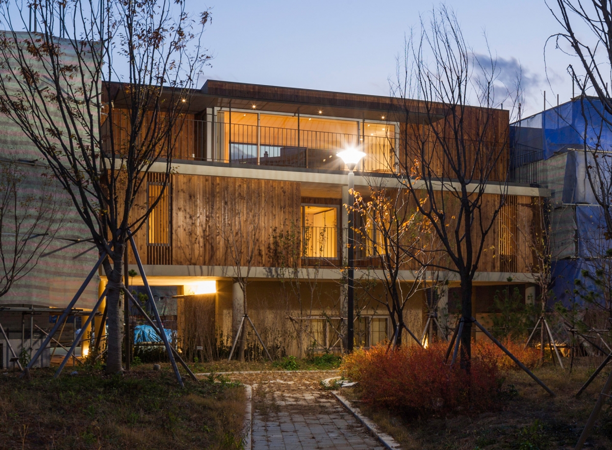
The design strategy chosen by the architect for the site in the residential development district of Hanam New City, where similar sized new buildings are built, was as to express the structure of the stacked layers, emphasising the most basic aspect of the multi-storey building, and to ‘reject’ any further composition of elevation. According to its programme and position, each level is designed with its distinctive plan composition and structural method. Then that connection is intentionally emphasised as just the rough condition of stacked layers. The second floor, which is the body of the building, used the same wood as a finishing material and a louver to hide the interior structure, and to abstract it into a single mass.
The simplified division of the elevation, through the representation of stacked layers, was already used by the architect in his earlier projects such as K Pension (2013), J Studio House (2014), and G House (2014). The separation between floors expressed only through a finishing material would be mere makeup, so the architect must have thought about how to differentiate the structure. Thus, the inside and the outside functioned as catalysts to form each other. Nonetheless, in the previous projects, the division between the levels were formed by a single structural/finishing material, while in M house, the 30cm-thick slabs were clearly expressed, preferentially foregrounding the form of stacked layers.
It is quite interesting that M House has the smallest change in levels of the four houses that this article is addressing. Are straight and thick slabs, which are established as a means of escaping the arbitrary composition of the elevation, in fact a constraint on developing various composition in the interior space? There is only one step down from the entrance on the first floor to the study room, and another step, like a narrow porch (toemaru) in the living room located on the third floor. The partial level change on the third floor stands independent, without affecting the ceiling of the second floor.
Case 4. A Designed Elevation to Conceal: Seocheon O House
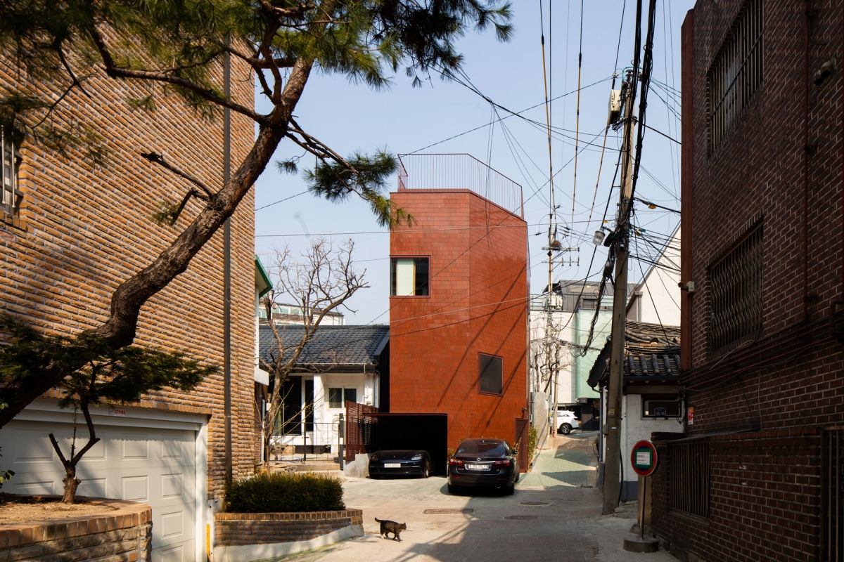
In contrast, O House is an example where the floor level adjustments are organically bonded to both the upper and lower floors. While M House is located in the New City’s detached housing area, O House is located on a small site in a complex alleyway of Ogin-dong in Seoul’s old town, situated in a condition that requires a compression of spaces. The result was a multi-layered interior composition. Corridors with differences in levels are connected like an alleyway, and rooms are positioned here and there (all rooms except the two children’s bedrooms vary in level), reaching the living room on the top floor at last. Only elderly residents with knee pain and robotic vacuum cleaners will not appreciate this set of steps that offers a rhythm to our body’s movements. The 800mm-wide corridor surrounds our body, and arched doors that are based on not structural logic but on the human shape of standing upright are also used. His architecture tightens our body just enough to make us feel cosy, and then releases it momentarily.
This spatial composition with a difference between levels reminds one of Adolf Loos’s houses based on his concept of Raumplan, built in the early 20th century in Vienna, Paris, and Prague. When Loos designed residences in highly dense urban areas, he managed to cleverly integrate rooms with different levels in a three-dimensional fashion, resulting in a dynamic cross-section that created the flow of circulation and sight, through the openings and the difference in levels between rooms. The elevation, however, was treated simply as possible, as a pure cube, with openings positioned sometimes freely or under an apparent order.
It is the same scenario for the elevation of O House. Red glossy tiles, whose colour is familiar but not its proportion, covered the elegant form of mass and created a monolith, to which windows of unified size of 1350x1350mm were distributed intermittently based on internal needs. The strategy of placing same sized windows on a mass, whose form and finish are simple, has been found in Asan C House in 2011, but the difference lies in a remarkably reduced proportion of windows on the elevation. The purpose of the interior space has been changed to create a cosy space that is adequately closed, proving that the architect has become confident in using this design method, which on the other hand risks creating a closed interior. The windows of O House were positioned according to the internal needs, such as a visual point of arrival of a somewhat narrow stairway or the direction of looking at a distant mountain from the living room. Nonetheless, the fact that they are uniform in size despite their different uses and positions is an interesting choice made by the architect, considering that he wishes to adjust the quality of interior space by providing appropriate lighting. It is analysed as limitations that he imposed upon himself in order to escape from the problem of the arbitrary composition of the elevation. But isn’t the arbitrariness of design something that one cannot completely escape from, and that eventually becomes a type of obsession as one tries to break away?
Four projects that we have investigated so far have a few things in common: an interior space that is formed by floors of various levels, unique lifestyles offered by that space, and a desire to escape from the composition of elevation. Many architects consider elevation composition an intricate problem. For instance, Choi Moongyu noted that ‘drawing the elevation’ is the most difficult task in the design process, and that he is ‘still uncertain about composing the elevation with the designer’s intuition or senses’ [5]. Rather than composing the interior space corresponding to a specific programme, a task of dividing surfaces, assigning colours, and adjusting proportions of elevation are indeed the most two-dimensional, pictorial, and arbitrary area of design. Adding to this difficulty is the absence of a discipline that we can rely on when designing elevation. Other than discourses related to the interrelationship between inside and outside, what can we reference when composing elevation?
Getting back to Loos, the dualism of the inside and the outside shows the distance between the private and public spheres, between life and art, and between daily routine and representation. The inside is where individuality is expressed, while the outside is a shield to hide individuality and protect oneself from the fatigue from urban life. In this extreme duality lies Loos’ multi-layered responses to the civilisation and culture of his time. They have their own voices, rather than one being the mere result of the other. The tension between the two is the message. It seems unfortunate for the elevation to be left apart as a simple resistance from the composition. To distance oneself from the problem of the elevation due to one’s resistance to arbitrary composition is quite unfortunate, as there are so much more stories that the elevation can tell.

O Hiouse
-
1. Le Corbusier, Vers une Architecture, pp.62-81, Lee Gwansuk trans., Dongnyok, 2002.
2. Min Hyunsik, Land, Place and Architecture, pp.74-97, Mikunsa, 1998.
3. Pai Hyungmin, Sensuous Plan, Dongnyok, pp.202-297, 2007.
4. Choi Moongyu, Kim Sunghong, ‘Particular Solution from Situations and Conditions’, pp.46-53. SPACE no. 572.
5. ibid, p.48.
Choi Wonjoon
Choi Wonjoon teaches architectural history, theory and design as an associate professor at Soongsil University. He graduated from Seoul National University and earned his master’s degree and Ph.D. in architectural theory and history from the same school. He worked for the architect Seung H-sang at IROJE architects & planners, before pursuing his post-doctoral studies at Columbia University. He was curator of the Seoul Biennale of Architecture and Urbanism and of the show ‘Sections of Autonomy: Six Korean Architects’ (both 2017), and is currently taking part in a collaborative effort to build an archive for Korean modern architecture at Mokchon Architecture Archive.
75


