Beginning with Structure
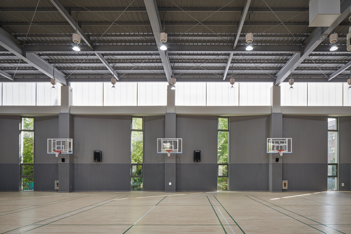
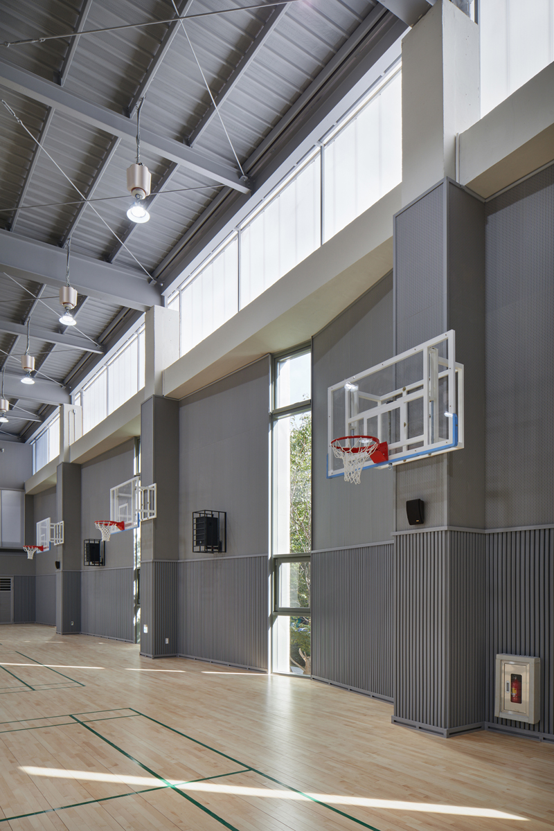
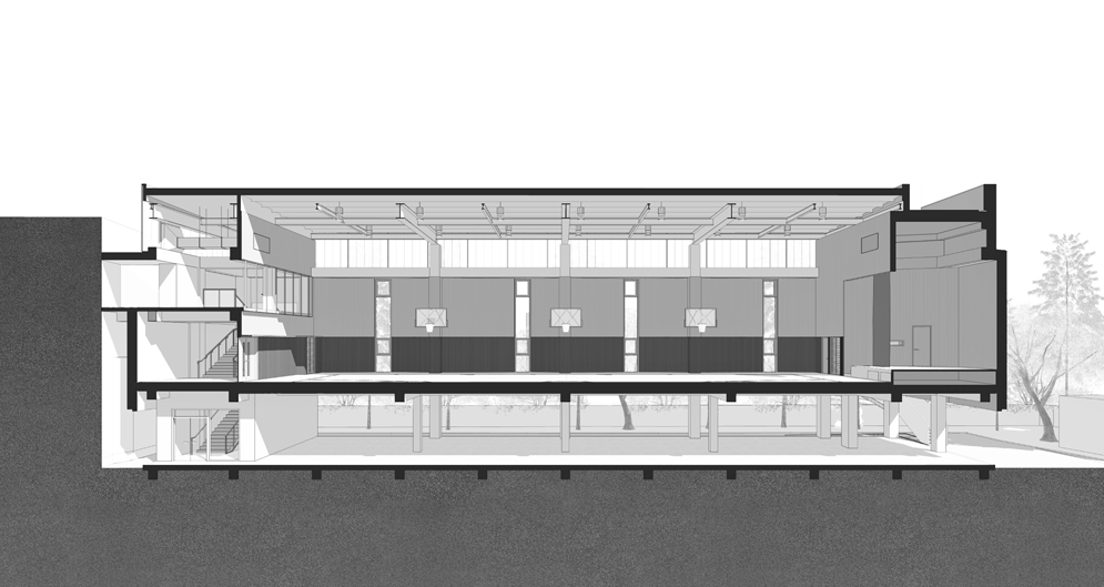
Multipurpose auditoriums require a different spatial approach from general architecture in terms of size and form. A column-free space of 30 meters in length, 18 meters in width and 8 meters in height is uncommon, thus,the first step of the project was deciding which structural system to use. In designing two multipurpose auditoriums for the competition, the main concern was to step away from the uniformity of existing auditoriums and focus on exposing the spatial richness created by light, while emphasizing the characteristics of each respective structural system. Apgujong Elementary School’s multipurpose auditorium is made of two horizontal solid concrete walls with a band of translucent polycarbonate panels rising above them, thus making the wide roof slab look like it is floating. At the same time, the inside of the auditorium is designed to be a bright and energetic space, with soft light spreading from above. Initially, a concrete waffle structure was chosen for the roof; though unconventional in Korea, it would have been an effective way to reveal the clarity of the simple, repetitive structural module. This design was replaced during construction due to budget limitations with a more common light steel structure with minimal slopes in both directions.
Origami Facade
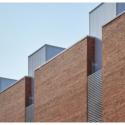
The exterior walls of the Apgujong Elementary School multipurpose auditorium is inspired by origami. The combination of the slightly different angles of the segments react to light, creating subtle differences in shade and texture. The position and number of wall segments were carefully adjusted to avoid the façade from appearing too complex or simple. In order to stimulate the creativity of the students, a strategy was chosen to maximize the innate textures of the materials, though it might look rather rough in contrast to the conventional method of placing primary color materials throughout the space. The hope is that students will be able to experience extraordinariness in everyday school life through this architectural setting. The concrete bricks were selected in the process of searching for materials that could harmonize with the sports field’s earth tone.
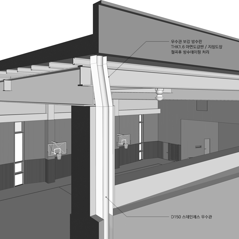
When seen from the outside, the layer of polycarbonate panels divides the multipurpose auditorium horizontally, while lowering the height of the brick walls keep it from overwhelming the elementary school students. If the lower layer of brick walls was conceived as an extension of the ground, the upper layer of the milky-white polycarbonate panels was intended to blend into the sky. Although the auditorium’s structure only has two sides that let in natural light, with the other two sides attached to the stage and entrance hall, polycarbonate panels crown the brick facade on all four sides in order to maintain consistency. Rainwater downpipes were placed between the structure and the insulation layer so they would not be seen from the outside. For the polycarbonate panel layer, the pipes were arranged behind the columns and a set of metal trays were designed to collect water from runoff condensation, as the pipes carry the outside air and are exposed in the room,.
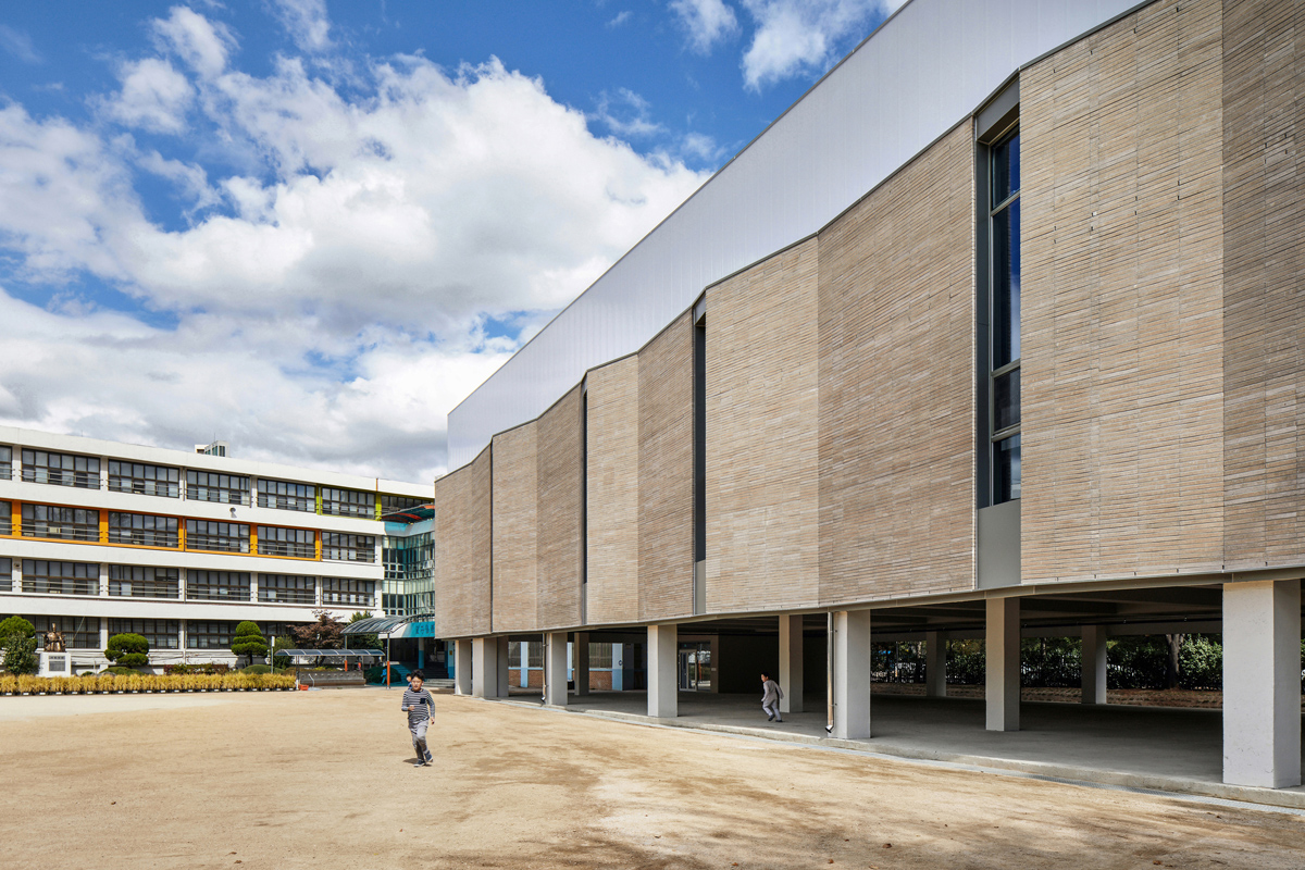
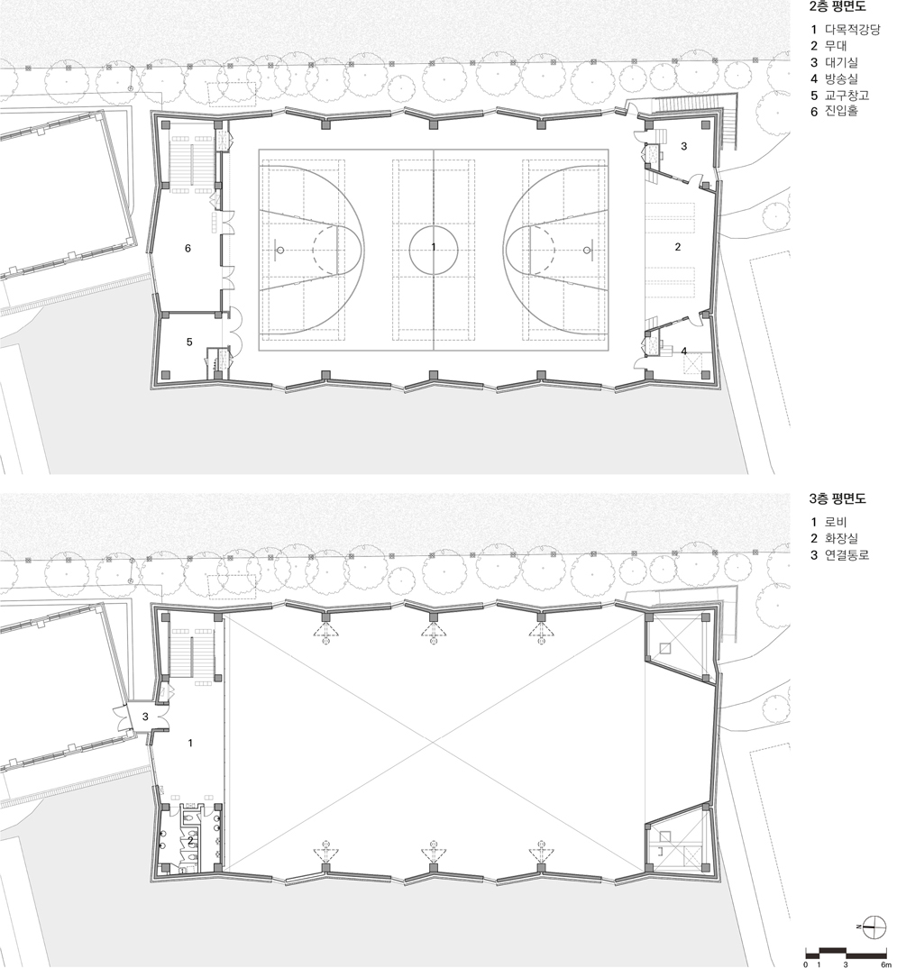
Since the given configuration of the plans and zoning do not leave not much room for interpretation, a piloti space takes up most of the first floor for a cafeteria extension, with a multipurpose auditorium and entrance hall on the second floor and a connecting bridge to the main building and toilets on the third floor. To implicitly show the activities taking place in the multipurpose auditorium when entering from the bridge on the third floor, a wall of transparent polycarbonate panels was planned between the third floor and the auditorium. They were replaced with opaque panels during the construction process, in which the architect was not the designated construction supervisor. In addition, the original design intent was unable to be fulfilled because a brick wall was later built due to safety concerns.
The outer walls of various angles create a somewhat unfamiliar zigzag pattern, which is a theme that has been continuously tested in previous projects. The zigzag pattern was realized for the first time in this multipurpose auditorium. It was originally an attempt to overcome the homogeneous conditions of leftover space and provide users with the possibility to appropriate the space for themselves. In the case of this multipurpose auditorium, it is limited to creating expression to the available space around the sport court markings. This idea would be better applied to larger public projects with integrated furniture design.
Selection of Materials, Color Scheme and Signage
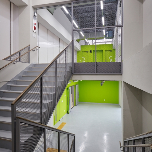
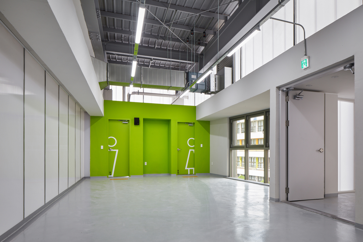
The concrete bricks and polycarbonate panels used in the exterior are both uncommon materials for school projects. Through material selection committee meetings, the school was strongly persuaded to agree to the proposed materials in the material specification sheets, thespecifications book and the budget schedule. Despite the scarcity of choices for acoustic boards and rubber wall padding for the inside the auditorium, dark gray materials were chosen to match the color of the ceiling. The base color scheme for the stairs and entrance hall is also achromatic, but a shade of green was carefully selected for one side to represent the space. As a result, only one primary color was used throughout the entire structure to stand out among the natural colors of materials and achromatic base colors. The signage on the toilet doors was intended to be large to resemble graphic design rather than to hide it. This was not part of the design contract, but as it would have eventually needed to be done and minor costs and effort can make a big difference, it was included in the drawing set and the budget schedule. The same principles for color and signage were applied to Eonbuk Middle School multipurpose auditorium that was constructed at the same time.
Unfinished Architecture
The multipurpose auditorium that currently appears in photographs is not inits final form. There are plans for an extension for a cafeteria to be built in the piloti space on the first floor for a. At the time of auditorium’s completion, the firm that was selected to design the cafeteria had already completed its working design. It is uncertain what the auditorium will look like upon its completion, but it is clear that the client has an important role to play in creating a high quality structure with a coherent design.
2F, 3F Plan
Architect
IDR Architects (Jun Borim, Lee Seunghwan)
Design team
Choi Jeongseok, Kim Hyeyeon
Location
461 Apgujeong-dong, Gangnam-gu, Seoul, Korea
Programme
educational facility
Site area
14,135.6㎡
Building area
837.83㎡ (extended area)
Gross floor area
943.74㎡ (extended area)
Building scope
3F
Parking
existing parking lot
Height
13.7m
Building to land ratio
18.75% (in total)
Floor area ratio
51.75% (in total)
Structure
reinforced concrete + steel (roof)
Exterior finishing
concrete brick, polycarbonate panel
Interior finishing
water based paint on concrete, acoustic board, rub
Structural engineer
Poeun Structure
Mechanical and electrical engineer
Hana Consulting Engineers
Construction
Woori Global Construction
Design period
Jan. 2017 – Apr. 2017
Construction period
July. 2017 – Nov. 2018
Client
Seoul Metropolitan Office of Education
Jun Borim, Lee Seunghwan
Jun Borim and Lee Seunghwan studied architecture at Seoul National University and started their training at small practices. After moving to United Kingdom and receiving MA degrees at London Metropolitan University, they returned to Korea in 2014 and founded IDR Architects. They received several awards for Maegok Library in 2017, which include Korean Rising Architect Award, Korean Architecture Awards, Public Buidling Awards of Korea and Ulsan Architecture Award. They have been writing about public architecture and struggles of young architects on their blog, and respectively teaching at Seoul National University and Korea National University of Arts.
128


