Space for Smooth and Accurate Care
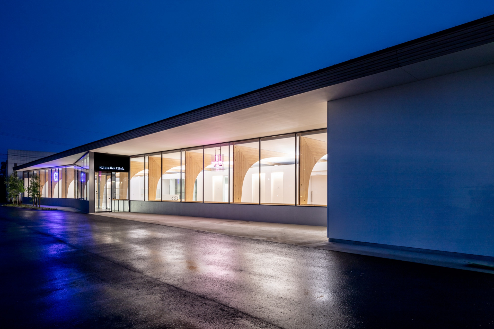
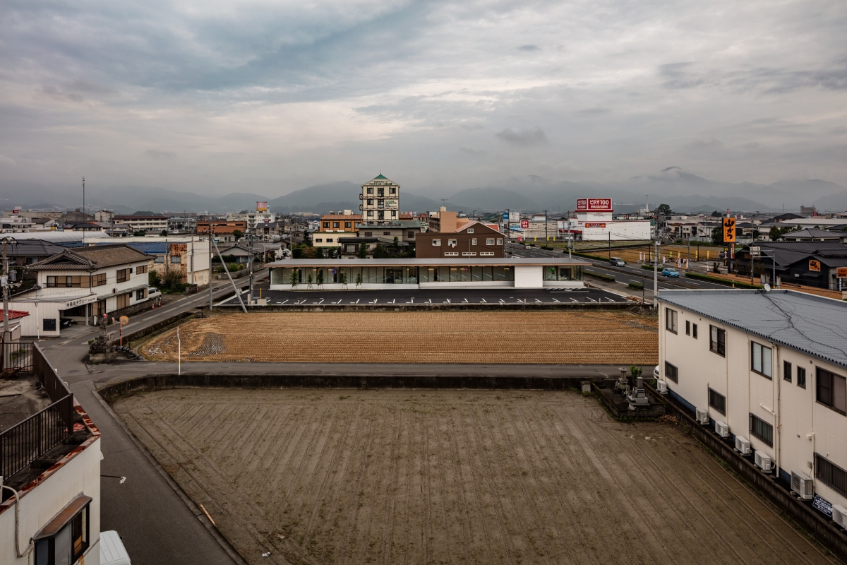
The Kohno INR Clinic is located along the main road leading to the Aizumi interchange on Tokushima Expressway. The clinic encompasses internal medicine, neurosurgery, orthopedics, rehabilitation and a pharmacy. A clinic is usually separate from the outpatient pharmacy and operated by different manager according to the regulations of the Pharmaceutical Affairs Act. However, considering the convenience of patients, they have been here combined in one building. With separate entrances the clinic and the pharmacy are connected through the space under the eaves for convenient.
The director of the clinic has a responsibility to accurately diagnose the patient’s symptoms irrespective of the uncertainties presented by illness and to provide the optimal medication and rehabilitation therapies. For this reason, I thought that each area, for examination, rehabilitation, and the pharmacy, should be well-connected in terms of architecture. At the same time, I wanted to emphasise the low architectural fence between the medical areas such as the consultation room and the treatment room, and the patient’s areas, such as the waiting room. I planned divisions between each space for doctors, staffs, and patients in a loose way.
Doctors and patients usually meet in the consulting room, but I designed the space, from the entrance to the waiting room, to be as open as possible, so that doctors would be able to observe patients while they are waiting to better understand their condition. In addition, I removed the boundary between the entrance and rehabilitation treatment areas, combining them into one space.
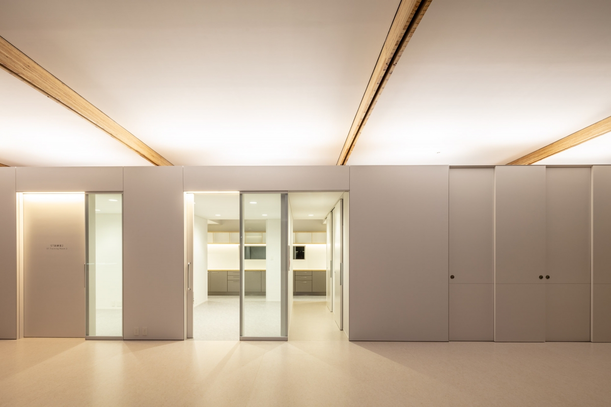
Instead of simply separating the consultation room from the waiting area with a wall, the consultation rooms are placed in a low and long box under a structural arch, forming a span, so that doctors and patients feel as if they are facing each other. Glass openings adjacent to the door of the consulting room allow the doctor to sense the patient’s condition without strictly separating it from that of the waiting room.
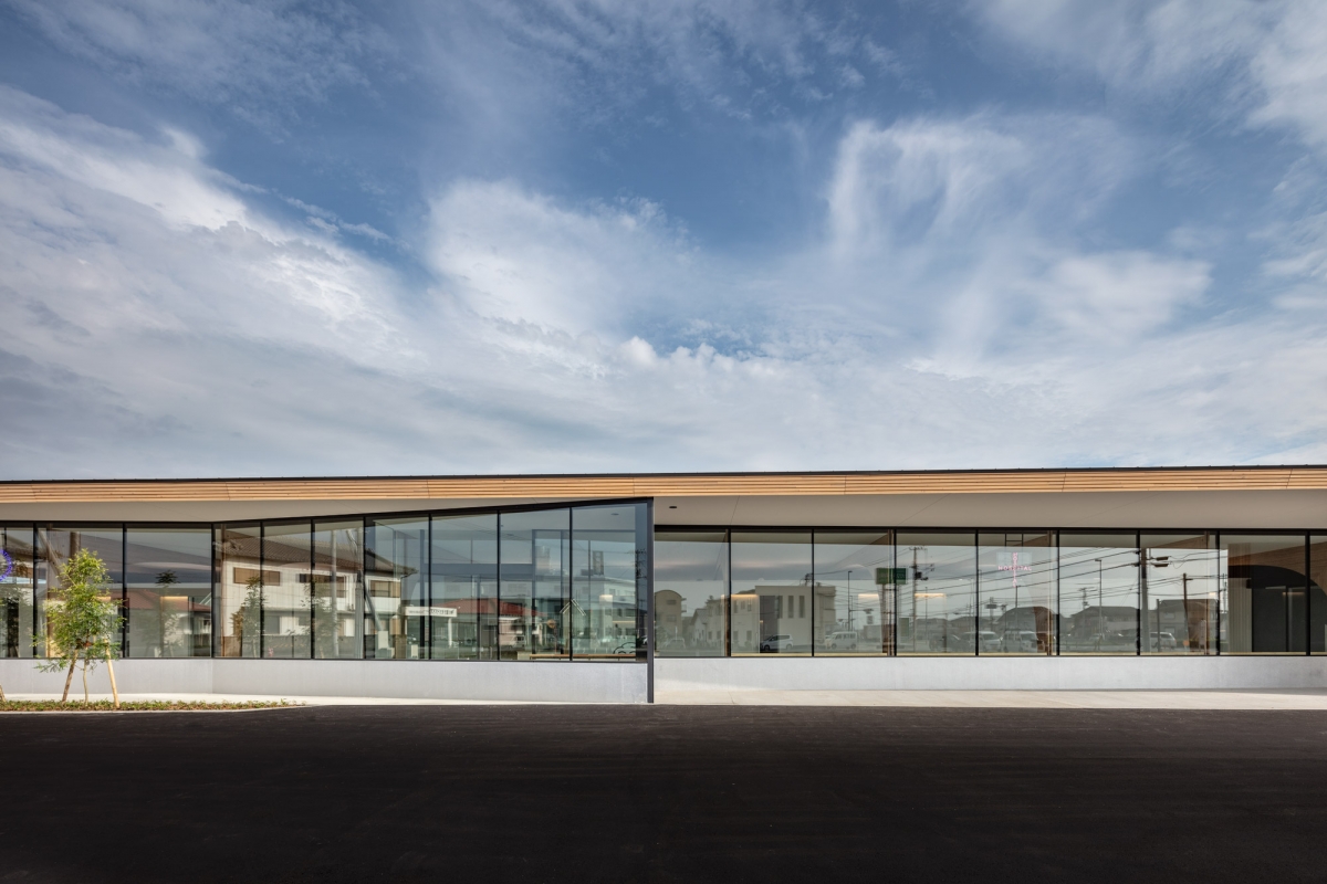
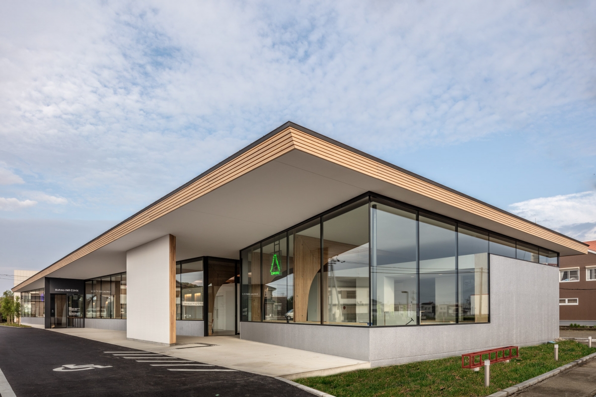
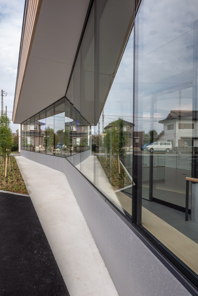
The layout for this plan consisted of four layers from south to north; eaves, a waiting room, a rehabilitation area, consultation rooms and service circulation. The division between the inside and outside of this clinic using a V-shape plan, mainly for the efficient operation of medical space, elevates the movement of people and the flexibility of the space. Service circulation behind the consultation rooms penetrates the entire building to support a laboratory, consultation rooms, treatment room, and rehabilitation area. This considers the convenience of staff to improve the efficiency of their overall operation.
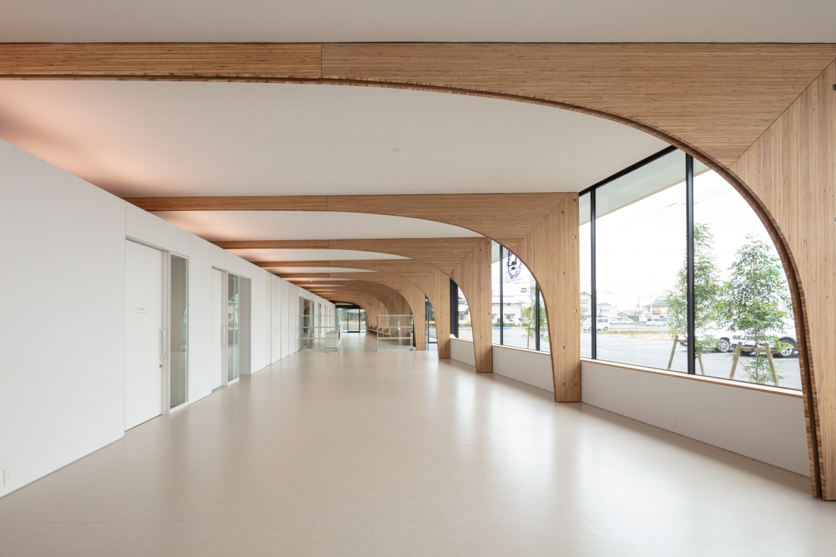
The front façade gets narrower from the west part of the clinic to the entrance of the pharmacy in the east, with the width of the structural arch decreasing. Seen from the pharmacy, facing towards the direction of the rehabilitation area in the west, the space seems smaller than its actual depth thanks to a reverse perspective effect. The further one penetrates the space, the more intimate atmosphere, which makes a family of patients observe and wait patiently and at peace in the waiting room. On the other hand, when looking back to the pharmacy side from the rehabilitation area, the perspective effect makes the patient taking rehabilitation treatment feel distant from the pressures of the consultation room, waiting room, and entrance, which helps them to concentrate on their treatment in a relaxed, calm atmosphere.
The southern façade connecting the rehabilitation and the waiting room has a low 70cm high wall (waist wall) and a bench furnished with indirect lighting rather than glass to make the interior space calming and to hide the inside from the outside.
The structure is simply designed by repeating a one-span structural unit. The shape of the arch was designed using thin steel plate skeleton of 28 × 300mm, 40 × 150mm (T × D) revealing the diagonal brace connecting the joint between the column and beam. Moreover, a laminated veneer lumber (LVL) of 28mm thick attached on both sides of the thin steel plate serves to prevent buckling of the steel plate. The space between the long box of the examination area on the north side and the low wall on the south side creates both an open and enclosed medical space. The rehabilitation area and the waiting room appear integrated through the repeated arches along the east-west direction, and the north-south direction divided by arches permits the patients to view the landscape of the village while they wait for their turn.
By concentrating the shear wall in one place, the southern façade supports the load of the very deep eave from the roof. A continuous V-shaped facade along the south side could be devised thanks to the shear wall separate and independent from the façade. The vertex of the V is behind the shear wall, which is the boundary between the clinic and the pharmacy. In front of the wall, 30 × 30cm wooden benches are provided for people to wait for their onward transport and to spend time appreciating the scenery of the village.
The Kohno INR Clinic is a one-story building which makes a modest impression on the street characterised by the messy signboards of restaurants, shops, but I think it will welcome locals and patients with a bright and open outlook. On the other hand, although it may seem unusual for a clinic, the tricolor neon sign which embodies △□○ is designed to elevate the building into a kind of artwork. Although this is a small private clinic and pharmacy, I hope that it will play a public role in the village and benefit its neighbours with the provision of a benevolent space.
Furuya Nobuaki + Lee Donghoon + NASCA
Yagi Sachiko, Kikkawa Takuya
Aizumi, Tokushima prefecture, Japan
clinic, shop
1,800.2m2
715.8m2
748.2m2
1F
21
4.1m
39.76%
41.56%
steel
weak solvent type polyurethane resin top coat of a
water repellent painting on laminated veneer lumbe
yAt structural design office
KANKYO ENGINEERING INC.
AZUMA CONSTRUCTION
Nov. 2016 – Nov. 2017
Jan. – Sep. 2018
Mizutani HD Corp.


