The Technique and Blank Space of the Zigzag
There once was a time when I used a two metres long, foldable wooden ruler. It was a zigzag device that had several parts, painted in yellow and with measurement markings, connected by pins, allowing the ruler to be unfolded and extended to two metres. I remember using this ruler in various, playful ways. In architecture, a zigzag style changes spatial form and adds liveliness to connections. On both sides, interval gaps are created in between slanted angles. This brings about the effect of securing spatial flexibility and creating relations to the surroundings by gradually drawing the building back. Additionally, spreading the masses forms difference and delays in spatial relations.
We can recognise the different usage of the zigzag in terms of apparatus and architecture. As an apparatus, zigzags have the two-dimensional usefulness of extending a line’s length and expanding the surface area. Meanwhile, in terms of architecture, zigzags are a means of creating infinite and dynamic space in accordance with the surrounding context. As such, zigzags in architecture increase the possibility of diverse usage through a process of constant change, lengthening the gap between spaces.
An example of architecture that employs zigzags is the Casa Díaz (2011) designed by PRODUCTORA. Casa Díaz is a modern house 450m2 in area and looks out towards a lake from an elevated site located in Valle de Bravo, Mexico City. Various scenes can be viewed from the house as the mass repeats, collapsing and retreating within two parallel lines. The architect turned the gap spaces into outside spaces for relaxation and green life, creating an open atmosphere. The masses are separated from the sloped surface and allows both spaces to be combined with the lower floor and to stay afloat.
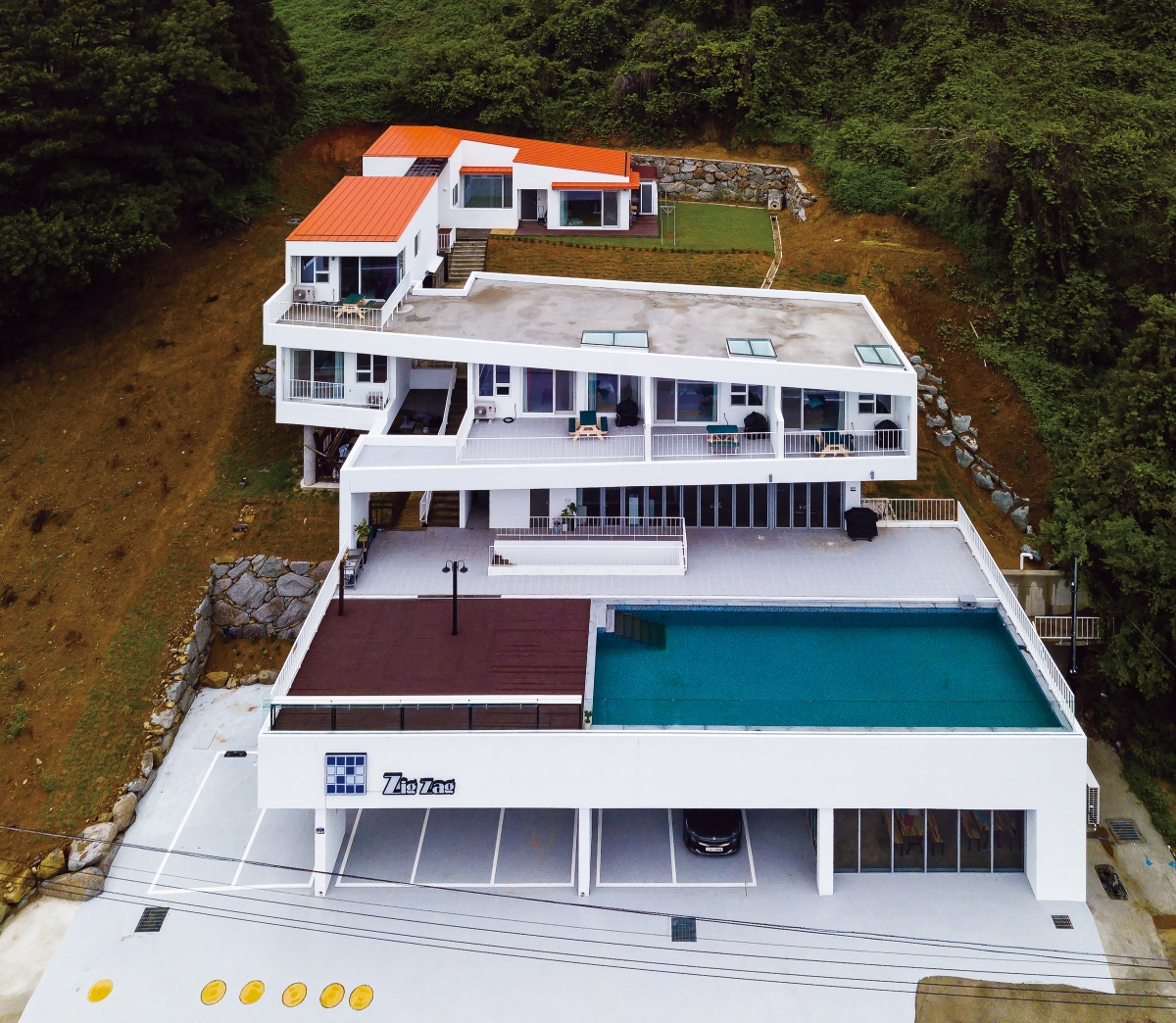
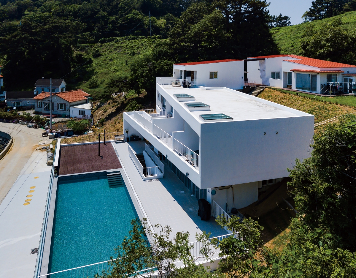
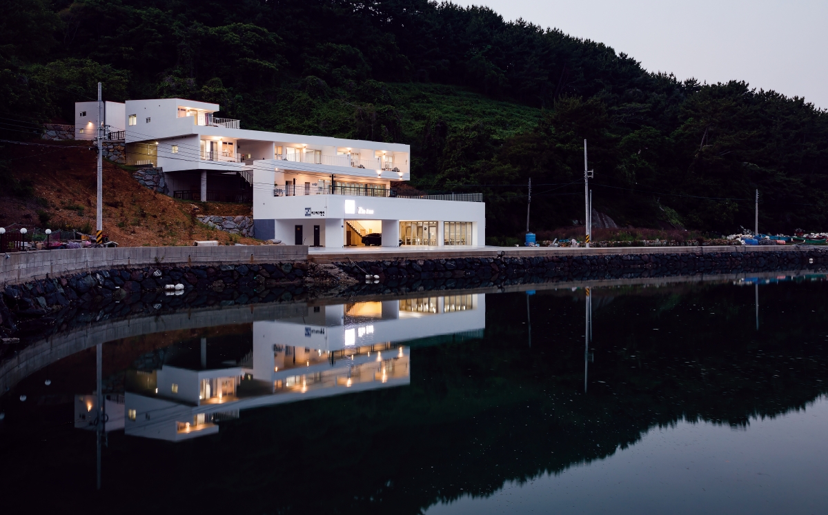
Zigzag House, located in a remote, seaside area of Tongyeong, is a multi-residence building designed by Hong Mansik, which effectively expresses dimensional overlapping. The topography and surrounding environment resembles that of Casa Díaz. The site neighbours a small port in a coastal village and the building zigzags up a 12m sloped terrain and faces a small hill and the sea to the south. The clients wanted a place to live and enjoy the sea while running a rental cottage. The architect started the project by thinking about how the ocean view and the house, and the relation between regular and irregular daily routines, would align. On the first floor, there is a piloti style parking lot and coffee shop and the second floor has a resting area where guests can socialize, a cafeteria and an outdoor swimming pool. The third and fourth floors have guest rooms with terraces to view the shore and the sea. The clients’ house is separately placed at the deepest area connected to the fourth floor.
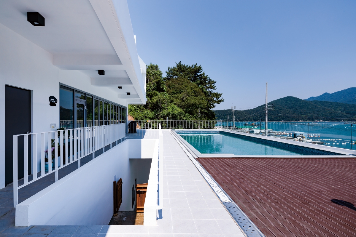
The first floor mass is comfortably placed as if it bolsters the visual weight of the white mass that trickles down from the fourth floor in zigzags. Spatially, the second floor cafeteria, which is behind the first floor mass, is open towards the first floor roof-top space where the swimming pool and deck are located. In between the first and second floor masses, a stairway intricately differentiates the two spaces. The left side of the stairway is an open area that horizontally expands out into the ocean scenery. The second floor swimming pool and cafeteria are parallel public spaces. Taking a right turn on the second floor is the stairway up to the third floor, which marks the entry to private spaces. The third floor terrace is a transitional point for the zigzag that stretches out above. This part serves as a sunscreen for the second floor cafeteria and continues on as the roof line of the third floor, completing the zigzag.
While PRODUCTRA’s Casa Díaz has three clear turns, Zigzag House displays a technique of using only one turn to create an impressive image, to bring change to spatial order, and to create new spaces. Although all the rooms face the same direction, the zigzag image produces an optical illusion of rooms having different angles and points of view.
Zigzag House appears to have strong cohesion at one point and an expansive flow in another. The in-between empty spaces appear to have the potential to present delightful and entertaining experiences and be used in various ways depending on production and usage. However, as this building has just been born as a spatial apparatus, it is yet to acquire such flexibility. The spatial difference and delay caused by crisscrossing spaces seems to require adaptation to simpler spaces and forms.
Zigzag House is a house of pure ‘placeness’ and space without embellishment. Watching how the clients interpret and naturally discover the complexity of the inter-crossing delays in space is intriguing and makes me look forward to the adaptation process rather than focus on concerns over misinterpretation. However, there seems to be an awkward boundary between the fourth floor guestroom terrace and the third floor roof, which could be turned into a floating garden that mirrors the front garden of the clients’ house, and coupled with the ocean scenery this could enrich the wider scenery with a clear boundary.
If change is needed on the inside or outside of a space or form, a healthy process of adjustment would be characterised by the sharing of thoughts with the designer. Since the client is into music, it is fun to imagine the Fringe Festival of the Tongyeong International Music Festival being planned to take place here and artists that will interact with Zigzag House. Imagine listening to the flow and peals of jazz at Zigzag House.


RICHUE Architects (Hong Mansik)
Lee Samgmin
1401-37, Punghwailju-ro, Sanyang-eup, Tongyeong-si
single family house
1,652
573.8
541.12
4F
7
34.59
33.29
RC, lightframe construction
staco flex, paint
wall paper, wood flooring
Bauen structure engineering
Codam engineering
Oh Hyungseok
Nov. 2016 – Jan. 2017
Aug. 2017 – Feb. 2018


