Phenomenon 1. Becoming the Purpose of the Visit
Phenomenon 2. Connecting Residents and Communities
Phenomenon 3. Weaving an Experience
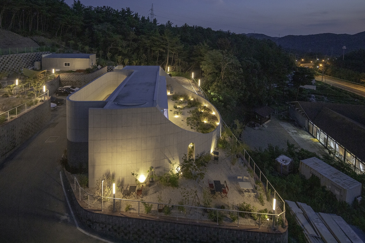
The site is located on the slope of the opposite side of the mountain ridge where Pohang University of Science and Technology is situated. Pohang, like other cities, has promoted all kinds of urban development projects, mainly in undeveloped areas, and this site is not immune to the trend. The site is a commercial and residential plot developed as a typical housing site development by clearing pine forest. Soil retaining walls 3m high surrounding the mountain ridge make the site seem barren, and I wondered whether this is a proper location for a café. Currently, only the first stage of the land development has been completed, with the second and third stages to follow, which will leave the area around this site a bare mountain without trees. It is common for cafés to be located in scenic areas or places with a lot of points of attraction, except in urban centres, but the conditions of this site are relatively difficult for people to access on foot, and the only spectacle is the sunset with transmission towers in the background. Considering the relationship with the houses and neighbourhood facilities around the site in the future, a solution to control noise and sight lines was essential to the design. Therefore, rather than relying on the relationship with the outside space, Café Everyday was intended to be ‘self-sustaining space’ that constricts the outside view and creates a variety of unique scenes within a given area.
Flexible ‘Layer’
Traditionally, an architectural element called a ‘wall’ is used to define an area, separating the inside from the outside. However, changing the height, shape, and the way it creates space can give a completely different meaning to a space. In particular, it can blur the boundaries to create a natural flow from one space to the next. Creating a ‘layer’ of a wall has the potential to go beyond a wall’s functional role, making it a fluid, shifting boundary that defines a place. In Café Everyday, the use of layer as a buffer space provided a clue to overcoming the limits of the site. Rather than creating a direct entrance facing the road, the curved wall creates a characteristic façade that invites either curiosity or recognition for those who visit the site. The dense shadows on the elevation, which change depending on the sun’s trajectory, allow the blunt concrete face to capture a variety of expressions. A kind of photo spot, which has become essential for a café, is created.
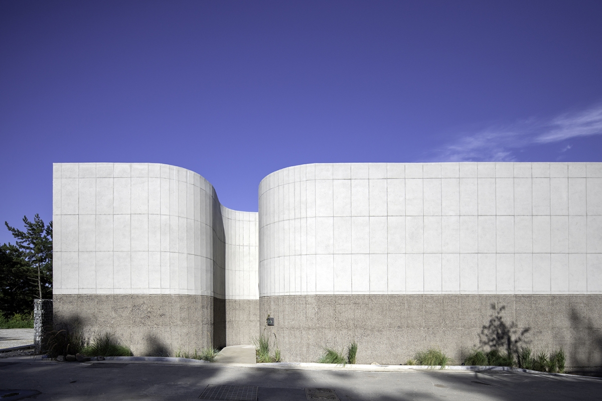
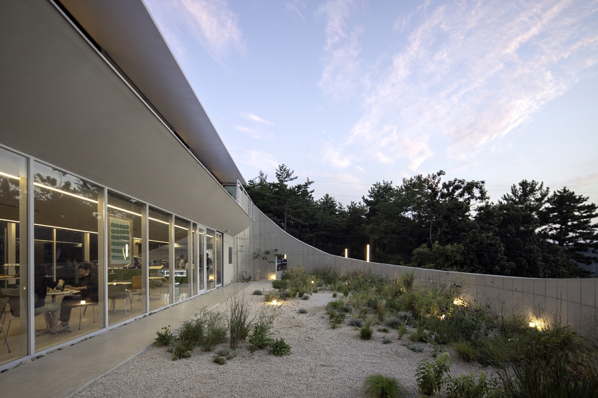
Following the curved and penetrating wall to the arched doorway, you are greeted by a front yard with an unexpected opening to the sky. The yard captures the sky framed by the wall and has a sense of visual openness and cosiness at the same time. The space takes you on a journey from the outside to the inside, and also functions as an extension of commercial space. The yard is filled with beautifully shaped plum trees and loosely arranged landscaping elements, with a feeling of warmth as the sunlight cascades from the sky to the floor. Café Everyday is visually connected from the front yard, interior, back yard, and distant views, so it doesn’t feel stuffy even though the space is not large. In particular, the line of the ceiling extends outside in the form of a continuous inverted arch from the ceiling to the eaves on the first floor, which offsets any stuffy feeling in the interior and amplifies the sense of openness to the front and sky. The visual intersection of these spaces creates a relaxed communication between inside and outside. The wall that encloses the backyard draws in distant mountain scenery and sunset light into the interior space of the café, and it also blocks the visual interference of external elements that would spoil the atmosphere of the café by difference of height. The space is filled with a variety of clouds embroidering the sky along the enclosing wall.
16.5m Column-free Space
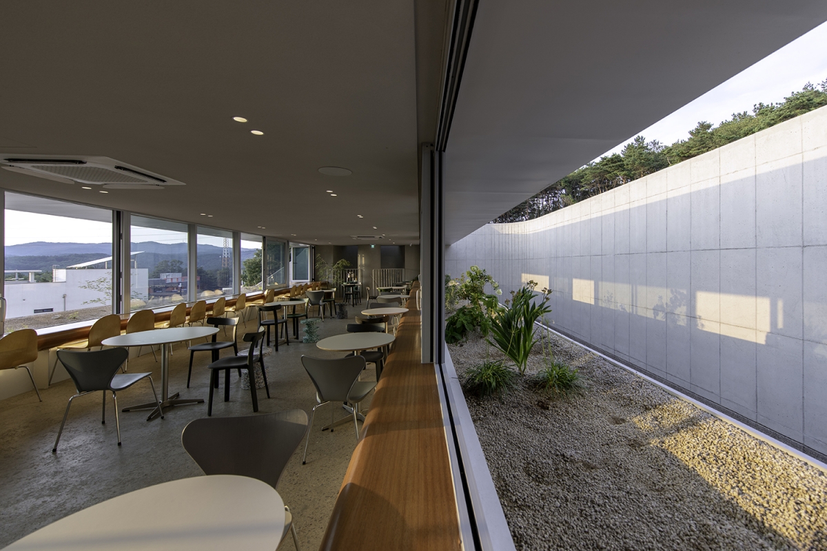
We wanted to make the interior of the café completely transparent. We wanted to open the 16.5m of interior space entirely toward the outside, so we tried to exclude any architectural elements, such as columns which would hinder expansion of the space. To realise the wide span, we chose composite structure of concrete and steel frames, and the unique inverted arch ceiling was realised by matching the shape and position of steel beams. The ceiling of the first floor is extended to the second floor to create a table made of steel beams, and it forms a plant box on the second floor terrace, creating a unified shape.
Orchestrating Nature
The simple landscaping that fills the yards with different forms creates a cosy feeling for visitors. Rocks, moss, and environment-conscious plantings are chosen by the client who is expert in landscaping. The wall of curved surfaces encloses the backyard, and it further enhances the feeling of comfort with the naturally anchored landscape. Considering the particular situation of the landscape elements juxtaposed with a manmade structure, we tried to incorporate the landscape in a natural way instead of an artificial arrangement or placement. The impression of curved surfaces experienced at the main entrance extends to the restroom on the second floor. The concrete wall, designed with a soft shape and blended with the landscape, creates a variation of closed and open space. It adds depth to the space by merging with the sky which one catches sight of here and there.

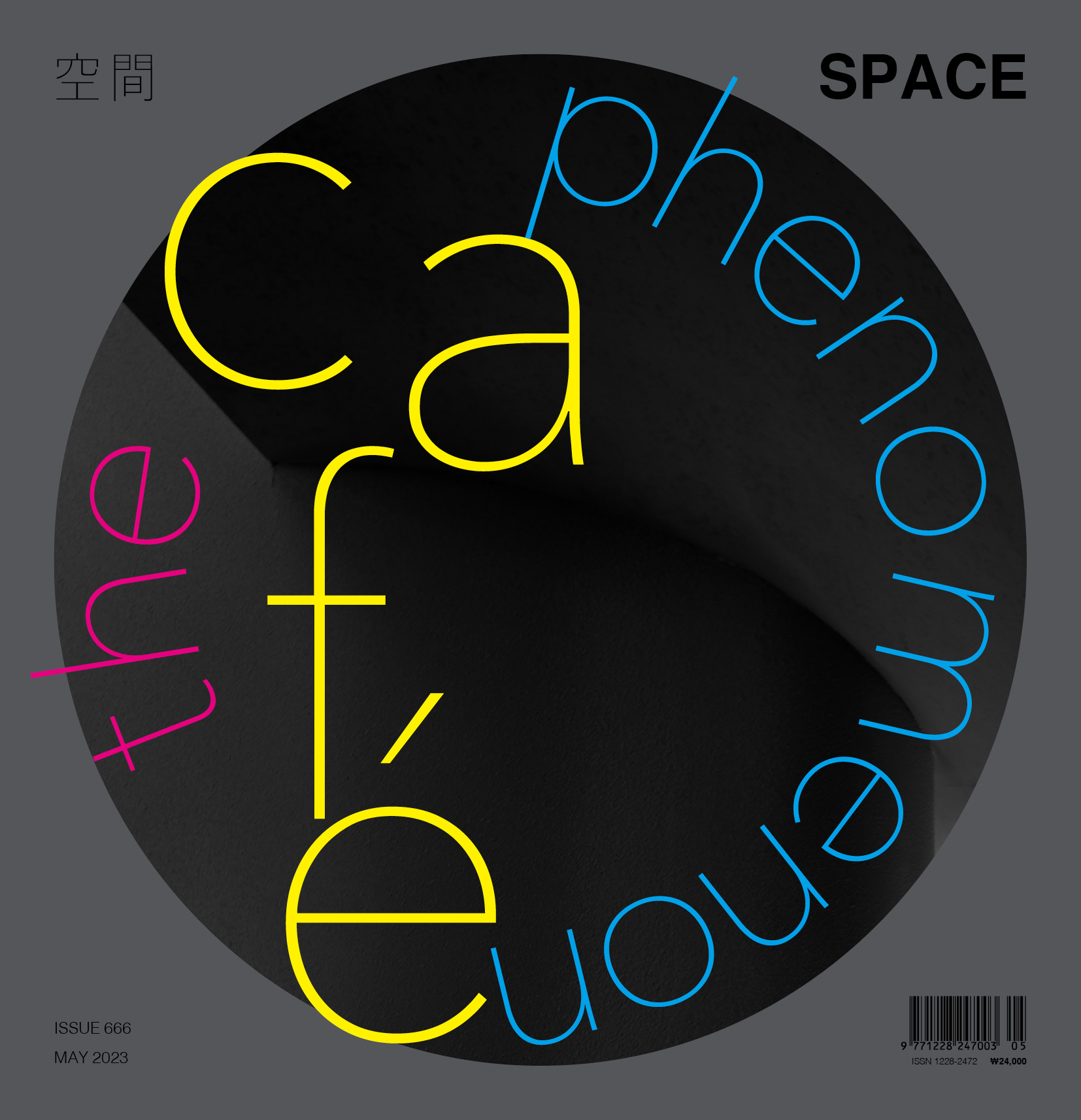
You can see more information on the SPACE No. 666 (May 2023).
Architect
Formative architects (Koh Youngsung, Lee Sungbeom
Design team
Byun Joohyun
Location
90-4, Yeonji-ro, Yeonil-eup, Nam-gu, Pohang-si,
Programme
neighbourhood living facility
Site area
995㎡
Building area
167.99㎡
Gross floor area
275.49㎡
Building scope
2F
Parking
16
Height
6.3m
Building to land ratio
16.88%
Floor area ratio
27.69%
Structure
RC, steel frame
Exterior finishing
euroform exposed concrete, chipping concrete
Interior finishing
stucco
Structural engineer
Dream structure (Kim Mingwan)
Mechanical and electrical engineer
GM emc. (Gang Wongu)
Construction
HouseA (Song Byeongseok)
Design period
Feb. – Aug. 2021
Construction period
Oct. 2021 – July 2022
Client
Cha Jiwook, An Jeonghui
Landscape design
Yeonil soop (An Jeonghui)
Koh Youngsung, Lee Sungbeom
Koh Youngsung and Lee Sungbeom lead Formative architects, a practice that emphasises the importance of the thought process, rather than architecture as a formative outcome. They have been working on a number of emotional and experimental works, paying attention to the authenticity of various architectural values and essences. They have won the Achun Architecture Awards 2020 of Korean Institute of Architects, the Grand Prize of Korea Wood Design Awards, and the President’s Award of the Korean Institute of Architects in the Emerging Architects category at the Korean Architecture Awards.
39


