Positioning in Introverted Space
A long while ago I heard an interesting story from an Australian architect. Building law underwent change whenever a new building designed by Wolf D. Prix (principal, Coop Himmelb(l)au)—the well-known architectural firm in Korea for designing Busan Cinema Center—was built in Vienna, Austria. On one occasion, Wolf Prix used a water tank to form a pointed shape in order to bypass the building codes in Austria, but then the building law changed so that even a supplementary system of architecture cannot have such a radical form.
The first impact is that the narrative of the space is obtained from the architectural style, which is not so large in size and that requires an inherent repetition of stacking. The architect accepts the conditions of the sloped road facing the site and the right to light clause that has to be guaranteed on the right side, creating the following path: once you climb up two-thirds of a level on the left – when seen from the front elevation, the circulation path shifts through the first floor’s outdoor hall and the deck; then the stair is planned along the property line of the site’s right side, leading the journey to the third floor. This outdoor hall, which was designed for the separate use of the first and the second floors in the future, took into account the overall connection to the office located on the upper level. However, it is also a very effective means of devising a prototype applicable to a general neighbourhood residential building. This is an optimistic design approach, where the most crucial outdoor space is not occupied only by the occupant in the corresponding level, but also promotes the natural encounter of the occupants of the whole floors.
The second impact is the space’s diverse opening, which was carried out during this process of ascending. It gives considerable inspiration to those determined to experience a space, in aspects such as, high floor heights and the void of the outdoor hall seen when entered from the roadside; the open view towards the deck on the third floor; the closed view of the hanging wall; the profound sense of space from the first floor connecting to the second and the third floors; and a classical space strategy of looking back at the path that one just took when arriving at the deck on the third floor. The path of ascending the space—which is not directly connected—is completed through the interior stairs connecting the third and the fourth, and the fourth and the fifth floors. The two experiences that are just described are combined, and the exterior staircase becomes a loop tying all the levels together. Often implying a deconstruction of the core, this is closely related to the structural theme that Japanese and Korean architects apply throughout small-scale buildings. However, if the connection with the exterior staircase found in the projects of the past have emphasised continuity with the roads outside, DAN pays closer attention to a circulation path that relates to the interior programme and the diverse relationships between the exterior and interior.
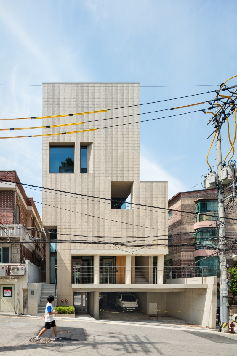
The architect combats the disadvantages of a narrow site and the difficulties of piloti parking and a sloping topology by naturally integrating those into the design, smoothly and flexibly developing the design.
The Means of Accepting a Context
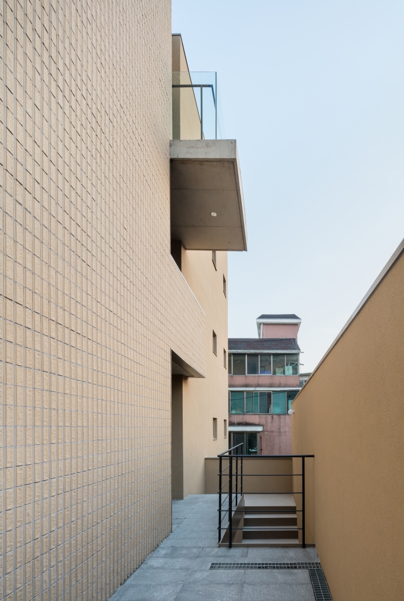
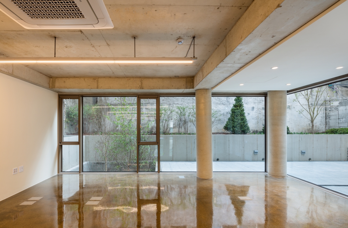
The variety of openings in the space involved in rising the DAN has considerable appeal to those who experience space.
Shape, Mass, Quintessence
In this dichotomous composition, the distinction between the two elements is bound to be one of contrast. The base plane part, which requires a harmony with reality, exhibits an open shape. Whereas, in contrast, the ideal form part exhibits a character of enclosure. Thus, in such configuration, the elevation of the upper part has to be designed as immanently ‘lacking’ in visual interaction. Therefore, it is meaningless to criticize the lack of interaction with the outside, because is a condition already included in the composition itself. Rather, what this project recalls is a certain preference of some architects, including myself, for this mode. Most architects use a method of emphasizing the appealing weight of the mass, and therefore the openings naturally shrink in design. If this sense of being enclosed was not commonly seen, the issue would not have been considered a subject of criticism in DAN. As a consequence it reveals our sense of aesthetics towards ‘architecture that is architectural’.
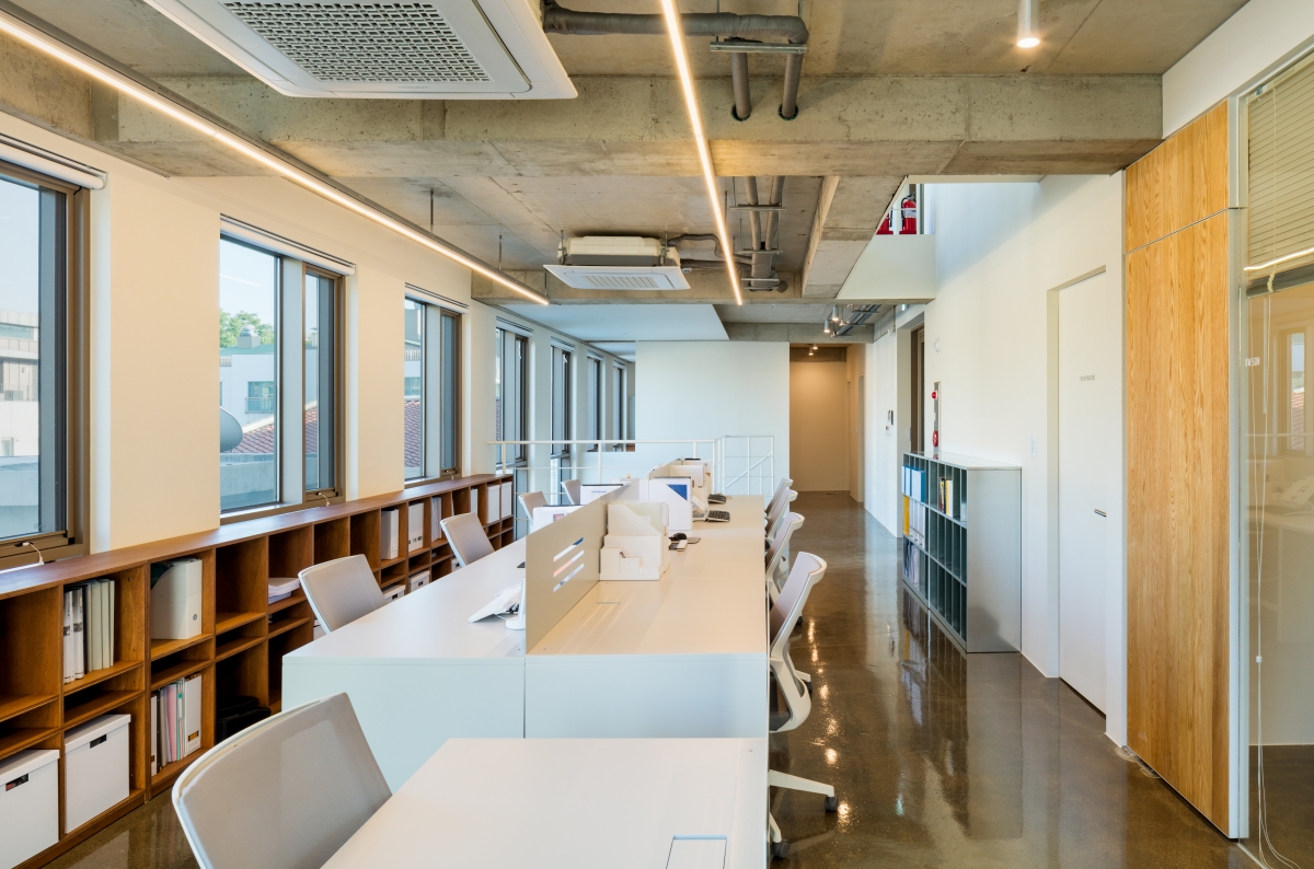
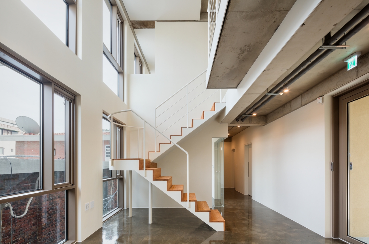
The rising narrative of the space is completed with three to four floors and four to five floors inside.
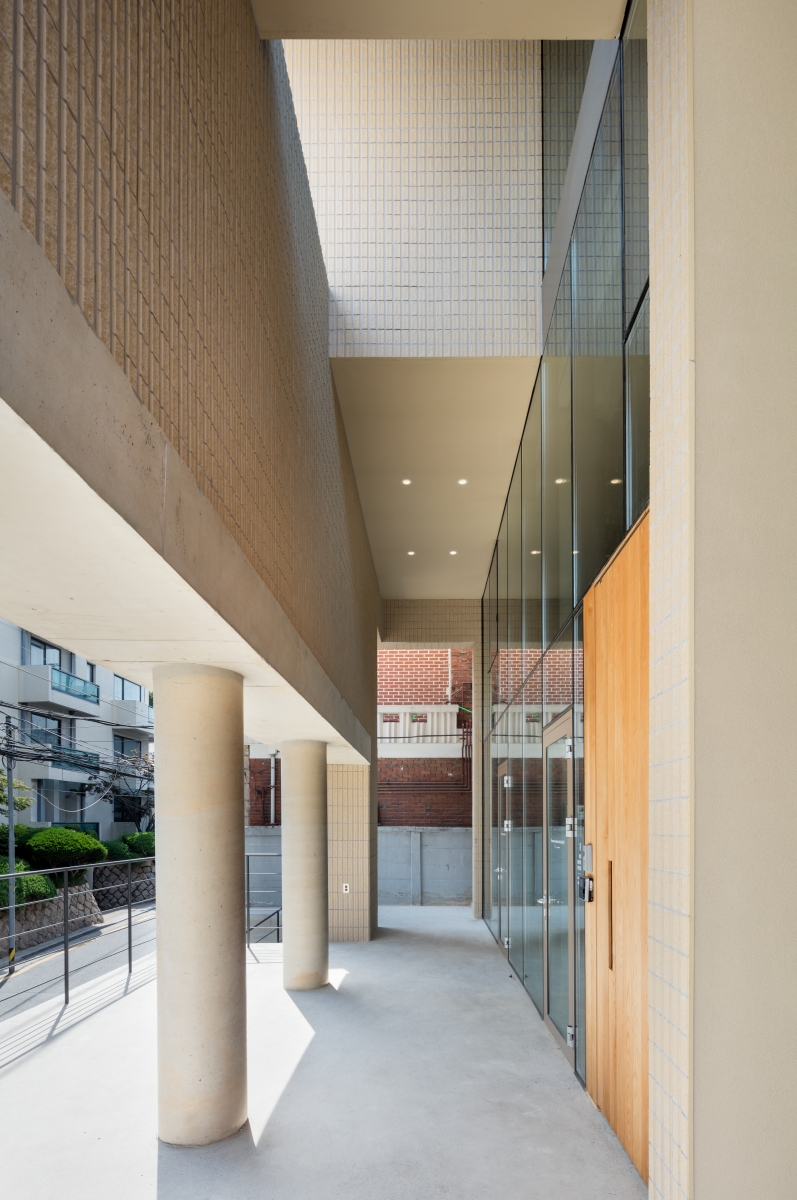
This outdoor hall, which was designed for the separate use of the first and the second floors, took into account the overall connection to the office located on the upper level.
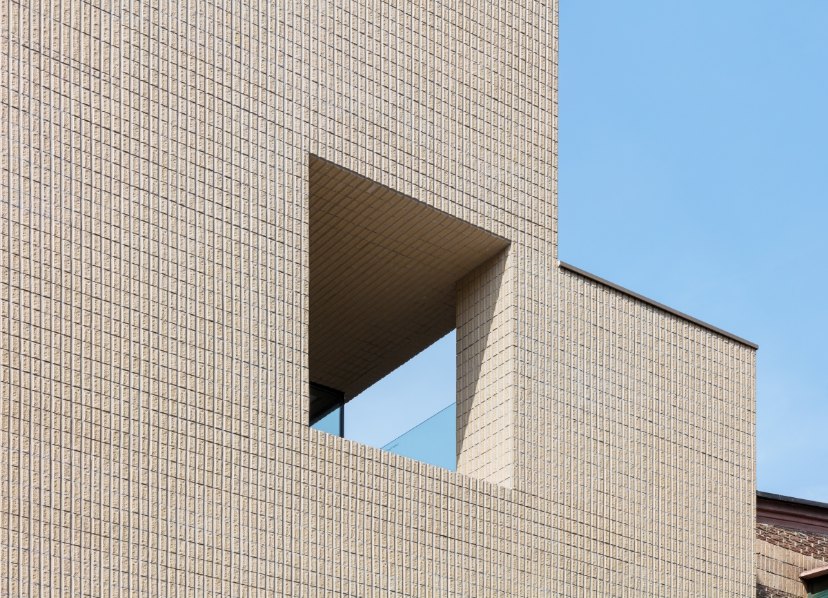
The architect designed a building by cutting the mass from an ideal hexahedral shape. He minimized other elements to draw more attention to this cutout.
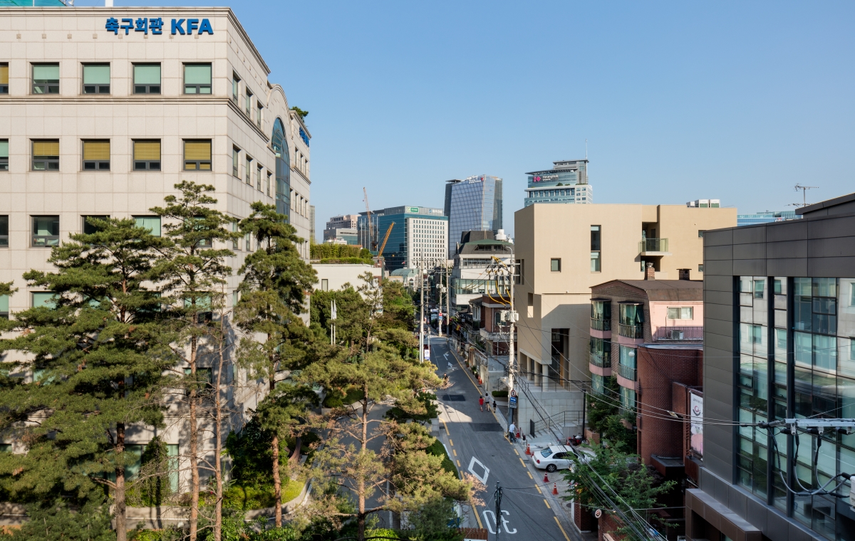
This method of composition depicts an ‘ideal form’ as a pure sculpture on the upper part, and the lower part is interpreted as a dichotomous composition pursuing a ‘harmony with reality’ in response to the site condition.
Kim Leehong (Hongik University)
Kim Leehong
1-137 Sinmunno 2-ga, Jongno-gu, Seoul, Korea
office, distribution center
311.1m2
156.69m2
835.52m2
B1, 5F
5
16.86m
50.37%
195.97%
reinforced concrete
tile, stucco, exposed concrete
gypsum board + paint Structural
MOA & Consulting Engineers
KS Engineering
YIGAK
GIE
Aug. 2016 – Mar. 2017
June 2017 – May 2018
314HORNET Co.,Ltd.


