SPACE May 2023 (No. 666)
Phenomenon 1. Becoming the Purpose of the Visit
Phenomenon 2. Connecting Residents and Communities
Phenomenon 3. Weaving an Experience
Location and Design Contexts
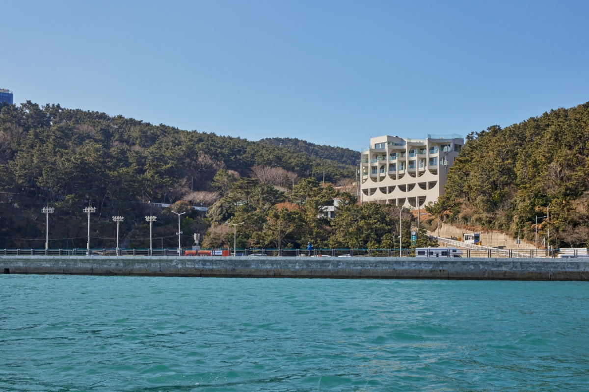
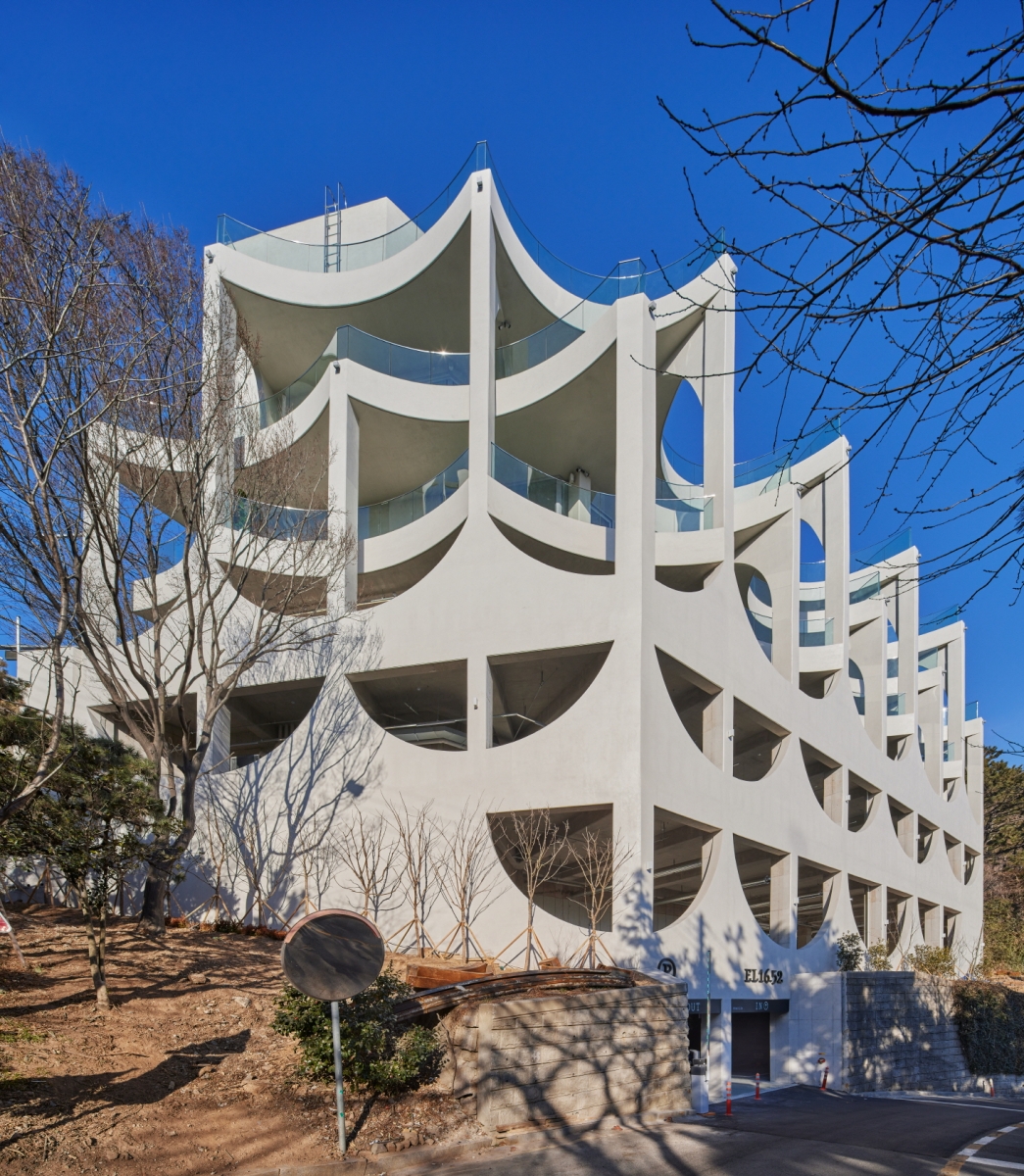
EL 16.52 is a café located off the shore of Songdo in Busan, Korea. The name of the café refers to the altitude above sea level from the building’s underground level. It was intended that the site should seek to embed itself within the architectural context of the national geopark to which the site belongs, as well as to convey a sense of temporality through the stratum. The site is located off the shore of Songdo, close to the myobakji (anchorage) which is a place for ships to rest, with a height level difference of 13.5m. The architecture of EL 16.52 reinterprets these differences in the levels between the geopark, the sea, and the site to devise an innovative new architectural archetype, through a design that draws upon all of them to maximise its commercial viability.
Parking Circulation Influenced by the Difference in Levels
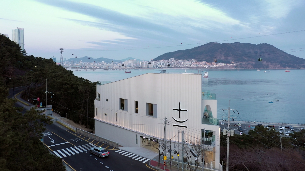
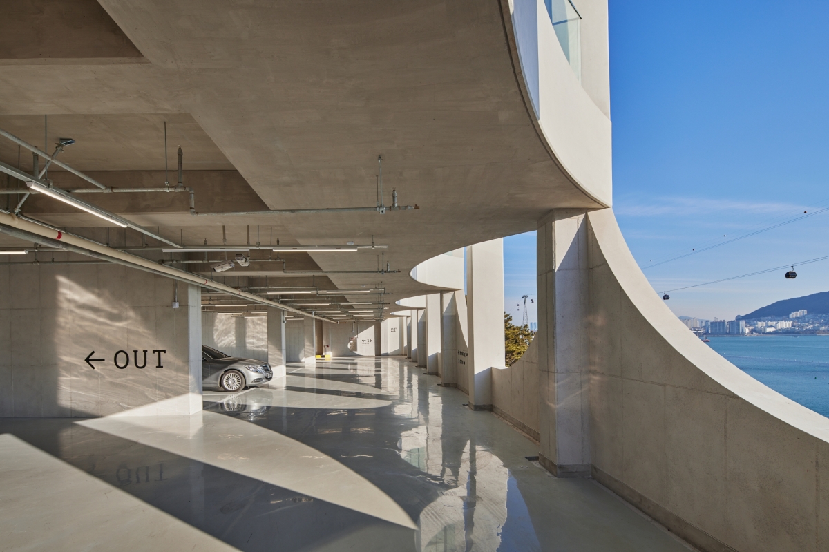
The site is bordered by two roads. One road connects to the lower public parking lot on the second basement level, while the other road connects to the city centre on the level of the second floor. Since the two roads differ by approximately 13.5m in height, the change in land shape and quality is marked and therefore limiting. Therefore, the site area, within the range of a slope in which construction work was permitted, was the first thing to be determined, and then the area in which construction work was deemed feasible within the reduced range of the site area was determined. The parking lot was divided into two zones to maximise the use of the restricted architectural area. Rather than connecting the upper and lower levels using a ramp, it was thought to be more economical to split the upper and lower parking levels, and then construct different pits, including a mechanical room, in the area between the upper and lower parking levels. The aim of using the 13.5m height difference as the guide by which to most effectively divide the spaces, as well as to interpret the two parking zones in terms of their function, was a major starting point in the effort to understand the site conditions and to establish the fundamental frame of the architecture.
A Floor Area Ratio That Ensures Commercial Viability
The site’s surveyed area was initially 1,274㎡, but it was reduced to 963㎡ when the average gradient was taken into account so as to identify the area in which the actual construction work could take place. The subsequent task was to remain below the permitted floor limit (less than four storeys) while maximising the sloping site’s advantages to increase the commercial viability as well as the floor area ratio. In other words, it was necessary to determine the appropriate scale for the area of the café, the number of parking spaces higher than the legal standard, and the circulation system that would connect the two roads that adjoin the site. Of the total 2,882.76㎡, it was decided that the café should occupy roughly 1,000㎡, and the terrace would be expanded to maximise the usable area. When the building to land ratio was taken into account, within the site area feasible for the changing shape of the terrain and its quality, the maximum depth of the building was estimated to be 15m. This was the minimum depth of the parking space, one that took into account the turning radius of vehicles, the size of the parking spaces, and the width of the parking passageways. It was also the minimum depth that would ensure the continued commercial viability of the project. The core space has been positioned on the triangular space on the south side, which is formed along the shape of the site, in order to ensure the most effective area on each floor. The building is six storeys tall, with parking and mechanical rooms from the second basement level to the second ground floor, as well as café spaces on the third and fourth ground floors with windows that provide a dramatic view of the sea to draw the outdoor scenery indoors. Visitors can gain access to the café on the upper levels from the main road connecting to the city centre on the second floor, and there is a separate VIP parking lot on the lower road.
Motifs and the Unit System
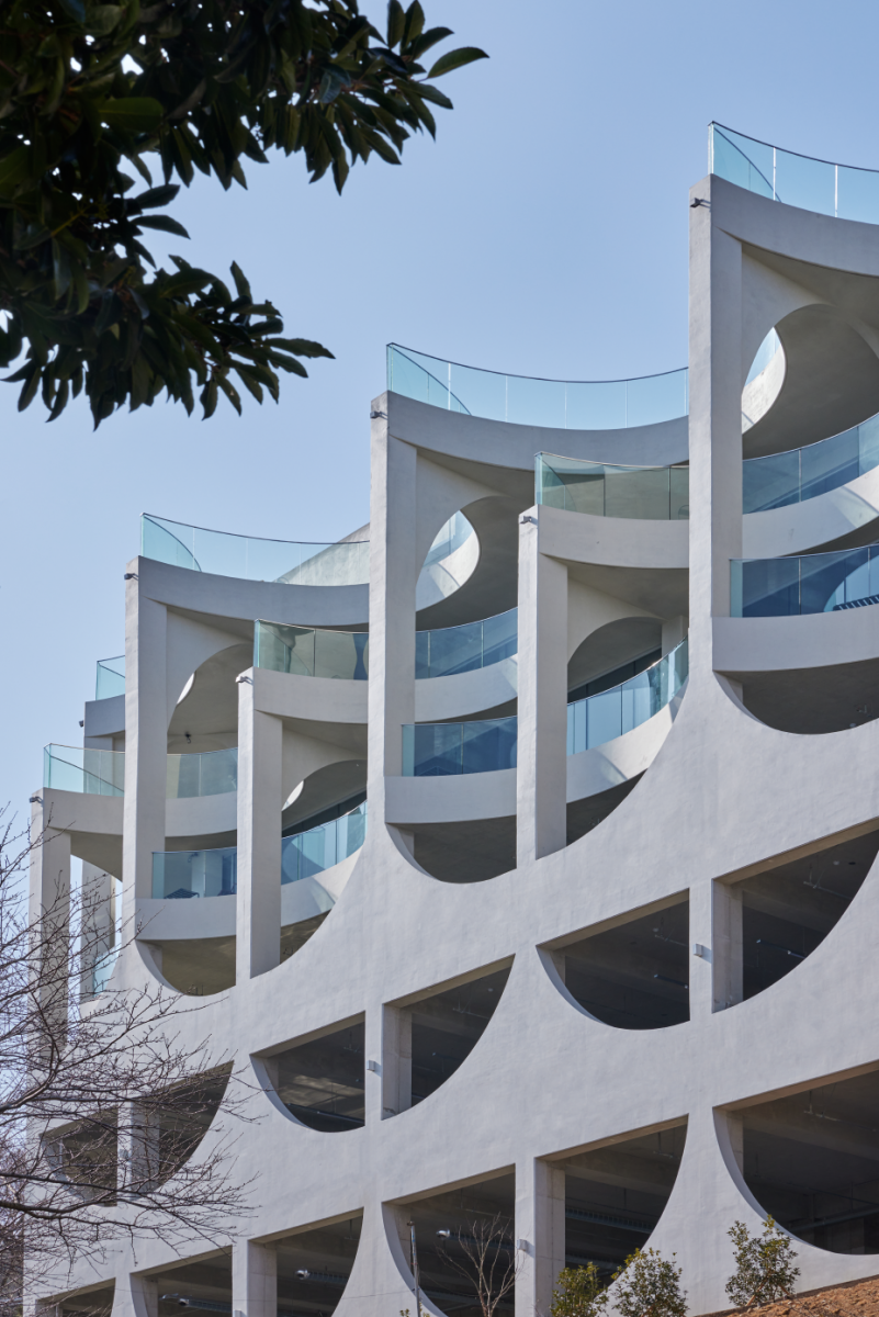
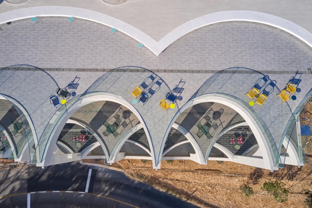
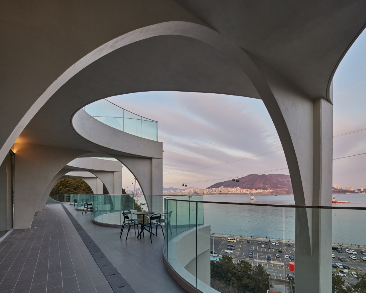
An ‘archetype’ is a kind of universal symbol that arises instinctively within our minds. Suppose you try to imagine a symbol representing the sea. The first thing that comes to mind would be a line that stretches from the left to the right, like the horizon. The notion of an archetype is also used in architecture to refer to what a particular form might evoke or suggest. The sea is never still. Even if a placid horizon unfolds before one’s very eyes, there is a tremendous amount of energy concealed beneath. The sea must be held in reverence in the eyes of the fishermen who have to work long into the dark nights and mornings. The picturesque views from this place, which is known as an myobakji, must be understood as dynamic as opposed to relying on clichéd understandings of the sea as tranquil. It is close to the dynamic wave that condenses and releases life’s energy, in contrast to the more lyrical stillness of beaches at Haeundae and Songdo. The arch form that resembles a dynamic wave serves as a motif – emphasisng energy rather than a tranquil horizon – and as a unit of construction. This architectural form derived from the red strata of Amnam Park, which faces the sea. EL 16.52 was architecturalised by the lamination of arches, where an arch is interpreted as a archetype for the sea, much in the way layers of strata consolidate themselves over time as they are placed on top of one another. The repeating arch was used as a unit system on the elevation of the parking level as well as in the plan for the terrace on the café level, resulting in a consistent design. The wave-like elevation was generated by interweaving it with the 10m-tall columns on the third and fourth floors. The towering columns at the peak of the vertical wave, which are expressed in the elevation of the parking lot on the lower level, meet the peak of the horizontal wave on the plan of the upper level. It was important to create a unified system, in terms of form, by connecting the structural form on the exterior with the spatial pattern on the interior.
The Formation of the Viewing Axis and Various Spaces
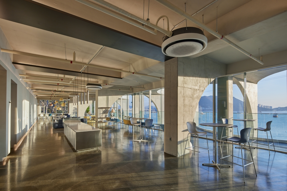
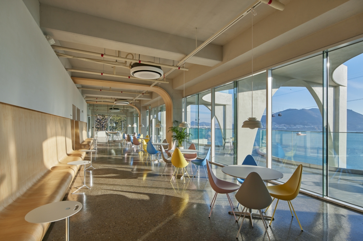
Due to what one has come to expect of a contemporary café, a great view is now one of the most significant requirements. In order to make the most of these veiws, we placed the café at the building’s upper level. We also differentiated the functions by level inside the café, in order to fulfil the needs of the wide range of customers and to encourage different spatial uses throughout the day. There is a counter, sofa-type seating, and group rooms located on the third floor. Compared to the third floor, which is a universal space for everyone who visits this café, the fourth floor features many more private spaces. On the west side of the café space on the fourth floor, adjacent to the road, the VIP lounge and archive lounge have been positioned to be versatile and used for small meetings and gatherings. The VIP lounge has been designed as a private room, whereas the archive room was intended to house a general meeting room and also serve as an archive that displays the designs and construction plans for EL 16.52. In order to achieve a structural threedimensional effect with a picturesque view of the sea, terraces of various widths were introduced to the outdoor area of the café on the third and fourth floors. The rooftop space is the highest point of this building and offers views of both the sea and Amnam Park. It is a vast open space with unobstructed and panoramic views in every direction of the natural scenery. The third and fourth floors are where one can access the best views of the sea on the outside from the inside or terraces, while the rooftop is where one can observe at a glance how this site situates itself within the city. The rooftop space presents the sensation of being within nature, both horizontally and vertically.
JOHO Architecture (Lee Jeonghoon)
Chi Sunghyun, Park Chaeryeong, Park Hyungwook, Kan
177, Amnamgongwon-ro, Seo-gu, Busan, Korea
neighbourhood living facility
963㎡
561.66㎡
2,882.76㎡
B2, 4F
20
17.42m
58.31%
116.48%
RC
concrete
concrete
HUB Structural Engineering Co., Ltd.
ACE Engineering Co., Ltd.
JOONG-A Construction Co., Ltd.
EON SLD
Fritz Hansen Korea, COLOS
Site & Page
twothree


