SPACE April 2023 (No. 665)
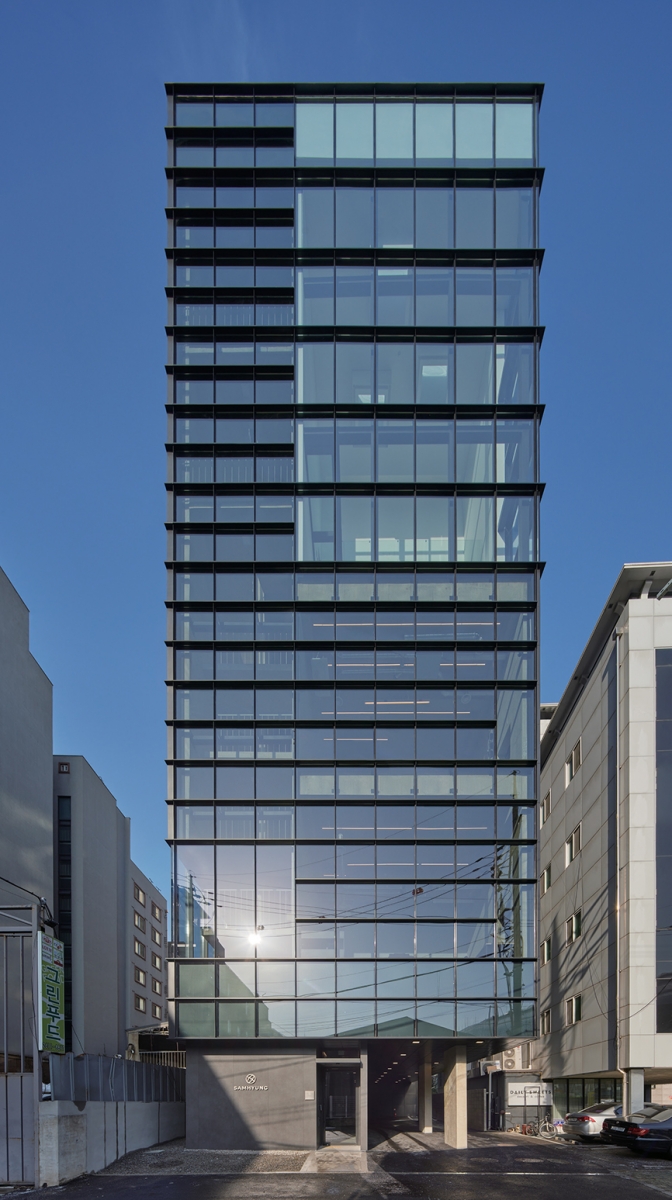
A Building that is Quite Something
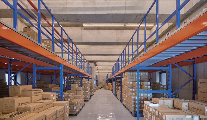
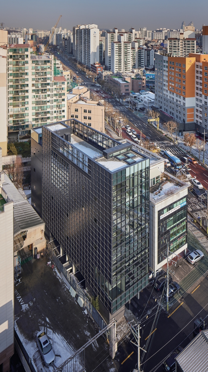
The client sent a request as we embarked on the project: ‘In the industry, we are frontrunners, but it is not easy to hire staff since the company’s building is in this poor condition. Please design a building that appears to be quite something.’ On an atypical site within the city centre, the volume was determined by putting all the regulations – like puzzle pieces – together. The first to third floors, which were to be used as a warehouse and laboratories, are 5.5m high to accommodate the in and out of the freight as well as scientific equipment, whereas the fourth and fifth floors, which are office spaces, are 4.4m high. When tall spaces are stacked on top of a long, narrow site, we formed a mass of elongated proportions that differs from the typical five-storey building. This marked the beginning of designing what appeared to be quite something.
Cladding that Responds to the Function and Context
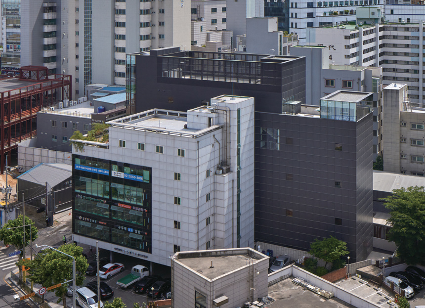
We carefully considered how the building would reveal itself within the complex city centre. First, we differentiated between four cladding types (A – viewing window, B – filtering window, C – shade-generating panel, and D – neat panel) and combined them to design the exterior based on the context and interior space. Such combinations vary depending on the type, for instance, whether it was transparent (A) or not (B), whether it had an folded (C) or flat surface (D), but each elevation element was integrated into a single cladding system by using a 1100mm-sized square elevation module. For the most frequently used room, we used glass curtain-wall cladding (A, B). We also differentiated the between the depth of the 100mm-projected horizontal louvers and the vertical pins by 20mm and 3mm, respectively, to add a sense of rhythm by emphasising the horizontal line that varies in length. Panels (C, D) are used as the cladding of the storage area. The cladding that is finished with offset panels and horizontal members (C) changes with the growing shadows over time, meaning the depth of the elevations vary. When puncturing an operable window, it is installed at the same size and angle as each panel so that the elevation remains consistent.
Pride Deriving from a Spatial Experience
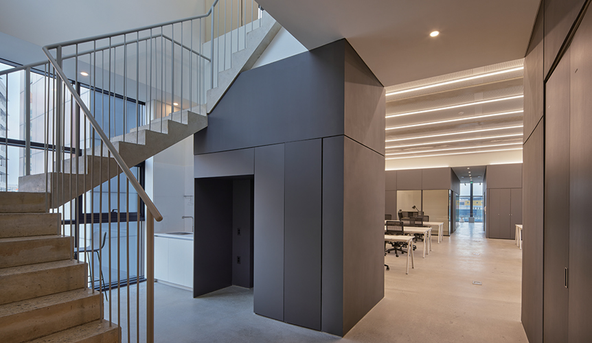
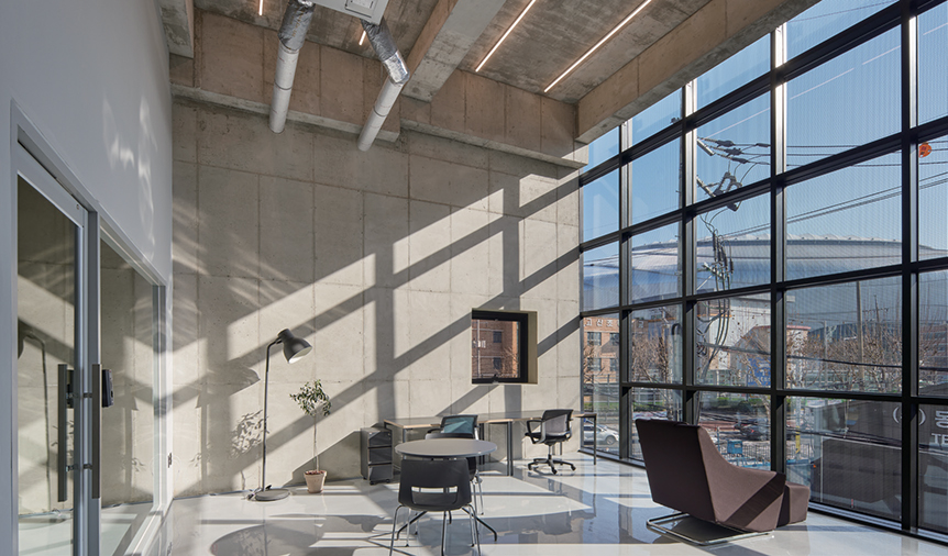
We thought that the varied spatial experiences that one encounters from the time one arrives at work till one leaves work are linked to a feeling of workplace pride. In addition to an exterior that adopts a strong sense of corporate identity, transparent glass (A) and silk-screened glass (B) have been contrasted here so that the sense of transparency of the sky lobby can even be perceived from the distant crossroads. From a closer view, the way the shadow of the folded panels varies over time generates points of visual intrigue and elevations with depth. To give the employees the impression that they are going to a nice office, the core is positioned as close the roadside as possible so that commuter circulation does not obstruct the parking lot. A small garden was also built in the elevator hall on the first floor. When people get off on the fourth floor, which is the main office space,
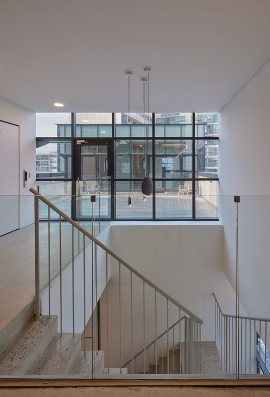
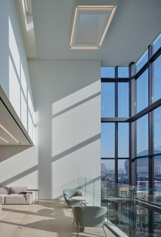
they are greeted by a bright and refreshing lobby that contrasts with the first floor. It is the space where work begins—getting ready for the new day while overlooking the Gocheok Sky Dome and greeting co-workers in the fifth-floor lounge. A silk-screened glass curtain wall has been installed in the tall office in order to minimise the awkward sightline while also drawing plenty of light into the space. A void for communication and a moment’s repose is created while the stairwell that connects the fourth and fifth floors is on the inside of the office space. (written by Lee Juhan / edited by Bang Yukyung)
You can see more information on the SPACE No. 665 (April 2023).
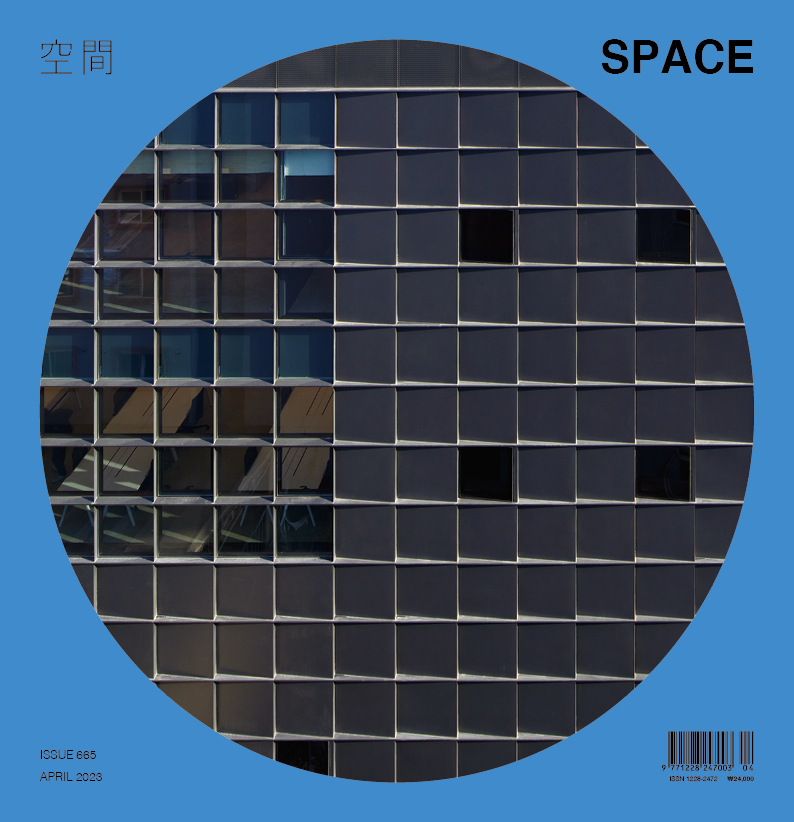
fig.architects (Lee Juhan)
Park Dohyun, You Jimin, Lee Sunah, Soh Yujeong, K
Jungang-ro 1-gil, Guro-gu, Seoul, Korea
office, factory
627㎡
376㎡
1,650㎡
B1, 5F
7
30m
59.9%
247.5%
RC
steel sheet, low-e pair glass, ceramic tile
xposed concrete, ceramic tile, paint
BASE STRUCTURAL CONSULTANTS CO., LTD
DAEO ENGINEERING
BOW TECHNOLOGY AND CONSULTANTS
MOA Construction CO., LTD.
Dec. 2019 – June 2020
July 2020 – Dec. 2021
3.6 billion KRW
SAMHYUNG ELECTRONICS CO., LTD.


