SPACE April 2023 (No. 665)
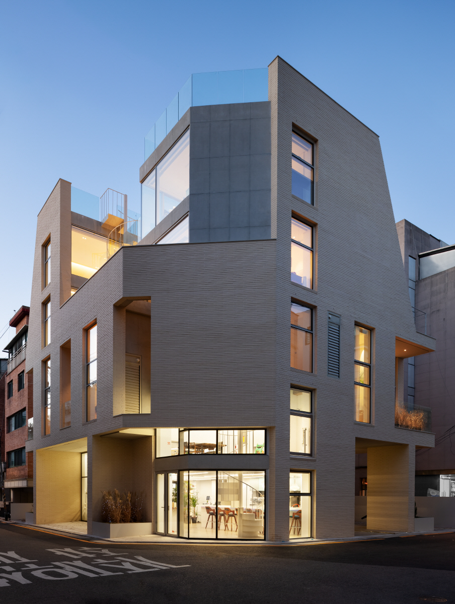
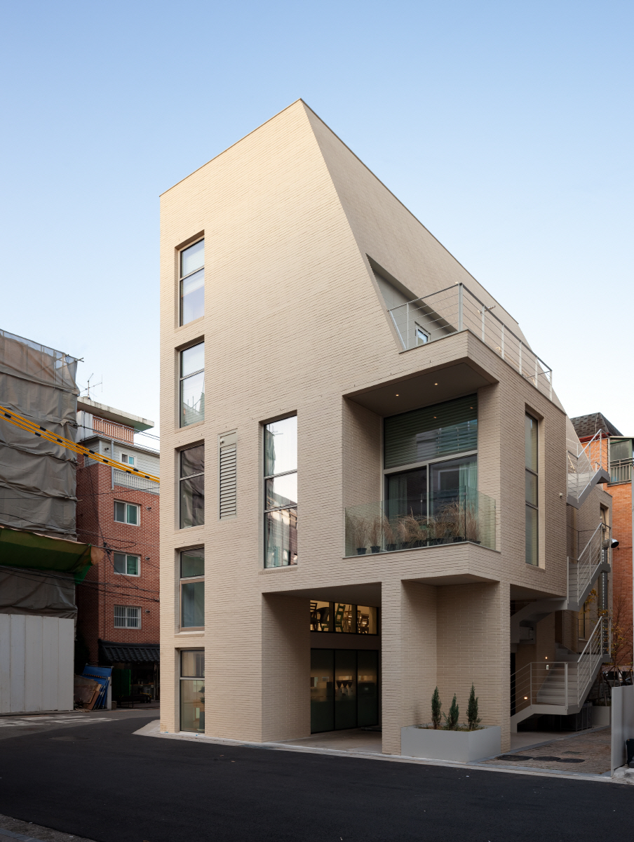
Here is a city where different people occupy it at different times. In the morning, one man leaves the city for work, while at the same time another man arrives in the city for work. At noon, the streets are bustling with crowds of office workers on their lunch breaks. At dusk, people flock to cafés or head towards Yangjaecheon Stream, all captured in a single frame. It is a Class-II general residential area. The site, located at the corner of the two-sided road, is a miniature version of a typical neighbourhood in a busy city, where all venues such as cafés, restaurants, offices, one-room apartments, two-room apartments, and penthouses have been drawn into one place.
A Neat Fit between Function and Space
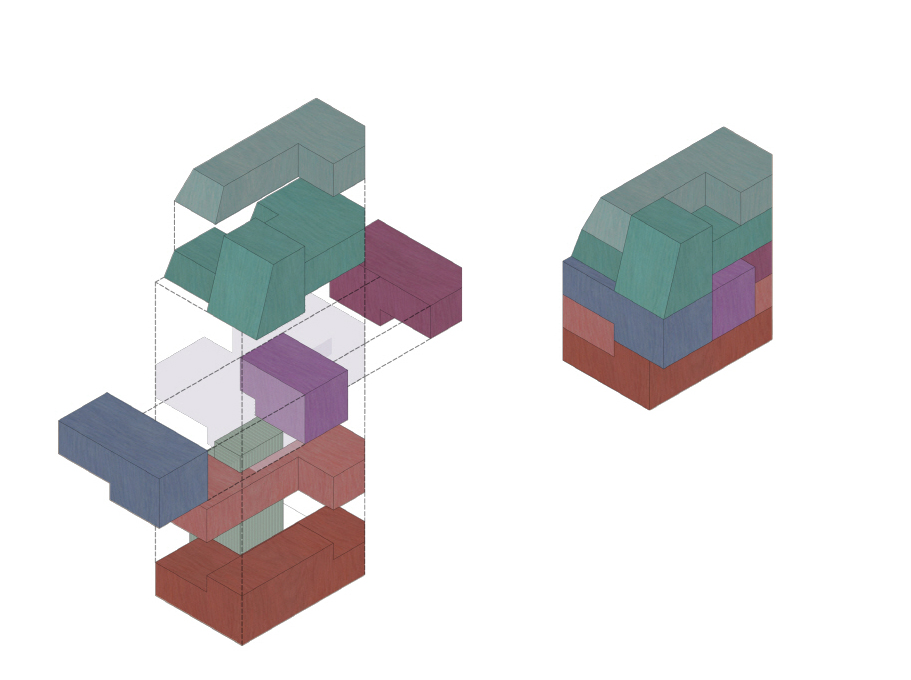
Gyeolgu Heon, much like the marriage of each element at every corner of the Sabang Takja(square table), provides an answer to how the functions and spaces are joined at the street corner. Various elements are present on the sides of a square table, also known as a Sabang Takja. At closer inspection, each element is intricately fitted like elements in a well-crafted gear, despite the apparent simplicity of the form. The beauty of the Sabang Takja lies in its humble structure, but also as it is both aesthetically pleasing and functionally sound. The well-crafted joint is key to its neat design.
An Interlocking Configuration across Five Floors
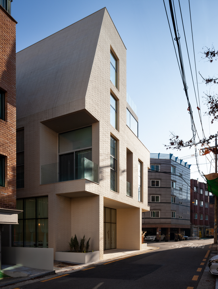
The first and second floors serve as a neighborhood living facility, while the third, fourth, and fifth floors are for multi-family housing. Originally, we planned to prioritise the rental apartments but had to allocate the fourth and fifth floors for the owner's living space, leaving us with just one floor. To optimise the smaller area, we divided the households by light levels, orientation, space, and circulation, and adopted a skip floor on the broader second level. This also complements the neighbourhood living facilities on the upper floors, presenting a greater openness and deeper feeling. We integrated gaps caused by the level difference between the first and second floors. Spaces that are divided according to their function exist in a complex interplay of stacked volumes, rather than being separated into simple horizontal floors.
Flowing Structure
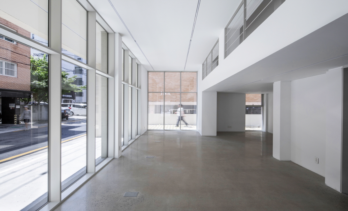
Structures in this building flow and move past the gaps in the joints which connect the spaces. This means that no structure runs through the centre of any given space. For instance, the columns supporting the centre of the building are not located in the middle of the first-floor neighbourhood facility, it rather transitions to the second floor. Similarly, the interior compartments of the multifamily housing are constructed with partitions rather than structural walls or columns. Placing a single column in the center of a space establishes a standard way of using the space, like the first move in Baduk (Go). However, in a rental space with unspecified users, flexibility is much sought after. The walls of each room can be modified as needed to adapt to the changing needs of the space.
 ЈЯKim Jemin
Communicating with the Street
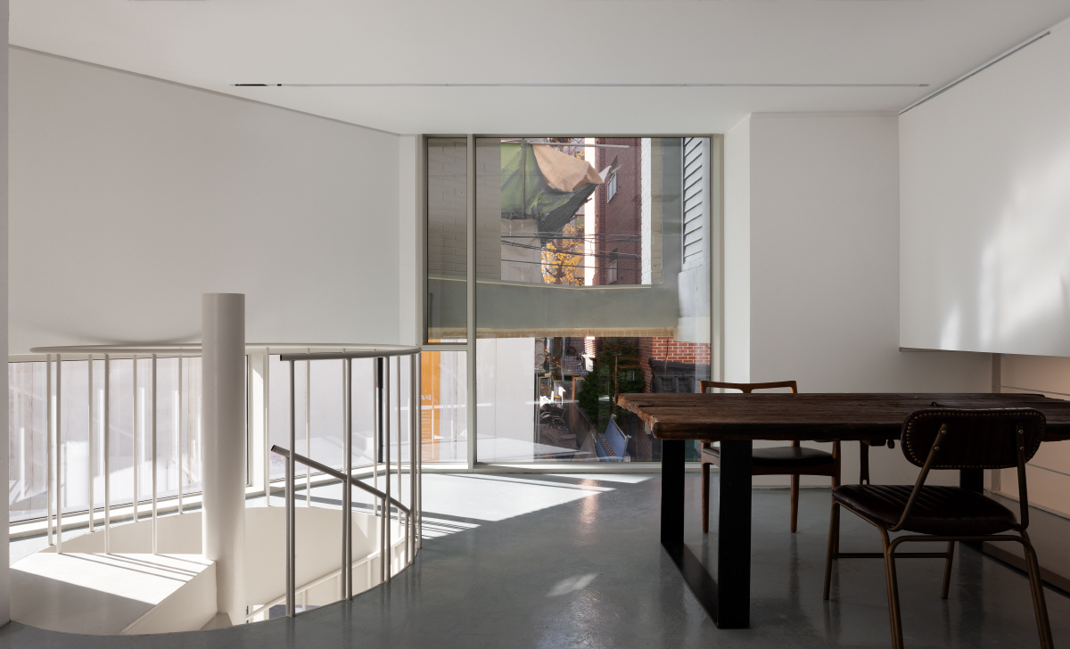
Cities and buildings communicate at the ground level. The ground floor serves as a welcoming space for shoppers, residents, and neighbours in the community. The main entrances to the multi-family dwellings at the back of the building project out towards the front, featuring tall, open driveways. Landscaping that would typically be placed at the back of the building is instead drawn out onto the street, creating a neighbourhood flower bed that is set back from the building's four corners. The first-floor neighborhood living facility, with its open corner entrance, faces the street from the front. We reduced the size of the second floor, which does not face the ground, due to concerns about renting it out. To compensate for the reduced area, the ceiling of the first floor was raised. The height of the ceiling was opened outward, increasing the surface that faces the neighbourhood. The second floor overlooks the neighbourhood beyond the first floor, and the second-floor neighbourhood living facility is connected to the lower floor, forming a single space.
Narrow but Lavish
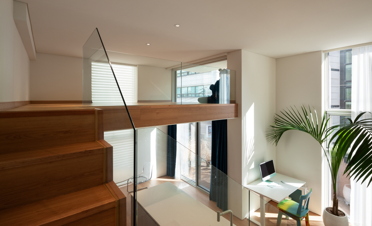
To make up for the smallness of this space, the three-story multi-family house adopted a skip floor design. The entrance, bathroom, and bedroom are on the same level as the entrance, while the living room is half a floor below, and the attic is half a floor above. The space between is open and features tall windows, which create a sense of expansiveness. For orientation, two families have their living rooms facing the southwest façade, while the unit at the corner of the lot has its living room at the back, which faces southeast. To further refine the plan, the bedrooms facing two roads were set back, and a wall was built next to the setback to block the view from the street. Each unit has a space set back from the exterior wall through a layer, which can either be a false wall or a balcony facing the outside.
A House within a House
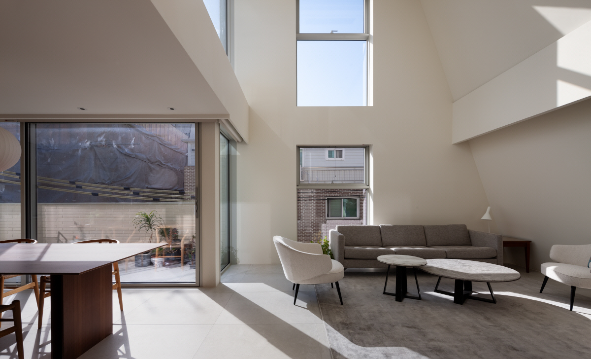
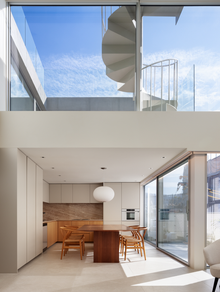
The houses on the fourth and fifth floors are hierarchically a house within a house and geometrically a house in a house. Like the suburban house that rises above the city, the architects wanted large, open windows and plenty of external space. On the fourth floor, the windows face forward and, as on the lower level, are set back one step to create a narrow, extended terrace. A low wall with railings was constructed to introduce a barrier guarding from the city. On the fifth floor, the exterior space extends inward to the house to form a courtyard in the centre. The bedroom on the fifth floor opens up to the courtyard, and the sunlight that falls on the courtyard penetrates into the living room on the fourth floor, which is cooled by the double glazing. At the same time, due to the height difference, the lines of sight between the living room on the the fourth floor and the bedroom on the fifth floor do not intersect, creating an perfect balance between openness and privacy.
You can see more information on the SPACE No. April (2023).
Architect
An architect(An Sooin)
Location
Yangjae-dong, Seocho-gu, Seoul, Korea
Programme
multi-family house, neighbourhood living facility
Site area
269.5ЇГ
Building area
161.47ЇГ
Gross floor area
524.85ЇГ
Building scope
5F
Parking
6
Height
16m
Building to land ratio
59.91%
Floor area ratio
194.75%
Structure
RC
Exterior finishing
brick, exposed concrete
Interior finishing
paint on plaster board
Structural engineer
Institute of Structure IN Design
Mechanical and electrical engineer
ONE engineering Co., LTD.
Construction
COAZ construction CO., LTD.
Design period
Feb. - Aug. 2021
Construction period
Oct. 2021 - Aug. 2022
An Sooin
An Sooin is a Korean architect and the principal of An architect. An graduated from the Department of Architecture at Chung-Ang University and worked at Archium, where she involved various works on the theme of opening up space. Since establishing An architect in 2019, the studio has been based in Seoul and has been working on projects that consider the daily life of the city. The main works include Golmokan house and Dugyeop house, and An is also a public architect for Yongin City.
39


