SPACE February 2023 (No. 663)
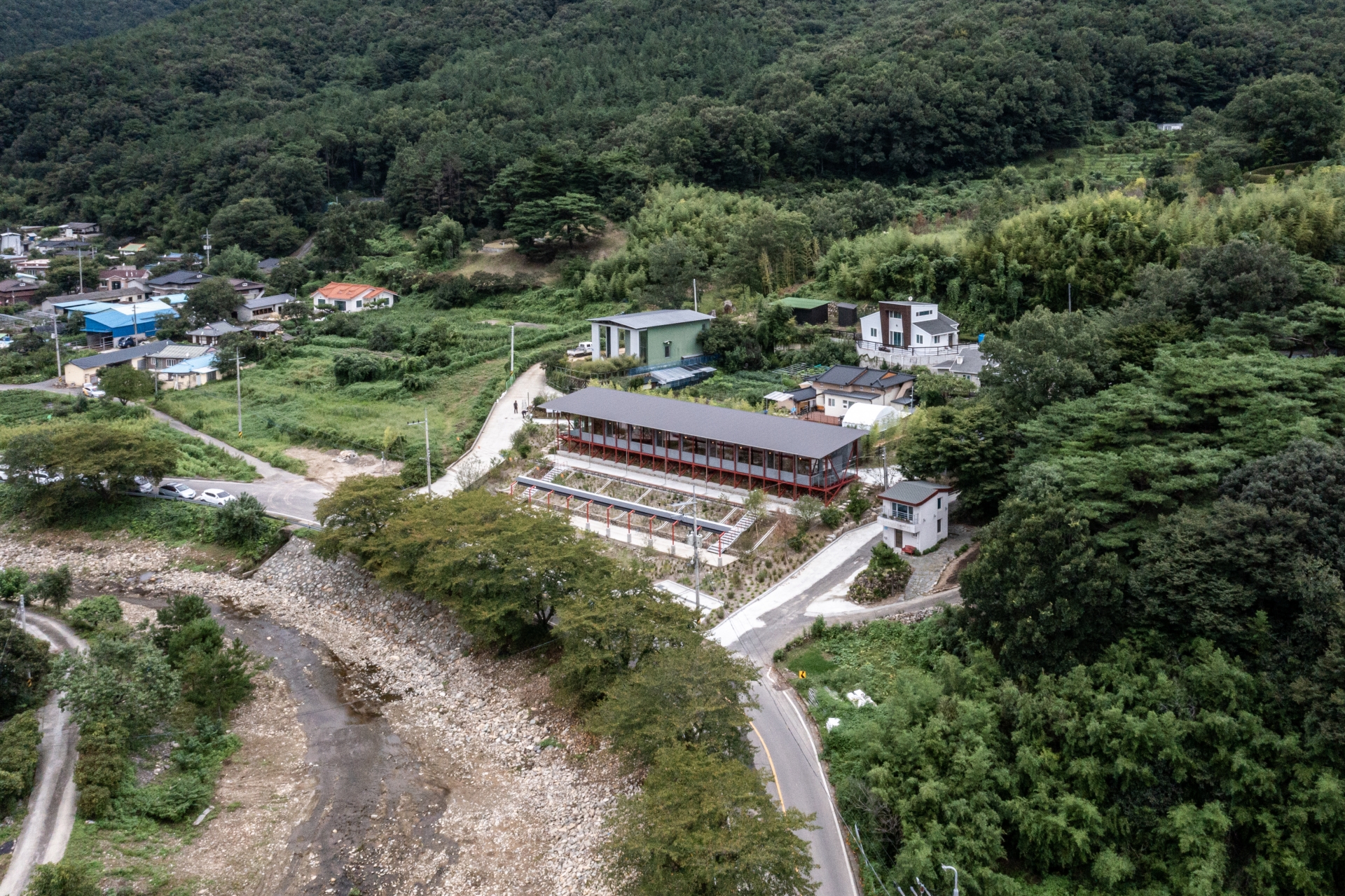
One frequently encounters grain or livestock warehouses in Duseo-myeon, Ulsan, a village specialising in both arable and livestock farming. With such a high proportion of the population involved in the livestock industry, the cattle sheds are built in long rectangular designs, advantageous for natural light as well as ventilation to improve sanitation. Also, the sheds are characteristic of industrial facilities with repeated modules, permitting them to be built rapidly with affordable materials. The steel columns and bearings and the slanted roofs of the cattle sheds brings to mind the archetype of the Primitive Hut which emerged when the Enlightenment period was at its height in Europe. Marc Antoine Laugier who asserted that the Primitive Hut represented the origin of architecture, questioned the idea of elaborate baroque design, proposing instead a restrained and rational architecture based on naturalism. This idea has relevance to Korean architecture today, with its flood of images and the trending of photogenic buildings. Duseo-myeon, which sits at the furthest tip of the Taebaek Mountains, its people whose livelihoods depend on primary industries like farming, and the Primitive Hut proposed by Laugier, somehow all blend together well. Similarly, Chari Café was also intended to be of a modest and rational design.
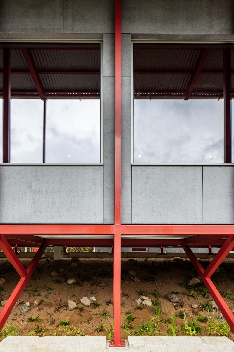
The site was originally a stepped terrain used for farming. The stepped field was reconstructed as part of the mountain, on one hand to recover the original form of the terrain, but also with the hope that future users could enjoy a sense of visual continuity with a garden in plain sight, by creating an uninterrupted visual continuity from the top to bottom of the site, without the obstruction of different levels or ledges. Through this, the visitors would be able to have a more dimensional experience of the garden and to appreciate, all at once, the fields and farmhouses on the other side of the road, as well as the hills to the rear. This was inevitably a challenge for two reasons. First, it meant the building would end up sitting on a slope. While it would be possible to establish the project on a flat land by constructing a retaining wall, we wanted to avoid using such a wall after considering the specificities of the site, such as the chance to see the building and the garden together, and the long shape of the building. Instead, we discovered exemplary cases, such as Myeongokheon in Damyang, where adaptation to the terrain made appreciation of the landscape possible. With this as a reference, we redirected the design towards employing angular tubes to create a rahmen type frame structure, which would establish the project’s baseplate. The second challenge was the vegetation on the slope. As soil on slopes does not retain water well, it takes longer for vegetation to settle and thrive, becoming instantaneously victim to drought. Unfortunately, we had not taken such difficulties seriously until the schematic design and drawing development phase, hence missing the chance to concentrate efforts into assuring appropriate irrigation. It remains a regret that in the end, the garden on the slope can only be maintained through the persistence of its plants and the dedication of those caring for them.
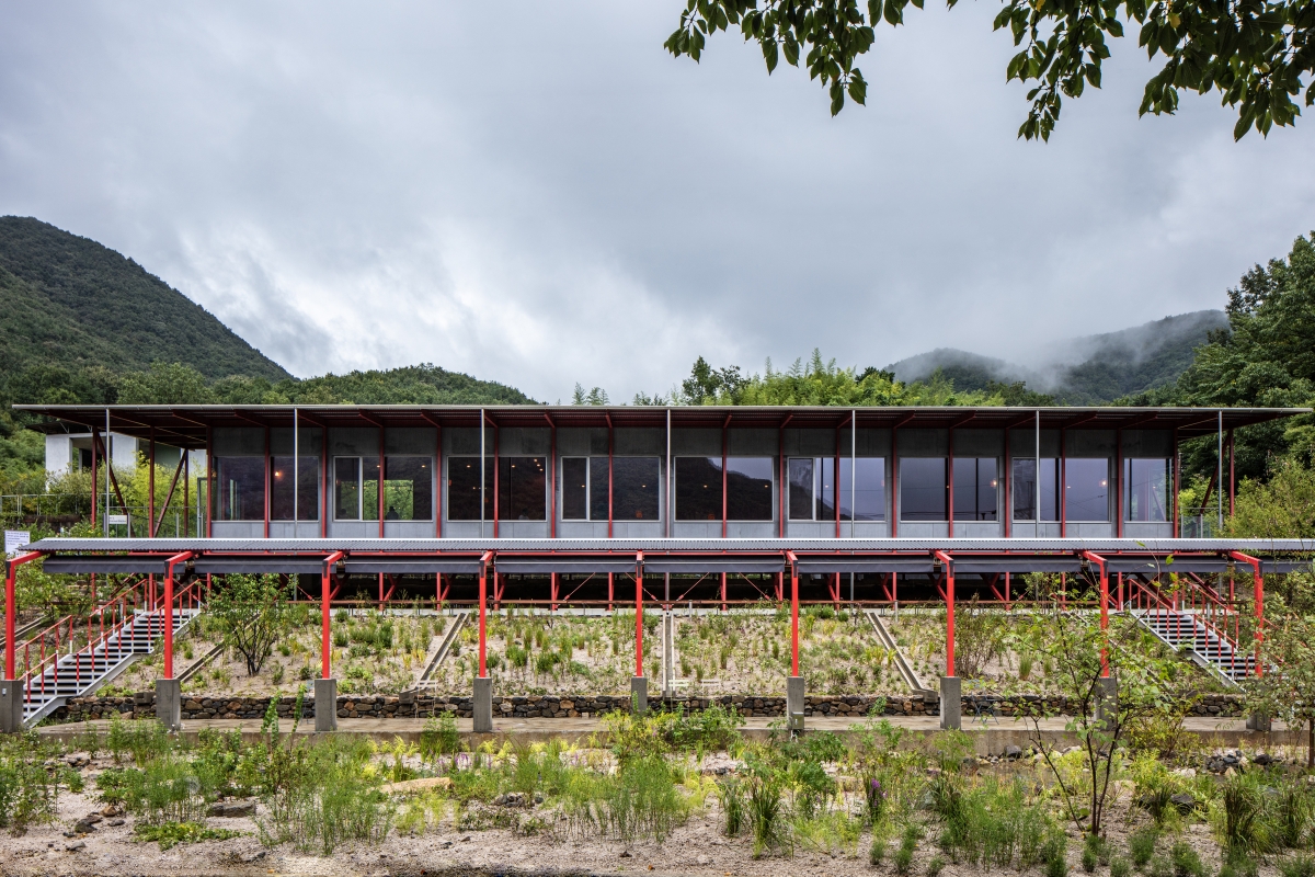
When visiting Venice a couple of years ago, the Church of Santissimo Redentore by Andrea Palladio left us with a lasting impression. By dividing the façade of a large structure into ideal proportions, the project’s grandeur and elegance were expressed together, making a fascinating illusion emerge, whereby it seemed that the façade was composed to look as if four different buildings had been melded together. One might think that the church had been designed to appear as an assemblage of buildings instead of a single project, so as to not impede a sense of the building’s magnificence, while being obliged to divide the façade for a good sense of proportion. Seen from the front, the Church of Santissimo Redentore looks as if four different façades have been compressed together. The façade of the Chari Café was similarly composed of three layers, by dividing it up into smaller proportions yet maintaining the stature of the building, so that it would remain in harmony with the surrounding buildings, the nearby low-set small farmhouses and country homes. The first floor has a gridded façade of 6 × 6.4m composed of eave troughs and downspouts, the largest grid corresponding with the open garden. The next level is made of 20 2 × 4m grids divided up with angular tubes, and the final level is CRC boards grids. The gridded façade appears smaller and smaller as one approaches the project.
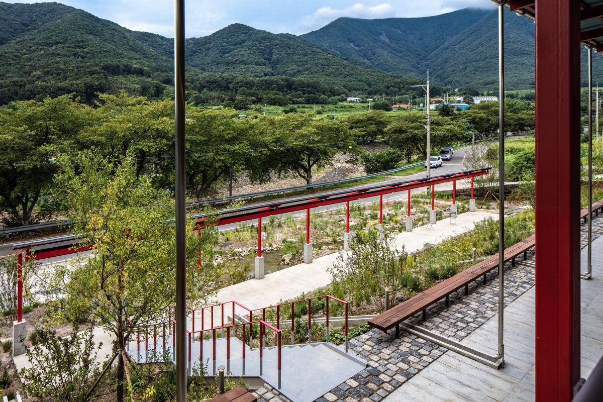
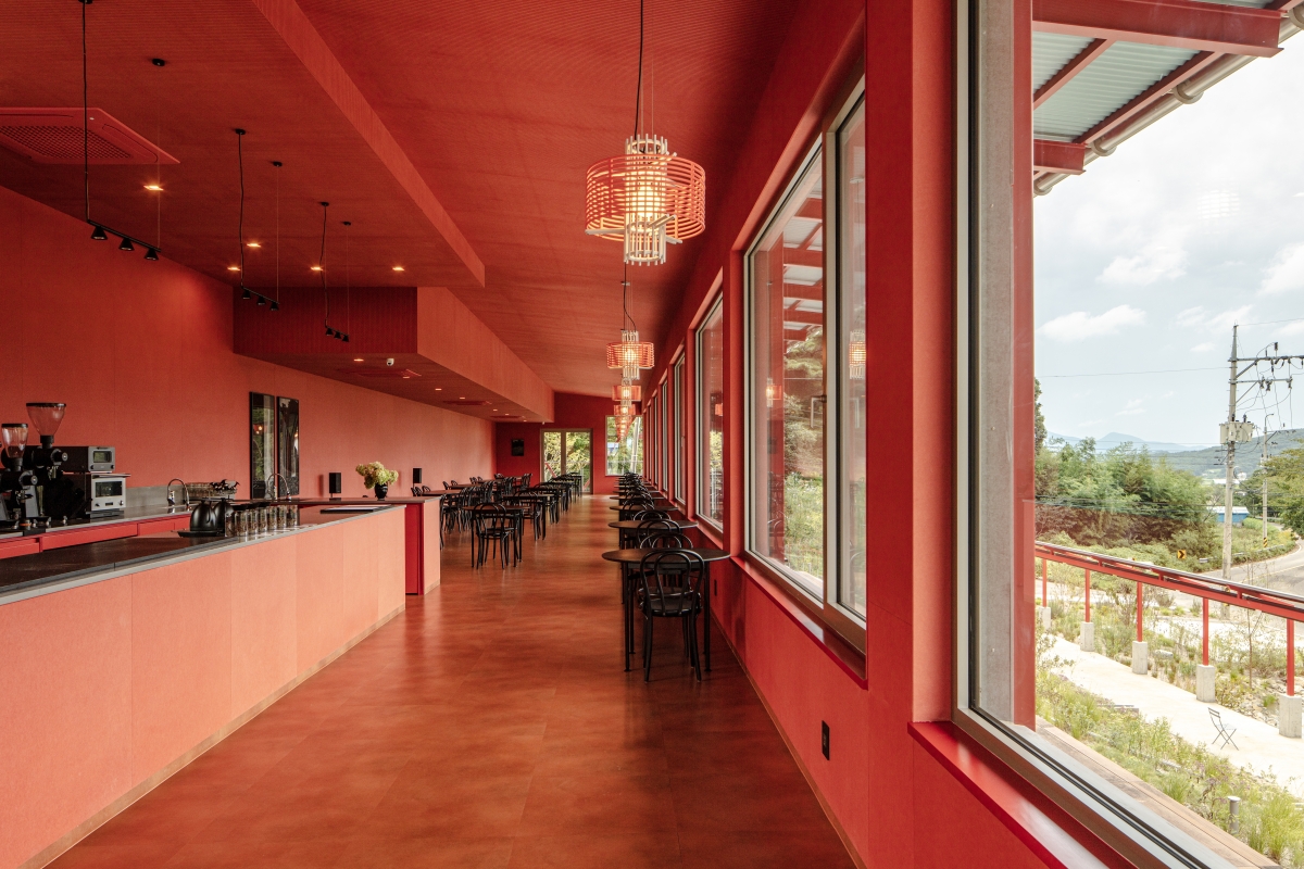
Red tones, contrasting with green, were selected so as not to disrupt the view of green landscapes from the windows, while allowing us to realise our vision of an interior decked with vivid colours hard to come by in everyday life. The red pigment combined with fine wood particles creates a smooth surface like paintwork applied on metallic or gypsum board, yet reveals its minutely rough surface up close. The background fades away and reveals itself according to the distance, and as such, coloured MDF boards appear to be artificial or natural according to how it is seen. A previous visit to the Museum SAN in Wonju, where James Turrell’s room filled with red light can be experienced, was particularly fascinating. The interior finish was selected while imagining the moment one might see the sunset-lit sky inside the café. On the other hand, the tone of the furniture remains a regret. The black tables and chairs create a new imposing relationship with the red of the space, disrupting the principle of contrast originally intended to be emphasised through a contrast with the outside scenery. What would it have been like if neutral tones like beige or grey had been arranged to allow a greater contrast between the green and the red?
While we had not hoped to realise the dream of a completely energy-neutral house, our design for Chari Café sought to promote the idea of a low energy building. Heat bridges are hard to avoid with externally placed insulation, as the piloti is the grounding connection, so we decided to establish the insulation ducts on the inside of the structure. With the project existing on a single level, with no partition walls inside, no heat bridge would occur even if we selected a method of internal insulation. The composition of the outside walls and roofs drew from the same principles of North American timber light frame structure using wooden studs. Meanwhile, we could not use wooden studs as steel and timber have up to three times difference in linear expansion coefficient. Instead, we transformed the linear thermal bridge developed by TIFUS KOREA into point thermal bridge to apply an ‘insulation frame’ which could reduce the level of heat transfer. From the inside, this would be in order of the utilities layer, the smart vapor barrier, insulation frame and glass wool, vapor permeable membrane, ventilation layer, siding structure, CRC board. This product was originally developed to be used in construction by placing the vapor permeable membrane on top of the insulation frame to fit the external insulation method on the roof, but in the case of Chari Café, we selected an internal insulation method to, counterintuitively, hang the vapor permeable membrane on the structure, and as such the contractors had a big part to play.
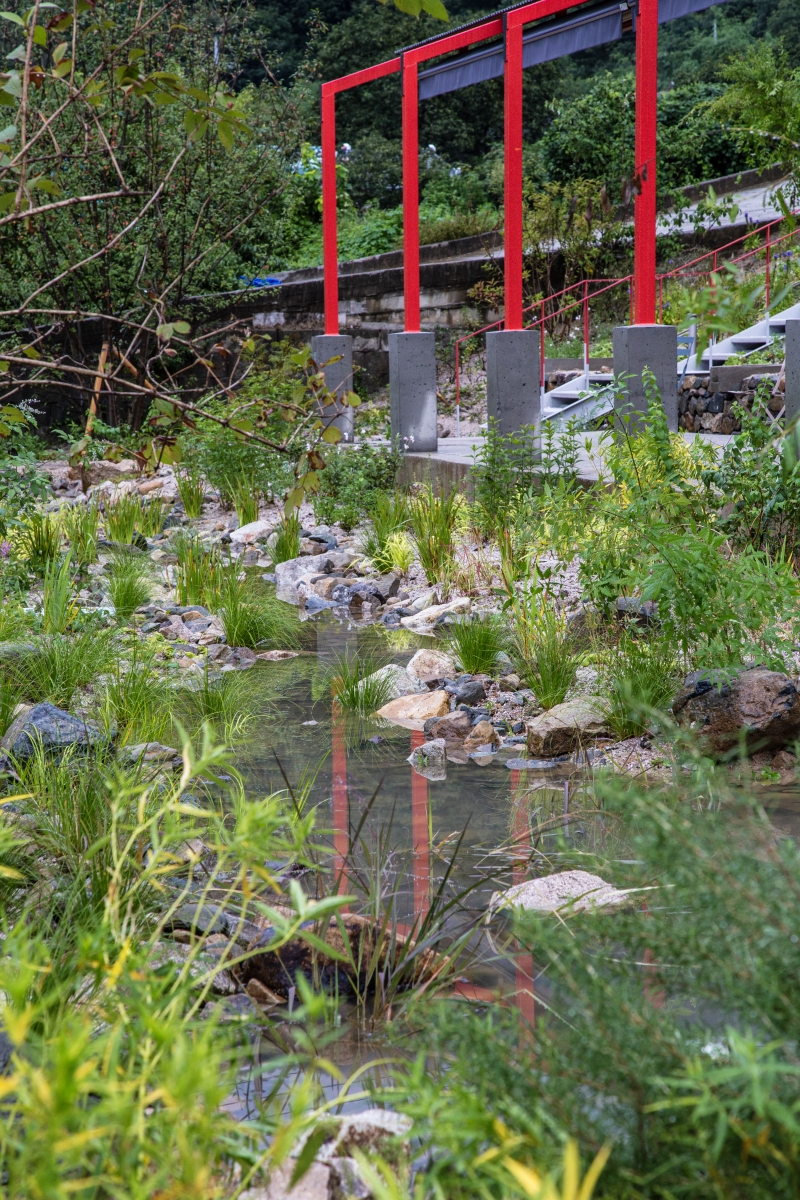
The outdoor spaces of Chari Café can be largely divided into the rear of the café, the front of the café and the pergola section according to the architectural plans. The three zones are distinguished not by vertical walls or gates but by a change in level. This in turn creates a slope, where the flat area becomes the user zone and the slope is used for vegetation. The three paved surfaces that are placed parallel to the direction of the architecture take on alternating roles of shelter and path. Each of the zones are connected with steel and natural stone stairs. Vertical circulation occurs between the zones, with horizontal circulation within the zones. These parts were finished with the materials of CIP concrete, granite slabs and custom-made paving stones. The middle slope is steep and masonry was added in to ease the slope. The masonry structure was created using stones from areas in front of the site, which had been discarded during maintenance work at the local stream. The concrete irrigation placed on top moves the rainwater from the downspouts to the pool of water below. This pool is a massive collecting well for the site. Ordinarily, rainwater from the site would flow directly into the river through the collecting well and the drainage pipes, but in the case of Chari Café, when rain falls, the water fills up the pool, and this is gradually absorbed into the land, to become groundwater or to evaporate and return to the skies. The water in the pond also becomes an aesthetically pleasing element.
apparat-c (Lee Sewoong, Choi Yeonyung)
Kim Soyeon, Kim Suhwan
(Informal Garden) 374, Guryangchari-ro, Duseo-myeo
neighbourhood living facility
1,768㎡
349㎡
297㎡
1F
3
7.18m
19.76%
16.82%
rahmen (rectangular hollowed section)
CRC board, corrugated steel sheet
colored MDF board, vinyl tile
Eden Structural Consultant
Jungyeon Engineering
Eden Structural Consultant
Oct. 2020 – Sep. 2021
Nov. 2021 – Aug. 2022
Anmadang The Lab


