SPACE December 2022 (No. 661)
The Recomposition of Space
The original building had the appearance of a multi-unit and multi-household house, which since the 1980s has become one ofthe most common urban residential types found in KoreaЁЏs architectural landscape. The air-conditioner outdoor unit that hangs from the sun-drenched brick exterior, the disorganised electric wires and water pipes— these elements stand in contrast to the trendy cafés, restaurants, and office buildings of the neighbourhood and added to the buildingЁЏs outdated and dull aspect. In search for a rental building that they might also use as their workroom, the client couple ‒ the husband an author and the wife the manager of a publishing company ‒ sought out an architect because of the exterior of the building that departed from the expected image in Cheongdam-dong area. Raising the land value and securing basic conditions for a rental building were prioritised at the planning stage as much as the design itself. The budget and time were tight, so we had to come up with an efficient method to maximise change with minimum modification. As a rental building, a flexible spatial composition that can cater to various functions and situations was required. The original non- bearing wall that shaped the residential space and the elements that had outlived their use were removed to create a variable plane that would not be defined by or conform to any specific function. The symmetrical house plane, with a staircase at the centre, was the biggest limiting factor, but we decided to
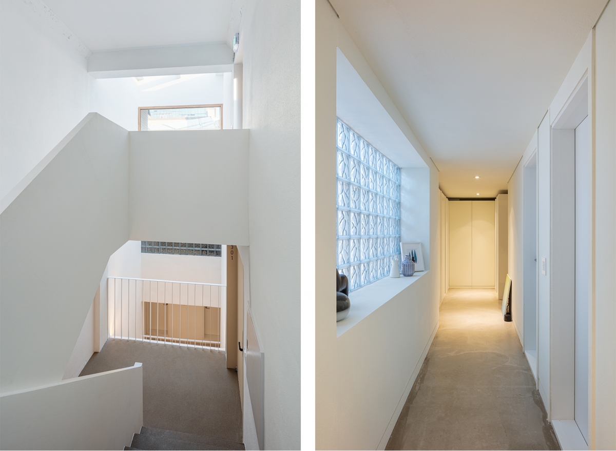
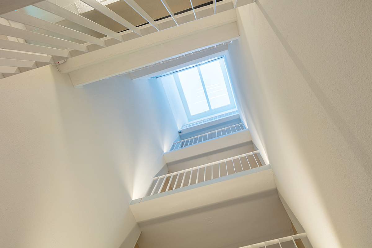
make use of it in a proactive way; we kept the shared spaces, like the staircase hall and bathroom, at the centre and configured the two symmetrically-divided dedicated spaces around them so that they could be used either as two separate spaces or as one unified space according to userЁЏs desires. We designed a small inner courtyard, which cuts through the building vertically, by emptying out the unused space between the central staircase hall and the bathroom to maximise the userЁЏs perceived sense of a shared area. The inner courtyard, which is connected to the staircase, not only encourages visual connection and a stronger sense of community between the occupants but also creates a unique ambience by securing privacy from an outside view and thus striking a balance between a sense of the outward looking and the enclosed.
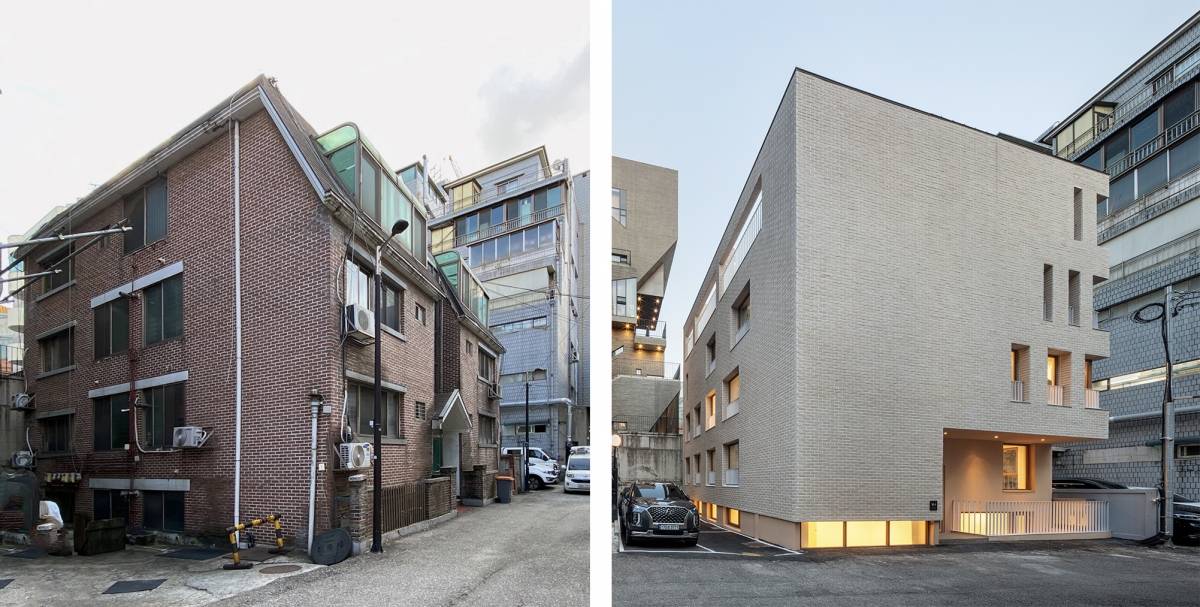
(left) Exterior view of existing building / Image courtesy of ODETO.A
The Middle Area in the Rental Building
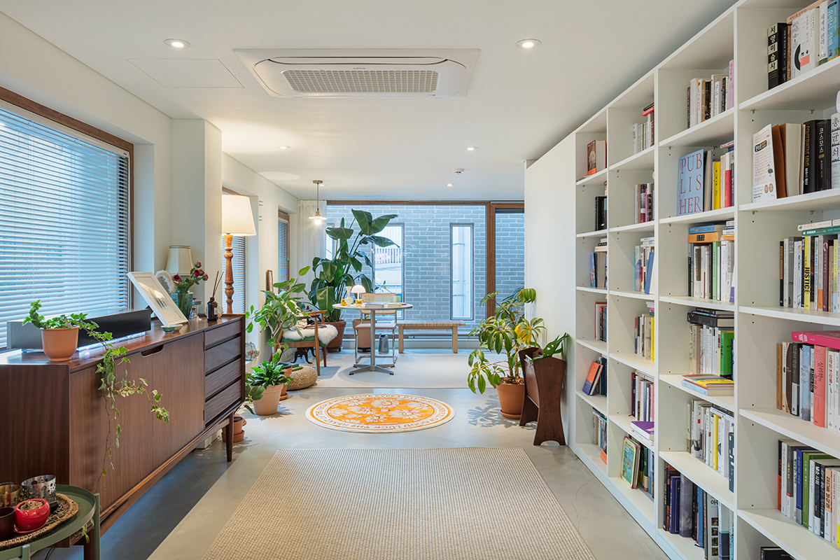
The combination of residential spaces on each floor as two rental spaces ‒ which was previously divided into four housing units ‒ created a spare space in the shared areas like the staircase and the hall. Instead of filling up the shared space ‒ which had a dark and dull atmosphere due to the low ceiling height ‒ with new architectural elements, we emptied it out to create a looser and brighter boundary point. The empty space introduced here not only distinguishes the movement flow between each rental space but also newly defines the relationship between space and its users by encouraging the exchange of gazes within the shared space. It creates a middle area, a buffer space, that both connects and distinguishes the interior and exterior spaces in a seamless manner. The staircase hall is the main movement flow connecting each room and the sole shared space in the rental building. We tried to overcome the limitations of a narrow interior shared space by modifying it vertically and perspectively. We added changes to the staircase position and width as it connects from the first basement floor to the third floor, partially opened up the slab to give it a sense of openness, and made it flexible enough to fit all situations—whether for movement, rest, or display. The atrium that penetrates the entire building and embraces the staircase hall, the interior of each rental space, and the exterior space beyond the window, creates visual expansion. We also sought to enhance sensory engagements with the space, where the users may ordinarily have rather short-lived experiences of changing views of the sky, the changes in the weather, and the march of time through the shifting lights, shadows, sounds, and reverberations as one enters the building and climbs up and down the staircase. The horizontally and vertically connected and expanded line of sight and the sequencing of perspectival space expresses our intention to create a rich spatial experience out of this small area and to rediscover the versatility of the ЁЎmiddle areaЁЏ that lies in between the interior and exterior.
Rhythms Across the Composed Façade
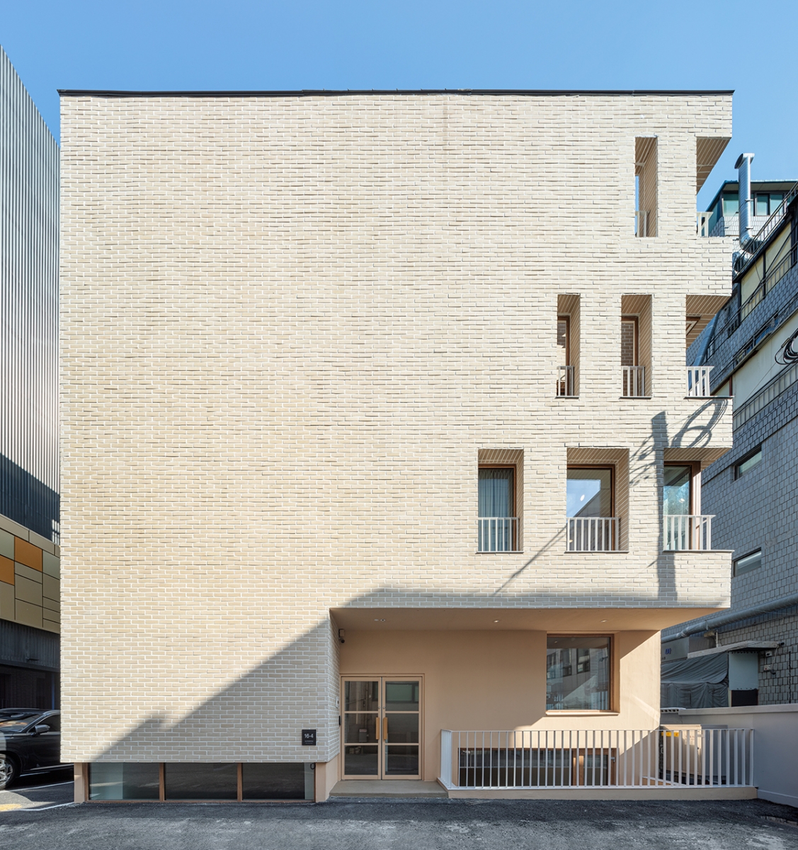
Despite acting as a direct connection to the exterior, the exterior wall surface of the original building had fully closed in onto the road boundary line and was merely functioning as a firm boundary. We set the lobby entrance and part of the wall surface back to widen theentrance while also reflecting on the somewhat flat façade. By moving the main entrance a step back, it not only loosened up the building boundary to create more breathing room for interaction with activity on the street, but also created a small sunken space to let light into the basement. Moreover, by expanding the line of sight to the staircase and the inner courtyard, the shared space becomes further highlighted. In this way, the entrance space thus connected to the emptied interior space extends to the façade. The sole road-adjacent western façade is kept mostly closed off to block out sunlight exposure from the west, while its subtle openings reveal an elegant and quiet expression. The façades to the south and north were mainly designed as functional elements to increase daylight exposure and air circulation. The openings (their number decreases towards the higher levels) on the western façade – which is solidly clad with subdued beige-toned brick tiles – adds a sense of rhythm as it blends with the regular patterns created by the openings on the southern and western façades. We wanted to create a new kind of scenery in this crowded part of the city that would be ЁЎsimple rather than fancyЁЏ. (written by Lee Heewon, Jeong Eunju / edited by Bang Yukyung)

ODETO.A (Lee Heewon, Jeong Eunju)
Kim Taewoo, An Dahye
16-4, Dosan-daero 55-gil, Gangnam-gu, Seoul, Korea
neighbourhood living facility
263.4ЇГ
153.14ЇГ
551.35ЇГ
B1, 3F
4
10.4m
58.14%
155.17%
steel frame
brick tile
water paint on gypsum board, self leveling mortar
Eden Structural Engineering Group
TOHAUS
Sep. 2020 – Jan. 2021
Mar. 2021 – Mar. 2022


