A Building of Serenity
David Chipperfield (principal, David Chipperfield Architects) × SPACE
SPACE: How did you cope with the issues presented by the Yongsan area?
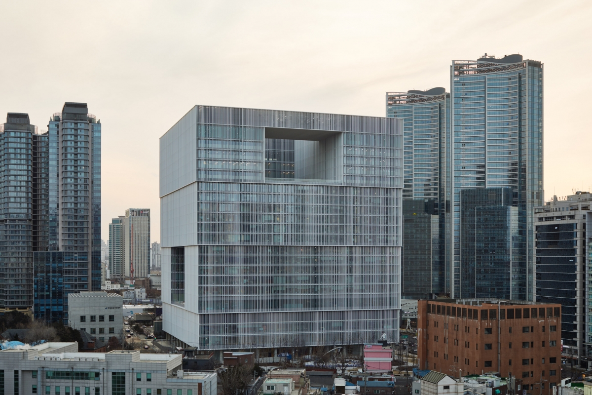
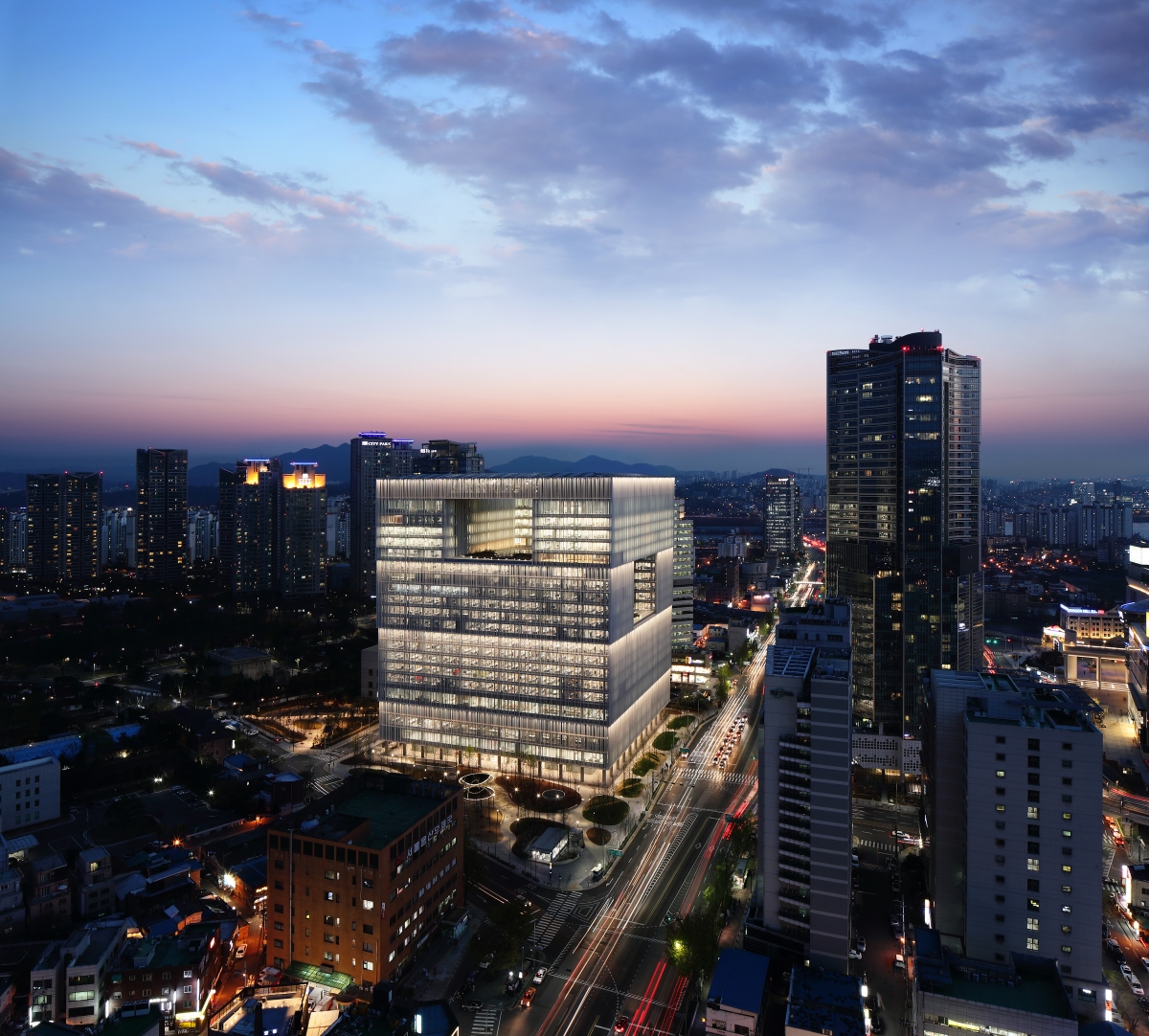
SPACE: The new Amorepacific headquarters is a huge cube. What are the pros of this form?
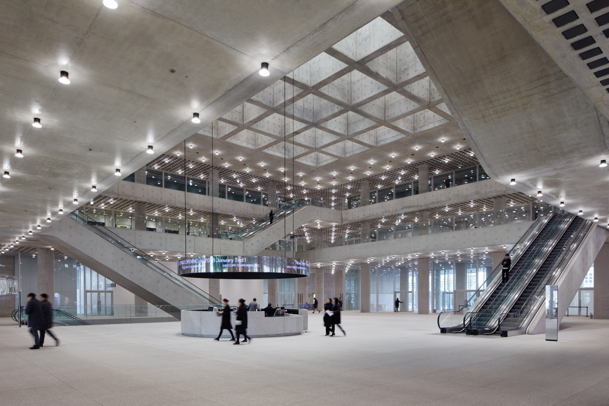
Atrium is usually a space of public purposes. Opened to all directions, the atrium attracts people naturally into the public space.
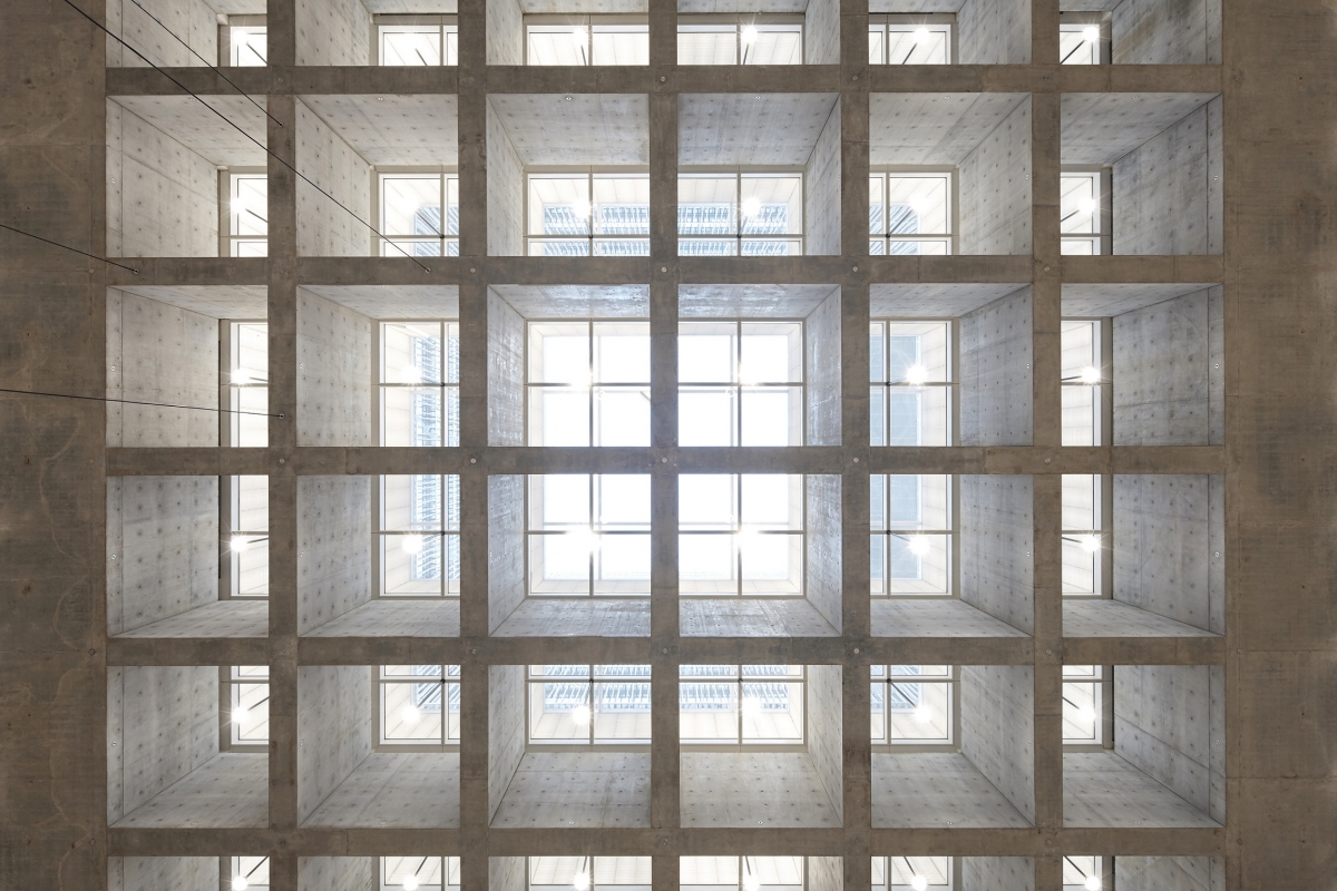
The glazed floor of the courtyard invites a diffuse, natural light into the most important public space of the building, the atrium.
SPACE: What is the intended purpose of louvers in this building, in the sense of form and function?
Chipperfield: In fact, it is extremely difficult to express the weight of glass buildings such as the new Amorepacific headquarters. Louvers that act like folding screens help to disclose a sense of weight. Depth and light details are added to the exterior. Excessive heat gain in glass buildings can be reduced thanks to using aluminum louvers that prevent the glare of direct sunlight and reduce the heat load by shading the building. Matt-finished louvers enhance diffuse reflection and increase the quality and quantity of daylight entering the interior. The aerodynamic profile of the fins has been optimized to eliminate vibration and wind generated noise.
SPACE: What is the role of the courtyard?
Chipperfield: Fascinated by the hanok, which has the characteristics of a loggia that is open and private, I adopted its principles in the design of the roof garden. Breathing closer to nature and feeling the changing seasons, workers in the building can communicate and relax comfortably. Three large urban openings are well connected with the exterior surroundings, providing views over the city and the mountains in the distance and therefore establishing a sense of orientation and belonging. In other words, they are windows and frames that mediate between the company and the city.
-
Architecture: A Beauty
Lim Sunghun (professor, Tongmyong University)
Although the DDP and Tower Palace have failed, one building in Busan has succeeded in attracting people's attention, ‘I’PARK’ near the beach of Haeundae. On his visit to Busan, Daniel Libeskind said that he thinks that he has found what people in Busan want. Cutting a ball in several ways, as he has done in his works, he has created a shape that satisfies their desire. This presented dream apartments for Busan’s people with a unique view of the old small harbour with a decent high-rise building to the visitors to Busan. He created a building that evokes people’s desires. The ‘Amorepacific’ Headquarters, like the I’PARK building, is an issue not only for the architectural community but also members of the public. It is easy to find people saying on SNS that the building is marvelous in many ways, from its external appearance to the restaurants in the basement, and that they want to get a job in the company. The reason is simple: it is pretty and attractive. From the perspective of a design competition, ‘beauty’ played a central role in this project. More emphasis was placed on the issue of beauty than architectural solution until the end of the project.
Then what makes it beautiful? First, it was made in the shape of a mass. David Chipperfield likened this building to a white porcelain form known as a ‘Moon Jar’. They share some common factors. The white porcelain was so large that it had to be made in two parts and combined later, which is seemingly in line with his aspiration. Making all facades uniform and sticking them closely together, he made a lump. Coincidentally he didn’t connect the concrete mass of the escalator in the hall with the concrete slab in a smooth way. Although different materials and colours were used in the ceilings, walls, and floors, the use of sparkling lights has created a coherent atmosphere. This applies to the external appearance. The surface-treated aluminum louvers have been attached unevenly and different in size, but they make a consistent surface when they are well lit by sunshine, creating a continuous mass. The horizontal articulation also contributes to emphasizing the presence
of a mass. Increasing the size slightly in the upper part, the mass delivers the impression that the different masses are firmly piled up.
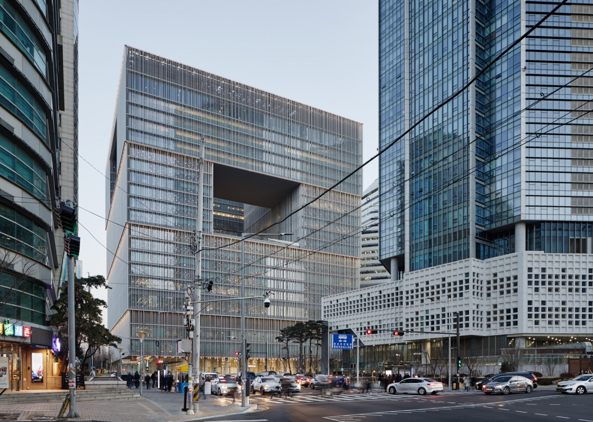
Increasing the size slightly in the upper part, the mass edlivers the impression that the different masses are firmly piled up.
The Headquarters building is beautiful. It seems firm and unchanging, but it varies depending on the light conditions. The hall on the ground floor appears different when it is lit by the skylight and when it is lit by artificial lighting in the evening. The external appearance created by the louvers also varies when they are lit by strong sunlight and when it is cloudy. Of course, it seems different when it is lit at night. As the beauty of white porcelain is said to lie in its earthy qualities, rather than as pure white, the building changes in its appearance a bit.
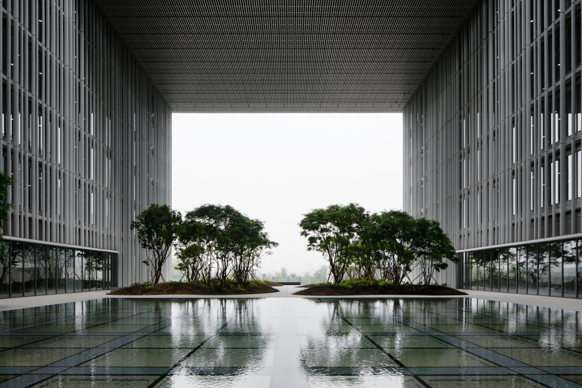
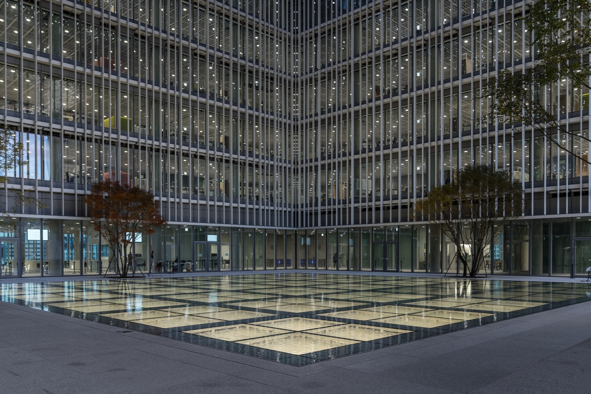
Fascinated by the hanok, which has the characteristics of a loggia that is open and private, the architects adopted its principles in the design of the roof garden.
Then, if the beauty of Amorepacific Headquarters comes from desire when we regard it as beautiful, what does that desire mean?
I was deeply impressed by his attempts to use a limited range of materials to make the building consistent in its aspect and also by his delicate skill in dealing with the detail to make all the pieces act as one. My first disappointment in the building on a cloudy day made me regard the building as more beautiful as it turned into my impression in a sunny day. The feeling of each surface was also agreeable. It was more amazing because the feeling came from not the ‘surface of the material’ but the ‘surface of architecture’ created in the combination of various materials. But this is regrettable as it arose from an effort to create a freestanding beauty rather than to play a useful social role.
I wonder whether I would feel more comfortable if beauty worked like white porcelain, a traditional beauty that unfolds all the memories of life. The proportion of the mass looks oriental, but it is not traditional or Korean, and in a similar way the rooftop landscaping on the fourth floor may seem like irregular curves floating on the water but also appear like a curve around large stones in the Japanese landscape. I think, if it is intended to stand alone, it would be better, at the very past, to find a connection point with the past. Am I just making a worn-out complaint yearning for Korean tradition?
It still leaves some questions. After the candle revolution, we discussed the problems facing our society. Now we must start discussions about architecture. What kind of methods should be adopted to make architecture beautiful? This prompts a further question, is this building created by Chipperfield good or bad?
David Chipperfield Architects (Berlin)
100, Hangang-daero, Yongsan-gu, Seoul, Korea
mixed use (office building, museum, etc.)
14,500m²
8,700m²
216,000m²
B7, 23F
680
110m
60%
848%
Arup Deutschland GmbH, CSSE, Seoul
Hyundai Engineering & Construction, Seoul
KESSON, Seoul
Arup Deutschland GmbH, CSSE, Seoul
Arup Deutschland GmbH, CSSE, Seoul
Hyundai Engineering & Construction, Seoul
2010 – 2014
2014 – 2017
Amorepacific Corporation, Seoul
SeoAhn, Seoul
Kunwon Engineering Co. Ltd.,Seoul
Hans Krause / Nicolas Kulemeyer, Thomas Pyschny
Design lead – David Chipperfield, Christoph
HAEAHN Architecture, Seoul


