SPACE October 2022 (No. 659)
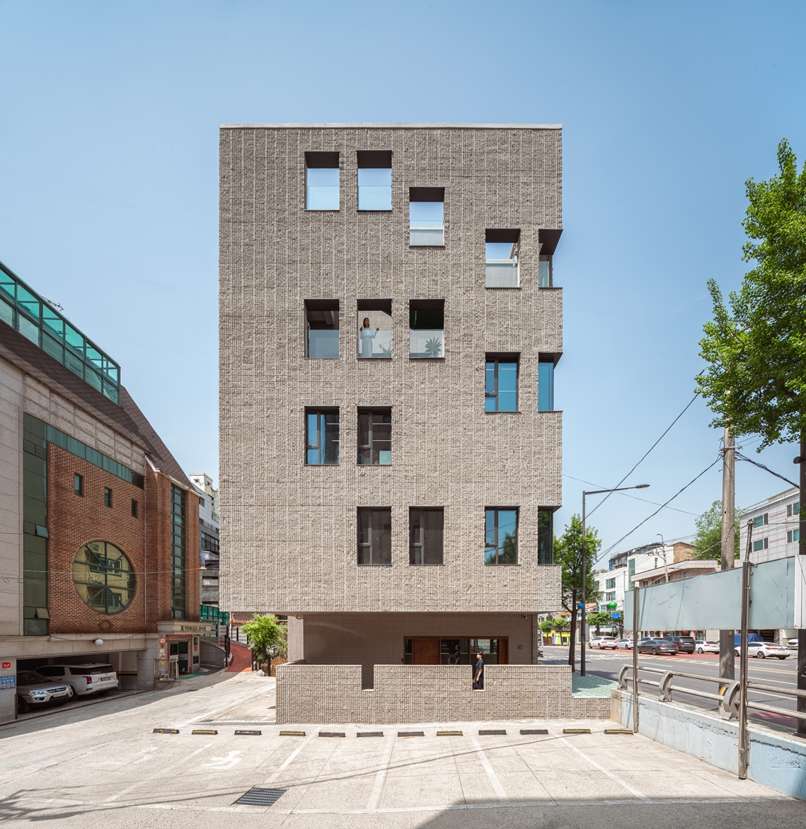
Buam Book Center is a new building that serves as both the office of Badabooks and the local bookstore. The client requested an office for 20 employees, a bookstore for residents, and a space to hold talks and lectures by invited writers.
The main concept we have established is ЁЎconnectionЁЏ. How might employees feel each otherЁЏs presence and begin to connect in a small workspace? Finding a solution was our design goal. Instead of stacking the floors of the same size on top of each other as in a general building, we arranged office spaces with alternating ceiling heights. We put indoor windows in the crossed gaps so that people working on different floors could look at each other.
Employees make connections by catching the gaze of one another through the interior window, while the natural light from the outside is transmitted to the office space inside. Employees implicitly notice what is happening in other departments, and so they form a bond on which they work in one building. Because of the placement of the offices, it became psychologically more convenient to move between floors by using the stairs rather than the elevator. It has also increased the opportunities for employees to pass each other on the stairs. There are small meeting rooms on landing so that the publishing companyЁЏs editorial, design, and administration team can quickly gather and hold short meetings. On the second floor, a lounge was created in which employees could gather to hold meeting or to share in a meal. Here, the gaze crosses through the indoor window in the meeting room and offices. Thanks to this, it has the agreeable impact of noting the presence of a visitor while working in the office without having a receptionist.
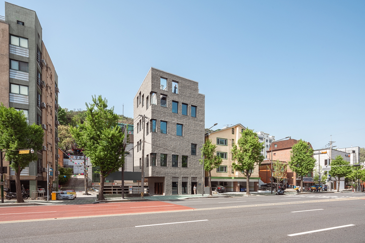
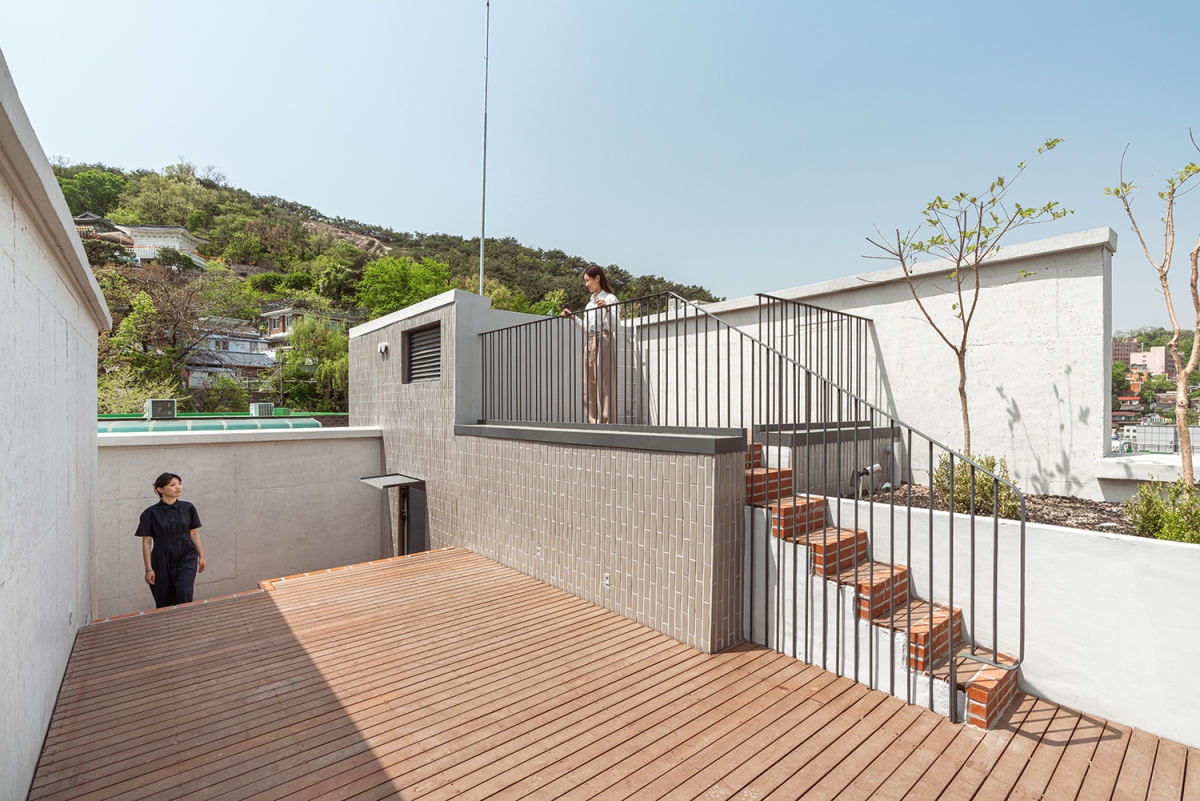
Buam-dong, Seoul, where the building is located, can be reached in just 15 minutes by car from downtown Seoul and is surrounded by mountains from which to enjoy the beautiful scenery. There is one particularly stunning panoramic view which spreads out if one ascends to the third floor or higherЁЊthis is the reason for the terrace that one can easily access from the offices on each floor. The terrace is connected by an external staircase leading to the roof garden. There is another need for a terrace. Due to the pandemic, the importance of semi-outdoor spaces to provide fresh air in office buildings has increased. Tables and power plugs have been installed throughout the terrace and roof garden that are directly connected to the office. Employees can freely move inside and outside to work in the beautiful scenery. The pandemic has also raised attention to indoor ventilation. By placing an indoor ventilation window on the wall where the office and the vertical core meet, the airflow that enters the window can easily escape to the stairwell.
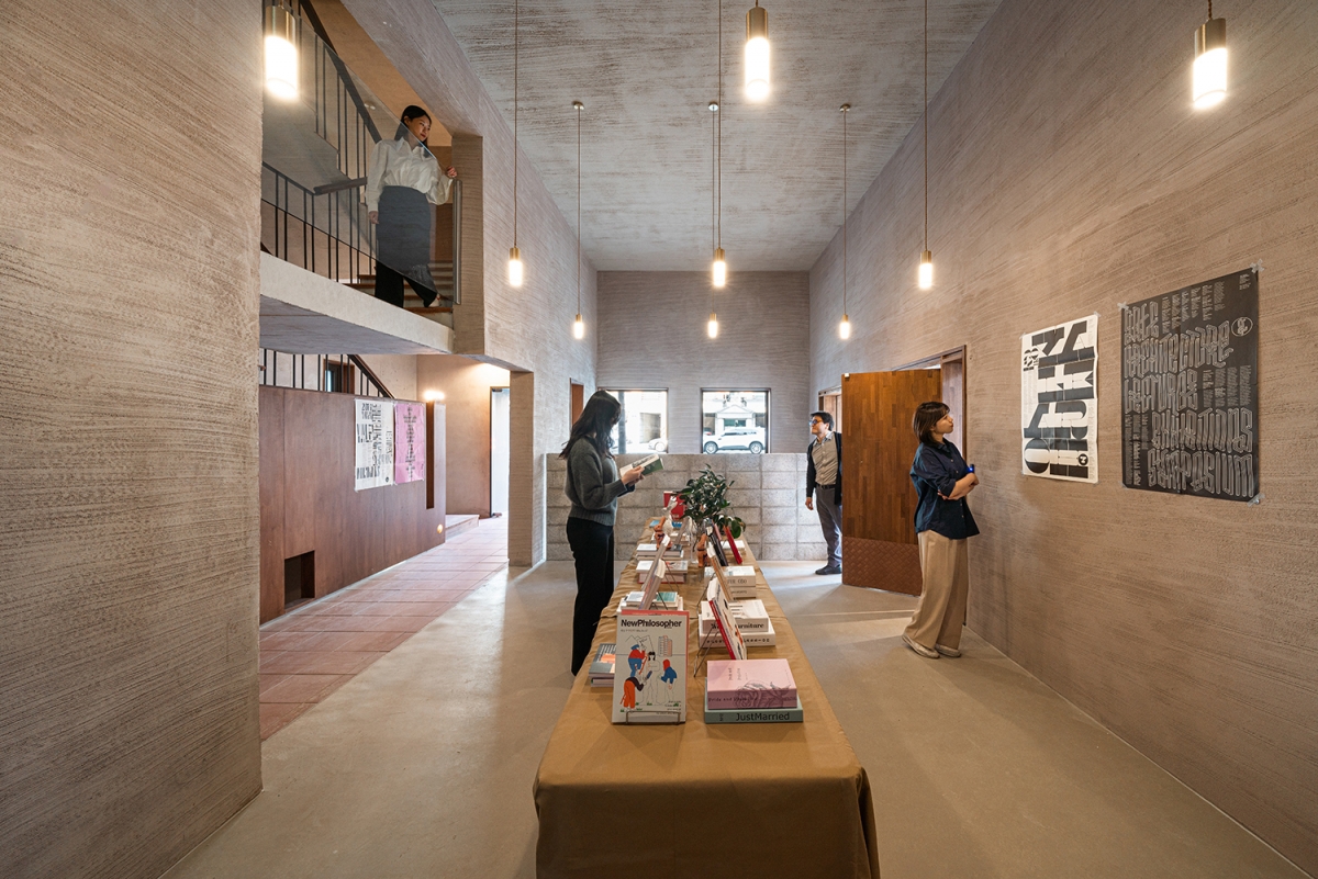
The front road on the siteЁЏs north side is noisy because cars pass at high speed. It needed an elevation design that blocks noise while preserving the view of the surroundings. Large windows starting at the floor level on each floor maximize the view, bring in natural light from the north suitable for work, and block noise by securing the portion of walls and installing fixed windows. After repeatedly arranging windows of the same size in the building of a solid cuboid, the position of the windows was subtly adjusted to match the interior space, implying a skewed space inside. For the exterior material, it uses split blocks. The split block features a random texture of surface created by dividing a lump of cement in two. The rough surface creates different shades depending on the angle of sunlight that changes during the day, and the expressions of the entire building change accordingly. This building used a 6-split block, which is different from the normal split block. A guide metal rod was installed in advance to split the cement into two, and the vertical line pattern generated during the process is characteristic of the appearance. Along with the random surface, regular vertical stripes are throughout, giving a sense of orderliness. If we associate this feeling with a publishing company function, we may be reminded of a bookshelf with old books.
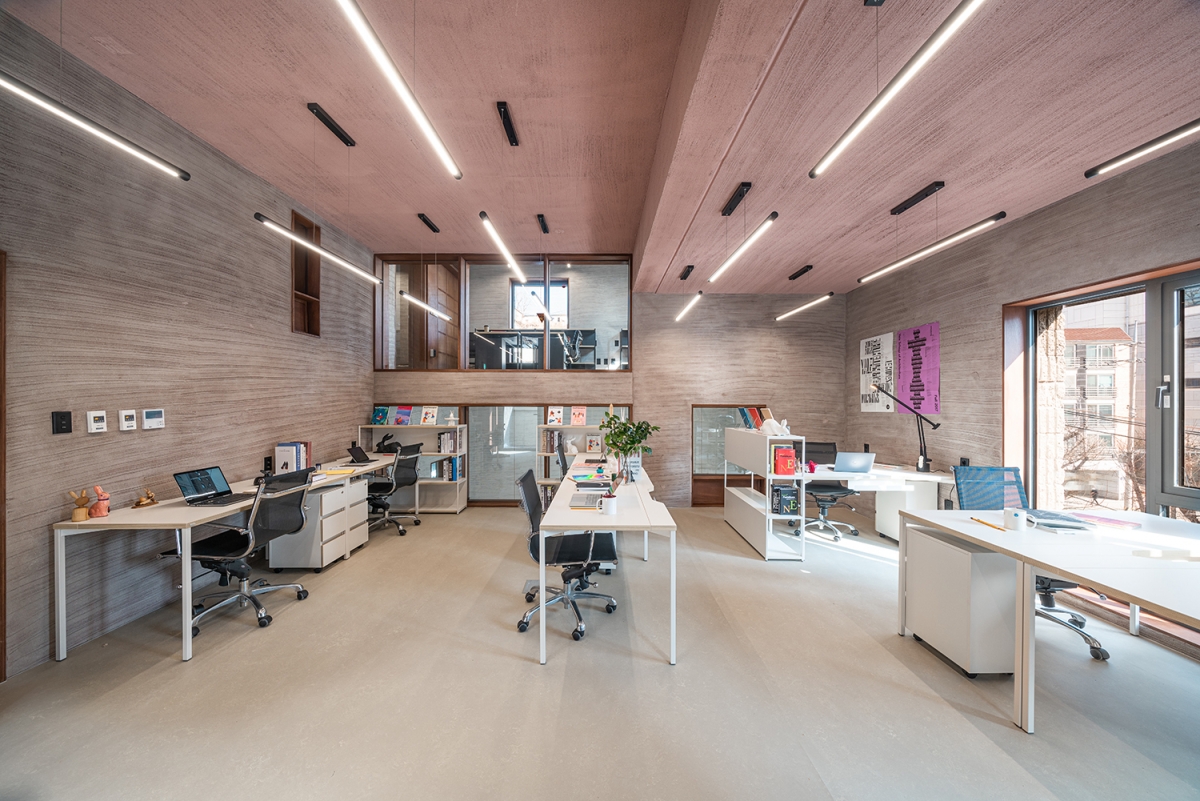
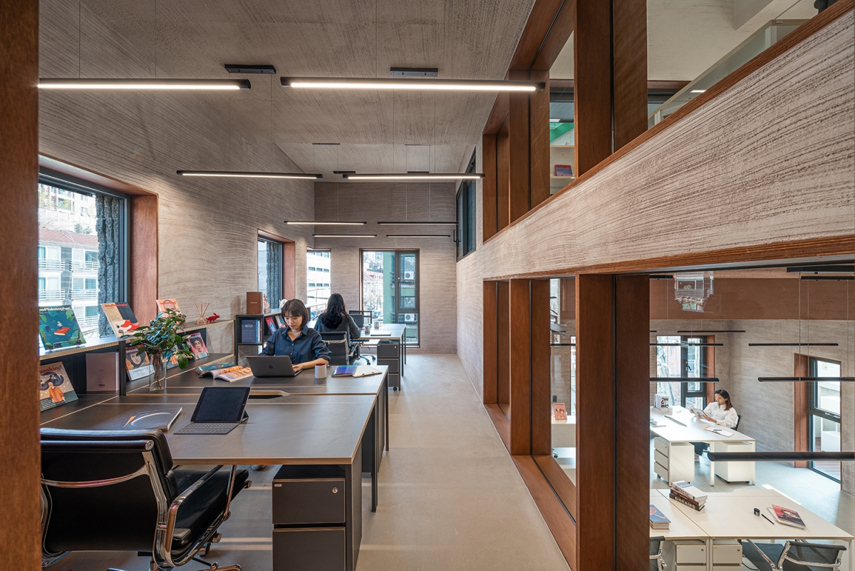
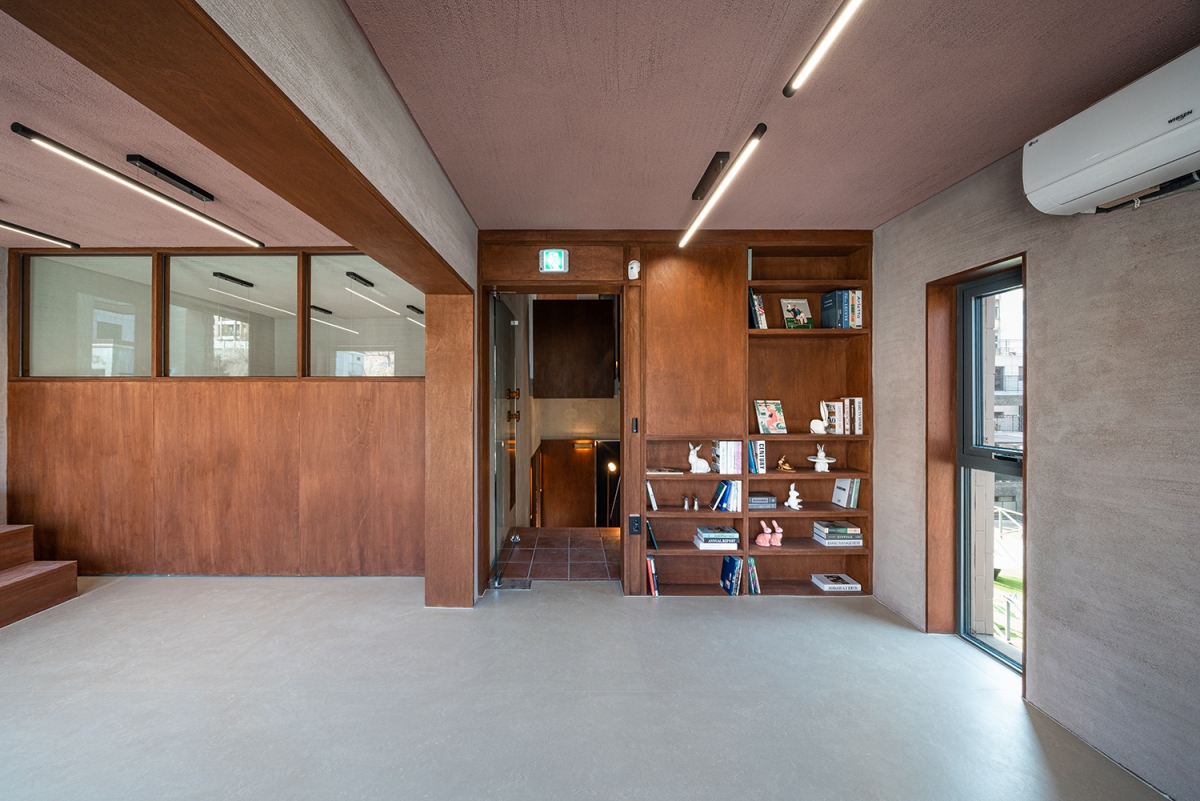
As working from home increases due to the pandemic, employees want an office that feels like home. The sense of comfort is related to the use of materials and lighting in the room. We used a finishing material of warm colour and textures indoors and adjusted the lighting to suit the spatial function that marks a departure from standardized municipal bright lighting. The interior was finished with cement mortar mixed with indian pink and beige dyes, and the surface has been scraped with a wire brush to create a wall that will gently absorb light. The staircase floor is finished in orange terracotta and dimmed to create a contrast with the bright office space. The interior doors, window borders and furniture are made of plywood to add warmth. The interior door and bookshelves have been combined to form a single piece of furniture and installed between the walls using an inset method.
The visual impression of building materials has been conveyed by touch through hand-held details such as handles and handrails. The handrails of the stairwells are made of merbau wood on the metal, conveying the gentle appearance of a staircase in a house. The handles of the office doors were custom-made in cooperation with carpenter Kim Hyungchul of the studio Deokduwon. The handle, designed with the idea of ʻcell divisionʼ, can tell which floor the door is from by the number of curved lines that protrude like dividing cells. For example, a door in the shape of a cell that divides into two is attached to the one on the second floor, and a handle on the third floor is divided into three. The door handle on the first floor, nicknamed ʻpizza doughʼ, represents the shape of pizza dough deformed by the power of moving the door with oneʼs hand. It enables the user to recognise instinctively the direction of pushing and pulling. We also made it by cutting merbau wood using CNC (Computer Numerical Control) and hand trimming in collaboration with carpenter Kim.
Due to the pandemic, the way we work is changing rapidly, and it is in an era that requires experimentation with a new way of working. This building divides the office space by utilizing the intersecting floors, and the indoor windows between the rooms allow the gaze, sunlight, and wind to pass through. It is a workspace where the ceiling height, colour, and layout are different on each floor, away from the same repetitive workspace, giving a friendly feeling like a house.
Architect
Cho Sungik (Hongik University) + TRU Architects
Design team
Shin Soyoo, Kim Donghee, Choi Jihyun, Um Hojoon, H
Location
287, Jahamun-ro, Jongno-gu, Seoul, Korea
Programme
neighbourhood living facility
Site area
150ЇГ
Building area
89.65ЇГ
Gross floor area
389.8ЇГ
Building scope
B1, 5F
Parking
3
Height
19.96m
Building to land ratio
59.77%
Floor area ratio
199.37%
Structure
RC
Exterior finishing
split block, tile
Interior finishing
stucco, colored plastering, exposed concrete
Structural engineer
Eun Engineering
Mechanical engineer
IREH MEC
Electrical engineer
SUNGJI ENC
Construction
T&I Construction
Design period
Sep. 2019 – Feb. 2021
Construction period
Mar. 2021 – Feb. 2022
Client
Badabooks
Working design
Kim Yerie (studio ARC architects)
Cho Sungik
Cho Sungik establishes TRU Architects and realises various architectural projects ranging from housing to complex planning. As a professor at Hongik UniversityЁЏs College of Architecture and Urban Design, he is doing research on urban and architecture together. He studied architecture at Seoul National University and Yale University, and worked at the SOM in USA. And he obtained the certified architect qualification in USA (AIA) and Korea (KIRA).
42


