SPACE September 2022 (No. 658)
It is no exaggeration to say that this we are living through the high point of café architecture. Following the pandemic, the number of café buildings are increasing at a very rapid rate, unlike other buildings used for other purposes. South Korea is said to have one of the highest numbers of cafés per capita in the world, and with rising income levels, they have become favourite spots for people of all generations. This was a surprise to me—I didnʼt know it would such a high rate. Maybe itʼs because our homes and workplaces are in fact unfit for spending more relaxed or informal time and for meeting people. The continued influence of social media also cannot be ignored. More recently, as a tool for searching diverse information from diverse viewpoints or positions in society, social media has easily replicated and shared icons and artifacts that are immobile structures, so-called works of architecture, as the symbols of an analogue lifestyle. This helps to reduce the mental and physical distance between architecture and the public. Many individuals are generating images when visiting the latest ‘brand-new café’, as if making a pilgrimage to a holy place. It is more effective than any form of formal advertising. Photos circulating on social media sometimes capture new aspects of the architecture from a different angle, in perhaps a more engaging way than the experts. In this sense, when I criticise the architecture of the café, I am more curious about how the architect tried to distinguish between the new form and the space.
Comforting Impression
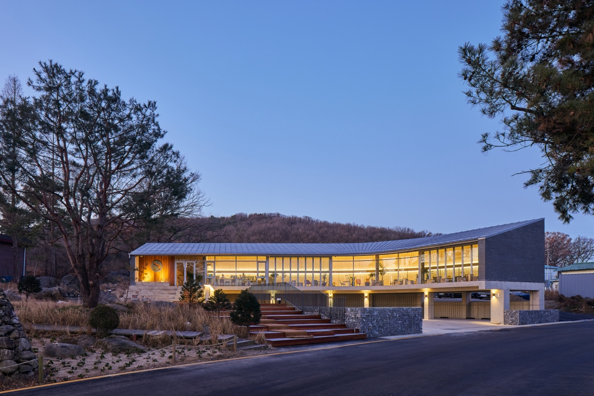
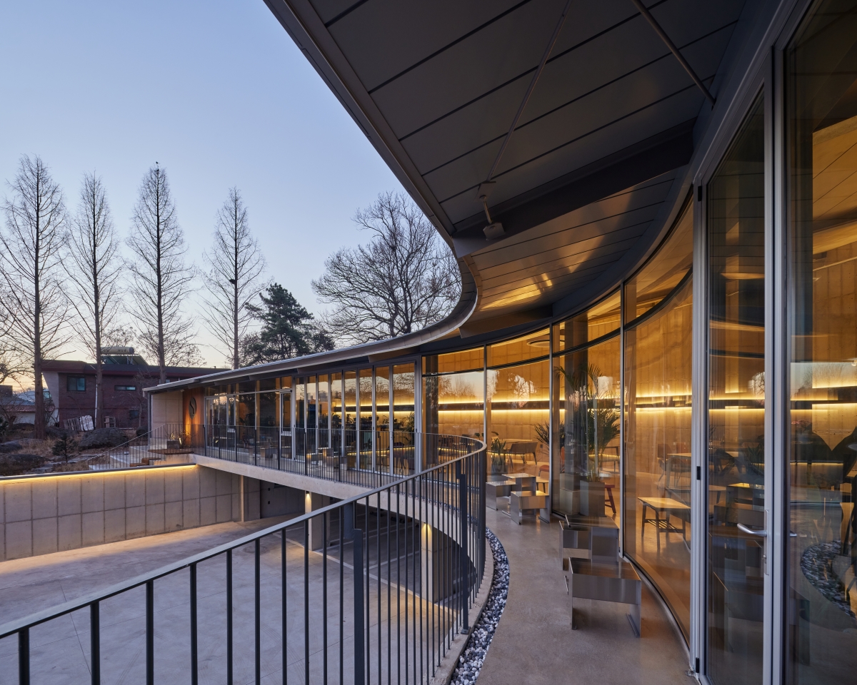
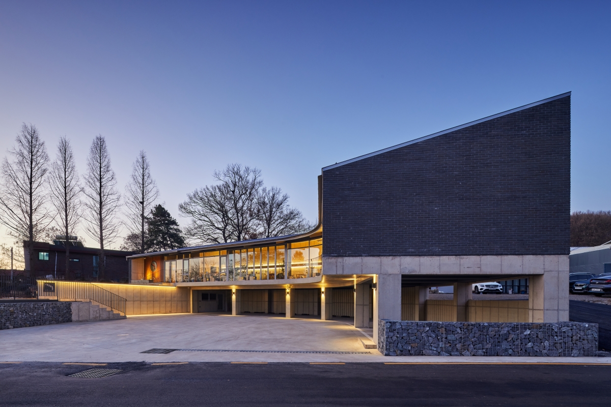
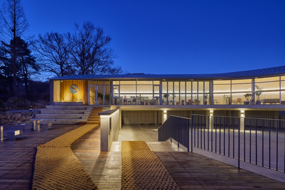
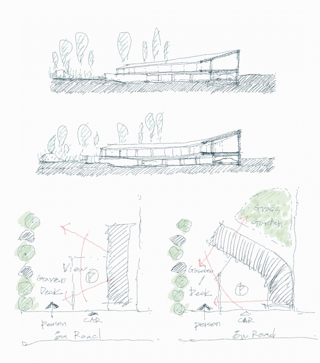
Searching for a shelter to avoid rain at the end of the rainy season, we reached Café rockgarden, located on the verge of Simhaksan Mountain, near the Paju Book City. Driving through winding roads, the café made its appearance on the backdrop of mountains, adopting a calm and elegant posture. It was an unexpected first impression. No spatial, architectural attempt had been made to impose its presence upon the environment. Instead, adopting a pose that draws curves and comfortably wraps itself around the garden and trees welcomes those who arrive and elevates one’s expectations for the interior spaces. The attempt continues in the parking lot. Unlike other cafés, which have become accustomed to the difficulties of the traffic, the cars lined up along the curvy piloti offer a neat impression. From the volume floating above it, straight walls and stairs stretch out to guide visitors naturally around the space. Different levels of exterior movement have been achieved by employing the existing topography, directing the visitor’s gaze in many directions. Walking towards the entrance makes the walk a brand-new experience as you enjoy ever-changing impressions of the landscape and architecture. The most striking thing before entering the interior is the low-hanging eaves towards the yard and the lower space. Even on rainy days, some people were sitting and gazing at the rain falling from the eaves and outside spaces. I was hoping for clear skies on that day to be honest, but, thanks to the rain, I was able to witness scenes I might never have encountered. With eaves changing the depth and height of the space, visitors sense the curious nature of the space, and, at the same time, it creates a mid-space, keeping direct sunlight and rain away from the visitors. This means that they remain, and also adds light to the space and casts shadows, creating a deep sense of space. The eaves have their sense of place. It is no coincidence that we feel a certain comfort under these eaves, because weʼre physically built to respond to the encouraging nature of this sentiment.
Constructing Natural Space
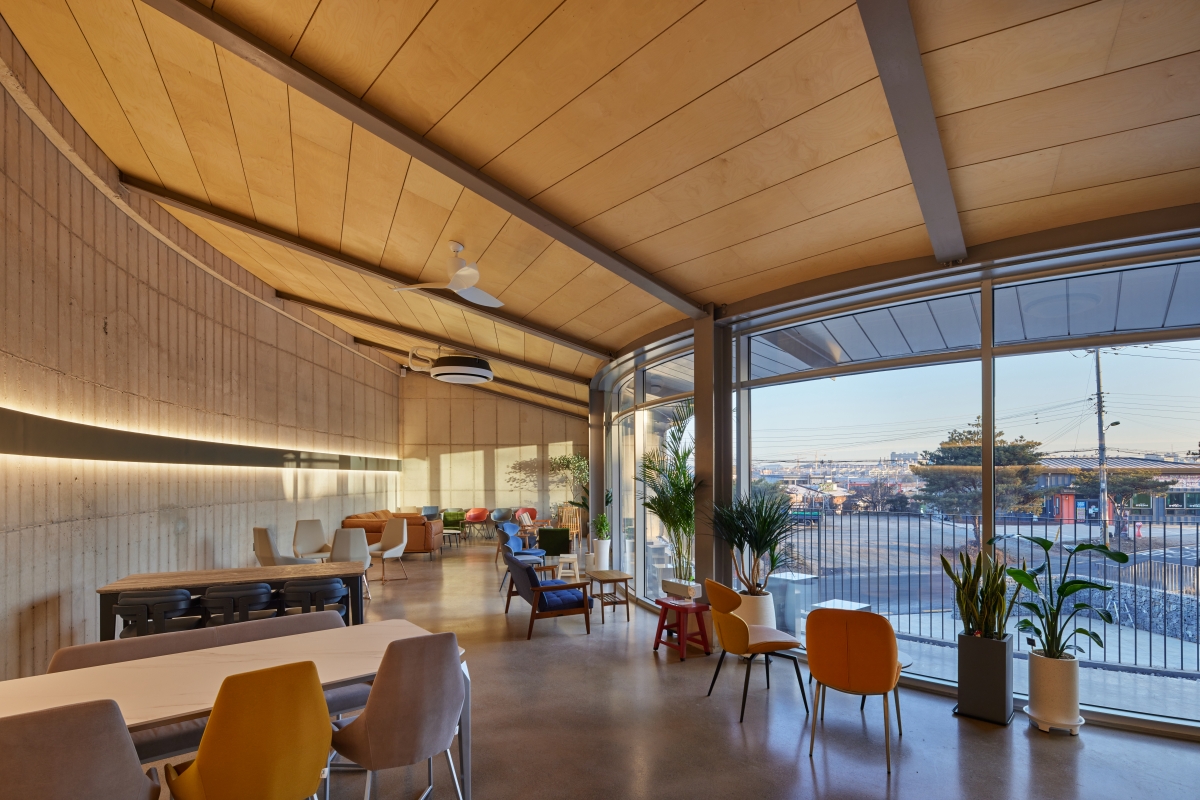
Curved masses are often the result of avoiding rocks and gardens on the existing site. The name Café rockgarden was coined in light of this, and yet at the same time, it reveals the architectʼs intention to preserve the existing terrain and the wild garden. During the design process, the choice of construction methods and materials was made naturally, according to the architects, by changing the shape of the massing from straight lines to curves and adding terraces and eaves. Unlike the concrete structure of the piloti on the first floor, thin steel columns and beams are used on the second floor. It is a hybrid structural system combining reinforced concrete and steel structures. By completely separating the glass walls from the structure, the transparency of the façade has been further emphasised, and the upper volume floats in a lighter way. The architects designed this structural system to maximise external views while achieving a strong contrast between concrete and glass. The interior appears to be simpler than the exterior. The curved interior spaces are connected without segmentation. Visitorsʼ eyes follow a wall that is connected by a curvature, making us curious about its conclusion. In addition, the two walls standing side by side add accents to the space. A glass surface running parallel to the rough exposed concrete shows the beauty of the material as it is, and a roof sloping from a heavy high wall to a light glass surface side without a single window naturally directs the body toward outer space. The gaze that follows the window remains with a garden, shaped by curved eaves and a horizontal urban landscape. From the interior space to the exterior terrace, the three-layered seating faces the courtyard, allowing visitors to enjoy the external scenery without interruptions.
Scenic Café Architecture
While architecture incorporates a landscape, it must also become part of the landscape itself. Café rockgarden meets both needs with a simple layout that does not disrupt or impose itself upon the surrounding landscape and topography. The elegant arc arrangement runs through the surrounding background, the eaves add to the building a sense of anticipation of the interior space, and the space under the eaves flows along the glass wall. The simple yet strong material contrasts achieved by concrete and glass and the construction method, as well as the subtle details, applied everywhere, add to the attractiveness. Exterior materials and colours do not stand out but they do elevate pleasure. In the world of the café, which is so often deemed to be a temporary and unsustainable type of architecture, what alternatives, other than adopting an extravagant architectural language, will exist in the future? Café rockgarden showcases one of the options. If you feel comfortable in curvatures, then youʼll discover subtleties and satisfy your senses in this calming and yet diverse space. It is neither difficult nor archetypical when compared to other buildings, but just quietly blends into its surroundings. It is said to be the first new building since the opening of the studio. I don’t have anything but great anticipation at what might begin to take shape throughout the trials at the moment. I am looking forward to seeing the results of all kinds of trial and error in his works and to the production of buildings at even higher degrees of perfection.
Koo Joongjung
Park Hyuntae
27, Dolgoji-gil, Paju-si, Gyeonggi-do, Korea
neighbourhood living facility
1,826㎡
210.4㎡
198.51㎡
2F
12
7.91m
11.52%
10.87%
RC, steel-frame structure
exposed concrete, concrete brick
birch plywood, exposed concrete, polished concrete
HANGIL STRUCTURAL ENGINEERING
MK ChungHyo Inc.
The MAP
May 2020 – Feb. 2021
May – Nov. 2021
Choi Moonyoung


