Sign up for VMSPACE, Korea's best architecture online magazine.

Login Join


The Presence of Unfamiliar Architecture in a Provincial Town: Muyang House

Ulak Ha Architects + ZIUM ARCHITECTURE

written by
Lim Mijung
photographed by
Yoon Joonhwan
materials provided by
Ulak Ha Architects
edited by
Han Garam
background

SPACE July 2022 (No. 656) ​
 

 ​ 

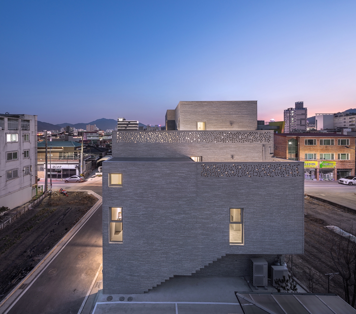
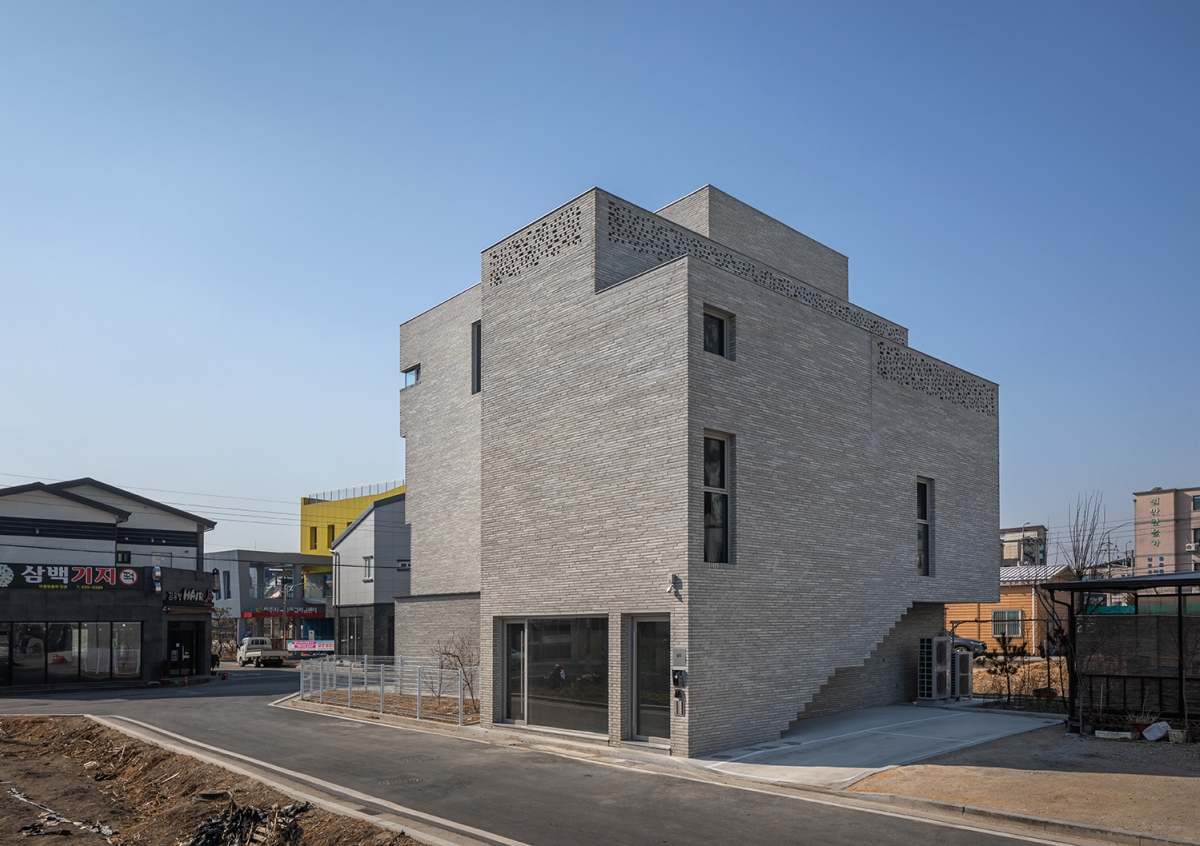
Apartments, neighbourhood living facilities, single houses, warehouses, new multi-family houses tend to appear after the development of an apartment complex, filling the surrounding area and vacant sites with development possibilities. Observing the scenery of a small town, where layers of different eras mix, an unfamiliar and forward-looking brick building stands out. Muyang House, which is comprised of a two-storey neighbourhood living facility and another two-storey residence, adopts a different tone and register to that of its surrounding context.


Site and Mass: Exploiting Constraints
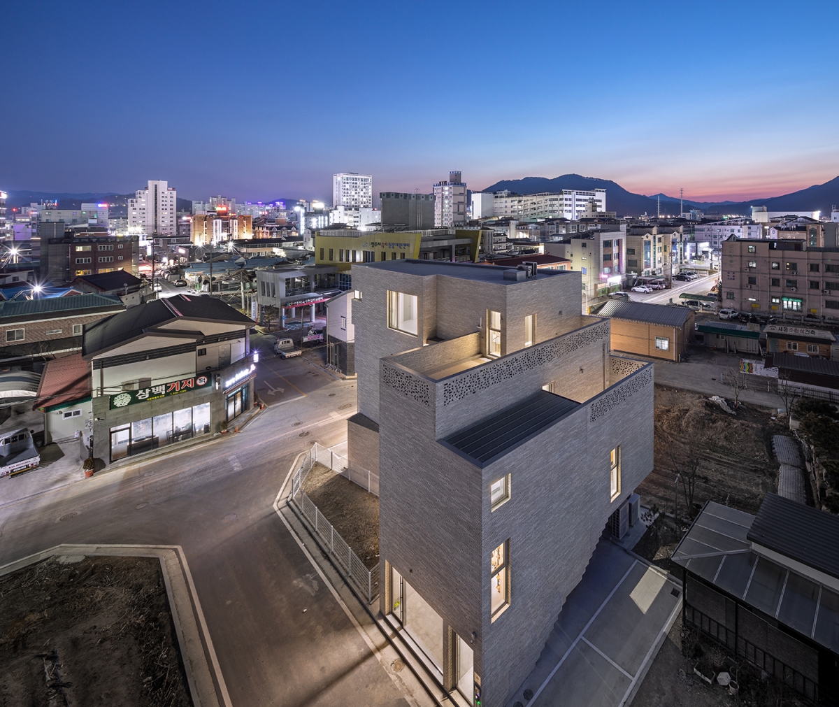
The site is situated slightly set back from the crossroads because it failed to obtain a small piece of land that defines the corner¡¯s boundary, and it is a symmetrically-inverted L-shape that touches the south and east roads. The irregular shape of the site and the resulting restrictions may have caused the client and the architect cause for deliberation, but it all seems to have become a kind of medicine applied to the zone. Because the small piece of land is small and elongated, it is unlikely that meaningful construction activities would be accomplished. As if the house has laid claim to this characteristic, the resulting shape embraces the small piece of land while taking out the corner, rather than becoming a shape that is commonly seen on the flat site on a corner.

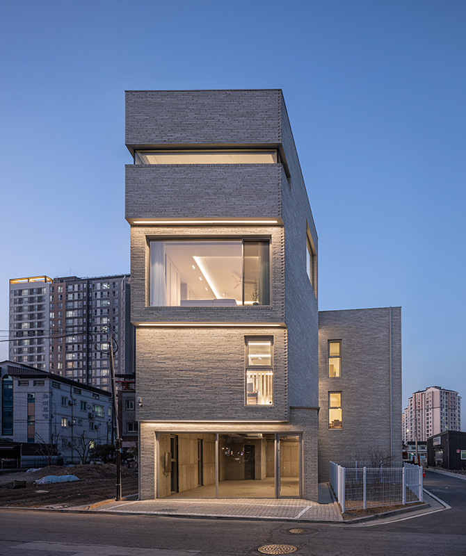
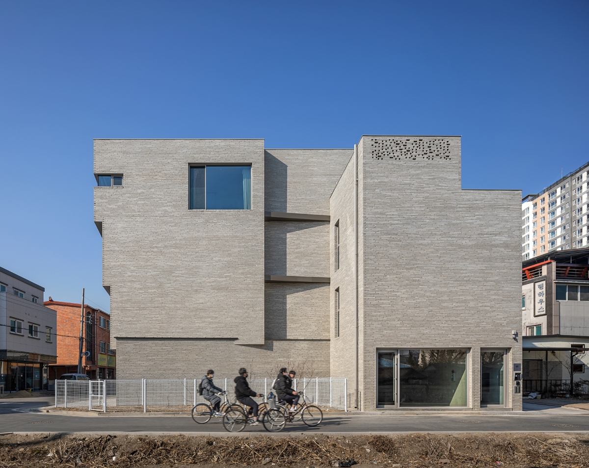
Muyang 2-gil stretches out to the south of the site, and the building actively responds to this street. As you walk along Muyang 2-gil, you will notice a bold front aspect, which appears forward-looking but neat at the same time. The sense of mass, that has been divided from the second floor and gradually expands, becomes clearer as the windows having different sizes and shapes on each floor. Compared to the lively south-facing front of the building, there is only the required number of windows and doors on the east elevation, implying the traces of a conflict between the different volumes and uses of the interior space. As a result, the composition of this east elevation has aided the aspect of the south-facing front.
 

 ​


Stairs and Interior Space: Connecting and Separating Experiences

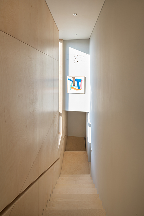
When composing a two-storey neighbourhood living facility and another two-storey residence on top of it, the architect has connected and separated these functions with straight stairs that run along the length of the building. Unlike in a normal stairwell, the act of going up non-repeating stairs clearly distinguishes the experiences in the neighbourhood living facility and residence. The exposed concrete finished stairs from the ground to the second floor lead to the office where the client works, and when you open the front door – which you unexpectedly encounter at the top of the second-floor stairs – you can see wooden stairs leading to the house after taking off your shoes. The residence that thus begins from the stairs on the second floor allows you to experience a complete separation from the office space through variations in materials and sense of space. The architect persuaded the client to employ stairs instead of an elevator, ensuring that it would provide a sense of space and memories unique to a single house. Delicately finished with wood, these stairs are composed in such a way that the journey is not monotonous. These stairs inside the residence, connecting the third and fourth floors, yield the west side – where the windows can be installed – open to each room, and they are positioned on the east side to complete the configuration of the residential space. These interior stairs exist as the only stairs in a two-storey single house, and only the fire hydrant panel next to the stairs shows the disparate traces of the residence with shops.
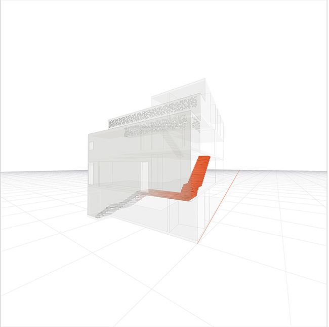


Circulation diagram 


Vista on Each Floor: Adding Narratives
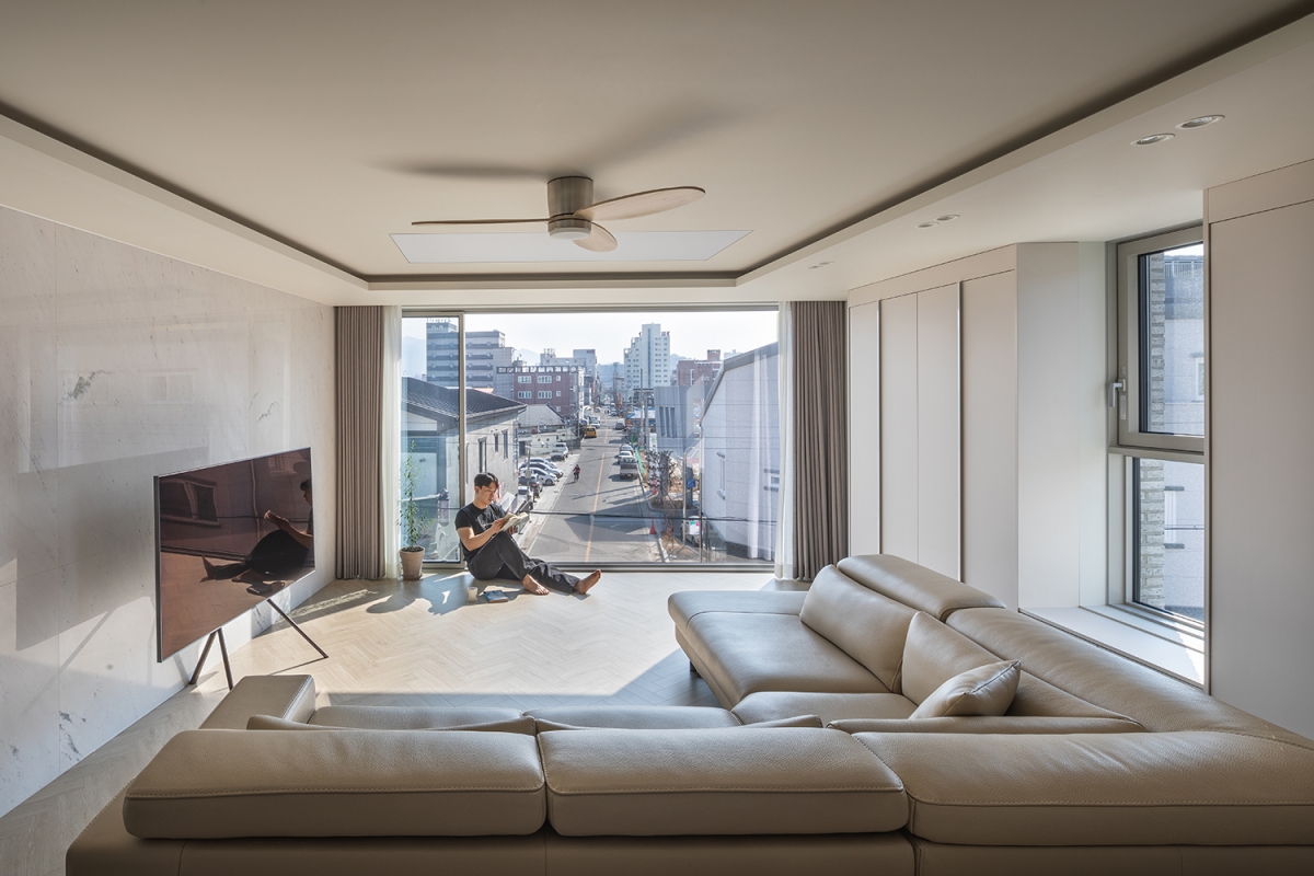
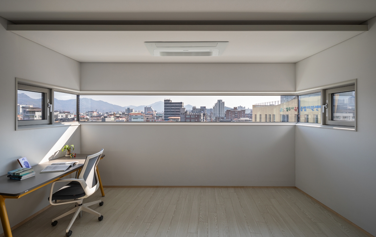
The shop on the first floor was designed by actively drawing upon the characteristics of the site facing the two roads and by attentively considering the possibilities of divided leasing. On the second floor, which is used as the client¡¯s office, the cluttered streets of the small town are hidden without being expressed openly. Instead of finishing the design of the office space with limited openings, the main scene is shown in the residence on the third and fourth floors. The living room window on the third floor is bold and open to the south from the starting point of the stretched-out Muyang 2-gil, capturing the scenery of the small town along with the mountain peaks that spreads out across a view into the distance. The ¡®¤§¡¯-shaped, thin, and long window on the fourth floor appears to have transferred the fundamental content of the borrowed scenery intact. The thin window softens the untidy scenes of the small town, while the nature in the distant view is brought in through the two corners, allowing the users to enjoy the scenery with excitement. It is the narratives of the vistas that clearly explain the architect¡¯s intention, which was to capture the character of each floor as well as each floor¡¯s sense of mass in the elevation.


Unfamiliar Architecture¡¯s Potential: Growing in Tandem

The building¡¯s straight stairs are large frameworks that define and shape the building¡¯s narrative, even if they can only be traced on the north side. The architect communicates the composition through the elevation by matching the height of the bricks on the exterior finish with that of the stair¡¯s riser, but in the neatly-arranged exterior of the west side, the stairs disappear into a very ordinary elevation, leaving no traces to be detected. The architect¡¯s manner of handling the west side is focused on creating a refined surface, thereby demonstrating a passive gesture in displaying the building¡¯s fundamental and distinctive characteristics. If such an intention had been reflected on the west side, perhaps it could have been another subject that would have strengthened the building¡¯s identity.
The interior windows that open from the private office space on the second floor to the stairs connecting the first and second floors; the use of surplus space from the second to the fourth floors generated by the segmentation of the volume, as well as the windows that aid communication between the surplus spaces; and the hobby room inside the master room and the terrace, which are designed according to the setback regulation for the right of light and based on active studies of the cross-section: all of this demonstrates the architect¡¯s sincere understanding of spatial planning. On the other hand, the plan of the residence on the third and fourth floors reveals a mixture of persistent details and an unrefined design arrangement. In comparison to the construction details, and in terms of arranging the house¡¯s design, the elaborate and meticulous planning – such as the relationship between the space and furniture required by the residential facilities, and the appropriate scale of the space used – does not satisfy, leaving one with unresolved feelings. I think this must be a difficult task to achieve in a housing project, which by necessity contains everyday life. 
The client is said to have received a lot of attention after the building was completed. It will be an opportunity to share with many people the potential of well-handled architecture in the hands of a thoughtful architect, and furthermore, I believe that the town¡¯s scenery will become more progressive and grow in tandem with this unfamiliar architecture.


Architect

Ulak Ha Architects (Ha Ulak) + ZIUM ARCHITECTURE (

Design team

Lee Donghyeok, Yang Kyungjin (intern)

Location

Muyang-dong, Sangju-si, Gyeongsangbuk-do, Korea

Programme

residence, neighbourhood living facility

Site area

247§³

Building area

141.29§³

Gross floor area

437.81§³

Building scope

4F

Parking

3

Height

13.65m

Building to land ratio

57.2%

Floor area ratio

177.25%

Structure

RC

Exterior finishing

brick, anodized aluminum

Interior finishing

birch wood, polaris natural stone, drywall

Structural engineer

Dongyang Structural Engineering

Mechanical engineer

Dongnam Engineering Co., Ltd

Electrical engineer

Karam Technology Group

Construction

Seum Construction Co., Ltd.

Design period

Sep. 2020 – Mar. 2021

Construction period

Apr. 2021 – Jan. 2022

Cost

800 million KRW

Client

Seoil Co., Ltd


Ha Ulak
Ha Ulak established Ulak Ha Architects in 2017 after graduating from AA School (DRL) and working for the Zaha Hadid Architects (team code) and the HAEAHN Architecture. Rather than focusing purely on morphological design, he is working on projects considering the relationship between local narratives, climates, materials, and communities. He has been teaching students at Korea University and Hanyang University ERICA since 2014.
Seo Sunduk
Seo Sunduk graduated from Yeungnam University, gained practical experience in Urban Architecture and Dongwoo E&C, and established ZIUM ARCHITECTURE in 2012. He has won a number of public competitions, including the Seongnae 1-dong Community Center and Geomdan-dong Administrative Welfare Center, and is at present an adjunct professor at Daegu Catholic University.
Lim Mijung
Lim Mijung is an assistant professor at Hongik University and a co-principal at stpmj Architecture. After graduating with B.S from Yonsei University, she received her B.Arch from Rhode Island School of Design and M.Arch from Harvard University Graduate School of Design. She is a registered Architect in New York, US, and in Korea and is a winner of Young Architects + Designers from Architectural League of New York 2012, a winner of AIA New Practices New York 2016 and one of the Korean Young Architects of 2016.

COMMENTS