SPACE August 2022 (No. 657)
A Cemetery Embraced by the City
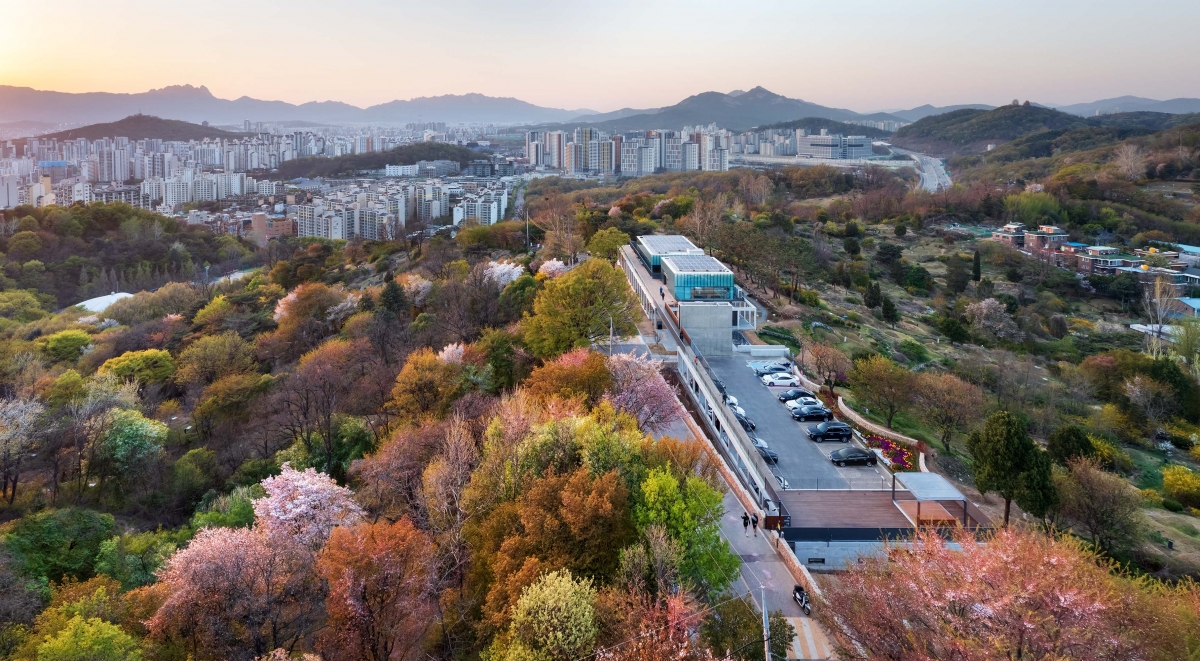
The present Mangu History & Culture Park, also known as Manguri Cemetery, a name familiar to our generation, is far from the dark and eerie atmosphere one might suppose. It is a park full of lush trees, the tombs of celebrities, and stunning views. This cemetery, located at a distance from the residence during the Japanese colonial period in 1933, was converted into a park as Seoul expanded and this place entered the perimeter of the city. The awkward cohabitation between the city and the cemetery became more natural as time passed by and walking among the graves became a daily routine for some. Efforts to break away from the image of an unwanted public facility continued: in 2013, it was selected as a Future Heritage in Seoul, and in 2016, Manguri Humanities Path was created. The Jungnang Mangu Space opened in April 2022 as its highlight. Located on the mountain ridge, Jungnang Mangu Space is a two-story building with a total floor area of 1,247.25ЇГ designed by architect Jeong Jaeheon. Drawings and photos reveal the simple and proportional formal beauty and delicacy of its details, which are so often design features in the work of MONO architects, all of which are consistently applied throughout this space. I selected a few key points in preparation for the excursion with the architect. The first is how this long structure had come to settle into the terrain. It is not uncommon for a building to sit on a slope, but this building sits on a ridge. It cannot have been easy to interpret the positioning. The second is related to ridge topography. I wondered how they had come to set the principal elevation of this building along the mountain ridge. Moreover, I wanted to check the visual impression of the building when viewed from the surrounding context. Third, I wanted to see how this building captures its scenery. Therefore, I will check the performance of the building as a tool of perspective.
A Pavilion on the Ridge
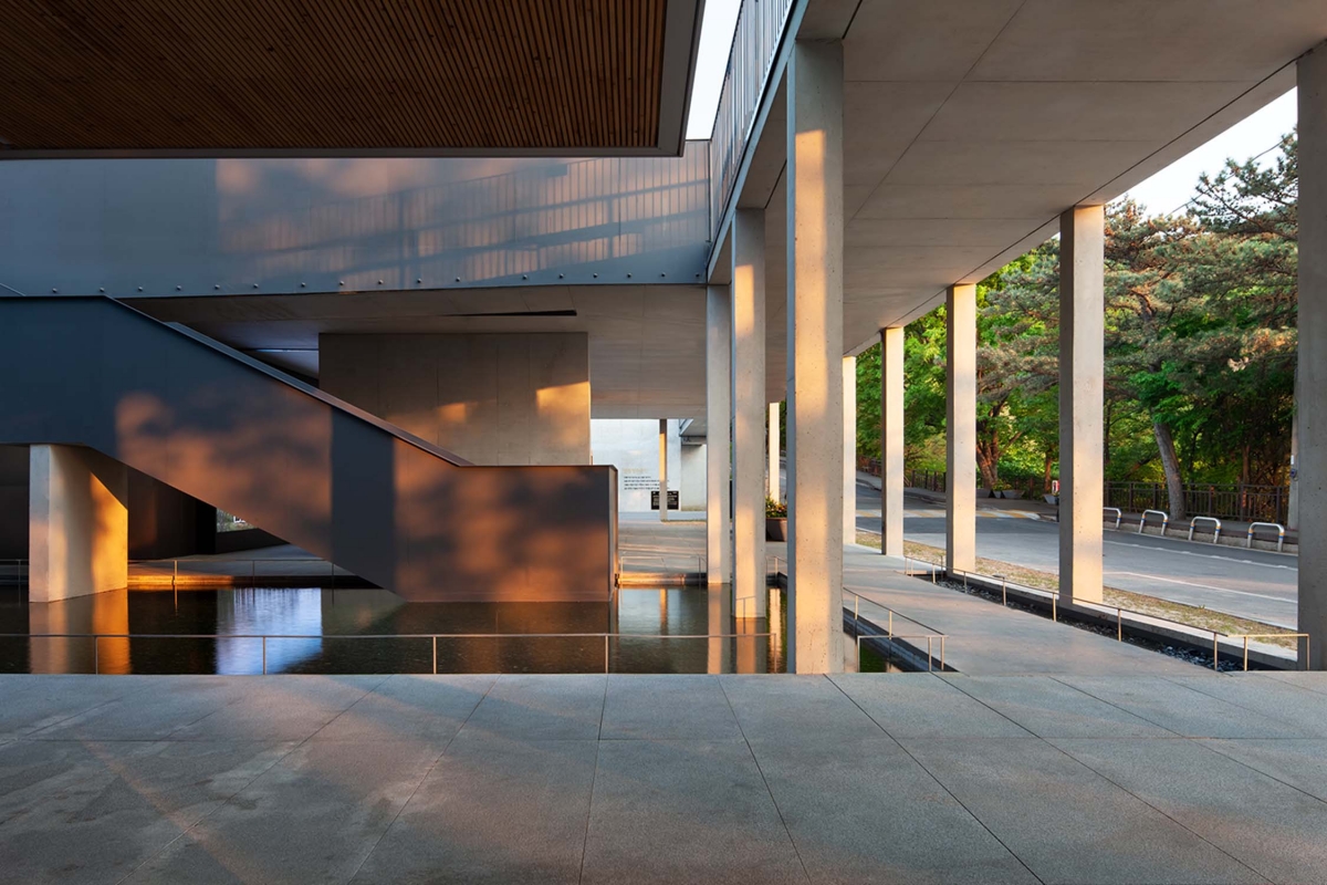
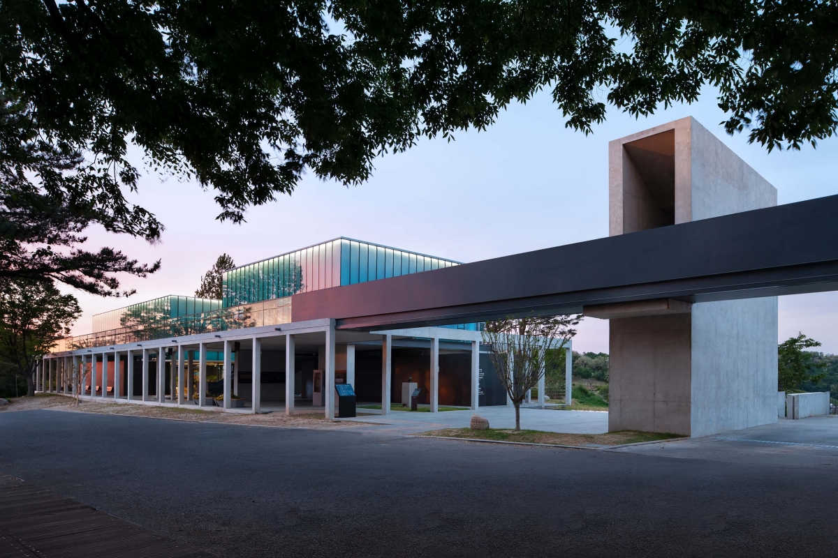
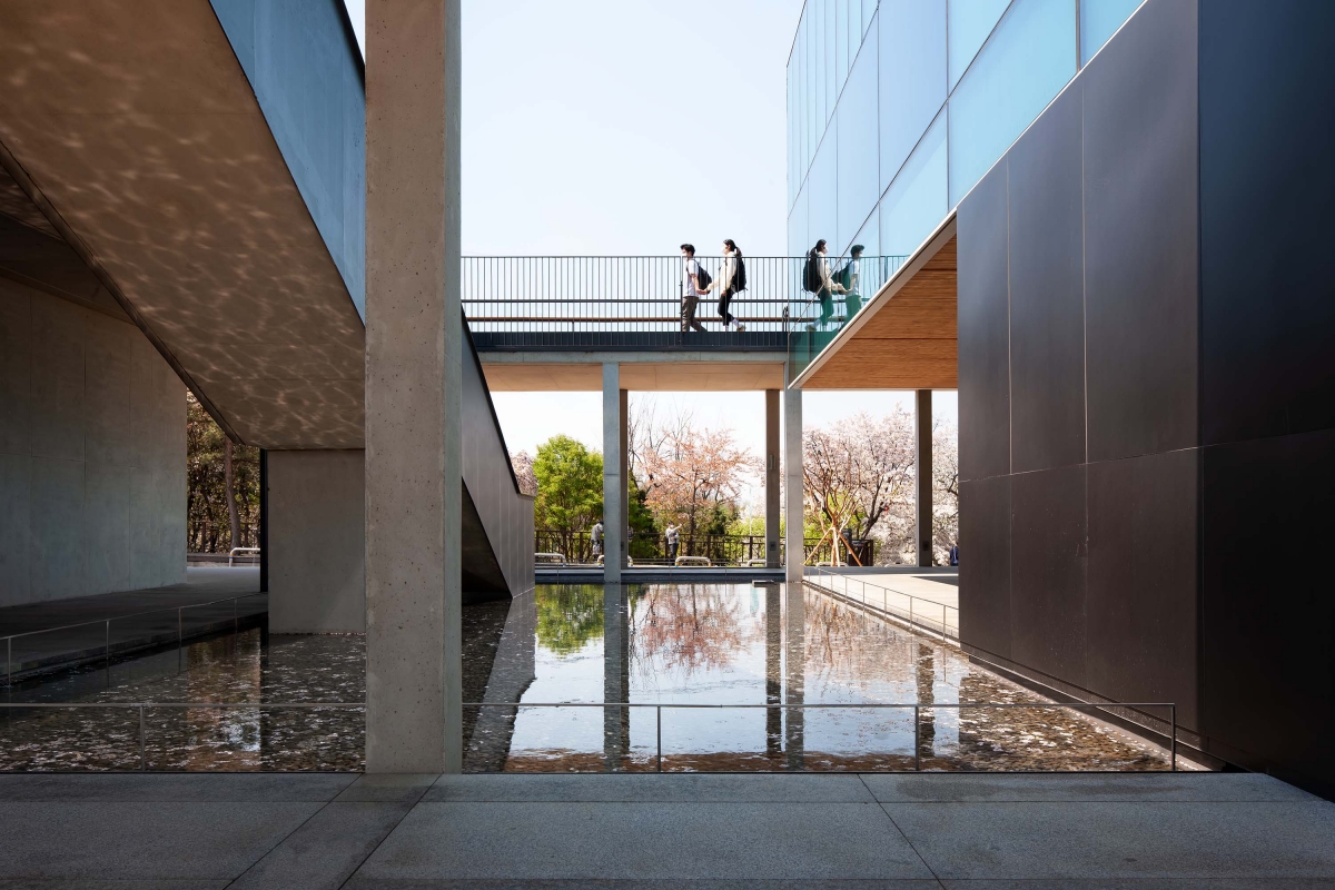
It seemed pretty far away, as it was my first visit, but the northwest corner of the Jungnang Mangu Space soon appeared. I wanted to verify the use of materials. My first impression of this wide road was one of slight disappointment. There was a hubbub all around, of hikers, cyclists, and residents out for walks with their dogs. It was a lively atmosphere rather than a calming one. Is this why architect Jeong Jaeheon named this building ЁЎa merry cemeteryЁЏ? I started looking at the architectural structures with my topics in mind. The first is sighting. It is not easy for a 120m long linear structure to meet the sloping road. The architect cleverly used the slope of the road. The parking lot was placed in the southeast part of the site, lower than the road, to hide it from outside view, and the central mass of the building was placed in the northwest part, higher than the road, so that the first impression of the architecture was revealed on the way up. At the southeast corner, a gate was installed that directly connects the road and the second floor of the building. The approach, whereby both ends of the building meet with the terrain, was handled smoothly using retaining walls and slopes, but the rear of the building did not seem sufficient. Pine trees were planted on the terrain about one metre higher than the first floorЁЏs level for use as the background. However, considering the nature of the ridge, where the scenery looks down on three sides, the mounding of pine trees obstructs the view of the park on the northeast side. The second topic is the image. Due to these topographical conditions, the central location where buildings can be seen is from the road. The point at which one can fully face the façade of the building is at the midpoint of the same level as the first floor, and this is also the main entrance of the building. The façade is not exposed in the view from the entrance. The building yields focus to the cemeteries and mountains seen to the rear and serves as a view frame. Rather than architecture, it was closer to the composition of a pavilion in which the skeleton forms the main image. Last but not least, we have the view. The building appears to declare to all that it will establish a relationship with the view from all directions. The walk on the first floor led to the corridor. Although the surrounding atmosphere is complicated, as if not to forget that it is a memorial park, the achromatic corridor is simultaneously light and respectful. The shadows of the pillars of the corridor enrich the expression of the space, and the neat water glass that reflects the sky doubles it. There are four connections to the second floor. Among them, the concrete staircase structure that is installed at the boundary with the parking lot and runs from the linear terrace on the second floor to the cemetery on the north side through the first floor not only serves to shield the parking lot and to connect the feet but also to link the graveyard and the sky in a sensual way that works as a device to create a respectful space. There are offices and exhibition rooms on the second floor, but the more significant role here is its function as an observatory. The lush forest and corridors provide pleasant shaded areas, but it is difficult to relate to the memorial park on the first-floor level visually. However, the second floor is not exposed to sunlight, but various encounters with the surrounding landscape are possible. The boundary fence was installed incisively and stylishly with glass or flat iron so as not to interfere with observation. It is an environment in which one can entirely focus on this prospect.
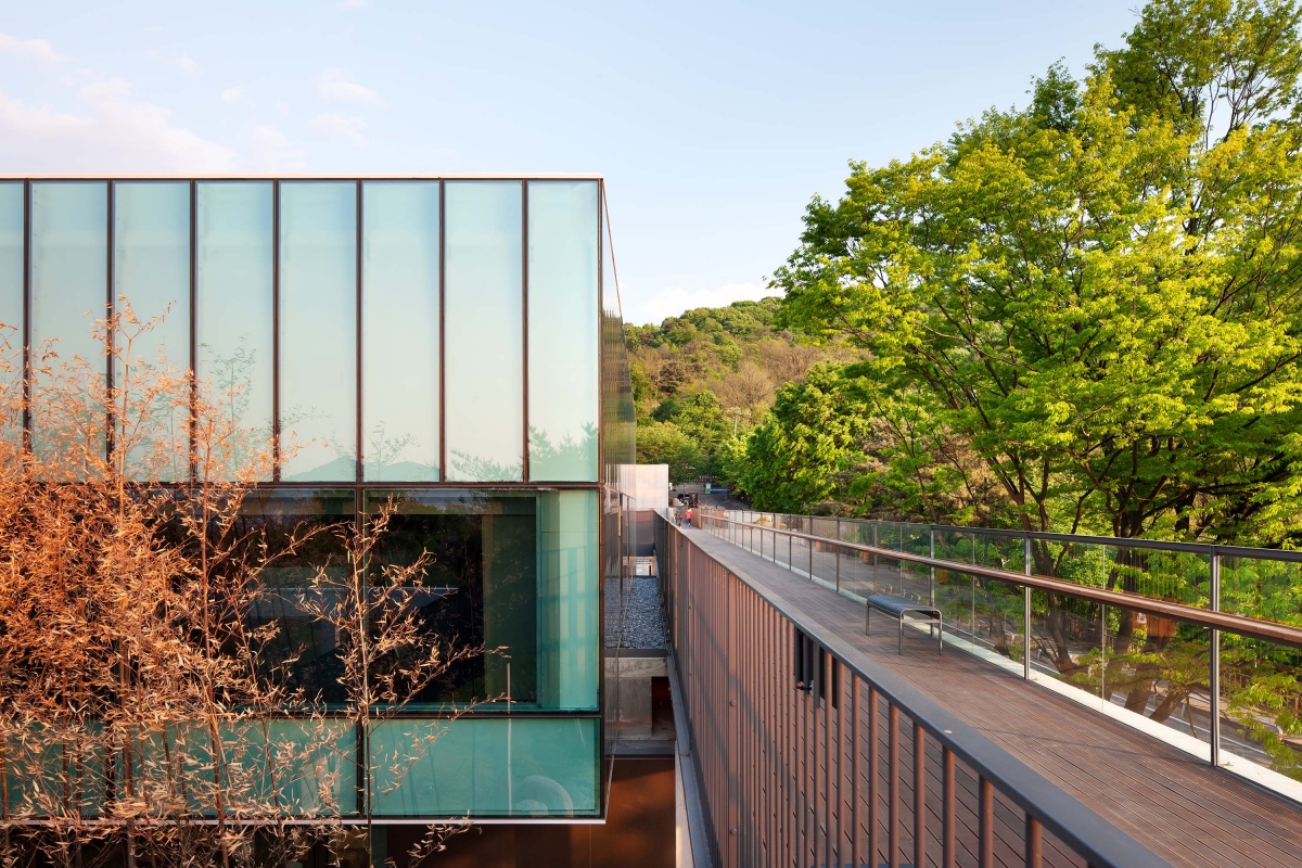
The Coordinates of Public Architecture
The architect said he did not want to reveal the presence of the building. He knew a building that reveals its existence through its mass would not suit this site. He optimised the building for walking and viewing and maximised the connection to the outside. Since refined structural designs such as the first-floor corridor and the second-floor fence were provided, a high quality work of architecture was created that actively communicates with the surroundings without imposing the presence of its own mass. However, no matter how talented an architect may be, the unavoidable limit of expression in public architecture was revealed in this building without exception. Bold and crude construction touches, that could not even be attempted in a private project, were found here and there. By listening to the architectЁЏs explanation, some doubts were also resolved. The architect also expressed his disappointment about the unnecessarily wide roads and large amount of parking lots. At the same time, he expressed the aims and hopes that it will one day elect a pedestrian-oriented approach without parking. I also learned that the pine tree mounting on the back of the first floor was a separate project. It is said that the end of the pavement on the first floor is thought of as the site boundary, and beyond that was under the jurisdiction of the Guri City. It could be the aspect the architect will come to regret the most, but this demonstrates his will for the next battle rather than regret. He said that the building should act as a coordinate for future work, and the future of public architecture exists only when one goes one step further based on these coordinates. Having the notion of the coordinate in mind, I also foster a will to improve the quality of public structures.
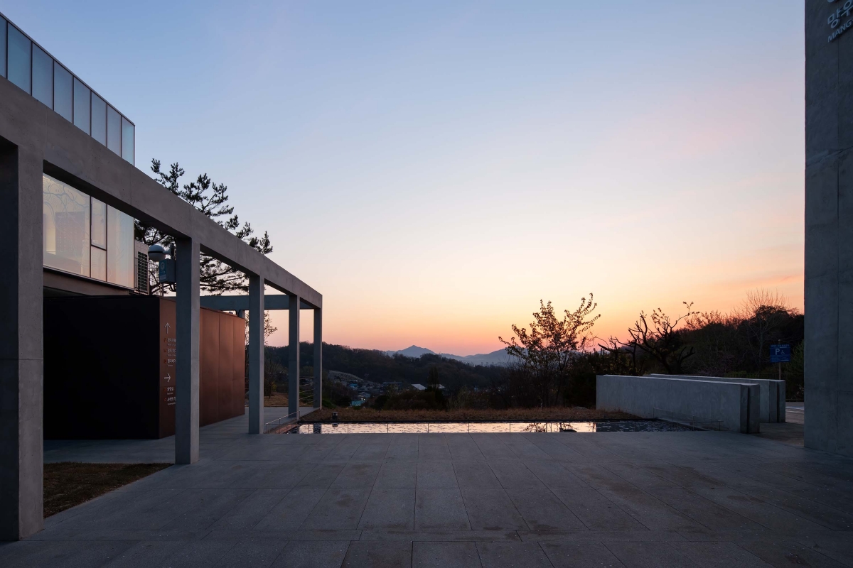
Jeong Jaeheon (Kyung Hee University) + MONO archit
Kim Jungho, Hwang Soyeon, Kim Hongil, Kim Yeongcha
2, Mangu-ro 91-gil, Jungnang-gu, Seoul, Korea
cemetery-related facility
116,826ЇГ
935.52ЇГ
1,247.25ЇГ
2F
29
0.8%
1.07%
RC
exposed mass concrete, SST
paint on the gypsumboard
Eun Engineering
Jusung Engineering Co.
Hankil Engineering Co.
Zion Construction Industry
Dec. 2018 – Mar. 2021
Apr. – Dec. 2021
Seoul Metropolitan Government


