SPACE June 2022 (No. 655)
Museum Embracing the House
Mai Komuro principal, KOMPAS × Han Garam
Han Garam (Han): The NISHIJI PROJECT began as a request from a client who is a real estate developer and art collector. What were the main requirements?
Mai Komuro (Komuro): At the beginning, the client didn’t have a strong vision for the new gallery and only had a plan to build his residence and office space with a private gallery space for his own art collection. However, he was motivated to do something more active on the site and the neighbourhood where he grew up. Thus, his key requests were cultural commitments to the neighbourhood, attraction to external visitors, and optimisation of suburban potential.
Han: The site is located where the client’s parents live. What was the original site situation like?
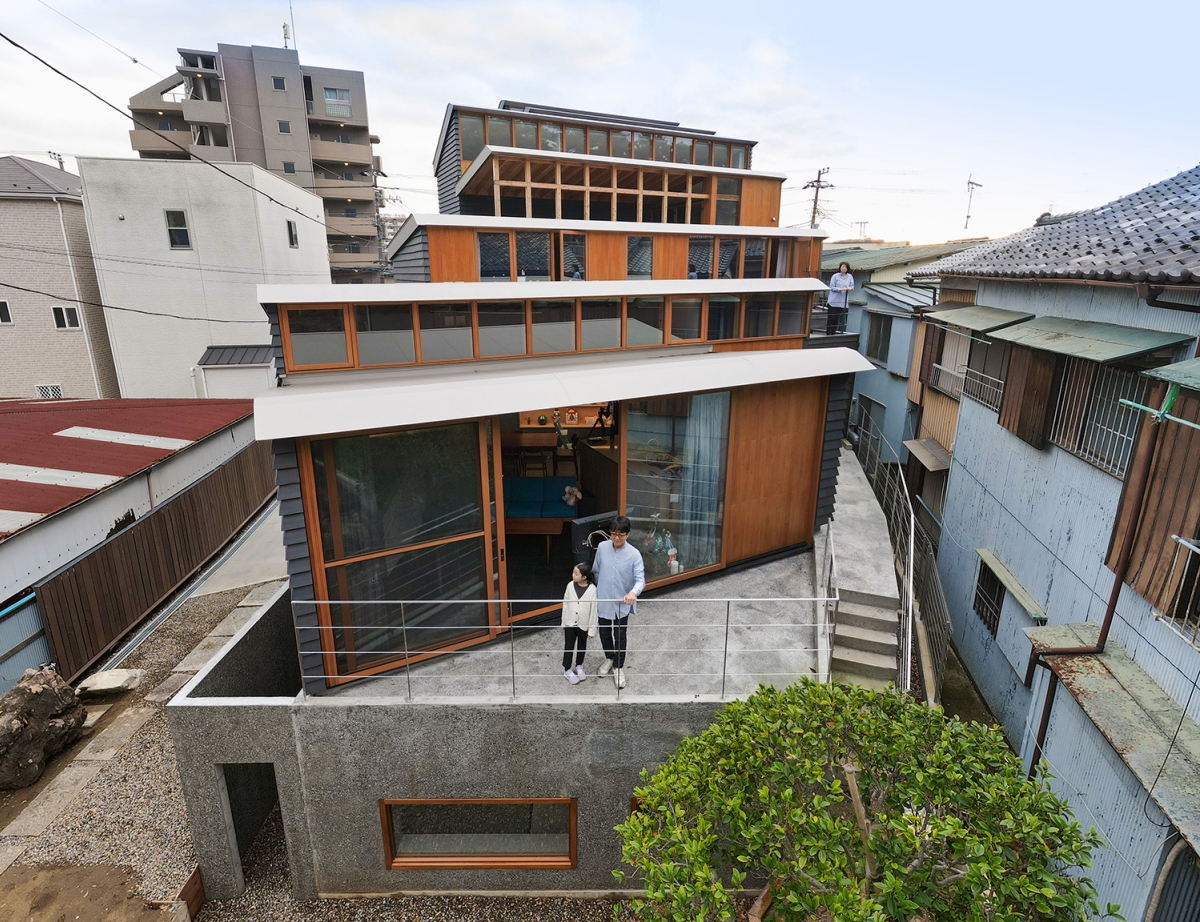
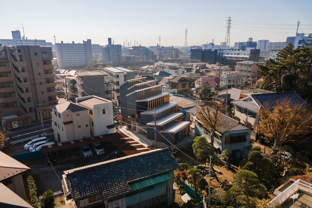
Komuro: The site is in linear shape and his parents’ house is located at the northern end. At the rest of the southern side of the site, along the main road, which was once occupied by parking and an old warehouse with a kawara roof together with full of trees and stones from the previous generation, were rather disorganised and not used to their full potential.
Han: While positioning the building, I assume that there were opinions raised regarding the contrasting programme between residence and gallery as well as the relationship between the building and the parents’ house.
Komuro: Since the main road at the southern side is too busy for a residential environment and the building volume needs to be lowered on the northern side of the site due to the building code, naturally we came to set the office and gallery as a taller volume along the road and place a residence of a lower volume on the quiet northern side. By locating the residence facing to the parents’ house, the vacant area between the two building was able to be designed as a shared garden to keep a comfortable distance.

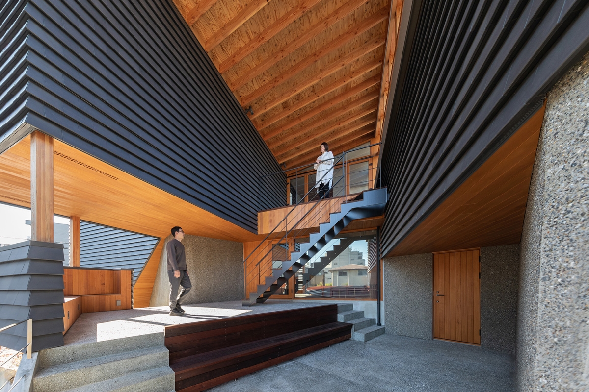
Komuro: First, to promote stable indirect daylight within the gallery spaces without direct sunlight, we wanted to orient the sawtooth roof towards true north, however the site geometry doesn’t fit well with the true north arrangement. Thus, the concrete wall grid is twisted from the timber structure grid to follow the site geometry, which creates various triangle interstitial spaces and dynamic three-dimensional sequences. The height and pitch of the sawtooth roofs vary according to each internal usages to incorporate appropriate daylights. The southern three steep roofs function as skylights and the northern three gentle roofs play the role of residential windows. The central outdoor roof covers the multi- purpose terrace, a common space as well as a threshold between public and private.
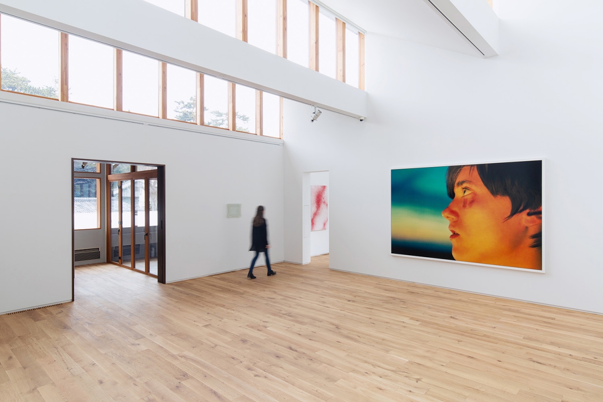
Han: The north-facing skylight window leaves behind a deep impression whether seen from the interior or the exterior. I heard that the long window was resolved with wood alone. What method did you use?
Komuro: To achieve a long span with timber structure for the gallery and living dining room, the ribbon windows at the northern side of each sawtooth roof unit are framed by the timber vierendeel trusses spanning in east- west direction. We used a particular timber joint using invisible connectors to achieve both clean appearances and structural necessity for truss system. Thus, the symbolic sawtooth roofs are integrating multiple important elements like structure, daylighting, and views.
Han: As exterior material, you used kawara tiles ‒ in particular, the black kuroibushi kawara ‒ which is a traditional Japanese construction material.
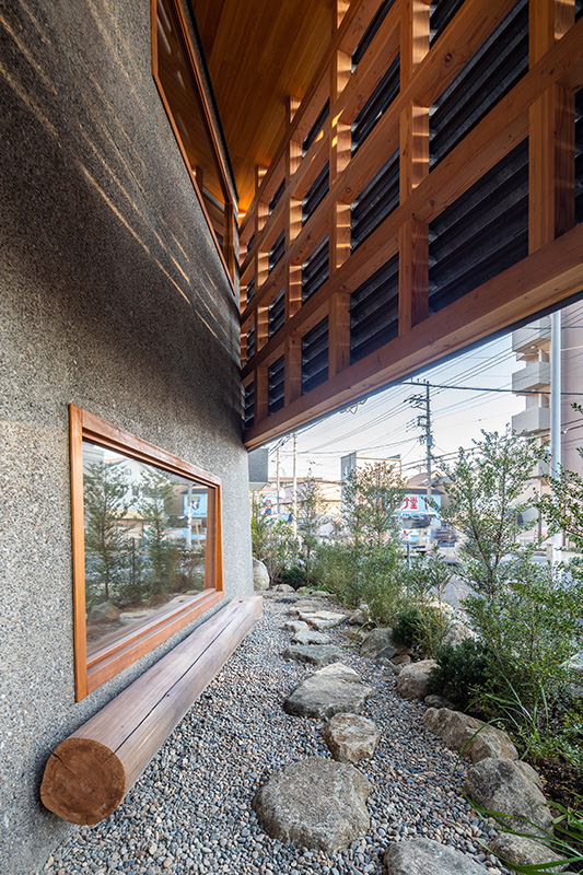
Komuro: The old warehouse building that had existed on the site as well as some old buildings in the neighbourhood have traditional kawara roofing. It came to the idea to use this material for the building façade to sufficiently protect the client’s life and collections like a ‘warehouse’. Considering salt damages on this site, we found kuroibushi kawara, blackened type of kawara, which is more resistant than standard one. Also, we wanted to take over the traditional material into the new building in a different way. To reduce the type of mold to produce custom kawara tiles, we developed a shape that can be used in two ways, as façade cladding and as a perforated louver.
©Munemasa Takahashi
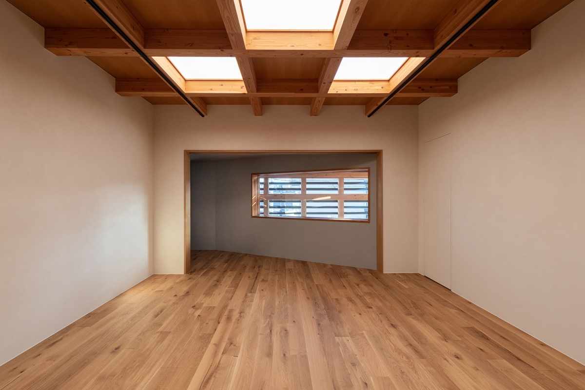
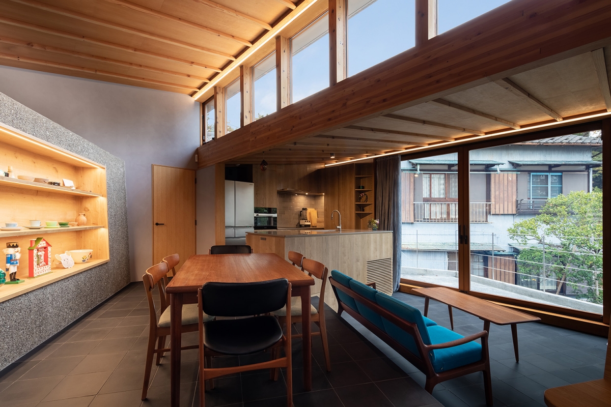
Komuro: Basically the southern half of the building is the gallery part and the northern half is the residence part, and they are not connected internally. On the ground level, garages are located in the middle to separate them. On the second floor, where the living dining room is located, the covered terrace is placed as a threshold to keep a comfortable distance between them, which functions as a common flexible area as well as a shortcut path to the office from the living room. Since most of the windows of the residence are facing towards the north under the sawtooth roof, inside of the residence is not visible at all for the visitors even from both terraces on the second floor and the third floor.
Han: You expressed the spatial concept as a ‘museum with a house’ instead of a ‘house with galleries’. Ultimately, what role did you want this building to play?
Komuro: At the beginning the gallery space was planned to be just for private usage, so it was supplemental components to the residence. However, while the design process and the dialogues with the client, we felt that this building should have museum-quality art spaces that would attract international audiences, although the floor area is not so large. So, we proposed to design the gallery programme more like a small museum incorporating a sort of publicness, considering external visitors, various types of exhibitions, potential events, service arrangements, and so on. We hope that this building will become an interesting example in the genre of the private art space, and the place for exciting opportunities to all kinds of art people, such as artists, audiences, collectors, curators, and so on.
Han: During your career at Herzog & de Meuron, you used to participate as a project manager of museum M+ (covered in SPACE No. 650). After becoming independent in 2018, this is your first time directing the museum all by yourself. Regarding this, I would like to know your thoughts.
Komuro: I have worked for M+ for about four years throughout the entire design stage of the project, and thankfully I learned a lot about designing a museum through such an exciting design process. This experience definitely helped a lot in this project. I felt that I was quite lucky to have got such an opportunity to design a gallery building right after starting my own practice, so I really wanted to concentrate all my knowledge and experiences into this project, not only from Herzog & de Meuron but also what I’ve seen and experienced living in abroad.

Architect
KOMPAS (Mai Komuro)
Design team
Hidenori Sakai
Location
Nishifuna 1-1-16-2, Funabashi, Chiba, Japan
Programme
art gallery, office, residence
Site area
585㎡
Building area
251㎡
Gross floor area
557㎡
Building scope
3F
Parking
3
Height
12.6m
Building to land ratio
43%
Floor area ratio
79%
Structure
1F – RC / 2, 3F – timber structure
Exterior finishing
washed concrete, custom-designed kawara tile, timb
Interior finishing
screed, oak flooring, kawara tile
Structural engineer
Yasuhirokaneda STRUCTURE
Mechanical engineer
MOCHIDA Building Engineering
Electrical engineer
EOS plus
Construction
Aoki koumuten Co.,Ltd.
Design period
July 2018 – July 2020
Construction period
July 2020 – Aug. 2021
Client
Nishiji Inc.
Landscape design
N-tree (Takeshi Nagasaki)
Mai Komuro
Mai Komuro was born in 1983 in Osaka, Japan. B. Arch. from Kyoto University and M. Arch. from the University of Tokyo with exchange study at ETH Zurich. She worked at Herzog & de Meuron in 2008 ‒ 2017 and led M+ project in Hong Kong as an associate. She established KOMPAS in Hong Kong and Tokyo in 2018.
37


