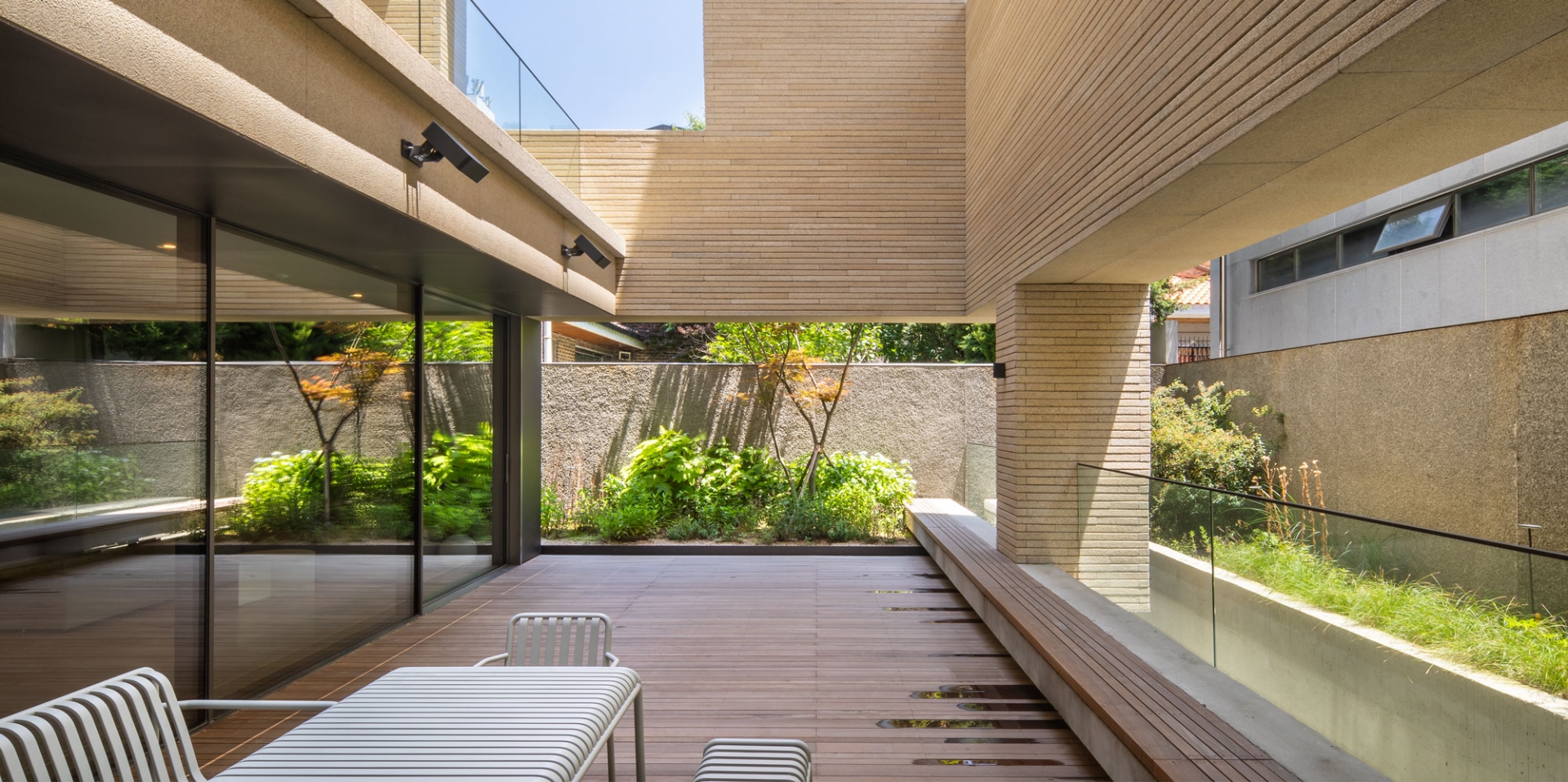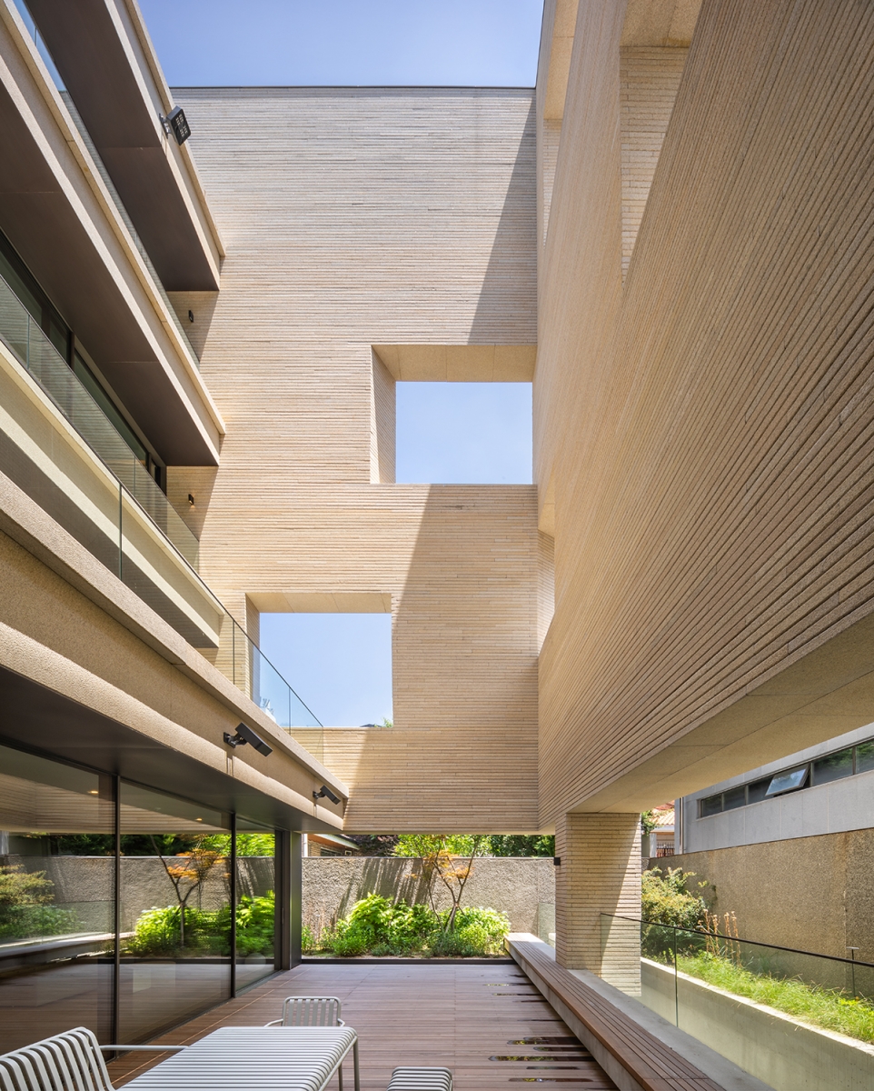
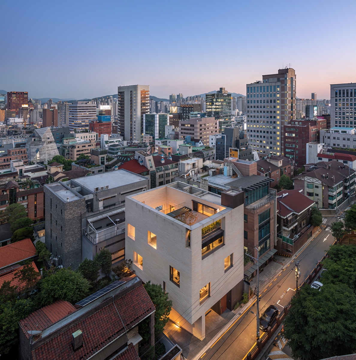
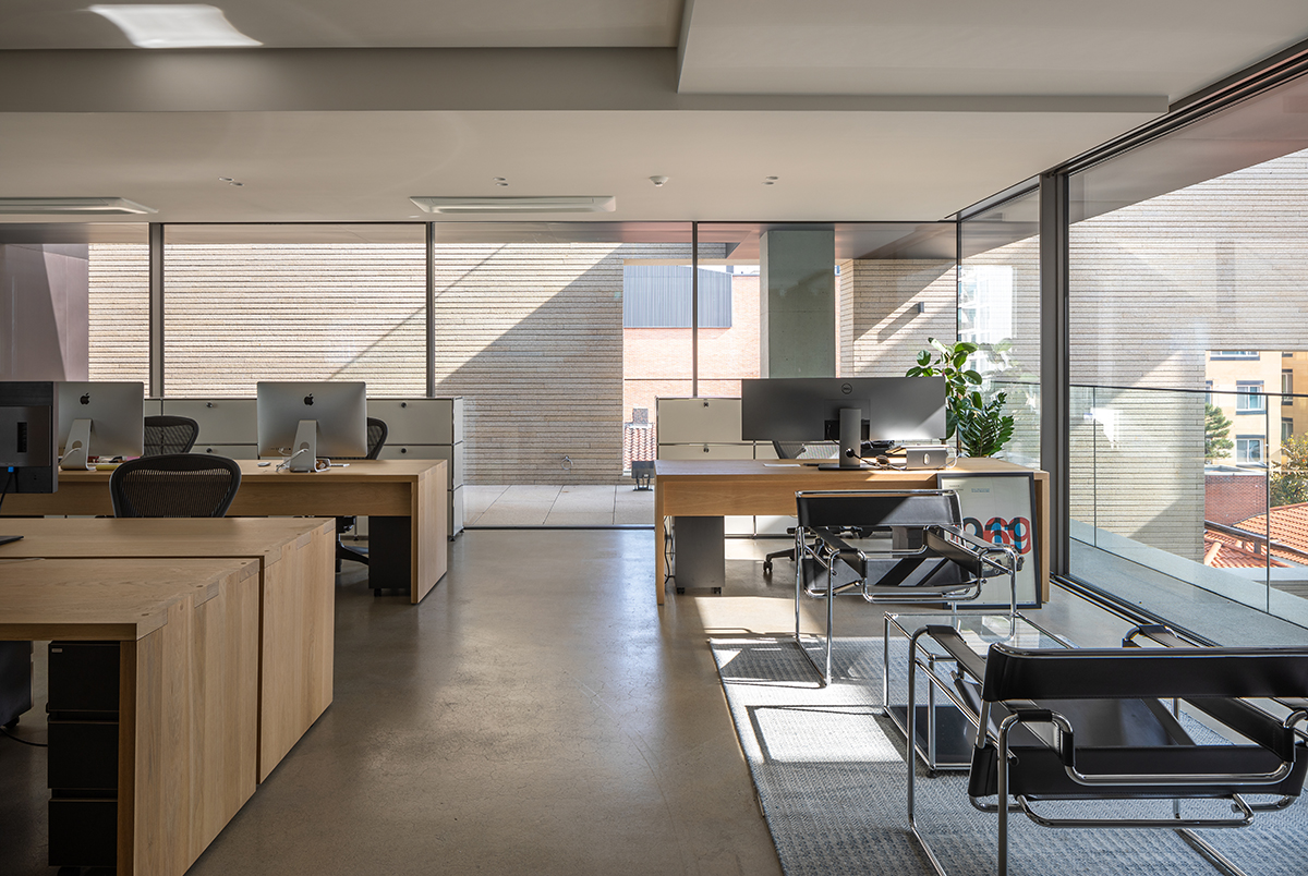
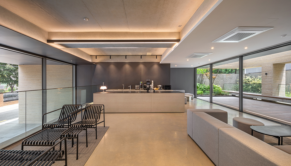
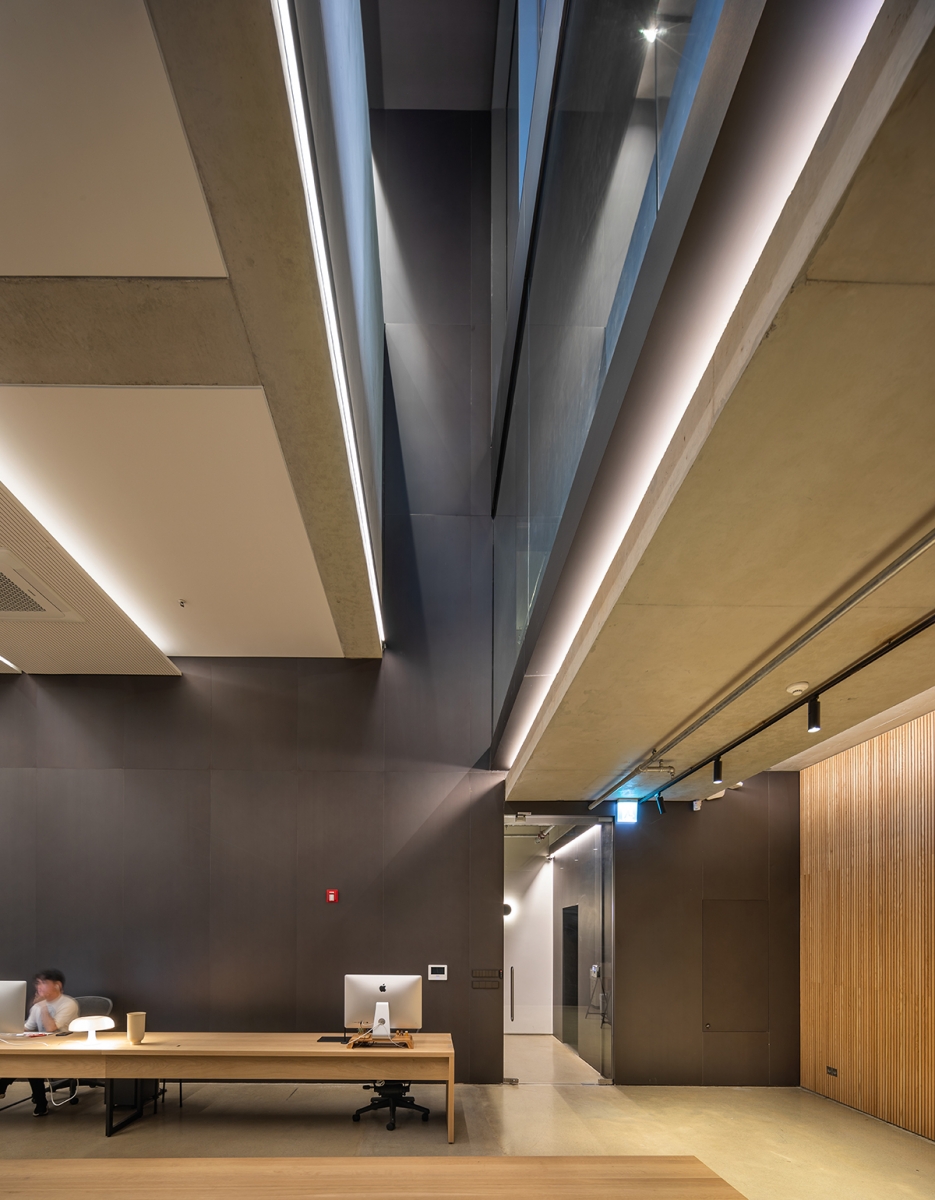
The DFY Head Office is located in a quiet residential district in Gangnam, with high-rise apartments rising in front of it as if a barrier. The site is surrounded by similar-sized buildings. The lower part of the building is open to provide a sense of stability while maintaining a line of communication with the street, while a strong boundary was constructed with substantial walls between adjacent buildings. In return, the first floor, with a lounge, was designed as a split floor, raising half a story to visually shield the interior space while allowing light to flow into the basement level. The lounge on the first floor, which extends into the courtyard, is a vibrant space where all the vertical and horizontal circulation paths and interior and exterior lines of sight converge. The fundamental concept of the ‘office’ has evolved from the ‘functional’ to the ‘personal’, and it encompasses the comforting connections between the ‘somatic’ to the ‘psyche’. The office is no longer a general workspace, as it has evolved into a comfortable living space that feels like ‘home’. Should we not have smaller spaces in which people can look up at the sky, feel the breeze, experience seasonal change and the effects of the weather, and be able to get away from their daily lives spent in front of a screen? The notion that cultivating a relationship with the outdoors would be more important than anything else, the void was designed first, followed by the solid structure. To encourage active communication, the courtyard was placed on the inside, connected to each level’s interior space. The light from the courtyard filters into the basement space through a light wall that runs the length of the sunken garden. The mood of the space is set by this streak of light that streams down into the basement space, which has a higher floor height to achieve a maximum sense of openness, sometimes strong and sometimes gentle. The courtyard, which is surrounded on three sides by walls, is a space of sensitivity in which impressions of light and nature move. Rather than shielding the line of sight, the courtyard’s ‘wall’ was designed as a ‘window’ through which people could better appreciate their refined surroundings. As a ‘media’ set to acknowledge light and the sky, the wall itself delivers a new and ever-changing experience in every corner of the head office. The thick wall was designed so as to be heavy and rigid enough to be understood as a volume. It takes on the appearance of an elevation from the outside, as well as a different elevation experienced on the inside. (written by Jeong Jaeheon / edited by Choi Eunhwa)
Jeong Jaeheon (Kyung Hee University) + MONO archit
Lim Hongryang, Song Younggu
Nonhyeon-dong, Gangnam-gu, Seoul, Korea
neighbourhood living facility
380㎡
185㎡
997㎡
B2, 4F
7
18m
49%
146%
RC
yellow granite, SST
aint on the gypsum board, SST, exposed concrete
Eun Engineering
Sungdo Engineering
Ean R&C
Oct. 2018 – Apr. 2019
May 2019 – July 2020
Hwang Byungsam
Gema Co.


