‘L’existence Précède L’essence’
It has been a while since monotonous minimalism reigned supreme in Korean architecture or design. One stands in awe, drawing up close to the sheer finish of architectural projects, while a sense of unease establishes itself through close observation, probably due to feeling of aversion at such an inherent and servile essentialism and dogmatic approach, and the notion that a purer metaphysical idea exists. If one cannot accept things as they are, or create potential from the barrenness of our lives and the urban realities of where we stand, our (Korean) architecture will not only become distanced from the public but will also fail at being recognised for its originality from an international perspective.
Genius Loci called Hongdae
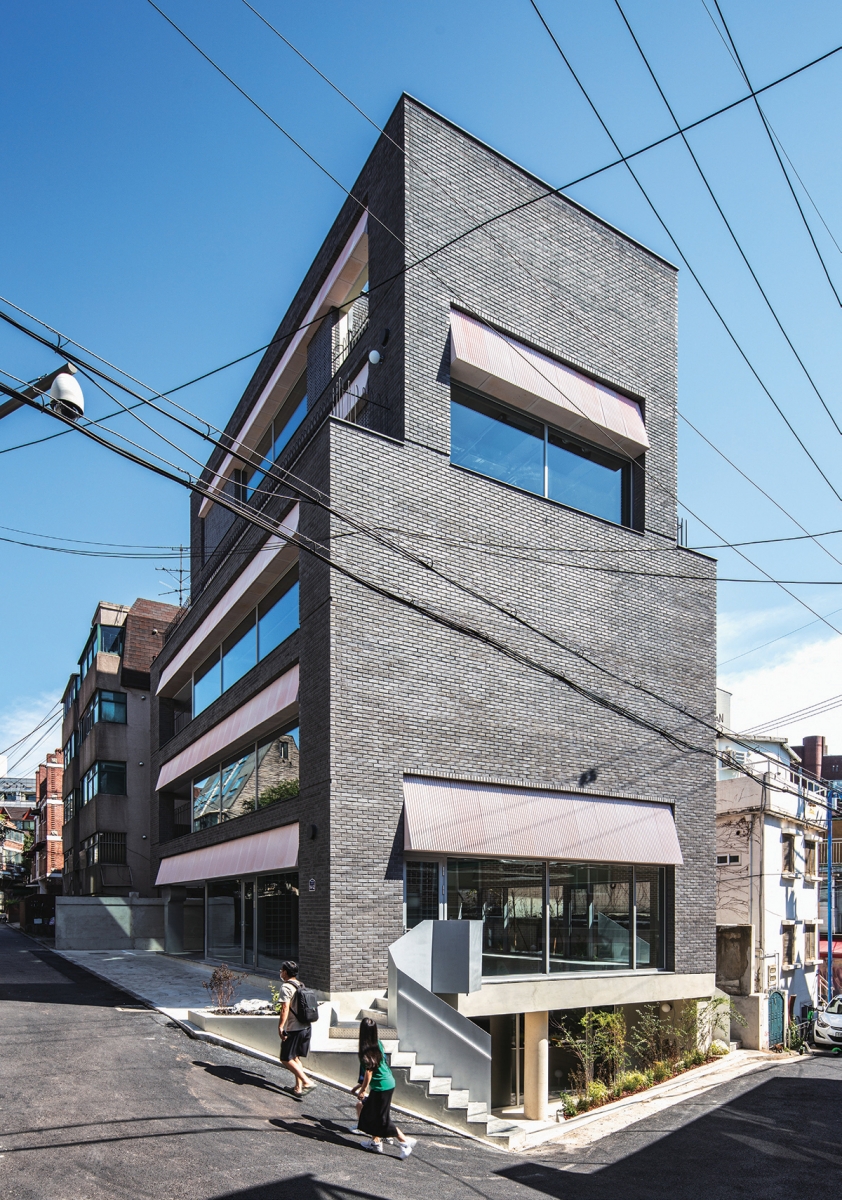
The ʻwhite boxʼ building, which stands alone within the disorderly town context of Hongdae, does not fit in, like a tense nerd at a social event. Just looking around, all sorts of structures have coolly settled in, with their own reasons to be there, and with no desire to create a sense of harmony. The most important issue is to accept these situations, while considering how they can be situated within the congenital rules of architecture. If left in disharmony, it can longer be thought of as ʻdesignedʼ, and if one obsesses over harmony, it no longer feels hip. Ultimately, one hopes that a black suited gentleman will turn up wearing ugly shoes and carrying a coke.
A Rental Neighbourhood Living Facility and Cost-Effective Floor Plan
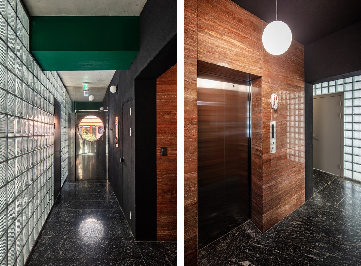
Rental neighbourhood living facilities built in Hongdae, with their high real estate prices, must leave nothing surplus to requirements. In this way, the building preserves its compact core on one side, with columnless square rental spaces stacked one over the other. The central entrance for the first floor is located at the end of a long corridor that is made possible by slightly opening up the core and the rental space. Therefore, there is no space resembling a ‘hall’ as we know it, and emergency exits, the men’s restroom, a stairway, the utilities deck and the women’s restrooms are all placed in order with as much of an outlet as they require alongside the wall to the side of the core. Meanwhile, the glass block wall on the other side allows light to penetrate the corridor, exciting the senses, yet also ruthlessly cutting off the views of the structural beams of the ceiling.
A Toy for a Symmetry Game
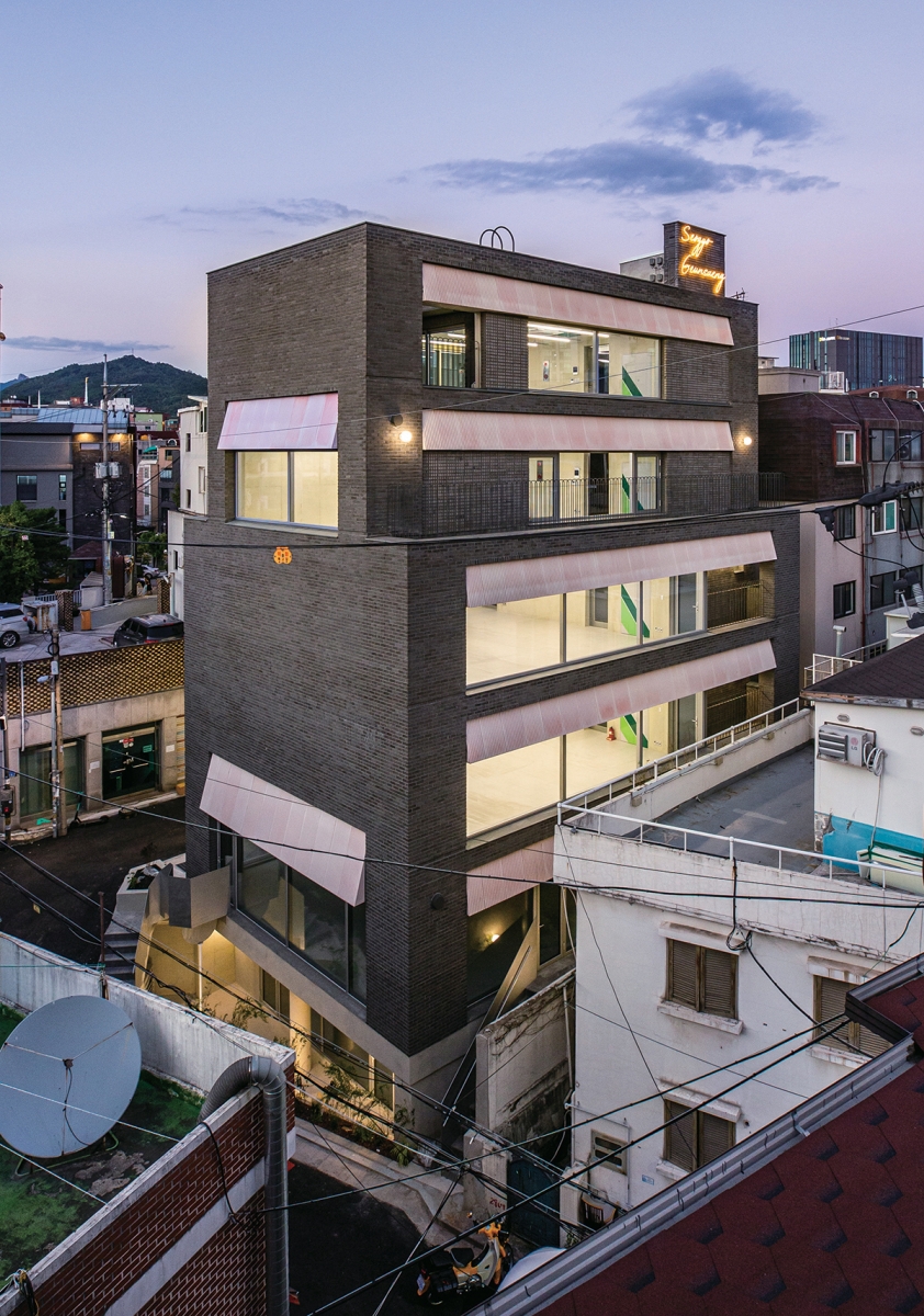
As witnessed in nature, the most settled and optimal structural form is achieved through symmetry. However, it is no easy task for architecture to acquire a symmetrical form within complex urban conditions. It would be no exaggeration to say that the right-to-light and floor area ratio measurements determines the form for building that are built on a small site. However, it would also be undesirable to suggest an architect removes the possibility of independence and has unreservedly accepted the external conditions. Seogyo Geunsaeng is also influenced by a diagonal right-to-light rule, with a setback form from the fourth floor. By treating the other side in the same way, an illusion is created as if the project overall is untouched by external conditions. As such, the building not only takes on structural efficiency, but also separates itself from the context, taking on a cute form like a stack of lego bricks.
(A)tectonics and the Matter of Expression
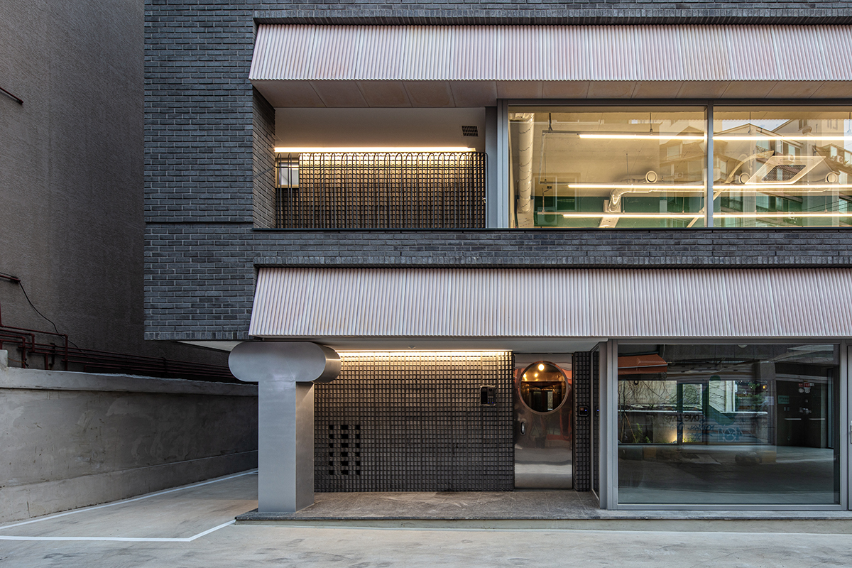
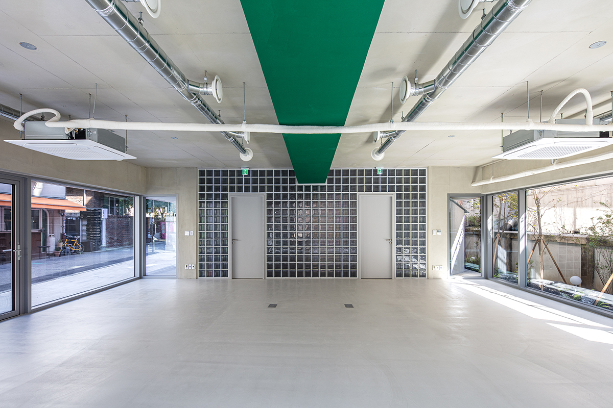
While the form may be easily understood, the structure is not as open about its aims. The metal object on the first floor façade at the northern side, which props up the volume like a column, is in fact an empty post box, and the circular concrete column on the façade of the semi underground floor to the west is also in fact a column (yet, according to its location, is not a necessary structural element). In other words, the main structure of Seogyo Geunsaeng is created through core walls, the wall beams and wall columns buried in the solid wall to the west, while the other façades have all been designed using a cantilever, so that the project takes on a slightly ambiguous look, appearing to be at times a box-frame construction and at others a rigid frame. The bold beam which supports the slab like a splint on the ceilings of all floors plays the most critical role in the entire structural system, and this was painted in thick layers of green to suggest the lightness of plastic and the heaviness of structure. The diagonal line drawn on the facilities access door of the core wall enhances the graphic play of these green beams.
Five Heterogeneous Elements
This neat box, which could look uppity, settles on its irregular site by softening its aspect in relation to heterogenous elements dotted here and there. The silver staircase, which is located at each side of the western front, in obeyance with the site borders, seduces passersby into the shop; while the T-shaped post box placed near the main entrance, as an homage to the architect Hans Hollein, adds a symbolic resonance to this commercial project. The corrugated iron roofed restrooms to the south create the impression of an outdoor lavatory inserted as if an afterthought following construction, while the small wall installed to hide away the elevator tower exposed on the rooftop becomes the neon sign for ʻSeogyo Geunsaengʼ, celebrating
the atmosphere of the neighbourhood.
Gage, Sangga, Geunsaeng
The gage (store), sangga (mall) called geunsaeng (neighbourhood living facilities) mostly have awnings, and because they were installed after construction was complete, the majority of them are composed of cheap and light materials. Seogyo Geunsaeng interpreted such awnings as typical of geunsaeng and sought to include them in the architectural vocabulary. The resulting project resembles a mall with long awnings stacked on top of each other. Yet, as the awnings were not as affordable and functional as those installed after construction, it was important that this feature would not just be a representation. Therefore, the angle of the light pink wedge attached to the spandrel stops at a non-functional moment, and is made with the most expensive and heaviest material, concrete, to subvert functionality and act as ornamentation. Through a social interpretation of the programme itself instead of the users, the building discovers its own character.
Harmony of Disharmony
The common areas including the stairwell are a purposeful mix of diverse materials. Instead of emphasising textures or details, honest materials have been placed in sequence and juxtaposed with no regard to their status, engaging in the particular aesthetic philosophy of Hongdae, and allowing for a range of analogical interpretations. The stainless mirror finish of restroomʼs door, the black stucco of the staircase, the spotted stone of the floor, the red travertine wall of the elevator hall, the white oak wooden ceiling, railings painted with copper metallic paint, and the circular pendant, and so on. These strong patterned materials were used to create a relatively sombre and classical atmosphere. Rather than excluding what might not fit in, this was an experiment in what, if left to its own devices according to disparate needs, might create harmony.
Again, Architecture
While architecture is of course a social construction, a building is not created by popular vote. While architecture is categorised as a service, we know all too well that the satisfaction of the client cannot be the only objective. While the building may be altruistic, it is better to recognise, for ourselves, that architecture cannot be entirely altruistic. A project might be a public asset, yet we must not forget the fact that architecture cannot help but be an extremely internal subjective voice advanced by the architect who thinks about and interprets countless conditions, to devise new rules. Therefore, what should be treated with the closest scrutiny is not the measurements nor the details but the architect himself. (written by Suh Jaewon / edited by Bang Yukyung)
aoa architects (Suh Jaewon, Lee Euihaing)
Sunwoo Uk
14-12, Wausan-ro 29-gil, Mapo-gu, Seoul, Korea
neighbourhood living facility
255.9㎡
128.51㎡
597.14㎡
B1, 5F
4
16.49m
50.21%
188.41%
RC
brick, UHPC concrete panel
exposed concrete, stucco (terracotta granules)
Eden Structural Consultant Inc.
Daedo Engineering
jium CM Corporation
May – Oct. 2020
Oct. 2020 – Sep. 2021
Botanical Studio SAM


